
Here’s a look at the elements of a dropdown menu, its different variations, and the steps to design a dropdown menu in Figma.

A design kickoff is the starting point. It’s about bringing people together, clarifying questions, aligning objectives, and more.
What if we all used one global design system? Would this benefit users and developers equally? Let’s explore this concept in depth.

With drag-and-drop interfaces, no-code website builders allow designers to focus on creativity rather than technical implementation.

UX leaders need to keep close contact with other stakeholders to get help. Here’s how to communicate with stakeholders in your organization.
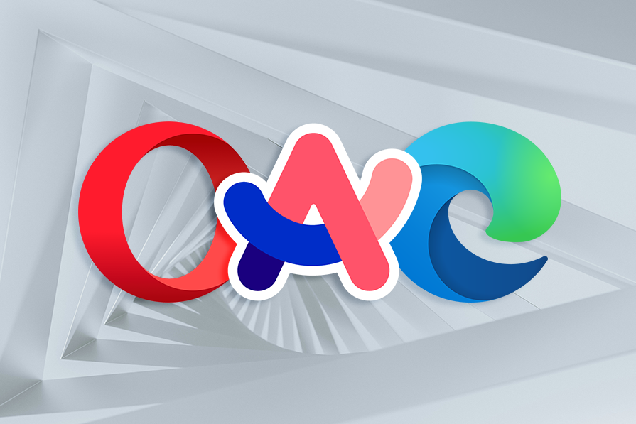
Are we experiencing a new age of browsers? Let’s break down the UX design of the most popular browsers and upcoming stars.

Service design can help our organizations innovate customer experience and build brand loyalty — and it’s great for small businesses.
Digital addiction is bad for your mental and physical health. Learn what trends encourage this concerning behavior and how to avoid it.

Let’s compare Zeplin with Figma Dev Mode to find out which suits design handoff better for your software product team!
Here are some tips to help you create an effective UX design portfolio to get past the recruiter’s line and land the interview.
AI can help make your designs more accessible to people with disabilities by automating tasks, such as captions, image descriptions, and more.

Validating and verifying your designs can spare you from having to rehaul them down the road. Here’s why and how to conduct these processes.