Editor’s note: This post was last updated on 20 November 2023 to include visual examples and updated information on scroll behavior.
Prototyping is an essential part of the design process that enables designers to visualize and evaluate a user’s journey of interactions within a design. It allows designers to create a tangible version of their design and experiment with different ideas before the design is fully developed.
A key benefit of prototyping is that it allows designers to gather feedback and iterate on their designs quickly and efficiently. These prototypes can then be shared with stakeholders, end users, or team members, who can test the designs and provide feedback on what works well and what needs improvement.
Figma’s prototyping feature offers a range of tools to make the prototyping process smooth. In this post, we will learn how to create prototypes in Figma, add animations and transitions to enhance their functionality, explore the process of sharing and testing prototypes, and gain insights into optimizing the prototyping process.
Before putting anything down on your empty canvas, it is helpful to make a plan of what you want your prototype to achieve. Here are some tips to help you plan an effective prototype that will be received well by your audience:
Finally, it’s important to keep your prototypes simple and avoid bloating them with features. Focus on the core features that align with your prototype’s goals. With that in mind, let’s learn how to create prototypes in Figma.
To start exploring the prototyping feature, you’ll need actual Figma screens to practice with. You can duplicate this Figma template file that contains four screens for a travel mobile application. We will use this to prototype a user flow for booking a trip within the app:
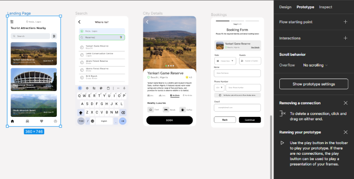
Enter prototype mode by clicking on the Prototype tab at the top-right of the properties panel. Alternatively, you can use the keyboard shortcut Shift + E to toggle between the Design and Prototype tabs.
The prototype tab consists of three sections: Flow starting point, Interactions, and Scroll behavior. These sections will be displayed when you click on a frame. These properties will be explained in a practical example using the provided screens in the template.
A flow is a series of interactions that represent the path your user will take through your application. This feature lets you define the starting point for a flow in your prototype. A user’s journey through these interactions is what creates a flow in a prototype. You can create multiple flow starting points in your prototypes.
To create the flow, highlight the landing screen in prototype mode and click on the + icon beside Flow starting point. A blue box featuring a play icon will appear, having a default label of Flow 1:
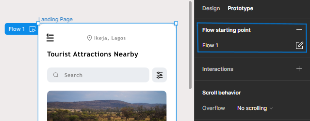
You can rename this to Book Trip Flow. Clicking on the play icon will display your prototype in a presentation view.
N.B., while in presentation view, use the left and right arrow keys to navigate between screens attached to a flow.
Interactions are the connections made between elements in a design. Interactions are created by drawing lines (also called noodles) from one element to another. These elements that initiate an interaction are referred to as hotspots. They can vary from frames to buttons or icons. Every interaction begins with a hotspot and ends at a destination frame:
N.B., tapping on a random area of the screen in presentation view will show the available hotspots in the prototype.
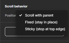
You can employ the scroll behavior feature to define the behavior of a particular element as the user scrolls within the parent frame. We see a prevalent application of this feature in a navigation bar that remains affixed to the top of the screen during scrolling.
By default, every element is set to Scroll with parent. However, two alternative options exist: Fixed, which ensures an element remains stationary, and Sticky, a setting that causes the element to initially move with the scrolling, but once it reaches a certain point, it halts and sticks to the top of the screen. With sticky, alphabetical markers stick to the top as users scroll through the list, providing a convenient reference:
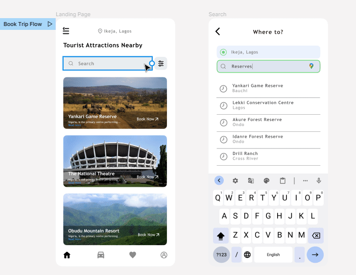
The interactions on the landing screen include:
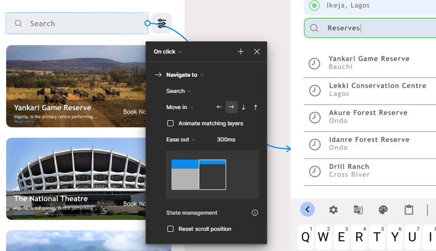
Start by hovering the search bar area till a blue circular node appears then click and drag this node to the Search screen. This creates a noodle that links the search bar to a destination screen. Draw this noodle to the Search screen as such:
After a noodle is drawn, the Interaction details panel pops up:
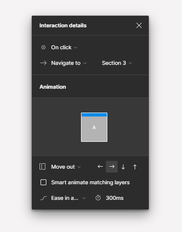
The panel is designed to manage the behavior and appearance of an interaction. It comprises three properties: Trigger, Action, and Destination. There’s also an animation section used to configure animation applied to this interaction.
The Trigger property defines the kind of input a user has to perform to initiate the interaction. Figma sets the default trigger value to On Click, which is what we’ll use majorly. However, there are more trigger options that include On Drag, Hover, Open Overlay, Mouse Enter, and more.
The Action property defines the transition that occurs when a user interacts with a hotspot. Figma sets the default action value as Navigate to, which is what we would use for our landing screen. Other available options include Scroll to and Open overlay.
The Destination property defines the endpoint of an interaction. The value of this property will be the top-level frame your noodle points to. Figma also detects all the top-level frames and allows you to pick a destination from a dropdown menu. Our destination here is the search screen.
So, our basic prototype is done, but we can make it better. Let’s explore the Animation settings next.
In prototyping, the animation setting is used to create seamless transitions between screens. It dictates the behavior of an interaction’s transition into another screen. The animation section comprises Transition, Direction, Easing, and Duration properties, as well as a preview window — which you can hover on to preview the animation.
This field defines the interaction’s transition effect. It is set to Instant by default, which is what we would use for our landing screen. Smoother transition modes include Dissolve, Smart Animate, and Move In or Out. Here’s some info about the transition modes:
And these fields control the feel of the transition:
For the search bar hotspot, we’ll be using the Move In animation, with a direction of Left, the easing method set to Ease Out, and the animation duration set to 300ms.
Once, you’ve replicated this, repeat this process for the other landing screen interactions by drawing noodles from the Yankari display image to the city display screen, and the Book Now button to the bookings screen all with the same interaction settings.
Your interactions should look like this:
![]()
The interactions on our search screen will include the following:
Start by drawing a noodle from the back icon to the landing screen. In the Animation section of the Interaction details panel, set the transition field to Move Out, the direction to Right, the easing to Ease In and Out, and Duration to 300ms:
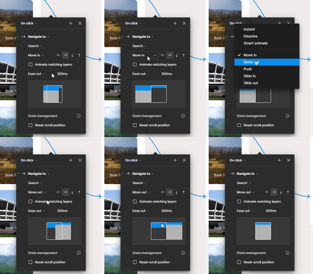
By adjusting these settings, the animation will create an effect of smoothly shifting the search screen towards the right side as it transitions into the landing screen.
To achieve a leftward transition effect for our search results in the Animation section, do the following:
With these settings, the search screen will smoothly give way to the city details screen as it transitions into view from the left direction, creating an animated effect. Now your design should have this current set of interactions:
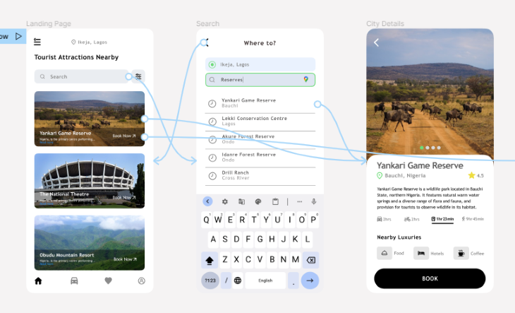
The interactions on the city details screen will include the following:
In our current design, there are two ways to access the city details screen: by clicking the display image on the landing screen or by selecting a search result on the search screen. However, drawing a noodle from the Back button on the city details screen to a specific page would not accurately represent the prototype, since there are two entry points for the city details screen. To address this issue, we can utilize Figma sections as a technique.
Sections are containers that help you organize and manage different parts of your design that can improve efficiency and consistency. They can also be used to create more advanced interactions during prototyping. You can select the Section tool from the toolbar or use the keyboard shortcut Shift + S.

In our current prototype design, we can use the section tool to group the landing and search screens. Then, link the Back button on the city details screen to this section we’ve just created. This way, Figma will remember the entry point that led to the city details screen and return to it to the correct screen when the Back button is interacted with.
Follow this procedure to create this effect:
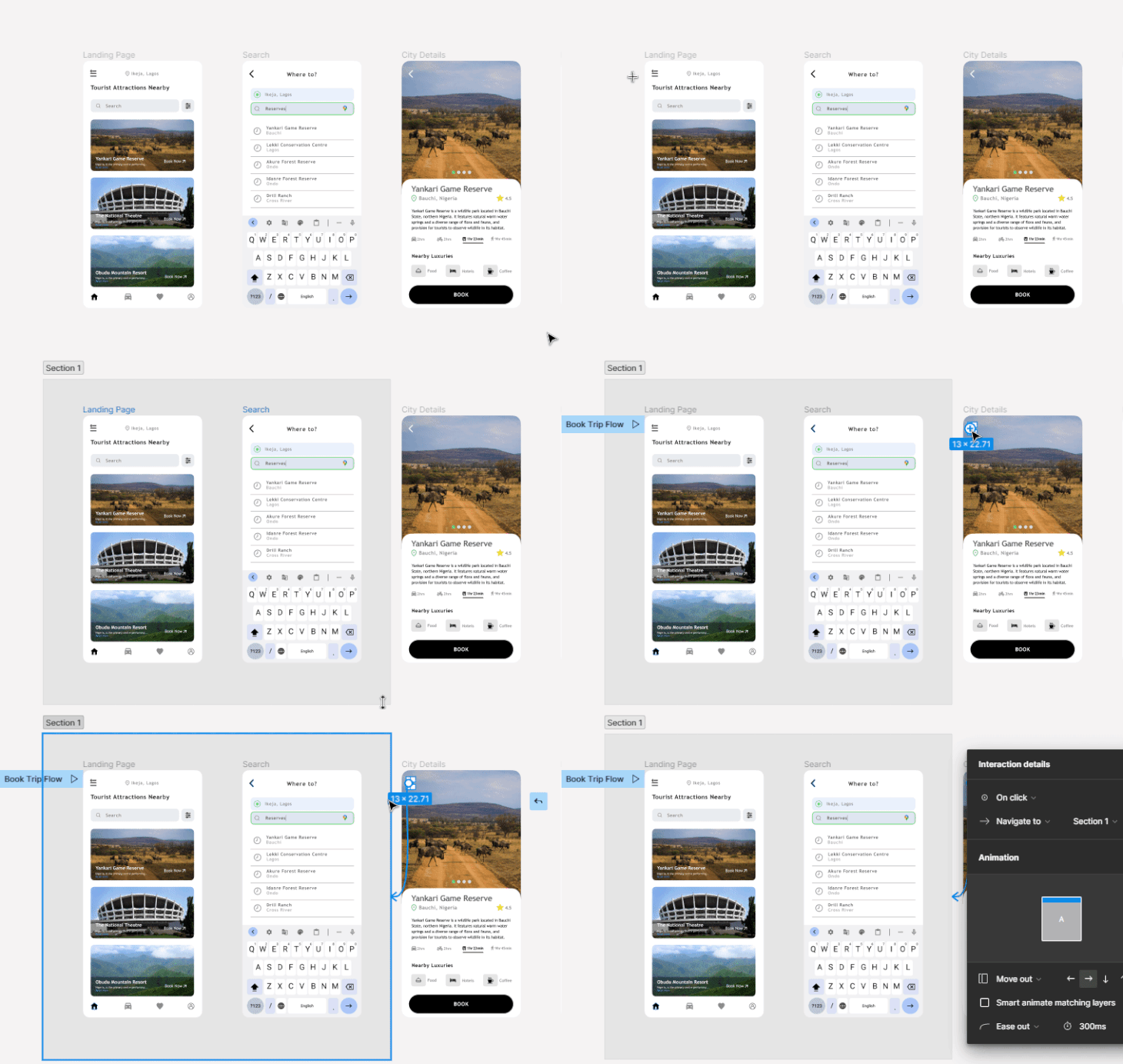
Apply the same animation settings as the back button on the search screen, but set the direction to Right. Now, you can view the prototype in presentation mode and see the magic Figma sections allow us to perform. Your prototype will now become intuitive and can detect which entry point led to the City Details page.
Also, don’t forget to draw another noodle from the Book button to the booking screen. Now, let’s shift our focus toward the interactions on the booking screen.
The interactions on the booking screen will include the following:
Similar to the city details screen, the booking page has multiple entry points, making it difficult to map the Back button to a specific screen. To address this, we can create an intuitive prototype by grouping the previous three screens into a new section and linking the Back button to it like so:
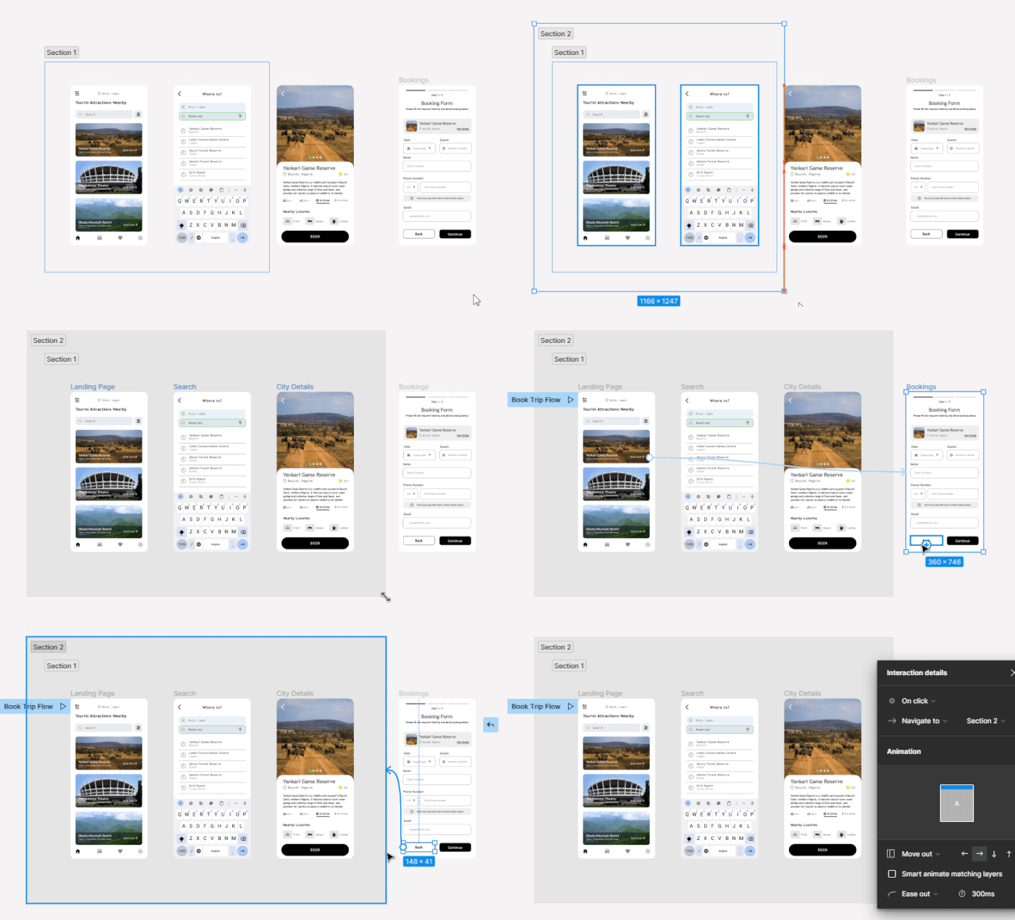
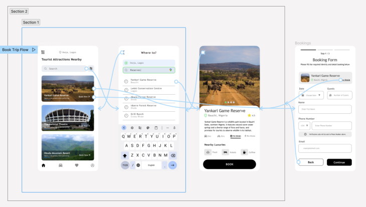
Next, you can draw a noodle from the View Details button to the city details screen. Here is a diagram of the full Book Trip user flow:
So far, we’ve mastered the major details of prototyping in Figma. However, there are several tricks you can use to enhance your prototypes further. These include leveraging components to create reusable prototyped elements, using overlays for popovers, modals, or hover states, and incorporating scrolling effects to create more advanced and visually appealing designs.
Components in Figma enable you to create reusable design elements for consistent designs across projects. They act as master elements that can be copied and placed on different screens, with any changes made to the master component automatically updating all its instances. This saves time and ensures consistency in your designs.
Picture a scenario where you have a menu icon present on multiple screens in your design. If you manually drew interactions for each instance of the icon, it would be time-consuming.
However, by transforming the menu icon into a component (Ctrl + Alt + K) and adding the interaction to the master component, all instances of the icon will open the same overlay. This eliminates the need for manual repetition and streamlines your design process. See reusable Figma components in action in this video.
Prototyping in Figma can be more than just linking screens together. Overlays can be used to create pop-ups, modals, tooltips or any element that sits on top of the base screen. By incorporating overlays into your prototypes, you can simulate realistic user interactions and demonstrate how different elements of the interface interact with each other. Note that you will have to set the Trigger property to Open Overlay when using overlays in your prototypes. See this in action with this tutorial on Figma overlays.
Learn more ways to improve your prototyping workflow.
Sharing a prototype in Figma encourages collaboration with other designers, end-user testing, and stakeholder communication. It helps to gather feedback, validate design decisions, and improve the user experience by involving stakeholders and users in the design process.
To share a prototype with stakeholders and end users in Figma, you have two options: sharing a link or sending an email invitation. Here’s a step-by-step guide:
By following these steps, you’ll be able to efficiently share your Figma prototype with stakeholders and end users and control their access level.
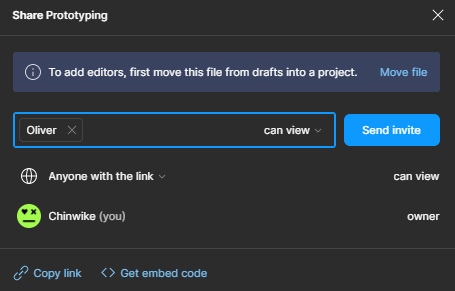
Once you’ve shared your prototype with stakeholders, designers, developers, or end users, the next step is to collect feedback from them, analyze it and make relative improvements. The goal of feedback in the design process is to prioritize the implementation of stakeholders’ needs and desires, observe how they engage with your product, and develop innovative strategies and tactics based on the resulting analysis.
Feedback should focus on aspects such as visibility, visual design, functionality, and interactivity.
In Figma, you can conduct a usability test or utilize the commenting feature to facilitate this feedback process. Here’s how you can leave a comment; Click on the comment icon located on the left side of the toolbar, or use the keyboard shortcut key C. Your mouse cursor will change to a comment icon that can be placed directly on specific elements within the prototype.
Remember to actively review and respond to comments, engaging in a collaborative dialogue with the reviewers. This iterative feedback loop helps refine the design and ensures it aligns with the stakeholders’ expectations and goals.
To analyze feedback and make improvements in design, designers should identify recurring patterns, and prioritize improvements based on their frequency and impact. They should assess the feedback’s relevance, feasibility, and alignment with project goals to determine valuable suggestions. Figma’s design tools can be used to implement these changes while maintaining design coherence and consistency. Following these steps enables designers to analyze feedback, make informed improvements, and iterate effectively in Figma.
In conclusion, prototyping is a crucial step in the product development process that allows designers to visualize and evaluate user interactions within a design. Creating prototypes in Figma involves defining a flow, creating interactions, and adding animations for better user experiences. Figma’s prototyping feature provides a range of tools and functionalities to create simple and complex prototypes.
To further explore Figma prototyping and enhance your skills, you could reference Figma’s guide to prototyping or explore the Figma Community where you are likely to see interesting ways designers are creating prototypes.
LogRocket's Galileo AI watches sessions and understands user feedback for you, automating the most time-intensive parts of your job and giving you more time to focus on great design.
See how design choices, interactions, and issues affect your users — get a demo of LogRocket today.

We’re told to reduce friction, but sometimes friction builds value. This blog explores how scarcity, when designed well, sharpens focus and strengthens user trust.
Discover how to craft UX-friendly hero sections with examples, design tips, and strategies that drive engagement and conversion.

While Apple’s Liquid Glass can’t yet be perfectly recreated with CSS or Figma, we can still think about how to adopt the effect thoughtfully in our designs.
Figma Make is here to automate your design-to-code workflow. I tested it. Let’s talk about the good, the bad, and the straight-up weird.