Arguably one of the trickiest components in mobile design, the breadcrumb is often overlooked.

A breadcrumb refers to the navigation element that indicates where a user is currently within the information hierarchy of a website. They’re represented by trails of links that usually start with the root of the hierarchy (such as the home page). Each link is separated by a divider, such as “>” or “/”, which represents a level within the website’s hierarchy.

Now, when breadcrumbs are used in mobile navigation, there are a few different challenges that arise. Often due to limited screen space, patterns that work on desktops don’t always translate perfectly to mobile devices.
In this article, we’ll talk about when mobile breadcrumbs are necessary and the best practices to implement them in your designs.
Breadcrumbs have long been used to help users navigate between pages on a website. The name of the component is a metaphor that goes back to the fairytale of Hansel and Gretel, who left a trail of breadcrumbs in the woods to find their way back home. This is the main purpose for breadcrumbs that designers use in web and app design.
In mobile design, it can be easy for users to get lost within a website or app, as mobile gestures can add a layer of complexity to navigation. Mobile breadcrumbs are helpful in orienting users within the app and helping them understand their current location within the app’s hierarchy structure:

With mobile breadcrumbs, users can easily skip back to the home page or another previous page without tapping a back button multiple times. This potentially reduces the number of taps it would take to achieve the same result.
Now that we have a better understanding of the purpose of mobile breadcrumbs, let’s talk about some best practices when using them in our designs.
As a secondary navigation option, breadcrumbs should be relatively easy to locate. They are usually placed near the top of the page, either right below the page banner or main navigation.
Alternatively, it can be placed right above the page heading. This way, the page heading appears as the last crumb in the trail, allowing the user to understand where it sits in the website or app:

When designing a breadcrumb, the label for the current page should be styled a bit differently in order to indicate that it is the page that the user is currently on. This can be done by bolding the text or using a larger font size.
It’s common for the current page heading to be excluded from the breadcrumb, as it usually sits right above the page heading itself. Page headings should be consistently styled across any website or app to be easily identifiable. The text should also be formatted such that screen readers can communicate it as a page heading to users:

Often, the home page is represented by a house icon, which is universally accepted as a “home” icon. This not only saves limited mobile screen space but also helps the user understand how their current location relates to the website or app’s homepage:
![]()
You can use folders and overflow menu icons when the breadcrumb trail is too long and has to be truncated. These icons indicate that there are hidden links within them, and selecting them will reveal a dropdown of those links. We’ll talk more about truncating breadcrumb trails in the next section:

Don’t use icons for every link. This can disrupt the flow of the breadcrumb trail. It also unnecessarily takes up limited screen space. Only use icons to represent the root or an overflow menu:

Breadcrumb trails can get long, especially if the website or application has a particularly deep hierarchy structure. It’s easy to have more than five breadcrumb trails leading you back to the homepage.
In the context of mobile design, it might not even take that many links to fill up the screen. Here are some tips on how to design long breadcrumb trails that won’t ruin the mobile experience.
Mobile breadcrumbs shouldn’t take up more than one line. When they start to take up two or more lines, it loses its structure as a trail.
Viewing multiple lines, some with one link and some with two, can be confusing for your users. Not to mention, it would take up vertical space, which is precious on mobile devices:

Consider placing the title of the current page on a separate line, as this makes the user’s current location stand out. It might not need to be included in the breadcrumb trail, depending on how it is styled. Each website handles this differently, so it’s really up to your discretion.
If your breadcrumb trail starts to wrap onto multiple lines, consider shortening it. A solution to take up less space on smaller device screens is to include only the previous page in the breadcrumb trail:

This can be an effective solution that frees up screen space on mobile but at the cost of allowing users to jump back multiple pages. It acts more as a back button in this case. It also removes the context of how deep the user currently is within the website or app.
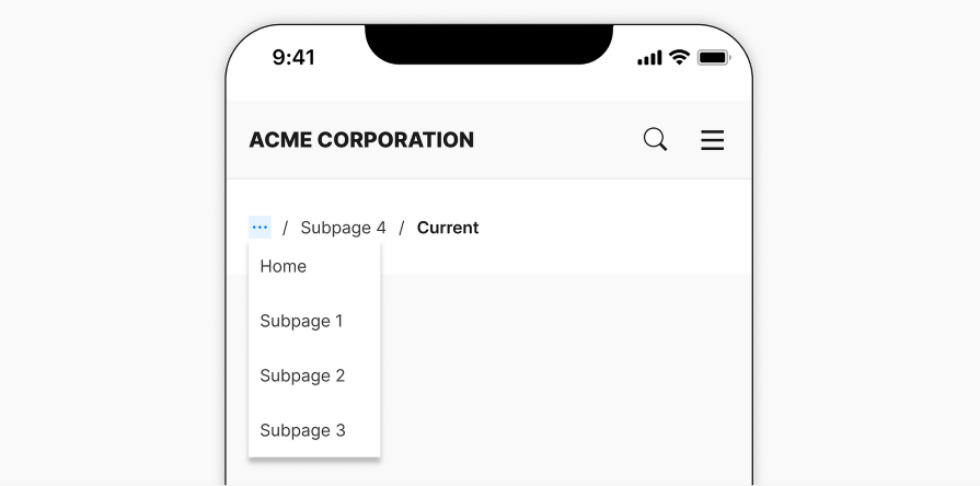
The depth issue can be addressed by adding an overflow menu. It can be used to hide additional links to save screen space, while still giving users access to the entire breadcrumb trail. The overflow menu is typically used at the start of the trail, followed by the next two links or whatever fits on the page:

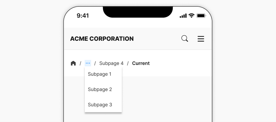
Alternatively, keeping the root link visible allows users to quickly go back to the home page, which could be a helpful way out. Users can reveal the overflow menu to view the other pages in between the homepage and where they currently are:

Even when using an overflow menu, the label of the last link may still be too long for the given horizontal screen space. In this case, you can truncate the label. This might not be a problem on a desktop, but it is a great option on mobile when the label won’t fit in one line:

Most commonly, labels are truncated using an ellipsis at the end. However, if the end of the label is helpful for clarity, then you can truncate the middle of the label instead:

When truncating a label on a desktop, it’s best practice to ensure that a tooltip appears with the full label when hovering over it. However, for mobile design, hovering isn’t possible. Instead, you can implement a long-press gesture to reveal the tooltip as a replacement for hovering:

If you would prefer to avoid using truncation or overflow menus, consider creating a horizontally scrollable breadcrumb trail. This may be better suited for mobile than desktop, as scrolling can be done with a swipe gesture:

However, some users might not have the dexterity to scroll horizontally, which renders this design option inaccessible to all users.
Additionally, there should be an affordance included in the design to indicate that the breadcrumb trail is scrollable, perhaps with arrows on each end of the screen. Otherwise, users might not notice that it is scrollable, which can cause confusion.
Breadcrumbs still have their purpose in mobile design. Websites and applications that have deep, complex hierarchy structures, such as ecommerce or banking, can benefit from having breadcrumbs at the top of the page.
But remember that breadcrumbs are only one type of navigation pattern. It can be used in combination with other navigation patterns, such as tab bars.
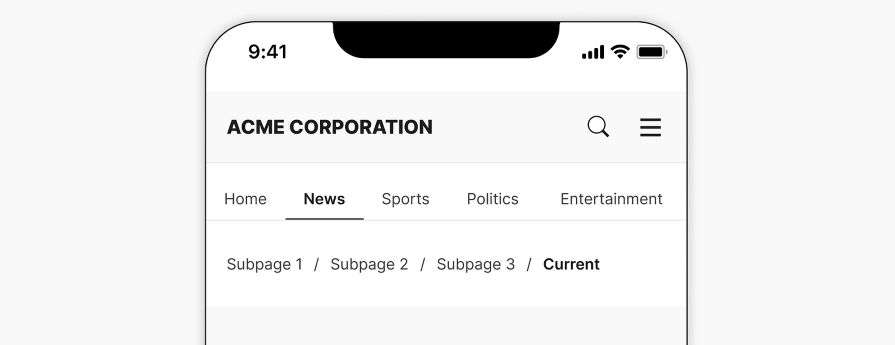
If your website or app is separated by main sections, a tab bar can be used for the primary navigation and breadcrumbs for the secondary navigation.
This removes the need to include the high-level sections in the breadcrumb, which will free up space. It also allows users to maintain context on where they are located and quickly jump across sections without having to use secondary navigation:

The key is to understand your users’ specific navigation needs for the context of your website or application. Then, decide on an appropriate and effective navigation system, whether it involves using breadcrumbs or not. The breadcrumb trail is just a tool to help users get from point A to point B.
Breadcrumbs are a common and effective design component used for secondary navigation in websites and apps. They help users understand where they are currently located within the hierarchy structure of the website or app, and navigate back to previous pages. The benefit of a breadcrumb trail is that it allows users to jump back multiple pages instead of clicking a back button multiple times.
In mobile design, breadcrumbs can still be effective if designed properly. By following best practices such as maintaining visibility, clarity, and thoughtful icon usage, as well as different techniques to handle long breadcrumbs, designers can implement breadcrumbs in their mobile designs while maintaining a smooth user experience.
Header image source: IconScout
LogRocket's Galileo AI watches sessions and understands user feedback for you, automating the most time-intensive parts of your job and giving you more time to focus on great design.
See how design choices, interactions, and issues affect your users — get a demo of LogRocket today.

Optimization fatigue is real. Here’s why designing only for metrics drains creativity, and how to bring the human back into UX.

Let’s explore why and when to use drag and drop, discussing real-world examples, platform-specific considerations, and accessibility tips.

We’re told to reduce friction, but sometimes friction builds value. This blog explores how scarcity, when designed well, sharpens focus and strengthens user trust.

Discover how to craft UX-friendly hero sections with examples, design tips, and strategies that drive engagement and conversion.