Creating design documentation is an important part of every design team’s in-house process. It provides an ongoing point of reference, a record of the project for future team members, important details of the problem being solved, and justification for design decisions.
If you’re wondering the best way to go about creating your own design documentation, then you’re in the right place. Let’s dive into how to build design documentation that will tell the story of your design to all your stakeholders.
Design documentation is a compilation of documents that describe the design of a product, service, or digital interface as well as how the team should execute the design. These records include documentation, screenshots, diagrams, and all other types of visual references.
Design docs serve as a complete guide to the design elements and details of a project. Teams use these docs as a reference point both during the design process and after its completion.
These files might include:
As you can see, that’s quite a lot. That’s why it’s important to lock down your documentation before undergoing a significant design project.
While most teams create design documentation during the beginning phases of a design project, you can also add to it as the process gets underway. The project’s direction might change while you do your research, or company pivots might influence the project’s priorities or scope.
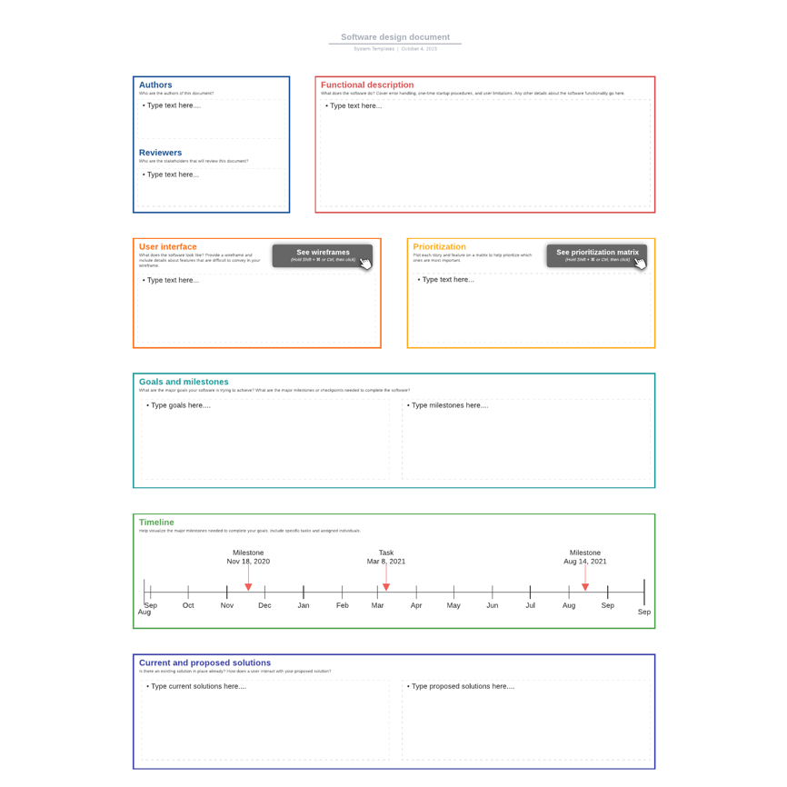
Design documentation and style guides serve distinct (and different) purposes within the design process. However, teams sometimes use the two terms interchangeably due to their interlinking purposes.
While it’s true that both concern the creation and maintenance of a design project, the purpose of design documentation is to provide a comprehensive record of the technical design details of the project, such as the system architecture or API documentation.
Meanwhile, a style guide provides guidelines, best practices, and standards for the visual elements of the design. These might include how labels and icons should look in order to stay consistent with established branding, for example.
Another key difference between the two is their intended audiences. Design documentation is usually intended for developers, website architects, and project stakeholders seeking a complete and in-depth understanding of the project. It’s to give a holistic approach to handling design.
A style guide, on the other hand, is typically for UX designers, UI designers, marketing teams, and content creators who need to ensure that the visuals of a project remain consistent with the company’s current branding, tone, and style.
Although these two sets of design records have distinct purposes, some overlap can occur. Some teams might include a style guide as a subset of the design documentation, or they may refer to it within the design documentation when referring to design conventions and best practices.
Design documentation holds significant value for a number of reasons, the main one being that it serves as an important record of why a team launched a project.
Although this may seem obvious, you can easily lose this kind of information once a project is underway. Having a catalog of design information allows stakeholders to refer back to a project’s origins and ensure that it still serves the purpose it was designed for.
Having a record of how a project comes together is also extremely valuable for the continuous learning and development of the team. Looking back on the early phases of a project at a later date can be a good exercise because it helps the team to see what they could have done better, where they made mistakes, and how they might do things differently next time.
Detailed design documentation also makes it easier for a team to fix or update errors that might occur further down the line. When a project has gone particularly well, the design documentation serves as a helpful blueprint for future projects.
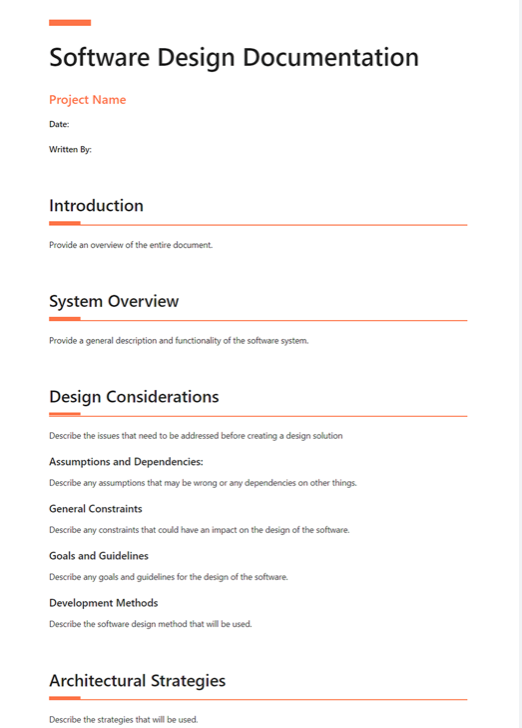
Your design docs will usually incorporate a wide range of details that succinctly describe the product specifications you and your team are working on.
A standard part of any design documentation is an overview of the system and its architecture. This involves:
The visual side of the docs often include diagrams, illustrations, images, and flowcharts. The goal of this content is to accurately represent how information flows through the system and give a clear picture of how the system processes work.
Alongside user experience best practices and guidelines, this documentation should include details of the interface layout itself and the design elements that populate it. Here, you might want to include the user research that supports the design; this will justify your decisions to future teams.
Because the design documentation is intended to be a catalog of the technical design details of a project, comprehensive API documentation is an important component of these records. We often accompany this with details on testing, QA plans, and processes to ensure the product or service being designed meets designated industry standards and fulfills user and company requirements.
Of course, the level of detail within your design documentation will depend on the size and expertise of the team, the availability of resources, the scope and timeline of the project, and the complexity of the design you are implementing.
For larger projects, additional documents you may wish to include are version control and change logs, maintenance guidelines, compliance and regulatory information, and performance metrics and scalability specifications.
However, irrespective of the size of your project, the overarching goal of your design documentation should be to provide stakeholders with a clear and complete understanding of the design of the project through the package of reference material you have provided.
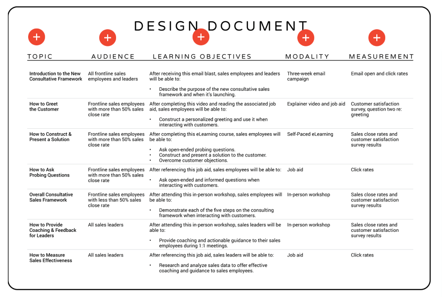
With many different stakeholders involved in a design project, your design documentation should be as accessible, readable, and navigable as possible. Within the documentation, you’ll be communicating technical information to those who may not have a technical background, which means that both the language you use and the layout of the content need to be clear to those of all knowledge levels.
Here’s how to make this possible.
The formatting of your design documentation will need to be clear to ensure it’s easy to refer back to and legible to all readers. Just like the design of a platform or interface, you’ll want to consider the information architecture of each page and use headers and subheaders in a way that indicates the importance of the information you’re communicating.
In terms of font sizes and typography, be sure to stick to the same conventions throughout the documentation, and keep the variety of size and style to a minimum. This will keep the layout streamlined, preventing readers from getting distracted.
The use of diagrams, illustrations, screenshots, tables, and charts can really support the reader as they learn about the project. Not only do these visual aids break up the text, but these illustrations can also be considerably more effective than text at conveying complex concepts quickly and clearly. This is all the more true for visual learners.
Implementing version control to track changes and updates to your documentation helps the team learn what you’ve already adjusted. This can prevent repeated mistakes as well as offer a learning opportunity.
Be sure to clearly highlight different versions and updates to the documentation (including author information) as this maintains accuracy and makes it easier for those jumping into a project at a later date to see the reasons behind your decisions.
When trying to convey a complex message, you should aim for clarity while avoiding repetition. In a similar vein, you should avoid using jargon at all costs, adopting simple language that ensures all stakeholders, irrespective of their technical know-how, can understand the main points.
When creating your design documentation, the labels you use to organize and categorize each section should have clear yet descriptive headers that enable readers to quickly find what they’re looking for.
It is unlikely that a stakeholder will want to read the entire catalog of information every time they visit the documents. They need to jump to the part they want to read easily. An index and clear labeling on each page will make navigating the documentation considerably easier for all those who read it.
Finally, providing additional context to your design decisions can help others understand why a project has evolved in a certain way. While it’s unwise to overload your design documentation with extra details, you can provide links to external resources that support the process you’ve chosen. You’ll also want to clearly reference any work done by others that you have used in order to have their contribution acknowledged.
It’s important to begin with a clear plan, and that’s why design documentation is essential. Furthermore, it’s important that your stakeholders have a clear grasp on your project, which is a key reason why your docs exist.
Be sure to design your documentation with intention, like you would any other project.
Header image source: IconScout
LogRocket's Galileo AI watches sessions and understands user feedback for you, automating the most time-intensive parts of your job and giving you more time to focus on great design.
See how design choices, interactions, and issues affect your users — get a demo of LogRocket today.
Discover how to craft UX-friendly hero sections with examples, design tips, and strategies that drive engagement and conversion.

Figma Make is here to automate your design-to-code workflow. I tested it. Let’s talk about the good, the bad, and the straight-up weird.

After designing AI search systems, I’ve seen what builds trust — and what kills it. Here’s my take on what really works.

I used to think ‘clean’ design meant hiding things. Turns out, less isn’t always better. This blog walks through lessons from my own overdesign moments.