Ever wondered how the words in an app or website influence your thoughts and actions as a user? During the content drafting phase, us designers engage in rigorous research to understand user needs and how content can help satisfy those needs.

In this article, we’ll showcase a library of effective UX writing examples and analyze their impact. We’ll also emphasize how well-crafted writing contributes to an intriguing and user friendly interface.
After all, when you do UX writing properly, you bridge the gap between users and the digital product they interact with. For UX writing to be effective, it has to be concise, clear, consistent, relevant, and tailored to the audience. In the end, the goal of UX writing is to enhance the customer experience through content.
Effective UX copy has an impact on how users view your product. There are key principles to follow as designers or writers to create effective copy:
Apps are becoming more and more difficult for some users to navigate. Having clear content on your website can make it easy for users to interact and have good experiences.
UX writing requires the ability to write in the simplest form. For your writing to be clear, you need to understand what you want to communicate and how to best communicate it.
Most users scan website content, so your website content should be bold, organized, and easy to scan. If you have a lot of information, break it down into a list or bullet points.
Let’s assume you’re conversing with a friend who changes tones and personalities every few minutes. You’d tire of that conversation quickly — how could you keep up? This is how inconsistency feels; the experience is unsettling, and users may leave your product because they can’t follow your directions.
Inconsistent writing can be visible in tone, color, size of text, etc. To achieve consistency, ask yourself the following questions:
As UX writers, we should have empathy to craft useful designs and content that are relevant to users. UX writers can tap into the research their companies have conducted and find valuable data that can influence their writing. Empathy is a core element of UX. Empathetic content answers these questions:
If your user doesn’t feel understood, your user will assume your product is not for them.
As a UX writer, you become very deliberate about the content you include in your product. Every piece of content drafted has to be well-researched and screened before getting on the website. Each piece of content needs to have a function and serve user needs.
Now that we know the essentials of UX writing, let’s see these at work.
These examples will bring our principles to life. They’re clear, consistent, empathetic, and functional.
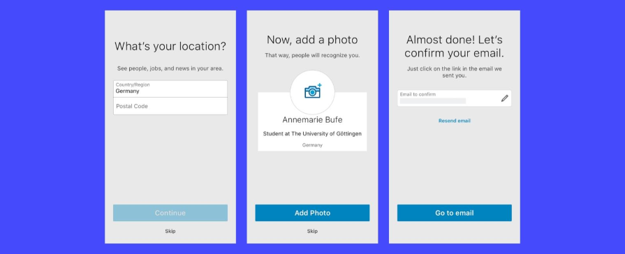
LinkedIn is a professional social network with over 740 million users, and regardless of how you sign up, LinkedIn delivers smooth onboarding.
LinkedIn’s mobile onboarding flow uses progressive disclosure to avoid overwhelming the user with too much information; instead, users sign up one step at a time. Notice that the instructions for each step are the largest text on each screen, and below these prompts are spaces for the user to answer.
LinkedIn exemplifies great UX copy for any new user making sense of onboarding.
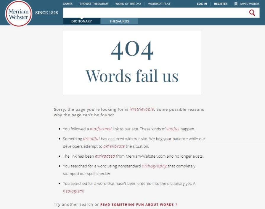
Merriam-Webster’s dictionary is a good example of an error message. Regardless of experience how watertight your user experience may be, some errors will slip through the cracks. Sometimes, these are out of a designer’s control. We can always be prepared by informing users about the error they are experiencing.
Merriam-Webster’s dictionary error message not only tells you the error but also what to do and why the error occurred. This gives the user an idea of what to do next. The tone is playful yet informative.

Duolingo sends a couple of reminders to learners, but let’s look at the call to action in the image above. A call to action is an organized way to tell users what to do. This can range from accepting an action to rejecting it.
Also, when creating a call to action, the designer and UX writer can work together to create a button. Like in the image, the designer took note of the size of the text, text on buttons, colors of buttons, etc. The UX writer wrote compelling texts that are playful and colorful to drive actions, and the buttons show active and inactive buttons.
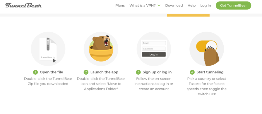
TunnelBear is an easy-to-use VPN service that allows users to change their online location to anywhere in the world.
An amazing part of this platform is the copy. On the screen above, you can see the steps for setting up your VPN location. It’s short and straightforward, and they also make use of branded images that show users (or bears) performing the task, from opening a file to using the VPN services. Users can scan through and see the steps quickly.
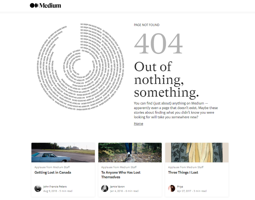
Oftentimes, designers neglect error pages or have a one liner that says, “Page not found.” Although this isn’t bad in itself, we can design better.
A good example of an error page that focuses on UX is Medium’s 404. The tone is friendly and encourages users. If users can’t find what they are looking for, there are other related articles they can explore in the meantime. It keeps the user engaged and persuades them to keep reading.
![]()
Airbnb’s writing is intended to make the booking process as simple as possible. Users scan rather than read, so it is important to make your copy compelling at first glance.
Another example of Airbnb’s excellent UX is its use of images, icons, and content in its listings. Hosts provide short, detailed descriptions of their accommodations as well as clear images because users’ attention will be drawn directly to the images; they use the images to direct users’ eyes to the content. Proper use of images and icons is also a principle of UX writing.
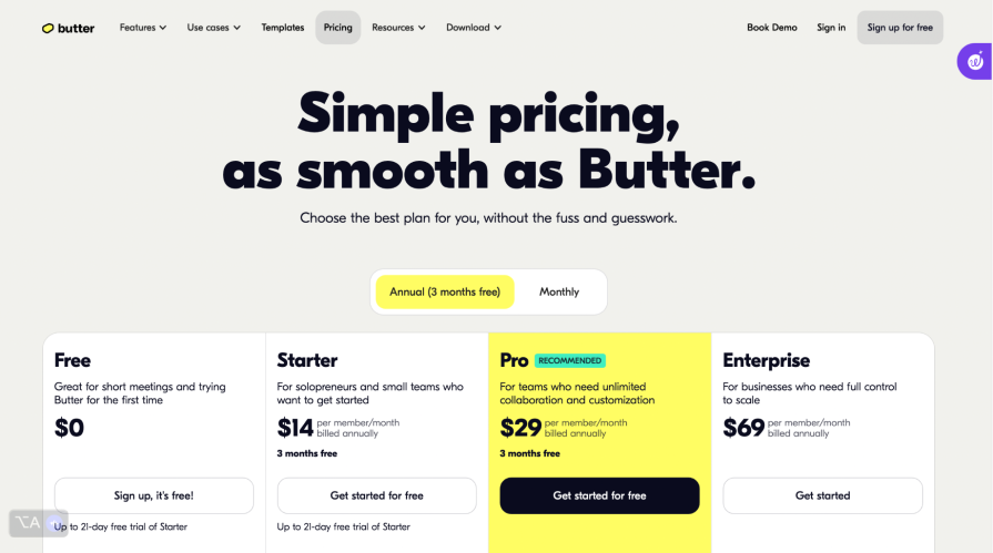
Butter is a virtual conferencing tool that enables team members to collaborate on a whiteboard remotely, attend webinars or training, and perform other team collaborative tasks.
Butter communicates playfully. The image above is of their subscription page, which, aside from its aesthetics, is also casual with customers and uses a fun way to encourage them to subscribe.
It says “pricing” instead of “subscription,” like other platforms. There’s wordplay comparing pricing decisions to butter, which explains to users that this is a smooth and seamless decision process.

Remote.co is an online resource for businesses to consider remote work as an opportunity. They also connect remote job seekers with companies that hire remotely. As a result, the platform can assist both employees and HRs in tracking a variety of tasks, which they can view on their dashboard.
As you can see, the tone is no-nonsense, indicating that the user is caught up on tasks and has no pending ones. It employs both a head copy that grabs the reader’s attention and a subcopy that goes into greater detail. This hierarchy is typical in good UX writing.

On Pinterest’s homepage, just before login, their interface gives you a little preview of the platform. Over this, Pinterest uses clear copy to inform users of the contents of the site. The login screen is simple and provides clear guidance on how users can input their details.

Wakanow is a travel booking website that enables users to find and book flights and hotels for trips easily. It has an exciting layout design that allows users to find whatever they are looking for.
Unlike many other travel websites, the search bar is very intuitive and allows you to enter the location for departures and arrivals as well as the date on one interface. Users of the Wakanow interface find it very simple to obtain information ranging from visas to city rides. Wakanow makes it simple to find things; it uses clear and simple text to describe actions.
Now that you’ve seen a handful of good examples, let’s go over why these examples are critical touchpoints for users.
One of the primary purposes of UX writing is to make user engagement seamless. UX writing helps to create frictionless navigation across your product, making it easy for users to get what they want.
The more positive interactions users have with your product, the more likely they will be to refer that product to others, thereby increasing the user pool.
Compelling UX content can bridge the gap between humans and technology. This is because research and empathy were put into drafting this content, and in turn, this can make users feel more at ease when interacting with the interfaces you’ve created and more invested in using them.
Removing ambiguous words reduces confusion in your copy. Through empathy, UX writers craft content that reduces the mental overload on users. As a result, we reduce the likelihood of users making mistakes and causing confusion.
UX writing is a vital component in enhancing user experiences. It directs users, reduces confusion, and ultimately leads to improved user satisfaction. The best way to improve your writing is by doing, but the second best way is by learning from great examples like these.
Header image source: IconScout
LogRocket's Galileo AI watches sessions and understands user feedback for you, automating the most time-intensive parts of your job and giving you more time to focus on great design.
See how design choices, interactions, and issues affect your users — get a demo of LogRocket today.

Discover how to craft UX-friendly hero sections with examples, design tips, and strategies that drive engagement and conversion.

Figma Make is here to automate your design-to-code workflow. I tested it. Let’s talk about the good, the bad, and the straight-up weird.

After designing AI search systems, I’ve seen what builds trust — and what kills it. Here’s my take on what really works.

I used to think ‘clean’ design meant hiding things. Turns out, less isn’t always better. This blog walks through lessons from my own overdesign moments.