Editor’s note: This post was last updated on 21 November 2023 to include visual examples and a more extensive tutorial for various Figma styles.

Styles in Figma are custom properties for objects that can be saved and reused from a dropdown on the object properties panel on the right-hand side. Styles can be defined for fonts, colors, and effects like shadows, blurs, and even grids.
Let’s optimize how you manage and create your styles so you can free up more of your time and do your job effectively.
There are several advantages to defining styles in Figma, which include:
The four main types of styles in Figma are text styles, color styles, grid styles, and effect styles.
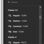
Text styles define attributes such as font family, size, color, and line spacing. Establishing a font hierarchy for different use cases, like body, small body, heading, subheading, and others, ensures that these styles are utilized in developer files, such as CSS. Line spacing for font sizes can vary, but it generally involves multiplying the font size by the golden ratio of 1.6 to create an aesthetic line height with pleasant white space.
Color styles help maintain a consistent palette that is suitable for the brand and product. Consistency in colors establishes familiarity, builds trust and credibility, and tangibly improves the user experience by making the UI more organized.
Users can distinguish between different elements and their functions using colors—for example, always using the color red for critical actions like deleting. Colors also aid with accessibility by designing color palettes with ample contrast ratios to accommodate colorblind users.
Grid styles are another crucial aspect of UI design, and they can vary for different device sizes like desktop, mobile, and tablet. Grid styles define attributes like the number of columns, gutter size, and alignment. Maintaining a responsive system that adapts to varying screen sizes is essential, as is designing the UI in a way that is ready for implementation from a frontend developer’s perspective.
Effect styles are just that: special effects. These can include drop shadows, layer blurs, background blurs, and so on. Effects are the finishing touches on your design.
The component library in Figma allows for the creation of components with varying styles that can be easily toggled on a need basis. A more mature and sophisticated version is called a design system, which usually requires greater effort and ongoing development.
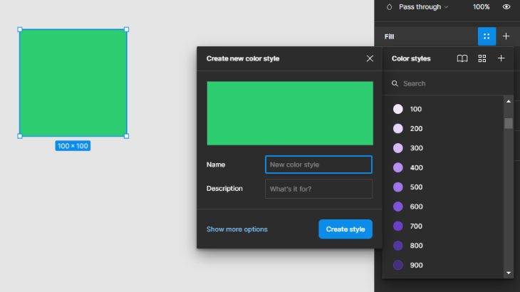
The style creation process in Figma is intuitive. First, select an object that has the property you want to create a style for — it could be a font or color. Then, click on the four-dot icon in the right-hand sidebar with the property defined. Let’s say I want to introduce a blue gradient as a style. Here’s a step-by-step of how to do that.
First, I create a rectangle with a blue gradient:
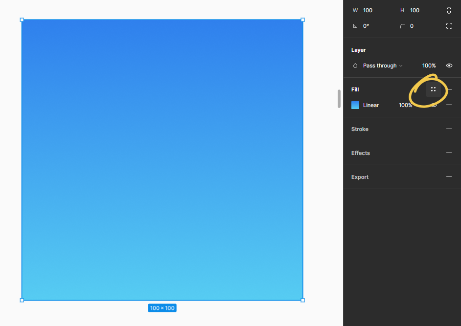
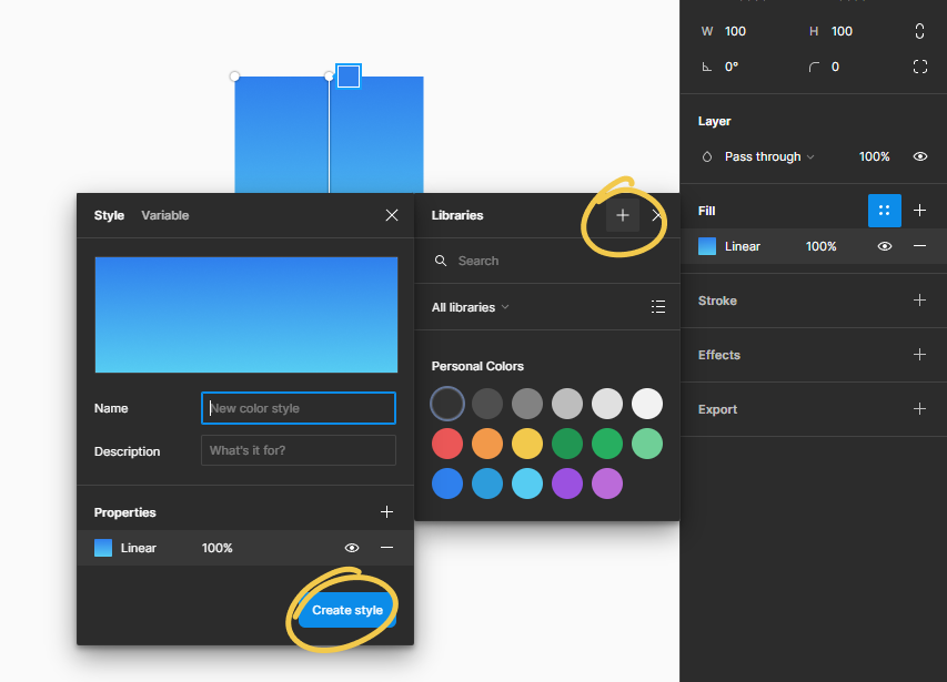
Having the rectangle selected, I click on the four dots style icon > click on the + icon in libraries > give my style a name > and click the Create style button:
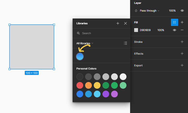
Now when select any object and click the four dots icon again in the fill or stroke properties, you will be able to see our blue gradient as an option. Selecting the blue gradient will apply that gradient to our color property for that object:
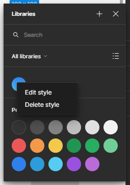
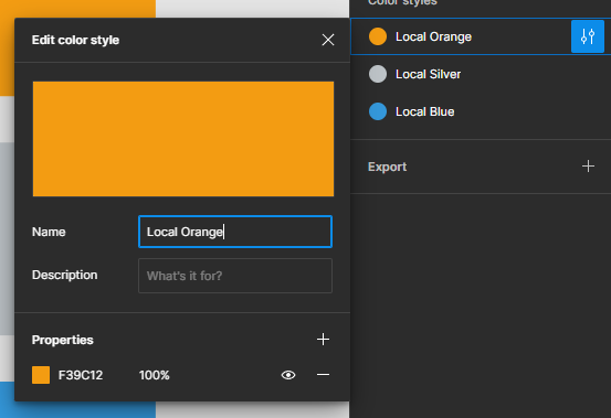
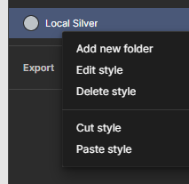
In case you want to edit or delete the style, you can right-click on the color property, which will display the edit and delete options:
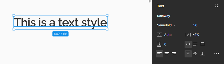
Similar to the color style creation process, we must first create the text layer with the properties of our desired style.
We create a text layer with the following properties:
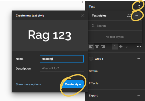
Next, we click the four-dot icon in the text panel > click the + icon > give our text style a name of “Heading” > click the button Create style:
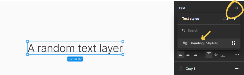
Next, we can select any text layer, click the four-dot icon again, and find our created “Heading” style already present. Clicking the style will apply the style’s properties to our selected text layer:
The most common grid styles are twelve columns or eight columns for desktop and tablet interfaces, and four columns or six columns for mobile interfaces. More columns in a grid typically helps in building interfaces that have a lot of intricate details.
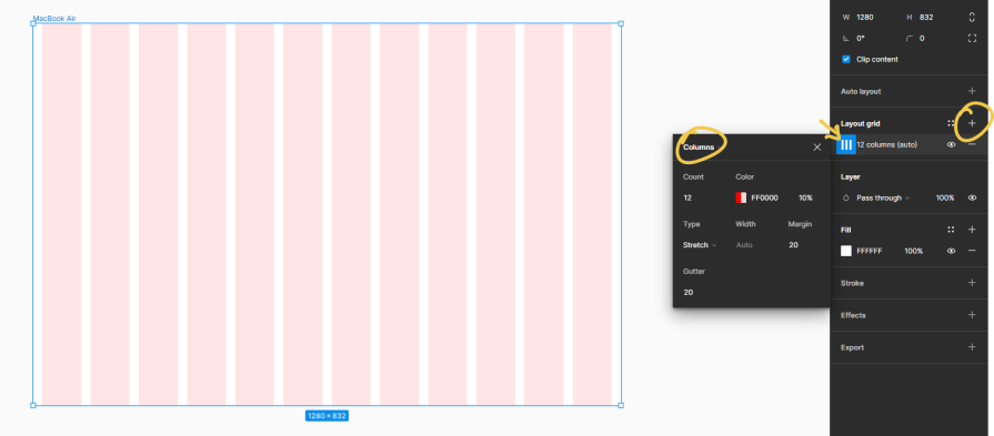
However, more columns don’t necessarily mean better design, since it’s not always possible to strictly keep the design set against the grid. To demonstrate the creation of grid styles, we will create a twelve-column grid in this example.
First, we select an empty frame > click the + icon under layout grids. Click the grid icon right beneath the layout grid title to open up grid properties. Then we set our grid type to columns and give it the following properties:
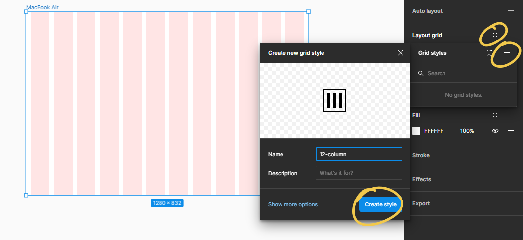
Next, with the frame selected, we click the four-dot icon in the layout grid panel > click the + icon > give our grid style the name “12-column” > Create style:
The most common effect styles used in interface design are shadows and background blur. Shadows convey depth and sticking to set properties ensures uniformity in our design. We use background and layer blur styles to overlay one object on top of another and achieve a frosted glass effect to blur the object behind.
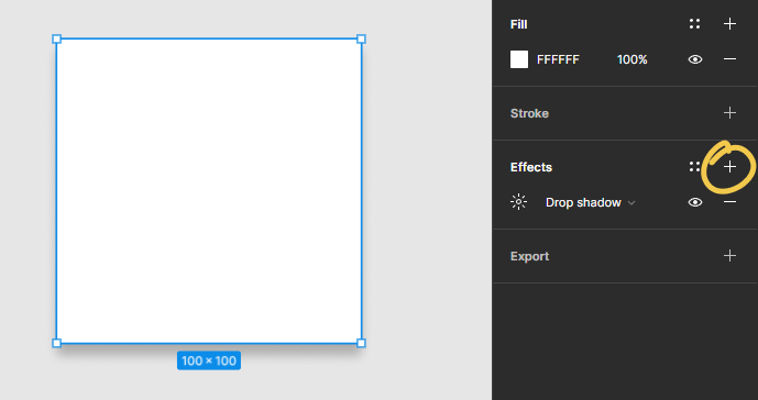
To demonstrate how to create effect styles, we will only work with shadows in the example below.
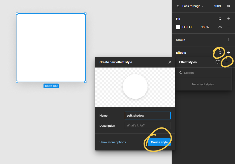
First, we create a rectangle, and with the rectangle selected, we click the + icon in the effects panel. This creates a default shadow effect.
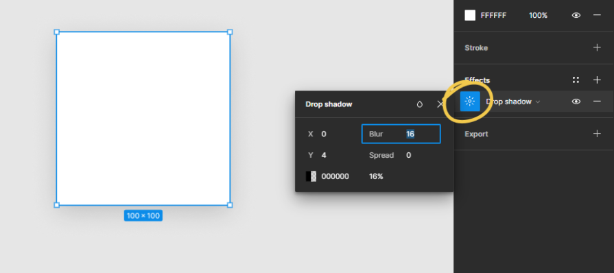
Next, we click the sun icon to alter the properties of the shadow effect, give it a Blur of 16, and lower the opacity of the blur to 16 percent to achieve a softer shadow:
Next, we click the four-dot icon to open the effects library > click the + icon underneath to give our effect style a name > click the Create style button to create our shadow style:
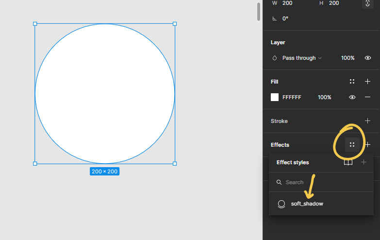
Next, when we select a new object and open the effects library again, we will find the created shadow style available for us to apply:
Instead of giving your styles a plain name, you can use a “/” to group your style under a certain folder. For example, first type the group name, followed by a “/”, and then the style name.
For instance, a shade of green could be named “Green/Light,” and another could be named “Green/Dark.” They would then appear under the Green group as two separate styles.
Examples of styles grouped together include:
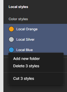
Instead of naming styles with a “/”, Figma also has the option of selecting local styles, right-clicking on them to either put them inside a folder or delete as needed for cleaning and organizing.
Updating styles is easy: clicking on the adjust icon opens up the style properties. Anywhere the style exists, hover over it to reveal the adjust icon, which then opens up the properties box to update the style. Reordering these styles can be accomplished with the drag-and-drop interaction.
On certain occasions, you might need to move styles between files. To do this in Figma, right-click on the style and click Cut style. You can then paste the style into the destination folder by right-clicking again on the local styles panel on the right sidebar.
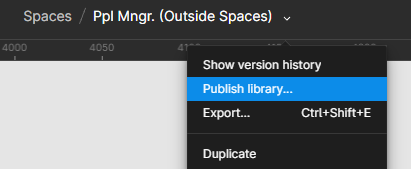
The true magic of defining styles comes alive when we publish them as a library. Next to the filename that has our file, there’s an arrow icon that opens a menu with the Publish library option. Clicking on Publish library makes the styles in our file available to all other files in our Figma team plan.
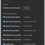
When creating a new file, open the Figma menu and select Libraries. In the libraries list, toggle on the file you just published. Doing so makes all the styles in that file available to you in your new file. Using this system of libraries helps organize styles in a global file and easily reuse them for different projects. For large projects, this feature is essential.
Thomas Lowry (Designer Advocate at Figma) recommends using several small libraries for organizing libraries for medium to large operations. However, small teams often start with one large library with all the styles and components. A single library becomes unsustainable in the long term because it ends up exceeding the working memory available to use the file reliably without Figma crashing.
Lowry also suggests using pages and frames to organize components.
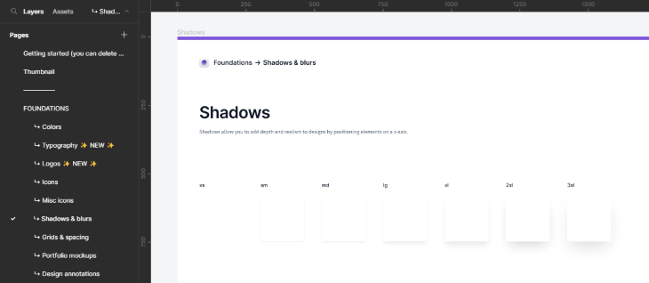
Following is an example of how to structure a style guide in Figma. The page Shadows and blurs contains all the shadow and blur effect styles. The styles are then demonstrated inside a frame in a neat chronological manner with supporting documentation, such that any consumer of the style guide can understand the utility of the different styles with ease.
Creating a style guide can be intimidating for beginners. The best approach is to take inspiration from existing style guides and design systems created by reputed institutions — examples include Microsoft Fluent, Shopify Polaris, and the Atlassian Design System.
Compare the typography style guides for the mentioned systems:
The style guides vary quite a bit because they’re custom tailored for their unique use cases, but the basics are the same. All of them define a font stack and different sizes, weights, character spacing, line heights, and other relevant properties. In addition, they document when to use ech style with illustrated examples.
There are numerous plugins to help with complex tasks, and each new article or tutorial will introduce a new one. By going to the Figma community, using keywords such as “style,” and sorting by trending, you can identify the best plugins for your needs.
The most relevant and useful plugins will vary based on the designer. For instance, a batch styler can be quite handy for use cases where we are updating an entire project with new aesthetics. However, this might not be something that happens frequently and may be more of a one-off need.
Based on personal experience, a helpful plugin for starting a new project is Automatic Style Guides – Figma. This plugin automatically generates a style guide based on the styles defined in the local file. Designers can focus on exploring different styles without worrying about defining style guides.
Once satisfied with the outcome, you can use the Automatic Style Guides plugin to generate a guide. The initial basic style guide can then be refined and iterated over time as the project scope allows.
An alternate, less popular plugin is Auto Documentation – Figma, which serves the same purpose as the aforementioned plugin. Another alternative is Color Style Guide – Figma.
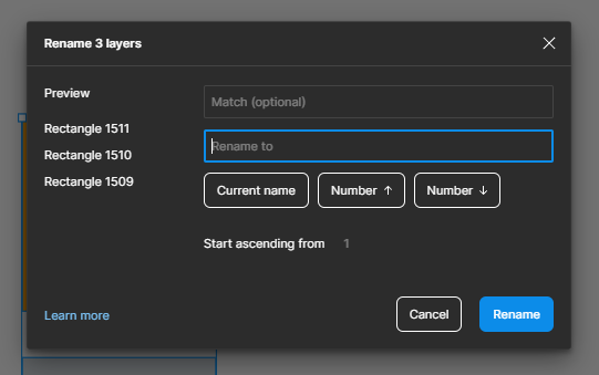
The bulk renaming option in Figma is often underutilized by beginners. Renaming layers as a key part of creating organized style guides and components can simplify the creation process.
To create style guides quickly, create a group of objects with the desired styling. Select them in bulk and press Control + R on Windows or Command + R on Mac to open the bulk renaming option. Rename the objects to something appropriate, such as “Success/$N00” — which renames the rectangles to “Success/100,” “Success/200,” and “Success/300.”
Then, select these rectangles and run the Styler – Figma plugin to automatically generate styles for the “Success” use case.
This method provides more control over defining the style guide rather than letting the plugin create a style guide without context. Use both methods together to enhance productivity gains.
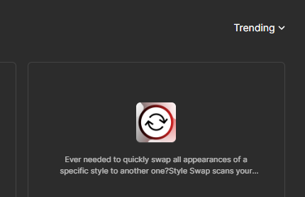
Another common use case for designers is bulk updating styles of objects. To accomplish this, some users rely on plugins such as Style Swap – Figma and Batch Styler – Figma. Style Swap works only for fonts, while Batch Styler covers both fonts and colors.
Ensure the style guide is powerful yet easy to understand. Following the structure of other style guides should make it easier to gain stakeholder buy-in. The maturity and utility of the style guide will evolve over time.
To communicate new styles and aesthetics and update old ones, it is helpful to compare old and new visuals side by side. Some stakeholders may be wary of changes, as many people are creatures of habit and unfamiliarity can be uncomfortable. In such cases, communicate the merits of the new styles, whether it’s a more soothing color palette or tangible benefits like improved accessibility.

LogRocket's Galileo AI watches sessions and understands user feedback for you, automating the most time-intensive parts of your job and giving you more time to focus on great design.
See how design choices, interactions, and issues affect your users — get a demo of LogRocket today.
Documentation may not be your favorite part of the UX design process, but it’s crucial to the success of any design project.

I’ve spent enough time designing with WCAG 2.2 to know it’s not enough. Here’s why I’m skeptical and cautiously hopeful about WCAG 3.0.

I learned this lesson the hard way. Good UX doesn’t survive endless approval loops. Here’s what went wrong — and how to protect your vision.

I’ve reviewed “final” designs more times than I can count — and the copy almost always gives users a reason to hesitate.

 Learn more →
