A design system includes carefully designed properties, components, and templates for creating digital products. They help designers to maintain visual and functional consistency, which in turn helps users become more efficient at using said products. Design systems also help designers to craft more efficiently — that is, as long as they have clear documentation that explains the use cases of the different design system elements.
With the help of developers, many design systems even include code snippets so that developers can reap the same benefits. Mature product design teams even have a written process for contributing, reviewing, and merging changes to design systems to ensure that they remain lean, organized, and provide great experiences for users.
As you can imagine, owning a design system is a lot of work. That being said, designers don’t necessarily need to start from scratch. There are plenty of design systems and UI kits on the market — many of them free — that you can use and adapt. In this article, we’ll take a look at the best Figma design systems and what they’re useful for.
If you’re designing an app, you’re expected (and in some cases required) to make it look and function like it’s a part of the operating system that it’s installed on. In many cases, it actually will be a part of the operating system — for example, if you’re leveraging its dialogs API or notifications API.
This means that you’ll need to use the operating system’s design system in some way or another.
Earlier this year, Apple made their design systems (or “design libraries”) public for the first time. This includes a Figma design system for iOS 17 and iPadOS 17, app icon templates for iOS and iPadOS apps, a design system for macOS Sonoma, and a design system for visionOS.
You’ll need to pair these with Apple’s Human Interface Guidelines to properly understand the use cases of the different design elements in the design systems:
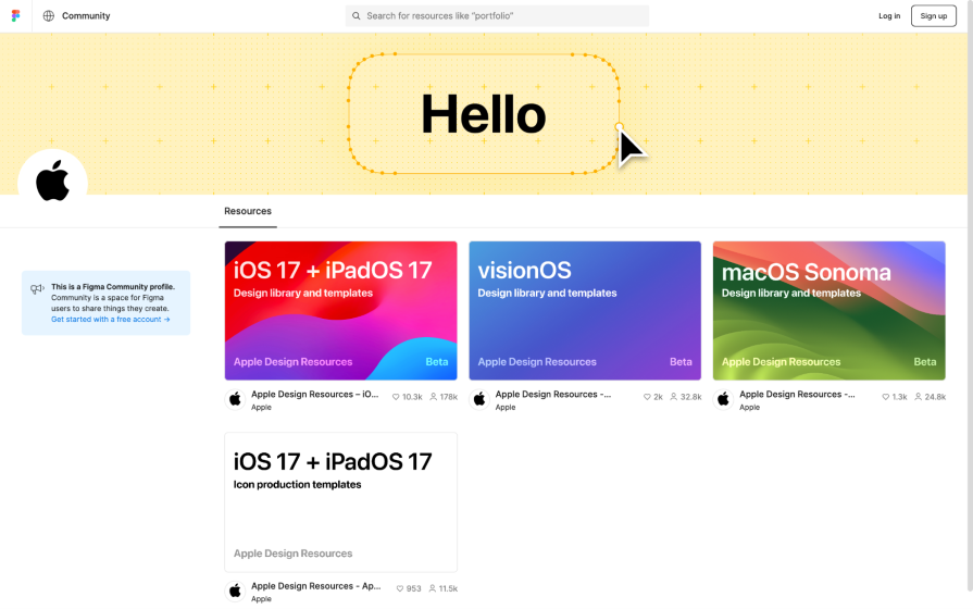
Unfortunately, you won’t find official design resources for Apple products released prior to those above; however, you’ll definitely find unofficial ones (on the Figma community website). After all, that’s what we had to make do with before Apple finally stepped up!
Apple hasn’t built any design systems for websites.
Google’s design system is called Material Design. This is what they use to design their apps and websites, and you can use it too if you like their design language. Grab Material Design for Figma and read the Material Design documentation and you’re good to go:
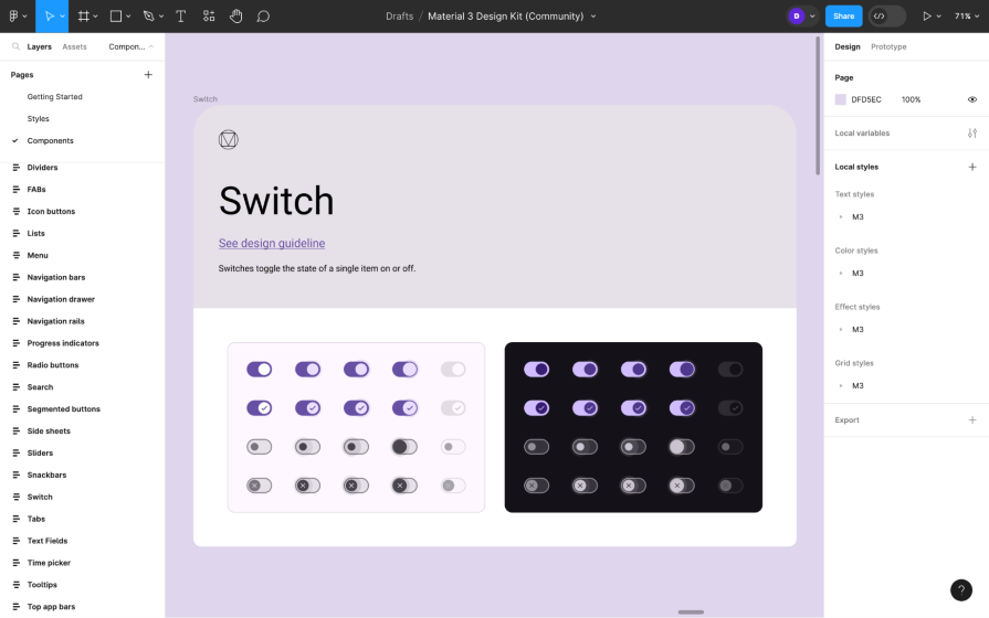
Material Design’s Figma profile also provides some supplementary resources (such as this Material Design color scheme builder) to help you utilize the design system to its full potential.
That being said, you’ll most likely want to use Material Design to build Android-powered apps. If so, you’ll also need the Android UI kit and the Android app icon template:
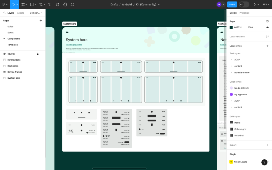
There’s also a Figma plugin called Relay that designers can use to annotate and hand off Android UI components to developers. Developers, using the Relay plugin for Android Studio, can then receive the Android UI components and use them in their codebase. The annotations can contain information about the component’s layout, content, styles, and interactions, which translates to code automatically.
Microsoft’s design system is called Fluent, and similarly to that of Google, you can use it to build Microsoft (Windows) apps or any other apps (or websites) simply because you like their design language.
For Windows apps, you’ll need Windows UI 3 (this’ll probably get renamed to “Microsoft Fluent Windows” eventually):
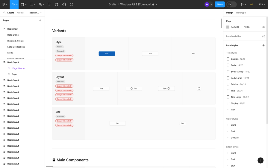
And since Microsoft isn’t really in the business of handheld devices anymore, you can totally use the Fluent design system for iOS apps, which combines the design languages of Microsoft and iOS — it distinctively feels like both while of course leaving room for you to make it your own app as well:
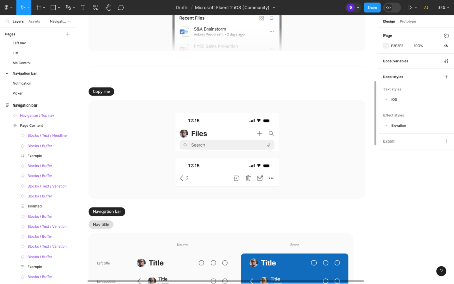
Fluent for Android is currently in the works.
As usual, the web is fair game, so if Fluent is your design language of choice, then you’re welcome to design websites using Microsoft Fluent Web, Microsoft’s Figma design system for web products:
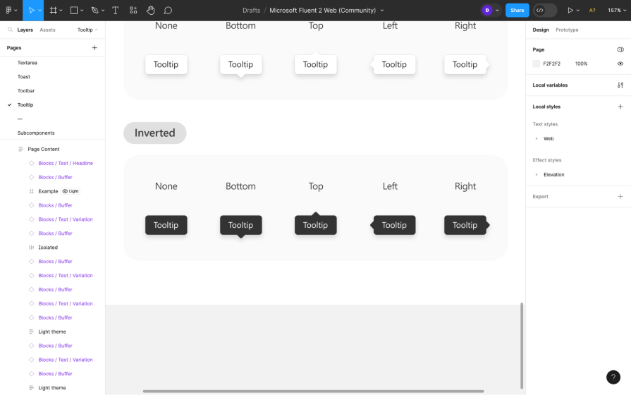
Microsoft’s Figma profile has some cool extras too: access to the full suite of Fluent’s icons and emojis. You’ll also find design systems for creating Microsoft SharePoint websites and Microsoft Teams apps, but those are obviously quite niche, which is why they’ve been separated from the main Fluent design systems.
Make sure to read through Fluent’s documentation, too.
It’s common for brands of large products to build their own design systems. Some of these design systems even serve multiple products, and the ones that are publicly available can serve your products, too.
The main benefit of these design systems is that they’re created to solve real problems. The main downside, though, is that they aren’t as versatile as they could be, since they’re only designed to solve the problems of that brand’s products.
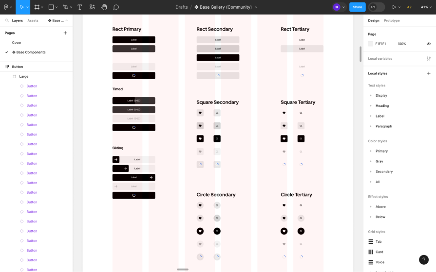
However, this doesn’t mean that brand design systems can’t be useful. For example, Uber’s design system (Base) is naturally ideal for designing transportation-related apps. They are trying to make it even more versatile.
From the documentation we can see that Uber hasn’t published everything yet, but there’s still a lot to love. In particular, its black-and-white color scheme sets it apart from other design systems. However, a huge downside is that it doesn’t yet utilize Figma variables like other design systems.
Base supports web, iOS, and Android:
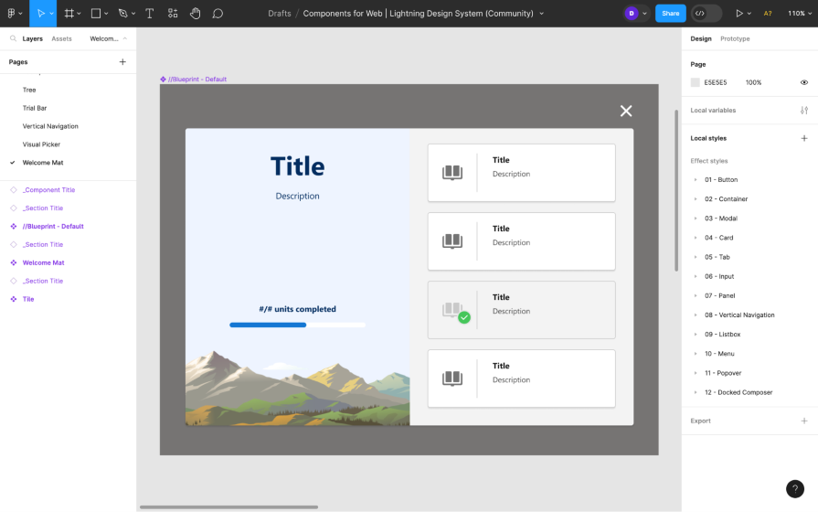
For anything related to sales, customer service, or marketing, you’d be in good hands with Salesforce’s Lightning design system. It can only be used to build websites, but it’s very extensive (e.g., you’d be able to design enterprise software with it).
It’s also fully accessible and has some incredible design system documentation to go with it:
Polaris design system (separated into three files — icons, styles, components) and its documentation is meant for designing the admin side of Shopify apps, but it’s otherwise good for designing admin features and tools in general. Alex Page and Yuraima Estevez go into more detail about Polaris in this podcast episode:
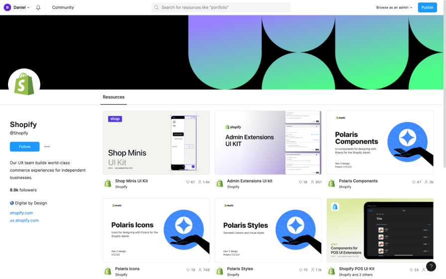
Shopify’s Figma profile also includes UI kits for Shopify’s checkout apps, POS apps, and more if you’re interested, but those ones are Shopify specific.
Atlassian having skin in the game when it comes to SaaS products is an understatement. They built Confluence, Jira, Trello, and Bitbucket (just to name a few), and as you can imagine they not only need to maintain consistency within each of their products, they also need to maintain consistency across all of their products. This is what makes their design system so powerful.
You can use Atlassian’s design system (which is also separated into three files — design tokens, foundations, components) and its documentation to design almost any type of SaaS product:
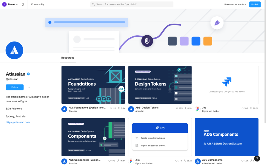
This design system is for websites.
Today, IBM is one of the largest tech companies in the world, which makes their design system, Carbon, far more versatile than the average design system, and it’s arguably the most accessible, too. The icons, color styles, text styles, and components (in a variety of themes, by the way!) are split up for ease of use:
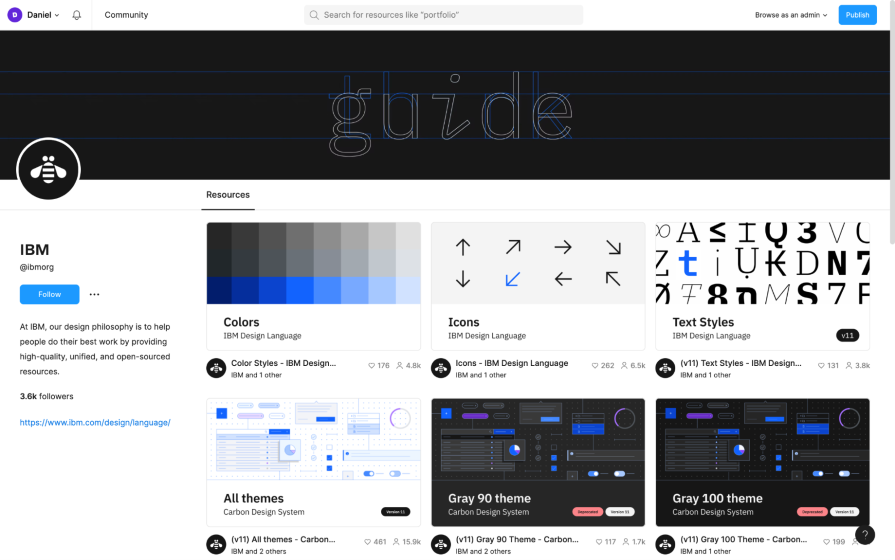
Carbon only supports the web for now, but iOS and Android versions are being crafted. Carbon’s documentation also mentions that a mid-fidelity prototyping kit is also in the works — awesome news for those that enjoy prototyping using design systems.
Premium design systems are more versatile because they’re specifically designed for a wide array of use cases, but at a price of course.
While they may not be based on the problems of real apps and websites, we could still argue the same of those mentioned above since they too weren’t designed to solve the problems of our apps and websites. Ultimately, it’s up to us to assess whether a design system provides what our users need, and that could lead us to purchasing a design system that “does everything.”
Another benefit of premium design systems is that they’re updated more frequently and to serve us, whereas the design systems of popular brands are primarily updated to serve the brands.
For example, the public version of Uber’s design system hasn’t yet been updated to match what’s in their documentation, and Fluent for iOS doesn’t contain the latest iOS design elements — you’ll need to look to the official design libraries for those.
The Untitled UI Figma design system is $149 or $499 for a team of five, but it might be cheaper depending on your location. There’s a free version, but realistically it’s only for testing.
Simply put, it’s huge, it’s upgraded frequently, and it just works. It’s one of the most popular premium Figma design systems for a reason. It’s only for designing websites, though:
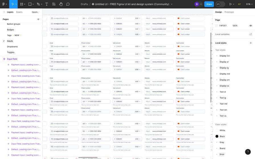
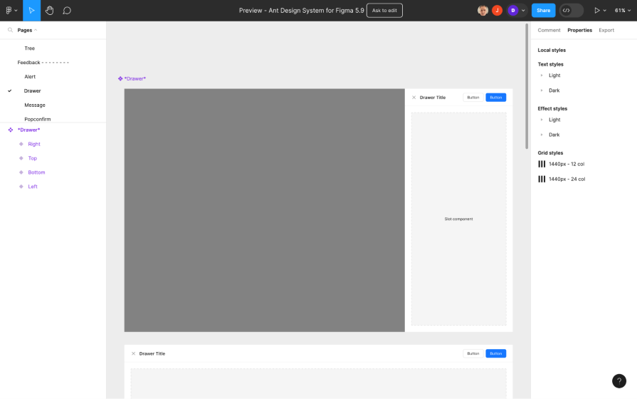
Ant Design system is very comparable to that of Untitled UI. They’re both two of the most popular design systems that you can buy, with a huge offering of design elements. Ant Design’s pricing is a bit more complex though, starting at $199 + taxes for a year’s worth of updates (whereas Untitled UI is for life).
It’s web only, same as Untitled UI:
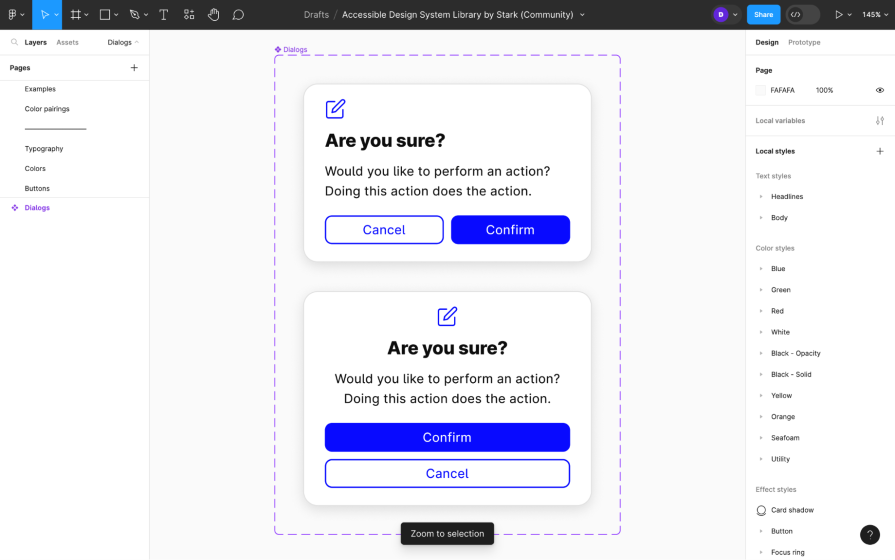
Stark is an organization committed to increasing digital accessibility, and one of the projects they have in the works right now is an accessible design system for Figma. While all great design systems are accessible enough, Stark specifically focuses on accessibility.
It’s still under development but provides a good foundation (typography, colors, buttons, and so on) and addresses the main concepts of the WCAG (Web Content Accessibility Guidelines):
Whether you’re forking an existing design system or building one from scratch, here are some of the best Figma plugins for design system management.
Building a design system from scratch requires more resources but is very rewarding, brings about a sense of pride, and it results in digital products that look and function more uniquely, which is essential to building a distinctive brand. Just make sure to build an accessible design system and keep your design system under control.
If you’re just looking for more awesome things for Figma, check our roundup of the best Figma widgets and best Figma templates.
Got any design system success stories to share? Perhaps with any of those mentioned above, a design system that we missed, or one that you created from scratch? Let us know in the comment section below, and thanks for reading!
LogRocket's Galileo AI watches sessions and understands user feedback for you, automating the most time-intensive parts of your job and giving you more time to focus on great design.
See how design choices, interactions, and issues affect your users — get a demo of LogRocket today.

As products evolve into ecosystems, navigation becomes a system-level challenge. This article explores how to align structure, context, and user journeys to create seamless movement across tools without confusion.

Figma’s AI features have exploded in 2026 — from text generation and image editing to full UI drafts and code handoff. But speed isn’t the same as quality. This guide breaks down every major feature, what it’s good at, and where human judgment still does the heavy lifting.

Zero UI works well for screenless, voice-first experiences, but most digital products still require visual interaction. Here’s why multimodal UX offers a more scalable foundation for the future of design.

Multimodal UX goes beyond designing for screens. Learn how context-aware systems, progressive modality, failover modes, and accessibility-first design create better digital product experiences.