
Research is becoming more democratized, product cycles are accelerating, and AI is transforming synthesis and ResearchOps. Here are the three trends shaping UX research in 2026.

There’s no universally “best” design language. This section breaks down when Linear-style design works well, how to build beyond it (or start from Radix UI), why it felt overused in SaaS marketing, and why conversion claims still need real testing.
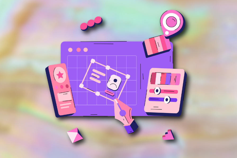
Minimal doesn’t always mean usable. This comparison shows how Linear-style UI keeps contrast, affordances, and structure intact, unlike brutalism’s extremes or neumorphism’s low-clarity depth effects.

Linear-style UIs look simple, but the theming system has to do real work. Here’s how to meet WCAG 2.2 contrast requirements across light, dark, and high-contrast modes — whether you’re using a UI library or rolling your own tokens.
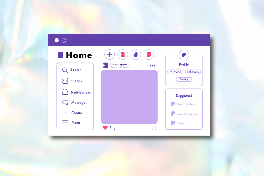
Linear design is a minimalist SaaS aesthetic inspired by Linear. Here’s what to use to recreate it — from Radix UI + shadcn/ui ecosystems to Linear-style Figma kits — plus how to structure pages using modular components and an 8px spacing scale.

A well-designed multi factor authentication system enhances security without slowing users down. Let’s explore how to make authentication feel effortless.

Scaling MFA in large organizations is more than a technical task. Teams must navigate user hesitation, older devices, legacy systems, and the ongoing operational burden of training, documentation, and compliance. Balancing security with usability and efficiency is key to a successful rollout.

Multi-factor authentication methods affect users differently depending on devices and abilities. This article explores the accessibility trade-offs of biometrics, OTPs, magic links, and more, helping you design inclusive MFA flows.

There’s no universally “best” authentication method. The right choice depends on the risks you’re protecting against, your users’ needs, and the data your product handles. This article breaks down modern authentication options and the factors that should guide your decision.

MFA improves security, but design choices matter. This article examines common MFA risks and practical ways to balance protection, cost, and user experience.
corner-shapeLearn about CSS’s corner-shape property and how to use it, as well as the more advanced side of border-radius and why it’s crucial to using corner-shape effectively.
CSS text-wrap: balance vs. text-wrap: prettyCompare and contrast two CSS components, text-wrap: balance and text-wrap: pretty, and discuss their benefits for better UX.