UX design frameworks are strategic guides that help you create consistent, user-centered designs. They align teams, streamline decision-making, and keep user needs front and center.

But no framework is one-size-fits-all. Real-world user behavior can be messy, nonlinear, and hard to predict — so frameworks should be flexible, not rigid. Use them as a compass, not a map.
In this guide, we break down 15 popular frameworks and when they’re best used — whether you’re mapping a journey, building empathy, or scaling a product experience.
Editor’s note — This post was last updated on April 24, 2025. We’ve reorganized the frameworks into four practical categories: process, visual/structural, behavioral, and evaluation. New additions come with concise definitions and clear use cases. You’ll also find a summary table to help you quickly compare and choose the right framework for your project.
A UX design framework is a strategic guide that helps designers create and scale effective, user-centered designs. It provides a set of principles and structures that inspire design decisions while considering how users interact with the product.
Originally developed for both physical and digital products, frameworks ensure a more organized and thoughtful approach to design.
By using a UX design framework, you can streamline your design process, ensuring that all key factors are considered. A well-crafted framework helps create designs that are not only functional but also visually engaging for users.
A clear and concise framework is essential in UX design — it guides the process and keeps everything aligned. It fosters a shared understanding of a project’s goals among team members, making collaboration smoother. Frameworks help ensure that designs remain focused on user needs and expectations, providing a structured approach without stifling creativity.
And while there are plenty to choose from, most frameworks share the same north star — clarity, usability, and keeping the user at the center. But the process isn’t set in stone. You can mix, match, and adapt frameworks based on what your project actually needs. It’s structure without the rigidity — giving you space to stay creative while staying on track.
Even the best frameworks can’t always predict how users will behave in reality. People may skip steps, revisit earlier ones, or take unexpected detours that don’t fit neatly into a structured model.
That doesn’t mean frameworks aren’t useful — they absolutely are — but it does mean they’re best used as flexible guides rather than strict rules. Real-world user behavior is messy and nonlinear, and great design embraces that unpredictability.
UX design process frameworks provide structured approaches to guide product teams from discovery through delivery. These models help teams align on user needs, business goals, and iterative development to ensure a product’s success in real-world contexts:
User-centered design is all about putting people first. It’s a mindset and a method that puts the user at the heart of every decision. You focus on their needs, behaviors, and emotions to create something that’s not just functional, but genuinely helpful and enjoyable.
How it plays out:
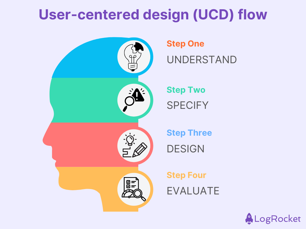
Why UCD works — It keeps your work grounded in real user needs, which usually leads to more effective, successful products.
But heads-up — It can take time and resources, especially with deep research and lots of iteration. Plus, if your user sample is too narrow or biased, it can steer you in the wrong direction.
Design thinking is like a creative jam session with structure. It’s a flexible, user-first approach to solving complex problems, and it works best when you embrace curiosity, rapid prototyping, and cross-team collaboration.
How design thinking plays out:
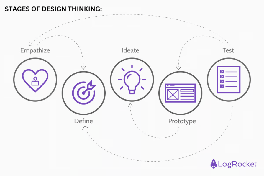
Why design thinking works — Design thinking helps you build things people actually want. It’s not just about solving problems; it’s about solving the right problems.
But heads-up — It can be time-consuming, especially if teams get stuck in endless ideation. And without clear constraints, things can get a bit chaotic.
The Double Diamond design process is a neat visual model that splits the design process into four key phases — two for understanding the problem and two for building the solution. It helps teams open up to explore possibilities, then zoom in to make smart decisions.
Here’s how it flows:
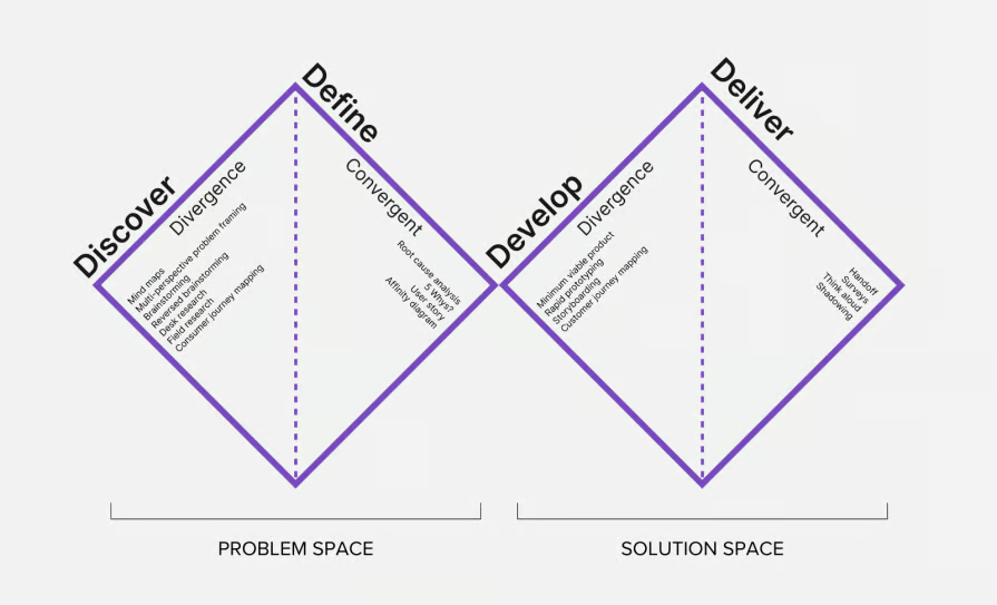
Why the double diamond works — It helps prevent teams from jumping to solutions too early. The clear phases promote better, evidence-based outcomes.
But heads-up — It can feel linear and rigid if taken too literally. Teams need to stay flexible and loop back when new insights emerge.
Agile UX blends user experience work into Agile development cycles. The goal is to keep design and development moving in sync — so teams can release faster without losing sight of the user.
How Agile UX plays out:
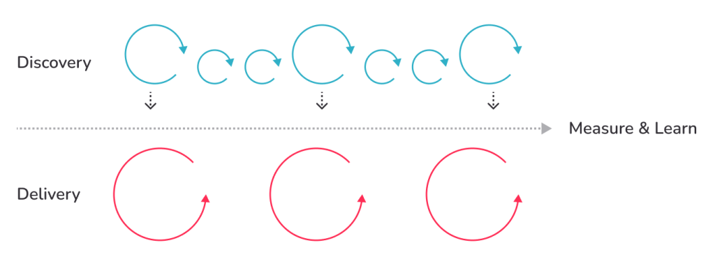
Why Agile works — Agile UX thrives on flexibility. Teams love how naturally it welcomes feedback and adapts to shifting requirements without derailing the whole process. Plus, it brings designers, developers, and stakeholders closer together, fostering real-time collaboration that keeps everyone aligned and moving forward.
But heads-up — The speed of Agile can sometimes backfire. When sprints move too quickly, design work risks being rushed or superficial. There’s also a tendency to skip or shrink research and usability testing, which can lead to decisions based on guesswork rather than user insight.
Lean UX is about learning fast and avoiding waste. It’s perfect for teams working in fast-paced environments where shipping quickly and testing ideas in the wild is more valuable than creating polished mockups.
How lean UX plays out:
Why lean UX works — You get user feedback early and often, which keeps you agile and focused on delivering real value.
But heads-up — It can be tough for stakeholders who want fixed deliverables and roadmaps. Also, lean UX relies heavily on team trust, autonomy, and a fast feedback loop.
These design systems are structural design frameworks that inform how UI elements are built and applied — focusing on construction, consistency, and modularity. They act as the blueprint for cohesive digital products, streamlining collaboration between design and development teams.
Whether you’re building with components, atoms, or object models, visual frameworks bring logic and order to creative chaos:
Atomic design is a methodology that helps teams create interfaces that are both modular and scalable. Think of it like chemistry for UI — start small with atomic elements, then combine them into larger units, such as molecules, organisms, templates, and full pages. This mental model makes it easier to build and maintain consistent design systems.
How atomic design plays out:

Why Atomic design works — It keeps design systems modular and scalable. Reusing components (like molecules or organisms) leads to faster builds, easier maintenance, and greater consistency across products.
But heads-up — Atomic design systems grow fast, and with that comes complexity. Without solid documentation and governance, things can quickly get messy or duplicated.
Component-based design is a flexible approach where designers build a UI using a library of reusable parts (aka components). These parts can be assembled in many different UX design layers, making the design adaptable across pages, content types, or even platforms.
How component-based designs play out:
Why component-based design works — It’s endlessly flexible and scalable. Designers can build fast without reinventing the wheel, and teams can maintain a consistent look across varied content types.
But heads-up — Initial setup takes effort — organizing, documenting, and aligning dev/design workflows. Plus, loading and rendering tons of components can slow down performance if not optimized.
Material Design is Google’s take on a unified design language. It’s bold, structured, and deeply inspired by real-world cues like paper, light, and motion. Designed for Android but expanded to the web and iOS, it’s built to help teams create interfaces that feel familiar, accessible, and modern:

How Material Design plays out:
Why Material Design works — It’s polished, fast, and consistent across platforms. You get animations, visual cues, and ready-to-use components right out of the box — ideal for rapid, scalable product design.
But heads-up — It can be restrictive. Material’s strong visual identity may limit branding flexibility, and designs often end up feeling a bit too “Google-y,” especially outside Android ecosystems.
Object-oriented UX is a strategic approach that flips traditional UX thinking. Instead of starting with user flows, you start with the objects that matter most to your users — like products, profiles, or events — and build your interface around those.
How OOUX plays out:
Why OOUX works — It makes complex systems easier to understand and navigate. By focusing on objects, your product mirrors how users think — which leads to better mental models and more intuitive UIs.
But heads-up — It takes upfront planning and a shift in mindset. Teams used to thinking in terms of tasks or features may need to retrain how they design and scope interfaces.
Behavioral design frameworks help us understand and predict user actions, making it easier to shape experiences that guide people naturally through our interfaces. The goal is to improve user flows by encouraging specific behaviors, boosting engagement, and even fostering habit formation.
Below are some of the key frameworks used in behavioral design:
The hook model is a framework for creating habit-forming products. Developed by Nir Eyal, this model explains how products can trigger user engagement by moving them through four stages — trigger, action, variable reward, and investment. The idea is to create a loop that keeps users coming back by offering unpredictable rewards tied to their actions.
How it plays out:
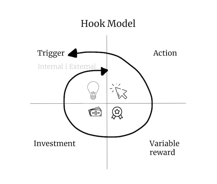
Why the hook model works — It taps into psychological triggers, like dopamine and variable rewards, to create a cycle of engagement. It’s powerful for products that aim to develop long-term user habits, like social media platforms or fitness apps.
But heads-up — While effective, the hook model can raise ethical concerns. If not designed with user well-being in mind, it can lead to addictive patterns that exploit user behavior in harmful ways.
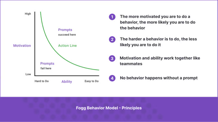
The Fogg Behavior Model focuses on the three elements required for a behavior to occur — motivation, ability, and trigger. The model is based on the idea that when these three factors align, users will act. The Fogg Behavior Model helps designers understand how to influence user behavior by manipulating these variables:
How it plays out:
Why the Fogg Behavior Model works — It’s a straightforward framework that highlights the balance between motivation and ability. By optimizing both, designers can ensure that users are more likely to take action at the right moments.
But heads-up — The model works best for short-term behaviors. For long-term engagement, the balance between motivation and ability may shift over time, requiring constant adjustments.
The laws of UX are a set of principles based on psychology and design research that predict how users will behave and how they perceive interactions. These laws help inform design decisions by aligning user behavior with predictable patterns, improving overall usability and experience.
How it plays out:
Why the laws of UX work — They’re based on human psychology and provide universal insights into how users process information and make decisions. Applying these principles leads to intuitive designs that resonate with users’ natural behavior.
But heads-up — While useful, these laws are general guidelines and can vary depending on context. It’s important to adapt them based on your target audience and specific design goals.
Evaluation frameworks help designers assess the usability and effectiveness of a design by defining what “good UX” looks like. These frameworks provide structured ways to analyze user interfaces, identify issues, and ensure that designs align with usability principles.
Below are some key evaluation frameworks commonly used in UX design:
The UX honeycomb, developed by Peter Morville, offers a visual way to evaluate user experiences by highlighting seven core elements that define good UX — useful, usable, desirable, findable, accessible, credible, and valuable. This framework helps designers balance these elements and evaluate how well a design addresses each aspect to create a seamless user experience.
How it plays out:
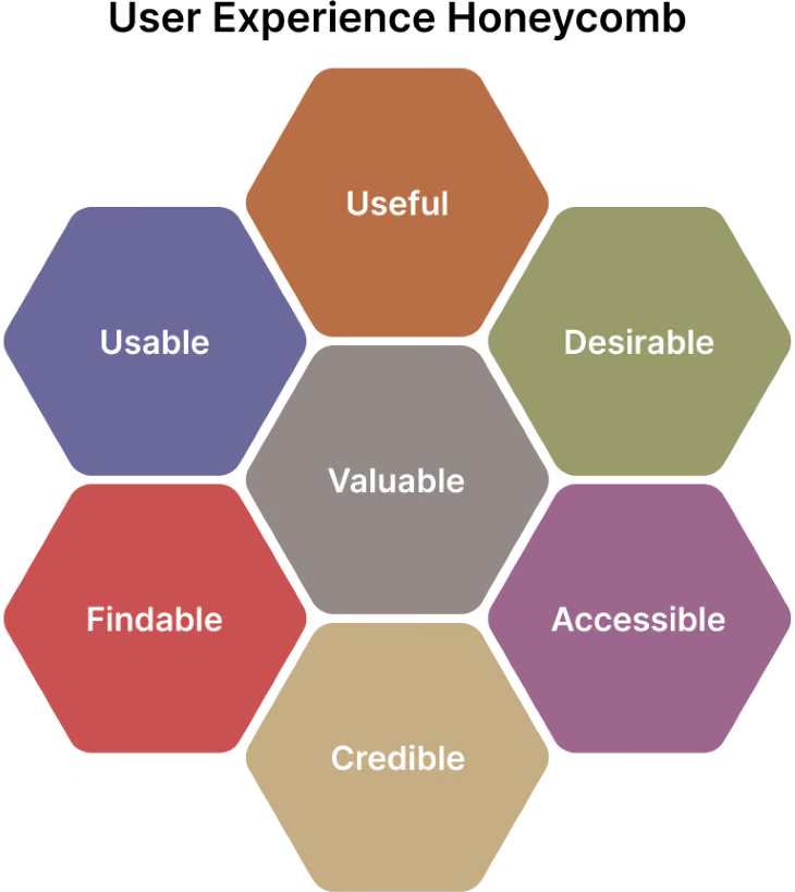
Why the UX honeycomb works — It’s a comprehensive, holistic framework that ensures a balanced approach to evaluating UX. Each element is critical to creating a product that resonates with users while meeting business goals.
But heads-up — The UX honeycomb can be broad in its application, and designers may need to prioritize specific aspects depending on their project goals and user needs.
The BASIC framework focuses on evaluating user behavior by examining five critical elements — behavioral impact, affective impact, social impact, intellectual impact, and cognitive impact. This model helps designers evaluate how a product influences users at both an emotional and functional level, ensuring a well-rounded user experience.
How it plays out:
Why the BASIC framework works — It provides a comprehensive look at the user experience, addressing emotional, intellectual, and social factors that influence behavior. It’s useful for evaluating how well a design aligns with users’ holistic needs.
But heads-up — While the BASIC framework is versatile, its application can be subjective. Different users may react differently to the same design based on their background, needs, and goals.
The 10 usability heuristics, proposed by Jakob Nielsen, are a set of general principles for user interface design that help identify common usability issues. They provide a quick, effective way to assess the usability of a product by evaluating key aspects like system feedback, consistency, and error prevention.
How it plays out:
Why the 10 usability heuristics work — They’re widely used because they’re simple, actionable, and effective for identifying usability problems in any design. They provide a fast and reliable way to evaluate a design’s overall user-friendliness.
But heads-up — These heuristics are general rules of thumb and may not cover every specific use case or design context. It’s important to supplement them with other frameworks for a more thorough evaluation.
Selecting a UX design framework isn’t about picking the trendiest name — it’s about matching your tools to your context. A well-aligned framework helps you move fast without breaking the user experience. But first, you need to look inward.
Start with the fundamentals. Understand your organization’s design maturity, the project’s scope, and the complexity of the problem you’re solving. What are the user needs? What’s the product’s vision? Is the problem exploratory or well-defined? These inputs shape the structure you’ll need.
Also consider your team — their experience, design process, tech stack, and collaboration style. A heavyweight framework may overwhelm a lean team — or clash with your internal workflows. Instead of defaulting to what’s familiar, focus on what fits.
Once you’ve narrowed the field, evaluate the framework through three UX-critical lenses:
Above all, stay flexible. Frameworks are meant to support creativity, not limit it. The best one is the one that amplifies your design intent — without getting in the user’s way.
| Framework | Summary | Best for | When to use |
| User-centered design (UCD) | Focuses on user needs through research, prototyping, and testing. | Building experiences grounded in real user behavior. | When you need to deeply understand and validate user needs before building. |
| Design thinking | A creative, iterative problem-solving method based on empathy and ideation. | Tackling vague or complex human-centered problems. | When you’re exploring new ideas and open to innovation and reframing. |
| Double diamond | A four-phase model that separates problem and solution spaces. | Aligning teams around both exploration and execution. | When you want structure without rigidity for full-cycle design projects. |
| Agile UX | Merges Agile dev cycles with UX workflows. | Teams shipping regularly and iterating quickly. | When you have short sprints and need user input embedded in development. |
| Lean UX | Strips design to MVPs with fast learning cycles. | Fast-paced teams that prioritize outcomes over deliverables. | When you’re experimenting with early concepts and hypotheses. |
| Atomic design | Breaks UI into five hierarchical levels from atoms to pages. | Creating scalable design systems with reusable parts. | When building or scaling a modular component library. |
| Component-based design | Builds UI with reusable, code-ready components. | Cross-platform consistency and system scalability. | When aligning design and dev around shared components and style guides. |
| Material design | Google’s design system with clear UI rules and components. | Android and web apps needing rapid UI standardization. | When you want to move fast with strong defaults and accessibility baked in. |
| Object-oriented UX (OOUX) | Maps design to real-world objects and relationships. | Structuring complex platforms like dashboards or CRMs. | When clarity around content and relationships is crucial early on. |
| Hook model | Drives habit formation through triggers and rewards. | Increasing retention through behavioral loops. | When aiming to build sticky, high-engagement digital experiences. |
| Fogg behavior model | Explains behavior as a function of motivation, ability, and prompts. | Micro-interactions and behavior nudges. | When you’re optimizing for specific user actions or conversions. |
| Laws of UX | Collection of psychological principles applied to UI. | Enhancing usability through cognitive ease. | When refining UI patterns or making interfaces feel more intuitive. |
| UX honeycomb | A framework for understanding UX through seven key facets. | Holistic UX strategy and communication. | When presenting UX value or aligning stakeholders on experience goals. |
| BASIC framework | Focuses on users’ cognitive, emotional, and behavioral states. | Creating emotionally resonant and psychologically sound UX. | When you want to deeply connect design to user emotion and intent. |
| 10 usability heuristics | Jakob Nielsen’s timeless principles for usable interfaces. | Quick UX audits and design quality checks. | When evaluating UI for clarity, efficiency, and error prevention. |
To successfully implement UX frameworks, securing the right funding and dedicating resources to research and testing is crucial. Embracing these frameworks not only accelerates innovation but also drives streamlined workflows, enhances cross-team collaboration, and ensures exceptional user experiences. By choosing and integrating the right UX framework, your team can create products that meet user expectations and deliver business success.
So, gather your team, assess your framework options, and start reimagining your design process for a future-ready, user-centered approach.
LogRocket's Galileo AI watches sessions and understands user feedback for you, automating the most time-intensive parts of your job and giving you more time to focus on great design.
See how design choices, interactions, and issues affect your users — get a demo of LogRocket today.

Zero UI works well for screenless, voice-first experiences, but most digital products still require visual interaction. Here’s why multimodal UX offers a more scalable foundation for the future of design.

Multimodal UX goes beyond designing for screens. Learn how context-aware systems, progressive modality, failover modes, and accessibility-first design create better digital product experiences.

Learn how context-aware mode prioritization and seamless transitions improve multimodal UX and reduce mode confusion.

Research is becoming more democratized, product cycles are accelerating, and AI is transforming synthesis and ResearchOps. Here are the three trends shaping UX research in 2026.