Did you know your brain innately creates groups, patterns, and objects from visual information? As you look at something, like your laptop screen or a flower on a walk, your brain perceives all the information coming from your optic nerves and simultaneously makes sense of it.

To make things easy and efficient, the brain quickly organizes visual stimuli as a whole instead of its individual parts. For example, when you look at a chair, you don’t have to consciously process that it has four wooden legs and a L-shaped cushion. Instead, your brain instantly recognizes that it’s a chair.
Let’s understand how this process works, as well as how to leverage it for better UX and UI design. We’ll define a design principle called the law of proximity, discuss how to use it, and see some real-world examples.
In the early 20th century, psychologists Max Wertheimer, Kurt Koffka, and Wolfgang Köhler set out to identify how people perceive the world around them. Their work resulted in the famous gestalt principles of design.
These principles remain relevant today. We can use them to better understand how people recognize objects and patterns as a whole instead of their individual pieces:
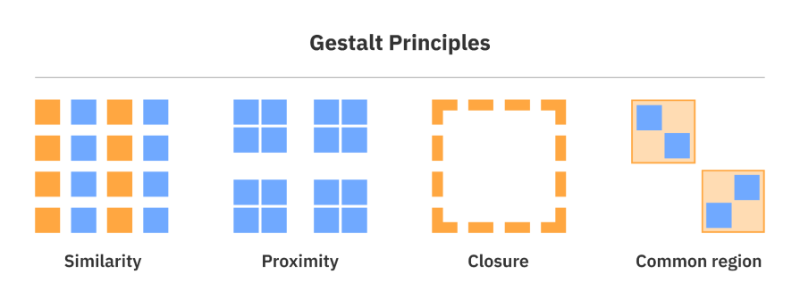
Since UX and UI design are heavily influenced by psychology, gestalt principles have played an important role in shaping how designers create layouts and position elements on interfaces. Principles such as the law of similarity and continuity help designers create interfaces that users can easily structure and follow without explicit instructions.
The law of proximity is an important gestalt principle used in UX and UI design. It explains how people create groupings based on how close or far away elements are from each other.
This principle gives designers great power in deciding how they want to create groups or ensure elements feel distinguished on an interface. Using design fundamentals like colors, spacing, or shapes can all be used to implement this law. It’s simple, yet effective.
Let’s talk about why the law of proximity is important, how to use it in your designs, and review some real-world examples.
The law of proximity tells us that it matters how we position elements in relation to each other. If elements are close to one another, they’ll be recognized as a group. On the other hand, if elements are far away from each other, they’ll be distinguished as separate groups.
We need to match how people perceive and process information so they can create automatic groupings and distinctions. Here’s an example of how we can group related information visually using the law of proximity:
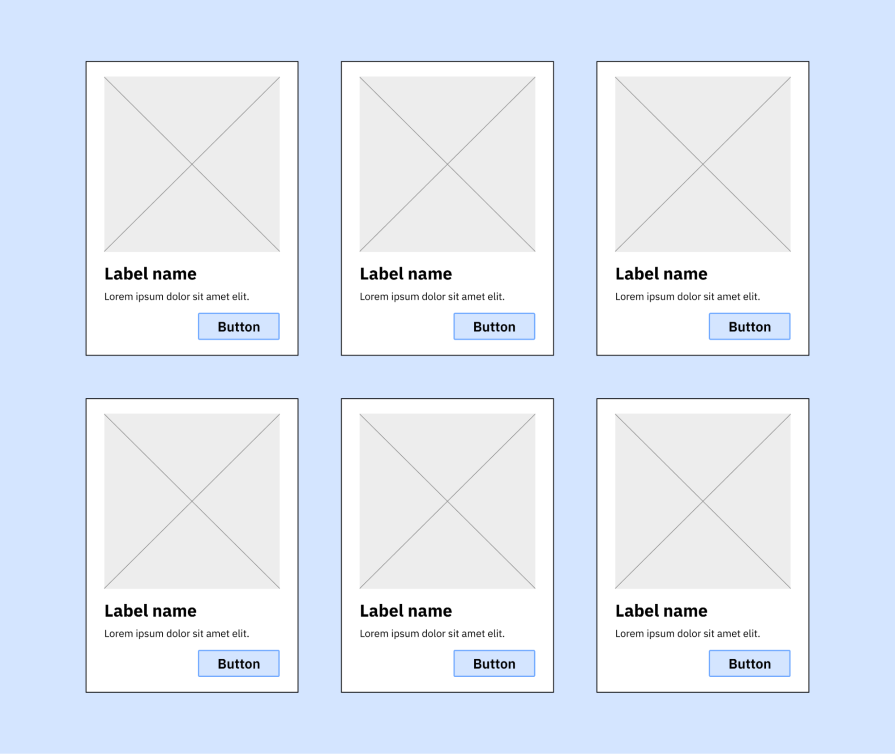
Understanding and knowing how to apply the law of proximity can enhance any type of content, from interface design to even writing an article. Content needs to be grouped into their relevant sections or categories to enhance visual hierarchy, readability, and comprehension.
When we apply the law of proximity to content displayed in a user interface, we create a visual hierarchy that helps people quickly organize sections and determine what is most important.
For example, when you read an article (like this one), you might read all the main headings first to see if there’s a specific section you want to read. These headings, typically styled with large fonts, create a group from the start of the heading to the following heading:
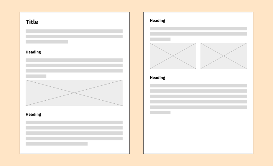
So, when we reach the following heading, we know we’ve migrated from one group of content and moved to a new group.
The law of proximity also improves the readability of content. Placing content near each other implies that they are related and should be viewed as a group. Usually, these groups are expressing the same idea.
If we refer back to the scenario of reading an article, the sentences that make up a paragraph are related and get the same point across. These paragraphs chunk up the ideas made in the article to help people read and process the content more efficiently — plus, no one wants to read one, long, paragraph-less article.
Lastly, the law of proximity helps with comprehension. Our brains convert the complex into simple not only so we can better understand complex ideas, but so we can do it incredibly fast.
Again, while reading an article, instead of reading a word one letter at a time, you would read the entire word as a whole. This is because the spacing between letters of a word is tiny, but the spacing between words is larger. We can discern between words due to these small-but-mighty spaces, allowing us to read many words in a short amount of time.
Applying the law of proximity is crucial when organizing any kind of content since it affects how people read and understand the ideas the content creates. Without this principle, content would take much longer to get through, and separating one idea from another would be near-impossible. Who knew a little spacing and grouping could be so powerful?
Now that we’ve reviewed what the law of proximity is and why it’s important, how can it be used? Thankfully, the answer is simple: you only need white space and focal points. Using these two elements will create groupings and give visual weight where needed in an interface.
White space, also known as negative space, just refers to any unused areas of an interface. This space is not necessarily white, as the term might suggest; you can use any color — and even sometimes patterns or textures — to create negative space.
Though it seems counterintuitive to making optimal use of a screen’s real estate, white space is necessary for UX and UI design. White space uses margins and padding around design elements that are both related and unrelated.
That being said, white space is needed to separate elements in internal groups as well as to split groups apart. The power of negative space is that it can maintain the oneness of a group in addition to keeping it separate from other groups.
To design using white space:
You can see an example of how to use white space below. The blue sections indicate the white space:
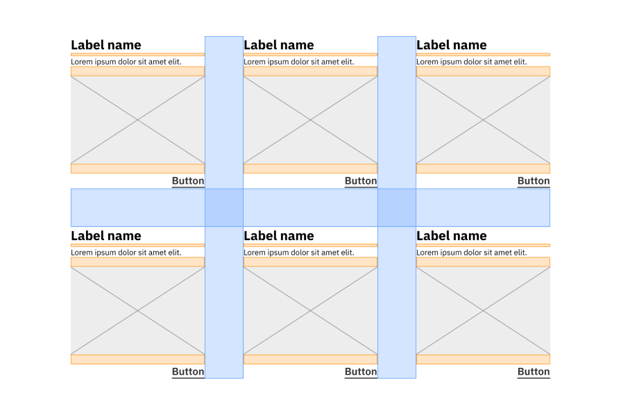
A good rule of thumb to have when applying white space is if the groups don’t look distinguishable to you, they probably won’t look distinguishable to your users. It’s important to establish and use a spacing system accordingly to take advantage of this gestalt principle.
Another element to use in conjunction with white space is focal points. Focal points give emphasis and visual weight to certain areas of an interface, and can be used in groups to further create distinction. We can also use focal points consistently across groups so users can easily identify new groups from others.
To design using focal points:
In the example below, the focal point in each group is the Label name text element, which uses a larger font with a heavier weight to draw attention:
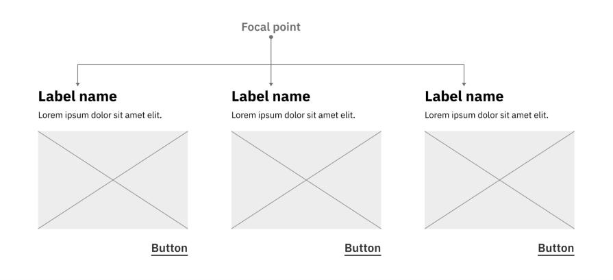
After designing a focal point for one group, you can use the same visual styling across multiple groups so users can pick up the organization of the interface to skim the content from group to group.
By using white space and focal points, the law of proximity should naturally come to your designs. Not only that, they will bring balanced composition and visual hierarchy so your users innately create groups on the interface.
The law of proximity can be found everywhere. Just take a look around you. Maybe you’re at your desk or on your couch. Wherever you are, you probably have many objects nearby like a water bottle, laptop, or headphones.
Each of these objects are made up of individual parts, such as a laptop which includes a base piece with a keyboard and a top piece with a screen. However, our brains don’t process objects in that way. Instead, our brains process the overall visual of the laptop, grouping all its components together to reduce the complexity.
The same goes when looking at UX and UI design. Let’s examine a couple of real-world applications of the law of proximity with Hulu and Delta Air Lines.
The first example we’ll look at is Hulu. The image below is from my home view of the Hulu desktop website:

As you can see, there are four main groups created in the interface. There’s a black-colored header at the top and three rows of data in the main content.
What’s interesting is even without the direct labels above each row of grouped TV shows or movies, you can still make visual groupings. This is because the white space between the rows is greater than the white space between the individual TV shows and movies within each row:
Hulu creates simple, but clear groups through the law of proximity with its use of white space that distinguishes the individual elements within a group as well as separates the large groups from each other.
The next example is Delta Air Lines. On their website, I searched for flights from Atlanta to New York City and sorted through the results:
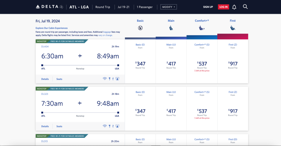
In the main content of the interface, I can form multiple groups from the data table list provided. I am easily able to distinguish the individual flights, but I’m also able to distinguish the type of seat and its price for the flight. So, there are general groups based on the flight, and more specific subgroups for the type of seat for each flight:

You can see how it’s easier to comprehend these search results through the white space used between individual flights along with the focal points used for the flight times and seat prices.
As I mentioned before, the law of proximity is one of the main design principles that derive from gestalt psychology. “Gestalt” is a German word that has no direct English translation, but you can interpret it to mean something like “whole” or “complete.”
Gestalt principles explain how the human brain organizes all the visual data it handles at one time. Instead of looking at objects and entities as their individual parts, the brain processes it as a whole piece of information.
Gestalt psychology was established in the early 20th century by Czechoslovakian and German psychologists Max Wertheimer, Kurt Koffka, and Wolfgang Köhler. Their early work involved the study of visual perception in regards to phi phenomenon, which is an optical illusion:
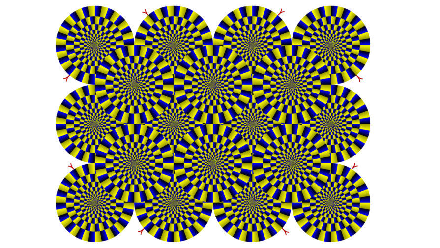
These psychologists were trying to understand how static objects repeated at a high-frequency appear to move. As it turns out, this phenomenon is caused by the brain being unable to process the repeated objects as individual pieces.
The phi phenomenon led to further research in visual perception to better understand how the human brain recognizes and processes visual data. This research helped develop the concepts of perception, including:
As gestalt psychology was elaborated over many years, it began to expand into new fields of study like social psychology and design. For design, gestalt principles such as the laws of proximity and closure have allowed designers to better communicate visual relationships, making their content easier to read and understand.
Without the research and work of the gestalt psychologists, who knows what UX and UI design would look like today?
Gestalt principles have heavily influenced the fields of psychology and design, so it’s inevitable that UX and UI designers also adopted these principles. These principles inform the ways designers visually communicate relationships only using visual stimuli.
Understanding how people perceive and process visual information allows us to create clearer and more aesthetically pleasing interfaces. In this article, we learned how applying one such gestalt principle — the law of proximity — to organize our content in a way that enhances visual hierarchy, readability, and comprehension.
To use the law of proximity in your content, you only need to apply white space and focal points. White space, or the unused areas of an interface, provides critical breaks in content that can either create a group or separate them. Meanwhile, focal points add visual weight to certain elements on an interface and help users distinguish groups from each other.
The law of proximity is all around us, not only in interface design. We perceive all the complex visual information, and our brains simplify it to output objects as a whole instead of its individual parts. Using the law of proximity in design allows us to create more readable, useful, and efficient interfaces for better UX.
LogRocket's Galileo AI watches sessions and understands user feedback for you, automating the most time-intensive parts of your job and giving you more time to focus on great design.
See how design choices, interactions, and issues affect your users — get a demo of LogRocket today.

Zero UI works well for screenless, voice-first experiences, but most digital products still require visual interaction. Here’s why multimodal UX offers a more scalable foundation for the future of design.

Multimodal UX goes beyond designing for screens. Learn how context-aware systems, progressive modality, failover modes, and accessibility-first design create better digital product experiences.

Learn how context-aware mode prioritization and seamless transitions improve multimodal UX and reduce mode confusion.

Research is becoming more democratized, product cycles are accelerating, and AI is transforming synthesis and ResearchOps. Here are the three trends shaping UX research in 2026.