Atomic design is a methodology used for building efficient and scalable design systems. Inspired by chemist Brad Frost, atomic design breaks down the user interface into tiny reusable components that act as the foundational blocks of a product. Atomic design helps design teams put together complex UI from simple parts. This results in a more consistent and organized design process.
By using atomic design, you make communication easier between your designers and developers. This is crucial when you’re designing a new application or when creating and maintaining a large design system. In these cases, atomic design can reduce errors, save time, and refine your UI.
Keep reading to learn everything you need to know about atomic design for UI design.
Editor’s note: This blog was updated 9 May 2025 by the author to elaborate on previous examples, provide new case studies, and cover FAQs.
Atomic design is a methodology developed by Brad Frost for creating design systems. In short, it works by breaking down interfaces into small and reusable components. Atomic design provides a structured way of building up complex UIs from basic building blocks in five distinct levels (we’ll cover those in depth later).
Brad Frost’s book “Atomic Design” provides a methodical framework, carefully forming design systems to guarantee their robustness and consistency. The nomenclature itself is derived from the fundamentals of chemistry, referring to the complex structure present in all matter.
Atomic design comprises five steps that work together to form a cohesive interface design system. These five atomic design components or stages are atoms, molecules, organisms, templates, and pages:

Atoms are the smallest and the most fundamental element that can’t be broken down further without losing functionality. Some examples of atoms are buttons, text fields, labels, and icons:
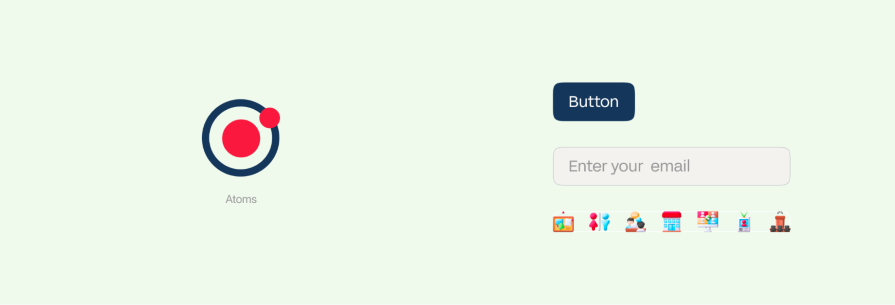
These simple HTML elements provide a foundation to build interesting and complex components.
Atoms set the ground rules in a design system. They define all the basic styles like color, font, and size across the system. Consistently styled atoms lead to consistency in more composite components:
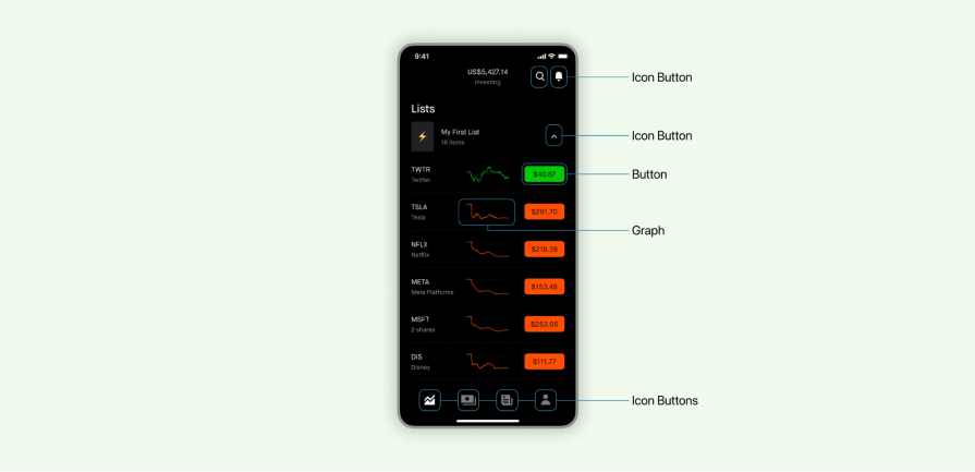
In the above example, you can see atoms in action as individual UI elements. They support the foundation of the interface. You can easily build a library of reusable atoms that act as a foundation of the frontend system.
Molecules are the group of atoms that come together to function independently as a unit. For example, a signup form molecule combines two input fields: button and labeling atoms:
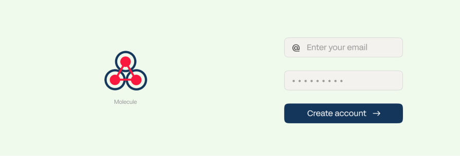
These simple molecular components represent recognizable pieces of an interface. They add an extra layer of functionality compared to individual atoms:
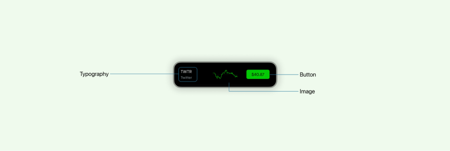
Molecules demonstrate how atoms can interact and combine into usable micro-components. These molecular components start having defined properties like size, shape, positioning, etc.
Another great example of a molecule would be a card element. In the snapshot above, the card consists of multiple atoms such as an image, text block, icons, and a CTA button. The atoms on the card exist independently and contribute to the molecule’s overall functionality.
Organisms are relatively complex UI components made up of multiple molecules. Molecules and organisms share many similarities, but one major difference is that molecules represent a smaller piece whereas organisms form more elaborate sections of an interface.
Some examples of organisms are signup forms, media boxes, and product lists:
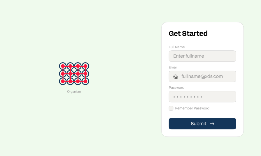
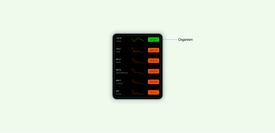
Organisms are tricky to identify as in some cases they’re made up of the same molecule used multiple times and in other cases can even be different molecules that come together to form an organism. In this example, you can see the same molecule used multiple times in a large section of an interface:
Templates help standardize a page layout across multiple pages that function similarly. Think of signup templates, hero section templates, article templates, and search results templates:
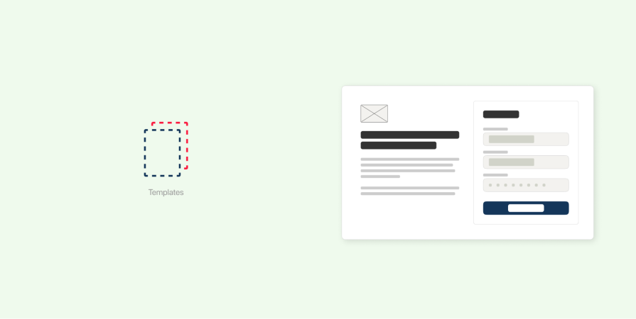
Templates handle layouts for organisms like headers, sidebars, footers, and more. Additionally, they also define things like spacing, grids, and styles that unify page designs:
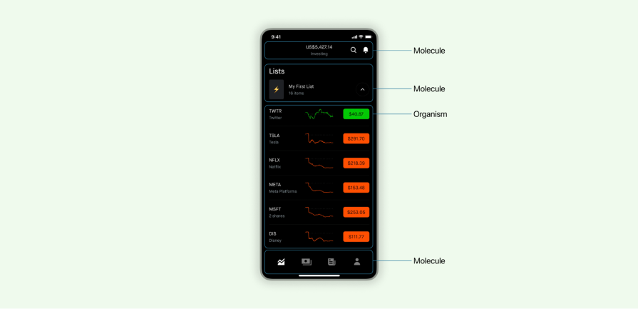
In the example above, you can see a standardized template made up of atoms, molecules, and organisms organized to form a template.
Pages are instances of templates in high fidelity. Some examples of pages are homepages, product pages, login pages, and blog article pages:
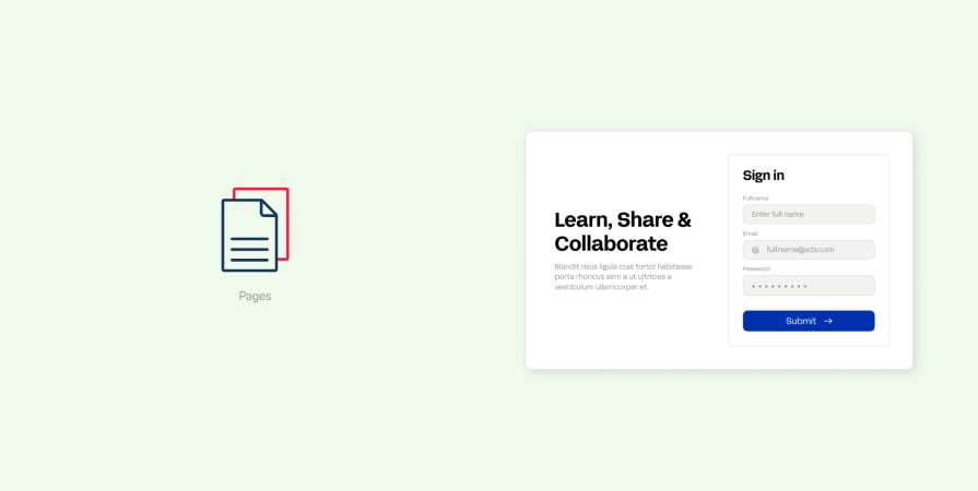
Pages utilize templates for their layout structure along with style components like atoms, molecules, and organisms:
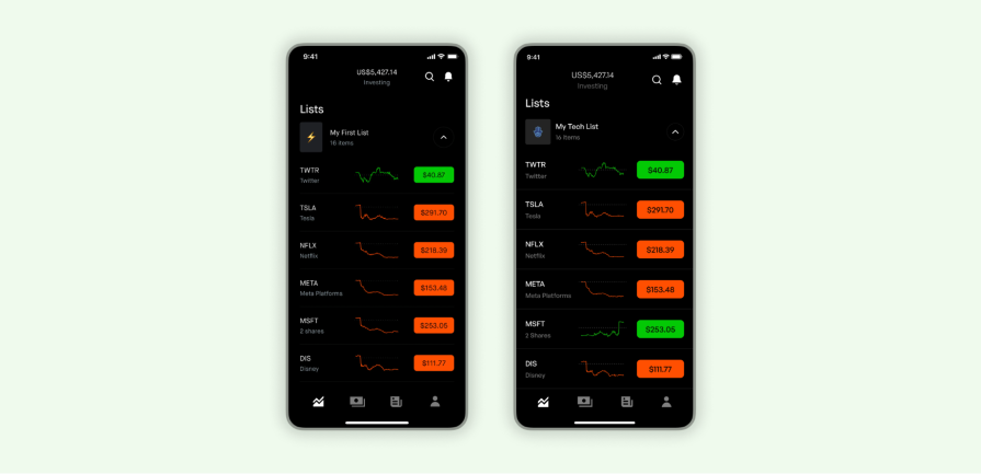
Here you can see a list of stocks from two different users on the RobinHood app. Based on user selection, the atoms and molecules take on different states. It’s equally as important to define a page as it is atoms and molecules when building a design system.
Consult the table below to help you understand the difference between design components:
| Stage | Purpose | Examples |
| Atoms | Set a standard for basic styles across a design system, providing a foundation to build more complex components | Buttons, text fields, labels, icons, images |
| Molecules | Build interface components with small interaction with well defined properties | Input fields, search bar, cards |
| Organisms | Create sections of an interface that contains one or more functions | Gallery, product listing, wizard |
| Templates | Define a layout pattern that can be reused across multiple pages | Hero section, sign in, footer section |
| Pages | Final output that shows how the interface looks like and functions | Homepage, dashboards, product detail page |
Designers and developers love atomic design for good reason. It’s a philosophy that improves collaboration between the two. Let’s go over why:
Now, let’s take a fictional ecommerce company “GoodDesign” to illustrate how atomic designs could be used at various stages:
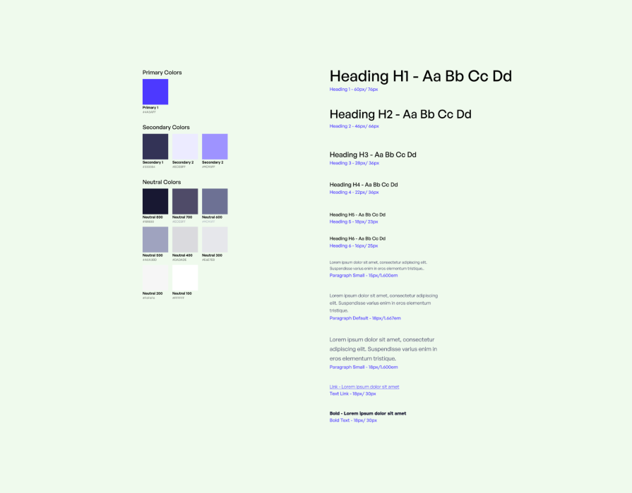
GoodDesign carefully selects a color palette and typography to represent its brand across various touch points. Each color and typeface is foundational in establishing a visual identity that represents its brand:
Buttons, icons, spacing, and composition are defined earlier in this stage to ensure a consistent, distinct, and recognizable user interface:
![]()
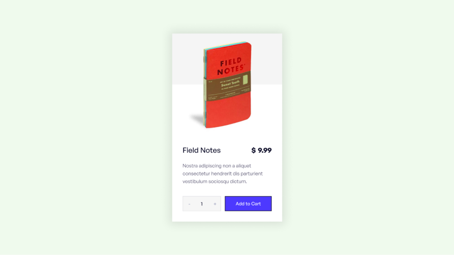
By combining atoms like buttons, text blocks, and product images, GoodDesign crafts beautiful product cards. This card serves as a cohesive unit, providing all the necessary details about the product:
By combining atoms like buttons, icons, and images, GoodDesign gets the navigation bar molecule. This element provides users with an intuitive means of navigating the website:

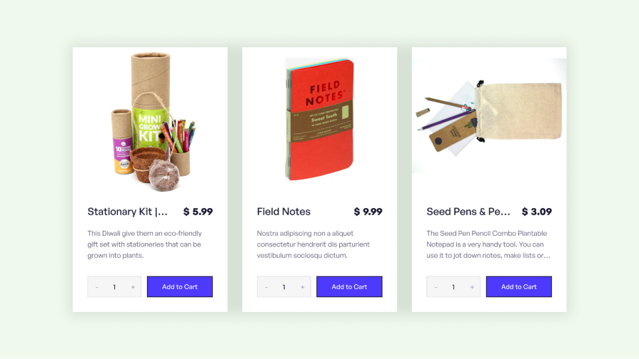
Product listings are examples of organisms that contain molecules like product cards, filters, and navigation bars. This provides a comprehensive design framework for users:
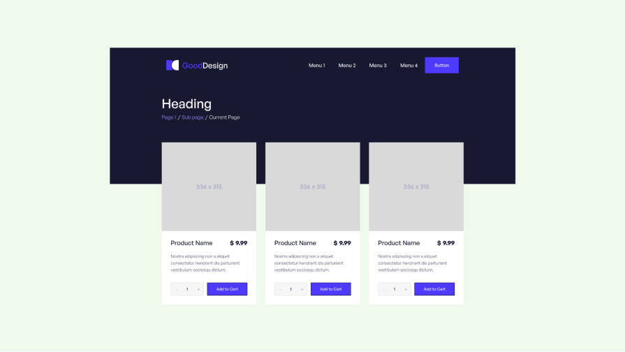
Templates bring together multiple organisms, molecules, and atoms. The product listing page template includes elements like filters, a navigation bar, a header, and product cards.
This standard design ensures a consistent layout throughout the ecommerce website:
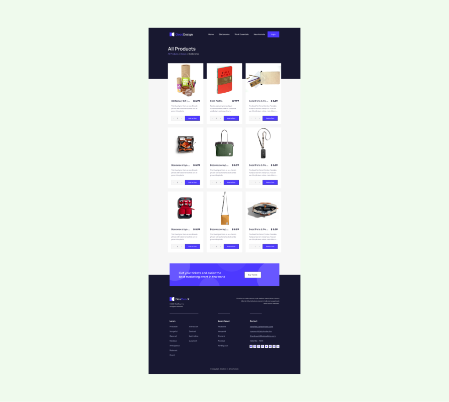
Pages are templates with real data. The product listing page pulls in a product listing template populated with atoms, molecules, and organisms in an orderly fashion:
There you have it. Now you have reusable design components to plug into your system.
Any product moves atom by atom, gradually building up to molecules, organisms, templates, and pages that work cohesively. Ultimately atomic design helps you evolve complex design systems while maximizing reusability and scalability.
Now you can organize your design systems more efficiently. Your whole team will thank you!
LogRocket's Galileo AI watches sessions and understands user feedback for you, automating the most time-intensive parts of your job and giving you more time to focus on great design.
See how design choices, interactions, and issues affect your users — get a demo of LogRocket today.

I’ve spent enough time designing with WCAG 2.2 to know it’s not enough. Here’s why I’m skeptical and cautiously hopeful about WCAG 3.0.

I learned this lesson the hard way. Good UX doesn’t survive endless approval loops. Here’s what went wrong — and how to protect your vision.

I’ve reviewed “final” designs more times than I can count — and the copy almost always gives users a reason to hesitate.

The checkbox is one of the most common elements in UX design. Learn all about the feature, its states, and the types of selection.