Push notifications can be a very effective way to engage your app’s users. But if done wrong, they can do great damage to user experience. It could result in the loss of the channel when users deactivate notifications, or worse, lose the user completely if they uninstall the app.
In this article, we’ll talk about finding a balance with push notifications. We’ll learn from some real-world examples of annoying push notification execution and learn the important steps to do push notifications the right way.
First, let’s take a look at two modern companies that didn’t use push notifications in the best way: Groupon and Pinterest.
Let’s look at a cautionary tale from Groupon. In its early days, Groupon experimented with more frequent email notifications and it proved to be successful for a while. They continued to aggressively test more and more frequent emails until, virtually overnight, the email channel lost its effectiveness due to users opting out. Engagement dropped, which affected their sales numbers negatively.
There are many articles out there that explain “how to stop Groupon emails,” which indicates that 1) they have an unfortunate legacy and 2) there’s still a need to stop it from happening.
And, if you search “unsubscribe from Groupon” on Google Trends, you can see a big spike in 2008 and another one from 2011-2012:

Groupon overused push notifications so much that their users were turning to Google to find a solution.
Looking at Pinterest, we can also learn something about the impact of excessive notifications. This is more anecdotal, but Pinterest tried to increase user engagement by sending more notifications, hoping they would lead users to interact and discover new content on their platform.
The notifications included pin recommendations, activity updates, trending pins, reminders about related pins, and friend activity.
All of these were well-intended, but I’d say they were not fully user-focused, at least when frequency increased. Users turned to social media and some even wrote articles critiquing the difficulty of being able to turn these notifications off.
Pinterest wanted too much. As the volume of notifications increased, some users reported feeling overwhelmed by them. Too many push notifications can really annoy and frustrate users because it comes off as being too pushy.
Annoying notifications are one of the biggest reasons why people uninstall mobile apps.
In fact, 71 percent of users who uninstall an app do so because of annoying notifications. You don’t want this to happen for your app, so let’s look at some tactics to consider:
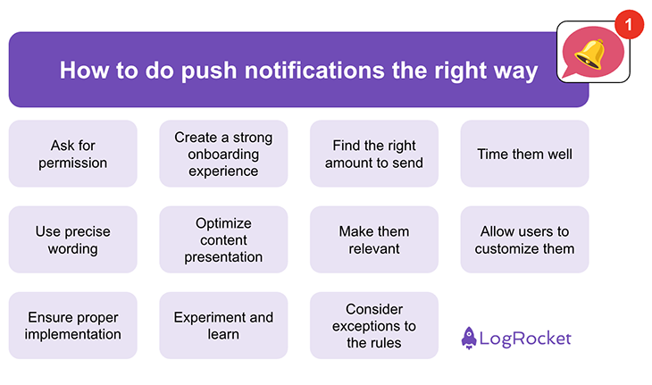
On iOS and Android, you need the user’s permission at the operating system level before you can reach the user with notifications.
First, think about the right timing. Instead of asking for permission right after the user installs the app, let them discover the value of your app first. For example, you can show the permission request alert after they open the app two times or after they use a certain key feature.
There are exceptions to this, however. BeReal needs to ask users right away because the whole experience is based on receiving one single daily notification that prompts you to take a picture right then and there.
Exceptions aside, we should ask for permission carefully. And before the official permission request, you can use one additional alert to explain the value of the notifications. This way, you inform the user about the benefits of allowing notifications or why your app doesn’t work without them (if that’s the case). When you do that before the official permission alert, the acceptance rate will be much higher.
You also need a good onboarding strategy. Many companies send out email notifications or newsletters as soon as users sign up and install the app. However, some users might not be aware that they permitted the app to send notifications while signing up.
Regarding notifications, it’s best to showcase the usefulness of notifications right inside your app. For example, you can implement “tooltips” — little signs that hint at a feature. For example, in an app that has live streams, you could hint at a feature that lets the user receive a notification as soon as a specific future live stream starts. This way, you get their permission right at that moment when they can physically see the benefit of a notification.
As we have seen from the examples of Groupon and Pinterest, the amount (or frequency) of notifications can make the difference between being useful and annoying.
Take your time to find out about a suitable amount of notifications to send to your product’s users. Of course, the right amount depends heavily on the purpose of your product. There’s basically no limit if you have an app where users can follow a live event, but the limit might be very low if you’re trying to get users to purchase something.
Don’t think of notifications as a way to sell something but as a service to your users. Ask yourself: will this information be useful and helpful?
Apart from the amount and frequency, you should also think about the optimal timing for each notification. How does a notification fit into their workflow? How does it fit into their daily life? Some products might be relevant in the morning, so you could send out a notification while people are on their commute.
If it makes sense for your product, you can also have settings that allow the user to choose times for certain notifications themselves. I have seen that some mindfulness and habit-tracking apps do this. Customizing requires effort from the user, but if they do it, your product can provide more value to them and feel more like their own thing.
In addition, you need to keep in mind that your users might be in different time zones, so make sure the push service you’re using has a localization option.
This one is short and simple: be precise. You only have a very limited amount of words in each notification.
You can also make use of so-called “rich” notifications. Add a picture, a title, and body text. This way, the notification itself might contain so much information that it provides value even when the user does not tap on it to open your app.
And a little side note: don’t use notifications for ads (at least, this is forbidden by Apple).
To keep the notifications relevant, personalize them and do not send the same content to everyone. People might have differing needs, goals, and preferences.
You can also personalize the timing and content of notifications based on the user journey — for example, for new users or those who have an item sitting in their shopping cart.
If it is suitable and helpful, you can also use the location of the user. For example, as a travel app, you could then provide relevant information when they arrive at a new destination and guide them to features they might need.
Using location to make notifications relevant was something that Groupon did do successfully. They send push notifications that let you know how close certain deals are to you. Keep in mind that you need to ask for permission from the user if your app wants to access the location.
If it makes sense in the context of your app, you can offer some customizations. Let users choose their preferences and respect those. I once deleted an app because it sent me push notifications on topics I had explicitly not selected in the settings.
One app I was working on in my career was a news app. Here, we had different categories of push notifications and one of them was for people who want to know about news immediately. Other categories allowed users to get summarized news every morning or every evening. Of course, there was also a breaking news category for those very important, but rare, pieces of news. Our users could customize the settings according to their needs and interests.
Your engineers will have to decide how to do this, but it probably makes sense to use a third-party service so you don’t have to worry about scaling and reliability. Make sure the provider can fulfill your specific needs, e.g., extremely fast push notifications if they’re time-sensitive.
Some push providers offer features to test and do experiments with your push notifications. This can help you understand what resonates with your users, provides them value, and drives engagement. A/B testing push notifications is a helpful way to optimize the content and timing for different audiences.
While working on mobile apps in the past years, I have found the above “rules” make sense, but also came across a few exceptions.
One app I was working on sent out a notification every day at 19:09, containing no other information other than the time. That would be completely random and annoying for every other app out there, except for this one. The reason? It was the fan app of a soccer club that was founded in the year 1909 — so for those users, this was always a time to think of their favorite soccer club.
While this example is really quite special, there are many other cases where you don’t go with the standard approach because of very specific user needs in a specific field.
As a positive example, let’s look at the language-learning app Duolingo. They focus on positive reinforcement, personalization, and human interests, such as competing with friends and being consistent. That way, their notifications are not annoying but engaging.
These are some of Duolingo’s notification types:
Like this, Duolingo helps its users get the most out of their language learning experience. Their notifications provide additional value. The right amount, timing, content, and relevance are what make the difference.
In the end, it’s always about value for the user. As people install more and more apps on their phones, many may struggle to focus and concentrate. This makes push notifications a fine line to walk, as many people are conscious and sensitive to interruptions.
If you want to use push notifications and increase engagement without damaging the channel, ask yourself for every push notification that you want to send out: is this user (segment) going to benefit from this information at this moment?
Remember, it’s an honor to get permission to send notifications, so do it respectfully and always provide value!
Featured image source: IconScout
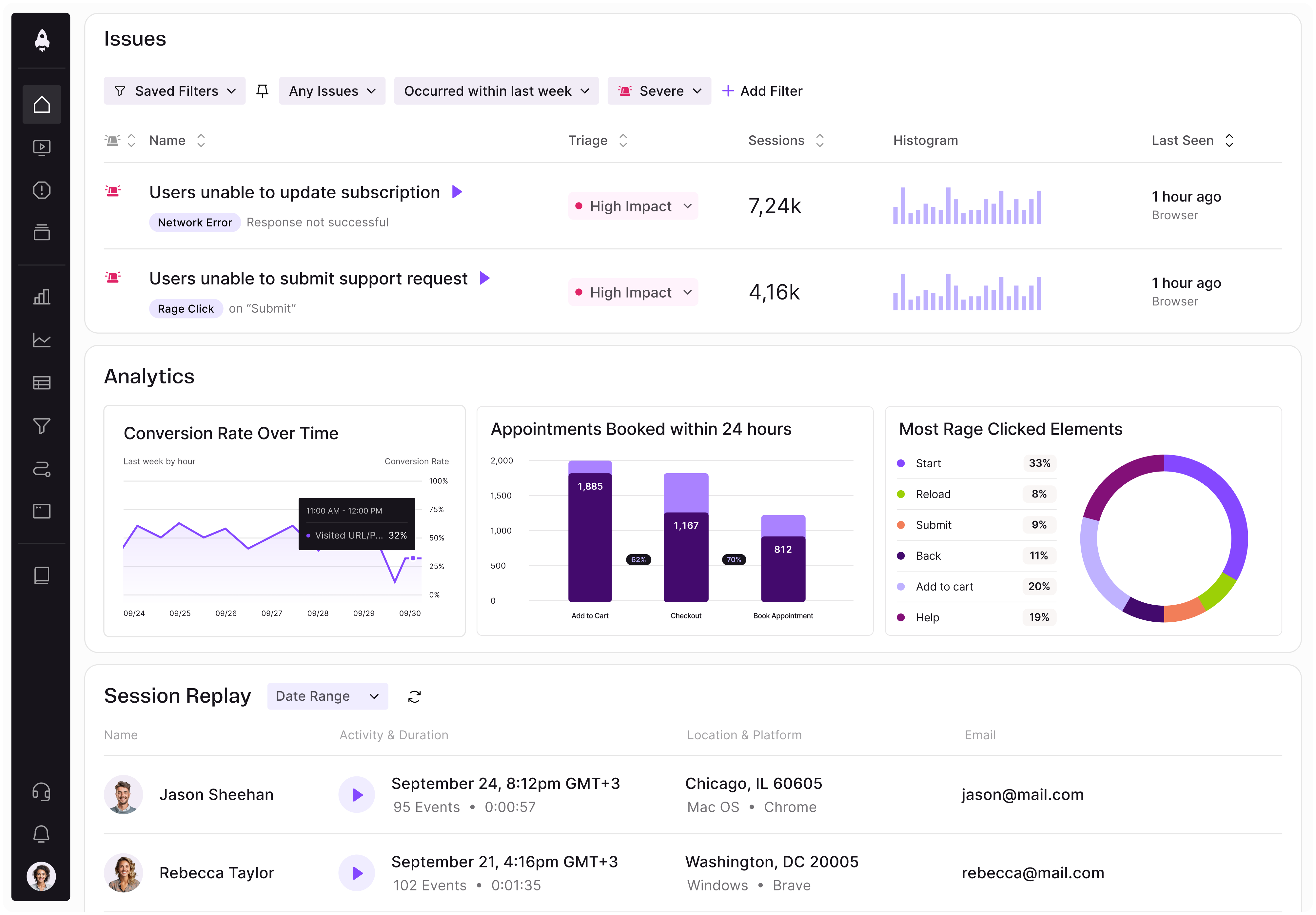
LogRocket identifies friction points in the user experience so you can make informed decisions about product and design changes that must happen to hit your goals.
With LogRocket, you can understand the scope of the issues affecting your product and prioritize the changes that need to be made. LogRocket simplifies workflows by allowing Engineering, Product, UX, and Design teams to work from the same data as you, eliminating any confusion about what needs to be done.
Get your teams on the same page — try LogRocket today.

AI can make PM thinking generic. Learn how to use it without losing judgment, user nuance, or product differentiation.

Learn a 3-lens framework that helps product managers shift stakeholder requests from feature ideas to real problems and outcomes.
CPO and PhD Jen Wang covers “The Zone of Absorption” and why product teams are struggling to build when AI is shifting faster than anyone can keep up.
Explore four product team structures, when each works best, and how to choose the right model for speed, ownership, and clarity.