“Can you please draft a PERT chart for next week?”

It happens to the best of us: spend enough time working on a project with a new team, and you’re likely to encounter an unknown term. The tech sector (in truth, any sector) often relies on obscure acronyms to refer to approaches, tools, and methods. That said, PERT charts exist to make your life easier.
In this guide, we’ll define what a PERT chart is, review the technique’s surprising history, and list key benefits of using this approach for product management. We’ll also walk you through a how-to guide and highlight some tools and templates to help you get the most out of your PERT charts.
A PERT chart is a project management tool designed to help teams visualize tasks and coordinate the timeline of events that must occur during the scope of a project’s lifetime.
PERT stands for Project Evaluation and Review Technique. PERT charts are similar to GANTT charts, but there are key distinctions — namely, that GANTT charts provide an overview of a project’s time dependencies while PERT charts represent task dependencies.
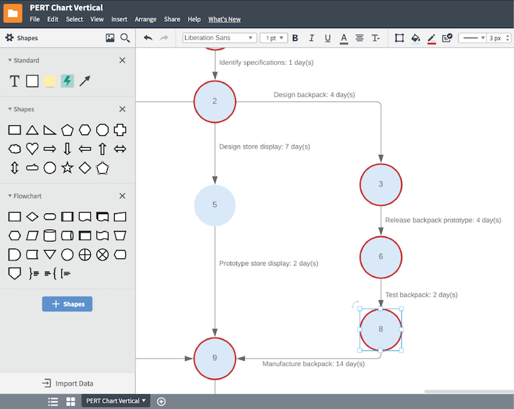
Below is an example of a PERT chart:
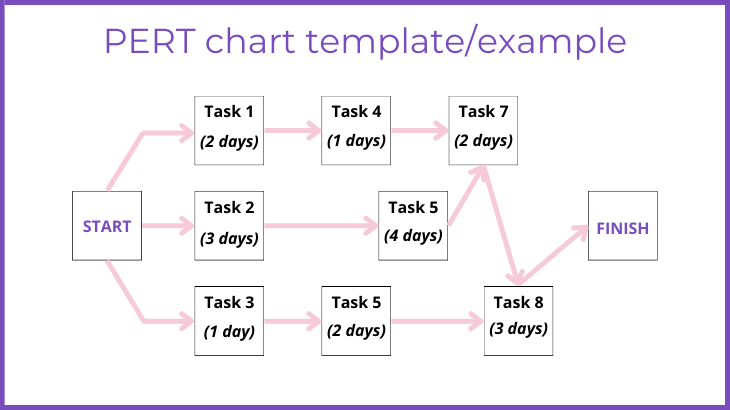
In the simplest terms, the purpose of a PERT chart is to help project managers more accurately estimate the amount of time it will take to finish a project.
Using a PERT chart for enables managers and their teams to break down tasks within a project, which makes it easier to schedule tasks and map them to individuals scoped to do the work.
Next time you struggle while building your PERT chart, remember that this framework was first developed in the 1950s to manage one of the most delicate projects in military history: Polaris. This codename designated the US-led effort to build a nuclear missile that could be launched from a submarine.
Polaris was part of the Cold War strategy of having a functional deterrent, so it made sense to focus on submarines. Underwater vessels would be too hard to detect and disable by a preventive attack from any nuclear foe.
Polaris gives the Program Evaluation Review Technique (PERT) chart quite an epic origin story. Imagine the complexities involved in such a project. Leaving aside the engineering challenge of designing a missile with the right weight and power, the US Navy also had to contend with the dangers of placing such a weapon within the tight and vulnerable space of a submarine.
Few of us will ever face even a fraction of this challenge in our day-to-day jobs.
In 1957, the Polaris team, led by Special Projects Office Director Willard Fazar, had sought to complete the task in record time. However, existing GANTT charts had shortcomings. They did not reflect how, exactly, stated plans were connected to overall goals, how achievement would be measured against these goals, and how likely it was that goals would be met through the plans.
The top priority for these military engineers? Saving time. If you know how exactly, how strongly and how likely the different components of your project are aligned, you can see immediately where bottlenecks and opportunities lie to advance faster and further. This is exactly how PERT worked in practice, allowing the first shot of Polaris to take place in 1960, barely three years after research had commenced.
What are the key differences between the PERT and GANTT approaches? To paint a clearer picture of how each is used for product management today, let’s review here the key features of GANTT vs. PERT charts.
Visually, you’re probably more familiar with GANTT charts. A GANTT chart lists project milestones on the left, which result in various rows that can be assigned precise timelines.
These timelines are graphically represented as “blocks” on the chart itself, whose length represents the time expected to completion (or the actual time it took once completed). Tasks are listed in the order in which they are meant to be completed. Typically, additional details, such as task owners and necessary tools, are expressed through color codes and other visual aids.
PERT charts are more purely visual than GANTT charts. Drafting begins with an initial bubble or node, which represents the starting point for your project. Then, arrows originating there result in supplementary nodes that can have multiple dependencies to ensuing project milestones. If bubbles are aligned, this means they should be completed in parallel as they unlock further milestones.
Timelines are not represented alongside the chart, but are directly listed next to the different nodes. Additional information after completion might include expected versus actual time, which can be added up to assess the overall project.
GANTT charts are commonly used in organizations across all industries. There are more and better resources out there that ease the learning curve for everybody. For example, there are plenty of templates you can find online that display a GANTT chart’s key features in either Excel or Google Sheets.
In terms of workflow, GANTT is decidedly a team contribution. Even the most self-reliant managers must align with others to draft the chart. This also involves a distribution of responsibilities and a continuous channel of communication to keep track.
Because PERT charts are less commonly used, it can be somewhat more difficult to find an appropriate template (don’t worry; we listed some below). Awareness of the PERT methodology is less widespread across teams, which means you might have to hold one or more extra sessions to familiarize your people with it.
In terms of workflow, the actual drafting of the PERT chart can be conducted individually. The philosophy behind PERT suggests that research be conducted beforehand, considering dependencies ahead of time, to trace development between milestones.
GANTT charts require the following information:
PERT charts require:
Users can adapt both GANTT and PERT charts to include additional points, but those listed above summarize the essentials.
GANTT charts can be drafted at any point in the project but are typically used once development has actually begun. As noted above, GANTT charts are meant to be updated by members of the team as steps are fulfilled to help with time and task management.
PERT charts, on the other hand, are normally built before the project starts. Organizations can use PERT charts to identify all possible complications and essential steps involving a project, regardless of specific time or staff assignments.
GANTT charts are versatile by design. This is partly aided by their simplicity: any human effort can be expressed chronologically. At the same time, they are not always suitable for more complex projects.
Think about high-tech projects, such as the nuclear submarine example above. What if the engineers tried different materials in parallel? A breakthrough in one team could completely revolutionize the project, closing one dependency (the now useless material) but opening others. This type of breakthrough is not easy to represent on a GANTT chart, which would simply change without acknowledging the breakthrough.
This is why the PERT chart’s inferior versatility might not be such a big drawback after all. Because they are developed before a project is launched, often for budgetary meetings and other preparatory processes, you might be tempted to suspect PERT analysis is dead after launch. However, this is far from the truth.
The careful consideration of dependencies, causal chains, and critical pathways can actually make PERT charts more evergreen than GANTT charts. Team members can often lose sight of the bigger picture when employing smaller-scale, siloed GANTT charts. A PERT chart operates as a polestar and serves as a useful assessment tool once the project is finished.
How do you choose which type of chart to use? It depends on what’s more important to track: time dependencies or task dependences.
GANTT charts are meant to offer a quick overview of a project and its time dependencies. It shows you at a glance how long past, present, and future steps will take. The methodology or data you employed to arrive at your estimates is hidden from view in favor of chronological information and its connection to tasks and team members.
PERT charts, while still reflecting time constraints, are more focused on task dependencies. The position of nodes and the arrows between them emphasize how each milestone contributes to completion.
A PERT chart is almost a reversal of GANTT: you are being transparent about your estimates, showing your target audience why and how you‘ve chosen to display steps in a particular order. In project management language, this entails revealing a clear critical path for your project’s completion.
The qualities listed below make PERT charts an excellent choice for project and product managers seeking to highlight task dependencies at a more granular level.
PERT charts demand that every milestone is considered from the perspective of linkages to other crucial steps.
When drafting a PERT chart, you’re forced to gather and analyze research to the highest possible degree of detail. This means your project, at least in its planning stages, starts with very strong foundations.
Unlike other time/task-based methods, PERT focuses extensively on causes and consequences.
You can see at a glance how, if certain milestones are unlocked quicker or take longer to complete, the whole process is affected. This means you can test various scenarios and prevent them before they emerge.
Even the most well-prepared report or presentation can fall prey to imprecision and overextension.
PERT charts are precise by definition, limiting their information to essential steps and their relationship. In both drafting and displaying them, the PERT framework helps viewers focus on what really matters to complete the project.
Unlike GANTT and other approaches, which are usually tailored to the operations of a small team or subteam to be operational, PERT charts can cover a lot of ground.
The arrows linking milestones together are the perfect antidote to siloed mentality because teams responsible for milestones are aware of who is dependent on them to achieve shared success.
As handy as they can be for certain types of products, PERT charts aren’t for every team or project. Below are some characteristics that, depending on your goals, capabilities, and product requirements, might make the PERT approach an imperfect fit for your project.
Functional PERT chart data requirements are steep. You must do a lot of research before you can portray accurate dependencies on the chart.
Similarly, if you seek to include the time requirements that are reflected on other types of charts, you’ll also have to gather information from a range of teams and managers.
With GANTT and other approaches, you only need a broad outline of milestones and the time it might take to complete them. These can even be altered later.
PERT charts require substantial and accurate data at the very beginning, knowing that the diagram will remain more or less unaltered in the foreseeable future. This can be quite paralyzing.
While PERT charts can certainly be cohesive, this comes at a price. You must already have a good working relationship with all relevant teams and professionals. If not, you’ll have to spend some precious time gaining this trust, which might defeat the purpose.
By design, people who create PERT charts build nodes and connections by considering how steps are vital preconditions to fulfill other milestones. However, agile projects evolve dynamically, which means teams might be closed to new opportunities if they are excessively beholden to a PERT chart.
There are 10 steps involved in building a PERT chart. Let’s go over the process step by step:
To help you get started on your PERT journey, let’s review some resources designed to help you execute the PERT methodology effectively with templates and other dynamic features.
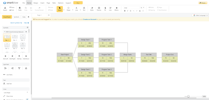
Smartdraw offers a basic template that you can edited online. The tool includes all the elements described above. Best of all, you can examine how it works and even do basic editing without having to register.
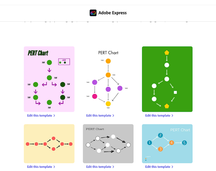
Adobe offers PERT chart templates, but they’re fairly bare-bones and require editing if you want to include more advanced elements.
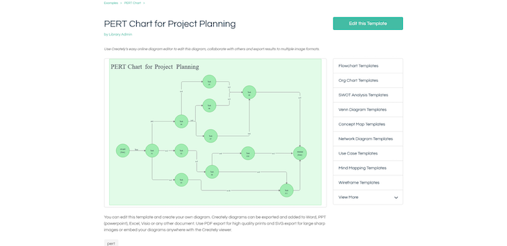
Creately offers a simpler version of a PERT chart. The main draw here is that this PERT chart template is accessible for free.
Lucidchart also has a PERT chart template. Lucidchart is rich in features, so it’s no surprise that you need to register to use it.
Featured image source: IconScout

LogRocket identifies friction points in the user experience so you can make informed decisions about product and design changes that must happen to hit your goals.
With LogRocket, you can understand the scope of the issues affecting your product and prioritize the changes that need to be made. LogRocket simplifies workflows by allowing Engineering, Product, UX, and Design teams to work from the same data as you, eliminating any confusion about what needs to be done.
Get your teams on the same page — try LogRocket today.

Guard your focus, not just your time. Learn tactics to protect attention, cut noise, and do deep work that actually moves the roadmap.

Rumana Hafesjee talks about the evolving role of the product executive in today’s “great hesitation,” explores reinventing yourself as a leader, the benefits of fractional leadership, and more.

Trey Courtney talks about his process for evaluating partnerships or acquisitions and how he successfully implements these initiatives.

Asma Syeda shares the importance of responsible AI and best practices for companies to ensure their AI technology remains ethical.


