Editor’s note: This guide to dark mode in React was last updated on 29 March 2023 to reflect changes to React and provide more information about dark mode and a new section on testing for dark mode. Check out our new UX blog to learn more about bettering your UX.

As we move towards a better and more accessible UX on the web, dark mode has become a mainstream feature for web apps. Developing dark mode is more than just adding a simple toggle button and managing the CSS variable. Here we will discuss dark mode and create a complete dark mode experience in a React app. You can find the demo application and its code on GitHub.
Jump ahead:
The Replay is a weekly newsletter for dev and engineering leaders.
Delivered once a week, it's your curated guide to the most important conversations around frontend dev, emerging AI tools, and the state of modern software.
Dark mode is a UI feature that changes the color scheme of an application or website to use darker colors, typically replacing white or bright backgrounds with black or dark gray backgrounds. This creates a high-contrast visual effect that makes reading text and viewing content easier in low-light or dark environments, reducing eye strain and improving overall readability.
Dark mode has gained popularity for its functional benefits, including enhanced accessibility for users with visual impairments, improved focus and productivity in professional settings, and its sleek and modern aesthetic appeal.
Dark mode has gained popularity not only for its aesthetic appeal but also for its potential benefits in terms of accessibility. Some key considerations for accessibility in dark mode include:
Dark mode offers several advantages that can enhance the UX. First, dark mode can reduce the strain on your eyes, particularly when using screens for extended periods by reducing the amount of blue light emitted and creating a softer, more comfortable visual experience.
Dark mode can also help conserve battery life on devices with OLED or AMOLED screens, as these screens use less power to display darker pixels compared to brighter ones. In addition, dark mode can help improve focus and productivity. Dark mode can create a focused environment by minimizing distractions and reducing visual clutter, enhancing productivity, particularly in low-light or nighttime settings.
Dark mode has become popular for its sleek and modern appearance, and many users find it visually appealing and enjoyable to use. Lastly, dark mode often comes with customization options, allowing users to choose from different color schemes, contrast levels, and font sizes, making it a versatile option tailored to individual preferences.
No one wants to hurt a user’s eyes when they land on their website! It’s best practice to set the app’s theme according to the device’s settings. CSS media queries, generally known for usage with responsive design, also help us check for other device characteristics.
Here, we will use the prefers-color-scheme that gives us dark, light, or no-preference based on the device’s selected color scheme. And, like any other media query, styles in this block will be applied when the device’s color scheme is set to dark. Placing it in some component styles will look like this:
body {
  background-color: #dadada;
  color: #1f2023;
}
@media (prefers-color-scheme: dark) {
  body {
    background-color: #1f2023;
    color: #dadada;
  }
}
This is a good start, but one cannot keep adding these styles in each component. In this case, CSS variables are the answer.
CSS variables are one tool that was missing from web styling for a long, long time. Now that they are available with all browsers, CSS is more fun and less of a pain. CSS variables are scoped to the element(s) on which they are declared and participate in the cascade (for example, elements are override values for children). We can use CSS variables to define themes of our application. Here’s a small snippet to recall how CSS variables are declared:
body {
  --color-background: #fafafa;
  --color-foreground: #1f2023;
}
To use these variables in our components, we will swap color codes with variables:
.App-header {
  background-color: var(--color-background);
  color: var(--color-foreground);
}
Now that our colors are defined via CSS variable, we can change values on top of our HTML tree (<body>), and the reflection can be seen on all elements:
body {
  --color-background: #fafafa;
  --color-foreground: #1f2023;
}
@media (prefers-color-scheme: dark) {
  body {
  --color-background: #1f2023;
  --color-foreground: #efefef;
  }
}
At this point, we have the simplest solution based on device preferences. Now, we have to scale it for devices that do not natively support dark mode. In this case, we have to make it easy for users to set their preferences for our web app. I opted for react-toggle to make our solution better at a11y, along with pleasing aesthetics. This can be achieved via a simple button and useState. Here’s what our toggle will look like:
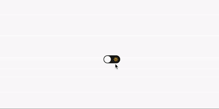
Here is how our toggle component looks:
import React, { useState } from "react";
import Toggle from "react-toggle";

export const DarkModeToggle = () => {
  const [isDark, setIsDark] = useState(true);

  return (
    <Toggle
      checked={isDark}
      onChange={({ target }) => setIsDark(target.checked)}
      icons={{ checked: "🌙", unchecked: "🔆" }}
      aria-label="Dark mode toggle"
    />
  );
};
This component will hold the user’s selected mode, but what about the default value? Our CSS solution respected the device’s preference. To pull media query results in our React component, we will use react-responsive. Under the hood, it uses Window.matchMedia and re-renders our component when the query’s output changes.
An updated version of the button looks like the following:
import React, { useState } from "react";
import Toggle from "react-toggle";
import { useMediaQuery } from "react-responsive";

export const DarkModeToggle = () => {
  const [isDark, setIsDark] = useState(true);

  const systemPrefersDark = useMediaQuery(
    {
      query: "(prefers-color-scheme: dark)",
    },
    undefined,
    (isSystemDark) => setIsDark(isSystemDark)
  );

  return (
    <Toggle
      checked={isDark}
      onChange={({ target }) => setIsDark(target.checked)}
      icons={{ checked: "🌙", unchecked: "🔆" }}
      aria-label="Dark mode toggle"
    />
  );
};
The useMediaQuery Hook takes a query, initial value, and an onChange handler that is fired whenever the query’s output is changed.
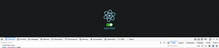
Now, our component will be in sync with the device’s preferences, and its value will be updated accordingly. But, how can we test if it’s done right? Thanks to developer-friendly browsers, we can emulate device preferences from browser inspectors; here is how it looks in Firefox:
It’s time to connect our toggle component’s state change to CSS. This can be done with several different techniques. Here, we have opted for the simplest one: adding a class on the body tag and letting CSS variables do the rest. To accommodate this, we will update the CSS of our body tag:
body {
  --color-background: #fafafa;
  --color-foreground: #1f2023;
}
body.dark {
  --color-background: #1f2023;
  --color-foreground: #efefef;
}
We will also update our DarkModeToggle component with this useEffect Hook to add and remove classes to the body tag based on the isDark state:
...
useEffect(() => {
  if (isDark) {
    document.body.classList.add('dark');
  } else {
    document.body.classList.remove('dark');
  }
}, [isDark]);
...
If we keep the user’s preferred color scheme in the component’s state, it might become problematic because we won’t be able to get the values outside of this component. Also, it will vanish as soon as our app is mounted again. Both problems can be solved in different ways, including with React Context or any other state management approach.
One other solution is to use the use-persisted-state. This will help us fulfill all requirements. It persists the state with localStorage and keeps the state in sync when the app is open in different browser tabs. We can now move our dark mode state in a custom Hook that encapsulates all logic related to media query and persistent state. Here is how this Hook should look:
import { useEffect, useMemo } from "react";
import { useMediaQuery } from "react-responsive";
import createPersistedState from "use-persisted-state";
const useColorSchemeState = createPersistedState("colorScheme");

export function useColorScheme() {
  const systemPrefersDark = useMediaQuery(
    {
      query: "(prefers-color-scheme: dark)",
    },
    undefined
  );

  const [isDark, setIsDark] = useColorSchemeState();
  const value = useMemo(
    () => (isDark === undefined ? !!systemPrefersDark : isDark),
    [isDark, systemPrefersDark]
  );

  useEffect(() => {
    if (value) {
      document.body.classList.add("dark");
    } else {
      document.body.classList.remove("dark");
    }
  }, [value]);

  return {
    isDark: value,
    setIsDark,
  };
}
The toggle button component will be much simpler now:
import React from "react";
import Toggle from "react-toggle";
import { useColorScheme } from "./useColorScheme";

export const DarkModeToggle = () => {
  const { isDark, setIsDark } = useColorScheme();
  return (
    <Toggle
      checked={isDark}
      onChange={({ target }) => setIsDark(target.checked)}
      icons={{ checked: "🌙", unchecked: "🔆" }}
      aria-label="Dark mode toggle"
    />
  );
};
While dark mode itself can be considered an accessibility feature, we should focus on keeping this feature accessible for a wider audience. We used react-toggle in our demo to ensure the button used for changing the color scheme follows all a11y standards. Another important part is the selection of background and foreground colors in both dark and light modes. In my opinion, colors.review is a great tool to test the contrast ratio between colors. Having an AAA grade makes our apps easier to navigate and more comfortable to look at. Here’s our app:
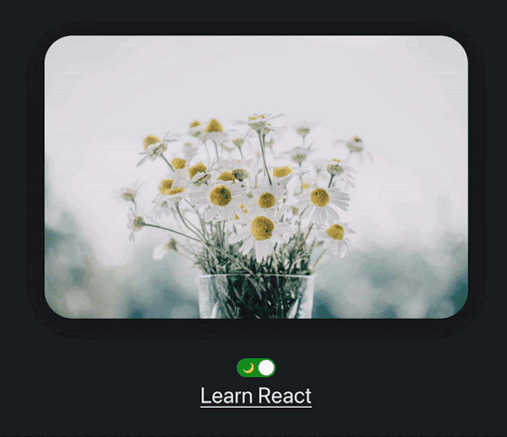
For better aesthetics, we usually have pages with bright images. In dark mode, bright images might become a discomfort for users. Several techniques can avoid these issues, including using different images for both modes and changing colors in SVG images. One way is to use CSS filters on all image elements; this will help lower eye strain when bright images appear on the user’s canvas. To enable this, we can add the following to our global styles:
body {
  --color-background: #fafafa;
  --color-foreground: #1f2023;

  --image-grayscale: 0;
  --image-opacity: 100%;
}
body.dark {
  --color-background: #1f2023;
  --color-foreground: #efefef;

  --image-grayscale: 50%;
  --image-opacity: 90%;
}

img,
video {
  filter: grayscale(var(--image-grayscale)) opacity(var(--image-opacity));
}
Testing is an essential practice in software development to ensure the quality and reliability of applications. When implementing dark mode in a React app, you may wonder whether writing tests specifically for the dark mode feature is necessary. Here are some points to consider:
If the dark mode feature in your React app is relatively simple, such as just changing the background color and text color, and doesn’t involve complex logic or interactions, you could argue that writing tests specifically for dark mode are not necessary. In such cases, you can rely on your regular testing practices, such as unit testing and end-to-end testing, to cover the dark mode behavior as part of the overall application testing.
Consider the significance of the dark mode feature in your React app. Suppose dark mode is a critical part of the UX, and its correct functioning is crucial for the overall usability and accessibility of the app. In that case, writing tests specifically for dark mode is advisable. Dark mode has become increasingly popular as a user preference, especially for applications used in low-light conditions, and ensuring its proper functioning can greatly enhance the UX.
Dark mode can affect accessibility because it affects color contrast ratios, font sizes, and other visual elements. Suppose your app needs to meet accessibility standards, such as the Web Content Accessibility Guidelines (WCAG). In that case, it’s important to include testing for dark mode to ensure that it meets the required accessibility criteria. Writing tests for dark mode can help you catch any accessibility issues early in the development process and ensure that your app remains accessible to all users.
Consider the testing practices followed by your development team. If your team has a culture of writing thorough tests for all features and components, including dark mode, then it’s likely beneficial to write tests specifically for dark mode as well. Consistent testing practices across the team can help ensure higher quality and reliability in the application.
If you decide to write tests for your dark mode, consider some of these scenarios to ensure the correct functioning of your dark mode feature in your app:
By following these steps, you can create a comprehensive test suite for your dark mode implementation, helping catch issues early and ensuring correct functioning and accessibility.
In conclusion, dark mode is a UI feature that offers potential benefits in terms of accessibility, reduced eye strain, extended battery life, improved focus and productivity, and customization options. Considering these advantages, dark mode can be a worthwhile option to enhance the UX in various applications and websites.
Accessibility in web apps today is not just a utility; it’s a basic requirement. Dark mode should be considered a full feature that requires attention, just like any other critical feature. In this article, we have established a way to implement dark mode to its full extent. Please let us know in the comments if you feel anything has been missed. Happy coding!
Install LogRocket via npm or script tag. LogRocket.init() must be called client-side, not
server-side
$ npm i --save logrocket

// Code:

import LogRocket from 'logrocket';
LogRocket.init('app/id');
// Add to your HTML:

<script src="https://cdn.lr-ingest.com/LogRocket.min.js"></script>
<script>window.LogRocket && window.LogRocket.init('app/id');</script>

Learn how to build advanced Next.js forms with rule engines, client-side previews, Server Actions, and server-validated form logic.

AI is reshaping engineering teams emotionally as well as technically. A CTO shares insights on fear, trust, burnout, identity, and leading through AI change.

Learn what context rot is, why AI agent sessions degrade over time, and how to fix it with compaction, prompt anchoring, context files, plan files, and RAG.

Learn about TypeScript v6’s breaking changes, new ES2025 features, and deprecated options. A complete migration guide from v5 to prepare for v7.
Would you be interested in joining LogRocket's developer community?
Join LogRocket’s Content Advisory Board. You’ll help inform the type of content we create and get access to exclusive meetups, social accreditation, and swag.
Sign up now

 Learn more →
