According to StatCounter data, today’s device market is dominated by mobile, desktop, and tablets. In order to provide the best UX for users, responsive design is a must-have in modern web development.

In this article, we will check out the Fresnel package, which is one of the most efficient ways to implement responsive design for server-side rendering (SSR). It is an open-source npm project created by Artsy that is easy to use and trusted by developers.
We will explore what it does differently from the traditional approaches and why you should use it. We will also create a responsive color cards app in React to demonstrate its features in practice.
Media queries allow developers to define different styling rules for different viewport sizes.
Normally, we would use the traditional approach where we first create the HTML element and then use CSS to describe how it will behave on different screen widths via media queries.
A simple example would be:
<div class="wrapper"></div>
Then via CSS:
.wrapper {
  width: 300px;
  height: 300px;
  background: gold;
}

@media screen and (min-width: 480px) {
  .wrapper {
    background-color: light green;
  }
}
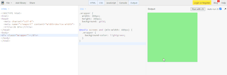
If we run an example on JSBin, we see that the square element changes its background color when the 480px width of the viewport is met:
Fresnel transfers the traditional media query approach to the React ecosystem.
Its breakpoint logic is beneficial when an app needs to be scaled and the complexity of components grows.
A basic implementation would look like this:
import React from "react"
import ReactDOM from "react-dom"
import { createMedia } from "@artsy/fresnel"

const { MediaContextProvider, Media } = createMedia({
  breakpoints: {
    sm: 0,
    md: 768,
    lg: 1024,
    xl: 1192,
  },
})

const App = () => (
  <MediaContextProvider>
    <Media at="sm">
      <MobileComponent />
    </Media>
    <Media at="md">
      <TabletComponent />
    </Media>
    <Media greaterThanOrEqual="lg">
      <DesktopComponent />
    </Media>
  </MediaContextProvider>
)

ReactDOM.render(<App />, document.getElementById("react"));
Thanks to its API, we can use MediaContextProvider and Media components to build a solid foundation for a responsive web application.
The behavior on certain screen widths is controlled by providing the defined breakpoints as props. Those include at, lessThan, greaterThan, greaterThanOrEqual, and between and are self-explanatory by their names.
If you have implemented responsive layouts in React before, the code structure of the example above might look familiar. Chances are you have used conditional rendering, like this:
const App = () => {
  const { width } = useViewport();
  const breakpoint = 768;

  return width < breakpoint ? <MobileComponent /> : <DesktopComponent />;
}
The above example would work fine unless you need to implement a server-side rendering solution. That’s where Fresnel comes in and distinguishes itself from other solutions.
To explain the concept, server-side rendering (SSR) is a technique to render client-side single-page applications (SPA) on the server. This way, the client receives a rendered HTML file.
With Fresnel, we can render all the breakpoints on the server so that we can properly render HTML/CSS before React has booted. This improves the UX for users.
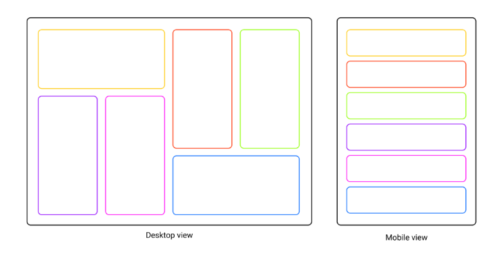
We will create a color card application that switches its layout for the mobile and desktop views.
The cards on the mobile view will be positioned in the single-column layout, while the desktop view will use a more complex grid-style layout alternating between horizontal and vertical cards.
Here’s the wireframe of the project displaying the sequence of cards:
We will start by creating a separate folder for our project and changing the working direction into it. To do that, run the following command in the terminal: mkdir fresnel-demo && cd fresnel-demo.
To initialize a new project, run npm init -y.
Notice that the -y tag will approve all the default values for the package configuration, so you do not have to go through a multi-step wizard in the terminal.
Next, we will install the fundamental prerequisites for the frontend. Run npm i react react-dom.
For the backend, we’ll use Express. To install it, run npm i express.
While we are at the root, let’s install the Fresnel library by running npm i @artsy/fresnel.
Because we are building the color app, the main data we will need are color names.
It’s good practice to separate the data from the app logic. For this reason, we will start by creating the src folder with a folder called data inside of it.
In the data folder, create a new file called colors.jsx and include the following code:
export const colors = [
  "gold",
  "tomato",
  "limegreen",
  "slateblue",
  "deeppink",
  "dodgerblue",
];
We created the colors variable with all the color names stored as an array of strings.
Now we must define the breakpoints our app will use.
Inside the src folder, create another folder called media. Inside it, create a file named breakpoints.jsx and include the following code:
import { createMedia } from "@artsy/fresnel";

const ExampleAppMedia = createMedia({
  breakpoints: {
    sm: 0,
    md: 768,
    lg: 1024,
    xl: 1192,
  },
});

export const mediaStyle = ExampleAppMedia.createMediaStyle();
export const { Media, MediaContextProvider } = ExampleAppMedia;
We used createMedia to define specific breakpoints and exported mediaStyle, which we will later inject into the server-side. We also wrapped Media and MediaContexProvider around the components that need to be responsive.
Inside the same src folder, create another folder called components.
Inside, create four separate files: DesktopComponent.jsx, DesktopComponent.css, MobileComponent.jsx, and MobileComponent.css.
Open the DesktopComponent.jsx file and include the following code:
import React from "react";
import "./DesktopComponent.css";
import { colors } from "../data/colors";

export const DesktopComponent = () => {
  return (
    <div className="dWrapper">
      {colors.map((el, i) => (
        <div
          style={{ backgroundColor: el, gridArea: `c${i + 1}` }}
          key={i}
        ></div>
      ))}
    </div>
  );
};
We imported the external style sheet and the color names. In the component, we looped through all the colors and assigned the background color as well as position in the grid.
Now, open DesktopComponent.css and add the following style rules:
.dWrapper {
  max-width: 1200px;
  height: 500px;
  margin: 0 auto;
  display: grid;
  grid-template-columns: repeat(4, 1fr);
  grid-template-rows: repeat(3, 1fr);
  gap: 20px;
  grid-template-areas:
    "c1 c1 c2 c3"
    "c4 c5 c2 c3"
    "c4 c5 c6 c6";
}
We set the max width and height for the wrapper and centered it in the viewport. Then, we used grid templates to define the columns and rows and created the layout schema.
Next, open the MobileComponent.jsx file and include the following code:
import React from "react";
import "./MobileComponent.css";
import { colors } from "../data/colors";

export const MobileComponent = () => {
  return (
    <div className="mWrapper">
      {colors.map((el, i) => (
        <div style={{ backgroundColor: el }} key={i}></div>
      ))}
    </div>
  );
};
Here, we imported external styles and color names. Then we looped through the colors and assigned background colors for each element.
Finally, open MobileComponent.css and add the following style rules:
.mWrapper {
  width: 100%;
  display: grid;
  grid-template-rows: repeat(6, 100px);
  gap: 20px;
}
We set the width to fill the whole viewport, used a grid system for the rows, and added gaps between them.
Let’s create an actual App component that will render the components we created earlier. Inside the src folder, create App.jsx and include the following code:
import React from "react";
import { Media, MediaContextProvider } from "./media/breakpoints";
import { MobileComponent } from "./components/MobileComponent";
import { DesktopComponent } from "./components/DesktopComponent";

export const App = () => {
  return (
    <MediaContextProvider>
      <Media at="sm">
        <MobileComponent />
      </Media>
      <Media greaterThan="sm">
        <DesktopComponent />
      </Media>
    </MediaContextProvider>
  );
};
Notice we imported Media and MediaContextProvider from the breakpoints.jsx file and used them to control which components should be displayed on which viewports.
To render the App to the screen, we will need a base file that will access the root element of the DOM tree and render it. Create a new file called index.jsx in the src folder and include the following code:
import React from "react";
import ReactDOM from "react-dom";
import { App } from "./App";

ReactDOM.hydrate(<App />, document.getElementById("root"));
Notice that we used hydrate instead of render. This is the recommended way for server-side rendering, as it turns server-rendered HTML into a dynamic web page by attaching event handlers.
Now let’s switch our focus from the frontend to the backend. Navigate back to the root of the project and create a new folder called server.
Inside server, create a single file, index.jsx. A single file will be enough to provide the functionality for server-side rendering.
Include the following code:
import React from "react";
import ReactDOMServer from "react-dom/server";
import { App } from "../src/App";
import { mediaStyle } from "../src/media/breakpoints";

import express from "express";
const app = express();
const PORT = 3000;

app.get("/", (req, res) => {
  const app = ReactDOMServer.renderToString(<App />);

  const html = `
        <html lang="en">
        <head>
        <title>Fresnel SSR example</title>
        <style type="text/css">${mediaStyle}</style>
        <link rel="stylesheet" href="app.css">
        <script src="app.js" async defer></script>
        </head>
        <body>
            <div id="root">${app}</div>
        </body>
        </html>
    `;
  res.send(html);
});

app.use(express.static("./built"));

app.listen(PORT, () => {
  console.log(`App started on port ${PORT}`);
});
First, we created an instance of Express, which we assigned to port 3000. For all incoming GET requests on the "/" route, we used renderToString() to generate HTML on the server and send the markup as a response.
Notice that we also injected mediaStyle into the head section of the HTML. This is how Fresnel will be able to render the breakpoints on the server.
Before we can run our app, we will need to bundle our files so we can access them during SSR. We will use esbuild, which is a fast bundler.
First, install it by running npm i --dev esbuild.
In the project root, open the file package.json and set the scripts to the following:
"scripts": {
    "client:build": "esbuild src/index.jsx --bundle --outfile=built/app.js",
    "server:build": "esbuild server/index.jsx --bundle --outfile=built/server.js --platform=node",
    "start": "node built/server.js"
  }
We will first have to run the build script for the frontend. Use the command npm run client:build. That will generate a new folder built with app.js and app.css files in it.
Next, we will have to do the same for the server files. Run npm run server:build.
Now, all we have to do to start the app is to run the command npm start. You will receive the message in the terminal from the server.jsx file informing you that the developer server is ready on port 3000.
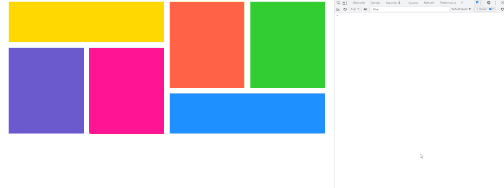
Open your browser and navigate to http://localhost:3000. You should be presented with the responsive app. Open the dev tools by pressing F12 on your keyboard and try to resize the browser view:
Be aware that if you want to make any changes on the frontend or server, you’ll have to rebuild the app and restart the server. Alternatively, you can use --watch flags at the end of the build commands. There are more instructions on that here.
In this article, we explored the Fresnel package and built a fully responsive web application.
We also learned how to set up the React project from scratch without using external tools like CRA, how to set up SSR rendering in React, and how to work with builders like esbuild.
Next time you need to provide the best rendering experience on React apps, you will have a secret method in your toolbox. You will know it’s possible by rendering the media breakpoints on the server via the Fresnel package.
Install LogRocket via npm or script tag. LogRocket.init() must be called client-side, not
server-side
$ npm i --save logrocket

// Code:

import LogRocket from 'logrocket';
LogRocket.init('app/id');
// Add to your HTML:

<script src="https://cdn.lr-ingest.com/LogRocket.min.js"></script>
<script>window.LogRocket && window.LogRocket.init('app/id');</script>

Learn how to use Fallow to analyze AI-generated code, detect dead code, duplicate logic, and complexity issues, and integrate automated code quality checks into your AI-assisted development workflow.

Learn how to protect full-stack projects from NPM supply chain attacks with a practical security checklist.

Explore 15 essential MCP servers for web developers to enhance AI workflows with tools, data, and automation.

Learn how contrast-color() automatically picks accessible text colors using native CSS, without JavaScript.
Would you be interested in joining LogRocket's developer community?
Join LogRocket’s Content Advisory Board. You’ll help inform the type of content we create and get access to exclusive meetups, social accreditation, and swag.
Sign up now

 Learn more →
