CSS offers many predefined standard key-value-based properties for styling semantic HTML elements. However, while designing webpages, developers often need to repetitively use the same values for properties in several segments of stylesheets — for example, while using a primary accent color for various webpage elements.
CSS now supports using custom properties, also known as CSS variables, to avoid repetitive CSS property values. Like any popular programming language, CSS also implements variables for writing clean code with a productive assignment and retrieval syntax, scoping support, and fallback values.
In this tutorial, we’ll first demystify CSS variables and then build four simple projects that utilize them. Some basic CSS knowledge is required to follow along with this tutorial. Let’s dive in!
CSS variables are user-defined values that can be reused throughout a stylesheet. They are also known as custom properties. The -- prefix and var() function is used to define and access CSS variables respectively:
:root {
  --primary-color: #3498db;
}

button {
  background-color: var(--primary-color);
}
Unlike traditional CSS properties, CSS variables can be modified dynamically with JavaScript using (element.style.setProperty). CSS variables can be changed in one place and all elements using it update automatically. They can be defined within selectors or globally using (:root ).
One of the most common use cases for CSS variables is managing websites in which numerous values are similar to those in the document. This helps to reduce the friction associated with refactoring or updating your code.
Editor’s note: This article was updated by Emmanuel John in March 2025 to include instructions on setting CSS variables dynamically with JavaScript, differentiate between CSS and SASS variables, and troubleshoot common developer issues with CSS variables.
To solidify our knowledge about CSS variables, we’ll build four very simple projects:
Each project should provide insights into how we can use CSS variables to take care of a wide variety of use cases.
Also referred to as custom properties or cascading variables, CSS variables have myriad use cases.
CSS variables can be declared in two ways (-- prefix and @property at-rule).
-- prefixThe -- prefix declares variables in two ways (globally and locally). The former uses the :root selector to define global variables:
:root {
  --primary-color: blue;
  --font-size: 16px;
}
While the latter defines a variable inside specific elements:
.card {
  --card-bg: lightgray;
  background-color: var(--card-bg);
}
Here, --card-bg is only accessible inside .card. Global variables are accessible everywhere in the stylesheet.
@property at-ruleThe @property at-rule allows you to be more expressive with the definition of CSS variables by allowing you to define their type, control inheritance, and set default values which act as fallback. Using the @property at-rule ensures more predictable behavior.
@property --card-color {
  syntax: "<color>";
  inherits: false;
  initial-value: #FFFFFF;
}
Here, --card-color is declared as a CSS variable that expects <color> value. The inherits:false; property prevents it from being inherited by child elements, and initial-value:#FFFFFF; sets a default color when no <color> value is assigned.
CSS variables can be applied to elements using the var() function:
button {
  background-color: var(--primary-color);
  font-size: var(--font-size);
}
If the value of --primary-color is updated, all the elements using it will automatically change.
Like traditional CSS properties, CSS variables follow standard property rules — i.e., they inherit, can be overridden, and adhere to the CSS specificity algorithm. The value of an element is inherited from its parent elements if no custom property is defined in a specific child element, as shown in the following example.
The HTML:
<div class="container">
  <article class="post">
    <h1 class="post-title">Heading text</h1>
    <p class="post-content">Paragraph text</p>
  </article>
</div>
The CSS:
.container {
  --padding: 1rem;
}

.post {
  --padding: 1.5rem;
}

.post-content {
  padding: var(--padding);
}
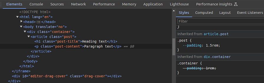
In this case, the .post-content selector inherits padding value from its direct parent, .post, with the value of 1.5rem rather than 1rem. You can use Chrome DevTools to see from where the specific CSS variable value gets inherited, as shown in the following preview:
You can use CSS variable inheritance to pass variable values from parent elements to child elements without re-declaring them in selectors. Also, overriding variable values is possible as traditional CSS properties.
CSS cascade rules handle the precedence of CSS definitions that come from various sources.
CSS variables also follow the standard cascade rules as any other standard properties. For example, if you use two selectors with the same specificity score, the variable assignment order will decide the value of a specific CSS variable.
A variable assignment in a new CSS block typically overrides the existing precedence and re-assigns values to variables.
Let’s understand variable cascading rules with a simple example.
The HTML:
<span class="lbl lbl-ok">OK</span>
The CSS:
.lbl {
  --lbl-color: #ddd;
  background-color: var(--lbl-color);
  padding: 6px;
}

.lbl-ok { --lbl-color: green }

/* --- more CSS code ---- */
/* ---- */

.lbl-ok { --lbl-color: lightgreen }
The above CSS selectors have the same specificity, so CSS uses cascading precedence to select the right lbl-color value for elements. Here, we’ll get the lightgreen color for the span element since lightgreen is in the last variable assignment. The color of the label may change based on the order of the above selectors.
CSS variables also work with developer-defined cascade layers that use the @layer at-rule. To demonstrate this, we can add some cascade layers to the above CSS snippet:
@layer base, mods;

@layer base {
  .lbl {
    --lbl-color: #ddd;
    background-color: var(--lbl-color);
    padding: 6px;
  }
}

@layer mods {
  .lbl-ok { --lbl-color: lightgreen }
}
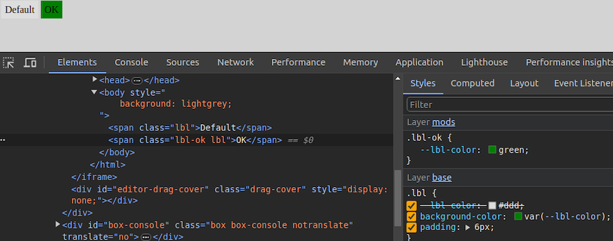
You can check how cascading rules overwrite variable values with Chrome DevTools:
When using custom properties, you might reference a custom property that isn’t defined in the document. You can specify a fallback value to be used in place of that value.
The syntax for providing a fallback value is still the var() function. Send the fallback value as the second parameter of the var() function:
:root {
  --light-gray: #ccc;
}

p {
  color: var(--light-grey, #f0f0f0); /* No --light-grey, so #f0f0f0 is
  used as a fallback value */
}
Did you notice that I misspelled the value --light-gray? This should cause the value to be undefined, so the browser loads the fallback value, #f0f0f0 for the color property.
A comma-separated list is also accepted as a valid fallback value. For example, the following CSS definition loads red, blue as the fallback value for the gradient function:
background-image: linear-gradient(90deg, var(--colors, red, blue));
You can also use variables as fallback values with nested var() functions. For example, the following definition loads #ccc from --light-gray if it’s defined:
color: var(--light-grey, var(--light-gray, #f0f0f0));
Note that it’s generally not recommended to nest so many CSS functions due to performance issues caused by nested function parsing. Instead, try to use one fallback value with a readable variable name.
If your web app should work on older web browsers that don’t support custom properties, you can define fallback values outside of the var() function as follows:
p {
  color: #f0f0f0; /* fallback value for older browsers */
  color: var(--light-grey);
}
If the browser doesn’t support CSS variables, the first color property sets a fallback value. We’ll discuss browser compatibility in the upcoming section about browser support for the CSS variables feature.
Meanwhile, custom properties can get invalid values due to developer mistakes. Let’s learn how the browser handles invalid variable assignments and how to override the default invalid assignment handling behavior:
:root {
  --text-danger: #ff9500;
}

body {
  --text-danger: 16px;
  color: var(--text-danger);
}
In this snippet, the --text-danger custom property was defined with a value of #ff9500. Later, it was overridden with 16px, which isn’t technically wrong. But when the browser substitutes the value of --text-danger in place of var(--text-danger), it tries to use a value of 16px, which is not a valid property value for color in CSS.
The browser treats it as an invalid value and checks whether the color property is inheritable by a parent element. If it is, it uses it. Otherwise, it falls back to a default color (black in most browsers).
This process doesn’t bring the correct initial value defined in the :root selector block, so we have to define custom properties with the accepted type and initial value using the @property at-rule, as shown in the following code snippet:
@property --text-danger {
  syntax: "<color>";
  inherits: true;
  initial-value: #ff9500;
}

body {
  --text-danger: 16px;
  color: var(--text-danger);
}
Now, the browser renders the expected text color even if we assign an invalid value within the body selector.
As discussed in previous examples, it’s possible to create global CSS variables using either :root or @property at-rule. Also, creating local variables is possible by defining variables inside child element selectors. For example, a variable defined inside header won’t be exposed to body.
However, if you define a variable inside a specific <style> tag, it gets exposed to all elements that match the particular selector. What if you need to create a scoped variable that is only available for a targeted HTML segment?
By default, browsers won’t scope style tags even if we wrap them with elements like <div> for creating scoped variables. The @scope at-rule helps us implement scoped CSS variables with scoped style tags, as shown in the following HTML snippet:
<style>
  button {
    padding: 6px 18px;
    border: none;
    border-radius: 4px;
    margin: 12px;
    background-color: var(--accent-color, #4cc2e6);
  }
</style>

<div>
  <style>
    @scope {
      button {
        --accent-color: #f2ba2c;
      }
    }
  </style>
  <button>Sample button #1</button>
</div>

<button>Sample button #2</button>
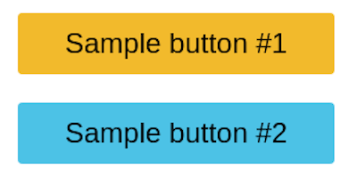
Here, the second style tag becomes scoped for the wrapped <div> element because of the @scope at-rule. So, the button selector in the second style tag selects only buttons inside the parent <div> element. As a result, --accent-color is only available for the first button.
The first button gets the #f2ba2c color for the background since the scoped style tag’s button selector sets the --accent-color variable. The second button gets the #4cc2e6 fallback background color since the --accent-color scoped variable is not available in the global scope:
Learn more about the @scope at rule from the official MDN documentation. @scope is still an experimental feature, so you can use the minimal css-scope-inline library to create scoped CSS variables in production.
Variables should be grouped logically as follows:
:root {
  /* Colors */
  --primary-color: #3498db;
  --secondary-color: #2ecc71;

  /* Typography */
  --font-size-base: 16px;
  --font-weight-bold: 700;
}
Fallback values should be used to ensure compatibility:
color: var(--text-color, black);
If --text-color is not defined, black will be used as a default.
Use meaningful names (avoid --color1, --sizeA)
In CSS frameworks such as Bootstrap, variables make sharing a base design across elements much easier. Take the .bg-danger class, which turns an element’s background color to red and its own color to white. In this first project, you’ll build something similar.
Get started with the first project by adding the following HTML document to a new .html file:
<!DOCTYPE html>
<html lang="en">
  <head>
    <meta charset="UTF-8" />
    <meta name="viewport" content="width=device-width, initial-scale=1.0" />
    <meta http-equiv="X-UA-Compatible" content="ie=edge" />
    <title>CSS Variables - Button Variations</title>
  </head>
  <body>
    <section>
      <div class="container">
        <h1 class="title">CSS Color Variations</h1>
        <div class="btn-group">
          <button class="btn btn-primary">Primary</button>
          <button class="btn btn-secondary">Secondary</button>
          <button class="btn btn-link">Link</button>
          <button class="btn btn-success">Success</button>
          <button class="btn btn-error">Error</button>
        </div>
      </div>
    </section>
  </body>
</html>
The structure of this markup is pretty standard. Notice how each button element has two classes: the btn class and a second class. We’ll refer to the btn class, in this case, as the base class and the second class as the modifier class that consists of the btn- prefix.
Next, add the following style tag content to the above
<style>
  * {
    border: 0;
  }

  :root {
    --primary: #0076c6;
    --secondary: #333333;
    --error: #ce0606;
    --success: #009070;
    --white: #ffffff;
  }

  /* base style for all buttons */
  .btn {
    padding: 1rem 1.5rem;
    background: transparent;
    font-weight: 700;
    border-radius: 0.5rem;
    cursor: pointer;
  }

  /* variations */
  .btn-primary {
    background: var(--primary);
    color: var(--white);
  }

  .btn-secondary {
    background: var(--secondary);
    color: var(--white);
  }

  .btn-success {
    background: var(--success);
    color: var(--white);
  }

  .btn-error {
    background: var(--error);
    color: var(--white);
  }

  .btn-link {
    color: var(--primary);
  }
</style>
The btn class contains the base styles for all the buttons and the variations come in where the individual modifier classes get access to their colors, which are defined at the :root level of the document. This is extremely helpful not just for buttons, but for other elements in your HTML that can inherit the custom properties.
For example, if tomorrow you decide the value for the --error custom property is too dull for a red color, you can easily switch it up to #f00000. Once you do so, voila — all elements using this custom property are updated with a single change!
Here’s what your first project should look like:

You can access the complete source code and see a live preview of this project from this CodePen.
The document.documentElement.style.setProperty method is used to set CSS variables dynamically with JavaScript, updating CSS variables in real-time without modifying the style sheet:
document.documentElement.style.setProperty('--primary-color', 'green')
This will update the --primary-color variable, affecting all the elements that use it.
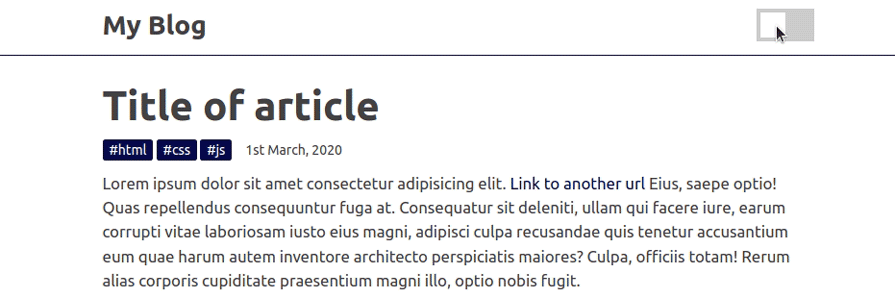
To see the practical use case for this, we’ll build the second project “a light-and-dark theme”. The light theme will take effect by default unless the user already has their system set to a dark theme. On the page, we’ll create a toggle button that allows the user to switch between themes.
First, add the following HTML structure into a new .html file:
<!DOCTYPE html>
<html lang="en">
  <head>
    <meta charset="UTF-8" />
    <meta name="viewport" content="width=device-width, initial-scale=1.0" />
    <meta http-equiv="X-UA-Compatible" content="ie=edge" />
    <title>CSS Variables - Theming</title>
  </head>
  <body>
    <header>
      <div class="container">
        <div class="container-inner">
          <a href="#" class="logo">My Blog</a>
          <div class="toggle-button-container">
            <label class="toggle-button-label" for="checkbox">
              <input type="checkbox" class="toggle-button" id="checkbox" />
              <div class="toggle-rounded"></div>
            </label>
          </div>
        </div>
      </div>
    </header>
    <article>
      <div class="container">
        <h1 class="title">Title of article</h1>
        <div class="info">
          <div class="tags">
            <span>#html</span>
            <span>#css</span>
            <span>#js</span>
          </div>
          <span>1st February, 2024</span>
        </div>
        <div class="content">
          <p>
            Lorem ipsum dolor sit amet consectetur adipisicing elit.
            <a href="#">Link to another url</a> Eius, saepe optio! Quas
            repellendus consequuntur fuga at. Consequatur sit deleniti, ullam
            qui facere iure, earum corrupti vitae laboriosam iusto eius magni,
            adipisci culpa recusandae quis tenetur accusantium eum quae harum
            autem inventore architecto perspiciatis maiores? Culpa, officiis
            totam! Rerum alias corporis cupiditate praesentium magni illo, optio
            nobis fugit.
          </p>
          <p>
            Eveniet veniam ipsa similique atque placeat dignissimos
            quos reiciendis. Odit, eveniet provident fugiat voluptatibus esse
            culpa ullam beatae hic maxime suscipit, eum reprehenderit ipsam.
            Illo facilis doloremque ducimus reprehenderit consequuntur
            cupiditate atque harum quaerat autem amet, et rerum sequi eum cumque
            maiores dolores.
          </p>
        </div>
      </div>
    </article>
  </body>
</html>
This snippet represents a simple blog page with a header, a theme toggle button, and a dummy article.
Next, add the following style tag to add CSS definitions for the above HTML structure:
<style>
  :root {
    --primary-color: #0d0b52;
    --secondary-color: #3458b9;
    --font-color: #424242;
    --bg-color: #ffffff;
    --heading-color: #292922;
    --white-color: #ffffff;
  }

  /* Layout */
  * {
    padding: 0;
    border: 0;
    margin: 0;
    box-sizing: border-box;
  }

  html {
    font-size: 14px;
    font-family: -apple-system, BlinkMacSystemFont, 'Segoe UI', Roboto, Oxygen,
      Ubuntu, Cantarell, 'Open Sans', 'Helvetica Neue', sans-serif;
  }

  body {
    background: var(--bg-color);
    color: var(--font-color);
  }

  .container {
    width: 100%;
    max-width: 768px;
    margin: auto;
    padding: 0 1rem;
  }

  .container-inner {
    display: flex;
    justify-content: space-between;
    align-items: center;
  }

  /* Using custom properties */
  a {
    text-decoration: none;
    color: var(--primary-color);
  }

  p {
    font-size: 1.2rem;
    margin: 1rem 0;
    line-height: 1.5;
  }

  header {
    padding: 1rem 0;
    border-bottom: 0.5px solid var(--primary-color);
  }

  .logo {
    color: var(--font-color);
    font-size: 2rem;
    font-weight: 800;
  }

  .toggle-button-container {
    display: flex;
    align-items: center;
  }

  .toggle-button-container em {
    margin-left: 10px;
    font-size: 1rem;
  }

  .toggle-button-label {
    display: inline-block;
    height: 34px;
    position: relative;
    width: 60px;
  }

  .toggle-button-label .toggle-button {
    display: none;
  }

  .toggle-rounded {
    background-color: #ccc;
    bottom: 0;
    cursor: pointer;
    left: 0;
    position: absolute;
    right: 0;
    top: 0;
    transition: 0.4s;
  }

  .toggle-rounded:before {
    background-color: #fff;
    bottom: 4px;
    content: '';
    height: 26px;
    left: 4px;
    position: absolute;
    transition: 0.4s;
    width: 26px;
  }

  input:checked+.toggle-rounded {
    background-color: #9cafeb;
  }

  input:checked+.toggle-rounded:before {
    transform: translateX(26px);
  }

  article {
    margin-top: 2rem;
  }

  .title {
    font-size: 3rem;
    color: var(--font-color);
  }

  .info {
    display: flex;
    align-items: center;
    margin: 1rem 0;
  }

  .tags {
    margin-right: 1rem;
  }

  .tags span {
    background: var(--primary-color);
    color: var(--white-color);
    padding: 0.2rem 0.5rem;
    border-radius: 0.2rem;
  }
</style>
This snippet can be divided into two main sections: the layout section and the custom properties section. The latter is what you should focus on. As you can see, the variables are applied above in the link, paragraph, heading, and article elements.
The idea behind this approach is that, by default, the website uses a light theme, and when the box is checked, the values for the light theme get inverted to a dark variant.
Since you can’t trigger these sitewide changes via CSS, JavaScript is critical here. In the next section, we’ll hook up the JavaScript code necessary to toggle between the light and dark themes.
Alternatively, you could trigger a change automatically via CSS using the prefers-color-scheme media query to detect whether the user requested a light or dark theme. In other words, you can directly update the website to use the dark variants of the light theme.
Add the following snippet to all the CSS code you just wrote:
@media (prefers-color-scheme: dark) {
 :root {
  --primary-color: #325b97;
  --secondary-color: #9cafeb;
  --font-color: #e1e1ff;
  --bg-color: #000013;
  --heading-color: #818cab;
 }
}
We’re listening to the user’s device settings and adjusting the theme to dark if they’re already using a dark theme.
Finally, add the following script segment to the above HTML document:
<script>
  const toggleButton = document.querySelector('.toggle-button');
  toggleButton.addEventListener('change', toggleTheme, false);
  const theme = {
    dark: {
      '--primary-color': '#325b97',
      '--secondary-color': '#9cafeb',
      '--font-color': '#e1e1ff',
      '--bg-color': '#000013',
      '--heading-color': '#818cab'
    },
    light: {
      '--primary-color': '#0d0b52',
      '--secondary-color': '#3458b9',
      '--font-color': '#424242',
      '--bg-color': '#ffffff',
      '--heading-color': '#292922'
    }
  };

  function toggleTheme(e) {
    if (e.target.checked) {
      useTheme('dark');
      localStorage.setItem('theme', 'dark');
    } else {
      useTheme('light');
      localStorage.setItem('theme', 'light');
    }
  }

  function useTheme(themeChoice) {
    document.documentElement.style.setProperty(
      '--primary-color',
      theme\[themeChoice\]['--primary-color']
    );
    document.documentElement.style.setProperty(
      '--secondary-color',
      theme\[themeChoice\]['--secondary-color']
    );
    document.documentElement.style.setProperty(
      '--font-color',
      theme\[themeChoice\]['--font-color']
    );
    document.documentElement.style.setProperty(
      '--bg-color',
      theme\[themeChoice\]['--bg-color']
    );
    document.documentElement.style.setProperty(
      '--heading-color',
      theme\[themeChoice\]['--heading-color']
    );
  }

  const preferredTheme = localStorage.getItem('theme');
  if (preferredTheme === 'dark') {
    useTheme('dark');
    toggleButton.checked = true;
  } else {
    useTheme('light');
    toggleButton.checked = false;
  }
</script>
Now let’s break down the current state of the website.
A user visits the page. The media query prefers-color-scheme determines whether the user is using a light or dark theme. If it’s a dark theme, the website updates to use the dark variants of the custom properties.
Let’s say a user isn’t using a dark theme or their OS doesn’t support a dark theme. The browser would default to the light theme, allowing the user to control that behavior by checking or unchecking the box.
Depending on whether the box is checked or unchecked, the useTheme() function is called to pass in the theme variant and save the user’s current selection to local storage. You’ll see why it’s saved in a minute.
The useTheme() function is where all the magic happens. Based on the theme variant passed, a lookup is performed on the theme constant and used to switch between light and dark modes.
The last piece of the puzzle is persisting the current theme, which is achieved by reading the last preferred theme from local storage and setting it automatically when the user revisits the website.
Here’s what your second project should look like:
You may be thinking of a million other ways to achieve this. Feel free to go through the code and make as many changes as you see fit. You can access the complete source code and see a live preview of this project from this CodePen.
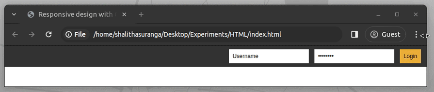
In our third project, we’ll build a responsive login form that loads some adjustment values from CSS variables. Like the media query feature dynamically switches standard CSS properties, it also switches custom properties, so we can assign different values for variables within different responsive breakpoints.
First, add the following content into a new HTML document:
<!DOCTYPE html>
<html lang="en">

<head>
  <meta charset="UTF-8" />
  <meta name="viewport" content="width=device-width, initial-scale=1.0" />
  <meta http-equiv="X-UA-Compatible" content="ie=edge" />
  <title>Responsive design with CSS variables</title>
</head>

<body>
  <div class="form-box">
    <input type="text" value="Username" />
    <input type="password" value="Password" />
    <button>Login</button>
  </div>
</body>

</html>
Here we created a simple login form that consists of two input elements and a button. Add the following style tag into this HTML document to style it properly:
<style>
  /* --- desktops and common --- */
  :root {
    --form-box-padding: 8px;
    --form-box-flex-gap: 8px;
    --form-input-font-size: 12px;
  }

  * {
    margin: 0;
    padding: 0;
    box-sizing: border-box;
  }

  .form-box {
    display: flex;
    justify-content: flex-end;
    gap: var(--form-box-flex-gap);
    padding: var(--form-box-padding);
    background-color: #333;
    text-align: center;
  }

  .form-box input,
  .form-box button {
    font-size: var(--form-input-font-size);
    padding: 8px;
    margin-right: 4px;
  }

  .form-box input {
    outline: none;
    border: none;
  }

  .form-box button {
    border: none;
    background-color: #edae39;
  }
</style>
The above CSS snippet styles the login form only for desktop devices, so it won’t adjust content responsively when you resize the browser, as shown in the following preview:
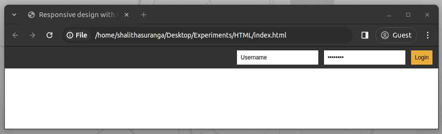
We can simply make this page responsive by writing some styling adjustments — i.e., changing flex-direction — inside media query breakpoints. For padding or font-size-like values-based properties, we can use CSS variables instead of writing CSS properties repetitively to improve the readability and maintainability of CSS definitions.
Look at the previous CSS snippet: you will notice three CSS variables. Change those variables with media query blocks and complete the responsive screen handling code using the following code snippet:
/* --- tablets --- */
@media screen and (min-width: 601px) and (max-width: 900px) {
  :root {
    --form-box-padding: 20px 12px 20px 12px;
    --form-box-flex-gap: 12px;
    --form-input-font-size: 14px;
  }

  .form-box input,
  .form-box button {
    display: block;
    width: 100%;
  }
}

/* --- mobiles --- */
@media screen and (max-width: 600px) {
  :root {
    --form-box-padding: 24px;
    --form-box-flex-gap: 12px;
    --form-input-font-size: 20px;
  }

  .form-box {
    flex-direction: column;
  }

  .form-box input,
  .form-box button {
    display: block;
  }
}
The above code snippet adjusts the layout for mobile and tablet screens with some standard CSS properties and custom properties. For example, it uses a different flex-direction mode, display mode for several elements, and the following custom property values for mobile screens:
--form-box-padding: 24px;
--form-box-flex-gap: 12px;
--form-input-font-size: 20px;
Test this project by resizing the browser window:
Try adjusting these CSS variables and creating new ones to improve this login screen further. You can use the same strategy to use CSS variables with container queries. Check the complete source code and see a live preview from this CodePen.
Imagine that you need to create a colorful native checkbox list with multiple accent colors. Using different values for accent-color via the inline style attribute is undoubtedly time-consuming since you have to define colors yourself. Hence, you may create this checkbox list dynamically with JavaScript.
However, what if this list gets rendered in a JavaScript-disabled environment, like inside a Markdown document? We can use CSS variables to generate JavaScript-free dynamic elements.
Let’s create a colorful native checkbox list with CSS variables. Create a new HTML document and add the following style tag:
input[type="checkbox"] {
  width: 80px;
  height: 80px;
  --hue: calc(var(--i) * 50 + 100);
  accent-color: hsl(var(--hue), 50%, 50%);
}
Here, we calculate a dynamic color for the accent-color property using the hsl color function.
For the hue input parameter, we use the --hue variable which gets a dynamically calculated value using the --i variable. This implementation lets us generate multiple colors by using different numbers for --i.
Use the following HTML snippet to get multiple colorful native checkboxes:
<div style="text-align: center">
  <input type="checkbox" checked style="--i: 0"/>
  <input type="checkbox" checked style="--i: 1"/>
  <input type="checkbox" checked style="--i: 2"/>
  <input type="checkbox" checked style="--i: 3"/>
</div>
Here we set an index manually for the --i variable via inline style attributes to generate a dynamic accent color. This approach is more productive than setting colors yourself for each checkbox element. Look at the following preview of the fourth project:

You can browse the complete source code and see a live preview from this CodePen. It’s possible to use the same strategy to generate JavaScript-free dynamic elements by adjusting any standard CSS property value, i.e., using --i to set dynamic image filter configurations.
The following table will help you know when to use CSS variables and preprocessor variables:
| Feature | CSS variables | Preprocessor variables |
|---|---|---|
| Scope | Can be dynamically modified at runtime | Compiles to static values before rendering |
| Use cases | Great for dynamic theming, user-controlled styles, or runtime updates | Great for working with a large-scale project that benefits from functions, mixins, and nested styles |
| Usage | Works directly in browsers | Requires a pre-processor like Less or SASS |
| Performance | Results in slightly higher runtime cost due to look up but mostly negligible in most cases | No runtime cost, but may impact load time due to larger stylesheets. |
| Runtime update | Can be modified easily with JavaScript | Impossible to update with JavaScript because it requires recompilation |
CSS variables can be used with @keyframes to make animations more dynamic and reusable without direct changes to the styles. However, they must be applied outside the@keyframes since variables are not recognized in keyframes.
:root {
  --btn-bg: #3498db; /* Default background color */
}

button {
  background-color: var(--btn-bg);
  color: white;
  padding: 12px 24px;
  font-size: 16px;
  border: none;
  cursor: pointer;
  animation: pulse 1.5s infinite alternate;
}

@keyframes pulse {
  from {
    background-color: var(--btn-bg);
  }
  to {
    background-color: lighten(var(--btn-bg), 20%);
  }
}
The background color changes dynamically based on --btn-bg. Adjusting --btn-bg in :root instantly updates the animation color!
Now, we can use JavaScript to update the CSS variable in real-time to animate the button’s color on hover or user interaction
document.querySelector("button").addEventListener("mouseover", () => {
  document.documentElement.style.setProperty("--btn-bg", "#e74c3c");
});

document.querySelector("button").addEventListener("mouseout", () => {
  document.documentElement.style.setProperty("--btn-bg", "#3498db");
});
The button smoothly transitions between colors when hovered!
According to the browser compatibility table of the official MDN documentation, the CSS variables feature is widely available in all popular browser versions released after April 2017. More specifically, browsers released this feature with the following versions:
According to these statistics, using custom properties in production apps is possible since most users nowadays use up-to-date web browsers. However, it would be prudent to analyze your audience’s browser versions before using any new native CSS feature.
Here are some common mistakes with CSS variables and how to fix them:
Some older browsers, like IE11, do not support CSS variables, which can cause styling issues if a fallback is not provided. A common mistake is using var(--color-primary) without specifying an alternative. To prevent this, always include a fallback value inside var(), such as var(--color-primary, #3498db), ensuring that a default color is applied if the variable is unavailable.
CSS variables cannot be used directly in media queries, as they are not evaluated in the same way as standard values. For example, defining a variable like --breakpoint-mobile: 600px in :root and attempting to use it inside @media (max-width: var(--breakpoint-mobile)) will not work. Instead, media queries require fixed values, so it’s best to use predefined breakpoints directly, such as @media (max-width: 600px), to ensure proper functionality.
display, z-index)CSS variables don’t work in all properties, especially those that require integer values like z-index or display.
:root {
  --display-mode: flex;
}

.container {
  display: var(--display-mode); /* Won't work */
}
By building these simple projects, you can learn how to use CSS variables like a pro. You can use the style attribute to apply CSS variables directly to an HTML element like this <p style="color: var(--primary-color);">Hello, world!</p>. Also, you can debug CSS variable issues using the browser DevTools. There’s certainly more to them than I explained, so feel free to mess around with the code to explore further.
CSS variables help simplify the way you build websites and complex animations while still allowing you to write reusable and elegant code. Using CSS variables is also possible with React Native projects that run on the React Native Web renderer.
You can use variables in your CSS using the var() function to apply declared variables in your styles.
CSS variables can be declared using either the -- prefix or the @property at-rule.
As web frontends get increasingly complex, resource-greedy features demand more and more from the browser. If you’re interested in monitoring and tracking client-side CPU usage, memory usage, and more for all of your users in production, try LogRocket.

LogRocket lets you replay user sessions, eliminating guesswork around why bugs happen by showing exactly what users experienced. It captures console logs, errors, network requests, and pixel-perfect DOM recordings — compatible with all frameworks.
LogRocket's Galileo AI watches sessions for you, instantly identifying and explaining user struggles with automated monitoring of your entire product experience.
Modernize how you debug web and mobile apps — start monitoring for free.
Hey there, want to help make our blog better?
Join LogRocket’s Content Advisory Board. You’ll help inform the type of content we create and get access to exclusive meetups, social accreditation, and swag.
Sign up now
A breakdown of the wrapper and container CSS classes, how they’re used in real-world code, and when it makes sense to use one over the other.

This guide walks you through creating a web UI for an AI agent that browses, clicks, and extracts info from websites powered by Stagehand and Gemini.

This guide explores how to use Anthropic’s Claude 4 models, including Opus 4 and Sonnet 4, to build AI-powered applications.

Which AI frontend dev tool reigns supreme in July 2025? Check out our power rankings and use our interactive comparison tool to find out.

 Learn more →

3 Replies to "How to use CSS variables like a pro"
Please do not encourage people to use “outline: none” on a button element.
I strangely couldn’t retrieve the value from documentElement via getPropertyValue, as it was not set on that element. Setting the value via javascript to black works fine, and then retrieval works and comes back as black. (I had one variable definition in css under :root in header style definitions – red, and one value set on the html element itself via chrome devtools – black)
Instead using getComputedStyle worked okay as it supports the pseudo selector as second argument and I was able to retrieve the original css value of red, or any overloaded value as appropriate.
window.getComputedStyle(window.document.documentElement,”:root”).getPropertyValue(‘–joy-colour’)
Excellent article. Very well written.