Every project starts with a need to solve a problem or to create something new, and a website is no exception. I’ll teach you how to design a website that is not only accessible and usable, but also stands the test of time.
We’ll discuss theory related to web design, code, and why everything works. It all starts with web accessibility.
The term “Accessibility” alone should give you an idea of what it is all about. In simple terms, it’s about making something accessible. In web development, this is easier said than done.
According to W3:
Web accessibility means that websites, tools, and technologies are designed and developed so that people with disabilities can use them. More specifically, people can: perceive, understand, navigate, and interact with the Web.
The summary of the definition above is that web accessibility is about creating websites for everyone irrespective of the following:
We’ll go from design to coding all the way to testing and launching. The result? A website that is accessible and usable to your users because Tim Berners-Lee said:
The power of the Web is in its universality.
Access by everyone regardless of disability is an essential aspect.
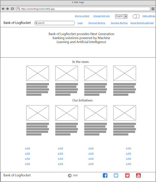
In case you are curious, here is the final design of the website:
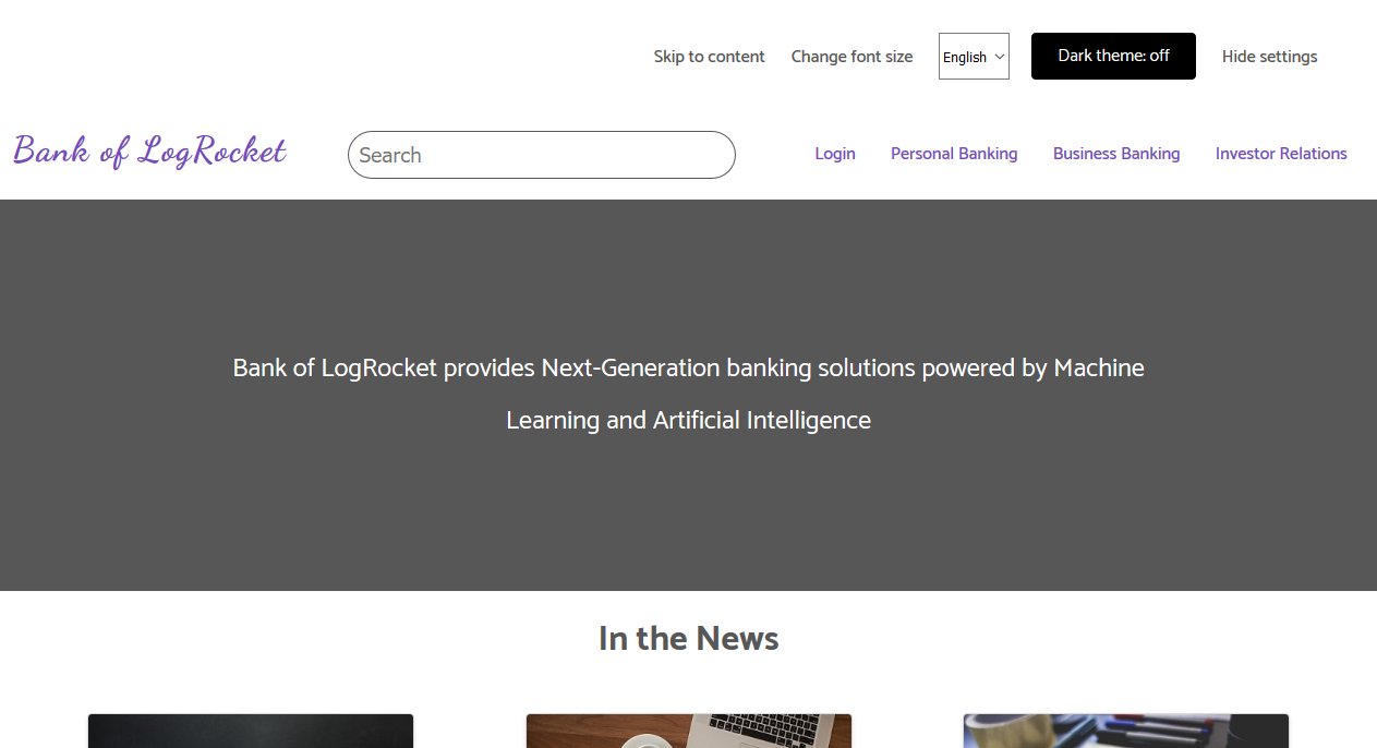
If you are in a hurry, you can view it online. If not, read on to see how it’s made.
The idea is to walk our way from the top of the website (as seen in a web browser) all the way down (to the website footer).
Let’s begin with user interface design, popularly called UI design.
When you set out to design an interface you should ask yourself some questions:
The answers to these questions is the first step towards getting it right. If the application userbase is a large one, you might need to conduct research to figure out what the users really want in the application. All in all, the interface must be easy to use and understand, even if the user is in an emergency.
There are variety of tools available for UI design. Sometimes it is all comes down to the designers choice. Some tools are:
For our website design, the interface was designed using Balsamiq. We started with the mobile display because most users access the web via their mobile device.
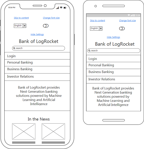
The image is known as a wireframe, which shows you the outlook of the website on an iPhone and a smartphone. There are subtle differences — most significantly the device height and width.
You should also note the following:
Mobile users include iPhone users, smartphone users, and tablet users.
You have seen the layout on the iPhone and smartphone. Next, you’ll see that of the Tablet users:
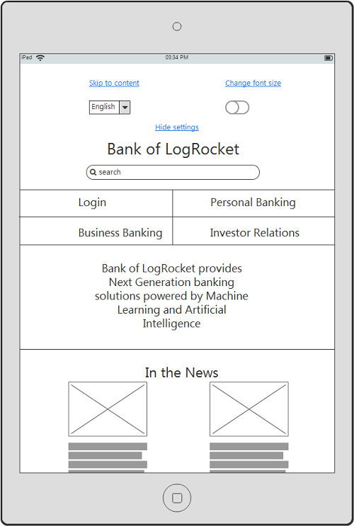
When you compare this layout to the iPhone/Smartphone layout, it’s almost the same, but the navigation is now divided into two lines.
Up next, we have the desktop view. This will feature the website’s layout in all its glory:
From the 3 layouts that we’ve shown so far, i.e iPhone/Smartphone, Tablet, and desktop, it’s evident that the layout should adapt to the device orientation.
The final implementation of the website is different compared to what we have in the mockup. The question is: Why did this happen? The answer: user experience.
If UI design is about how it looks, user experience design is about how it works, which can also change how we thought the website was going to look like.
In the initial website wireframes, we showed the intention of taking care of the user experience. Now we have to ensure that the layout behaves as we’ve intended.
Here is what we’ve done so far:
You might consider these minor page features (yes, to a certain extent, we still have to code) but if we neglect them, the usability of the website will decrease to a great extent.
The Web was built for everyone, so you should not lock people out irrespective of their browser version, among other things. Ensure that you make design decisions that won’t impact the user experience of your website and write code that is semantic and guaranteed to work in the users’ browsers.
Hypertext Markup Language is the markup language used on most websites. You can write website’s markup the way you see fit, but that does not mean it’s semantic. In simple terms, semantic markup is all about using the right HTML tag for the job. Most of the semantic tags comes with accessibility baked in.
In the early days of web design, designers had to resort to some HTML tags to get around layout issues that CSS could not resolve. The superstar HTML tag of choice was the table tag. This tag was even used in the early designs of Amazon online store. Later, it was the div and span tag.
HTML5 comes with some semantic tags that tells you by their name what they are meant for.
Some are:
headernavasidemainsectionarticlefooterWhen you take a look at the markup of our index page, you’ll find something similar to the code structure given below:
<header>
    <!-- header content -->
</header>

<aside>
    <!-- aside content -->
</aside>

<main>
    <!-- main content -->
</main>

<footer>
    <!-- footer content -->
</footer>
When you use a similar format (or other semantic tags) you’ve set the tone for making your web page accessible. However, you should know that these tags can contain other tags, some of which are not semantic. They serve a purpose because there are no other tags that fit in the situation you might find yourself in. An example of such a tag is span.
Color is awesome if used and combined well. Well-known websites that utilize a solid combination of colors leave their users in absolute awe. A prime example is Amazon. How do they do it? Color theory.
The field of color theory is an interesting one. It entails:
Most websites that deal with food and agriculture use some combination of green. If it’s a website related to baking, you’ll often see brown.
The color combination should be great if you intend to keep users on your site at first glance. That is when the color wheel is of great use.
The color wheel is a circular wheel consisting of colors. The colors can be combined in the following format:
In our prototype website we used the following colors:
#764abc — purple#1a1a1a — black#e3e3e3 — light gray#575757 — shade of gray#000000 — blackPurple is the dominant color used in the design. You’ll find it in most web page elements, e.g links and form submit buttons.
In our prototype website design, the colors are not used in an overkill manner. Instead, they convey meaning wherever you find them.
When you observe the links before the navigation, their colors indicate that their purpose is different compared to other links on the page, e.g, the navigation links. The theme switcher links are colored black because we are trying to convey that this particular element is for switching between the light and dark theme.
This theme switcher only works with a JavaScript enabled browser. When the browser does not support JavaScript or has JavaScript disabled, the user will see a disabled button with a gray color and receive no mouse cursor.
Most user interface designs use this effect to let the user know that this function is not available.
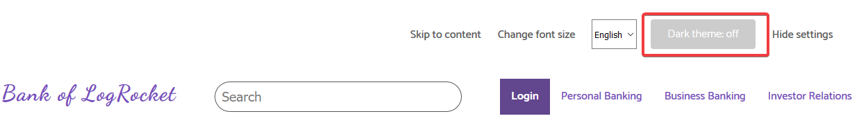
Another example is the active link as seen in the image above. The active link has a white text on a purple background to let the user know it’s the page they are currently viewing. The lessons here is to use color to:
Other color combinations will be discussed in the appropriate sections in this article. In addition, how the theme switcher is implemented will be discussed in detail in the “dark mode” section.
The next step after selecting color combination in the design process is to start the website coding using responsive web design, which is the part where we implement the different layouts depicted in our wireframes.
The three ingredients of RWD are fluid grids, flexible images, and media queries.
Over the years, Device Agnostic Design has come into the limelight. The concept behind this idea is to design for the content. You start with the mobile layout. When that’s done, you start adjusting the layout till it breaks. At this point, it’s time to redesign the layout. This is the approach used in our prototype design.
When you snap to a mobile layout, you will get the following:
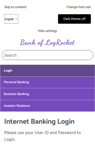
The layout is completely different compared to the layout that the desktop user will see. Here, the web page elements are arranged for easy access by the user.
When you start adjusting the layout, you’ll start to note changes in the website layout — particularly the navigation. Media queries are used to rearrange the layout.
@media screen and (min-width: 48em) {
    /* Code to ra-arrange the layout */
}
Inside the media query, some changes are applied to make it fit at that point. These changes can can include the following:
inherit (if necessary)display: flex or display: inline-blockIn our prototype website design, the following code is used to change the navigation layout:
@media screen and (min-width: 35em) {
    @supports (display: grid) {
        .navigation__menu {
            display: grid;
            grid-template-areas: "h1 h2" "h3 h4";
        }

        .navigation__item:nth-child(2) {
            border-top: none;
        }
    }
}
In this media query, we test for a grid layout using the @supports rule, which means only browsers that support CSS grid layout will adjust the navigation.
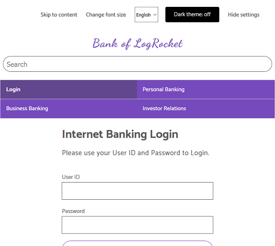
Browsers that do not support CSS grid will display a larger version of the mobile layout. The layout below is from Internet Explorer 11.
Further, resizing the layout beyond this point will result in the desktop layout, all thanks to media query.
Flexible images are also part of RWD. The idea is to ensure the images do not exceed their parent container. CSS max-width property with a value of 100 is the secret behind this.
img {
    /* max-width means maximum width */
    max-width: 100%;
}
Fluid grids are the third ingredient of RWD, which involve sizing containers using relative units. Examples of relative units include % and em. Relative units are used entirely in our prototype design. An example is when the container width is adjusted to occupy 60% percent of the browser’s viewport.
@media screen and (min-width: 48em ) {
    .container {
        width: 60%;
        margin: 0 auto;
    }
}
The idea behind progressive enhancement is to provide a solid baseline experience that is accessible to as many users as possible and only serves functionality to browsers that support them.
Our website prototype was built with progressive enhancement in mind. The layout was built with:
You’ve read about semantic markup and responsive web design in previous sections and you’ve seen an example of feature detection. But let’s revisit it again.
When the navigation layout was rearranged, we did the following:
@media screen and (min-width: 35em) {
    @supports (display: grid) { /* feature detection */
        /* Code here */
    }
}
The code tested if the browser supports CSS grid using @supports. Therefore, the code situated inside @supports will only run if the specified condition is true. In this case, it is asking the browser if it wants to support CSS grid. If yes, run the code in this block. If the browser does not understand it, it’ll gladly ignore the code in the @supports block.
That’s when you see that Internet Explorer 11 does not support CSS grid. As a result, it ignored the navigation rearrangement and it just shows the default mobile layout. That’s the power of progressive enhancement.
Another example is the theme switcher. The switcher is only useful and usable when the user’s supports JavaScript — therefore, it’s disabled by default in the HTML code.
<label
       id="themer-label"
       class="button header__form-label"
       data-state="disabled"
>
    <input type="checkbox" id="themer" disabled />
    Dark theme: <span aria-hidden="true"></span>
</label>
The opacity is reduced with CSS.
.button[data-state="disabled"]{
    opacity: 0.2;
    cursor: not-allowed;
}
When the users browser supports JavaScript, we remove the data-state and disabled attribute from the label and input respectively.
if (
    checkbox.hasAttribute("disabled") &&
    themerLabel.hasAttribute("data-state") &&
    themerLabel.getAttribute("data-state") === "disabled"
) {
    checkbox.removeAttribute("disabled");
    themerLabel.removeAttribute("data-state");
}
This ensures that the theme switcher works if the browser supports JavaScript. If we had not done this, a user with JavaScript disabled might click on the switcher thinking it works. This way, we’ve shown them that this functionality is not available.
Another option that other developers will advocate for is to hide the theme switcher altogether if it’s not functioning, but we’ll leave it as it is.
Here’s the best way of thinking about progressive enhancement:
When you follow this approach, your users will get the baseline experience on your website. If their browser supports modern features, they will get the full functionality and experience.
You’ve seen the picture of the website navigation, but can a mobile use it conveniently? Well, yes.
When you are designing your website navigation, you should take mobile users into account — particularly touch devices. In our design, the user can easily click the navigation links because it is wide enough. The secret here is to a two-way process:
display property of the link to blockpaddingThe resulting code in CSS:
.navigation__link {
    display: block;         /* Setup to make it cliackable */
    padding: 0.8em 1em;     /* Creating the clickable area */

    /* Other styling */
}
Add a different layout rearrangement for the navigation if necessary, but do not sacrifice the clickability and usability at any point. Some desktop computers have touch capability, and the user might choose to interact with your website with their hands instead of their keyboard.
Our prototype website is a static website and not dynamic, but we’ve ensured that even though you might decide to step it up and convert it to a dynamic one, the search input is usable.
The form is an associated label with an input and a placeholder that tells the user to “Search”. When the input receives focus, the border radius is changed from the curved corners to its initial format. This is another indication that the input is now active.
Here’s the HTML code:
<form class="header__search-form">
    <label class="visuallyhidden" for="search-site">Search site</label>
    <input
        id="search-site"
        class="header__search-input"
        type="text"
        name="search"
        placeholder="Search"
    />
</form>
The form label is visually hidden, but it’s available to screen readers.
When fonts are combined, they should be aesthetically pleasing. That’ll ensure the reader will continue reading the content of your website. In our website design, two fonts were combined: Catamaran and Dancing Script.
Both fonts are available on Google Fonts. You can also check out the font pairing resources on colors and fonts by Michael Andreuzza.
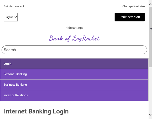
Some websites have complex navigation before the site’s main content. When a screen reader is navigating your site, it’ll have to read the entire navigation, and a user listening to this will not find it comforting. Luckily, there is a fix: skip to content.
Skip to content is an HTML link that allows the user to “jump” to the site content. There are two ways to implement this feature:
In our website design, we chose to show it. This decision is inspired by the design on W3’s website. The mechanism behind the skip to content is as follows:
#contentIn HTML:
<ul>
    <li><a href="#content">Skip to content</a></li>
</ul>

<main id="content">
    <!-- main content here -->
</main>
Another way to do this involves CSS that will visually hide the skip to content link. When the link receives focus via the user’s <kbd>Tab</kbd> key, it shows on screen.
First the HTML:
<div id="skip">
    <a href="#content">Skip to main content</a>
</div>

<main id="content">
    <!-- content here -->
</main>
The CSS:
#skip a {
    height: 1px;
    left: -10000px;
    position: absolute;
    overflow: hidden;
    top: auto;
    width: 1px;
    padding: 1.2em;
}

/**
  * Change the background color and color
  * based on your design.
 */
#skip a:focus {
    height: auto;
    position: static;
    width: auto;
    background-color: #06162f;
    color: #ffffff;
}
When you implement this feature, you are making it easier for users to navigate your site.
There is high probability that you are reading this article because you followed a link on a web page or other medium.
When you are coding links, ensure that the user can tell links apart from the rest of the web page elements. There are a variety of ways to do this. It all depends on your design. In our website design, the links are distinct based on their location on the web page. When a user interacts with them, they get additional indication that they have hovered over a link.
I encourage you to read University of Yale Usability and Web Accessibility article on Links.
When your users find it difficult to read the information on your website, they will go look for that information elsewhere. Responsive typography is typography done right and typography that scales.
There are a variety of techniques for achieving responsive typography, but in our prototype design we implemented it using relative font sizing.
This means the fonts on the web page are sized using either of the following:
emremsWith this, when the user zooms in the browser, they can still read the text with no difficulty.
In addition, we also implemented vertical rhythm, which is the space after or before a paragraph. This is sample code from the website design:
main p {
    font-size: 1.2em;
    line-height: 1.618;
    letter-spacing: 0.04em;
    font-weight: 400;
    font-style: normal;
    margin-bottom: 2em; /* This creates a space below all paragraphs */
}
This is done to ease the user’s reading process.
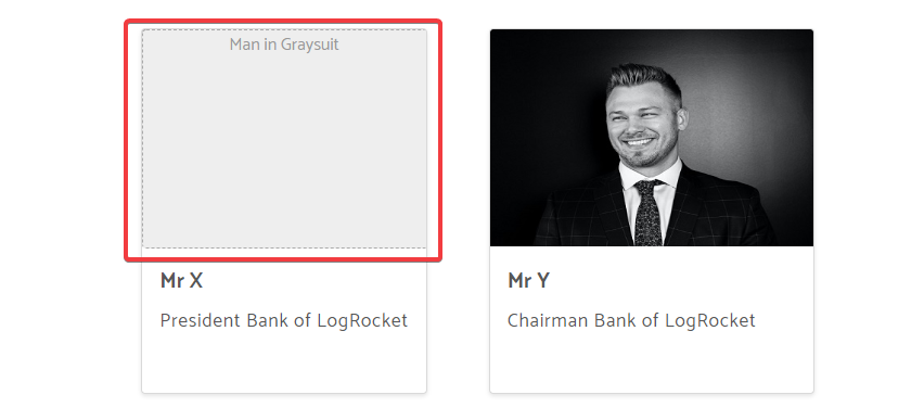
You will find images on most websites, and you’ll definitely handle images in one of your design projects. The first step to ensuring your images are accessible is to provide an alternate text.
Alternate text is a short description of the image. When writing an alternate text, avoid using the word “Image” e.g. “Image of an elephant”, as we’ll learn later that the accessibility checker will gladly point this out.
An alternate text also gives the user information about the image when the image fails to download or is just broken, either by a coding error or a network error.
In our design, a custom approach was implemented for styling the broken images. Here are parts of it:
/* parts of code for styling broken images*/
.media-card__image::before {
    content: " ";
    background-color: #eee;
    width: 100%;
    height: 100%;
    display: block;
    position: absolute;
    border: 1px dashed #aaa;
    border-radius: 4px;
}

/* Remaining code truncated, check the styles.css file */
An example of a styled broken image as seen in the Brave browser powered by Chrome:
You should also provide a width and height for the image in your HTML. This allows the browser to preserve that space before the image download is complete.
<img
    class="media-card__image"
    src="images/booksandpen_2.jpg"
    alt="Books and a pen on white notebook"
    width="300"
    height="200"
/>
If you don’t do this, the browser will download text and other content, and the image will appear out of nowhere to the user.
Finally, the image should be responsive.
img {
    max-width: 100%;
}
NOTE: if you are using an image as a hero image, ensure it has a small size. This way, the user will not notice that it’s downloading. Otherwise, create different versions of this image by reducing the width, thus reducing the size. Then use them at different breaking points in your design.
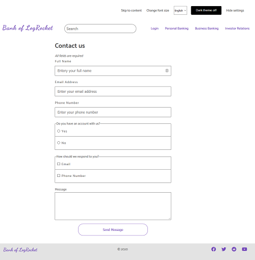
Forms are incorporated on most websites. Here are some steps to make your forms more accessible:
fieldset e.g. Radio buttonsinput with type=submit and not the button element.These steps can increase depending on the complexity of the form design, but always keep accessibility in mind.
Have a look at some code for a contact form:
<form class="form">
    <span><em>All fields are required</em></span>

    <div class="form__row">
        <label class="form__label" for="full-name"
            >Full Name</label
        >
        <input
            class="form__input"
            id="full-name"
            type="text"
            name="full-name"
            placeholder="Entery your full name"
        />
    </div>

    <div class="form__row">
        <label class="form__label" for="email"
            >Email Address</label
        >
        <input
            class="form__input"
            id="email"
            type="email"
            name="email"
            placeholder="Enter your email address"
        />
    </div>

    <!-- remaining code truncated to save space -->
</form>
The contact form as seen in Firefox web browser:
A table provides data in a tabular format. Luckily for developers, it has it’s own tag in HTML, which is the table tag. Other related tags are:
theadtbodythtdtrAfter the introduction of responsive web design, tables did not play nicely. However, developers solve problems, and so they solved this issue.
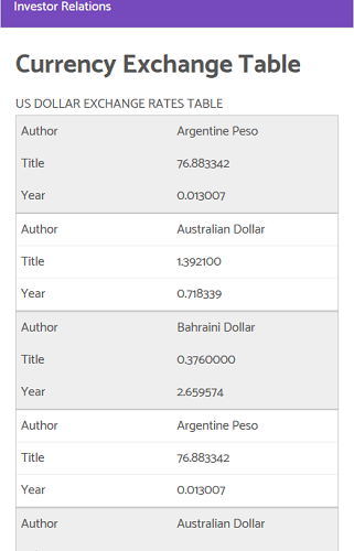
The “Currency Exchange Table” in our prototype design is accessible and responsive. Don’t believe me? Resize your browser’s viewport and observe the changes.
The technique used to implement this is courtesy of the work of Chris Coyier and Adrian Roselli in their articles Responsive Data Tables and A Responsive Accessible Table.
Both methods work without JavaScript, but Adrian’s does not fit well on mobile. Therefore, I combined both techniques that work for a browser with or without JavaScript without sacrificing accessibility.
Chris’ method is the default design because it works without JavaScript. When the browser loads JavaScript, we change to Adrian’s design.
The following JavaScript does the trick:
let table = document.getElementById("currencyTable");
table.classList.remove("noJS-version");
table.classList.add("js-version");
It changes the following CSS class in the table markup:
<table id="currencyTable" class="noJS-version">
    <!-- remaining table markup truncated -->
</table>
You will find the CSS for the table markup in styles.css.
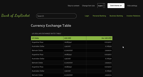
The responsive table on a smaller viewport with JavaScript enabled:
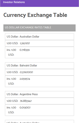
Without JavaScript:
The notable difference in the tables is the layout when a Screen Reader like NVDA reads it on mobile or in a smaller viewport.
We did not include any videos, but it’s good that you know about creating accessible videos.
Videos should have captions and subtitles if necessary. This is required because of Screen Readers.
YouTube videos have subtitles, and if you use the EDX platform, all videos have captions that allows the user to jump to specific points in the video.
You should check the following resources to learn more about accessible videos:
Do you use a dark theme in your code editor and favorite websites? I do.
Dark mode became a trend few years ago, and the trends is increasing by the day with popular websites like Twitter and DEV now implementing it.
Our prototype website also features a dark theme. It works on a JavaScript enabled browser. Here is the website with dark theme enabled:
The dark theme code is courtesy of Heydon Pickering in their book, Inclusive Components. Specifically, the chapter on theme switcher.
The theme works by inverting the colors of all page elements using CSS filters.
Here is the code again:
<style id="inverter" media="none">
    html {
        background-color: #eee;
        filter: invert(100%);
    }
    * {
        background-color: inherit;
    }
    img:not([src*=".svg"]),
    [style*="url("] {
        filter: invert(100%);
    }
</style>
The CSS code is located in the style attribute in the head of each document.
The HTML is given below:
<label
       id="themer-label"
       class="button header__form-label"
       data-state="disabled"
>
    <input type="checkbox" id="themer" disabled />
    Dark theme: <span aria-hidden="true"></span>
</label>
You’ll observe the label element has a data-state attribute set to disabled, and the input is also disabled.
This design decision was made because the theme switcher is only useful and usable with JavaScript. Therefore, it’s disabled by default. When the browser supports JavaScript, we remove the disabled state of the input, along with the data-state attribute of the label element.
var themerLabel = document.getElementById("themer-label");
if (
    checkbox.hasAttribute("disabled") &&
    themerLabel.hasAttribute("data-state") &&
    themerLabel.getAttribute("data-state") === "disabled"
) {
    checkbox.removeAttribute("disabled");
    themerLabel.removeAttribute("data-state");
}
You’ll have to enable the dark theme preference in the user’s browser on each page. You can solve this using JavaScript local storage.
When JavaScript is disabled in your browser, the theme switcher is disabled since it’s not useful without JavaScript. If you want, you can hide it when JavaScript is disabled. I’ll leave that to you.
If you’ve followed the route that we took in this tutorial up to this point, your website should be accessible to screen readers.
Screen readers will read your site’s content correctly if it is based on semantic and valid HTML, but you can take the prototype website or your website for a test using any of the screen readers below:
Personally, I used NVDA on the website designed for this tutorial.
Now it’s time to do accessibility testing for your website.
Accessibility testing allows you to note some errors in your HTML code that might have an impact on your site’s accessibility.
I discovered some issues when I was designing the website for this tutorial. Some were errors and others were warnings. I solved most of it, but there is one specific error that seems to have no solution when it comes to passing an accessibility check.
I used WEBAIM accessibility checker extension for Firefox, and it reported a single contrast error on the combo box in the heading section of all pages tested. After some research, I found out that the browser does not allow CSS styling on an option tag, specifically the background color. As a result, the tool reported a contrast error because the option tag has a white text on a blue light background, which is the default for this tag.
I found multiple solutions to alter the outlook of the option tag, but none of them passed the accessibility test. The WEBAIM reported the same contrast error on all found solutions. Therefore, it’s a minor trade off we’ll have live with.
In the lower part of each page, there is a site resources section that is implemented as an accordion on tablet and mobile devices.
The approach I took for implementing the accordion involves duplicated markup: one for the accordion and the other for the full layout on a wider screen. The code for the accordion is hidden on the wider screen and vice versa.
The WEBAIM accessibility tool reported an alert for this, because it involves pointing the two adjacent links to the same resource.
You can ditch the accordion in your design and stack the links on top of each other on tablet and mobile devices and ensure it’s easily clickable. I also consider this a minor trade off, since you can easily do away with them.
Aside from the error which seems unsolvable for now and the alert which you can do away with in your design, other accessibility checks got the green light.
Up to this point, our code is valid HTML and CSS. You can verify yourself using W3 Validator, but you’ll notice one tiny error in the head section.
It is the code for the theme switcher. The validator reported that the value used for the media attribute is unknown.
I stuck with this theme switcher because it’s accessible with the keyboard. But if you do not want this error, you can implement your own.
After your design process, ensure you validate your HTML and CSS — it’s free.
Our prototype website for this tutorial is a fictional Bank of LogRocket. Since it’s a banking website, we might need to worry about print style sheets (except for web page components). Most banking operations are done behind authentication, and we did not reach that level in this tutorial.
The currency exchange table on the currencyexchange.html file and the accordion are the only ones with a print style.
A print style sheet should ensure that the website contents print correctly on paper and reduce ink usage. You can do the following to reduce ink usage:
If your website is a recipe website, print style sheets is a must and you must get it right.
When you take the lessons learned in this article and apply it to your next design project, you’ll have done your best as a web developer and your users will have access to the baseline experience and more (if their browser supports it).
Install LogRocket via npm or script tag. LogRocket.init() must be called client-side, not
server-side
$ npm i --save logrocket

// Code:

import LogRocket from 'logrocket';
LogRocket.init('app/id');
// Add to your HTML:

<script src="https://cdn.lr-ingest.com/LogRocket.min.js"></script>
<script>window.LogRocket && window.LogRocket.init('app/id');</script>

We built the same app in TanStack Start RSC and Next.js RSC. TanStack shipped 40% less JS and built 4x faster — but Next.js is still the safer production bet.

From RSC vulnerabilities and the Vercel breach to TypeScript 7.0 Beta and AI agents — the nine frontend storylines that defined H1 2026, ranked.

AI tools generate working React code fast, but miss race conditions, empty states, debouncing, and accessibility. Here’s how to catch bugs before production.

Learn how to use Gemini CLI subagents to delegate frontend, backend, testing, and docs tasks to specialized agents with guardrails and clear ownership.
Hey there, want to help make our blog better?
Join LogRocket’s Content Advisory Board. You’ll help inform the type of content we create and get access to exclusive meetups, social accreditation, and swag.
Sign up now

 Learn more →
