Back in the good old days, the limits of CSS made even “simple” things like vertical centering a challenge, with some developers even relying on JavaScript solutions. It was fragile and very constrained, and there was always that one exception that made it fail.

Whether we were trying to align an icon or image beside the text, create one of those popular hero banners, or create a modal overlay, centering things on the vertical axis was always a struggle.
But CSS has come a long way since, providing many methods that make vertical centering easier every time. In this article, we will look at a summary of some of them, along with their use cases and limitations.
Editor’s note: This post was last updated by Rishi Purwar in March 2025 to offer a direct comparison of different alignment techniques (vertical-align, flexbox, grid), add interactive CodePen examples, and expand on browser compatibility.
The Replay is a weekly newsletter for dev and engineering leaders.
Delivered once a week, it's your curated guide to the most important conversations around frontend dev, emerging AI tools, and the state of modern software.
Vertical alignment can be seen everywhere in an application, from navigation menus, form fields, product listings, and so on. To vertically align a text or an element means to arrange it within a container or block along its vertical/y-axis. The image below demonstrates this:
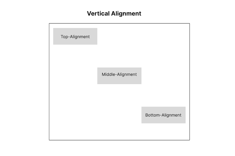 The diagram explains the concept of vertical alignment in this way:
Unless explicitly stated, each strategy highlighted below will work with inline elements as well. This makes sense, given that we’ll be directly transforming their position or display properties.
This table provides a high-level comparison of the different approaches, helping you choose the best method based on your layout needs:
| Method | CSS properties used | Works with | Key advantages | Browser support |
|---|---|---|---|---|
| CSS Flexbox | align-items, justify-content, align-self, align-content |
Flex containers | Flexible, responsive, minimal extra markup | All modern browsers |
| CSS Grid | align-items, justify-content, align-self, place-items, grid-template-rows |
Grid containers | Precise placement, single-line centering with place-items |
All modern browsers |
| Absolute positioning | position: absolute, top: 50%, transform: translateY(-50%) |
Any positioned parent | Works without Flex or Grid | Wide browser compatibility |
| Inline & table-based | vertical-align, display: table-cell, line-height |
Inline/text elements, tables | Works with inline and text elements, table-based layouts | Wide browser compatibility |
CSS Flexbox introduced great alignment properties (that are now forked into their own box alignment module).
These properties allow us to control how items are placed and how empty space is distributed. Previously, this would have required either magic numbers in CSS for a specific number of elements, or clever JavaScript for dynamic amounts. Now, with a few Flexbox properties, we can control how items are placed and how empty space is distributed.
The way you align items using Flexbox depends on the flex-direction property.
When using flex-direction: row, justify-content controls horizontal alignment, while align-items controls vertical alignment.
When using flex-direction: column, it’s the opposite. justify-content aligns items vertically and align-items aligns them horizontally.
align-items and justify-contentIn this example, we use align-items and justify-content to center items vertically and horizontally within a Flex container. This approach ensures consistent alignment, making it a go-to method for flexible layouts:
See the Pen
Align on the flex container or the flex item by Rishi Purwar (@rishi111)
on CodePen.
align-items and justify-content:| Browser | display: flex |
justify-content |
align-items |
|---|---|---|---|
| Chrome | ⚠️ 21–28 (partial, -webkit- prefix), ✅ 28+ |
⚠️ 21–51 (partial), ✅ 52+ | ⚠️ 21–51 (partial), ✅ 51+ |
| Firefox | ✅ 20+ | ✅ 20+ | ✅ 20+ |
| Edge | ✅ 12+ | ✅ 12+ | ✅ 12+ |
| Safari | ⚠️ 7–8 (partial, -webkit- prefix), ✅ 8+ |
✅ 7+ | ✅ 7+ |
align-selfIn this example, we use align-self to vertically align a flex item within its container. This is useful when individual flex items need different alignments:
See the Pen
Align on the flex container or the flex item 2 by Rishi Purwar (@rishi111)
on CodePen.
align-self| Browser | align-self |
|---|---|
| Chrome | ⚠️ 21–35 (partial), ✅ 35+ |
| Firefox | ✅ 20+ |
| Edge | ✅ 12+ |
| Safari | ✅ 7+ |
margin: autoOne of the simplest and most reliable ways to vertically center a flex item is by applying margin: auto. This approach automatically adjusts the margins around the Flex item, distributing the remaining space evenly and perfectly centering it within the container:
See the Pen
Using margin: auto on a flex item by Rishi Purwar (@rishi111)
on CodePen.
This tactic is one of my favorites because of its simplicity. The only major limitation is that it’ll only work with a single element.
align-contentAccording to the CSS Box Alignment Module Level 3 specification, align-content can be used to control alignment along the block axis in block and multicol containers. This allows centering content within these containers, similar to how it’s done in Flex and Grid layouts:
See the Pen
align-content by Rishi Purwar (@rishi111)
on CodePen.
align-content:| Browser | align-content |
|---|---|
| Chrome | ✅ 21+ |
| Firefox | ✅ 28+ |
| Edge | ✅ 12+ |
| Safari | ✅ 9+ |
In this example, pseudo-elements (::before and ::after) are used to distribute space evenly within the Flex container. By setting their flex: 1, they push the Flex item to the center, achieving vertical alignment without extra markup. However, this approach is not very practical for most layouts:
See the Pen
Pseudo-elements on a flex container by Rishi Purwar (@rishi111)
on CodePen.
| Browser | Pseudo-elements (:before & :after) |
flex-direction: column |
|---|---|---|
| Chrome | ✅ 4+ | ✅ 21+ |
| Firefox | ✅ 2+ | ✅ 72+ |
| Edge | ✅ 12+ | ✅ 12+ |
| Safari | ✅ 3.1+ | ✅ 7+ |
CSS Grid makes vertical alignment just as easy as Flexbox, giving you great control over content placement. With properties like align-items, justify-items, and place-items, you can quickly center elements within a grid container—no extra tricks needed! Let’s explore how to align items vertically using Grid.
align-items and justify-contentIn this example, we use align-items: center to vertically align grid items and justify-content: center to center them horizontally within the grid container. This approach ensures the item stays perfectly centered without needing extra spacing tricks:
See the Pen
Align on the grid container by Rishi Purwar (@rishi111)
on CodePen.
align-items and justify-content:| Browser | display: grid |
justify-content (Grid Layout) |
align-items (Grid Layout) |
|---|---|---|---|
| Chrome | ✅ 57+ | ✅ 57+ | ✅ 57+ |
| Firefox | ✅ 52+ | ✅ 52+ | ✅ 52+ |
| Edge | ⚠️ 12–15 (partial, -webkit- prefix), ✅ 15+ |
✅ 16+ | ✅ 16+ |
| Safari | ✅ 10.1+ | ✅ 10.1+ | ✅ 10.1+ |
align-self and justify-selfIn this example, we use align-self and justify-self to center a grid item within its cell. align-self: center vertically centers the item, while justify-self: center does the same horizontally. This approach is great for precise control over individual grid items without affecting the entire grid layout:
See the Pen
Align On The Grid Item by Rishi Purwar (@rishi111)
on CodePen.
align-self and justify-self:| Browser | align-self (Grid Layout) |
justify-self (Grid Layout) |
|---|---|---|
| Chrome | ✅ 57+ | ✅ 57+ |
| Firefox | ✅ 52+ | ✅ 45+ |
| Edge | ✅ 16+ | ✅ 16+ |
| Safari | ✅ 10.1+ | ✅ 10.1+ |
place-items: centerAnother beautiful and straightforward grid implementation is applying the center value to a place-items property in the same grid element. All of its child elements are magically centered:
See the Pen
grid and place-items by Rishi Purwar (@rishi111)
on CodePen.
Browser support for place-items: center:
| Browser | place-items (Grid Layout) |
|---|---|
| Chrome | ✅ 60+ |
| Firefox | ✅ 46+ |
| Edge | ✅ 79+ |
| Safari | ✅ 11+ |
margin: auto on a grid itemSimilar to the Flexbox example above, using margin: auto on a grid item allows it to automatically take up available space, centering it both vertically and horizontally within the grid container. This method is simple and requires no extra properties.
See the Pen
margin: auto on a grid item by Rishi Purwar (@rishi111)
on CodePen.
grid-rowWhen you need to place an element at a specific vertical position within a grid, grid-row is the way to go. In this example, the item is placed in the second row to achieve vertical alignment within the grid layout:
See the Pen
Pseudo-elements on a grid by Rishi Purwar (@rishi111)
on CodePen.
grid-row:| Browser | grid-template-columns |
grid-template-rows: repeat() |
| Chrome | ✅ > 57 | ✅ > 57 |
| Firefox | ✅ > 52 | ✅ > 52 |
| Edge | ⚠️ 12-15 (partial, -ms-grid-column prefix), ✅ > 16 | ✅ > 16 |
| Safari | ✅ > 11 | ✅ > 10 |
Just like the Flexbox approach, we can use pseudo-elements with CSS Grid to create vertical alignment. By defining a three-row grid and placing empty ::before and ::after elements in the first and third rows, we push the main element into the center without extra markup:
See the Pen
Pseudo-elements on a grid by Rishi Purwar (@rishi111)
on CodePen.
Absolute positioning offers a reliable way to vertically align elements. By using properties like position, margin: auto, and transform, we can center elements within their containers without depending on Flexbox or Grid.
position: absolute and margin: autoOne way to vertically center an element is by using position: absolute along with margin: auto. By setting inset: 0, the element is constrained within its container, and margin: auto, automatically distributes the available space, centering it:
See the Pen
Absolute positioning and margin: auto by Rishi Purwar (@rishi111)
on CodePen.
The limitation to this approach is, of course, that the element height must be explicitly declared, or it will occupy the entire container.
position: absolute and translateY(-50%)This is one of the first tricks, and still a go-to, for many developers. By relying on absolute positioning, the inner element at 50 percent from the top and left of its parent, we can then translate it up to 50 percent of its height:
See the Pen
The classic top:50%, translateY(-50%) by Rishi Purwar (@rishi111)
on CodePen.
A fairly solid approach, with the only major limitation being the use of translate that might get in the way of other transforms, for example, when applying transitions or animations.
Inline and table-based methods offer simple ways to vertically align content, especially for text and table elements. While vertical-align works well for inline elements, display: table-cell provides a reliable way to align content within table-based layouts. However, these approaches come with limitations and are less flexible compared to modern CSS techniques like Flexbox and Grid.
display: table-cell and vertical-alignThis is a really simple approach, and one of the first (back in the day, everything was centered around tables). We’ll use the behavior of table cells and vertical-align to center an element on a container.
This can be done with actual tables or using semantic HTML, switching the display of the element to table-cell:
See the Pen
Centering with tables by Rishi Purwar (@rishi111)
on CodePen.
But, bear in mind that this totally fails on screen readers (even if your markup is based on divs, setting the CSS display to table and table-cell makes screen readers interpret it as an actual table). So, it’s far from the best when it comes to accessibility.
display: table-cell and vertical-align CSS properties have great browser support, making it a reliable choice for vertical alignment, especially when working with table-like layouts.
vertical-align for inline elementsYou can also use the vertical-align property to center inline, inline-block, or table cell elements vertically. One of the many applications for this approach is to vertically align an image with text or to vertically align the contents of a table cell:
See the Pen
Using vertical-align for inline elements by Rishi Purwar (@rishi111)
on CodePen.
The fact that this method doesn’t work with the block element could be a deal breaker. Apart from that, it works reasonably well and is supported by older browsers.
line-heightBy default, this vertically aligns your text by sharing an equal proportion of space around the text, creating an illusion of vertical centering.
When the line-height value is greater than the font size of the text, we can, by default, get extra spacing, and the extra space is then distributed evenly above and below the text. This makes the text appear vertically centered within its containing element. The implementation of this is straightforward:
See the Pen
line-height by Rishi Purwar (@rishi111)
on CodePen.
line-heightline-height has full support for all modern browsers; feel free to make the most of it.
Another oldie that didn’t catch up for whatever reason is using inline-block with a ghost (pseudo) element that has 100% height of the parent, then setting vertical-align: middle for both the pseudo-element and the element we want to center:
See the Pen
The ghost element method by Rishi Purwar (@rishi111)
on CodePen.
It works quite well, with the most noticeable catch being that it moves the horizontal center just a tiny bit to the right because of the always cringy behavior of white space between inline-block elements.
This can be dealt with by adjusting the margin on the pseudo-element. In our case, we’ve assigned margin-left: -0.5ch. We can also get a perfect centering by setting the font size to 0 on the container and resetting it to px or rem on the element:
See the Pen
The ghost element method 2 by Rishi Purwar (@rishi111)
on CodePen.
The brain has an observed pattern; it is designed to read and easily assimilate concepts from the left to the right (left aligned), which makes reading large blocks of text easier.
Vertical alignment may stand out aesthetically, but those with reading difficulties may find it challenging to work with. Vertically aligned text should be minimal for the sake of accessibility. This means it should be limited to headers to accommodate users with reading impairments.
Vertically aligned, large text is known to reduce reading speed because readers need to pause before finding the next line. This isn’t advisable for long text. If you must slow down the reading speed, it should be for the right reasons, such as emphasizing specific content. Otherwise, text alignment should be kept simple for ease of reading.
For vertical alignment, it is more advisable to settle for CSS Flexbox or Grid in most cases because these tools offer a cleaner and more responsive approach compared to mimicking tables with CSS and the rest.
CSS has come a long way, making vertical alignment easier than ever. We’ve explored some of the best techniques, each with its use cases and limitations. Modern solutions like Flexbox and Grid offer flexibility and responsiveness, while classic methods still come in handy for compatibility. The key is knowing when to use which approach.
Got a favorite vertical alignment trick? Drop it in the comments; we’d love to hear it!

TSRX adds first-class control flow, conditional hooks, and scoped styles to React via a TypeScript compiler extension — no new framework required.

Learn how to build a full React Native auth system using Better Auth and Expo — with email/password login, Google OAuth, session persistence, and protected routes.

Compare the top AI development tools and models of June 2026. View updated rankings, feature breakdowns, and find the best fit for you.

Learn how Bloom filters reduce database lookups for username availability checks while preserving correctness at scale.
Hey there, want to help make our blog better?
Join LogRocket’s Content Advisory Board. You’ll help inform the type of content we create and get access to exclusive meetups, social accreditation, and swag.
Sign up now

 Learn more →
