Editor’s note: This CSS grid guide was last updated on 10 January 2023 to include more information on the differences between CSS grid and CSS flexbox, interactive code examples, and more in-depth definitions of when to use CSS grid. Check out our CSS archive to learn more about what you can do with CSS.
The web is based on and made up of layouts. The way you want your web apps to look across different platforms and devices — mobile, tablets, laptops, and desktops — is determined, to a large extent, by the layout structure.
For example, we have come to embrace a responsive and mobile-first design. This is because most people access the web from their mobile phones.
To achieve this layout initially, developers had to rely on CSS hacks for web apps, like tables, floats, positioning, and inline-blocks. Then, the CSS grid layout was introduced to help developers create better layouts without the hacks — particularly avoiding using floats and tables. What’s more about CSS grid? It has support across all of the different browsers.
With CSS grid, we can create amazing layouts and create responsive web pages seamlessly. Herein lies the power and relevance of the CSS grid layout system: being able to use it to design layouts for mobile-first web apps and responsive websites that cut across different browsers. This article will take a deep dive into CSS grid and show you how to get started in using it.
Jump ahead:
CSS grid is used for creating two-dimensional layouts. It is different from CSS flexbox, which can only create one-dimensional layouts and is mainly created for alignments. Being a two-dimensional layout system means that CSS grid allows us to simultaneously work with columns and rows to build complex and responsive layouts. The advent of CSS grid means we no longer need to deploy hacks like positioning and floats.
CSS grid is a great tool when we need to account for the position, sizes, and layers of different elements and how they relate with each other open a webpage. It also makes it easy to rapidly create different types of layouts for websites.
As with all things web and software development, the answer to this question is: it depends. While neither CSS grid nor CSS flexbox is a one-size-fits-all solution, there are some instances where CSS grid shines as the right and better tool for the job.
For websites that are composed of elements with varying sizes that need complex layouts like masonry layouts, CSS grid is your best option. While there are flexbox hacks you can implement to achieve these layouts, these hacks are often complex and require longer lines of code because you are not using the right tool for the job.
In cases where you want fine-grained control over the position of each individual element on the page, CSS grid shines as the better tool. CSS grid’s grid-template-areas, grid lines, and grid-spanning features make this possible. While we can also achieve this fine-grained control with flexbox, it usually requires more lines of code, which can be tricky to maintain and manage over time, and wild CSS files are always difficult to work with.
Lastly, in cases where you want greater flexibility to move elements around, regardless of the structure of the HTML markup, CSS grid should be your first choice.
At the most basic level, a CSS grid is a two-dimensional layout system for the web. With CSS grid, you can lay content out in rows and columns.
Before we go deeper, let’s take a look at the building block of CSS grid, the display: grid; container.
First, let’s create the HTML elements we want to style with CSS grid:
<body class="container">
    <div class="item box1"><p>One</p></div>
    <div class="item box2"><p>Two</p></div>
    <div class="item box3"><p>Three</p></div>
</body>
Next, we define the grid layout by setting the display to grid:
// define or create a grid
.container{
    display: grid;
}
Once your grid is defined, you’re in a good position to start. However, that doesn’t do anything magical just yet. We need to tell the grid how big the columns and rows should be. To become better acquainted with the details, let’s discuss the terminology of CSS grid:
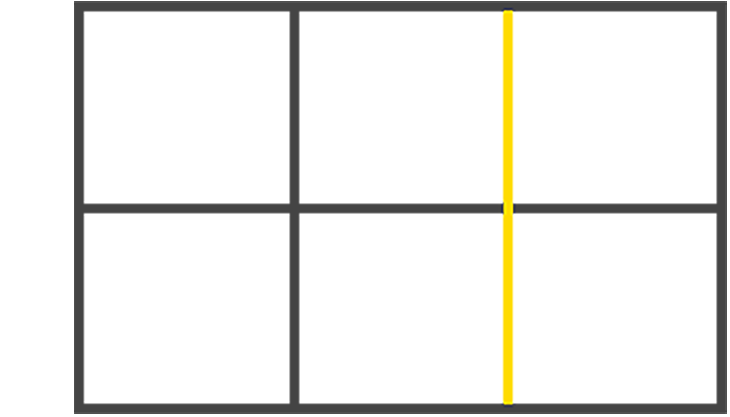
grid displaygrid containergrid cells, through rows and columnsgrid lines. It’s a single unit of the grid. Here’s a picture to explain a grid cell: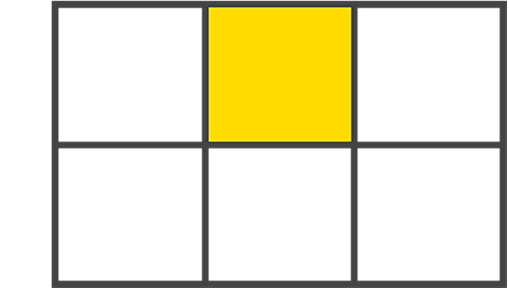
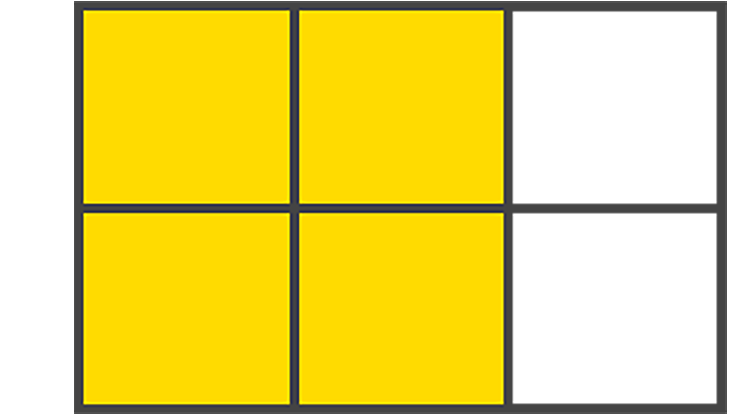
Implicit grid lines are visualized as dotted lines in your dev tools and are created by the browser without explicitly defining columns or rows.
Let’s use this code snippet to explain implicit grid lines:
.container{
    display: grid;
    grid-template-columns: 100px 100px 100px;
}
In the code snippet above, we explicitly define what the columns will be. We do not define the rows. So, the browser will decide what it will do to the extra items that aren’t covered by the explicit definition. It does this by creating new rows and moving these extra items into the rows. And that’s implicit!
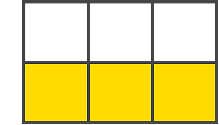
Explicit grid lines are the solid lines visible in the dev tools for rows and columns defined within your CSS. Explicit scenarios aren’t decisions made by the browser; they’re the decisions you make, which are explicit.
Here’s an interactive example:
See the Pen
CSS Grid – gapless by Emadamerho Nefe (@nefejames)
on CodePen.
Gutters are the spaces between grid cells. You can create a gutter using the gap shorthand property, or you can do so explicitly using column-gap and row-gap. Should you use the gap shorthand property to create the gutter, the value you assign to the gap will target both the row and column of the grid.
To provide your grid with gutters, using gap, you’ll define this property in the parent container:
// using gap to create gutter of 20px row and column
.container {
    gap: 20px; /* row and column gap */
}

// this can also be written as
.container {
    column-gap: 20px;
    row-gap: 20px;
}
See the Pen
CSS Grid – with gap by Emadamerho Nefe (@nefejames)
on CodePen.
The fr value, otherwise known as the fractional unit, solves the problem of automatically distributing free space among elements and replaces the need for percentages.
Let’s update our example’s CSS file to switch from pixels to fr:
.container {
  display: grid;
  gap: 10px;
  grid-template-columns: 1fr 1fr 1fr;
}
Note how the sizes of the child elements in the grid automatically increase in width to fill the available space in the grid parent:
See the Pen
CSS Grid – 1fr by Emadamerho Nefe (@nefejames)
on CodePen.
Seeing as nothing really happens until you actually define rows and columns, we should now learn to create them. There are various ways to define each, so let’s begin by learning how to create columns.
The grid-template-columns property is created in the parent-container where each value passed represents the number of explicit columns. For instance:
.parent-container {
  grid-template-columns: 20px 1fr 40px;
}
The example above tells the browser to create three columns. The first column is 20px wide, the second column is 1fr, and the third column is 40px. You can also pass functions and keywords as values, which we’ll address later in this article.
The technique known as spanning allows child items to stretch across columns present in your grid by defining column start and column end positions, as shown below:
.container{
  display: grid;
  grid-template-columns: 1fr 1fr 1fr 1fr 1fr;
}

.child-item:nth-child(1) {
  grid-column: span 2; /* span 2 columns */
}

.child-item:nth-child(2) {
  grid-column: span 3
}
The snippet above defines each column’s start and end position. However, you can also include a slash between two values.
You can also achieve this same result using the code below. The difference here is that the first value before the / will target the start line of the column, while the second value will target the end of the grid:
.child-item:nth-child(1) {
  grid-column: span 2 / 5;
}
The code above tells the browser to span my grid item two columns wide and end it at column five. This represents the column-start/column-end position, but notice we didn’t tell the browser where to start the column; we only said where to end.
This is something the browser figures out. It automatically understands that we want to span two columns and end column five’s grid line, so it calculates that the item will start at the end of column two’s grid line.
If we want to tell the browser exactly where to start a child-item, we’d remove the span keyword:
.child-item {
  grid-column: 2 / 5;
}
The snippet tells the browser to start my item at column 2 and end at column 5. Here’s an example:
See the Pen
CSS Grid – grid column span by Emadamerho Nefe (@nefejames)
on CodePen.
There’s this sneaky -1 value that you’ll frequently use to span the full grid container, and it’s all because your grid is one more than the number of columns/rows defined. It really has to do with tracks. This track officially ends at the end of your grid container:
.child-item {
  grid-column: 1 / -1;
}
This example starts at the first column and spans the full width of the defined grid, regardless of the number of columns defined in your CSS. Cool, right? Heck yeah, it is! Check it out below:
See the Pen
CSS Grid – full width -1 by Emadamerho Nefe (@nefejames)
on CodePen.
Grid rows are just like columns, only they run horizontally instead of vertically. The property is written identically to our column counterpart, except we use the word rows instead. Here’s how that’s written in CSS:
.parent-container {
  grid-template-rows: 1fr 1fr 1fr 1fr 1fr;
}
The above example defines four explicit rows, each of which is 1fr high. If any children wrap to a new row, that’s when your implicit rows will be created.
With the grid-row shorthand property, we have the same opportunity to span rows just like we can span columns, like so:
.item:nth-child(1){
  grid-row: span 2
}

.item:nth-child(2){
  grid-row: span 3
}
See the Pen
CSS Grid – grid template rows by Emadamerho Nefe (@nefejames)
on CodePen.
The grid-template() shorthand lets you define a start and end position for rows and columns in one line and is comparatively far more accessible to read than the grid property we previously discussed. I personally dig this shorthand. It just makes sense to me.
Here’s an example:
.parent-container {
  grid-template: 1fr 1fr / 100px 100px 100px;
}
The shorthands we’re provided with above are grid-template-rows and grid-template-columns, but we also have grid-template-areas to consider, too — more on that shortly.
The first value is the start position, and the second value is the end position, followed by the slash / that repeats this pattern. You can think of it like this: the part in front of the/ is your rows, and the part behind the / are your columns:
See the Pen
CSS Grid – grid-template by Emadamerho Nefe (@nefejames)
on CodePen.
What can be done when you have that pesky overflow lingering around in your grid? You throw your computer out the window, right? Wrong! You can control the overflow of your grid in one swift action using some carefully placed properties for column and row overflow. Let’s start by investigating column overflow.
The grid-auto-columns property will help handle your overflow needs. It’s defined on the parent-container and is written in the following fashion:
.parent-container {
    grid-auto-columns: 50px;
}
The above code snippet implies that when an implicit grid is created, the size of the column should take up two fractional units of the parent-container:
.parent-container {
    grid-auto-columns: 50px; /* overflow size */
    grid-auto-flow: column; /* overflow type */
}
The result of the code above tells the overflow to create columns that are 150px in size, meaning that the implicit overflow will be in the form of columns, not rows:
See the Pen
CSS Grid – auto column overflow by Emadamerho Nefe (@nefejames)
on CodePen.
This property works exactly like our column overflow property and is written the same way, too — bonus!
.parent-container {
    grid-auto-rows: 150px;
}
Just like the property we used for columns, we dictate the size of our implicit rows by passing a value of row to grid-auto-flow. What we get are rows that are created any time an overflow is present:
.parent-container {
    grid-auto-rows: 150px;
    grid-auto-flow: row;
}
With the above lines, we define the overflow type (rows) and the overflow size (150px) of the implicit overflow for children elements of the grid container:
See the Pen
CSS Grid – auto row overflow by Emadamerho Nefe (@nefejames)
on CodePen.
Grid templates are nice to use when you don’t know how many columns you’ll need upfront. They’re also great to use with media queries to achieve some rearranging magic. Here’s how you write the property:
.parent-container {
    grid-template-areas: "sidebar1 content sidebar2";
}
Using a set of quotes containing words of your choosing, such as "sidebar1 content sidebar2", we begin to define our grid areas. You can also define multiple areas. For example:
.container {
  display: grid;
  gap: 10px;
  grid-template:
    "header header header" auto
    "sidebar1 content sidebar2" 1fr
    "footer footer footer" auto
}
This property alleviates the need to worry about line numbers, and each one used will be positioned accordingly. You set the position by defining the property on a child item of your choosing:
.header{
  grid-area: header;
}

.sidebar1{
  grid-area: sidebar1;
}

.content{
    grid-area: content;
}

.sidebar2{
  grid-area: sidebar2;
}

.footer{
    grid-area: footer;
}
Using grid-area, we pass the corresponding area as a value. Nothing more, nothing less; it’s that straightforward. Here’s an example:
See the Pen
CSS Grid – grid template areas by Emadamerho Nefe (@nefejames)
on CodePen.
This particular feature of CSS grid, named grid lines, might be useful if you want to explicitly direct your layout behavior. You are granted the ability to name positions on your grid instead of using nameless numerical values:
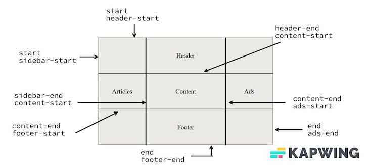
Let’s see how this works. First, the HTML:
  <body>
    <div class="container">
      <div class="item header">Header</div>
      <div class="item content">Content</div>
      <div class="item articles">Articles</div>
      <div class="item footer">Footer</div>
      <div class="item ads">Ads</div>
    </div>
  </body>
Then, the CSS:
.container {
  display: grid;
  grid-template-columns: [start sidebar-start] 3fr [sidebar-end content-start] 5fr [content-end ads-start] 3fr [end ads-end];
  grid-template-rows: [start header-start] auto [header-end content-start] auto [content-end footer-start] auto [end footer-end];
}
The region is given a name followed by the size (constraint). To define the position, we turn to children, where we’ll define the value based on the named regions above:
.header {
  grid-column: start / end;
  grid-row: start / header-end;
}
.articles {
  grid-column: start / sidebar-end;
  grid-row: header-end / footer-start;
}
.content {
  grid-column: content-start / content-end;
  grid-row: content-start / content-end;
}
.footer {
  grid-column: start / end;
  grid-row: footer-start / footer-end;
}
.ads {
  grid-column: ads-start / end;
  grid-row: header-end / footer-start;
}
See the Pen
CSS Grid: named grid lines by Emadamerho Nefe (@nefejames)
on CodePen.
These handy little devils are the helping hands for your grid desires. They’re the superstars that help make your code-writing life easier and far more efficient. Let’s start with one of my favorites: repeat().
repeat()The repeat() function allows recurring patterns to be written succinctly — one you’ll use quite a bit when it comes to CSS grid. We define how many rows or columns we desire followed by a constraint, but you can also pass other functions or keywords as arguments. See the code below:
.parent-container {
    grid-template-columns: repeat(2, 1fr);
}
See the Pen
CSS Grid – repeat first example by Emadamerho Nefe (@nefejames)
on CodePen.
Here’s an example of repeat() in action to create four columns that are 1fr wide, but you can also create repeating patterns:
.parent-container {
    grid-template-columns: repeat(2, 50px 1fr) 2fr;
}
In this example, the pattern repeats twice. The first column is 50px wide, and the next column is 1fr. The pattern is repeated once more and concludes with the final column set to 2fr:
See the Pen
CSS Grid – repeat second example by Emadamerho Nefe (@nefejames)
on CodePen.
The fit-content() property does one thing: clamps a value to a given size passed:
fit-content(100px)
You’ll mostly use it with grid-template-columns and grid-template-row. For example:
.parent-container {
    grid-template-columns: fit-content(200px) fit-content(400px) 1fr;
}
This creates three columns with a max width of 200px and 400px, and 1fr respectively. You can also think of it as another way to define a max-width for grid columns and rows. Here’s another example:
See the Pen
CSS Grid – fit-content() by Emadamerho Nefe (@nefejames)
on CodePen.
minmax()The minmax() function defines a range between a set of values that functions as — you guessed it — a minimum and maximum constraint — and writing it is a breeze:
minmax(20px, 100px)
When content breaks column bounds, this function can be used inside repeat(). For example:
.parent-container {
    grid-template-columns: repeat(3, minmax(150px, 1fr))
}
If you want your children to wrap like champs, this is the way to go — especially when more elements will be added dynamically:
See the Pen
CSS Grid – minmax() by Emadamerho Nefe (@nefejames)
on CodePen.
Keywords are extremely valuable to your arsenal, so you’ll wanna get familiar with them. Let’s start with the ones you’ll most likely use and certainly the most confusing: auto-fit and auto-fill.
auto-fill / auto-fitThe auto-fill keyword ends the grid on the explicit grid line and fills all the available space. It also stretches items inside the grid’s tracks to fit. This makes it a worthy approach for wrapping elements when combined with minmax().
The auto-fit keyword ends the grid at the explicit column line. This is the opposite of what auto-fill does, as it expands the explicit grid.
You can use this keyword within the repeat() function. For example:
repeat(auto-fill, 150px)
Since the above doesn’t explicitly state how many columns are desired, extra implicit grids or columns will be added. This is the equivalent of telling the browser to just figure it out. And it chops the grid into as many spaces as possible that fill up the available space. You can read more about auto-fill and auto-fit for further insight into these keywords.
Using the value dense will make the grid auto-fill spaces in the grid container. This will also help create space for other, smaller grid items that may come up later.
When used in this fashion, grid-auto-flow: dense will place items without creating remainder areas and wiggle in additional ones that fit. In other words, it packs items in without leaving unused space behind. As shown below:
grid-auto-flow: column dense;
grid-auto-flow: dense;
This is a good option if you don’t care about the order and just want all spaces filled.
CSS flexbox is well-known for making it easy to align items, but you can do it with CSS grid too. The same properties available in flexbox are also available with grid, such as:
align-itemsalign-selfjustify-selfjustify-itemsjustify-contentThink of justify as being along the row axis (left to right) and align along the column axis (top to bottom).
There’s also a powerful property called place-items that aligns items horizontally or vertically in one line:
place-items: x | y;
place-items: center center
Typically these alignment properties are defined on the parent container, but they can also be overridden on the children. Here’s another example:
See the Pen
CSS Grid – place items by Emadamerho Nefe (@nefejames)
on CodePen.
CSS grid has an order property that works exactly like flexbox’s to control the arrangement of items. It is written in the same fashion:
<body class="container">
    <div class="item content"><p>Content</p></div>
    <div class="item sidebar"><p>Sidebar</p></div>
</body>
Then, in your CSS:
.container {
    display: grid;
}

.sidebar{
  order: 1;
}

.content{
  order: 2;
}
Seeing as the source order of grid items has no relevance, it makes rearranging super easy, especially with media queries. See more below:
See the Pen
CSS Grid – order by Emadamerho Nefe (@nefejames)
on CodePen.
Earlier in this article, we saw how CSS grid differs from CSS flexbox and how grid creates two-dimensional layouts, while flexbox is for one-dimensional layouts and alignments. Even though their use cases and applications differ, we can combine grid and flexbox to get the best of both worlds.
Let’s see a basic blog page scenario, for example. Here’s a screenshot of the demo we will build:
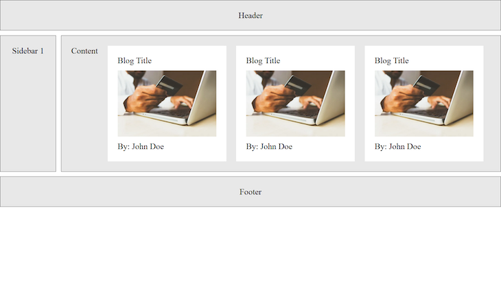
The image above shows a basic layout with a header, sidebar, footer, and some images.
The layouts for the header, sidebar, footer, and content sections are achieved with CSS grid, while the blog cards and their arrangement in the content section is created with CSS flexbox.
Let’s see how this works in practice, starting with the HTML markup:
<body class="container">
    //Header
    <div class="item header">
      <p>Header</p>
    </div>


    //Content
    <div class="item content">
      <p>Content</p>


      //Blog card 1
      <div class="blog-card">
        <span>Blog Title</span>
        <img src="/payment.webp" alt="a flexbox card" />
        <p>By: <span>John Doe</span></p>
      </div>


      //Blog card 2
      <div class="blog-card">
        <span>Blog Title</span>
        <img src="/payment.webp" alt="a flexbox card" />
        <p>By: <span>John Doe</span></p>
      </div>


      //Blog card 3
      <div class="blog-card">
        <span>Blog Title</span>
        <img src="/payment.webp" alt="a flexbox card" />
        <p>By: <span>John Doe</span></p>
      </div>
    </div>


    //Sidebar
    <div class="item sidebar1">
      <p>Sidebar 1</p>
    </div>


    //Footer
    <div class="item footer">
      <p>Footer</p>
    </div>
  </body>
Next, the grid layout:
.container {
  display: grid;
  gap: 10px;
  grid-template:
    "header header header" auto
    "sidebar1 content content" 1fr
    "footer footer footer" auto;
}

.header {
  grid-area: header;
}

.sidebar1 {
  grid-area: sidebar1;
}

.content {
  grid-area: content;
}

.footer {
  grid-area: footer;
}
Then, we create the blog card styles with flexbox:
 .blog-card {
  display: flex;
  flex-direction: column;
  align-items: flex-start;
}
Setting the flex-direction to column ensures that the images and text in the card are stacked on top of each other, and the flex-start alignment ensures that all content is aligned to the left.
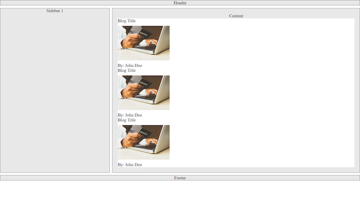
Lastly, we need to set up the flexbox styles that will define how the blog cards are arranged in the content section. This is important because the default behavior for divs is that they stack on top of each other because they are block elements. For this demo, we want the cards to sit beside themselves on large-screen devices and be stacked on mobile:
Because the blog cards are all in the content section, we will target the .content div and apply the styles there:
//mobile styles
.content {
  grid-area: content;
  display: flex;
  flex-direction: column;
  gap: 2rem;
}

//large screen styles
@media screen and (min-width: 600px) {
  .content {
    flex-direction: row;
  }
}
Setting the flex-direction to column on mobile ensures the cards stack upon themselves, and for large-screen devices, we set it to row.
This demo gives us an idea of how CSS grid and flexbox complement each other well. We also see that grid children can be flexbox parents or grid parents. Here’s our final product:
See the Pen
CSS Grid – flexbox + grid by Emadamerho Nefe (@nefejames)
on CodePen.
You’ve made it! We are at the end of our journey of learning the bits that helped create this amazing feature known as CSS grid. I hope what I’ve shared inspires you to start using CSS grid — it isn’t as scary as it may seem from afar!
As web frontends get increasingly complex, resource-greedy features demand more and more from the browser. If you’re interested in monitoring and tracking client-side CPU usage, memory usage, and more for all of your users in production, try LogRocket.

LogRocket lets you replay user sessions, eliminating guesswork around why bugs happen by showing exactly what users experienced. It captures console logs, errors, network requests, and pixel-perfect DOM recordings — compatible with all frameworks.
LogRocket's Galileo AI watches sessions for you, instantly identifying and explaining user struggles with automated monitoring of your entire product experience.
Modernize how you debug web and mobile apps — start monitoring for free.

Learn how to build smooth staggered animations in CSS using modern features like sibling-index(), complete with practical examples, fallbacks, and accessibility tips.

Compare the top AI development tools and models of July 2026. View updated rankings, feature breakdowns, and find the best fit for you.

Learn how to detect unused and ghost dependencies in JavaScript projects using Knip, a project-level linter that keeps your dependency graph accurate.

Learn how Storybook MCP enables AI agents to understand your component library, generate accurate UI, and validate code using documentation, stories, and automated tests.
Would you be interested in joining LogRocket's developer community?
Join LogRocket’s Content Advisory Board. You’ll help inform the type of content we create and get access to exclusive meetups, social accreditation, and swag.
Sign up now

 Learn more →
