Editor’s note: This article was last updated by Rahul Chhodde on 19 June 2024 to incorporate practices for optimizing the display of responsive CSS image galleries using properties like aspect-ratio and object-fit. It also now includes live CodePen demos of the responsive galleries created.

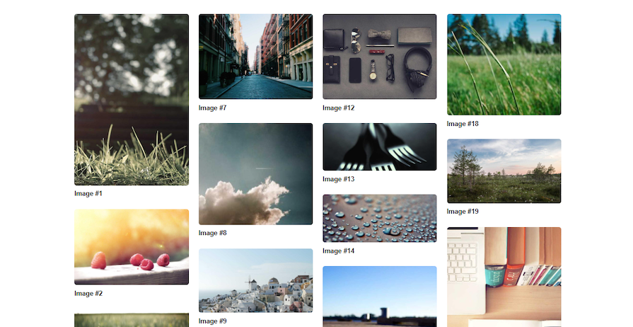
Galleries are an effective way to display collections of high-quality images. In web projects, developers create galleries to display images in a grid-like fashion so that users can easily browse them.
There are many ways to create such grid layouts with CSS alone. In this tutorial, we will cover how to use CSS flexbox to create responsive image galleries that look good on all devices. We will demonstrate the effectiveness of different flexbox properties through practical projects. Each project uses CSS custom properties to manage reusable values, incorporates media queries to add screen-specific CSS, and utilizes CSS flexbox properties to lay out the galleries.
A basic understanding of CSS is required to follow along with this tutorial.
The CSS Flexible Box Layout Module was designed to create one-dimensional layouts, either arranged as rows or columns at a time. It’s a CSS interface that provides access to properties that allow you to align and justify flex items inside flex containers.
In addition, flexbox can wrap items onto multiple lines to achieve a grid-like structure, which we will look at shortly.
When a flexbox container wraps its items, it treats every line as a separate flex line. It also allows you to justify these items based on their size and the available space on the flex line they are placed on. We will take a closer look at the wrapping and arrangement of flex items in the next section.
Let’s start by determining the structure of our image gallery. Our image gallery should be a flex container with multiple cells or items, each containing images. We can wrap each of these images inside a figure element that carries an optional figcaption element serving as the caption for the associated image:
<div class="img-gallery">
  <div class="img-gallery__item">
    <figure>
      <img src="..." width="..." height="..." alt="...">
      <figcaption>...</figcaption>
    </figure>
  </div><!-- .img-gallery__item -->
  <div class="img-gallery__item">
    <!-- ... -->
  </div><!-- .img-gallery__item -->
</div><!-- .img-gallery -->
N.B., specifying the width and height attributes of the images is a good practice that prevents cumulative layout shifts (CLS) issues and thus improves the Core Web Vitals (CWV) score of a webpage. If you are unsure about what values to provide to these attributes, simply add the original image dimensions and the browser engine will take care of the spacing and aspect ratios for each image.
Instead of using the ul or li elements to represent the gallery or gallery items, we used simple div elements to ensure we can easily extend this structure to something larger in the future, such as a lighthouse component.
Now, if we populate this structure with images, all the media will appear stacked on top of each other as no CSS styles have been applied to the structure yet.
Implementing a reset is important to provide a baseline for our project and normalize different elements to behave the same way on every browser. I‘ve tried to keep the reset as minimal as possible, but you may choose the one that best suits your needs:
:root {
  --body-leading: 1.6;
  --container-padding: 1.5em;
  --container-width: 1260px;
}

* {
  &,
  &::before,
  &::after {
    box-sizing: border-box;
  }
}

body {
  margin: 0;
  font: 1em/var(--body-leading) sans-serif;
}

img {
  max-width: 100%;
  vertical-align: middle;
  height: auto;
}

.page-container {
  padding: var(--container-padding);
  max-width: var(--container-width);
  margin-right: auto;
  margin-left: auto;
}
This reset sets box-sizing for every element on the page to border-box to keep the size of the elements unaffected by padding and border values. It also keeps our images from bleeding out of their parent elements. Alternatively, we may also add styles for a page container that wraps everything that is displayed on our page within itself.
As you may have noticed, we are managing some settings with CSS custom properties for easy customizability and maintenance.
We are now all set to apply flexbox properties and start building our image gallery. We will progressively enhance our galleries by first building basic functionalities and then adding features as the application grows.
As planned, the .img-gallery element will contain all the items with images, so it should be the flex container in this case. We’ll start by giving the .img-gallery a flex display and add more flexbox properties like flex-wrap and gap:
:root {
  --gallery-gap: 1.5em;
}

.img-gallery {
  display: flex;
  flex-wrap: wrap;
  gap: var(--gallery-gap);
}
Let’s take a closer look at the other CSS properties we applied to the flex container:
flex-wrap property ensures that flex items will wrap onto another linegap property sets a gap between rows and columns; in this case, it’s set to 1.5emAdditionally, you may add the justify-content property to align the items to the center or the end of the flexbox axis.
Note that, by default, the direction or main axis of a flexbox container is “row,” which is why all the flex items immediately line up horizontally.
Because this is a gallery of fixed-height items, we can use the aspect-ratio CSS property to maintain the relationship between the width and height of each image. Let’s also use the object-fit property and make the images fit within the available area as a cover, preventing them from appearing stretched out. Doing so will also avoid the need to add the height property to the gallery item and hide its overflow:
:root {
  --gallery-item-border-radius: .4em;
}

.img-gallery__item {
  img {
    aspect-ratio: 3 / 2;
    object-fit: cover;
    border-radius: var(--gallery-item-border-radius);
  }
}
Additionally, you may use properties like border-radius to add styles to the images to suit your design needs.
Next, we should specify a new custom property that governs the number of items per row in our gallery. Because we are building the gallery from smaller screen sizes to larger ones, we should set this number to 1 for now:
:root {
  --gallery-items-per-row: 1;
}
Also, we have to formulate what width (or flex-basis) we are going to give each of our items to fit perfectly considering the number of items per row and also the gap between the items.
If we manage to calculate the total space covered by the gaps between the items, we can find out the net space available for the items to occupy by subtracting that net gap amount from the available space in the container. Given that the container’s total space is 100%, this is how we’d calculate the space:
S = 100% - g * (n - 1)
S is the total space covered by gaps, g is the gap width, and n is the number of items per row. Now that we have the net space available for the items, we can divide this value by the number of items to calculate the space covered by each item (Si):
Si = S / n
Let’s implement this logic to provide a flex-basis to each gallery item, which sets the initial size of the flex items. We plan to create a gallery with fixed-width items, therefore, each item should be prevented from shrinking or growing automatically.
Keeping that in mind, we can now use the calc function to provide the calculated flex-basis, and also set flex-shrink and flex-grow values to 0 with the flex shorthand property, as shown in the code snippet below:
/* Previous styles */

.img-gallery__item {
  flex: 0 0
    calc(
      100% / var(--gallery-items-per-row) - var(--gallery-gap) *
        (var(--gallery-items-per-row) - 1) / var(--gallery-items-per-row)
    );
}
Also, we are using the figure and figcaption elements to contain the images and their captions. To ensure the layout doesn’t break, we should remove the usual extra margin that the figure element carries around it. We’ll also style the figcaption a bit:
.img-gallery__item {
  /* Previous styles */

  figure { margin: 0 }

  figcaption {
    margin-top: .5rem;
    font-weight: bold;
  }
}
We can now set up some media queries for larger screen sizes. Using the CSS custom properties, we only have to specify the appropriate items per row inside the media query blocks, and the rest of the logic for calculating the new flex-basis for each item will be handled automatically:
@media only screen and (width >= 1024px) {
  .img-gallery {
    --gallery-items-per-row: 4;
  }
}
@media only screen and (768px < width < 1024px) {
  .img-gallery {
    --gallery-items-per-row: 3;
  }
}
@media only screen and (540px < width < 768px) {
  .img-gallery {
    --gallery-items-per-row: 2;
  }
}
Piecing it all together, we now have a functional and responsive image grid, i.e., a gallery, that also supports simple captions:
See the Pen
Simple Flexbox Grid with captions by Rahul (@_rahul)
on CodePen.
We already have a simple setup for the captions associated with the images, which are handled by the figcaption element, as discussed above. We can further enhance these captions and set them to appear only on hover.
We will cover two variations of captions: transitioning from a simple appearance to a more funky and stylish one.
Our goal is to make the captions free-flowing inside the gallery items. This can be achieved by using absolute positioning for the figcaption.
To ensure that the free-flowing items do not disrupt the layout, the gallery items need to be relatively positioned to specify boundaries for the captions they carry.
Because the captions are no longer staying outside the gallery items and will float over the image instead, let’s also move the border-radius property from the image to the gallery item. To maintain the visual appeal of the decorations like border-radius, it’s important to prevent the gallery item contents from overflowing their parent element by setting the overflow property to hidden:
.img-gallery__item {
  position: relative;
  overflow: hidden;
  border-radius: var(--gallery-item-border-radius);

  figcaption {
    position: absolute;
    inset: auto auto 0 0;
    width: 100%;
    padding: 1rem;
  }
}
The captions appearing over the images should be clear and legible. To achieve that, let’s set a dark background to them with a bit of opaqueness and a brighter text color:
:root {
  --gallery-caption-bg-color: hsl(0 0% 0% / 90%);
  --gallery-caption-text-color: white;
}

.img-gallery__item {
  /* Previous styles */

  figcaption {
    background-color: var(--gallery-caption-bg-color);
    color: var(--gallery-caption-text-color);
  }
}
The caption is supposed to appear when the associated gallery item is hovered over. We should start with zero opacity for the initial state and transition it to 100% on hover, making the caption appear with a subtle fade-in transition:
.img-gallery__item {
  /* Previous styles */

  figcaption {
    opacity: 0;
    transition: opacity .25s ease-in-out;
  }

  &:hover {
    figcaption {
      opacity: 1;
    }
  }
}
The rest of the settings add alignment and size to the caption and are pretty straightforward to deal with, but you may also customize their behavior if needed:
See the Pen
Simple Flexbox Grid with classic captions by Rahul (@_rahul)
on CodePen.
Turning the classic captions into overlay ones requires spanning them all across the available space within the gallery items and aligning the caption contest to the absolute center:
:root {
  --gallery-caption-font-size: 1.5em;
}

.img-gallery__item {
  /* Previous styles */

  figcaption {
    position: absolute;
    inset: 0;

    display: flex;
    align-items: center;
    justify-content: center;
    margin-top: 0;

    font-size: var(--gallery-caption-font-size);
    color: var(--gallery-caption-text-color);
    background-color: var(--gallery-caption-bg-color);

    transition: opacity 0.25s ease-in-out, transform 0.15s ease-in-out;
    scale: 0;
    opacity: 0;
  }
}
In the CSS code above, we set the inset property to 0, which is a shortcut to set the top, right, bottom, and left positional properties to zero. This causes the target element to take up the full width and height of its container.
Then, we used flexbox to align the content of the caption to the absolute center. We also removed the extra top margin from the caption, as we want it to occupy the entire area provided by the item.
To make the hover transition slightly more interactive, we used the scale transformation property along with opacity. Finally, we adjusted the hover state to scale the caption to 100% as shown below:
.img-gallery__item {
  /* Previous styles */

  &:hover {
    figcaption {
      scale: 1;
      opacity: 1;
    }
  }
}
Now, let’s save and test our project to ensure it works as expected:
See the Pen
Simple Flexbox Grid with overlay captions by Rahul (@_rahul)
on CodePen.
The second example is more like a horizontal masonry and involves creating an image gallery that arranges its items automatically on the horizontal axis while respecting the aspect ratios of the images.
In the previous example, we fixed the aspect ratio of each image using the aspect-ratio property, which won’t be very useful in this particular example. Instead, the images with different dimensions in the markup will help demonstrate how the aspect ratio of the images is maintained and how a horizontal masonry-like grid is created.
Note that the markup for this example project is the same as that for the first project. The only things that change for this example are the CSS styles, where we got rid of the formula from the previous example for flex-basis, as we no longer want items with equal width. Because the number of items per row will be flexible, we do not need to maintain a custom property for it, and hence, no media queries are required in this example.
Here, we let the items flow freely with flex-grow and flex-shrink properties to emulate a horizontal, masonry-like effect. We have also defined a fixed height in pixels to ensure each item maintains the same height, or else the grid won’t make any sense:
:root {
  --gallery-item-height: 250px;
}

.img-gallery { ... }

.img-gallery__item {
  flex: auto;
  height: var(--gallery-item-height);
}
In the CSS code above, the auto value in the declaration matches flex-basis, thus making flex items use their natural content size (in this case, image size). They can now grow and shrink if necessary.
Now that the gallery items have filled the available space, we have again encountered the last row alignment issue with flexbox. In this case, the two items in the last row will grow to fill space equivalent to three columns.
To remedy this behavior, we should use the ::after pseudo-element on the gallery element and apply flex-grow with a higher value. This will make the pseudo-element occupy the extra space and ensure that there is no space left for the last few items in the last row to span:
.img-gallery::after {
  content: "";
  flex-grow: 999;
}
You can play with the flex-grow value further to determine an output that suits our layout. This brings us to the end of the second project, which can be seen below:
See the Pen
Flexbox Grid with classic captions (Horizontal masonry) by Rahul (@_rahul)
on CodePen.
Also, check out the overlay caption variant of the same.
In the previous demo, we learned how to create a responsive image gallery layout that maintains image aspect ratios without using media queries. However, using flexbox with media queries allows us to achieve a specific layout while still maintaining image aspect ratios with a few tweaks.
To demonstrate this, we will create another responsive gallery that follows a vertical masonry pattern to layout items and also maintains the aspect ratios of the images involved.
Interestingly, we don’t have to change the markup at all in this project. The whole layout will be managed by CSS styles, but we have to explicitly specify the height of the grid to maintain the masonry layout.
Calculating the height of the gallery in this case is a tricky process, which involves summing up the individual heights of all the gallery items, and then dividing it by the total number of items to obtain the average height of each masonry column, which is ultimately the height of the gallery.
This doesn’t seem doable in CSS and takes a good amount of guesswork:
:root {
  --gallery-items-per-row: 1;
}

.img-gallery {
  display: flex;
  flex-flow: column wrap;
  height: 900px;
}

.img-gallery__item {
  width: calc(100% / var(--gallery-items-per-row));

  img {
    border-radius: var(--gallery-item-border-radius);
    object-fit: cover;
  }
}
In the code above, instead of setting the flex-basis, flex-grow, or flex-shrink properties, we have used the width property to set the width of the gallery items. Again, we are ignoring the aspect-ratio property so that the items can size up using the original image size.
We’ll then specify the different items per row, as we did in the first example project. Here’s what the outcome should look somewhat like below (a live demo of the same can be seen here):
This isn’t the ideal solution for creating a vertical masonry layout, as it has several limitations. These include adjusting the height based on the total height of all the gallery items, ensuring optimal performance across different screen sizes, and setting the order to explicitly keep the items aligned from left to right instead of top to bottom.
If you still want to use flexbox to create this type of layout, you should consider using FlexMasonry, an open source JavaScript project that uses a similar pattern with flexbox properties we used above to create an ordered, left-to-right masonry with a vertical flow:
<script src="https://unpkg.com/flexmasonry/dist/flexmasonry.js"></script>
<script>
  FlexMasonry.init(".img-gallery", {
    breakpointCols: {
      "min-width: 1024px": 3,
      "min-width: 768px": 2,
    },
  });
</script>
It not only takes care of the height of the gallery and width of the gallery items but also specifies the right order for each item using the order flexbox property.
Adding gutter, or the space between the items of this masonry, will require us to add some padding to the grid items, which can be done as shown below:
:root {
  --gallery-item-gutter: 1em;
}

.img-gallery__item {
  padding: var(--gallery-item-gutter);
}
Our JavaScript and flexbox-powered gallery looks much better and more usable now. Use the demo below to see it in action, and try resizing the browser window to check out its adaptability to the screen:
See the Pen
Vertical Masonry w/ Flexbox by Rahul (@_rahul)
on CodePen.
The caption styles remain untouched and work perfectly with this setup as well. Here are the demos showing the classic captions and overlay captions.
In this tutorial, we used CSS flexbox to create three responsive image galleries that look amazing on all devices. We also learned how to implement some fallbacks and workarounds for masonry layouts.
CSS flexbox has the simplicity to wrap, align, and justify items in a container and create quick layouts as we covered above. However, it is not the best fit for advanced-level grid layouts, such as masonry grids and those that require more granular control over the item flow, alignments, and other customization aspects. For such cases, the use of CSS grid or dedicated industry-standard solutions is recommended.
If you have questions or contributions, share your thoughts in the comments section. And if you enjoyed reading this tutorial, share it around the web!
As web frontends get increasingly complex, resource-greedy features demand more and more from the browser. If you’re interested in monitoring and tracking client-side CPU usage, memory usage, and more for all of your users in production, try LogRocket.

LogRocket lets you replay user sessions, eliminating guesswork around why bugs happen by showing exactly what users experienced. It captures console logs, errors, network requests, and pixel-perfect DOM recordings — compatible with all frameworks.
LogRocket's Galileo AI watches sessions for you, instantly identifying and explaining user struggles with automated monitoring of your entire product experience.
Modernize how you debug web and mobile apps — start monitoring for free.

Learn how to protect full-stack projects from NPM supply chain attacks with a practical security checklist.

Explore 15 essential MCP servers for web developers to enhance AI workflows with tools, data, and automation.

Learn how contrast-color() automatically picks accessible text colors using native CSS, without JavaScript.

Learn how to build a harness-style AI workflow using Claude Code with specialized Dev, QE, and Ops subagents, gated handoffs, MCP telemetry, and LEARNING.md.
Would you be interested in joining LogRocket's developer community?
Join LogRocket’s Content Advisory Board. You’ll help inform the type of content we create and get access to exclusive meetups, social accreditation, and swag.
Sign up now

 Learn more →
