
Learn how contrast-color() automatically picks accessible text colors using native CSS, without JavaScript.

Learn how to build smooth staggered animations in CSS using modern features like sibling-index(), complete with practical examples, fallbacks, and accessibility tips.
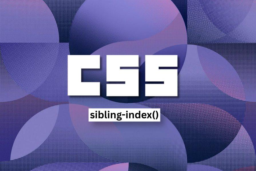
Learn how sibling-index() enables clean, JavaScript-free stagger animations using native CSS.

CSS wasn’t built for dynamic UIs. Pretext flips the model by measuring text before rendering, enabling accurate layouts, faster performance, and better control in React apps.

CSS art once made frontend feel playful and accessible. Here’s why it faded as the web became more practical and prestige-driven.
@container scroll-state: Replace JS scroll listeners nowCSS @container scroll-state lets you build sticky headers, snapping carousels, and scroll indicators without JavaScript. Here’s how to replace scroll listeners with clean, declarative state queries.

Animate SVGs with pure CSS: hamburger toggles, spinners, line-draw effects, and new scroll-driven animations, plus tooling tips and fallbacks.

Tailwind CSS is more popular than ever. This guide breaks down v4’s biggest changes, real-world usage, migration paths, and where it fits in the AI future.
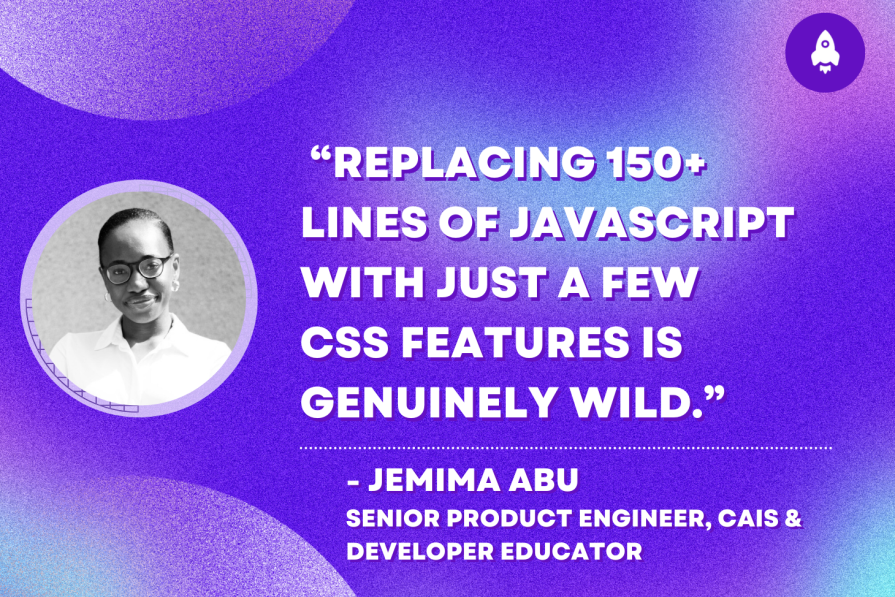
Jemima Abu, a senior product engineer and award-winning developer educator, shows how she replaced 150+ lines of JavaScript with just a few new CSS features.

Container queries let components respond to their own layout context instead of the viewport. This article explores how they work and where they fit alongside media queries.
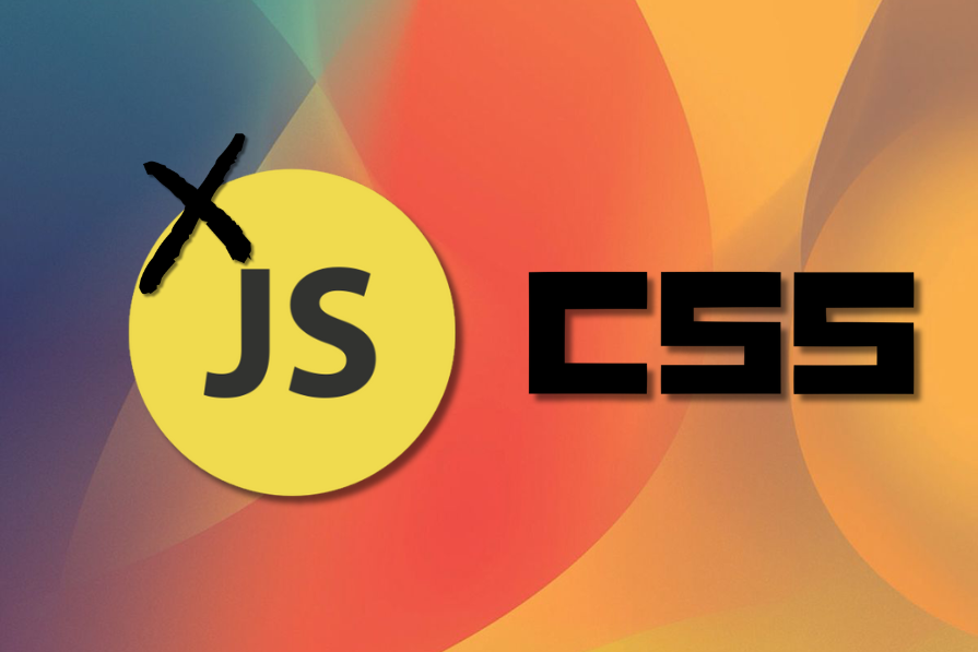
Stop defaulting to JavaScript. Modern CSS handles virtualization, responsive layouts, and scroll animations better than ever – with far less code.
corner-shapeLearn about CSS’s corner-shape property and how to use it, as well as the more advanced side of border-radius and why it’s crucial to using corner-shape effectively.