Editor’s note: This post was updated on 29 September 2022 to include a comparison of CSS pseudo-classes and pseudo-elements, and working CodePen demos of each pseudo-element.

The basic CSS selectors and their various properties are fun to work with, but learning about pseudo-classes and pseudo-elements is the next step towards becoming a CSS expert.
As a frontend developer, you should have a working knowledge of CSS pseudo-elements, including their functionalities and their different presentational and structural applications.
This article covers a detailed overview of pseudo-elements, how they differ from pseudo-classes, their different types and use cases, new additions in the latest module.
To jump ahead:
A CSS pseudo-element is primarily a keyword added to a CSS selector that lets you style a specific part of the selected HTML element. It acts as a sub-element and provides additional functionality to the selected entity.
Pseudo-elements were first introduced in 2015 with a single colon syntax. The later modules from CSS3 use a double-colon pseudo-elements syntax as shown below:
/* Older way (CSS2) */
selector:pseudo-element {
  property: value;
}

/* Modern way (CSS3 onwards) */
selector::pseudo-element {
  property: value;
}
As shown above, the double-colon keywords are our pseudo-elements that also indicate their functionality by their names. We will go through each of them in the upcoming segments.
A CSS pseudo-class is a state of the selected element when it goes through an event or series of events. You can change the element styles for a particular event with pseudo-classes.
In contrast, a CSS pseudo-element behaves like a sub-element itself and adds a different functionality to the selected element, based on its type.
There are some browser-specific and experimental pseudo-elements that we’ll be covering in the later segments of this article. For now, here is a list of different pseudo-elements that modern browsers support:
::before::after::first-letter::first-line::marker::placeholder::selection::backdrop::file-selector-button::cue::part()::slotted()All the examples we’ll be looking at in this tutorial are available in this codepen collection. You may also copy-paste the code and use it in your choice of code editor.
::beforeThe ::before keyword creates a pseudo-element that appears just before the content of the selected HTML element.
By default, it has an inline display and needs to be provided with the CSS content property to function. Take a look at the code snippet below for the ::before pseudo-element’s syntax:
.pe-before::before {
  content: "Content injected by the ::before pseudo-element.";
  display: block;
  margin-bottom: 1em;
}
The above code injects some content into each element with a pe-before class by making use of the ::before pseudo-element. See the demo here. The frontend development world often refers to this type of injected content as generated content.
Here’s another example to demonstrate an advanced application of ::before.
Let’s take a tag list as a use case where showing a tag icon or text just before the tag entity makes total sense.
Some alignment and spacing adjustments with flexbox properties and the ::before pseudo-element makes it super easy to implement:
.tag-list {
  display: flex;
  gap: 1em;
}

.tag-list li,
.tag-list a {
  display: block;
}

.tag-list a::before {
  content: "#";
  ...
}
See the Pen
Tag list with CSS ::before by Rahul (@_rahul)
on CodePen.
::afterThe ::after pseudo-element works just like ::before except for the fact that instead of appearing before, it appears just after, the content of the selected HTML element.
Like ::before, ::after has an inline display by default and takes a content property to function. Here’s an example to demonstrate its syntax:
.pe-before::after {
  content: "Content injected by the ::after pseudo-element.";
  display: block;
  margin-top: 1em;
}
Check out the code in action here:
See the Pen
CSS ::after pseudo-element by Rahul (@_rahul)
on CodePen.
For an advanced implementation of the ::after pseudo-element, consider constructing a “breadcrumb” navigation with forward-slashes between items.
Here’s an easy way to achieve that with ::after and some alignment adjustments:
See the Pen
Breadcrumb navigation with CSS ::after by Rahul (@_rahul)
on CodePen.
::first-letterAutomatically targeting the first letter of a given text block can help create rich typographical enhancements like drop caps.
Doing so may sound tricky, but the ::first-letter pseudo-element in CSS makes it relatively simple. It represents the first letter of the first line of a block element and only works if the first child of the targeted element is a text block.
Here’s how easy it is to target the first letter of all the paragraph tags and make them appear a bit bolder in weight:
p::first-letter {
  font-weight: 700;
}
See the Pen
CSS ::first-letter pseudo-element by Rahul (@_rahul)
on CodePen.
Most magazine-based blog layouts implement the ::first-letter pseudo-element to highlight the first letter of the first paragraph of an article. It is popularly known as the drop cap effect:
main p:first-child::first-letter {
  text-transform: uppercase;
  font-weight: 700;
  font-size: 3em;
  line-height: 1;
  float: left;
  margin: 0 0.5rem 0.1rem 0;
}
See the Pen
Drop-cap effect with CSS ::first-letter by Rahul (@_rahul)
on CodePen.
It is crucial to realize that the first letter of an element with ::first-letter can sometimes be tricky to spot. For example, if a text contains a punctuation mark at the beginning, the pseudo-element will logically select the mark instead of the actual first letter.
Another example could be a digraph or a trigraph, where you would want to select all two or three letters. The ::first-letter pseudo-element, in this case, could select only the first one.
Also, keep an eye on using ::before with ::first-letter. The ::before pseudo-element acts as the first child of a given element. This will cause ::first-letter to prefer the generated content added by it over actual content at the time of selection.
::first-lineWith ::first-line, we can easily select the first line of text in a block element. This pseudo-element considers the width and font size of the element, along with the width of the document to determine the selection:
p::first-line {
  font-weight: 700;
}
The code above will make the first line of every paragraph element bolder in weight. See a quick demo of the same here:
See the Pen
CSS ::first-line pseudo-element by Rahul (@_rahul)
on CodePen.
Let’s take it a step further by changing the case for the first line of an article. This can be done by pairing ::first-line with the :first-child pseudo-class:
See the Pen
Highlighting the first line with CSS ::first-line by Rahul (@_rahul)
on CodePen.
::markerThis pseudo-element enables us to select and modify the bullet icon and number in the marker box of a list item. It works with anything with a list-item display. <li> and <summary> elements are some of its general applications:
li::marker {
  content: "♥";
}
See the demo here:
See the Pen
CSS ::marker pseudo-element by Rahul (@_rahul)
on CodePen.
As you can see above, the ::marker pseudo-element made the ::before pseudo-element unnecessary. It would be great if it allowed adding spacing between the marker and the text in the future.
Adding custom markers to an unordered list is a cakewalk. Let’s do something similar with disclosable summaries as well:
See the Pen
Styling the detail disclosure elements with CSS ::marker by Rahul (@_rahul)
on CodePen.
::placeholderAs the name suggests, the ::placeholder pseudo-element allows you to style the placeholder of form input elements. Most browsers, by default, have light gray colored placeholders. Here’s how we can modify them using the CSS code below:
input::placeholder {
  color: blue;
}
In the demonstration below, I tried to make the color of the placeholder text look related to the background of the field. CSS HSL color function is handy for such cases; you can keep the hue constant and generate different shades and tints by only modifying lightness and saturation:
See the Pen
CSS ::placeholder pseudo-element by Rahul (@_rahul)
on CodePen.
::selectionGenerally, when you select text on a web page, the selection is highlighted in blue. The ::selection pseudo-element enables you to customize the styles for this highlighting:
::selection {
  background-color: #ccc;
  color: #888;
}
You may hook it to the body or the root element to apply the changes to every element. The demonstration below shows its implementation with two different elements:
See the Pen
CSS ::placeholder pseudo-element by Rahul (@_rahul)
on CodePen.
::backdropThe ::backdrop CSS pseudo-element represents a viewport-sized box rendered immediately beneath any element being presented in full-screen mode.
Let’s understand this with an example where we change the backdrop of a video from black to blue. Check out this CodePen example and play the video in full-screen mode:
video::backdrop {
  background-color: blue;
}
It works for the dialog elements as well, which, when initiated, get a customizable backdrop color. Click the “show the dialog” button in the demo below to see it in action:
See the Pen
CSS ::backdrop in action with <dialog> by Rahul (@_rahul)
on CodePen.
::file-selector-buttonThe HTML file input element displays a button that seems impossible to style with CSS. To your surprise, the ::file-selector-button pseudo-element actually lets you customize that button, and here’s a working demonstration of that:
input[type="file"]::file-selector-button {
  background-color: blue;
  color: white;
  ...
}
You might not like specifying the input type when adding styles to this pseudo-element. I’d recommend you always mention the type to keep things readable for others. See how neat the file input looks with some additions using ::file-input-button:
See the Pen
Styling the File Upload Input in CSS by Rahul (@_rahul)
on CodePen.
::cueThe ::cue CSS pseudo-element selects the WebVTT cues within a media element, usually videos. In simpler words, it allows you to style captions, subtitles, and other possible media cues using VTT tracks:
<style>
  video::cue {
    color: pink;
    background-color: black;
  }
</style>
<video controls
       src="./path/to/video.file">
    <track default
           kind="captions"
           srclang="en"
           src="./path/to/vtt.file">
</video>
::cue powered VTT captions look like: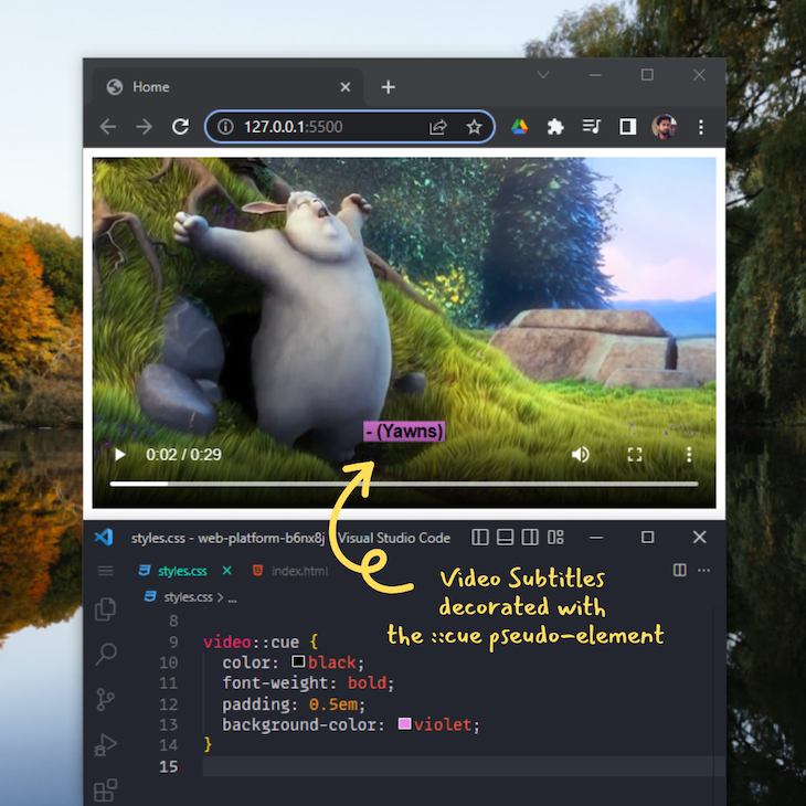
::part()Due to its element encapsulation nature, the shadow DOM stays isolated from the rest of the page. Therefore, not all styles reach the components attached to the regular DOM from the shadow DOM.
The ::part() pseudo-element, a new addition to CSS pseudo-elements, makes it possible to style the shadow DOM to a certain extent:
<template id="my-widget">
    <div part="widget">
      <p>...</p>
    </div>
</template>
Assigning a “part” plays an important role here and will help us later to alter the above component using the ::part() pseudo-element.
The code block below shows how it acts like a function and takes the part as an argument:
my-widget::part(widget) {
  ...
}
Here’s a small implementation of everything we discussed about ::part():
See the Pen
CSS ::part() pseudo-element by Rahul (@_rahul)
on CodePen.
::slotted()The slots in the shadow DOM are placeholders that hold the content between your custom web component tags. One limitation with slots is that you can’t style them from within the shadow DOM tree.
The introduction of the slotted pseudo-element counters that issue by taking slot elements as arguments to add styles. Here is a simple implementation of ::slotted using the same example as above:
<template id="my-widget">
  <style>
    div ::slotted(span) {
      color: red;
    }

    section ::slotted(span) {
      color: green;
    }
  </style>
  <div>
    <slot name="div">This is a div slot</slot>
  </div>
  <section>
    <slot name="section">This is a section slot</slot>
  </section>
</template>
See the Pen
CSS ::slotted() pseudo-element by Rahul (@_rahul)
on CodePen.
It’s impractical to use a browser-specific pseudo-element in production, because it will only add to the inconsistencies if no other alternatives are available for other browsers.
Some popular ones from such pseudo-elements are ::-moz-appearance, ::-webkit-appearance, and ::-webkit-search-cancel-button. The appearance pseudo-elements are used to control the native appearance of UI controls based on the operating system’s theme.
Web developers have been using the ::webkit-search-cancel-button for years to hide that ugly blue-colored “cancel” search control from HTML search inputs on WebKit-based browsers:
See the Pen
Hiding the webkit search cancel button with CSS by Rahul (@_rahul)
on CodePen.
Currently, some CSS4 pseudo-elements are still in experimental mode, meaning they are still undergoing development and won’t work as expected in any browser.
There are mainly four pseudo-elements that fall into this category:
::target-text: If the browser supports scroll-to-text fragments, the ::target-text CSS pseudo-element will allow us to highlight the scroll targets::spelling-error: It will represent text segments flagged as grammatically incorrect by the user agent::grammar-error: It will represent text segments flagged as incorrectly spelled by the user agent::cue-region: Different from ::cue, it will be used to style the whole cue region instead of just the cue textIn the contents above, we learned about CSS pseudo-elements and their different applications. We also introduced some experimental and browser-specific pseudo-elements, and why it is currently not practical to use them in production.
Even though pseudo-elements add a lot of functionalities that you would be adding with JavaScript otherwise, avoiding their aggressive use will keep your layouts lighter and glitch-free.
I hope you added a bit more to your CSS knowledge with this tutorial. Let me know your thoughts in the comments.
As web frontends get increasingly complex, resource-greedy features demand more and more from the browser. If you’re interested in monitoring and tracking client-side CPU usage, memory usage, and more for all of your users in production, try LogRocket.

LogRocket lets you replay user sessions, eliminating guesswork around why bugs happen by showing exactly what users experienced. It captures console logs, errors, network requests, and pixel-perfect DOM recordings — compatible with all frameworks.
LogRocket's Galileo AI watches sessions for you, instantly identifying and explaining user struggles with automated monitoring of your entire product experience.
Modernize how you debug web and mobile apps — start monitoring for free.

Learn how to build smooth staggered animations in CSS using modern features like sibling-index(), complete with practical examples, fallbacks, and accessibility tips.

Compare the top AI development tools and models of July 2026. View updated rankings, feature breakdowns, and find the best fit for you.

Learn how to detect unused and ghost dependencies in JavaScript projects using Knip, a project-level linter that keeps your dependency graph accurate.

Learn how Storybook MCP enables AI agents to understand your component library, generate accurate UI, and validate code using documentation, stories, and automated tests.
Hey there, want to help make our blog better?
Join LogRocket’s Content Advisory Board. You’ll help inform the type of content we create and get access to exclusive meetups, social accreditation, and swag.
Sign up now

 Learn more →
