visually-hidden class
In web development, there are many times when design and accessibility clash. Good communication can often make it possible to reach a compromise or resolution that satisfies both aesthetics and usability. Sometimes, though, it’s necessary to resort to workarounds to create a solution that meets both goals.
In this article, we’ll investigate an important workaround: the use of the CSS visually-hidden utility class to make certain elements available to users of assistive technologies without impacting the visual design of the website or app. We’ll discuss what the visually-hidden utility class is, how it works, and how it’s used. We’ll also consider solutions for the types of issues we might face when we use this utility class.
Jump ahead:
visually-hidden utility classvisually-hidden class
visually-hidden utility classWhen we use CSS rules to hide an element, for example using display: none or visibility: hidden, we conceal the content from screen readers as well. In some scenarios this is fine, but there are times when it’s important for visually hidden content to be available to assistive technologies. This is where the visually-hidden utility class comes into play. This class is sometimes referred to as sr-only — where the “sr” stands for screen reader.
There are multiple ways to hide content visually; using the visually-hidden class is the most common:
.visually-hidden:not(:focus):not(:active) {
  border: 0;
  clip: rect(0 0 0 0);
  height: auto;
  margin: 0;
  overflow: hidden;
  padding: 0;
  position: absolute;
  width: 1px;
  white-space: nowrap;
}
Let’s breakdown what the visually-hidden class in the above code does:
position: absolute to make sure it doesn’t affect the layout1pxoverflow: hidden to ensure the content can’t be seen outside of the elementclip: rect(0 0 0 0). It’s possible to use clip-path: inset(50%) as a more modern approach; just remember that it won’t work with Internet Explorerwhite-space: nowrap. We’ll discuss the concept of “visual cursor” in more detail later in this articleN.B., the addition of the :not(:focus):not(:active) exception to this selector makes the element visible when it’s focused; this will help us create visually hidden skip links
There are several real-life use cases for the visually-hidden class. Let’s take a look at a few.
A common use case for this utility class is adding an accessible name to an icon button. This is a button that doesn’t have a visible name and whose function is represented by an icon. A social “like” or a download icon are common examples of icon buttons. The purpose of types of buttons may be obvious to sighted users, but without an accessible name, the button will not be recognizable to assistive technology users.
We can use aria-label for icon buttons, but as accessibility consultant Adrian Roselli mentions in his article “aria-label does not translate,” it may be helpful to consider an alternative as some translation services don’t reliably translate the aria-label.
This is where the visually-hidden class comes into play. We can add the name in a <span> element and use this class to add an accessible name in a more robust manner, like so:
<button>
  <span class="visually-hidden">Send comment</span>

  <!-- Hides SVG from screen readers -->
  <svg aria-hidden="true">
    <!-- Svg path -->
  </svg>
</button>
Skip links are visually hidden links that only appear when a user navigates a website using the Tab key. Those links help users with motor disabilities to navigate between blocks of interactive elements, such as a navigation bar:
<header>
  <a class="skip-link visually-hidden" href="#main-content">Go to main content</a>
  <!-- Header content -->
</header>
<main id="main-content">
  <!-- Website content -->
</main>
In the above code, the skip link will help the user jump from the header to the main content. Adding the visually-hidden utility class with the :not(:focus):not(:active) exception makes the element visible when it’s focused.
Now, let’s add some styling to the skip link:
header {
  position: relative;
}

.skip-link {
  position: absolute;
  left: 50%;
  top: 0;
  background-color: rebeccapurple;
  font-weight: bold;
  width: fit-content;
  padding: 0.5rem 1rem;
  color: whitesmoke;
}
We used the :focus and :active pseudo-classes to add an exception to the visually-hidden class. This makes the class a bit less usable for other components where we’d want to hide an interactive element, like a custom checkbox. However, using this class for this component will create an issue that we’ll explore later in this article; it’s generally best to avoid using this class for interactive elements besides skip links.
A live region is a combination of markup and ARIA roles and properties that announces any change to assistive technologies when content is injected into it with JavaScript. Ideally, live regions should be visible as well in order to match the experience between sighted and visually impaired users as much as possible. This is something that happens automatically with certain components, like toasts.
Other types of components, like carousels, may need to be hidden visually. For example, when a user clicks a button to go to a new section, we’ll need to announce to a screen reader user that a new section is being shown. For this, we’ll add a live region, but most likely, we’ll want to hide it visually. This is where this class enters to help us to create this component:
<div role="group" aria-roledescription="Slider" aria-label="Recent publications">
  <span aria-live="polite" class="visually-hidden">Showing slide 1 of 3</span>
  <article role="group" aria-roledescription="Publication" tabindex="-1">
    <!-- Content -->
  </article>
  <article role="group" aria-roledescription="Publication" tabindex="-1">
    <!-- Content -->
  </article>
  <article role="group" aria-roledescription="Publication" tabindex="-1">
    <!-- Content -->
  </article>
  <div>
    <button>Previous publication</button>
    <button>Next publication</button>
  </div>
</div>
A good heading structure is useful for assistive technology users because it creates a document outline. This outline can help users navigate between the content and easily find information. However, sometimes the heading that’s needed to create this structure needs to be hidden visually to avoid detracting from the visual appeal of the app.
For the examples in this article, I’m using the h123 – Accessibility HTML5 Outliner bookmarklet to check the heading structure. Let’s look at a heading from the a11y project website:
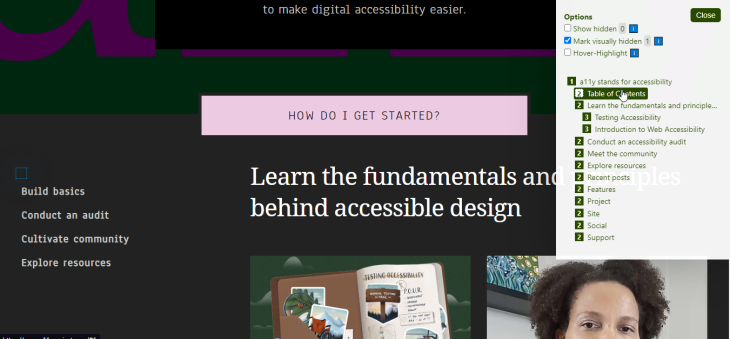
In this example, the level 2 “Table of Contents” header is helpful for letting screen reader users know they can use this section to navigate through different parts of the site. We use the visually-hidden class to hide it visually but make this resource available to screen reader users.
This class is very useful for enhancing the user experience for assistive technology users, but it’s not without issues. Improper use of this class can create usability issues for multiple users. Also, since it is a hack, it can have unexpected behavior.
visually-hidden classAt the end of the day, using the visually-hidden utility class is a hack; as such, there are some potential issues to be aware of. I’ve listed the issues below and organized them from least problematic to most problematic. Where available, I’ve also included alternatives or workarounds. The best way to avoid any potential discord between development and design is to have clear communication between both functions and discuss alternative solutions early in the design process.
Screen reader users generally use the up arrow and down arrow keys to navigate between different HTML nodes. Using the down arrow key moves the user to the next element in the DOM and using the up arrow key moves the user to the previous one.
When a screen reader is reading an element in the DOM, the virtual cursor (also referred to as visual tracking) highlights that element. To see an example, let’s go back to the a11y project’s website and check the visually-hidden heading with NVDA:
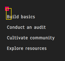
Here, we see the visually-hidden heading highlighted as expected, but in some cases, this behavior can add redundancy and unnecessary stop for screen reader users. Consider this markup that’s used to create an accordion:
<div role="group" aria-labelledby="accordion-group">
  <span id="accordion-group" class="visually-hidden">Frequently Asked Questions</span>
  <details>
    <summary>Question 1</summary>
    <!-- Accordion content -->
  </details>
  <details>
    <summary>Question 2</summary>
    <!-- Accordion content -->
  </details>
  <details>
    <summary>Question 3</summary>
    <!-- Accordion content -->
  </details>
  <details>
    <summary>Question 4</summary>
    <!-- Accordion content -->
  </details>
</div>
Now, let’s see how it looks in the accessibility tree:
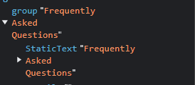
When the virtual cursor is positioned on the group element, a screen reader will read the element as “Frequently Asked Questions. Group.” But, when the user presses the down arrow key, the screen reader will read the span as “Frequently Asked Questions” again, creating an unnecessary stop. We could use an aria-label to tag this group, but it might not translate well and visually hiding the element creates a minor usability problem.
There are two alternatives to consider to address this issue. First, we could turn the span into a heading; this solution has the possible benefit of improving the heading structure for a screen reader user. As a second option, we could hide the span with the HTML attribute hidden instead of using the visually-hidden utility class, like this:
<div role="group" aria-labelledby="accordion-group">
  <span id="accordion-group" hidden>Frequently Asked Questions</span>
</div>
With this approach, the group element will still be recognized as having an accessible name, but the span itself won’t be detected by screen readers, thereby removing the extra stop. This may be a better approach for adding the utility class to label an element, except for instances where we need the semantic value of the element.
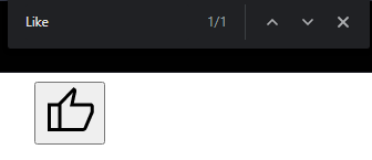
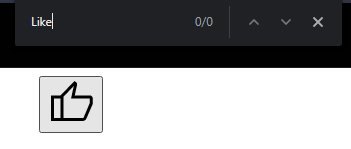
This is a bit of an edge case, but with the visually-hidden utility class, an element will still be detectable by the browser’s search function. Let’s take a look at this markup for creating a Like icon button:
<button>
  <span class="visually-hidden">Like</span>
  <svg aria-hidden="true">
    <!-- SVG content -->
  </svg>
</button>
If we search the word “Like” on the website, it will appear as a result, but the element won’t be highlighted because it’s hidden visually:
To prevent a potential usability problem, we can label the button as we did in the previous section — using aria-labelledyby and using the hidden attribute to hide the span:
<button aria-labelledby="like-btn">
  <span id="like-btn" hidden>Like</span>
  <svg aria-hidden="true">
    <!-- SVG content -->
  </svg>
</button>
N.B., we’re using aria-labelledby for cases where we’re using generic elements to label an element; using the visually-hidden utility class is the best approach to visually hide elements that have a semantic value
Using the visually-hidden utility class for interactive elements, like radio buttons or checkboxes, causes usability issues for mobile screen reader services like TalkBack for Android or VoiceOver for iOS.
Mobile users can navigate between different DOM elements using left and right swipe motions on the screen. However, some mobile screen reader users navigate between these different elements by touch. Instead of swiping, they explore a website by moving their fingers on the page to detect interactive elements.
Our utility class has a width of only one pixel, and some variants have a height of only one pixel as well. The visually hidden element would be too small to be easily detected by screen reader users who navigate by touch.
An alternative approach to ensure the element remains accessible for mobile screen reader users is to use the opacity property. This property hides the content visually but also makes the element occupy the same space in the background.
Let’s take a look at the markup of this custom component:
<div class="input">
  <div class="check">
    <input type="checkbox" id="email-notifications" />
    <svg width="256px" height="256px" viewBox="0 0 24.00 24.00" xmlns="<http://www.w3.org/2000/svg>" aria-hidden="true">
      <!-- SVG Content -->
    </svg>
  </div>
  <label for="email-notifications">Send me email notifications</label>
</div>
In the above code, we’re relying on the input element to handle the semantics, so we can hide the svg element with aria-hidden="true". Also, since we’re adding the svg element right after the input so we can select it using the CSS adjacent selector, +.
Now, we can use position relative and absolute to position the input at the same layout position as the svg:
.check {
  position: relative;
  height: 1em;
  aspect-ratio: 1;
}

.check input {
  position: absolute;
  inset: 0;
  margin: 0;
  opacity: 0;
}
Next, let’s use the :checked pseudo-class to modify the svg when the input is checked:
svg path {
  transition: stroke-dashoffset 0.3s linear;
}

.check input:checked + svg path {
  stroke-dashoffset: 0
}
This approach doesn’t solve all accessibility issues for this component, but it will ensure that mobile screen reader users can interact with the component without any problem. Of course, it will still be important to add focus styles to the custom checkbox (the :focus-within pseudo-class could be used for this task) and ensure it looks good in forced colors mode (like Windows High Contrast Mode).
Here’s the custom checkbox:
See the Pen
SVG accessible checkbox by ItsCrisDiaz (@ItsCrisDiaz)
on CodePen.
visually-hidden elements undetectable by voice control usersThe visually-hidden utility class can be helpful in working around the challenges associated with making a website accessible for screen readers, but it can make accessibility more difficult for users of other assistive technologies.
For example, voice control users may find it very difficult to click links or buttons with partially or totally hidden names because to click them, they would need to say the entire name of the link or button. Let’s look at an example of card components that use a “Read more” link to open a new page:
<ul role="list">
  <li>
    <article>
      <h2>Article title 1</h2>
      <a href="#">Read more</a>
    </article>
  </li>
  <li>
    <article>
      <h2>Article title 2</h2>
      <a href="#">Read more</a>
    </article>
  </li>
  <li>
    <article>
      <h2>Article title 3</h2>
      <a href="#">Read more</a>
    </article>
  </li>
</ul>
If we leave those links with the same name, it will potentially fail the WCAG Success Criterion 2.4.6 Heading and Labels, because each link should be a unique descriptor. If each link in this section used the name “Read more”, there would be no way to differentiate between them.
Here’s an example showing how we can use the visually-hidden utility class to add more meaningful labels to links:
<ul role="list">
  <li>
    <article>
      <h2>Article title 1</h2>
      <a href="#">Read more <span class="visually-hidden">about article title 1</span></a>
    </article>
  </li>
  <li>
    <article>
      <h2>Article title 2</h2>
      <a href="#">Read more <span class="visually-hidden">about article title 2</span></a>
    </article>
  </li>
  <li>
    <article>
      <h2>Article title 3</h2>
      <a href="#">Read more <span class="visually-hidden">about article title 3</span></a>
    </article>
  </li>
</ul>
To read more about how poor design patterns can affect voice control users like Voice Recognition for Windows or Voice Control for macOS and iOS, check out Eric Bailey’s article “Voice Control Usability Considerations For Partially Visually Hidden Link Names”.
This issue affects icon buttons as well. To activate an icon button via voice control, a user would need to guess what the icon represents. Some voice control technologies offer solutions for this scenario, but it begs the question: Why do we need to make user experience more difficult for certain assistive technologies?
Unlike the previous issues discussed in this article, this one doesn’t have a code workaround, because as Shell Little said in her talk, The Fatal Flaw of Overlays, “You can never outcode bad design.” So, the best solution to this issue is clear communication between development and design teams to create a better pattern. For example, replacing the “Read more” link with a link in the article’s title would be better for accessibility. Another option might be to add a visible label to the icon button.
In addition to the visually-hidden class explored in this article, there are a couple of other options for hiding elements.
opacity and filter propertiesThe opacity or filter: opacity properties can be useful for visually hiding an element by controlling its level of opacity (which is the opposite of transparency). For example, we can specify opacity: 0 or filter: opacity(0) to hide an element.
When we use the opacity or filter: opacity properties, the element still occupies the space it normally takes in the layout. This makes these properties less versatile than the visually-hidden utility class.
Another way to visually hide content is to put it off-canvas using position: absolute and then move it away to ensure it is not visible. Here’s an example:
.off-canvas {
  position: absolute;
  left: -200vw;
  top: -200vh;
}
However, as James Edwards mentions in his article “The Anatomy of visually hidden,” this method has some issues and should not be considered for modern standards:
The visually-hidden utility class is useful for improving the UX for assistive technology users, but improper use of the class can create problems. At the end of the day, this is still a hack we use to solve certain clashes between design and development, and sometimes the best way to work around those issues is to have clear communication between both areas and look for alternatives.
Here are some main points to keep in mind when using this class:
As web frontends get increasingly complex, resource-greedy features demand more and more from the browser. If you’re interested in monitoring and tracking client-side CPU usage, memory usage, and more for all of your users in production, try LogRocket.

LogRocket lets you replay user sessions, eliminating guesswork around why bugs happen by showing exactly what users experienced. It captures console logs, errors, network requests, and pixel-perfect DOM recordings — compatible with all frameworks.
LogRocket's Galileo AI watches sessions for you, instantly identifying and explaining user struggles with automated monitoring of your entire product experience.
Modernize how you debug web and mobile apps — start monitoring for free.

Learn how to detect unused and ghost dependencies in JavaScript projects using Knip, a project-level linter that keeps your dependency graph accurate.

Learn how Storybook MCP enables AI agents to understand your component library, generate accurate UI, and validate code using documentation, stories, and automated tests.
Debug RSC hydration mismatches in production with Next.js instrumentation, Suspense isolation, HTML diffing, and CI smoke tests.

Explore why npm dependencies are a major supply chain security risk and how to protect JavaScript apps from compromised packages and transitive threats.
Hey there, want to help make our blog better?
Join LogRocket’s Content Advisory Board. You’ll help inform the type of content we create and get access to exclusive meetups, social accreditation, and swag.
Sign up now

 Learn more →
