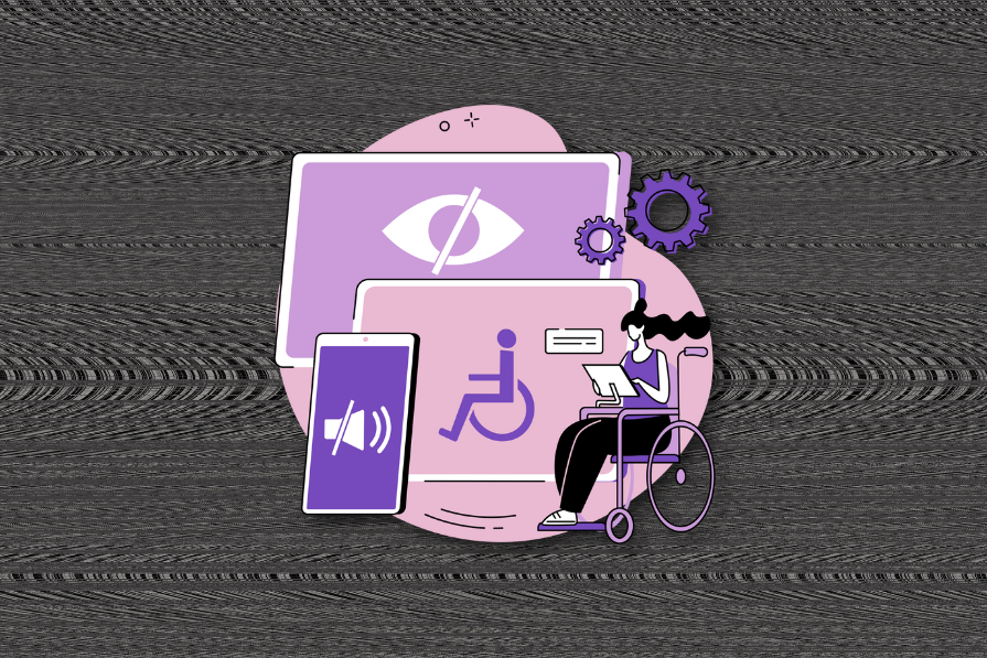
Accessibility is a right — and a legal requirement in many countries. The Web Content Accessibility Guidelines (WCAG) set the standard for digital accessibility, and failure to adhere to these guidelines can result in lawsuits, fines, or worse.
Legal risks aside, building inaccessible apps and websites means losing a chunk of your revenue. In the UK alone, businesses lose an estimated £206 billion per year due to inaccessible products — that’s £37,775 per business. That’s not a niche problem. And in today’s climate, where inclusive design is increasingly expected, a brand that ignores accessibility risks losing trust along with revenue.
In this day and age, we must also consider the negative impact that a brand incurs when it fails to be accessible, which inevitably comes with its own losses. Still, WCAG 2.2 (released in 2023) deserves some blame here. It leaves too many gaps.
That brings us to the point of this blog. What’s wrong with WCAG 2.2 — and how will WCAG 3.0 improve things?
Good color contrast ensures that text and icons can be seen clearly.
But WCAG’s color contrast algorithm is surprisingly inaccurate. Studies show that 23% of WCAG color contrast fails are actually accessible, and that 47% of passes are actually inaccessible. That’s, uhhh…very off.
It also only accounts for two font sizes (14pt and 18pt) and two weights (normal and bold), which makes it inflexible. You could design something completely readable — and still technically fail. Or the reverse:
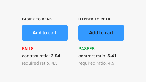
This doesn’t really bother me that much, as by aiming for the minimum criterion, you’re essentially doing the bare minimum; I aim to do much better than that anyway. However, it does show that WCAG’s color contrast algorithm just isn’t getting it done.
Here’s another example:
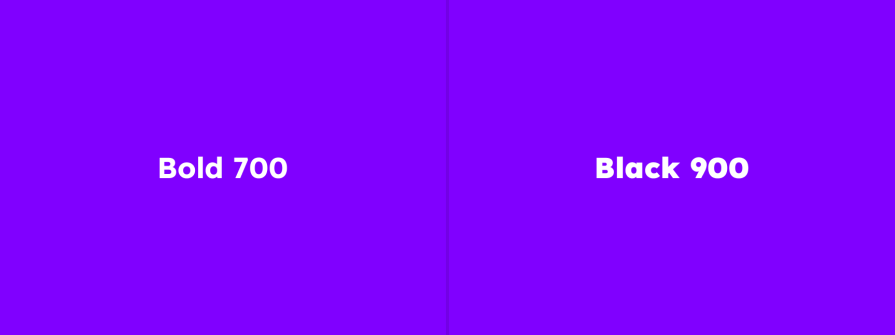
The bolder “Black 900” text on the right is clearer, and yet WCAG’s color contrast criterion says that they have the same contrast. The criterion just isn’t nuanced enough.
Alt text is meant to describe images to screen readers and assist users when visuals don’t load. But WCAG 2.2 only requires that alt text exists — not that it be clear, concise, or even accurate.
Too often, it’s keyword-stuffed for SEO, overly detailed, or just bad. For screen reader users, that creates a miserable experience. Imagine listening to long, irrelevant descriptions read aloud, one after another, without any visual context to make sense of it all.
Icons (with or without ARIA labels) don’t require visible text labels, even though many users — especially those with cognitive disabilities — rely on them for context.
Even as designers, we often guess what an icon means. A little visual support goes a long way, and WCAG 2.2 doesn’t enforce it.
Captions and transcripts help everyone — but they’re vital for deaf users. And yet, WCAG 2.2 doesn’t require that they be correct, synchronized, or complete.
Pre-recorded audio only requires a transcript at Level A. No standard for quality. As a deaf person, this is beyond frustrating — captions that are incorrect are effectively useless.
Sign language falls under the AAA level of WCAG 2.2, meaning it’s optional. That might make sense from a cost or enforcement perspective, but for deaf users, spoken and written languages are second languages.
If accessibility is a right, then this shouldn’t be a “nice to have.”
Focus indicators show which element on a page is active when using a keyboard or screen reader — often as a visible outline. But WCAG 2.2 only defines specific rules for these at AAA level. The bare minimum is just having a focus indicator, even if it’s nearly invisible.
That’s not helpful.
Users should be able to skip repeated content (like nav bars or footers). WCAG 2.2 recommends skip links or ARIA elements, but ARIA doesn’t always help keyboard users. So many end up slogging through the same blocks over and over.
The minimum target size in WCAG 2.2 is just 24×24 pixels — which is too small for many users and fingers. Worse, there’s no minimum font size at all. That’s simply bonkers.
APCA (Accessible Perceptual Contrast Algorithm) is a new color contrast algorithm that’s far more accurate. Not only that, but their APCA color contrast calculator displays the minimum font size for different font weights. The calculator assumes that your chosen font has an x-height of 0.5 and a thickness similar to that of Helvetica or Arial, but it also offers guidance on compensating accordingly, as well as suggestions on which types of fonts to avoid. Disabling antialiasing is strongly discouraged, too. As long as we end up with an APCA color contrast calculator that takes the font into account, this sounds like a much better algorithm/criterion.
The expectation is that APCA will replace W3C’s own color contrast algorithm in WCAG 3.0; however, reputable sources indicate otherwise. This isn’t unusual, though, since WCAG 2.0 standards that needed more time in the oven were introduced in WCAG 2.1 and WCAG 2.2.
We should also keep in mind that the APCA algorithm would need to be licensed by the W3C, so there may be some bureaucratic hurdles to overcome as well. Will we see it in WCAG 3? Yes, I’d say so, but it has been removed from the Working Draft for now due to insufficient documentation from Myndex Technologies (the creators of APCA).
While it’s difficult to establish hard rules that ensure concise, clear text (because what does that even mean exactly, and how would we verify it?), there’s an interesting concept that the WAI are exploring (you can read about the five different stages here):
“Text alternatives follow an organizational style guide.”
In my opinion, the requirements should be strict and definitely not just “You must have an alt text style guide” and nothing else. However, there are in-depth sections on clear meaning and simplified written content in WCAG 3.0, which we can assume would also apply to alt text. While I do love what I see, many of the requirements are open to interpretation.
WCAG 3.0 also mentions “Relying on user agents to describe images,” which alludes to web browsers providing alt text (possibly with AI). However, since the Working Draft is a working draft, it’s difficult to know exactly what the WAI is thinking.
Note — The WAI is looking for feedback regarding alt text (and other things), so here’s your chance.
WCAG 3.0 appears to require that “Interactive components have visible labels that identify the purpose of the component,” but this is only for controls (with or without an icon), and doesn’t extend to non-interactive icons (at least, not yet). Since the WAI wants to cover more disabilities, especially cognitive disabilities, I’m hopeful that they’ll consider visual labels more as they develop WCAG 3.0.
The barrier, I imagine, is the limited space on smaller devices, but perhaps the requirements could be relaxed for such scenarios.
WCAG 3.0 states that synchronized captions (as well as transcripts) are being explored, which is a huge win. However, keep in mind that any improvements may be for a higher, optional level of conformance. Time will tell.
Great news — it appears that WCAG 3.0 will require focus indicators of sufficient size and contrast, as well as a distinct style and adjacency. Higher levels of conformance might require supplementary indications instead, and there’s also talk of style guides to maintain consistency across different types of focus indicators.
Currently, WCAG 3.0 states that “Users [should be able to] determine where they are and move through content (including interactive elements) in a systematic and meaningful way regardless of input or movement method.” The “regardless of input method” part is great news, but said as a matter of fact rather than defined as an actual requirement (at the moment).
A different section says: “Users can navigate and operate content using only the keyboard focus.” But again, it’s not yet clear what this would mean. Hopefully, it means that keyboard and screen reader users would be able to navigate more fluidly and easily skip sections they’re not interested in.
They’re looking into it. Which is already better than the current nothing.
Beyond the infamous issues with WCAG 2.2 that I’ve already mentioned (and many more, no doubt), WCAG 3.0 will be different in other ways as well. I’ve already mentioned covering more disabilities, and we should expect WCAG 3.0 to be a bit clearer too (no luck so far though), but there’s more to it than that:
Instead of A/AA/ AAA, WCAG 3.0 introduces a new structure:
A more nuanced structure could help teams adopt improvements gradually, rather than chasing “AAA or bust.” It also allows laws to align with more realistic levels of effort, which helps with internal buy-in.
From my understanding, “Assertions” would be qualitative and quantitative tests used to verify accessibility conformance and even make conformance claims. An obvious example of a test would be using a color contrast calculator to verify accessible color contrast. Earlier conformance models included Bronze/Silver/Gold (although we shouldn’t rule those out just yet), but I think we can award those medals to those who make conformance claims and pass the assertions.
If you’re part of a product team or agency, these assertions could provide clearer metrics for accessibility testing. It also opens the door to more transparent audits and certification.
For the first time, WCAG 3.0 will explicitly address user-generated content — think social media posts, comments, reviews, marketplace listings, etc. Rather than holding individuals accountable, WCAG 3.0 aims to define what platforms must provide to support accessibility in these contexts. This could include:
If your product includes community-driven content, WCAG 3.0 could shape the features you need to build. It also gives UX designers a clear role in creating accessible authoring experiences.
Which takes me to my next point, WCAG 3.0 will apply to apps (and so on), too. We’ve all been using WCAG for app accessibility anyway, but WCAG 3.0 will support it officially with platform-specific conformance methods (for example, alt text conformance methods). Watch out, Apple. The WAI is coming for your Liquid Glass!
Ooh, and WCAG will stand for “W3C Accessibility Guidelines” instead of “Web Content Accessibility Guidelines” as it moves beyond the web and beyond content.
We’re talking years. However, the WCAG 3.0 conversation is already heating up, and that could expedite its adoption as the new standard. When accessibility and privacy laws come into effect, the majority of organizations aren’t compliant and are hit with substantial fines, so you need to start thinking about it now.
You can even contribute to the development of WCAG 3.0. Many aspects have the “Placeholder” status (learn about the five status levels here), which means that work hasn’t begun yet, and so you can’t offer feedback yet, but you can voice your thoughts on some things with the “Exploratory” or “Developing” status. Nothing is in the “Refining” or “Mature” stage yet, but that deadline will arrive sooner than you think.
(As a rule of thumb, if you don’t know when the WCAG 2.2 deadlines are, you should start worrying about WCAG 3.0 now.)
A huge blocker is that legislation around the world refers to WCAG 2 specifically, so laws would actually need to be updated. Plus, the APCA color contrast algorithm would need to be licensed from the owner. A small blocker, but still a blocker.
Conforming to WCAG 3.0 will be a monumental feat for most organizations, so in that respect, it’s just around the corner. There are numerous changes even at this stage, including a new conformance model and support for additional disabilities, platforms, and types of content. Now is the time to start learning about it.
Even if you’re conforming to WCAG 2.2, there are a number of issues with it, some of which we’ve discussed here today, and addressing some of those could really help you skate ahead of the curve.
More information on WCAG 3.0 here.
Got a question or thought? I’d be shocked if you didn’t. Feel free to drop it into the comment section just below, and thanks for reading!

LogRocket's Galileo AI watches sessions and understands user feedback for you, automating the most time-intensive parts of your job and giving you more time to focus on great design.
See how design choices, interactions, and issues affect your users — get a demo of LogRocket today.

AI has made polished, confident content easy to generate, but that does not make it trustworthy. This article explains how UX teams can design stronger quality signals using source transparency, validation, confidence communication, and reputation.

Inclusive design is evolving beyond accessibility alone. This guide explains how UX designers can create more inclusive products through usability, accessibility, neurodiverse UX, adaptive personalization, multimodal design, and culturally aware product experiences.

I was working with an intern on a UX research project, and before we even started, we both had private […]

AI has accelerated design execution, but speed can come at the expense of intentionality. Learn how UX teams can preserve product thinking and judgment.


