Color plays a huge role in UX. It aids usability and aesthetics, providing visual clues to help users understand what things mean. Contrasting colors, specifically, aid accessibility, determining whether or not users, even those with low vision, can see the interface clearly.
In this article, I’ll share all I know about contrasting colors.
I’ll discuss color contrast, the different types of visual impairments and how they affect the user’s experience of an app or website, how accessibility impacts businesses overall, how to get stakeholders’ buy-in for accessible design, how to actually contrast colors and how to achieve both great color contrast and a great visual identity.
Contrasting colors are two neighboring colors that are different enough that the main element (usually some text and/or an icon) stands out from the other element (usually a background), making said text/icon accessible, even for those with low vision.
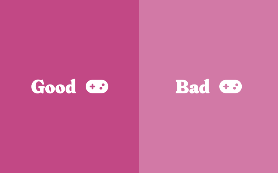
A sharp juxtaposition of colors would also produce sharp emotions. If those are the kinds of feelings that you’re trying to produce, then contrasting colors starkly would be ideal for your app, website, or brand.
Conversely, contrasting colors mildly would produce soft emotions, although they’d still need to meet app/web accessibility requirements (which I’ll cover in a bit). To truly understand why, we need to see through the lens of those with low vision.
There are various types of visual impairments.
Over 98% of them are caused by presbyopia (caused by aging), refractive errors (caused by misshapen eyes), and cataracts (which can be caused by various things).
But what’s really important is how low vision affects users.
Visual impairments that cause blurry vision make things…well, blurry. This can apply to far-away objects (myopia, or ‘nearsightedness’), up-close objects (hyperopia, or ‘farsightedness’), or both (astigmatism). Blurry vision can also be a symptom of other visual impairments.
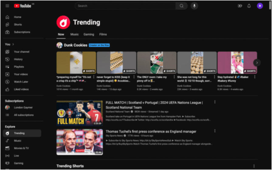
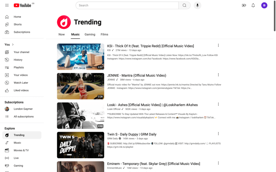
But either way, contrasting colors and using larger font sizes help people see apps and websites well. Here’s a good example from YouTube:
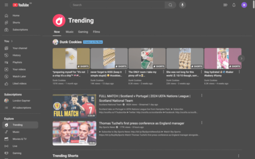
Contrasting colors and using larger font sizes also helps with cloudiness, which is most commonly brought on by white cataracts (simulated below) and yellow cataracts:
You’ll see what distorted vision can look like in the image below.
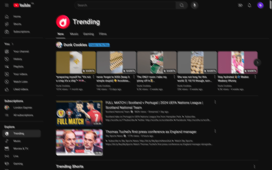
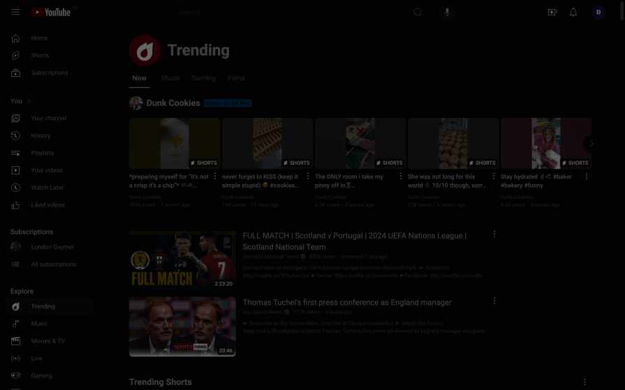
Night blindness often looks like the simulation below, especially after being in a brightly lit environment. Again, you’ll want to optimize color contrast and font sizes and avoid dark mode.
In the image below, you’ll see what a website looks like for those with different types of color blindness, or ‘color vision deficiencies,’ to use the correct term.
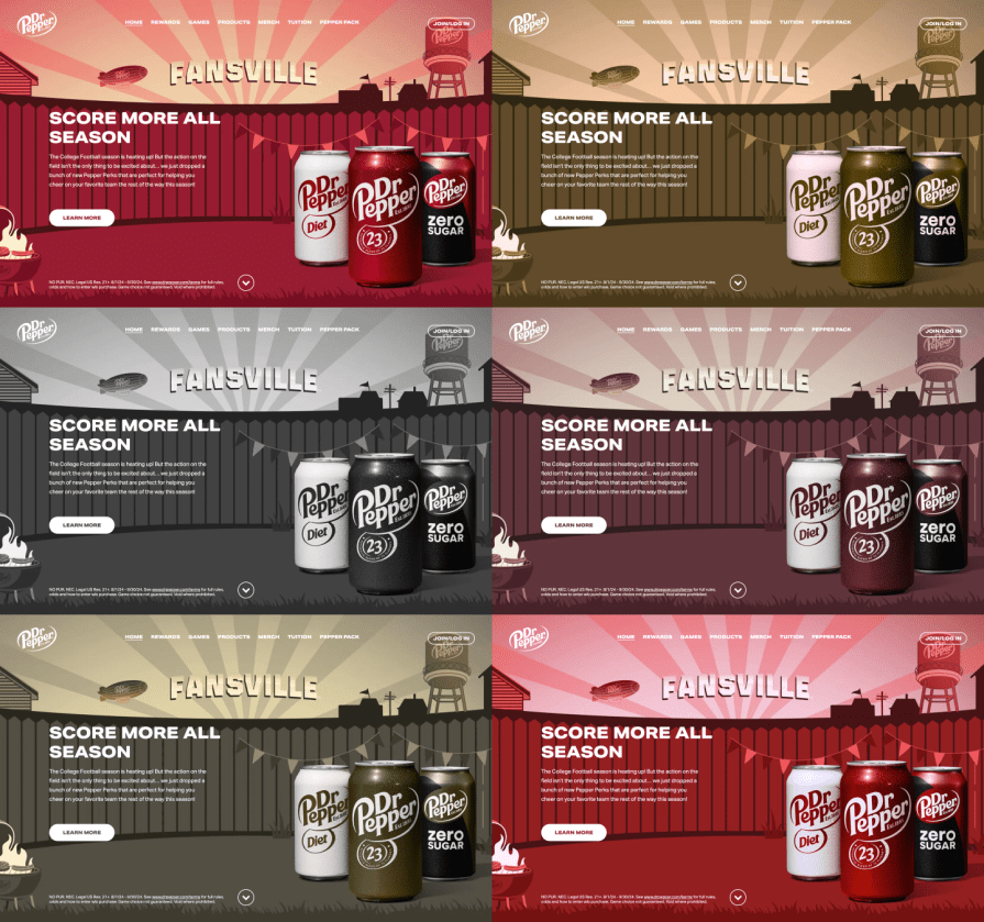
In fact, thanks to optimal color contrast, all of these examples are accessible despite being presented in dark mode to better simulate the visual impairments.
Of course, there are many more types and variations of visual impairments, some of which you can simulate with Vision Simulations, but these are the most common ones we can design for with accessible design.
There are also many really interesting statistics regarding the types of people who suffer from visual impairments. Who they are, or the fact that visual impairments are decreasing thanks to advancements in medical science and better healthcare, is irrelevant, though, since you will likely have to build accessible apps/websites by law.
In most countries, apps and websites must be accessible by law.
Those who don’t adhere to the app/web accessibility laws of a country are typically subject to fines if they’re a legal entity in said country or being banned from operating there if they’re not. Even if your country doesn’t have digital accessibility laws, you’re likely subject to those of other countries, and they are often enforced, even if you don’t hear about it much.
Generally, accessibility-related lawsuits rise every year.
Typically, the law is simply to follow the WCAG (Web Content Accessibility Guidelines), which also applies to apps and contains app-specific directives.
As a UX designer, empathy for users’ needs and wants probably comes naturally to you, but getting buy-in from other stakeholders can be challenging.
Here’s what to focus on when advocating for accessibility.
But how do we frame all of this for stakeholder buy-in? Well, because people tend to have a disproportionately more reactive attitude towards negative outcomes than their equivalent positive outcomes (read: Cumulative Prospect Theory), I advise framing these statistics as a potential loss rather than a potential opportunity.
Also, remember to mention any applicable laws, fines, and punishments and the fact that people are more likely to engage with businesses that commit to inclusion and diversity.
If it’s believed that your users don’t care about your app or website’s accessibility, clarify that 93% of users don’t report bad accessibility.
The WCAG has what they call a success criterion for color contrast. This success criterion depends on the font size and is measured by a ratio that a color contrast checker can identify.
WCAG color contrast level AA (minimum):
The minimum color contrast ratios as required by law:
WCAG color contrast level AAA (enhanced)
The success criteria for enhanced color contrast:
The best tool for checking color contrast is Stark, which you can use from within your UI design tool of choice (or on the web, if you need to). It identifies the color contrast ratio between two colors, but more importantly, it outright tells you whether the ratio is Level AAA, AA, or Fail, and it even offers more accessible color suggestions than what you currently have.
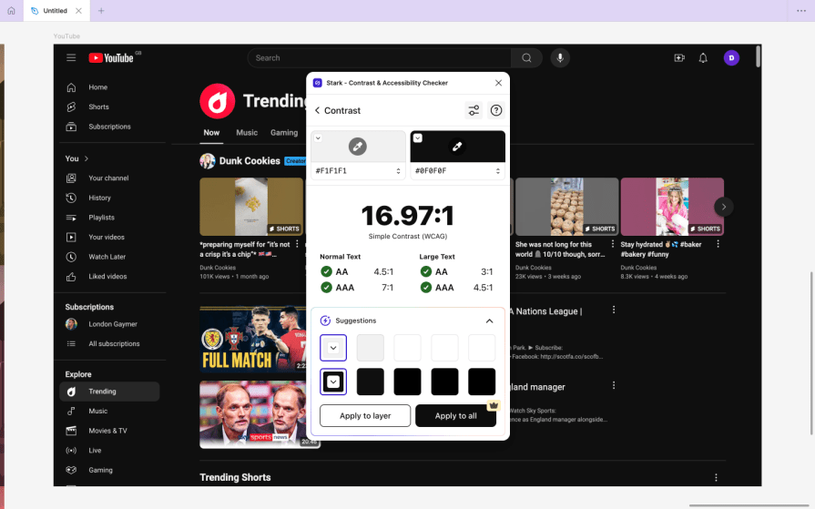
It also enables you to see your design through the lens of different CVDs and some other visual impairments, improving accessibility in a number of ways beyond color contrast.
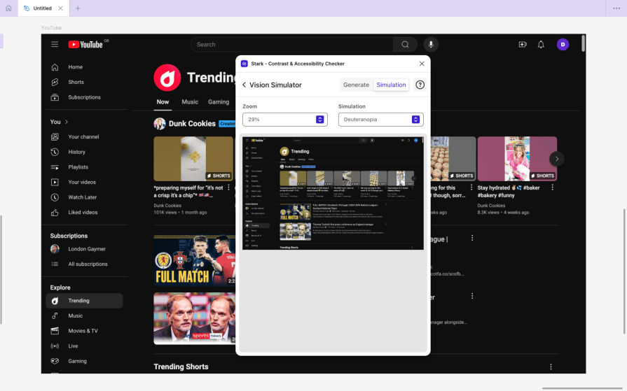
That being said, the Contrast plugin is much more usable and, ironically, more accessible. It’s also smarter, thanks to the RGBQuant technology that it uses to automatically ‘smart sample’ colors, even if they’re from images, gradients, or text shadows. However, it doesn’t have any of the simulators or additional accessibility tools that Stark has.
You’ll obviously want to use complementary colors in your design, but how do we do that while contrasting colors? Optimizing color contrast helps with that.
Between all of today’s standard color formats, choose HSL. It’s the only color format that enables you to change the hue, saturation, and lightness independently — RGB and HEX don’t enable you to do this. The HSL color format can be broken down as follows:
This lets you spin off complementary colors from your main/brand color just by changing the hue (H) value. Here’s an example:
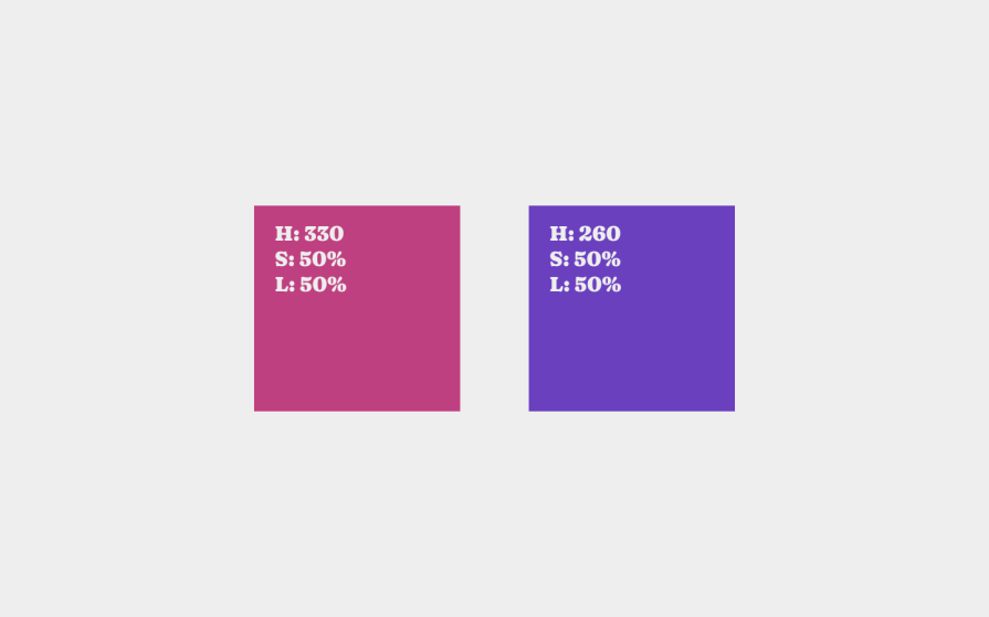
This isn’t a foolproof method, though. It works well for analogous colors (colors that are close to each other on the color/hue spectrum) but not so well for those far apart.
For example, the color contrast of a hue of 0 (red) will be quite different from that of 180 (as shown below, the teal square is more difficult to read), whereas more analogous color combinations (as shown above) will have similar color contrasts.
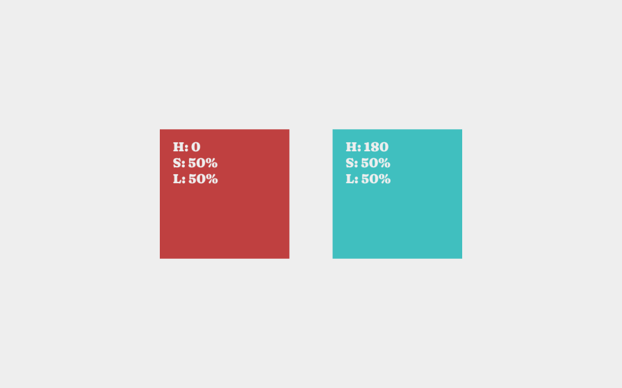
Newer color formats (e.g., LCH—Lightness/Chroma/Hue) ensure better color contrast consistency across the color/hue spectrum, but they’re not supported in any UI design tools yet. Keep an eye on them, though!
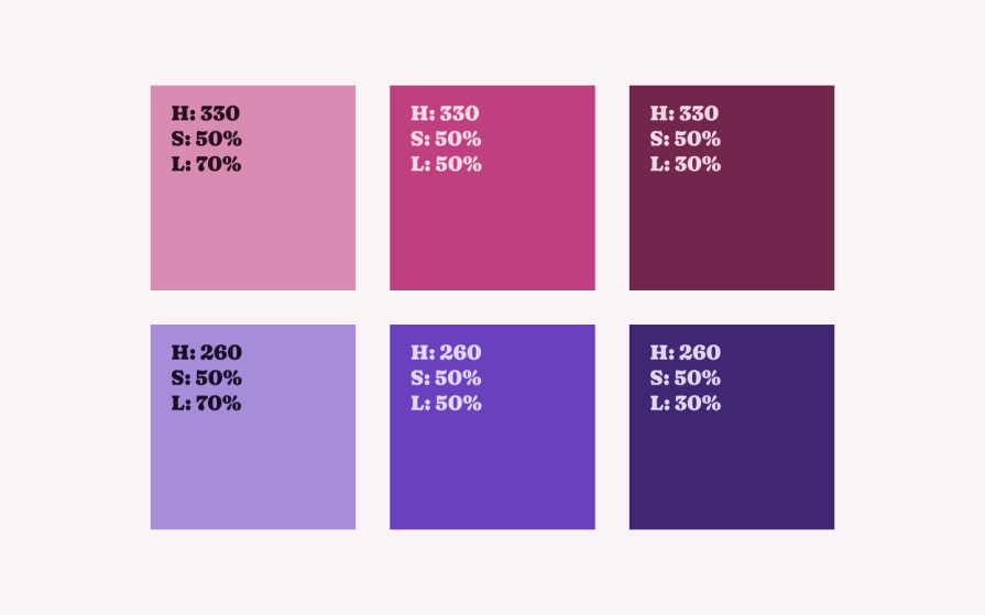
In addition to your brand’s ‘unique’ colors, you’ll want to choose at least a couple of spinoff colors to serve additional purposes, as well as fairly light and dark versions of your main/brand color to be used for text and backgrounds. So this time, instead of changing the hue, change the lightness to build different color combinations. This results in darker and lighter variants that harmoniously complement your brand color.
Besides, pure black and pure white will contrast so starkly that people will get eye strain and headaches (which is why, in the YouTube examples from earlier, the background is actually dark gray, even if it’s probably too subtle to notice).
But should you aim for a light mode or dark mode overall?
The reason why light mode is so great is that light makes the iris close more, decreasing the effect of most visual impairments. With dark mode, the iris opens more to receive more light while increasing the effects of most visual impairments.
So, despite dark mode being good for people sensitive to light, the cons significantly outweigh the pros (as we touched on earlier).
That being said, you can let users choose themselves, which is exactly what YouTube does. Although I demonstrated YouTube in dark mode earlier to better illustrate some visual impairments, many will actually prefer the light version.
In practice, you’re not really limited in terms of branding, as inaccessible colors are obviously not great to look at. In fact, the stunning color combination below exactly meets the success criterion (AA/minimum) for small text:
The truth is, there’s no ideal way to contrast colors while crafting a brand’s perfect visual identity. It just requires a bit of back-and-forth, especially if you’re aiming for desaturated color combinations.
McDonald’s, known for its hunger-inducing yellows and reds, does it particularly well, though. They’ve essentially built accessibility design into their product development lifecycle.
As a final piece of advice regarding visual identity, I’d say that thick decorations are much more prominent to those with visual impairments and can be mistaken for something important even if they’re not. Therefore, keep important sections blocky and defined, and save thinner and softer for illustrations and other decorative elements.
It’s clear that app/web accessibility has a return on investment, whereas a lack of it results in financial losses and excludes customers, which has a long-term impact on brands.
To add to this, contrasting colors isn’t that difficult. For the most part, it just means using a color contrast checker, many of which are free. Before that, just understanding a little bit about colors (e.g., hue, saturation, lightness, etc.) can help you know which colors are contrasting immediately and how to harmonize your overall color palette. This will save you from a lot of back-and-forth with your color contrast checker.
If you have any questions, please ask them in the comment section below. I’m happy to answer them and share more on improving accessibility with contrasting colors. Thanks for reading!
LogRocket's Galileo AI watches sessions and understands user feedback for you, automating the most time-intensive parts of your job and giving you more time to focus on great design.
See how design choices, interactions, and issues affect your users — get a demo of LogRocket today.
I’ve spent enough time designing with WCAG 2.2 to know it’s not enough. Here’s why I’m skeptical and cautiously hopeful about WCAG 3.0.

I learned this lesson the hard way. Good UX doesn’t survive endless approval loops. Here’s what went wrong — and how to protect your vision.
I’ve reviewed “final” designs more times than I can count — and the copy almost always gives users a reason to hesitate.

The checkbox is one of the most common elements in UX design. Learn all about the feature, its states, and the types of selection.