You know that a design system is a centralized repository of design principles, guidelines, and reusable components that aid design decision-making. And design system documentation gives the system structure and solidity without compromising adaptability. It should provide a vision for the team to buy into and act as a resource to refer to when focus is lost or things get tough. And being methodical and practical about documentation is an essential part of a design system. This isn’t a luxury — it’s a necessity.

Good documentation improves efficiency and productivity, drives engagement, and helps things get done faster while keeping everyone on the same page. It shouldn’t be dead weight that teams are forced to carry.
In this post, I’ll share steps and tips to help make your design system documentation useful, usable, and seamlessly integrated into your team’s daily workflow.
Design system documentation fails most often when it’s not prioritized alongside actual component delivery. Teams sometimes treat documentation as a static, secondary task rather than a living, collaborative product that evolves with input from all stakeholders. Let’s look at these types of errors in more detail:
Many teams build components first and document later. But if documentation work is left to “spare time,” it never gets done. This leads to outdated documentation and poor system adoption. Heavy, hard-to-read documentation only adds friction instead of solving problems.
Big-bang releases are tempting, but if the systems aren’t actively maintained, parts can become outdated and irrelevant. As products and user needs evolve, so should the documentation. Waiting to document everything all at once misses feedback loops and leads to low adoption.
Design systems must serve a variety of stakeholders. When only designers or a single team owns the documentation, they often overlook the needs of engineering or product. Without a shared template or cross-functional input, documentation becomes inconsistent and hard to use, leading to resistance and workarounds.
Designers may prioritize pixel-perfect components, but developers need practical implementation details. If documentation ignores things like tokens, accessibility, and content guidelines, consistency breaks down, and this leads to arbitrary deviations and headaches from technical debt down the line.
The saying “design systems solve the easy problem” seems true, but every organization’s challenges are different.
A successful design system must reflect the specific needs of its users. Copy-pasting another team’s system won’t work without thoughtful adaptation.
A good first step in design system documentation is to begin by looking at the audience. It can be helpful to look at a system from two perspectives:
Good documentation bridges both. Let’s look at the specific requirements of the three key audiences:
Designers require a system that uses well-illustrated examples to ensure consistency and creative alignment. Documentation should cover:
The main difference between design documentation and a style guide is that while both concern the creation and maintenance of a design project, the purpose of design documentation is to provide engineers with a comprehensive record of the technical design details of the project. The information that engineers seek includes:
PMs need a high-level view to align teams and timelines. They look for:
Don’t just outline how to suggest changes and version control practices, but maintain a changelog for updates somewhere deep in the documentation — show how it is done up top!
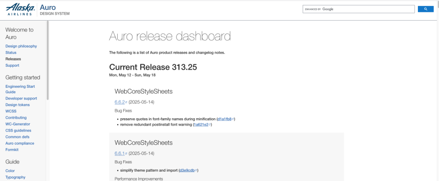
Many design system documentation boasts of being a single source of truth. This simple step goes a long way in making that a reality by promoting trust and reliability amongst users. By showcasing changes to the system in the documentation, new contributions and versioning are prioritized — an incentive for teams to keep the documentation updated.
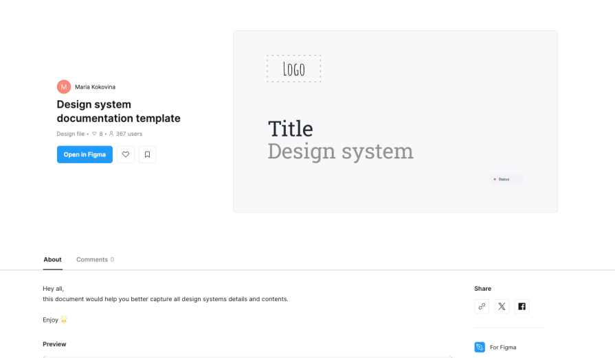
Instead of abstract theories about design, create and provide a template that demonstrates clearly the guiding philosophies and rationale behind the system to inform consistent decision-making.
Define tone, voice, punctuation, and text rules for consistent copy across components, and make it easy for teams to use this template to update their section of the documentation and easily meet expected standards.
Help designers and developers find what they need with a predictable structure. Include:
The following steps and practices can be used to ensure your documentation stays accurate, relevant, and valuable as the design system evolves:
Set up simple, visible rules for how team members can suggest changes, ensuring everyone knows how to participate. Plan routine audits and feedback sessions to catch outdated information and gather improvement ideas from users.
Appoint documentation champions or designate a core team to oversee updates and ensure accuracy. Involve designers, engineers, PMs, and writers in maintaining and reviewing documentation, and hold regular office hours or focus groups for feedback.
Track every update with semantic versioning and keep a running changelog so that the documentation can reflect what has changed and when as a source of truth. Use tools to flag outdated content, validate documentation, and sync updates across platforms.
These practices help ensure your documentation is clear, inclusive, and actionable, driving adoption and effective collaboration:
Outline what users (designers, engineers, or PMs) typically seek and make it easy to find and use logical categories like principles, components, patterns, and guidelines. The principle of discoverability should be leveraged so that users can seamlessly discover the information they need.
There’s no universal template. Adapt structure and granularity to your team’s size, workflow, and product needs.
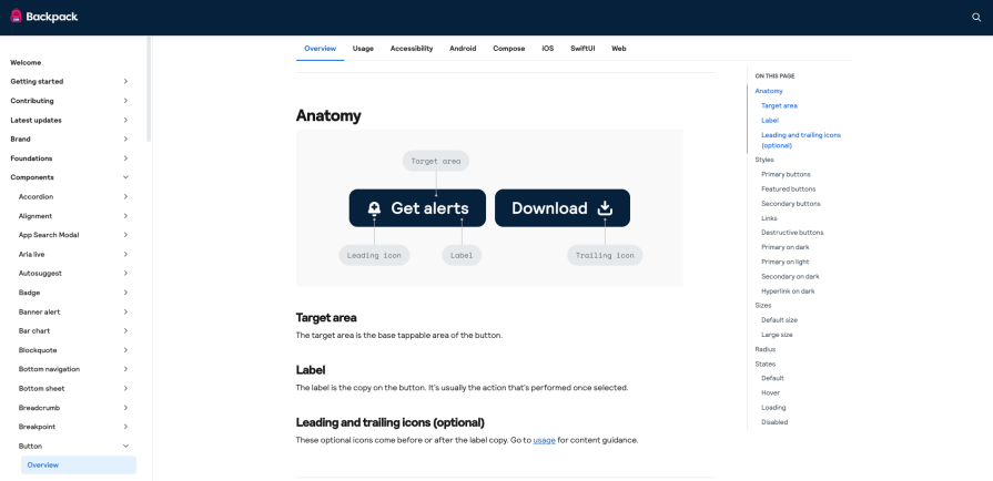
For each component, include usage guidelines, design specs, code snippets, accessibility notes, and real-world examples in one place.
Establish clear, visible guidelines for contributing updates or new components, and maintain consistency through review processes and templates.
Use tools and navigation that let users quickly search and filter for what they need, regardless of their entry point.
Material Design 3 is Google’s open-source design system for building products. The design system is organized in three main parts: foundations, styles, and components:
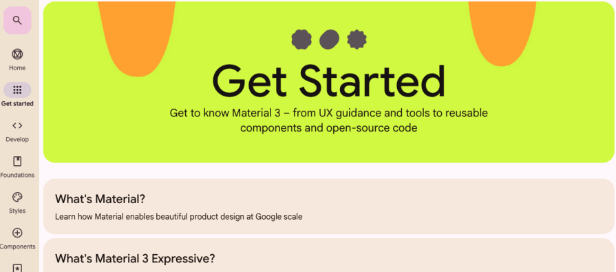
The documentation is addressed to two principal audiences: designers and developers. For designers, the documentation offers information on colors, motion graphics, adaptive components, typography, and shapes. For developers, the documentation includes information on Material Components substantiated with tutorials and case studies.
It is debatable how effective the contemporary trend of sprinkling design documentation with zany illustrations and animations featuring abstract shapes and fluorescent colors is.
Atlassian’s Design System is a comprehensive resource that provides designers and developers with a set of reusable patterns, components, and guidelines to create consistent and intuitive user experiences across Atlassian products like Jira, Confluence, and Trello. It serves as a single source of truth for design decisions, ensuring a unified look and feel while also allowing for flexibility and customization:

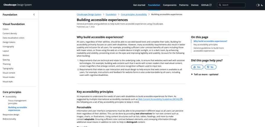
It is a clean and functional documentation system that prioritizes accessibility, striking a good balance between color, illustration, and text.
The GOV.UK Design System is an exemplar of a clear, structured approach to documenting design through the use of templates:
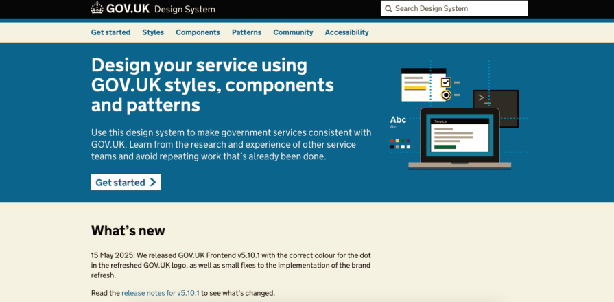
Another distinctive feature of this design system and its documentation is its voice — simple, functional, and precise. This delivers the mandate of the system, which is ensuring consistency, accessibility, and usability across government digital services.
eBay’s design system documentation, known as Evo, aims to unify brand, design, code, and accessibility into a single, comprehensive resource:
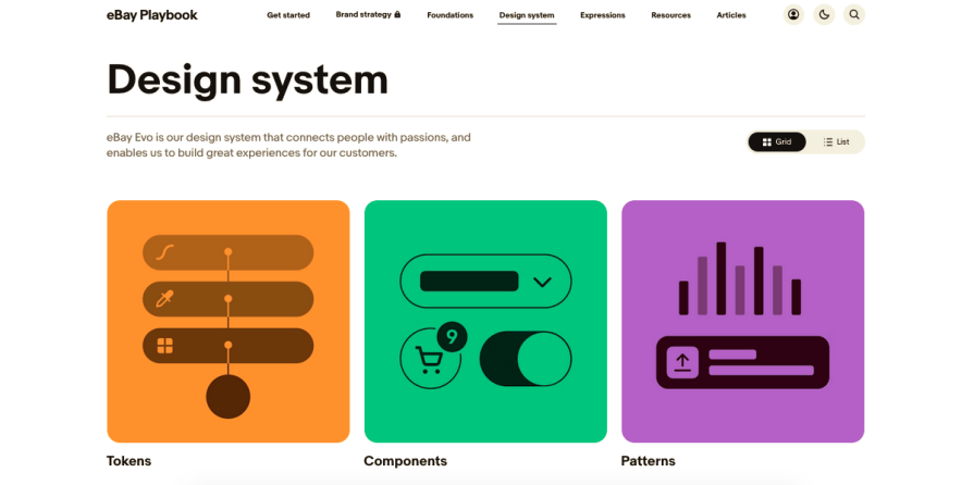
While an interesting and well-resourced approach to documentation, I found it a tad flashy, too loaded with animations, and not clear enough in terms of delineating functions and structure. The documentation seemed over-eager to advertise the philosophy of the system, possibly to encourage community buy-in. This is achieved at the cost of burying necessary, actionable information for designers and developers at the back of the documentation.
Actionable steps ensure documentation is easy to maintain while being clear, inclusive, and actionable. This drives adoption and the effective collaboration that a design system is supposed to facilitate.
A high-quality design system document infrastructure provides several benefits. To maximize the efficacy of documentation, teams should balance structure and individual functions. This fosters adoption across teams and assists a broader understanding of different functions by users. The documentation should be organized in a way that aids in finding information quickly. A mechanism to provide feedback when something is missing, erroneous, or broken is good practice.
A simple but foundational step is to create a template that embodies the philosophy and principles of the design system. The ownership of the documentation should be assigned but shared across the community. Abstract theorization about design and distracting, bizarre illustrations/animations should be kept to a minimum. At the same time, using a bare, wiki-like structure may attract feedback that the design is basic and dated.
Documentation fails when it is not treated as a living, collaborative product that evolves with input from all stakeholders and is prioritized alongside actual component development. If you want to win the buy-in of the design system’s users, effective documentation is a must.

LogRocket's Galileo AI watches sessions and understands user feedback for you, automating the most time-intensive parts of your job and giving you more time to focus on great design.
See how design choices, interactions, and issues affect your users — get a demo of LogRocket today.

Traditional A/B testing splits traffic evenly, but multi-armed bandits dynamically send more users to the better-performing version. Here’s how the method works, where it helps, and when UX teams should use it over classic A/B testing.

AI agent simulations promise faster, lower-risk UX testing by replacing real users with AI-simulated personas. Here’s how the method works, where it falls short, and when designers should rely on simulated users versus real user testing.

A/B testing is great for comparing two versions of a design, but multivariate testing helps teams evaluate multiple design element combinations at once. Here’s how both methods work, how they differ, and when UX teams should use each one.

Design engineering has always lived between design and code. But with AI tools turning prompts into interfaces and code into editable canvases, that bridge is becoming a new way of building.

 Learn more →
