We’ve all encountered the infamous 404 error page while browsing a website before. While they might seem insignificant, these error pages play an important role in website user experiences. When you click on a broken link or type in an incorrect URL in your browser, a 404 page tells you the content you’re looking for can’t be found. This can lead to confusion and frustration from a user’s perspective, as it feels like you’ve hit a dead end with no way out.
Think of a 404 error as an opportunity for your brand to connect and engage with your users. Instead of just saying, “Oops! Something went wrong!”, give them an easy way out or offer up a fun experience to lighten the mood.
In this article, we’ll talk about how to design an effective 404 page that navigates your users back to safety. After all, mistakes happen, so why not put a creative spin on it?
Often, websites go under maintenance where pages get moved, renamed, or taken down for various reasons. When the links to these pages aren’t updated properly, they create broken links. This isn’t the user’s fault, but when they click on one of these, they end up facing the dreaded 404 page. It’s also common to accidentally type in the wrong URL and end up on a page that doesn’t exist.
In both cases, the 404 page lets the user know that the server couldn’t find the page they were looking for. But instead of just displaying a generic error message, a well-designed 404 page shouldn’t leave users at a dead end. Infusing some creativity and problem-solving into its design, a 404 page should provide alternative pathways to different pages on the website. By redirecting users back to safety, you can avoid them leaving your website for good.
No one enjoys encountering a 404 page. Confusion can set in when the error message lacks clarity, leaving users to wonder if they somehow messed up. 404 pages can frustrate users, especially when they’re on a mission to complete an important task or find specific information.
Experiencing 404 pages repeatedly can lead to disappointment and even diminish trust in the website’s reliability. We live in a fast-paced world where patience wears thin and attention spans are shorter than ever. That’s why understanding user experiences and emotions becomes important to keep users engaged.
Designers who empathize with users can craft user friendly 404 pages that ease frustration and encourage retention. It’s an opportunity for businesses to show their caring side, too. By acknowledging errors gracefully without putting the blame on users, transparency and trust are fostered, ultimately enhancing brand perception.
Happy users are more likely to return to a website and become loyal customers who recommend it to others. So, a helpful 404 page can provide an opportunity for understanding, empathy, and a chance to strengthen the bond between users and the websites they visit.
Writing 404 error messages can take a bit of time to perfect, but it’s well worth it. The impact of a message can make the difference between users staying on your website or abandoning it forever. Crafting informative and user-friendly error messages is essential for ensuring a positive user experience when visitors encounter broken links or missing pages on a website.
Here are some best practices and techniques to follow when writing error messages for your 404 page. A well-crafted 404 page can turn a frustrating experience into a positive one, leaving a lasting impression on users and encouraging them to explore more of your content.
Use simple and friendly language in your 404 error message. Avoid technical jargon and be empathetic, letting users know that errors can happen to anyone.

Avoid language that places blame on the user for the error. Instead, focus on guiding them to a solution and offer tips to improve their search.
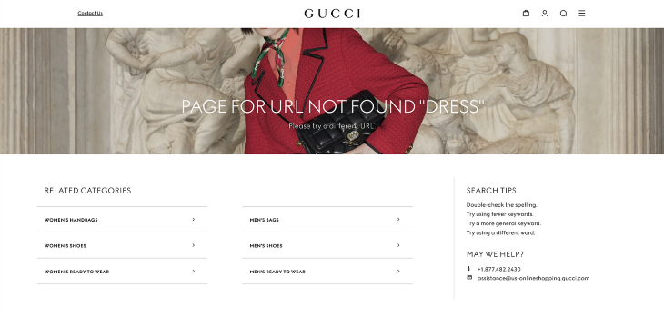
Clearly state that the requested page could not be found. Providing a concise and straightforward explanation helps users understand the issue and avoids confusion.
Use specific wording to describe the error. Avoid generic messages like “Error 404.” Instead, say something like “Page Not Found” or “This page seems to be missing.”
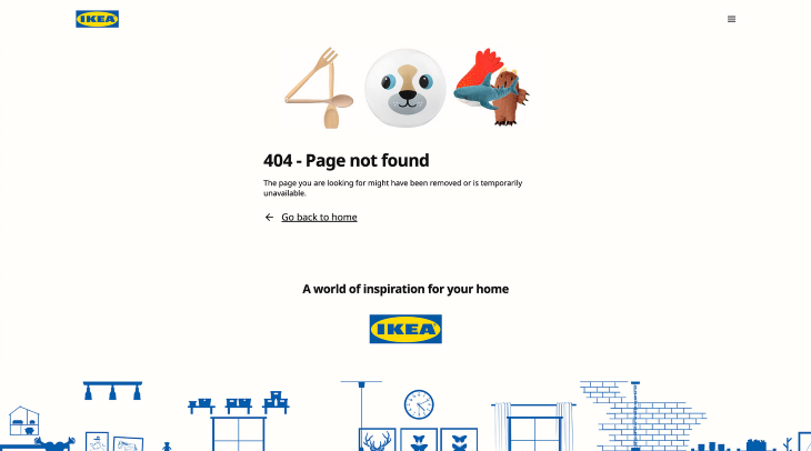
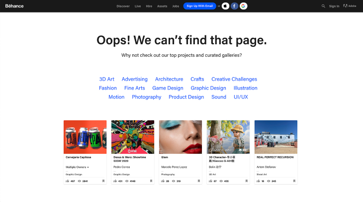
Provide helpful suggestions to assist users in finding what they were looking for. This could include offering a search bar, linking to the homepage, or suggesting popular content. Include links or buttons to help users navigate back to relevant sections or the homepage. This enables users to continue exploring the website despite the error.
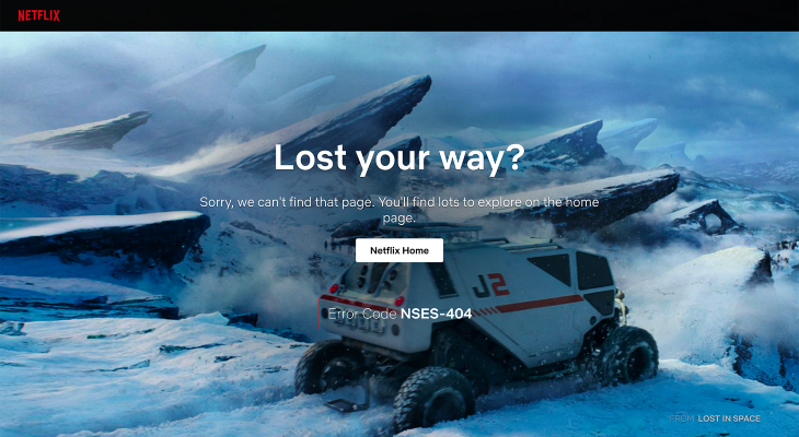
Creating a 404 page that captivates users involves visual design just as much as it does copy. A 404 page offers a blank canvas for websites to incorporate visual elements that further strengthen their brand.
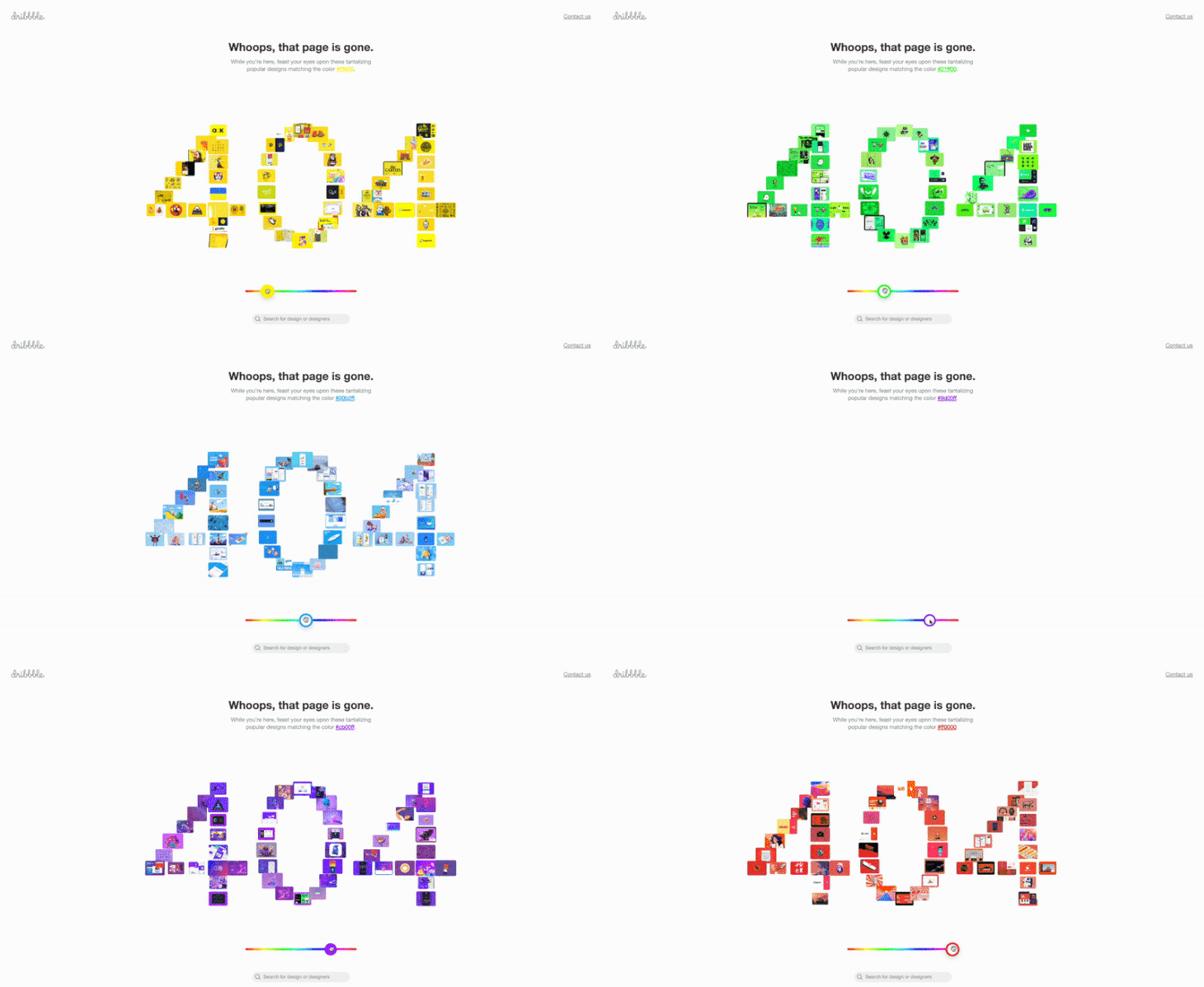
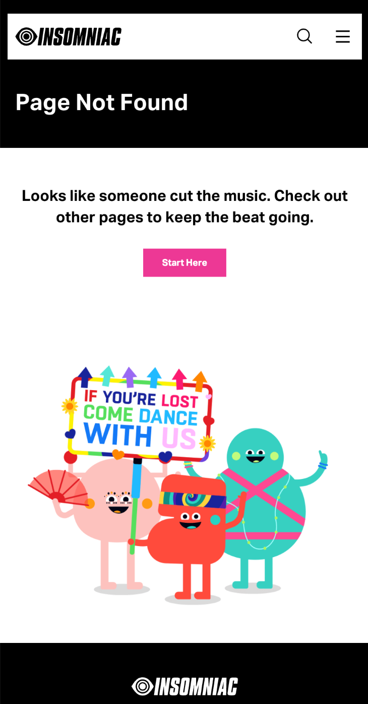
Use visuals like illustrations or icons that convey the error’s meaning. Visuals can make the message more engaging and help users quickly grasp the situation.
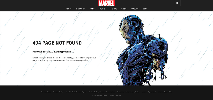
Ensure the 404 page’s design aligns with the website’s overall look and feel. Consistency helps users recognize the error message and maintain trust in the brand.
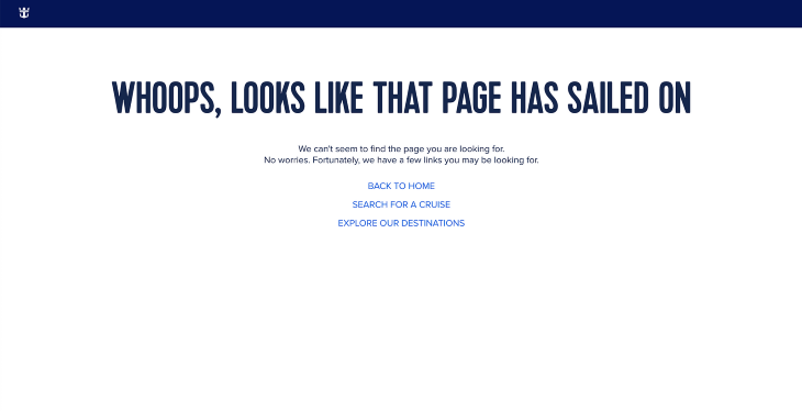
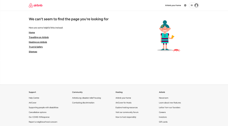
Users should never feel like they are lost when browsing a website, especially when encountering 404 pages. Although the webpage that the user was looking for could not be found, provide them with alternative options so that they can continue their journey on a different page within the website.
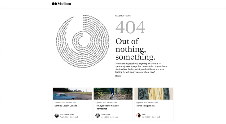
404 pages often contain call-to-action (CTA) buttons or links that return the user back to the homepage or a relevant page. This gives them a quick way to retreat to safety.
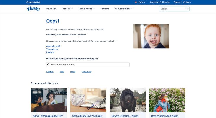
You can also include navigation options such as search bars, site maps, or related content links. Think of the 404 page as a way to redirect users to something else that they might be interested in. Being able to quickly deflect the user off of the error page can help retain the user and keep them engaged.
Leveraging user data to personalize 404 pages can be powerful when done correctly. You can turn what could be a frustrating experience into an opportunity to connect with your users, improve their journey on your website, and ultimately drive better engagement and conversions.
Relevant data that can be useful for personalizing 404 pages includes browsing history, location, recent interactions on the website, or previous purchases.
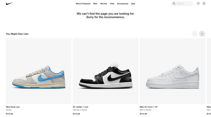
You can tailor the 404 page to display content relevant to their interests, including promoting specific products, services, or offers that align with their preferences. This keeps users engaged and encourages them to explore further, reducing the chances of them leaving your website in frustration.
However, you need to handle user data responsibly and in compliance with privacy regulations. Always be transparent with users about data collection and usage in your messaging and privacy policy. Consider also providing options for them to adjust their data preferences so that they feel in control of their data.
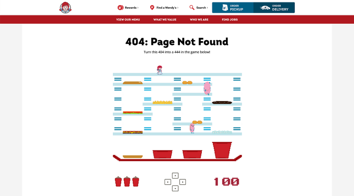
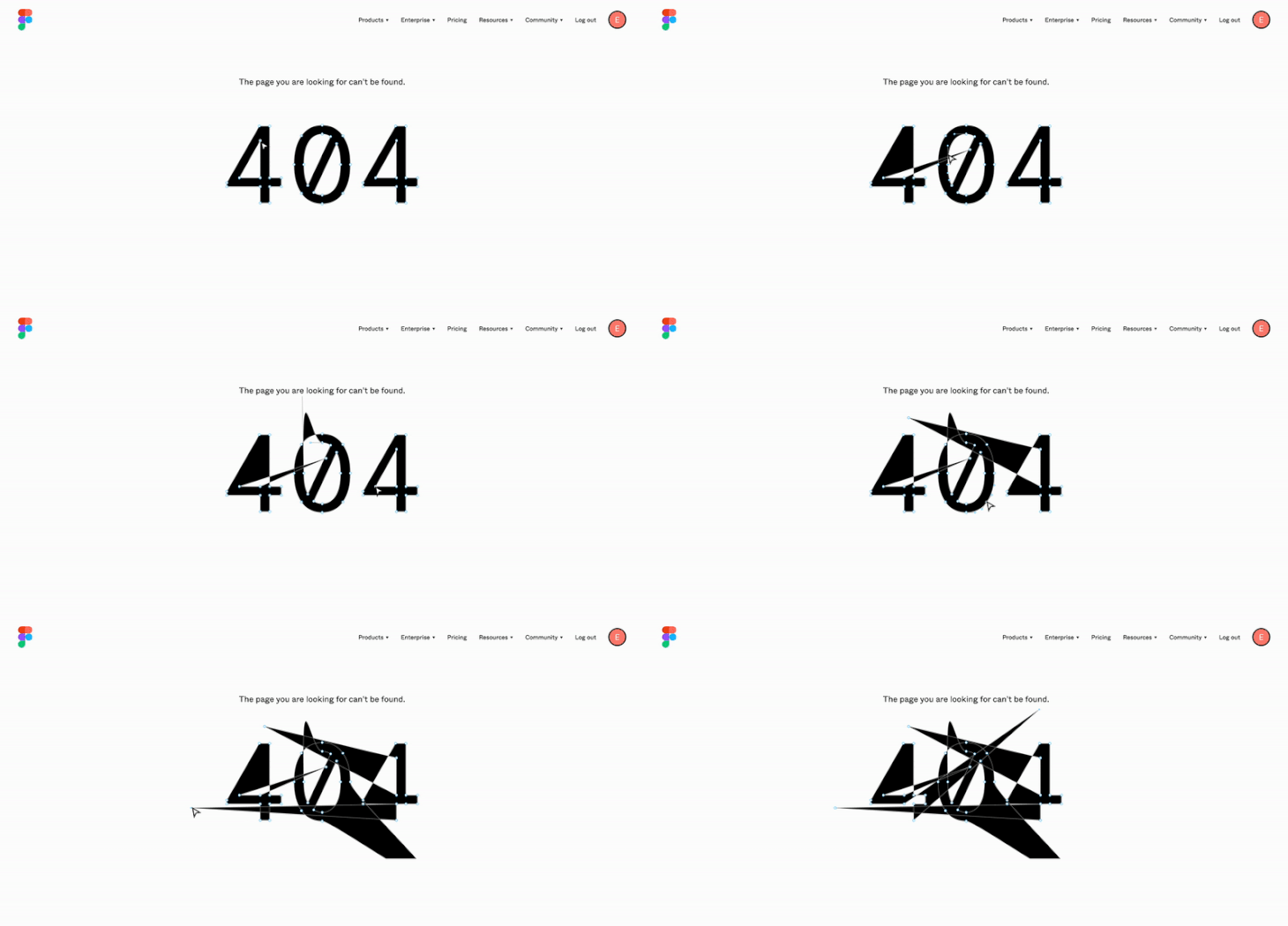
To make your 404 page designs stand out from the limitless sea of webpages out there, consider incorporating interactive elements, such as an animation or game that can turn a negative experience into a pleasurable one.
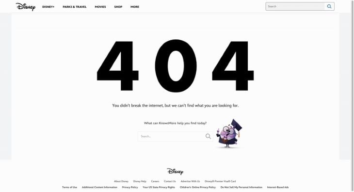
A fun interaction can distract the user just enough to make them lose their initial frustration about the missing page. By following a negative outcome with a positive one, the user’s journey becomes more memorable and enjoyable.
404 pages are not only an effective communication channel for the user. Understanding the frequency and nature of 404 errors allows website owners and developers to identify issues, make improvements, and enhance user satisfaction.
Error tracking helps identify broken links on the website. By knowing which links are generating 404 errors, website owners can quickly fix or redirect them, preventing users from encountering these errors in the future and ensuring they find the content that they’re looking for.
Broken links can negatively impact search engine rankings and user experience. Error tracking allows for quick identification and resolution of these issues, resulting in better SEO performance.
Web analytics tools, like Google Analytics, can track 404 errors and provide deeper insights, such as the frequency and sources of the errors. This can help website owners understand user behavior and where most of the errors occur.
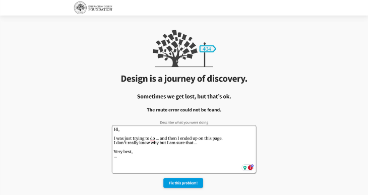
Encouraging users to report broken links through a user friendly form can also be helpful for capturing error data. This crowdsourced approach can help identify errors that analytics tools might miss and improve the error capture rate.
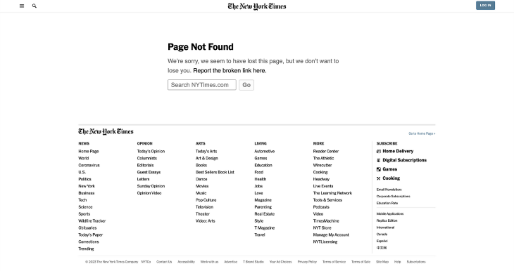
Don’t forget to regularly check webmaster tools provided by search engines for reports on crawl errors and 404 pages. This data can provide valuable insights into broken links and indexing issues.
404 pages should be treated like any other page on your website, which means that they need to be accessible to all users. People with disabilities face many challenges when it comes to using inaccessible websites. As designers, we need to consider the needs of all users so that everyone can share an equal experience on the same website.
When designing 404 pages, some accessibility considerations include ensuring the page is perceivable, operable, and understandable for all users.
People with disabilities may struggle with certain sensory abilities, such as reading or hearing, which can hinder their experience using a website. Providing text alternatives for non-text content on a 404 page, like images, videos, and audio, can assist users who can’t see or hear the content.
Image alt text can benefit users with vision impairments by describing an image or having it read aloud to them using a screen reader. Captions and transcripts can benefit users with hearing difficulties by allowing them to read the same content.
Always ensure that the content on your 404 page has sufficient color contrast with the background. This makes it easier for users with low vision to read the text and distinguish the visual elements on the screen. Use a color contrast checker to ensure that the contrast meets WCAG requirements.
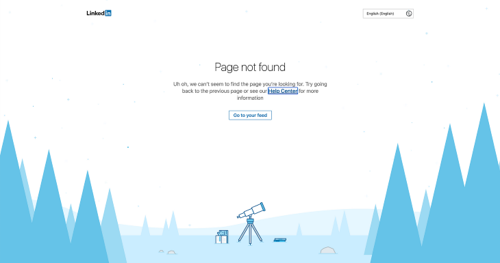
All users should be able to easily interact with a 404 page and navigate through it using different methods of input, whether it’s a keyboard, mouse, or other assistive device. All functionality on the 404 page should be operable using only a keyboard in order to remove barriers to access for users who solely rely on keyboard navigation.
Navigation is key to getting around a website, so it’s important to maintain consistent and predictable navigation throughout. The menu on the 404 page should stay in the same place as all other pages. Navigation buttons should lead the user back to a page that makes logical sense to the user, such as the home page or the previous page they were on. This ensures that users can navigate and find what they need without getting lost or confused.
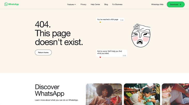
The information presented on a 404 page should be clear and straightforward for all users. This includes things like the error message and any instructions. To make your content easy to comprehend, use clear and simple language throughout the website and avoid using complex terms or jargon to explain things. Remember that not all users will understand technical terms, so keep things basic.
Provide clear and helpful copy that offers solutions and guides them out of the problem. This way, users are able to resolve issues on their own and can easily get out of the 404 page and back to safety.
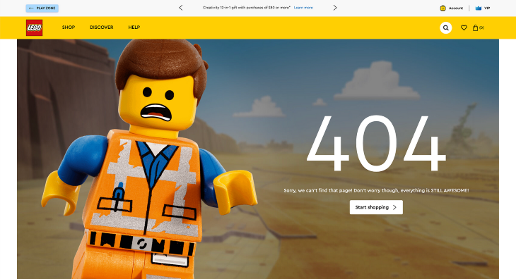
When designing your 404 page, consider how it might look and operate on a mobile device. By designing the 404 page to be responsive, it should adapt to different screen sizes and devices so that it maintains a consistent experience. Here are some techniques to adapt the page layout of your 404 page for mobile devices.
Any interactive element, such as a button or link, should have a minimum touch target size of 44px on iOS and 48dp on Android devices to ensure that users have enough space to accurately tap the element on with their finger. The actual visual aspect of the element can appear smaller than the touch target itself.
Using a grid layout can help you easily adapt your 404 page to different screen sizes. Grid columns help organize layouts by ensuring that elements are evenly and consistently spaced out. A flexible grid can shrink or expand to fit the size of the device’s screen, allowing content to adjust proportionally. Consider stacking objects vertically on smaller mobile devices to make use of the space allowed by scrolling.
When scaling images down to smaller screen sizes, keep the aspect ratio the same. Distorted images tend to cause a negative impression on the general usability of the website. By setting the CSS max-width property as a percentage and the height to auto, you can ensure that your images will scale down proportionally without getting stretched out.
We’ve covered the significance of well-designed 404 pages and how you can transform an error page into a positive encounter. By understanding the purpose of the 404 page and how a user might respond to it, we can provide information, empathy, and guidance toward a better solution. Assisting users in finding their way back to a safe spot through links and calls to action can make a difference between them leaving your site for good or recommending it to others.
As you design 404 pages, remember some key techniques: focusing on visual design and branding, integrating interactive components, and keeping track of errors. And don’t overlook accessibility in your designs, ensuring that all users can enjoy the same experiences.
When we approach our 404 pages as opportunities to connect with users, we can genuinely enhance their experiences by easing their frustration and directing them to safety. After all, we all make mistakes, so by adding some creativity, we can leave a positive and lasting impression on our users.
Header image source: IconScout
LogRocket's Galileo AI watches sessions and understands user feedback for you, automating the most time-intensive parts of your job and giving you more time to focus on great design.
See how design choices, interactions, and issues affect your users — get a demo of LogRocket today.

Multimodal UX goes beyond designing for screens. Learn how context-aware systems, progressive modality, failover modes, and accessibility-first design create better digital product experiences.
Learn how context-aware mode prioritization and seamless transitions improve multimodal UX and reduce mode confusion.

Research is becoming more democratized, product cycles are accelerating, and AI is transforming synthesis and ResearchOps. Here are the three trends shaping UX research in 2026.

Voice support is not the same as multimodal UX. Here’s how to design systems with true mode continuity and context-aware interactions.