
Editor’s note: This article was reviewed for accuracy on 8 April 2024 by Shalitha Suranga and updated to use the most recent package and library versions, explore additional prebuilt command palette options, compare their implementations, provide additional context and examples throughout the tutorial and more. Two sections about performance optimizations and accessibility & responsiveness were also added.

As developers, we often strive to optimize our workflows as much as possible, saving time by leveraging tools like the terminal. A command palette is one such tool that displays recent activity in a web or desktop application, enabling quick navigation, easy access to commands, and shortcuts, among other things.
A command palette is essentially a UI component that takes the form of a modal for the purpose of elevating your productivity level. It’s especially useful in large, complex applications with many moving parts — for example, where it might take you several clicks or skimming through multiple dropdowns to access a resource.
In this tutorial, we’ll explore how to build a fully functional command palette from scratch using the Headless UI Combobox component and Tailwind CSS. Also, we’ll learn about prebuilt command palette components in various popular open source packages.
The Replay is a weekly newsletter for dev and engineering leaders.
Delivered once a week, it's your curated guide to the most important conversations around frontend dev, emerging AI tools, and the state of modern software.
As a developer, there’s a very high chance that you’ve used a command palette before. The most popular one is the VS Code command palette that lists core and extension commands, but there are many other examples, including the GitHub Command Palette, Linear, Figma, Slack, monkeytype, and more.
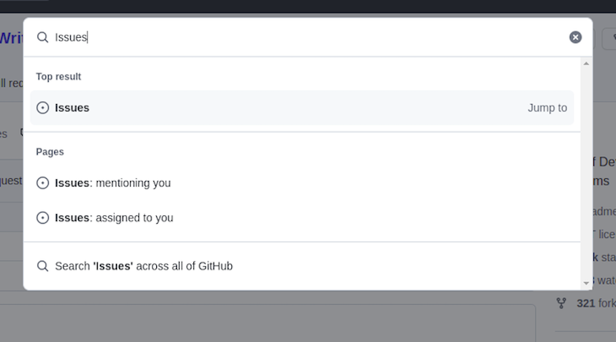
GitHub recently released a command palette feature that is still in public beta at the time of writing. It lets you quickly jump to different pages, search for commands, and get suggestions based on your current context. You can also narrow the scope of the resources you’re looking for by tabbing into one of the options:
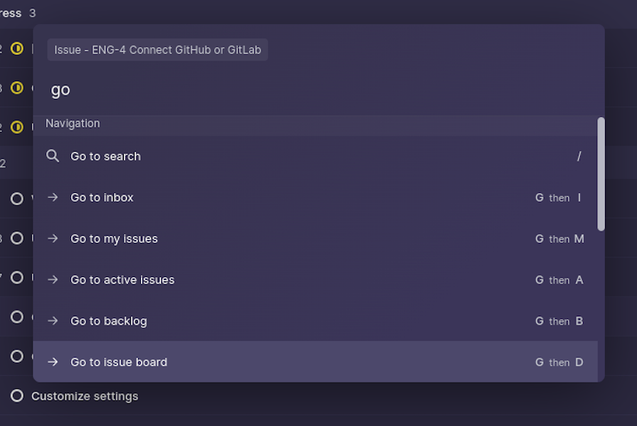
If you’re not familiar with Linear, it’s a project management tool similar to Jira and Asana that offers a really great user experience. Linear has a very intuitive command palette that lets you access the entire application’s functionality with its keyboard-first design.
In this tutorial, we’ll build a command palette similar to Linear’s:
Several modern applications are implementing command palettes as a feature, but what makes a good command palette component? Here’s a concise list of things to look out for:
ctrl + kIn the next section, we’ll build our own component that includes all the features listed above. Let’s get into it!
The command palette is not actually as complex as it seems, and anyone can build one quickly. I’ve uploaded project sources into a GitHub repository for this tutorial so that you can easily follow along. The starter project is a React and Vite SPA that replicates the Linear issues page.
To get started, clone the repository into your local directory and switch to the starter-project branch:
git clone https://github.com/codezri/react-command-palette.git
cd react-command-palette
git checkout starter-project
Install the necessary dependencies:
yarn
The project uses Yarn, but if you’re more comfortable with npm or pnpm, you can delete the yarn.lock file before running npm install or pnpm install.
Finally, start the Vite development server as follows to run the app:
yarn dev
If you visit localhost:5173, you’ll see the following page:
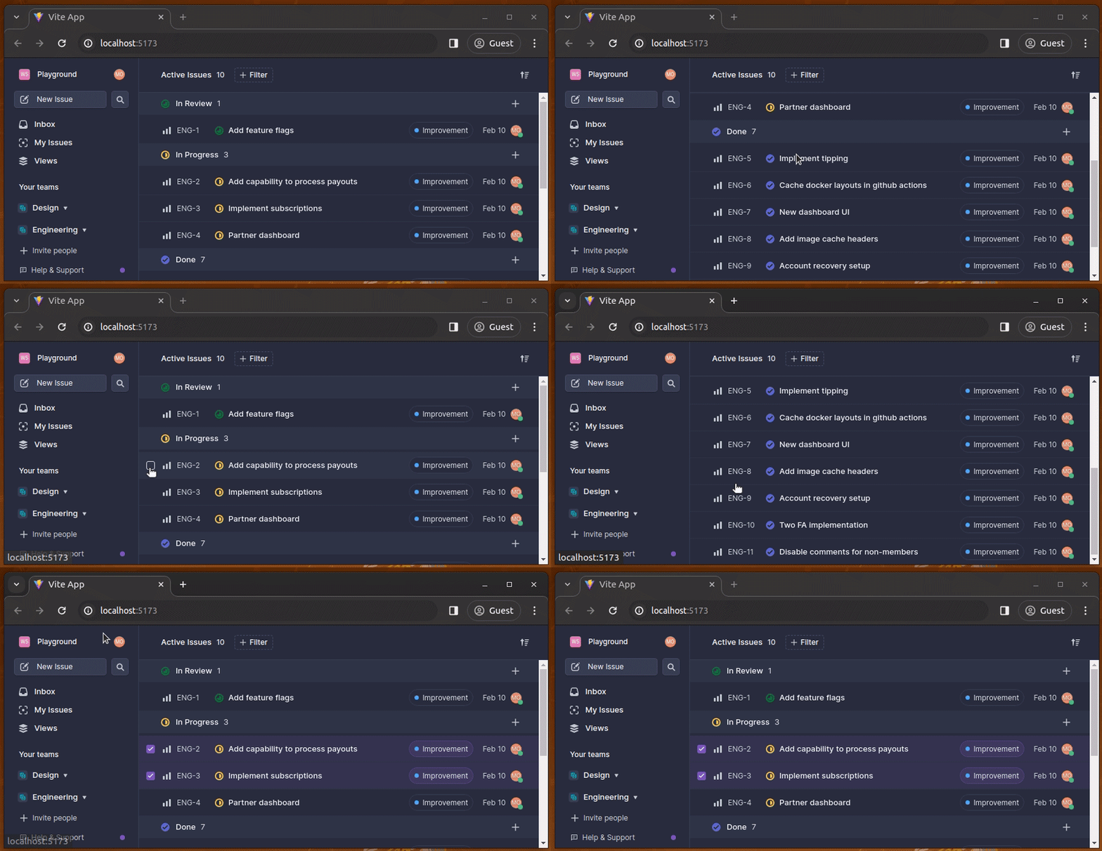
This sample app looks like the popular Linear project management app, but it doesn’t contain the command palette yet. So, let’s start implementing a brand new command palette!
CommandPalette componentNext, we’ll build the component. We’ll use the Headless UI Combobox and Dialog components. Combobox will be the base component for our command palette. It has built-in features like focus management and keyboard interaction. We’ll use the Dialog component to render our command palette in a modal.
To style the components, we’ll use Tailwind CSS. Tailwind is a CSS utility library that lets you easily add inline styles in your HTML or JSX files. The starter project already includes the configuration for Tailwind.
Install the necessary dependencies as follows:
yarn add @headlessui/react @heroicons/react@v1
In the components folder, create a CommandPalette.jsx file and add the following code block:
import React, { useState } from "react";
import { Dialog, Combobox } from "@headlessui/react";

export const CommandPalette = ({ commands }) => {
  const [isOpen, setIsOpen] = useState(true);

  return (
    <Dialog
      open={isOpen}
      onClose={setIsOpen}
      className="fixed inset-0 p-4 pt-[15vh] overflow-y-auto"
    >
      <Dialog.Overlay className="fixed inset-0 backdrop-blur-[1px]" />
      <Combobox
         as="div"
         className="bg-accent-dark max-w-2xl mx-auto rounded-lg shadow-2xl relative flex flex-col"
         onChange={(command) => {
            // we have access to the selected command
            // a redirect can happen here or any action can be executed
            console.log(command);
            setIsOpen(false);
         }}
      >
         <div className="mx-4 mt-4 px-2 h-[25px] text-xs text-slate-100 bg-primary/30 rounded self-start flex items-center flex-shrink-0">
            Issue
         </div>
         <div className="flex items-center text-lg font-medium border-b border-slate-500">
            <Combobox.Input
               className="p-5 text-white placeholder-gray-200 w-full bg-transparent border-0 outline-none"
               placeholder="Type a command or search..."
            />
         </div>
         <Combobox.Options
            className="max-h-72 overflow-y-auto flex flex-col"
            static
         ></Combobox.Options>
      </Combobox>
   </Dialog>
  );
};
A few things are happening here. First, we import the Dialog and Combobox components from the @headlessui/react package. Dialog is rendered as a wrapper around the Combobox, and we initialize a local state called isOpen to control the modal.
We render a Dialog.Overlay inside the Dialog component to serve as the overlay for the modal. You can style this however you want, but here, we’re just using backdrop-blur to blur the background app content when the Dialog is open.
Then, we render the Combobox component and pass in a handler function to the onChange prop. This handler is called whenever an item is selected in the Combobox. You’d typically want to navigate to a page or execute an action here, but for now, we just close the Dialog and log the selected command on the browser console.
Combobox.Input will handle the search functionality, which we’ll add later in this section. Combobox.Options renders a ul element that wraps the list of results we’ll render. We pass in a static prop that indicates we want to ignore the internally managed state of the component.
Next, we render our CommandPalette in the App.jsx file as follows:
import { Drawer } from "./components/Drawer";
import { CommandPalette } from "./components/CommandPalette";
import { AllIssues } from "./components/Workspace";
import { issues, teams, commands } from "./data/seed.json";

const App = () => {
   return (
      <div className="flex w-full bg-primary h-screen max-h-screen min-h-screen overflow-hidden">
         <Drawer teams={teams} />
         <AllIssues issues={issues} />
         <CommandPalette commands={commands}/>
      </div>
   );
};

export default App;
Let’s talk about how our command palette will function. We have a list of predefined commands in the data/seed.json file. These commands will be displayed in the palette when it’s opened and can be filtered based on the search query. Fairly simple, right?
CommandGroup componentCommandPalette receives a commands prop, which is the list of commands we imported from seed.json. Now, create a CommandGroup.jsx file in the components folder and add the following code:
import React from "react";
import clsx from "clsx";
import { Combobox } from "@headlessui/react";
import { PlusIcon, ArrowSmRightIcon } from "@heroicons/react/solid";
import {
   CogIcon,
   UserCircleIcon,
   FastForwardIcon,
} from "@heroicons/react/outline";
import { ProjectIcon } from "../icons/ProjectIcon";
import { ViewsIcon } from "../icons/ViewsIcon";
import { TemplatesIcon } from "../icons/TemplatesIcon";
import { TeamIcon } from "../icons/TeamIcon";

export const CommandGroup = ({ commands, group }) => {
   return (
      <React.Fragment>
         {/* only show the header when there are commands belonging to this group */}
         {commands.some((command) => command.group === group) && (
            <div className="flex items-center h-6 flex-shrink-0 bg-accent/50">
               <span className="text-xs text-slate-100 px-3.5">{group}</span>
            </div>
         )}
         {commands
            .filter((command) => command.group === group)
            .map((command, idx) => (
               <Combobox.Option key={idx} value={command}>
                  {({ active }) => (
                     <div
                        className={clsx(
                           "w-full h-[46px] text-white flex items-center hover:bg-primary/40 cursor-default transition-colors duration-100 ease-in",
                           active ? "bg-primary/40" : ""
                        )}
                     >
                        <div className="px-3.5 flex items-center w-full">
                           <div className="mr-3 flex items-center justify-center w-4">
                              {mapCommandGroupToIcon(
                                 command.group.toLowerCase()
                              )}
                           </div>
                           <span className="text-sm text-left flex flex-auto">
                              {command.name}
                           </span>
                           <span className="text-[10px]">{command.shortcut}</span>
                        </div>
                     </div>
                  )}
               </Combobox.Option>
            ))}
      </React.Fragment>
   );
};
We’re simply using the CommandGroup component to avoid some repetitive code. If you look at the Linear command palette, you’ll see that the commands are grouped based on context. To implement this, we need to filter out the commands that belong to the same group and repeat that logic for each group.
The CommandGroup component receives two props, commands and group. We’ll filter the commands based on the current group and render them using the Combobox.Option component. Using render props, we can get the active item and style it accordingly, allowing us to render the CommandGroup for each group in the CommandPalette while keeping the code clean.
Note that we have a mapCommandGroupToIcon function somewhere in the code block above. This is because each group has a different icon, and the function is just a helper to render the correct icon for the current group. Now, add the function just below the CommandGroup component in the same file:
const mapCommandGroupToIcon = (group) => {
   switch (group) {
      case "issue":
         return <PlusIcon className="w-4 h-4 text-white"/>;
      case "project":
         return <ProjectIcon/>
      case "views":
         return <ViewsIcon/>
      case "team":
         return <TeamIcon/>
      case "templates":
         return <TemplatesIcon/>
      case "navigation":
         return <ArrowSmRightIcon className="w-4 h-4 text-white"/>
      case "settings":
         return <CogIcon className="w-4 h-4 text-white"/>
      case "account":
         return <UserCircleIcon className="w-4 h-4 text-white"/>
      default:
         return <FastForwardIcon className="w-4 h-4 text-white"/>
   }
};
Now, we need to render the CommandGroup component in CommandPalette.
Import the component as follows from the CommandPalette.jsx file:
import { CommandGroup } from "./CommandGroup";
Render it inside the Combobox.Options for each group:
<Combobox.Options
   className="max-h-72 overflow-y-auto flex flex-col"
   static
>
   <CommandGroup commands={commands} group="Issue"/>
   <CommandGroup commands={commands} group="Project"/>
   <CommandGroup commands={commands} group="Views"/>
   <CommandGroup commands={commands} group="Team"/>
   <CommandGroup commands={commands} group="Templates"/>
   <CommandGroup commands={commands} group="Navigation"/>
   <CommandGroup commands={commands} group="Settings"/>
   <CommandGroup commands={commands} group="Account"/>
</Combobox.Options>
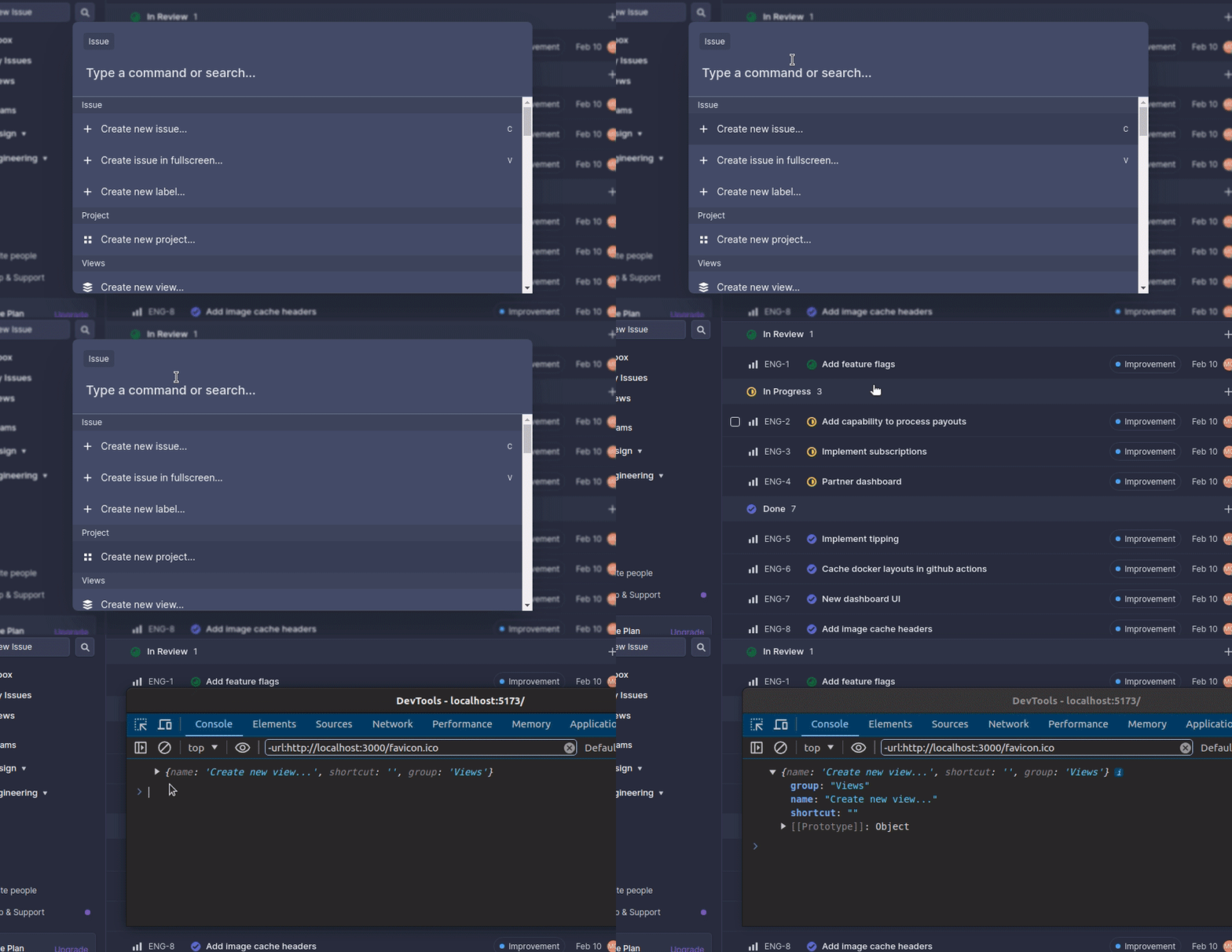
You should see the list of commands being rendered now. The command palette lets you select a specific entry with arrow keys, but it won’t implement the search functionality yet, as shown in the following preview:
The next step is to wire up the search functionality.
Create a local state variable in CommandPalette.jsx:
const [query, setQuery] = useState("");
Pass the state update handler to the onChange prop in Combobox.Input. The query will be updated with every character you type in the input box:
<Combobox.Input
  className="p-5 text-white placeholder-gray-200 w-full bg-transparent border-0 outline-none"
  placeholder="Type a command or search..."
  onChange={(e) => setQuery(e.target.value)}
/>
One of the key properties of a good command palette is extensive search functionality. We can just do a simple string comparison of the search query with the commands, however that wouldn’t account for typos and context. A much better solution that doesn’t introduce too much complexity is a fuzzy search.
We’ll use the Fuse.js library for this. Fuse.js is a powerful, lightweight, fuzzy search library with zero dependencies.
If you’re not familiar with fuzzy searching, it is a string matching technique that favors approximate matching over the exact match, implying that you can get correct suggestions even if the query has typos or misspellings. For example, in a fuzzy search engine incorrect user input terms — like JvaScript or JavaSript — typically get matched with the correct JavaScript term.
First, install the Fuse.js library:
yarn add fuse.js
Import the Fuse class from the CommandPalette.jsx file:
import Fuse from "fuse.js";
Instantiate the Fuse class with a list of commands within the CommandPalette component as follows:
const fuse = new Fuse(commands, { includeScore: true, keys: ["name"] });
The Fuse class accepts an array of commands and configuration options. The keys field is where we register what fields are in the commands list to be indexed by Fuse.js. Now, create a function that will handle the search and return the filtered results:
const filteredCommands =
  query === ""
     ? commands
     : fuse.search(query).map((res) => ({ ...res.item }));
We check if the query is empty, return all the commands, and if not, run the fuse.search() method with the query. Also, we’re mapping the results to create a new object. This is to maintain consistency because the results returned by Fuse.js have some new fields and will not match the structure we already have.
Now, pass the filteredCommands to the commands prop in each CommandGroup component. It should look like the code below:
<Combobox.Options
   className="max-h-72 overflow-y-auto flex flex-col"
   static
>
   <CommandGroup commands={filteredCommands} group="Issue"/>
   <CommandGroup commands={filteredCommands} group="Project"/>
   <CommandGroup commands={filteredCommands} group="Views"/>
   <CommandGroup commands={filteredCommands} group="Team"/>
   <CommandGroup commands={filteredCommands} group="Templates"/>
   <CommandGroup commands={filteredCommands} group="Navigation"/>
   <CommandGroup commands={filteredCommands} group="Settings"/>
   <CommandGroup commands={filteredCommands} group="Account"/>
</Combobox.Options>
Try searching in the command palette and see if the results are being filtered:
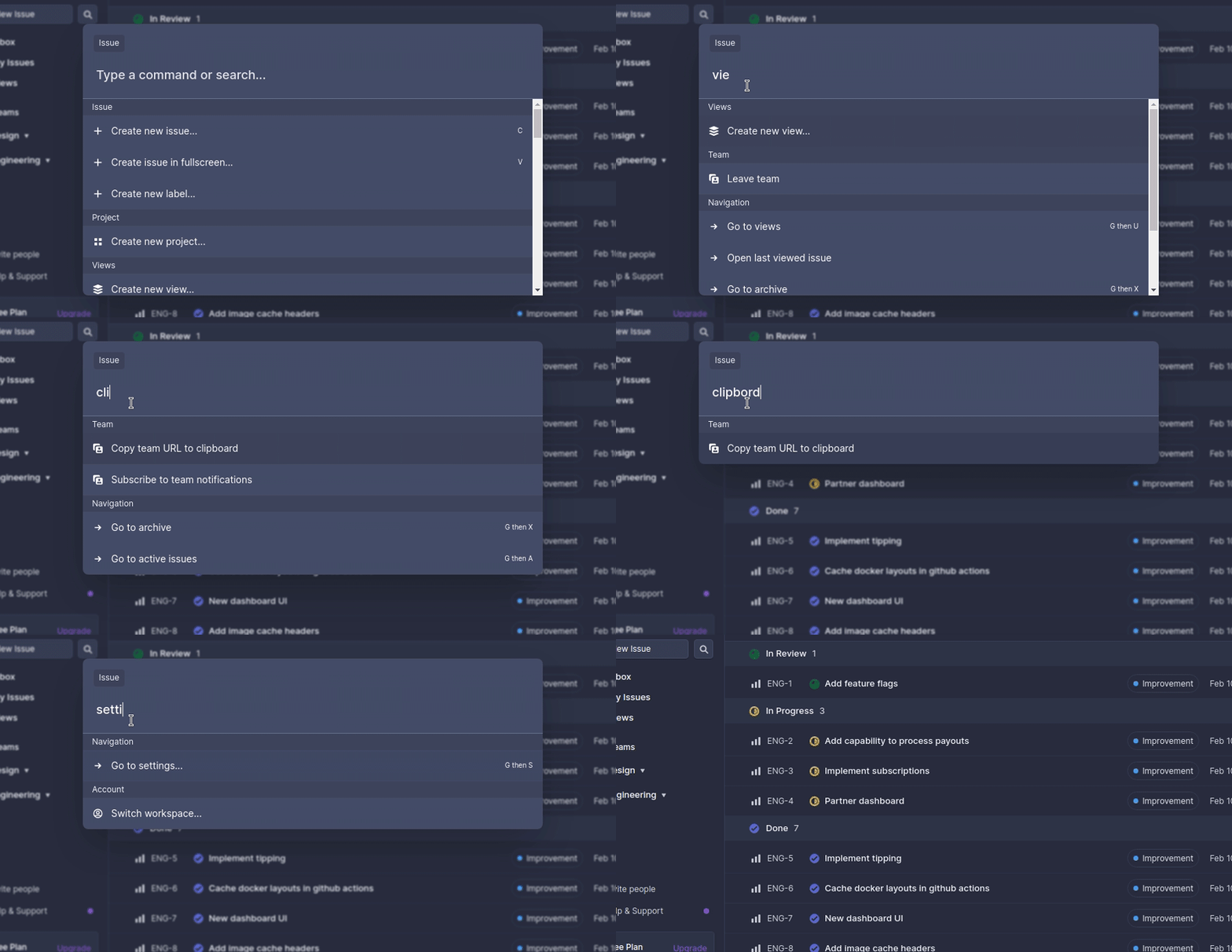
We have a fully functional command palette now, but you might notice that it’s always open. We need to be able to control its open state. Let’s define a keyboard event that will listen for a key combination and update the open state. Add the following code to CommandPalette.jsx:
useEffect(() => {
  const onKeydown = (e) => {
     if (e.key === "k" && (e.metaKey || e.ctrlKey)) {
        e.preventDefault();
        setIsOpen(true);
        setQuery("");
     }
  };
  window.addEventListener("keydown", onKeydown);
  return () => {
     window.removeEventListener("keydown", onKeydown);
  };
}, []);
We’re using a useEffect Hook to register a keydown keyboard event when the component is mounted, and we use a clean-up function to remove the listener when the component unmounts.
In the Hook, we check if the key combination matches ctrl + k. If it does, then the open state is set to true. You can also use a different key combination, but it’s important not to use combinations that clash with the native browser shortcuts.
Make sure to set the initial value of the isOpen state to false to hide the command palette at the application startup:
const [isOpen, setIsOpen] = useState(false);
That’s it! Now you can open the command palette component by pressing ctrl + k key combination. Use arrow keys and press enter to select a specific entry as usual:
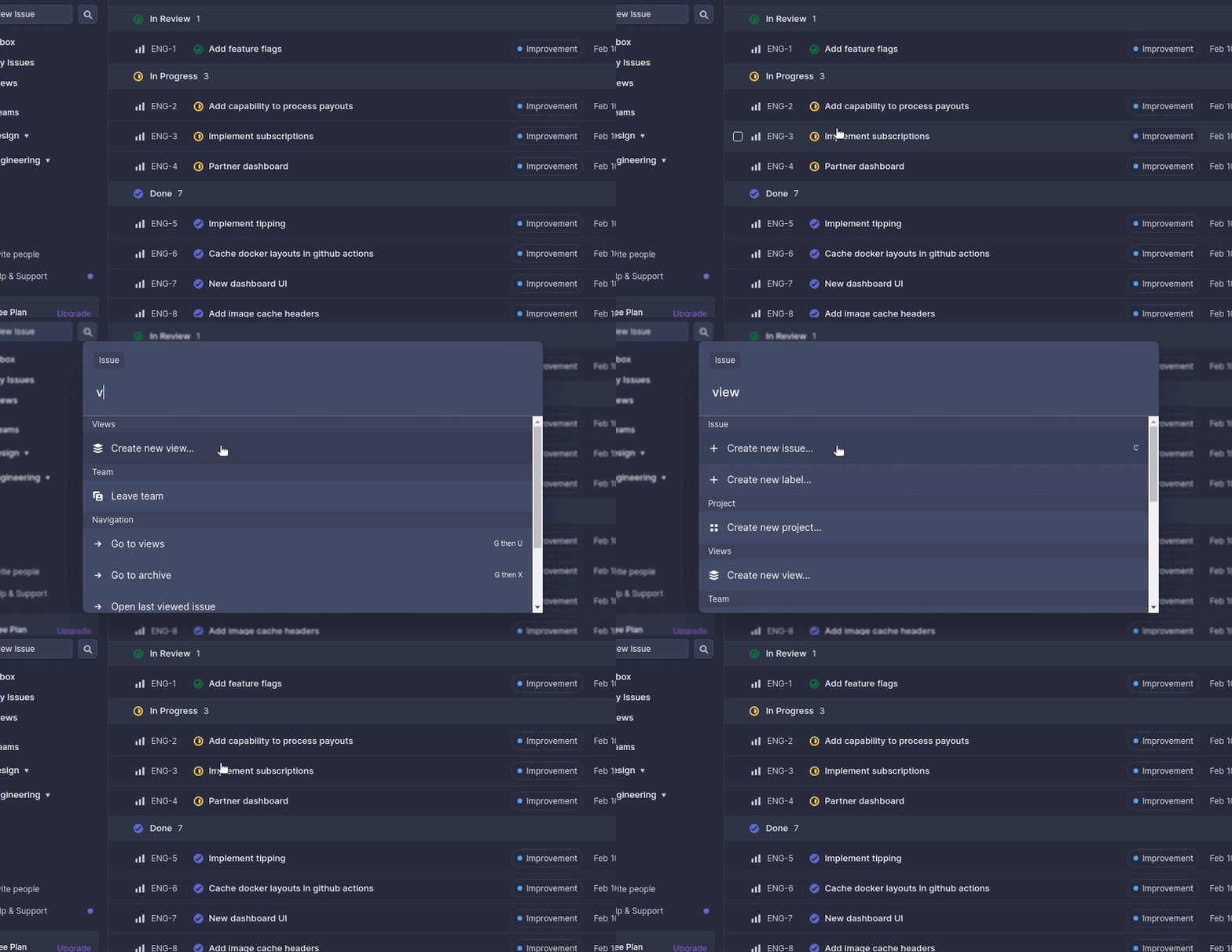
You can find the finished version of this project on the finished-project branch.
Accessibility and responsiveness are two important concepts that every web developer should consider when they build modern web apps.
Accessibility features help all users to use a particular website productively regardless of their device, network speed, and physical ability. Meanwhile, responsive features help users to use websites properly on various screen sizes and modes — i.e., portrait or landscape — without using the horizontal scroll bar often.
In the case of our React command palette project, we used Headless UI, a library that offers completely unstyled, fully accessible UI components. Thanks to this library, we don’t need to worry about accessibility and responsiveness.
Headless UI components implement accessibility features by default. Additionally, its app components render well on any device screen because of Tailwind responsive-friendly CSS classes.
For example, the Dialog component comes with the following accessibility features:
Esc key or an outside click event closes the dialog elementrole and aria-modal attributes for accessibility technologiesThe Combobox autocomplete also improves accessibility factors as follows:
role, aria-autocomplete, aria-selected -like attributes for accessibility technologiesEven though Headless UI implements behavioral accessibility features, you’ll have to use Tailwind styles strategically by thinking about accessibility factors — for example, using visible colors for texts.
Tailwind-based styling makes the command palette responsive as follows:
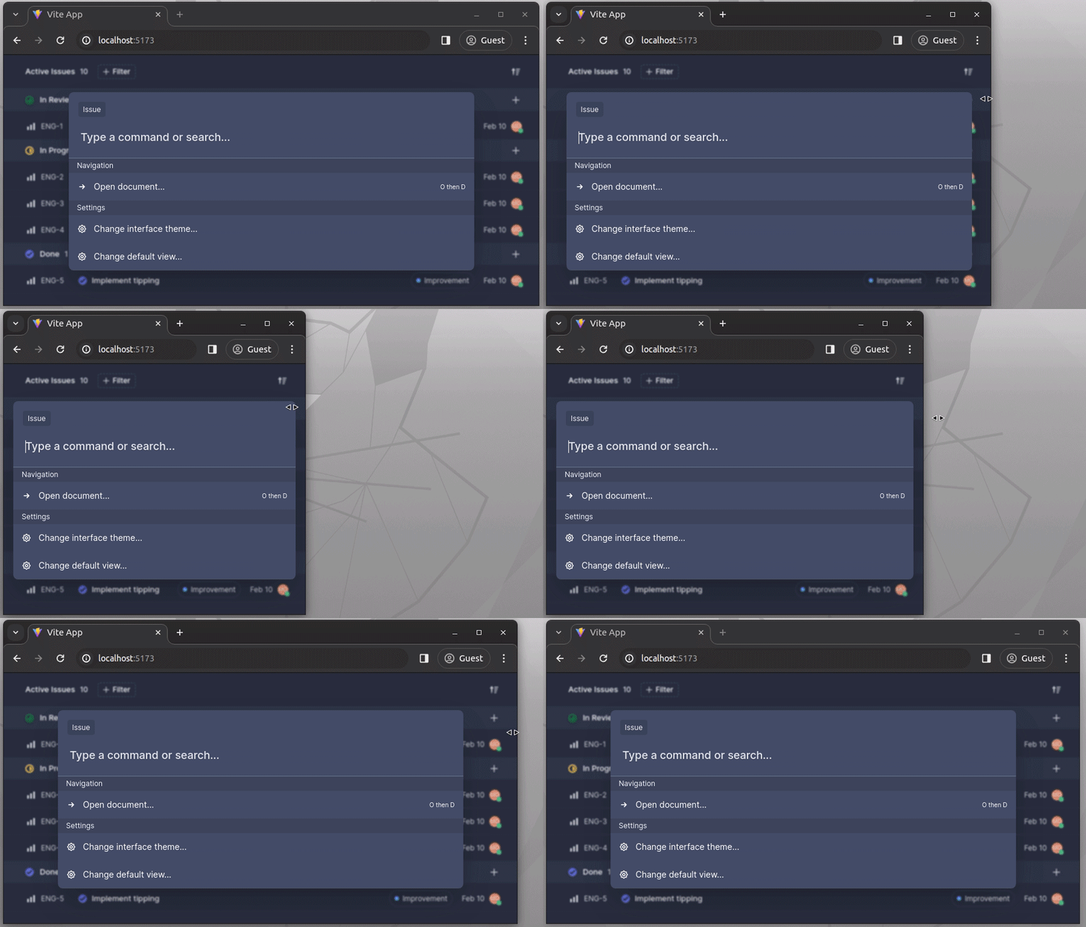
We can use dynamic styles based on the screen size with Tailwind breakpoint prefixes, as explained in the official Tailwind documentation.
In this tutorial, we made a command palette with all required core features, like fuzzy search, grouping, etc. We used less than 50 commands for demonstration.
However, in complex, modern apps, we may have to feed the command palette with thousands of commands. In some scenarios, we may have to fetch dynamic command lists from web APIs. These cases may create performance issues in your app if you don’t carefully optimize your command palette performance
Here are some generic performance optimization tips for command palettes:
Let’s see a quick example of how to implement these performance optimizations. To limit command search results, you could adjust the threshold option in Fuse.js:
const fuse = new Fuse(commands, { includeScore: true, keys: ["name"], threshold: 0.4 });
Apart from these command palette-related optimizations, identify and solve performance bottlenecks in React-specific code and JavaScript code. However, don’t try to overthink performance aspects in small command palettes, as it leads to overengineered codebases.
We’ve explored how to build a command palette component from scratch. However, you’d probably rather not build your own every time you need a command palette.
That’s where a prebuilt component can be useful. Let’s discuss some popular prebuilt command palette components. We’ll install several external command palette libraries and use their prebuilt components within the App component for demonstration.
react-command-palette packagereact-command-palette is a well-written command palette component that is accessible and browser-compatible. It offers an inbuilt fuzzy search feature with the fuzzysort package and offers an accessible auto-complete list on a modal with react-modal and react-autosuggest packages.
This command palette component also offers various props to adjust the component according to our requirements.
To use this component, install it as a dependency in your project:
yarn add react-command-palette
Import the component and pass your list of commands to it within the App.js file as follows:
import CommandPalette from "react-command-palette";
import { Drawer } from "./components/Drawer";
import { AllIssues } from "./components/Workspace";
import { issues, teams, commands } from "./data/seed.json";

const App = () => {
   return (
      <div className="flex w-full bg-primary h-screen max-h-screen min-h-screen overflow-hidden">
         <Drawer teams={teams} />
         <AllIssues issues={issues} />
         <CommandPalette
          commands={commands}
          hotKeys={["command+k", "ctrl+k"]}
          trigger={null}/>
      </div>
   );
};

export default App;
Run the app and press ctrl + k. You’ll see a pre-styled command-palette, as shown in the following preview:
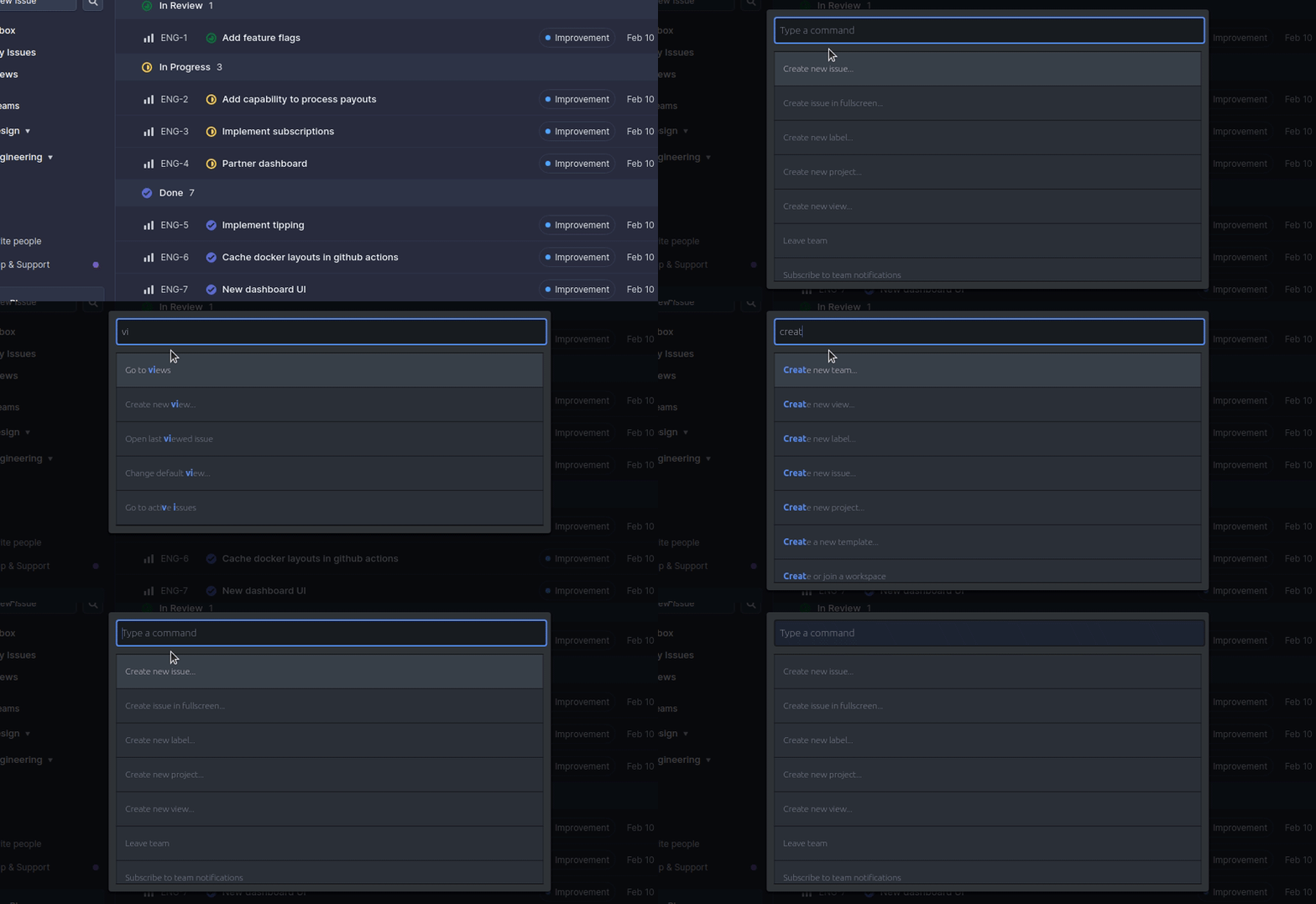
Note that this library doesn’t offer the pre-developed command grouping feature and rendering icons. However, you can implement such features by using a custom component for each entry via the renderCommand prop.
As you already noticed, react-command-palette styles the component with pre-developed CSS styling. If you want to customize the component’s styles, you can use Tailwind CSS classes with the theme config object, as shown in the following code snippet:
<CommandPalette
  commands={commands}
  hotKeys={["command+k", "ctrl+k"]}
  trigger={null}
  theme={{
    modal: "fixed inset-0 p-4 pt-[15vh] overflow-y-auto",
    overlay: "fixed inset-0 backdrop-blur-[1px]",
    container: "bg-accent-dark max-w-2xl mx-auto rounded-lg shadow-2xl relative flex flex-col",
    input: "flex items-center text-lg font-medium border-b border-slate-500 p-5 text-white placeholder-gray-200 w-full bg-transparent border-0 outline-none",
    suggestionContainer: "max-h-72 overflow-y-auto flex flex-col",
    suggestion: "px-3.5 w-full h-[46px] text-white flex items-center hover:bg-primary/40 cursor-default transition-colors duration-100 ease-in",
    suggestionHighlighted: "bg-primary/40"
}}/>
Now, the prebuilt command palette looks the same as the component we built before using Headless UI:
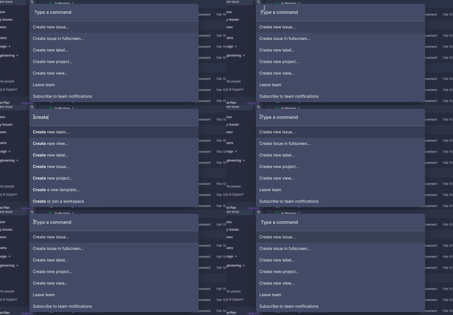
There are a lot of config options that you can use to customize the look and behavior to meet your requirements. Read the official documentation to learn more about all supported props of this prebuilt command palette component.
react-cmdk packageThe react-cmdk package offers a prebuilt command palette component that comes with a pre-styled, accessible UI. This command palette component has built-in support for command grouping and rendering icons.
react-cmdk internally uses Headless UI to use its dialog box and transition implementations and Heroicons to load icons by icon names. This component’s command searching feature won’t use a fuzzy search and uses a simple string-matching logic with inbuilt JavaScript APIs, but it offers inbuilt scoping — i.e., searching issues within the issues page.
To use this component in your project, add the external package as follows:
yarn add react-cmdk
Use it within the App component, as shown in the following source code:
import "react-cmdk/dist/cmdk.css";
import CommandPalette, { filterItems, getItemIndex } from "react-cmdk";
import { useState, useEffect } from "react";
import { Drawer } from "./components/Drawer";
import { AllIssues } from "./components/Workspace";
import { issues, teams, commands as ungroupedCommands } from "./data/seed.json";

const commands = groupCommands(ungroupedCommands);

const App = () => {
  const [isOpen, setIsOpen] = useState(false);
  const [search, setSearch] = useState("");
  const filteredItems = filterItems(commands, search);

  useEffect(() => {
    const onKeydown = (e) => {
      if (e.key === "k" && (e.metaKey || e.ctrlKey)) {
          e.preventDefault();
          setIsOpen(true);
      }
    };
    window.addEventListener("keydown", onKeydown);
    return () => {
      window.removeEventListener("keydown", onKeydown);
    };
  }, []);

    return (
      <div className="flex w-full bg-primary h-screen max-h-screen min-h-screen overflow-hidden">
         <Drawer teams={teams} />
         <AllIssues issues={issues} />
          <CommandPalette
            onChangeSearch={setSearch}
            onChangeOpen={setIsOpen}
            search={search}
            isOpen={isOpen}
          >
         { filteredItems.length ? (
          filteredItems.map((list) => (
            <CommandPalette.List key={list.id} heading={list.heading}>
              {list.items.map(({ id, ...rest }) => (
                <CommandPalette.ListItem
                  key={id}
                  index={getItemIndex(filteredItems, id)}
                  {...rest}
                />
              ))}
            </CommandPalette.List>
          ))
        ) : (
          <CommandPalette.FreeSearchAction />
        )}
          </CommandPalette>
      </div>
   );
};
The above code snippet uses the prebuilt CommandPalette component and its sub-components. This library doesn’t offer inbuilt global hotkey support as the react-command-palette library, so we had to register a hotkey within a useEffect() block.
Next, added the following utility functions that are needed to run the above App.js implementation:
function groupCommands(commands) {
  return commands.reduce((acc, command, commandIndex) => {
    let headingIndex = acc.findIndex((e) => e.heading === command.group );
    command.id = "itm_" + commandIndex;
    command.children = command.name;
    command.icon = mapCommandGroupToIconName(command.group.toLowerCase());
    if(headingIndex !== -1) {
       acc[headingIndex].items.push(command);
    }
    else {
      acc.push({
        heading: command.group,
        items: [command],
        id: acc.length
      });
    }
    return acc;
   }, []);
}

function mapCommandGroupToIconName(group) {
   switch (group) {
      case "issue":
         return "PlusIcon";
      case "project":
         return "CommandLineIcon";
      case "views":
         return "ViewColumnsIcon";
      case "team":
         return "UsersIcon";
      case "templates":
         return "WindowIcon";
      case "navigation":
         return "ArrowRightCircleIcon";
      case "settings":
         return "CogIcon";
      case "account":
         return "UserIcon";
      default:
         return "ForwardIcon";
   }
};

export default App;
Here, the groupCommands() utility function transforms the commands array in seed.json to a JSON structure needed for the external library. Meanwhile, the mapCommandGroupToIconName() function helps us get a valid HeroIcon name using a command group name.
Run the app and press ctrl + k. You’ll see a well-styled command palette that supports Tailwind’s dark and light mode feature:
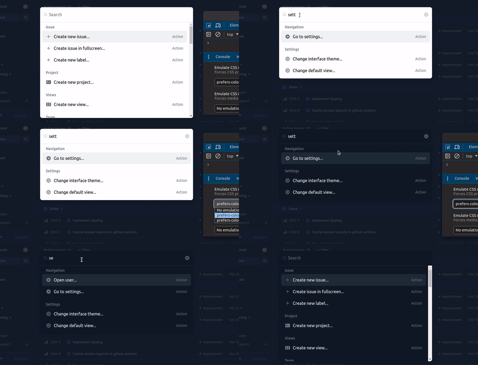
This library won’t let you set custom CSS classes for sub-components, but it looks great with normal Tailwind apps since it only uses Tailwind color schemes and utility classes.
cmdk packageThe cmdk package, also known as ⌘K, offers an unstyled (like Headless UI components) and accessible prebuilt command palette component. It offers a similar component API structure like react-cmdk with scoping support, but it lets you use Tailwind CSS classes via the className prop.
This prebuilt command palette also comes with a fuzzy search feature using the command-score library.
Install the package to use this prebuilt command palette:
yarn add cmdk
Next, use it within the App.js file, as shown in the following source code. Make sure to keep the groupCommands() function from the previous example:
import { Command } from "cmdk";
import { useState, useEffect } from "react";
import { Drawer } from "./components/Drawer";
import { AllIssues } from "./components/Workspace";
import { issues, teams, commands as ungroupedCommands } from "./data/seed.json";

const commands = groupCommands(ungroupedCommands);

const App = () => {
  const [isOpen, setIsOpen] = useState(true);

  useEffect(() => {
    const onKeydown = (e) => {
      if (e.key === "k" && (e.metaKey || e.ctrlKey)) {
          e.preventDefault();
          setIsOpen(true);
      }
    };
    window.addEventListener("keydown", onKeydown);
    return () => {
      window.removeEventListener("keydown", onKeydown);
    };
  }, []);

    return (
      <div className="flex w-full bg-primary h-screen max-h-screen min-h-screen overflow-hidden">
         <Drawer teams={teams} />
         <AllIssues issues={issues} />
         <Command.Dialog open={isOpen} onOpenChange={setIsOpen}
            contentClassName="fixed inset-0 p-4 pt-[15vh] overflow-y-auto"
            overlayClassName="fixed inset-0 backdrop-blur-[1px]">
          <div className="bg-accent-dark max-w-2xl mx-auto rounded-lg shadow-2xl relative flex flex-col">
            <Command.Input className="flex text-lg font-medium border-b border-slate-500 p-5 text-white placeholder-gray-200 w-full bg-transparent border-0 outline-none" />

            <Command.List className="max-h-72 overflow-y-auto flex flex-col">
            { commands.map((list) => (
              <Command.Group key={list.id} heading={list.heading}>
                {list.items.map(({ id, name, ...rest }) => (
                  <Command.Item
                    key={id}
                    className="px-3.5 w-full h-[46px] text-white flex items-center data-[selected=true]:bg-primary/40 hover:bg-primary/40 cursor-default transition-colors duration-100 ease-in"
                    {...rest}
                  >{}</Command.Item>
                ))}
              </Command.Group>
            )) }

            <Command.Empty className="text-s text-slate-100 p-5">No results found.</Command.Empty>
            </Command.List>
          </div>
          </Command.Dialog>
      </div>
   );
};
The above source code implements a command palette using the cmdk library and styles it using Tailwind CSS classes. This library doesn’t offer inbuilt hotkey support, so we had to use useEffect() to implement it.
The cmdk library lets you use Tailwind classes via className, but it lacks className support for some sub-components. For example, we have to use CSS to style command headings as follows:
[cmdk-group-heading] {
  @apply flex items-center h-6 flex-shrink-0 bg-accent/50 text-xs text-slate-100 px-3.5;
}
Here, we re-used Tailwind styles within the [cmdk-group-heading] CSS selector. Browse all supported CSS selectors from the official documentation.
Run the app and press ctrl + k. You’ll see a Tailwind-styled command palette, as shown in the following preview:
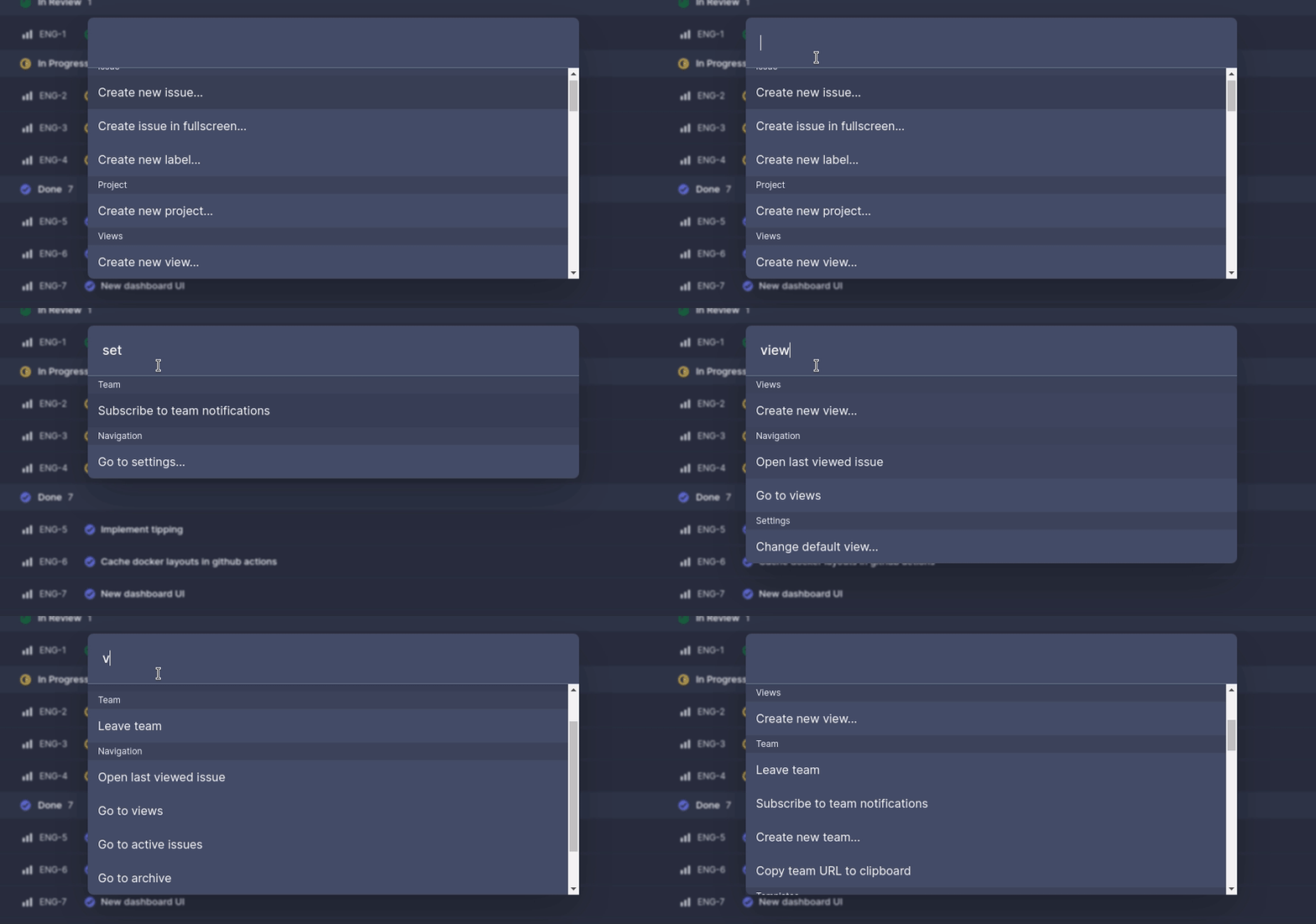
While the cmdk library doesn’t offer inbuilt icon support, you can render icons using any React icon library within the Command.Item component.
kbar packageThe kbar package offers an accessible, unstyled, prebuilt command palette component. The component comes with inbuilt hotkey support, scoping, CSS class/style object-based styling, and undo and redo support-like features.
The kbar package’s prebuilt command palette component implements fuzzy command search with the Fuse.js library and supports high-performance rendering of large command lists with inbuilt list virtualization. It offers a somewhat complex API compared to previous prebuilt command palette implementations.
Let’s create a command palette with this library by installing it:
yarn add kbar
Use the library components and hooks as follows within your App.js file:
import React, { useEffect } from "react";
import {
  KBarProvider,
  KBarPortal,
  KBarPositioner,
  KBarAnimator,
  KBarSearch,
  KBarResults,
  useMatches,
} from "kbar";
import { Drawer } from "./components/Drawer";
import { AllIssues } from "./components/Workspace";
import { issues, teams, commands as originalCommands } from "./data/seed.json";

const commands = originalCommands.map((command, index) => {
                    command.section = command.group;
                    command.shortcut = [command.shortcut];
                    command.id = index.toString();
                    return command;
                });

const App = () => {
    return (
      <KBarProvider actions={commands}>
        <div className="flex w-full bg-primary h-screen max-h-screen min-h-screen overflow-hidden">
          <Drawer teams={teams} />
          <AllIssues issues={issues} />
        </div>
        <KBarPortal>
          <KBarPositioner className="fixed inset-0 backdrop-blur-[1px]">
            <KBarAnimator className="fixed inset-0 p-4 pt-[15vh]">
              <div className="bg-accent-dark max-w-2xl mx-auto rounded-lg shadow-2xl relative flex flex-col">
                <div className="flex items-center text-lg font-medium border-b border-slate-500 ">
                  <KBarSearch className="p-5 text-white placeholder-gray-200 w-full bg-transparent border-0 outline-none"/>
                </div>
                <RenderResults />
              </div>
            </KBarAnimator>
          </KBarPositioner>
        </KBarPortal>
      </KBarProvider>
   );
};

function RenderResults() {
  const { results } = useMatches();

  return (
    <KBarResults
      items={results}
      className="max-h-72 overflow-y-auto flex flex-col"
      onRender={({ item, active }) =>
       typeof item === "string" ?
        (
          <div className="flex items-center h-6 flex-shrink-0 bg-accent/50">
            <span className="text-xs text-slate-100 px-3.5">{item}</span>
          </div>
        )
       : (
          <div
            className={`px-3.5 w-full h-[46px] text-white flex items-center ${active && "bg-primary/40"} hover:bg-primary/40 cursor-default transition-colors duration-100 ease-in`}
          >
            {item.name}
          </div>
        )
      }
    />
  );
}

export default App;
Here, we created a context for the command palette using the KBarProvider component and constructed the command palette structure using sub-components.
This library doesn’t offer a dedicated command palette item component. Instead, it requires a component that uses the KBarResults component and useMatches() Hook to render command items.
We created the RenderResults component to render command items including their sections.
Run the app and press ctrl + k . You’ll see a Tailwind-styled command palette as follows:
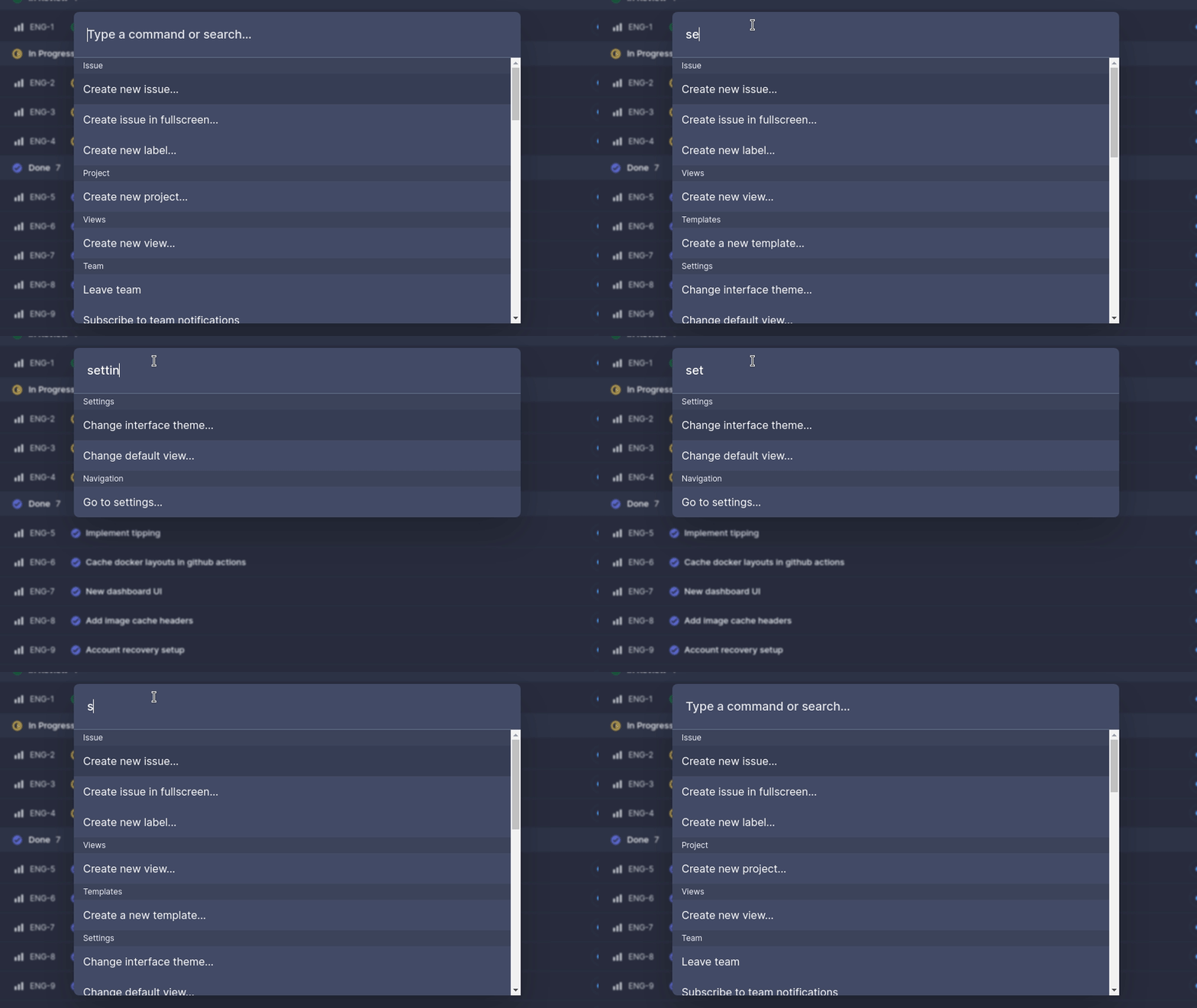
The kbar library doesn’t support inbuilt icons, but you can add icons using any React icon library by rendering icon elements with the onRender prop of the KBarResults component. Read the official library documentation to learn more about advanced features.
In this tutorial, we explored four prebuilt command palette components by creating demo projects using the same data file used for the command palette we’ve built with Headless UI. We tried to match the Headless UI-based command palette UI by using the same Tailwind classes.
As we noticed, each library is different — each one has different pros and cons. Let’s compare them in a table to select the best prebuilt command palette component for your next development requirement:
| Comparison factor | react-command-palette | react-cmdk | cmdk | kbar |
|---|---|---|---|---|
| Accessbility features | ✅ | ✅ | ✅ | ✅ |
| Inbuilt hotkey registration | ✅ | ❌ | ❌ | ✅ |
| API style | Single component that depends on a command list | Multi-component composition with functions | Multi-component composition | Multi-component composition with Hooks |
| Pre-styled | ✅ | ✅ | ❌ | ❌ |
| Styling approach | A theme object that accepts CSS classes | Not stylable, but it supports inbuilt dark/light mode and it’s possible to adjust some styles with the Tailwind configuration | Standard React styling and CSS class names | Standard React styling and CSS class names |
| Fuzzy search | ✅ | ❌ | ✅ | ✅ |
| Command grouping | ❌ But the category can be displayed with commands | ✅ | ✅ | ✅ |
| Scoping/nested commands | ❌ | ✅ | ✅ | ✅ |
| Virtualized lists (Performance improvement for large command lists) | ❌ | ❌ | ❌ | ✅ |
| Inbuilt icon rendering | ❌ | ✅ via HeroIcons | ❌ | ❌ |
| Bundle size (gzipped, measured with BundlePhobia) | 23.5 kB | 137 kB (contains HeroIcons) | 14.9 kB | 17.3 kB |
In this article, you’ve learned about command palettes, the ideal use cases for them, and what features make up a good command palette. You’ve also explored in detailed steps how to build one using the Headless UI combobox component and Tailwind CSS.
If you just want to quickly ship this feature in your application, then a prebuilt component is the way to go. However, creating your own command palette component brings endless customizability, flexibility, and the ability to reduce the final app bundle size.
Thanks for reading, and be sure to leave a comment if you have any questions.
As web frontends get increasingly complex, resource-greedy features demand more and more from the browser. If you’re interested in monitoring and tracking client-side CPU usage, memory usage, and more for all of your users in production, try LogRocket.

LogRocket lets you replay user sessions, eliminating guesswork around why bugs happen by showing exactly what users experienced. It captures console logs, errors, network requests, and pixel-perfect DOM recordings — compatible with all frameworks.
LogRocket's Galileo AI watches sessions for you, instantly identifying and explaining user struggles with automated monitoring of your entire product experience.
Modernize how you debug web and mobile apps — start monitoring for free.

When should you move API logic out of Next.js? Learn when Route Handlers stop scaling and how ElysiaJS helps.

Explore how Dokploy streamlines app deployment with Docker, automated builds, and simpler infrastructure compared to traditional CI/CD workflows.

A side-by-side look at Astro and Next.js for content-heavy sites, breaking down performance, JavaScript payload, and when each framework actually makes sense.

AI-generated tests can speed up React testing, but they also create hidden risks. Here’s what broke in a real app.re
Hey there, want to help make our blog better?
Join LogRocket’s Content Advisory Board. You’ll help inform the type of content we create and get access to exclusive meetups, social accreditation, and swag.
Sign up now