In this article, we’ll walk you through using Feather-inspired animated icon libraries in React applications and guide you through setting up a React project, adding and customizing icons using various libraries, and handling common issues like double rendering.
By the end of the article, you’ll have a firm grasp on integrating and manipulating animated icon libraries in React. The detailed steps and accompanying GIFs provide a practical, hands-on guide for readers. The article’s sections are as follows:
Jump ahead:
React is particularly effective at creating single-page applications and handling the view layer for web and mobile apps. It enables developers to create reusable UI components, simplifying the coding process and making it more efficient.
To create a new project with React, open your terminal and run the following command for an automatic setup:
npx create-react-app my-app

# or

yarn create react-app my-app
Replace my-app with the name of your project, then navigate to your project’s directory and start your developer server with the following command:
cd <project-name>
npm start
To confirm that everything has been set up properly, navigate to http://localhost:3000 in your browser. If the setup was successful, you’ll be greeted by your brand-new React application, alive and running smoothly!
We are now prepared to enhance our project by incorporating some animated icon libraries.
Font Awesome animated icon library is an impressive resource that significantly boosts the visual appeal of any web project. Its extensive, customizable icon collection, combined with high-quality, vector-based designs, ensures consistency and clarity across various resolutions.
You can choose from a variety of animations, including spin, bounce, fade, shake, beat and more. Moreover, the library’s seamless integration process is as simple as including classes in your HTML, amplifying its appeal and practicality.
Let’s begin by installing the necessary Node module packages. Open your command line interface, navigate to the root level of your project, and execute the following commands:
For the core package:
npm i --save @fortawesome/fontawesome-svg-core
For the Free icons styles:
npm i --save @fortawesome/free-solid-svg-icons
npm i --save @fortawesome/free-regular-svg-icons
If you want to access their Pro icons, you need to configure access for Pro.
Next, proceed to incorporate the Font Awesome React component into your project by running the following command:
npm i --save @fortawesome/react-fontawesome@latest
There are three flexible ways of incorporating these icons into your project:
We’ve chosen to integrate icons into our project by using the Individual method.
To incorporate the desired icons into your project, import FontAwesomeIcon alongside the specific icons you wish to use, such as faHandshake and faEnvelope:
import { FontAwesomeIcon } from '@fortawesome/react-fontawesome'
import { faHandshake } from "@fortawesome/free-regular-svg-icons";
import { faEnvelope } from "@fortawesome/free-solid-svg-icons";
When it’s time to position your icons, just place them in the desired location like this:
export default function FontAwesome() {
 return (
   <>
     <FontAwesomeIcon icon={faHandshake} shake size="3x"
/>
     <FontAwesomeIcon icon={faEnvelope}  spin size="3x" />
   </>
 );
}
The appearance of the icons will vary based on whether you import your icons from "@fortawesome/free-regular-svg-icons" or "@fortawesome/free-solid-svg-icons". Icons from the former will appear as outlines (regular), while those from the latter will be fully filled (solid):
![]()
You can modify the styling and customize these animations according to your preferences. With the size property, you can easily adjust the size of the icons, offering a range of options from xs to 10x. If you want to alter the color, simply add the style prop and specify your desired color, as demonstrated in the following example:
import { FontAwesomeIcon } from '@fortawesome/react-fontawesome'
import { faHeart } from "@fortawesome/free-solid-svg-icons";

export default function FontAwesome() {
return (
<FontAwesomeIcon icon={faHeart} size="3x" beat fade
 style={{ color: "red" }}
       />
);
}
You can explore a comprehensive list of available icons here.
React Icons Animated is a remarkable collection of animated icons designed specifically for React applications. Developed by the talented frontend-joe, this package is built with TypeScript to ensure reliability and maintainability. These icons are optimized for dark contrast environments, so the stroke style cannot be modified, but they excel particularly when you require a burger menu icon.
To get started, install the npm package with the following command:
npm i react-icons-animated
Next, you’ll need to import your desired icon using the following code. Remember, it’s essential to wrap the icon within a button element as the onClick function does not work directly on the icon itself:
import { BurgerClose} from "react-icons-animated";
import { useState } from "react";

export const App = () => {
  const [isClosed, setIsClosed] = useState(false);

  return (
    <button
      onClick={() => setIsClosed(!isClosed)}
      style={{
        width: "50px",
        height: "50px",
        display: "grid",
        placeItems: "center",
      }}
    >
      <BurgerClose isClosed={isClosed} />
    </button>
  );
};
![]()
A wide range of icons with various styles is available for you on the react-icons-animated website.
If you want to have multiple icons on the same page, it’s important to initialize the state for each icon individually. This ensures proper management and control over each icon’s behavior and properties:
import { BurgerRotate, BurgerSwipe } from "react-icons-animated";
import { useState } from "react";

export default function ReactIcons() {
 const [isClosed, setIsClosed] = useState(false);
 const [isClosed2, setIsClosed2] = useState(false);
 return (
   <>
     <a href="https://www.npmjs.com/package/react-icons-animated?activeTab=readme" target="_blank >
       <code>react-icons-animated</code>
     </a>
     <button
       onClick={() => setIsClosed(!isClosed)}
       style={{
         width: "50px",
         height: "50px",
         display: "grid",
         placeItems: "center",
         backgroundColor: "black",
         borderStyle:"none"
       }}
     >
       <BurgerRotate isClosed={isClosed} />
     </button>

     <button
       onClick={() => setIsClosed2(!isClosed2)}
       style={{
         width: "50px",
         height: "50px",
         display: "grid",
         placeItems: "center",
         backgroundColor: "black",
         borderStyle:"none
       }}
     >
       <BurgerSwipe isClosed={isClosed2} />
     </button>
   </>
 );
}
You can customize the style according to your preferences by modifying the properties inside the style attribute. Feel free to adjust the style to your liking and achieve the desired visual appearance.
React UseAnimations is a micro icon library designed specifically for React applications. With a focus on providing dynamic animated icons, this lightweight library is an excellent choice for enhancing your projects’ visual appeal.
To begin, you’ll need to install the npm package in your project with the following command:
npm install -S react-useanimations
There are a couple of prerequisites to fulfill before we incorporate the desired icons into your project. Before implementation, make sure to import both React and UseAnimations:
import React from "react";
import UseAnimations from "react-useanimations";
Following that, you’ll need to import the specific icon or icons you wish to use. As an example, consider the following import statement:
import activity from "react-useanimations/lib/activity";
export default function UseAnimation() {
 return (
  <>
         <UseAnimations animation={activity} size={56} />
  </>
 );
}
The resulting output will resemble the following:
![]()
![]()
The issue above arises when the icon is rendered twice, but only one is animated. One approach to resolving this is to disable <StrictMode>, as outlined in the documentation. React’s <StrictMode> renders each component twice in order to detect and report any potential issues within your application. However, it’s generally not recommended to disable <StrictMode>, as it may result in undetected bugs and errors.
Alternatively, you can implement the icons using a controlled checkbox or by wrapping the animation within an element using render props, as explained in the documentation.
You can explore the available properties for custom styling here. For instance, to change the color of the icon, you can use the strokeColor property within the UseAnimations icon or the fillColor property for filling an icon:
<UseAnimations animation={lock} size={56} strokeColor="blue" />

<UseAnimations
         animation={star}
         size={56}
         fillColor="yellow"
         strokeColor="red"
       />
The visual outcome will resemble the following:
![]()
This comprehensive library offers a wide selection of captivating and dynamic animated icons powered by Lottie. Whether you need icons for your website, mobile app, or any digital project, LottieFiles has got you covered.
LottieFiles offers multiple approaches to implement their icons, and for our purposes, we have chosen the LottiePlayer React component. This approach provides a seamless integration of LottieFiles icons into your React projects.
Please note that in order to use Lottie icons, you’ll need to download their corresponding Lottie JSON files. To do this, you will need to create an account first. However, to simplify the process, we have opted to use the free Lottie files available from LottieFlow, which gives you the flexibility to choose an option that best suits your needs.
To explore more implementation options and detailed instructions, I recommend referring to the comprehensive LottieFiles documentation.
To begin, you’ll need to install the necessary npm package with the following command:
npm install --save @lottiefiles/react-lottie-player
After successfully installing the npm package, you’ll also need to import the LottiePlayer package into the component where you intend to implement the icon. Ensure you include the following import statement:
import "@lottiefiles/lottie-player";
Next, add the Player element and set the src property to a URL that points to a valid Lottie JSON file.
Select the icon you wish to use, download its corresponding JSON file, and add it to your project. Remember to place the JSON file within your project’s src folder so that you can easily import it into your component:
import navigation from "../navigation-icon.json";

export default function LottieFiles () {
<>


</>
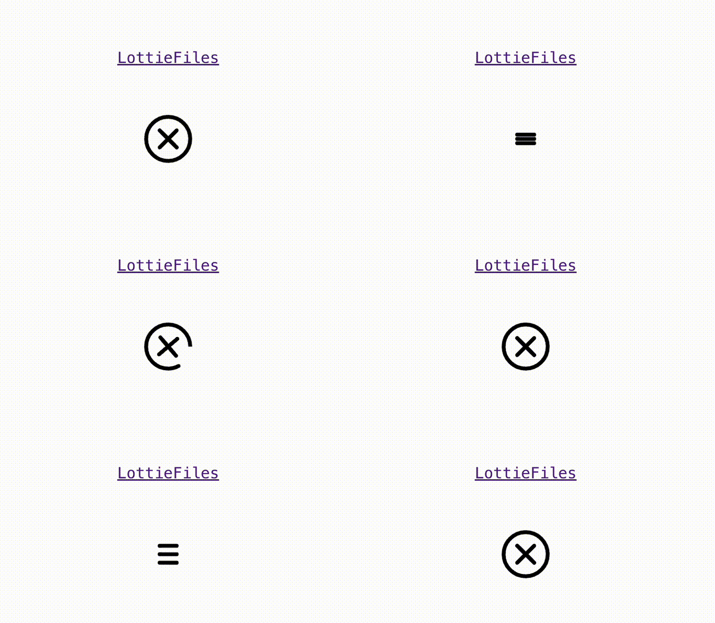
Here’s an example of how the output will appear:

You have the flexibility to customize the icon using the available properties, which can be found here. For instance, by setting the property hover= {true}, the animation will only run when you hover over the icon. Additionally, you can configure the icon to listen to various events such as load, play, pause, and more. Explore the available properties to enhance the behavior and interactivity of your icon.
The Lordicon library offers a wide range of icons with captivating visuals and interactive animations in multiple styles.
Implementing these icons into your project is easy, and you’re able to customize icon styles and control animations with simple HTML tags to render the icons. You can also adjust the stroke width, colors, and other properties to achieve your desired look.
Another good thing about this library is that you can manually interact with the icons and respond to different motion types and states within the animation. The library also provides various built-in interaction options such as:
You will need to create an account to use Lordicon icons, but the good news is that creating an account is free — if you opt for the free version and free icons. It’s important to note that when using the free icons in a public project, you are required to include a link to Lordicon in your website footer:
![]()
First, let’s install the necessary npm packages. The main Lordicon package should be used in combination with the lottie-webpackage. To install these dependencies, execute the following code in your command line:
npm install lord-icon-element lottie-web
import lottie from 'lottie-web';
import { defineElement } from 'lord-icon-element';

// define "lord-icon" custom element with default properties
defineElement(lottie.loadAnimation);
Now that you are all set, it’s time to implement the icon into your project. Select your desired icon from the Lordicon library. You have the freedom to choose from options like system outline, system solid (Feather-inspired), or any other icon that suits your needs.
Once you have made your selection, copy the HTML code below and paste it into your component, as illustrated below:
export default function Lordicon() {
 return (
    <>
       <lord-icon
         src="https://cdn.lordicon.com/tyvtvbcy.json"
         trigger="hover"
       ></lord-icon>
    </>
  );
}
Here is an example of the outcome:
![]()
If you wish, you have the flexibility to customize the styling of the icon using the styling property. Feel free to adjust the icon’s appearance according to your preferences. The below example shows you how to modify attributes such as size or color:
export default function Lordicon() {
 return (
  <>
        <lord-icon
         src="https://cdn.lordicon.com/tyvtvbcy.json"
         trigger="hover"
         colors="primary:#9ce5f4"
         style={{
           width: "50px",
           height: "50px",
         }}
       ></lord-icon>
 </>
 );
}
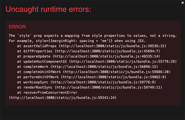
While the documentation suggests using the style property with a string, we encountered an error that prompted us to explore alternative options:

In addition, you have the ability to modify the triggers using the trigger property, enabling you to associate specific events such as click or loop with the icon. For further optimization option, you can clone this repository and sort through the code.
Another alternative for customizing your icon is to use the interface provided by the Lordicon library before implementing your code. This allows for greater flexibility and fine-tuning of your icon’s behavior and appearance:
![]()
In this article, we delved into a selection of Feather-inspired animated icon libraries for React, including FontAwesome, react-icons-animated, React UseAnimations, Lottie Icons, and Lordicon. Each library offers unique features and capabilities, allowing developers to enhance their React applications with visually appealing and interactive icons.
Among these libraries, Lordicon stands out as an excellent choice. One key factor that makes Lordicon appealing is its effortless customization options for icon styling and animation control. So, if you’re in search of a comprehensive Feather-inspired and user-friendly animated icon library for React, look no further than Lordicon.
Install LogRocket via npm or script tag. LogRocket.init() must be called client-side, not
server-side
$ npm i --save logrocket

// Code:

import LogRocket from 'logrocket';
LogRocket.init('app/id');
// Add to your HTML:

<script src="https://cdn.lr-ingest.com/LogRocket.min.js"></script>
<script>window.LogRocket && window.LogRocket.init('app/id');</script>
Hey there, want to help make our blog better?
Join LogRocket’s Content Advisory Board. You’ll help inform the type of content we create and get access to exclusive meetups, social accreditation, and swag.
Sign up now
This guide explores how to use Anthropic’s Claude 4 models, including Opus 4 and Sonnet 4, to build AI-powered applications.

Which AI frontend dev tool reigns supreme in July 2025? Check out our power rankings and use our interactive comparison tool to find out.

Learn how OpenAPI can automate API client generation to save time, reduce bugs, and streamline how your frontend app talks to backend APIs.

Discover how the Interface Segregation Principle (ISP) keeps your code lean, modular, and maintainable using real-world analogies and practical examples.