There is an abundance of great survey tools out there, but many product teams only consider the free ones, not realizing that premium survey tools have some useful features (e.g., skip logic) that are worth paying for if the budget allows it.

In addition, there are also many survey templates out there, but while these can be incredibly useful, people rarely customize them enough, assuming that they’re good to go right off the bat.
All-in-all, the ability to generate a survey easily and for free has its drawbacks. It suggests that creating a survey is a low-effort task that doesn’t require much thought, leading product teams to ask the wrong questions (or the right questions in the wrong way, like using the wrong question types). Teams end up wasting insane amounts of resources just to end up with data that can’t be synthesized into actionable insights.
In this article, we’ll look at the different types of survey questions, what they’re suitable for, what types of data are returned (qualitative or quantitative), and how to synthesize that data. Let’s begin!
Open-ended questions allow respondents to go into as much detail as they want — no restrictions. If you want to really understand the depth of what respondents feel, think, do, or would do, an open-ended question is perfect for that.
However, to get respondents to open up, you’ll need to push them. After asking your question, make it clear to respondents that you’d like them to open up as much as possible (survey tools normally enable you to add further context as a “question description”) and perhaps help them to do so by asking several proxy questions:
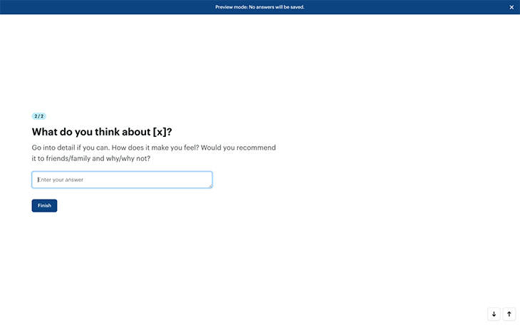
Open-ended questions are quantifiable, but not directly — you’ll need to do affinity mapping to quantify qualitative responses. This involves grouping identical feedback and then ordering it by popularity, which helps with prioritization.
Closed-ended questions are those with two or more predefined answers for respondents to choose from. Unlike open-ended questions, closed-ended questions are directly quantifiable and also segmentable. They can sometimes restrict respondents from opening up though.
Let’s get into the details.
Rating scale questions are designed to help respondents quantify how much they like or agree with something, usually on a scale of 1–10 or 1–5. Optionally, the values can be represented as stars (referred to as “star ratings”):
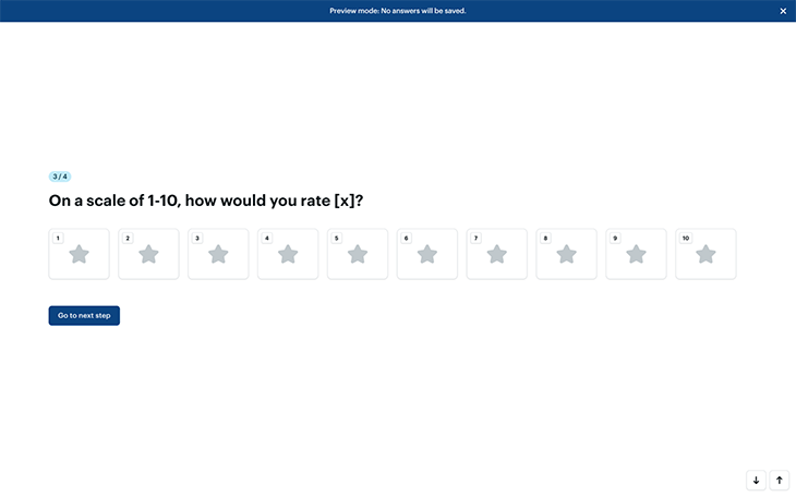
They’re extremely easy to synthesize into a single mean, median, mode, or range average. For example, to find out the mean average, simply add up the values of all the answers and then divide them by the number of answers.
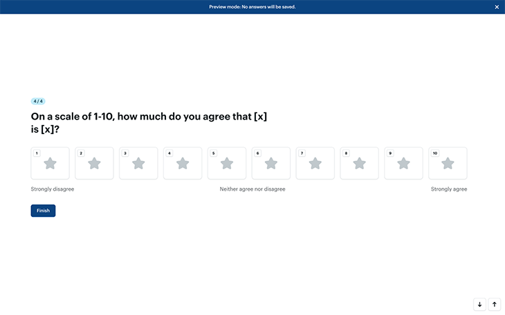
If you’d rather visualize the scale from “Strongly disagree” (1) to “Strongly agree” (5), keep in mind that “Neither agree nor disagree” would then equal “3” and thus 60 percent (not 50 percent). For this reason, you’ll want to visualize this approach on a scale of 1–10 instead, where “Neither agree nor disagree” (5/10) would correctly equal “50 percent.”
You won’t need to name every value; simply have “1” equal “Strongly disagree,” “10” equal “Strongly agree,” and “5” equal “Neither agree nor disagree,” and then leave respondents to infer the other values:
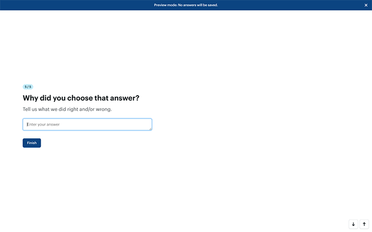
To add to all this, it’s always a good idea to pair closed-ended questions with open-ended questions for additional qualitative context. For example, you’d probably want to follow “How would you rate your recent customer service experience on a scale of 1–5?” with “Why did you choose that answer?” (optional question description: “Tell us what we did right and/or wrong”):
And finally, by running surveys more than once, you’ll be able to see how these scores improve (or not!) over time, assuming of course that you’re taking the qualitative feedback seriously.
Binary questions (or as I like to call them, this or that questions) have two possible answers, usually synthesized as percentages. “Yes or no” questions are also binary questions, as are A/B tests (sometimes referred to as preference tests, where respondents are asked to choose their preferred option, design, wording, or whatever):
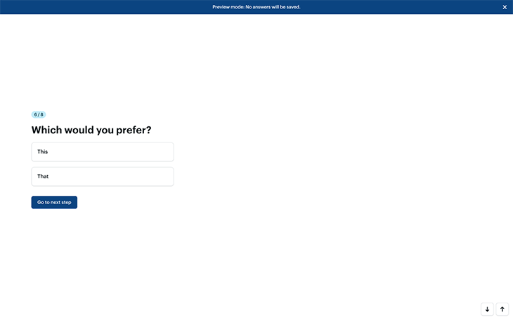
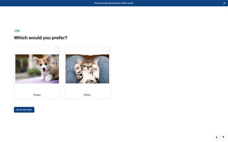
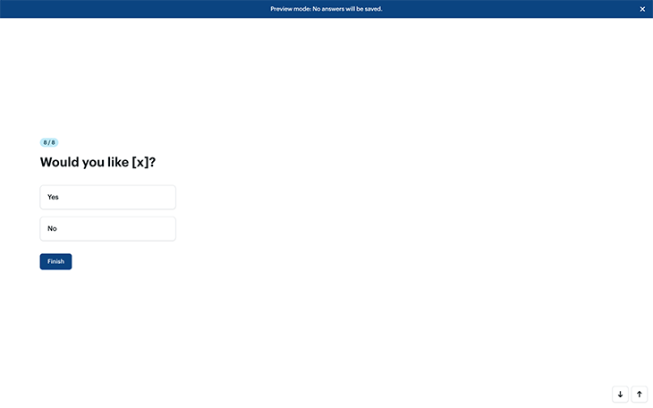
Just like with rating scales, you can follow up with an open-ended question for additional qualitative context, as is the case for all closed-ended questions.
Multiple-choice questions are just binary questions but are more complex, the main difference being the fact that there are more answers to choose from (obviously!). However, there are a couple of additional settings to be aware of that alter how flexible respondents are allowed to be when answering the questions.
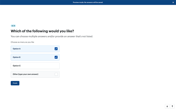
Firstly, can respondents choose more than one answer? In most cases, there’s nothing to be lost and everything to be gained by allowing respondents to choose multiple answers.
Secondly, can they provide their own answer? Like with all closed-ended questions, you can make multiple-choice questions qualitative by including an open-ended “Other” option where respondents can go into alternative or additional detail. Although this makes it harder to quantify the answers, making the data easier to synthesize should never be at the expense of not getting the answer:
You can use multiple-choice questions for A/B testing too (or would it be A/B/C/… testing in this case?). Remember, A/B testing is most effective when only one variable is changed at a time — for example, version A shows a button in red, version B shows the button in blue, and version C shows it in yellow. To ensure a fair experiment, run a separate experiment to determine, for example, whether or not they should have rounded corners.
If you think that running separate consecutive A/B tests would take far too long, you could try multivariate testing instead, which enables you to experiment with multiple variables in one test/question (e.g., red with rounded corners, red without rounded corners, blue with, blue without, and so on). Special tools exist that can help generate all the different variations needed. This type of question is rarely used outside of design research.
Surveys work best when they’re concise. This means skipping questions that aren’t relevant and jumping to questions that are. For example, respondents wouldn’t be able to answer “How would you rate <this> on a scale of 1–5?” if their answer to the previous question was “I’ve never used <this> before.” Skipping the question would help those respondents complete the survey faster and enable them to think more carefully about the questions that matter.
Logic jumping (sometimes referred to as ‘branching logic’ or ‘conditional logic’) is the feature that makes this happen. You might be familiar with it if you’ve used Typeform before, but it’s actually a common feature that most survey tools have, and many people don’t realize this (or just don’t use it, probably because most survey tools tout it as an advanced feature that people assume they don’t need).
Another way to keep surveys concise is to literally make them concise. Stick to the most important stuff and remember that you can always follow up with additional questions if needed, as opposed to spending a lot of time thinking of every possible question to ask (which will make respondents feel exhausted anyway).
Don’t fall prey to FOMO; instead, take your time and treat surveying more like a conversation — get the insights you need over several back-and-forths as opposed to trying to knock it all out in one shot.
Like most aspects of product design, surveying works best when it’s lean and iterative.
There’s certainly no shortage of survey tools out there, so here are just some of the best ones (feel free to suggest more in the comments):
Hopefully, you now feel more comfortable customizing survey templates or even crafting surveys from scratch, ensuring that you ask the right questions in the right way.
This isn’t to say that survey templates are bad, it’s just that they’re unlikely to give you all the insights you’ll need right out of the box. A survey template is a helpful tool, but it’s like a hammer — it won’t help you build what you’re trying to make if you just start hammering away. You’ll need to think carefully about the answers that you need before choosing the right questions and question types to facilitate those answers.
If you have any questions, drop them in the comment section below.
Thanks for reading!
Featured image source: IconScout
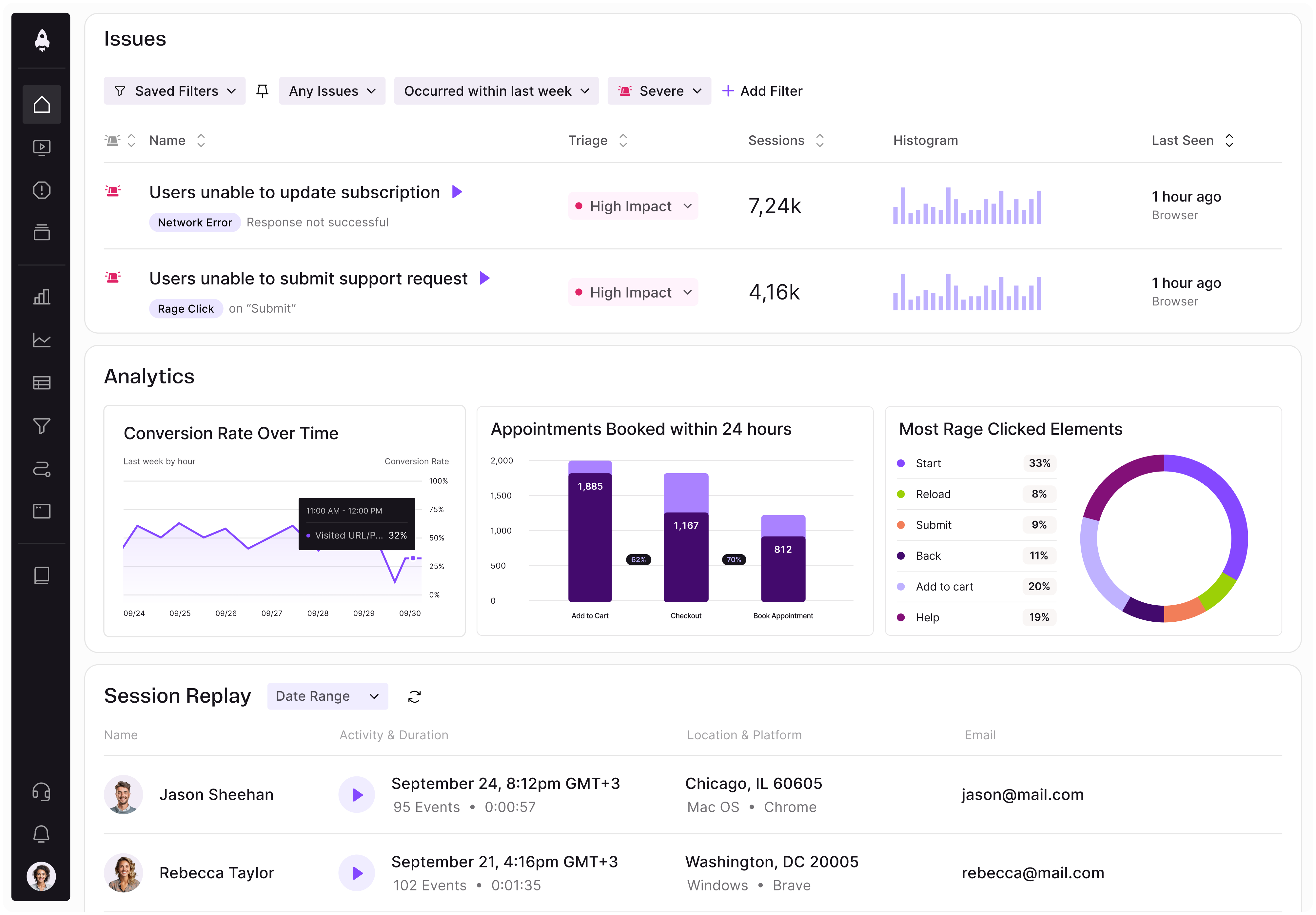
LogRocket identifies friction points in the user experience so you can make informed decisions about product and design changes that must happen to hit your goals.
With LogRocket, you can understand the scope of the issues affecting your product and prioritize the changes that need to be made. LogRocket simplifies workflows by allowing Engineering, Product, UX, and Design teams to work from the same data as you, eliminating any confusion about what needs to be done.
Get your teams on the same page — try LogRocket today.

A practical framework for product leaders to prioritize better, reduce noise, and focus teams on what matters most.

Explore how urban planning helps product managers think in systems, strengthen foundations, and build products that scale well.
Learn how product managers can move from output tracking to outcome-driven product management with metrics tied to user impact.

Learn how to spot PMF erosion early, diagnose the cause, and help your product recover before decline turns into panic.