Affinity diagramming, also known as affinity mapping, is a tool that is used to efficiently organize and categorize information. It is often used in the early stages of a project to help identify patterns and relationships that you might not have noticed before. The process involves gathering data, such as ideas or research findings, and then organizing them into groups based on their common themes or characteristics.
It’s a versatile and effective tool that can be used in a wide range of situations, from brainstorming to research to product management. It helps to make sense of complex information, facilitates collaboration and creativity, and streamlines problem-solving and decision-making processes.
In this article, we’re going to dive into affinity diagramming, including different use cases, its impact on collaboration, best practices, and tools for remote use. By the end, you will have a thorough understanding of the process and be equipped with the knowledge and tools necessary to facilitate your own successful affinity diagramming session.
Affinity diagramming is best conducted in a group setting, where multiple people are involved in generating and organizing ideas. This can be done in person or remotely, depending on the situation. In-person group sessions are best for facilitating communication and collaboration among team members, while remote sessions may be more convenient and efficient for geographically dispersed teams.
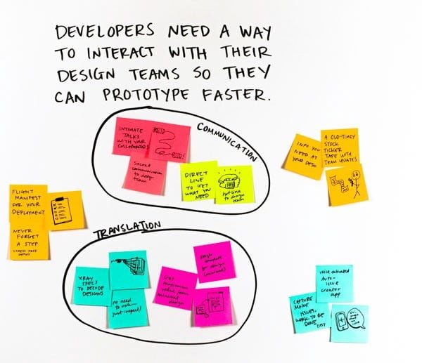
Affinity diagramming is often used in various design thinking activities to help identify patterns, themes, and connections in data and ideas.
Affinity diagrams can be used to generate ideas for user need statements. For example, a team might gather user need statements such as “I need a way to easily track my daily water intake” and “I need a way to set reminders for taking my medication.” They could then use an affinity diagram to generate ideas for solutions such as a water-tracking app with reminders and a medication reminder app.
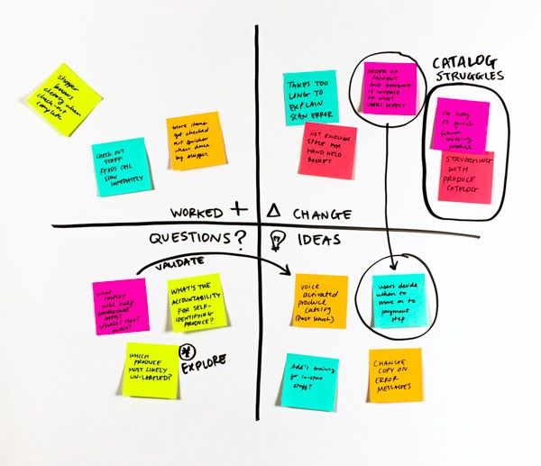
Affinity diagrams can be used to organize and categorize feedback from team members during a retrospective or feedback session. Team members can write their feedback on sticky notes and then use a feedback grid with four quadrants to group similar feedback together. An example of a four-quadrant grid could be “What worked,” “What needs to change,” “Questions we have,” and” Ideas to try.” This can help the team to understand what is working well and what needs to be improved along with actionable next steps.
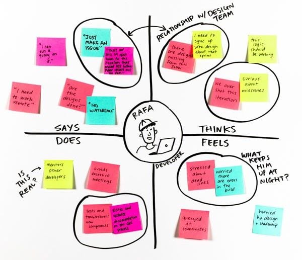
Affinity diagrams can be used to organize information about a user or customer, such as their needs, thoughts, feelings, and behaviors. This can be used to create an empathy map, which can help teams to understand the user’s point of view and to generate ideas for solutions that address their needs.
Affinity diagrams can be used to organize the different stakeholders of a project. This can help teams identify relevant stakeholders and any relationships among the groups in order to understand how to effectively communicate with them.
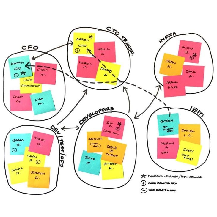
Affinity diagramming is a great way for teams to get together and make sense of all the information they’ve gathered. It’s like one big puzzle where everyone gets to put their pieces together. It’s not just one person doing all the work, everyone gets to pitch in and share their ideas.
Being able to openly discuss your thoughts and opinions toward certain ideas is beneficial because it allows for a free flow of ideas and perspectives. When everyone is able to express their thoughts and opinions freely, it encourages people to think critically and consider different viewpoints. This can lead to a more thorough understanding and exploration of the information being discussed. It can also result in identifying new insights and potential solutions that might not have been considered otherwise.
Additionally, open discussion allows for more inclusive decision-making because everyone can express their ideas and perspectives. This is particularly beneficial for less vocal team members who may not have the opportunity or feel comfortable speaking up during more formal meetings. The final decision is more likely to be representative of the entire team, rather than just the views of a select few.
Plus, working together like this means that everyone is on the same page and can make sure that the information is organized in a way that makes sense for the project.
Here are some best practices to keep in mind when conducting an affinity diagramming session:
With more teams working remotely, digital whiteboarding tools have become increasingly popular for facilitating remote affinity diagramming. Two popular tools in the design industry that can be used are FigJam and Miro.
These tools allow teams to collaboratively organize and categorize information in a virtual whiteboarding space. Because they are web-based and accessible from any device, they enable remote teams to work together in real-time on a shared digital space, eliminating the need to meet in person. They also provide a variety of features such as sticky notes, drag-and-drop functionality, and the ability to add images, videos, and other multimedia, which make it easy for team members to organize and visualize their ideas.
FigJam and Miro both provide templates that come with premade layouts, sticky notes, and categories that can be used as a starting point. This can save time and make it easier for team members to get started with the affinity diagramming process:
Affinity diagramming is a powerful method that helps teams gather, organize, and analyze data in a structured way. By working together to group similar ideas and information, designers can ensure that all ideas are considered and that none are overlooked.
Using affinity diagramming in the design process has several benefits. It promotes teamwork and collaboration, helps identify patterns and relationships, and can be used to prioritize features and set the direction for a project.
If you want to improve your team’s design process, consider incorporating affinity diagramming into your workflow. From brainstorming ideas early on in a project to synthesizing user feedback, it’s a simple but effective way to take your design process to the next level.
Featured image source: IconScout
LogRocket's Galileo AI watches sessions and understands user feedback for you, automating the most time-intensive parts of your job and giving you more time to focus on great design.
See how design choices, interactions, and issues affect your users — get a demo of LogRocket today.
Discover how to craft UX-friendly hero sections with examples, design tips, and strategies that drive engagement and conversion.

While Apple’s Liquid Glass can’t yet be perfectly recreated with CSS or Figma, we can still think about how to adopt the effect thoughtfully in our designs.

Figma Make is here to automate your design-to-code workflow. I tested it. Let’s talk about the good, the bad, and the straight-up weird.
After designing AI search systems, I’ve seen what builds trust — and what kills it. Here’s my take on what really works.