With any relationship, you need a way to successfully initiate it and then maintain it for the long-term. This holds true for users and products just as much as love and friendship. A great value proposition might entice a user in the beginning, but you still need a way to maintain their loyalty for years to come.

As an example, I once worked on a product with really healthy client acquisition. At first, this seemed great, except I soon realized that we had a high churn rate and struggled to build sustained engagement. For the next couple of months we focused our efforts on getting our users to stick around (product stickiness).
This article provides you with an overview of product stickiness so that you can increase user retention and position your product well for the future.
Stickiness refers to a product’s ability to keep users engaged and coming back regularly. As a product manager, stickiness plays a key role in helping you increase customer lifetime value (CLV).
High stickiness leads to better user retention, fostering long-term relationships and loyalty, which are essential for sustainable growth. Additionally, sticky products often benefit from lower customer acquisition costs due to positive word-of-mouth and organic growth. Ultimately, stickiness ensures that a product remains relevant and indispensable to its users, driving continuous engagement and contributing significantly to its success
Sticky products tend to demonstrate the following characteristics:
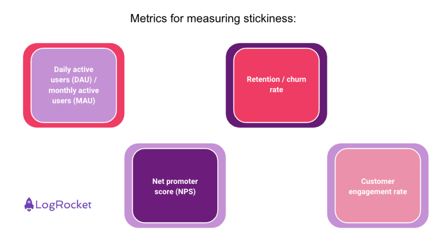
You need to be able to measure stickiness to understand how well your product retains and engages users. Here are some common methods and tools used to measure stickiness, along with practical examples:

This ratio measures the number of daily active users compared to monthly active users. Of course, not all products require daily use, but things like a mood tracker, social network, or language learning app will aim to achieve as much daily usage as possible.
Example: If a product has 1,000 DAU and 5,000 MAU, the DAU/MAU ratio is 0.2 or 20 percent. A higher ratio indicates higher stickiness.
Retention represents the percentage of users who continue to use your product over a specific period. Typically a business analyst and/or product manager will look into 1, 7, and 30-day retention periods and address the biggest drops in this funnel.
For example, if you see a low retention in the first 24 hours, this might indicate a poor onboarding experience or that the marketing team provided weak leads.
On the other hand, churn refers to the percentage of users who stop using your product over a specified period.
Example: If 100 users sign up in January and 40 of them are still active in March, the 3-month retention rate is 40 percent.
NPS measures user satisfaction and loyalty by asking how likely users are to recommend the product to others. This is quite tricky to ask, as you need to time it right so that the user gives you an honest opinion without being irritated with a pop-up.
Use this more as an internal metric to show whether users appreciate your efforts or if you’re trending in the wrong direction and need to pivot.
This metric tells you how engaging your customers find your content. It tracks interactions such as the number of logins, session length, and other forms of engagement across the product.
The engagement rate is often expressed as a percentage and can be calculated by dividing the total engagement by the total number of users and then multiplying by 100.
Metrics are always important, but in order to get them you need tools that help you measure, record, and analyze them. You can break these down into two categories:
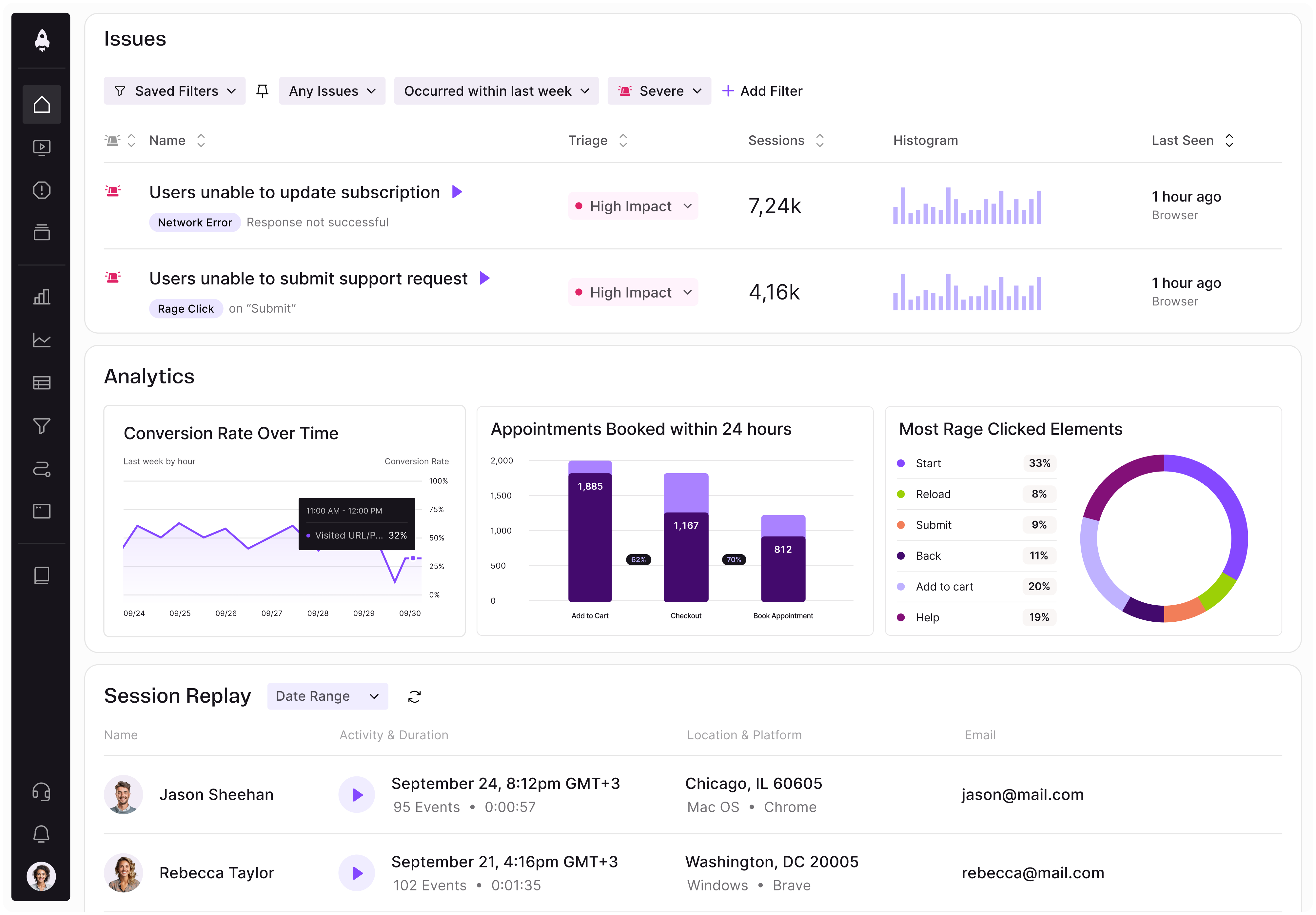
As a PM, Data analysis tools should be your best friend. LogRocket offers features like retention charts that help you track how sticky your products and features are. These charts allow you to understand the specific actions users take that make them more likely to convert and become repeat users.
Softwares like Hotjar allow you to observe how users use the product and provide session recordings to understand user behavior. While it might be hard to measure stickiness this way directly, it’s super helpful to understand what elements of the UI hurt your engagement and embark on fixing them.
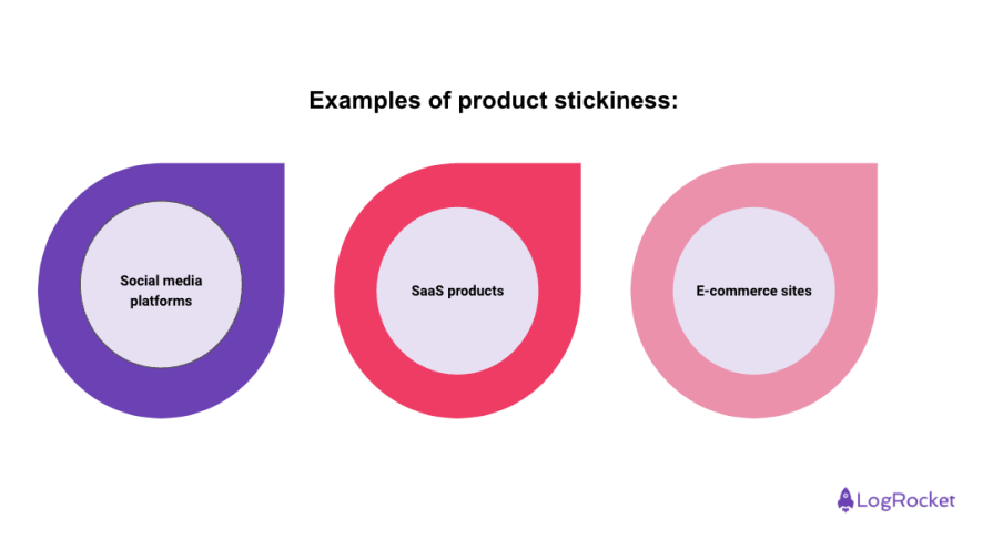
Now that you know how stickiness can be measured, let’s look at a few categories of products and analyze how each assess this metric:

Facebook uses the daily and monthly active users (DAU/MAU) ratio to measure stickiness. A high ratio indicates that users are logging in daily, showing strong engagement. Given the “addictive” design of social media platforms, the goal is to have frequent, daily users that visit the platform every day rather than settle on an occasional visit, which would be okay for an e-commerce website.
Slack tracks retention rates and engagement metrics to ensure users find value in its communication tools, leading to higher stickiness. After all, if their users don’t use the product for whatever reason, a company will be unlikely to extend the contract. You don’t just want a working software; you want an enjoyable one that your users embed into their workflow.
Amazon uses customer engagement and repeat purchase rates to measure how often users return. A user return indicates a good initial experience or exclusivity for certain items.
Stickiness can be difficult to improve without knowing where to start. To this end, try implementing some of the following strategies within your product team:
You can only make one first impression, so make it count! The first user interaction with the product needs to set a good tone for years to come. If your onboarding is missing steps or confusing, users will become frustrated and unlikely to stick.
Best practice: Use interactive tutorials and guided walkthroughs to highlight key features.
Example: Slack’s onboarding process includes a step-by-step guide that helps new users set up channels and integrate with other tools, ensuring they see immediate value.
Make your users feel special. You might try using the user’s name and picture throughout the product to create an intimate feeling. You could also either manually or automatically adjust the product and its UI to best serve a particular user.
Best Practice: Implement recommendation engines and personalized content wherever possible. Non-LLM AI models are easily available to achieve that with not too much training effort.
Example: Netflix uses advanced algorithms to recommend shows and movies based on a user’s viewing history, keeping them engaged and coming back for more.
Whether it’s Reddit, Discord, Telegram, or any other platform, be close to your users and let them express their opinions. The fact they’re willing to talk about the product proves they’re already invested and if you reply to messages and moderate the conversation, you’ll only deepen this connection.
Best practice: Create a dedicated space if a community doesn’t emerge organically. Either way, make sure that the product advertises this community, makes it easy to join, and perhaps gives some perks to active community members.
Example: The Helldivers II game community participates in the game’s ongoing narrative and uses official Discord to coordinate game-wide quests. Also, the developer quickly picks up on bugs and issues based on Discord’s chatter.
As already mentioned, a product that changes and surprises keeps the user interested. However, take into account that not all new updates and features will keep stickiness.
Best practice: Find space in your roadmap for user-oriented updates (“quality of life” features) that don’t address any business metrics directly, but improve UX.
Example: The online card game Marvel Snap adds approximately five cards every month. That means that the decks are always evolving, making the game fresh and entertaining at all times.
Make sure to offer responsive and helpful customer support to address user issues promptly. If a user feels well taken care of, they’re likely to stick with the product and provide great word of mouth.
Best practice: Use chatbots, knowledge bases, and articles for instant self-serve. However, it makes it easy to talk or write to a human as well. Have the support team write a template response for common issues to save time and provide a shorter time to fix.
Example: idibu, one of my former companies, was offering a very similar product to an established and more expensive alternative. However, it offered poor client support, and a lot of clients would stick or move to idibu based on excellent and personalized client support alone.
With gamification you reward the user in some way (say free in-game currency for video games) for being engaged and active. Sometimes the reward can be as trivial and easy as supporting messages with nice animations.
Best practice: Make sure to integrate the gamification in a way that makes sense and provides rewards meaningful to the user.
Example: DuoLingo built a gamification engine that basically defined the product and allowed it to succeed in the language learning market, where regularity is the key to success.
As you can see, stickiness is essential for the long-term success of your product. In order to have a healthy user funnel you not only need to acquire new leads but also keep them in the product long enough to compensate for the customer acquisition cost (CAC).
Sticky products create memorable experiences connected with their quality. Invest in your product’s stickiness, and if you’d like to learn more about how to create great products, make sure to come back and read the next article. Until then, good luck!
Featured image source: IconScout

LogRocket identifies friction points in the user experience so you can make informed decisions about product and design changes that must happen to hit your goals.
With LogRocket, you can understand the scope of the issues affecting your product and prioritize the changes that need to be made. LogRocket simplifies workflows by allowing Engineering, Product, UX, and Design teams to work from the same data as you, eliminating any confusion about what needs to be done.
Get your teams on the same page — try LogRocket today.

CPO and PhD Jen Wang covers “The Zone of Absorption” and why product teams are struggling to build when AI is shifting faster than anyone can keep up.

Explore four product team structures, when each works best, and how to choose the right model for speed, ownership, and clarity.

Learn how code-style reasoning helps product managers make sharper decisions, surface edge cases, and write clearer requirements.

A practical framework for product leaders to prioritize better, reduce noise, and focus teams on what matters most.