As a product manager, you should aim to create accessible products and provide equal user experiences for everyone, regardless of their impairments. Accessibility ensures that your product promotes inclusivity and equality. By making products accessible, you can broaden your potential customer base, reaching out to those who are otherwise neglected.

This article emphasizes the significance of creating products everyone can access without physical or cognitive limitations. Designing products with accessibility in mind offers numerous advantages, such as improved search engine optimization through semantic HTML, the ability to reach a wider audience across various devices and environments, and a better brand image.
Accessible and universal design are closely related. Universal design is an approach to product development that ensures that customers with a wide range of identities can use products in any context. This approach incorporates accessible features into the product experience from the outset, by providing built-in accommodations that offer immediate accessibility for all disabled customers.
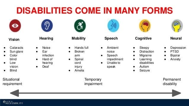
By making accessibility a core consideration of product development, different types of accessibility issues can be solved before you even release a product. The image below shows potential accessibility issues that can be addressed through this approach:

To help ensure an inclusive product, you can follow the WCAG 2.0 guidelines developed by the World Wide Web Consortium (W3C), which aim to improve the accessibility of digital apps and web content for people with disabilities.
These guidelines are useful for individuals and governments and can be easily tested through automated testing and human evaluation. Some common tests include checking for missing alt text in images, insufficient color contrast, or lack of keyboard accessibility.
Alongside universal design and accessibility, the following principles will guide you towards developing a product that supports a range of user profiles.
The experience must be designed to make it easy for people to perceive and understand. This can be achieved by providing adequate visual, auditory, and tactile cues. For instance, you could use high-contrast colors, clear and concise language, and easily identifiable icons to make the experience more distinguishable.
This means that the website or application should be designed to be compatible with assistive technologies such as screen readers, braille displays, and voice recognition software. Additionally, it’s important to provide keyboard shortcuts, clear and concise instructions, and alternative text for non-text elements like images, videos, and audio files. By doing so, users with disabilities can access the same information and functionality as non-disabled users and have a positive experience using the system.
It’s imperative to ensure that any labels and instructions associated with a product or service are designed to be easy for users to read, comprehend, and act upon. Clarity and simplicity should be the guiding principles when creating any form of guidance so that users can navigate the product/service easily and without confusion.
Web pages must be designed to be compatible with various browsers and devices. This means the web page’s layout, functionality, and performance should be consistently reliable, regardless of the user’s preferred browser or device. In addition, it’s important to understand that the app is optimized for different screen sizes and resolutions to be viewed and accessed properly on desktop computers, laptops, tablets, and mobile phones.
When you’re still in the design phase of your product, you can continue to improve the accessibility of your design by:
To keep you accountable you can develop a checklist. Besides providing improved access, these tactics also help with your application’s search engine optimization (SEO) by creating an app that is practical, user-friendly, and easy to find.
The WCAG 2.0 provides a list of free tools that can be helpful for designers. These tools range from color contrast checkers to screen reader simulators and accessibility validators. Some of these tools are:
While at a healthcare startup, I was responsible for enhancing the accessibility of the company’s flagship mobile application. The app was designed to help users keep track of their vital health statistics, such as blood pressure, heart rate, and weight, among others. To make sure that the app could be used by a broad range of users, including those with disabilities, I conducted a comprehensive analysis with our design lead of its features and identified areas that needed improvement.
The main objective of the healthcare app was to assist visually impaired users with navigation by using gestures and spoken descriptions of on-screen elements. To achieve this goal, the team integrated accessibility features into the app to make it more user-friendly and accessible.
Our team dedicated about four months to extensively modifying the app’s Android and iOS versions. We also spent an additional two months solely on accessibility modifications to ensure that all users could access our app’s features and functionality. Given the subtle differences between the operating systems and their corresponding assistive functions, we had to take an individualized approach to ensure that the app was fully optimized for all users.
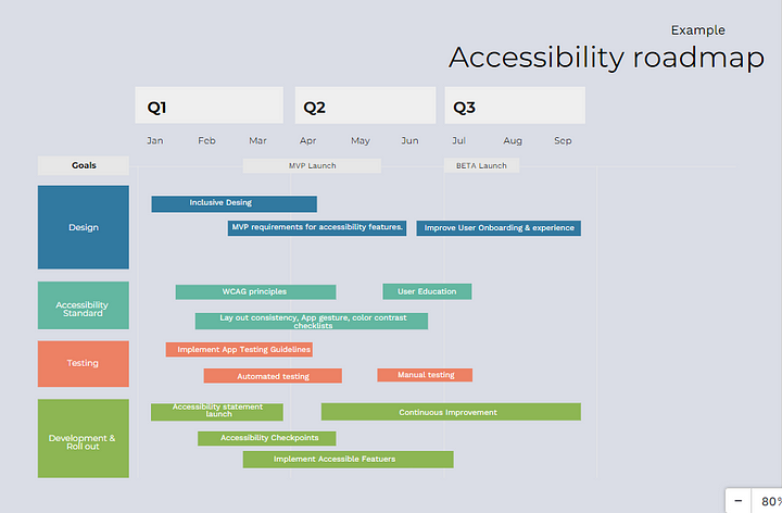
A hypothetical roadmap for this kind of accessibility implementation would look like:

The product team ensured that the app was easy to use through various gestures such as tapping, swiping, labeling, and maintaining consistency in layout across different screens. Our accessibility usability testing revealed that websites or applications that use low contrast between the background and text or use mismatched colors can become inaccessible for color-blind users.
We also conducted testing on a health app. We discovered that using yellow in the app’s graphics, suggested by the company logo, created problems for visually impaired users. While yellow worked well with a black background, it was unreadable when projected against a white background.
After multiple attempts, we modified the shade of yellow to match well with buttons and black and white backgrounds, ensuring that visually impaired users can easily access the app’s content. It’s important to note that our modifications did not affect the app’s overall design or functionality. By making small changes to the color scheme, we were able to make a significant impact on the app’s accessibility without compromising its original design.
Relying solely on automated testing is insufficient for achieving accessibility objectives. It’s imperative to conduct manual accessibility tests with actual users and seek expert guidance to ensure your application is accessible to everyone.
Strive towards cultivating a team culture that values and prioritizes inclusivity. To achieve this, it’s vital to allocate specific time for accessibility and maintain open communication channels with product managers and designers.
Featured image source: IconScout

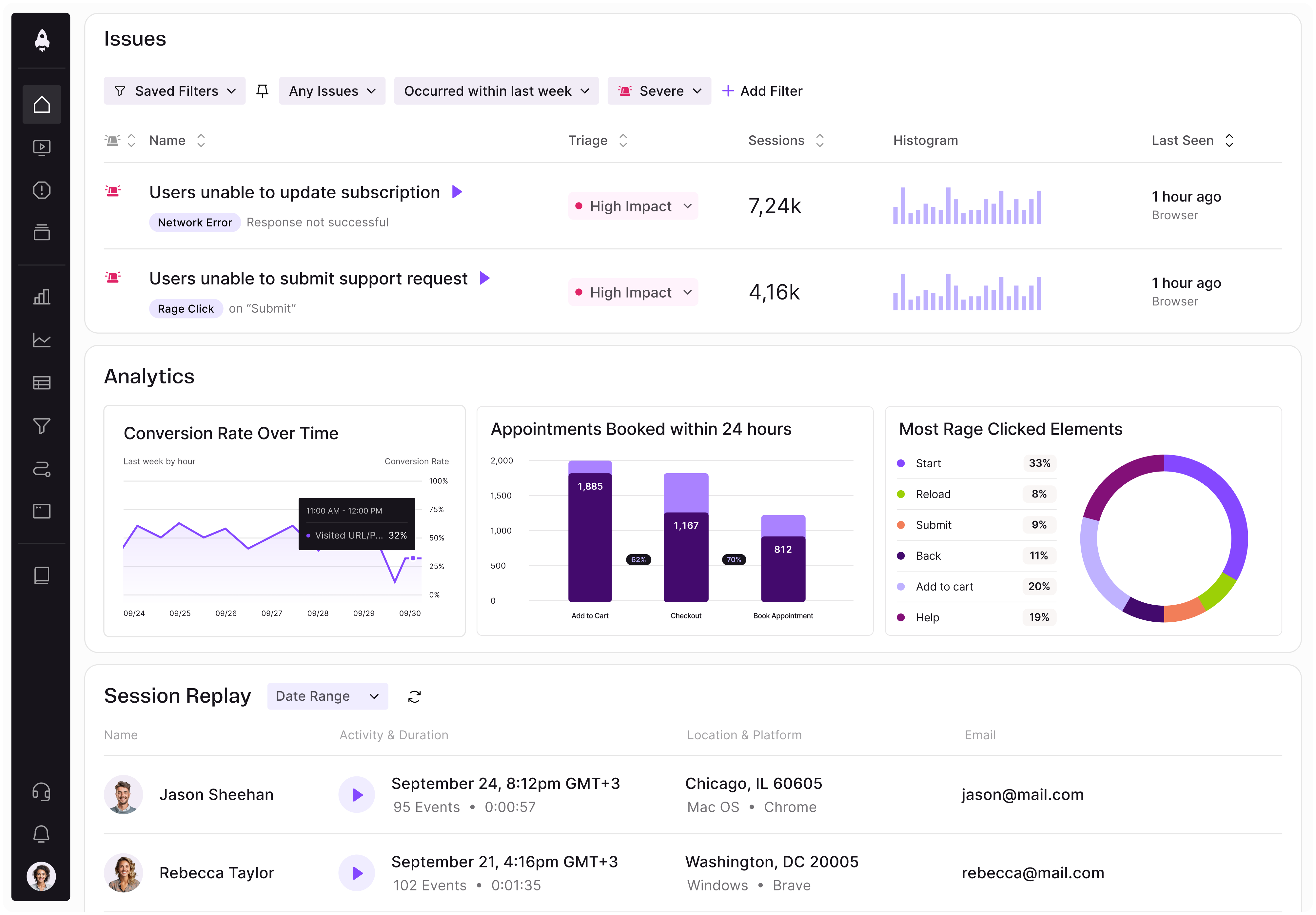
LogRocket identifies friction points in the user experience so you can make informed decisions about product and design changes that must happen to hit your goals.
With LogRocket, you can understand the scope of the issues affecting your product and prioritize the changes that need to be made. LogRocket simplifies workflows by allowing Engineering, Product, UX, and Design teams to work from the same data as you, eliminating any confusion about what needs to be done.
Get your teams on the same page — try LogRocket today.

Controlled scope creep can help PMs use capacity buffers, AI tools, and clear guardrails to turn new ideas into better outcomes.

According to SVP Julia Dalton, managing humans at scale and managing AI agents have a lot more in common than most people realize.

AI can make PM thinking generic. Learn how to use it without losing judgment, user nuance, or product differentiation.

Learn a 3-lens framework that helps product managers shift stakeholder requests from feature ideas to real problems and outcomes.