React Native apps offer a responsive UX with high-performance interactivity, which is important for creating engaging and intuitive UIs. Incorporating comment functionality in your React Native app provides another way for users to engage with the app’s content as well as with other users.

In this article, we will explore how we can enable React Native comments in an example application. To do so, we will build a React Native app from the ground up, using Firebase to store posts and comments as well as designing authentication flows for users.
To learn how to generate a new React Native application, set up navigation, properly structure our files, and authenticate users with Firebase, we will cover:
You can also jump ahead to where we implement comment functionality in our React Native project. We will cover:
You can check out this project’s source code in this GitHub repo. By the end of this tutorial, we will have a functional application that works as shown below:
Adding comment functionality to your React Native app – sample
Adding comment functionality to your React Native app
This is going to be a long one! Are you ready? Let’s go.
Let’s start our project by setting up our Firebase authentication, database, and storage. Head to the Firebase homepage and click on the Get started button to navigate to the next page. You should see options to add a new project or continue with an existing one:
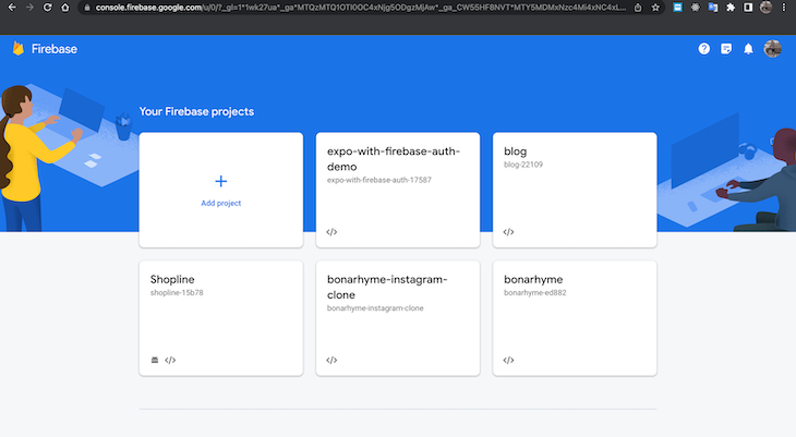
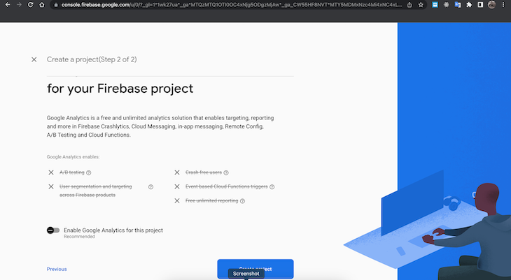
When you select the Add project option, you’ll be prompted to enter a project name. After naming your project and selecting Continue, you will be taken to a page where you can disable or enable Google Analytics. For this tutorial, we will disable it:
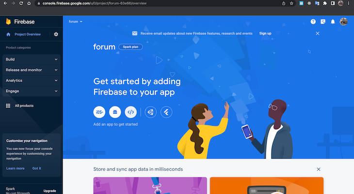
Next, you should see a loading page followed by a success message showing that the project has been properly created. Click the Continue button to move on to configuring your project. On the next page, click the web icon so we can configure our project for React Native:
You should then be prompted to register an application. Note that this step indicates we can register multiple applications in a given project.
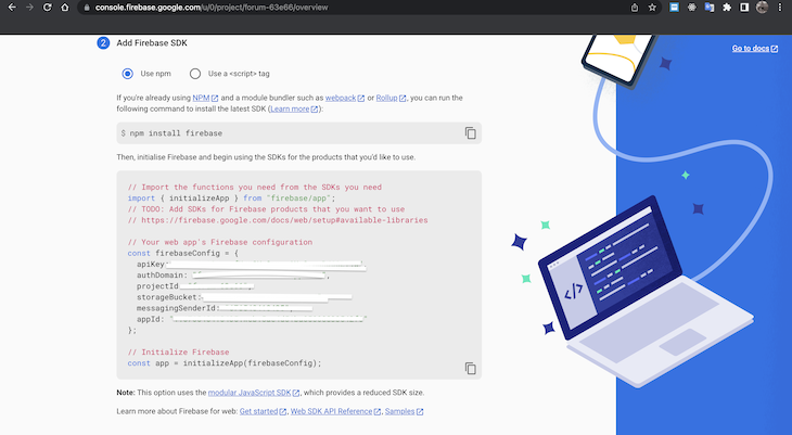
After registering the app, you will be shown instructions regarding how to install Firebase into your project and the credentials you’ll use to connect to the cloud. Copy the credentials, which are obscured for privacy in the image below, and store them safely for later use:
Next, navigate back to the Firebase Project Overview dashboard and select the Authentication card to start setting up authentication. On the next page, click on Get started.
You will be directed to yet another page to select your preferred sign-in method. For this tutorial, we will stick with the Email/Password option:
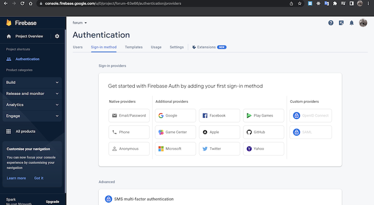
You’ll be prompted to enable your preferred authentication method and save your selection.
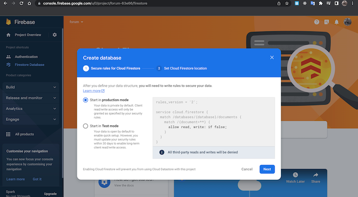
Next, we will set up our Cloud Firestore database. Navigate back to the Firebase Project Overview dashboard and click the Cloud Firestore card. On the next page, we will click the Create database button to launch a popup modal.
In the popup, ensure that you’ve opted to set up Cloud Firestore in production mode and then click the Next button:
After that, select the region closest to you. For this tutorial, we’ll be using the nam5 (United States) option. Once you’ve selected your region, click the Enable button to close the popup modal.
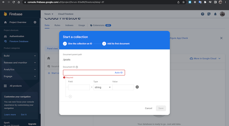
Next, click on the Start collection button to open a new popup modal. You will be prompted to give the collection an ID or name — for this tutorial, we’ll call our collection “posts” — and then add the collection’s first document.
In this step, you have the option to give the document an ID or have Firebase handle the ID. We want to use the second option in this tutorial, so we’ll click Auto-ID in the text input box:
Firebase will then generate a random ID for us. For this tutorial, we also need to create more collections for “comments” and “replies” in our application.
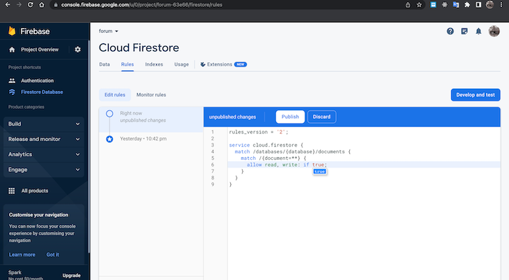
Next, we will permit users in our application to read and write to our Firestore so that users can publish comments. We can do that by clicking on the Rules tab, changing false to true on line six, and clicking the Publish button:
As a general note, we can manage the users that sign up for our application by clicking on the Authentication menu on the left sidebar and then clicking on the Users tab.
Now that we have Firebase set up, we can set up our React Native app with the Expo SDK and TypeScript. You can follow the LogRocket guide or search through the Expo docs for basic setup instructions. After that, we will create the necessary folders and files:
components folder in the root directory and add the following files:
Button.tsxComment.tsxCommentsModal.tsxInput.tsxMessage.tsxhooks folder and add a useAuthentication.ts filenavigators folder and add the following files:
appTabNavigators.tsxauthNavigator.tsxhomeNavigator.tsxscreens folder and add the following files to it:
CreatePost.tsxHome.tsxLogin.tsxProfile.tsxSignup.tsxSinglePost.tsxWelcome.tsxtypes folder and add env.d.ts and index.d.ts files.env file in the root directoryfirebase.ts file in the root directoryIf we set up everything properly, our folder structure should look similar to this:
// App Folder structure

expo-blog-with-firebase-
 ┣ .expo
 ┃ ┣ README.md
 ┃ ┣ devices.json
 ┃ ┣ packager-info.json
 ┃ ┗ settings.json
 ┣ assets
 ┃ ┣ adaptive-icon.png
 ┃ ┣ favicon.png
 ┃ ┣ icon.png
 ┃ ┗ splash.png
 ┣ components
 ┃ ┣ Button.tsx
 ┃ ┣ Comment.tsx
 ┃ ┣ CommentsModal.tsx
 ┃ ┣ Input.tsx
 ┃ ┗ Message.tsx
 ┣ hooks
 ┃ ┗ useAuthentication.ts
 ┣ navigators
 ┃ ┣ appTabNavigator.tsx
 ┃ ┣ authNavigator.tsx
 ┃ ┗ homeNavigator.tsx
 ┣ screens
 ┃ ┣ CreatePost.tsx
 ┃ ┣ Home.tsx
 ┃ ┣ Login.tsx
 ┃ ┣ Profile.tsx
 ┃ ┣ Signup.tsx
 ┃ ┣ SinglePost.tsx
 ┃ ┗ Welcome.tsx
 ┣ types
 ┃ ┣ env.d.ts
 ┃ ┗ index.d.ts
 ┣ .env
 ┣ .gitignore
 ┣ App.tsx
 ┣ app.json
 ┣ babel.config.js
 ┣ firebase.ts
 ┣ package.json
 ┣ tsconfig.json
 ┗ yarn.lock
With our folder structure set up, we can start configuring various aspects of our application. We’ll start with the env variables.
Application security is essential — we want to keep bad actors from tampering with our data. Securing our application includes storing the configuration variables we copied from Firebase in a .env file.
For this reason, we will use the react-native-dotenv package. Let’s open our terminal, making sure we are in the project directory, and then run either of the following installation commands:
//npm
npm i react-native-dotenv

// Yarn
yarn add react-native-dotenv
Then, in the .env file that we created earlier, we will add the following variables:
  apiKey=ioosIzaSy5453662J60ZTjw
  authDomain=forum-i8.firebaseapp.com
  projectId=forum-i8
  storageBucket=forum-i8.appspot.com
  messagingSenderId=5453662
  appId=7:5453662:web:ey7iijnsjhjjsjskwksk
Make sure to replace the dummy data above with the actual data you copied from Firebase.
Next, open or create a babel.config.js file and replace the content with the following code:
module.exports = function (api) {
  api.cache(true);
  return {
    presets: ['babel-preset-expo'],
    plugins: [
      [
        'module:react-native-dotenv',
        {
          moduleName: '@env',
          path: '.env',
        },
      ],
    ],
  };
};
Also, add the code below to the env.d.ts file we created earlier:
declare module '@env' {
  export const apiKey: string;
  export const authDomain: string;
  export const projectId: string;
  export const storageBucket: string;
  export const messagingSenderId: string;
  export const appId: string;
  export const measurementId: string;
}
This configuration ensures that we will be able to access the variables we set in our .env file from the @env module while still enjoying the autocomplete functionality that comes with TypeScript.
To set up our Firebase configuration in our application, we will have to install the firebase npm package using one of the commands below in our terminal:
//npm
npm i firebase

//Yarn
yarn add firebase
Next, open firebase.ts and add the following code:
// Import the functions you need from the SDKs you need
import { initializeApp } from 'firebase/app';
import { getAuth } from 'firebase/auth';
import { getFirestore } from 'firebase/firestore';

// Import the .env variables
import {
  apiKey,
  appId,
  authDomain,
  measurementId,
  messagingSenderId,
  projectId,
  storageBucket,
} from '@env';

// Add the config
const firebaseConfig = {
  apiKey,
  authDomain,
  projectId,
  storageBucket,
  messagingSenderId,
  appId,
  measurementId,
};
// Initialize Firebase
const app = initializeApp(firebaseConfig);

// Initialize firestore database
export const db = getFirestore(app);

// Initialize authentication
export const auth = getAuth(app);
In the code above, we are importing the necessary dependencies from Firebase and our @env file courtesy of our earlier setup.
Then we created the firebaseConfig object with the variables we imported before we initialized our Firebase app, created the database, and initialized the authentication.
We exported the database and authentication variables because we will be using them subsequently in our application.
In this section, we will set up the code for controlling user authentication. Essentially, we will open hooks/useAuthentication.ts file and add the following code:
// hooks/useAuthentication.ts

import React, { useEffect, useState } from 'react';
import { onAuthStateChanged, User } from 'firebase/auth';
import { auth } from '../firebase';

export function useAuthentication() {
  const [user, setUser] = useState<User>();

  useEffect(() => {
    const unsubscribeFromAuthStatusChanged = onAuthStateChanged(
      auth,
      (user) => {
        if (user) {
          setUser(user);
        } else {
          setUser(undefined);
        }
      }
    );
    return unsubscribeFromAuthStatusChanged;
  }, []);

  return {
    user,
  };
}
In the code above, we first imported all necessary dependencies — especially the auth initialization instance we created in the previous section.
After that, we created our Hook, initialized a user state, and passed the User type we got from firebase/auth package. Then, we declared a useEffect Hook, which is supposed to mount after our application starts because of the empty dependency array we passed to it.
Next, we created the unsubscribeFromAuthStatusChanged variable and called the onAuthStateChanged function from firebase. The function accepts an auth initialization and a callback function, which also returns a user parameter that we can use to set the user state.
Finally, we return the user state, expecting it to contain an undefined value or an instance of the User interface.
Navigation is an important aspect of our application that allows us to provide routing between pages. We will use the following npm packages to achieve the navigation setup we want:
@react-navigation/native@react-navigation/stack@react-navigation/bottom-tabsLet’s start by modifying the navigators/authNavigator.tsx file. In this file, we will add the following code:
// navigators/authNavigator.tsx

import React from 'react';
import { NavigationContainer, NavigationProp } from '@react-navigation/native';
import { createStackNavigator } from '@react-navigation/stack';

import Login from '../screens/Login';
import Signup from '../screens/Signup';
import Welcome from '../screens/Welcome';

export type AuthScreenNamesTypes = ["Welcome", "Login", "Signup"];

export type AuthStackParamList = Record<AuthScreenNamesTypes[number], undefined>;

const AuthStack = createStackNavigator<AuthStackParamList>();
export type AuthStackNavigationType = NavigationProp<AuthStackParamList>;


type Props = {};

const AuthNavigator = ({ }: Props) => {
    return (
        <NavigationContainer>
            <AuthStack.Navigator>
                <AuthStack.Screen name="Welcome" component={Welcome} />
                <AuthStack.Screen name="Login" component={Login} />
                <AuthStack.Screen name="Signup" component={Signup} />
            </AuthStack.Navigator>
        </NavigationContainer>
    );
};
export default AuthNavigator;
In the code above, we began by importing dependencies from react, @react-navigation/native, and @react-navigation/stack. Then, we imported Login, Signup, and Welcome screens.
Next, we declared AuthScreenNamesTypes and AuthStackParamList types for our navigator setup. After that, we created the stack navigator and added it to the AuthStack variable. To enable autocomplete when using our navigator in our project, we declared an AuthStackNavigationType type.
Finally, we set up our AuthNavigator in the function by wrapping the whole component in a NavigationContainer and AuthStack.Navigator before assigning a route name to each of the three screens we have for authentication.
Remember to follow the best practice of ensuring that the screen name matches its route name to avoid confusion.
In the following sections, we’ll set up our React Native app structure. We’ll start by constructing the home navigator, which will establish how users navigate through our app. Then, we’ll build out additional tab navigators and create reusable helper components to enhance both DX and UX.
The home navigator will contain two main screens — Home and SinglePost. Essentially, our setup will be similar to our AuthNavigator, so the content of our navigators/homeNavigator.tsx file should look similar to the code below:
// navigators/homeNavigators.tsx

import React from 'react';
import { NavigationProp } from '@react-navigation/native';
import { createStackNavigator } from '@react-navigation/stack';;
import Home from '../screens/Home';
import SinglePost from '../screens/SinglePost';

export type HomeScreenNamesTypes = ["Home Landing", "Single Post"];
export type RootStackParamList = Record<HomeScreenNamesTypes[number], { id?: string; }>;
const HomeStack = createStackNavigator<RootStackParamList>();
export type HomeStackNavigationType = NavigationProp<RootStackParamList>;

type Props = {};
const HomeNavigator = ({ }: Props) => {
    return (
        <HomeStack.Navigator screenOptions={{ headerBackTitle: "" }}>
            <HomeStack.Screen name="Home Landing" component={Home} options={{ title: 'Forum' }} />
            <HomeStack.Screen name="Single Post" component={SinglePost} />
        </HomeStack.Navigator>
    );
};
export default HomeNavigator;
Note that by setting our screenOptions to {{ headerBackTitle: "" }}, we ensure that our Home Landing and Single Post screens will contain no text in the headerBackTitle.
Let’s work in the navigators/AppTabNavigator.tsx file to handle navigation between our home navigator, profile page, and post creation screens. To begin, we will install the @expo/vector-icons npm package in the terminal using one of the following commands:
//npm
npm i @expo/vector-icons

//Yarn
yarn add @expo/vector-icons
>
Next, we will add the following code to the file:
// navigators/AppTabNavigator.tsx

import { Entypo } from "@expo/vector-icons";
import { createBottomTabNavigator } from "@react-navigation/bottom-tabs";
import { NavigationContainer, NavigationProp } from "@react-navigation/native";
import { StyleSheet } from "react-native";
import CreatePost from "../screens/CreatePost";
import Profile from "../screens/Profile";
import HomeNavigator from "./homeNavigator";

export type AppScreenNamesTypes = ["Home", "Create Post", "Profile"];
export type RootStackParamList = Record<AppScreenNamesTypes[number], any>;
const Tab = createBottomTabNavigator<RootStackParamList>();
export type AppTabNavigationType = NavigationProp<RootStackParamList>;

export const AppTabNavigation = () => {
    return (
        <NavigationContainer>
            <Tab.Navigator
                initialRouteName="Home"
                screenOptions={({ route }) => ({
                    tabBarHideOnKeyboard: true,
                    tabBarStyle: styles.tabBarStyle,
                    tabBarLabelStyle: styles.tabLabelStyle,
                    tabBarActiveTintColor: "#FF5E00",
                    tabBarInactiveTintColor: "#6D3805",
                    tabBarIcon: ({ focused, color, size }) => {
                        let iconName;
                        if (route.name === "Home") {
                            iconName = <Entypo name="home" size={20} color={focused ? "#FF5E00" : "#6D3805"} />;
                        }
                        if (route.name === "Create Post") {
                            iconName = <Entypo name="edit" size={20} color={focused ? "#FF5E00" : "#6D3805"} />;
                        }
                        if (route.name === "Profile") {
                            iconName = <Entypo name="user" size={20} color={focused ? "#FF5E00" : "#6D3805"} />;
                        }
                        return iconName;
                    }
                })}
            >
                <Tab.Screen name="Home" component={HomeNavigator} options={{ headerShown: false }} />
                <Tab.Screen name="Create Post" component={CreatePost} />
                <Tab.Screen name="Profile" component={Profile} />
            </Tab.Navigator>
        </NavigationContainer>
    );
};
const styles = StyleSheet.create({
    tabImage: { width: 18, height: 18 },
    tabLabelStyle: {
        fontSize: 10,
        textTransform: 'capitalize',
        fontWeight: "500"
    },
    tabBarStyle: {
        borderColor: '#E9E9E9',
        paddingVertical: 10,
        paddingBottom: 20,
        height: 70,
        borderTopRightRadius: 30,
        borderTopLeftRadius: 30,
    }
});
This file is pretty lengthy, so let’s break it down to understand each part of the code.
In the first part of this file, we import the needed dependencies. After that, we declare the types and initialize the bottom tab navigator. Then, we wrap our component inside the NavigationContainer and Tab.Navigator.
Next, we add props to the Tab.Navigator component. These props include initialRouteName and screenOptions, the latter of which provides various options to customize how the tab navigator will look and behave:
tabBarHideOnKeyboard allows us to either show or hide the tab menu when the keyboard is opentabBarStyle and tabBarLabelStyle provide styles for the tab bar itself and its labels, respectivelytabBarActiveTintColor and tabBarInactiveTintColor control the colors of the tab label when active or inactivetabBarIcon is a little different since we will be providing different icons based on the active screen. It accepts a callback that gives three parameters — focused, color, and size — which we can use to return any custom icon based on which screen the user is onFinally, we assign the Home route name to the HomeNavigator we created previously and also assign the Create Post and Profile route names to their respective screens, as shown above.
Let’s build reusable Button.tsx, Input.tsx, and Message.tsx helper components. To create the Button.tsx component, add the following code to the components/Button.tsx file:
// components/Button.tsx

import { StyleSheet, Text, TouchableOpacity, View } from 'react-native';
import React from 'react';

type Props = {
    variant?: 'green' | 'blue' | 'red' | 'gray' | 'info' | 'dark-red';
    title: string;
    onPress: () => void;
    width?: string | number;
    height?: string | number;
    paddingVertical?: number,
    disabled?: boolean;
};
const colors = {
    blue: '#007bff',
    green: "#28a745",
    red: "#dc3545",
    gray: '#6c757d',
    info: "#17a2b8",
    'dark-red': '#8b0000'
};
const Button = ({ variant = "blue", title, onPress, width = "100%", height = 'auto', paddingVertical = 10, disabled = false }: Props) => {
    return (
        <TouchableOpacity style={{ backgroundColor: colors[variant], alignItems: 'center', paddingVertical, borderRadius: 8, width, height }} onPress={onPress} disabled={disabled}>
            <Text style={{ color: 'white' }}>
                {title}
            </Text>
        </TouchableOpacity>
    );
};
export default Button;
const styles = StyleSheet.create({});
The Button component accepts the props we defined in the Props type. Then, we call a TouchableOpacity component and pass props to it before defining our Text and rendering our title in it.
For the Input component, open the components/Input.tsx file and add the following code:
// Input.tsx

import { StyleSheet, Text, TextInput, TextInputProps, View } from 'react-native';
import React from 'react';
type Props = TextInputProps & {
    label: string;
};
const Input = ({ label, ...textInputProps }: Props) => {
    return (
        <View style={styles.container}>
            <Text style={styles.label}>{label}</Text>
            <TextInput {...textInputProps} placeholder={'Enter ' + label} style={[styles.textInput, textInputProps.style]} />
        </View>
    );
};
export default Input;
const styles = StyleSheet.create({
    container: {
        width: "100%",
        marginBottom: 20
    },
    label: {
        fontSize: 16,
        color: "#333",
        marginBottom: 5
    },
    textInput: {
        borderWidth: 1,
        borderColor: "#222",
        borderRadius: 8,
        fontSize: 18,
        paddingLeft: 5,
        paddingVertical: 5,
    }
});
The Input.tsx file contains a component that accepts TextInputProps and a label. This component returns a view containing Text and TextInput components.
The components/Message.tsx component accepts variant and message props and serves as our alert component. It will contain the following code:
// components/Message.tsx

import { StyleSheet, Text, View } from 'react-native';
import React from 'react';
type Props = {
    variant: 'green' | 'blue' | 'red';
    message: string;
};
const Message = ({ variant, message }: Props) => {
    return (
        <View>
            <Text style={{ color: variant, marginVertical: 20 }}>{message}</Text>
        </View>
    );
};
export default Message;
const styles = StyleSheet.create({});
We need to set up authentication flows, including signup, login, and logout functionality.
Welcome screenFirst, let’s create the Welcome screen by opening the screens/Welcome.tsx file and adding the following code:
// screens/Welcome.tsx

import { StyleSheet, Text, View } from 'react-native';
import React from 'react';
import { AuthStackNavigationType } from '../navigators/authNavigator';
import { useNavigation } from '@react-navigation/native';
import Button from '../components/Button';
type Props = {};

const Welcome = (props: Props) => {
    const navigation: AuthStackNavigationType = useNavigation();

    const goToSignUp = () => {
        navigation.navigate("Signup");
    };
    const goToLogin = () => {
        navigation.navigate("Login");
    };
    return (
        <View style={styles.container}>
            <Text style={styles.title}>Our Forum</Text>
            <View style={styles.buttonContainer}>
                <Button onPress={goToSignUp} title='Signup' variant='green' />
                <Button onPress={goToLogin} title='Login' />
            </View>
        </View>
    );
};

export default Welcome;

const styles = StyleSheet.create({
    container: {
        flex: 1,
        justifyContent: 'center'
    },
    title: {
        fontSize: 25,
        textAlign: "center",
        marginBottom: 30
    },
    buttonContainer: {
        width: "100%",
        maxWidth: 200,
        marginLeft: 'auto',
        marginRight: 'auto',
        gap: 20,
    },
});
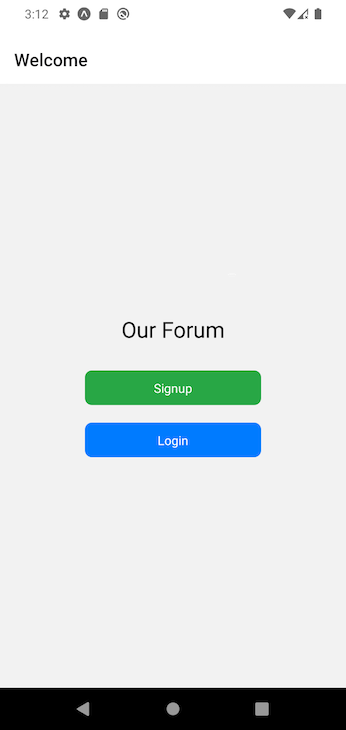
The Welcome.tsx screen displays some text and two Button components that have already been imported as dependencies. The buttons can be used to navigate to the login and signup pages, respectively.
With the added styles, our Welcome screen should look similar to the image below:
Signup screenThe next screen we’ll set up is the Signup screen. Add the following code to the screens/Signup.tsx file:
// screens/Signup.tsx

import { ActivityIndicator, StyleSheet, Text, TextInput, View, } from 'react-native';
import React, { Dispatch, SetStateAction, useState } from 'react';
import { auth } from '../firebase';
import { storeDataInStorage } from '../storage/localStorage';
import Input from '../components/Input';
import { useNavigation } from '@react-navigation/native';
import { AuthStackNavigationType } from '../navigators/authNavigator';
import { createUserWithEmailAndPassword } from 'firebase/auth';
import Message from '../components/Message';
import Button from '../components/Button';

type Props = {};

const Signup = ({}: Props) => {
    const navigation: AuthStackNavigationType = useNavigation();

    const [email, setEmail] = useState<string>('');
    const [password, setPassword] = useState<string>('');
    const [loading, setLoading] = useState<boolean>(false);
    const [success, setSuccess] = useState<boolean>(false);
    const [error, setError] = useState<string>('');

    const goToLogin = () => {
        navigation.navigate("Login");
    };

    const handleSignup = async () => {
        setLoading(true);
        setError('');
        setSuccess(false);
        try {
            const result = await createUserWithEmailAndPassword(auth, email, password);
            setSuccess(true);
            // navigation.navigate('Login');
        } catch (error: any) {
            setSuccess(false);
            setError(error?.message || "An error occured while signing up");
        }
        setLoading(false);
    };

    return (
        <View>
            <View style={styles.container}>
                {error ? <Message message={error} variant='red' /> : null}
                {loading ? <ActivityIndicator size='large' /> : null}
                <Input label='Email' value={email} onChangeText={(text) => setEmail(text)} />
                <Input label='Password' value={password} onChangeText={(text) => setPassword(text)} secureTextEntry />
                <Button title='Signup' onPress={handleSignup} />
                <Text style={styles.promptContainer}>Already have an account? <Text style={styles.prompt} onPress={goToLogin}>Login</Text></Text>
            </View>
        </View>
    );
};
export default Signup;
const styles = StyleSheet.create({
    container: {
        marginTop: 40,
        width: "100%",
        maxWidth: 350,
        marginLeft: "auto",
        marginRight: "auto"
    },
    promptContainer: {
        marginTop: 20
    },
    prompt: {
        color: "blue",
        textDecorationLine: "underline"
    }
});
In the code above, we start by importing the necessary dependencies, including the Button, Input, and Message components we previously created. After that, we declare our navigation Hook and set up the email, password, and other states for the API call.
Next, we define a goToLogin function that we can use to navigate to the login page, as well as a handleSignup function. In the handleSignup function, we set the appropriate states before wrapping our createUserWithEmailAndPassword call in a try...catch block.
createUserWithEmailAndPassword accepts three parameters — auth, email, and password. The auth is imported from the firebase.ts file we created earlier, while the others will come from the local state.
If the request returns successfully, we set the setSuccess state to true; if not, we catch the error in our try...catch block, set the setError state to true, and set setSuccess to false. Outside the try...catch statement, we also set the setLoading state to false.
In the component’s return statement, we check whether we have an error from the API call and then render the relevant Message component. We also check for when the API call is loading to display a Loader component.
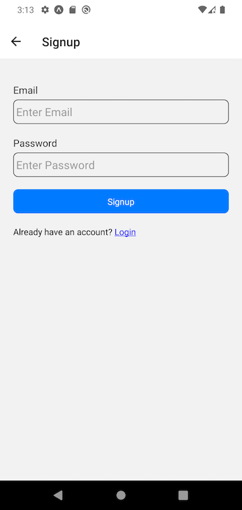
Next, we render two Input components for email and password entry and pass the appropriate onChangeText callbacks to each. Right below the inputs, we have a Submit button that calls the handleSignup function and a Text component that calls the goToLogin function.
At this point, our signup screen should look like the below:
Login screenThe next auth screen is the components/Login.tsx screen. The code for this screen is similar to the code we wrote for the Signup screen — with some important differences.
For example, on this Login screen, we want to call the goToSignUp and handleSignIn functions instead of goToLogin and handleSignup, respectively. Another difference is that we have signInWithEmailAndPassword instead of createUserWithEmailAndPassword:
// screens/Login.tsx

import { ActivityIndicator, StyleSheet, Text, TextInput, View, } from 'react-native';
import React, { Dispatch, SetStateAction, useState } from 'react';
import { auth } from '../firebase';
import { storeDataInStorage } from '../storage/localStorage';
import Input from '../components/Input';
import { useNavigation } from '@react-navigation/native';
import { AuthStackNavigationType } from '../navigators/authNavigator';
import { signInWithEmailAndPassword } from 'firebase/auth';
import Message from '../components/Message';
import Button from '../components/Button';
type Props = {};
const Login = ({}: Props) => {
    const navigation: AuthStackNavigationType = useNavigation();

    const [email, setEmail] = useState<string>('');
    const [password, setPassword] = useState<string>('');
    const [loading, setLoading] = useState<boolean>(false);
    const [success, setSuccess] = useState<boolean>(false);
    const [error, setError] = useState<string>('');

    const goToSignUp = () => {
        navigation.navigate("Signup");
    };

    const handleSignIn = async () => {
        setLoading(true);
        setError('');
        setSuccess(false);
        try {
            const result = await signInWithEmailAndPassword(auth, email, password);
            setSuccess(true);
            await storeDataInStorage("USER_AUTH", result?.user);
        } catch (error: any) {
            setSuccess(false);
            setError(error?.message || "An error occured while signing up");
        }
        setLoading(false);
    };

    return (
        <View>
            <View style={styles.container}>
                {error ? <Message message={error} variant='red' /> : null}
                {loading ? <ActivityIndicator size='large' /> : null}
                <Input label='Email' value={email} onChangeText={(text) => setEmail(text)} />
                <Input label='Password' value={password} onChangeText={(text) => setPassword(text)} secureTextEntry />
                <Button title='Login' onPress={handleSignIn} />
                <Text style={styles.promptContainer}>Don't have an account? <Text style={styles.prompt} onPress={goToSignUp}>Signup</Text></Text>
            </View>
        </View>
    );
};
export default Login;
const styles = StyleSheet.create({
    container: {
        marginTop: 40,
        width: "100%",
        maxWidth: 350,
        marginLeft: "auto",
        marginRight: "auto"
    },
    promptContainer: {
        marginTop: 20
    },
    prompt: {
        color: "blue",
        textDecorationLine: "underline"
    }
});
Profile screenThe last auth screen to build is the screens/Profile.tsx screen. It will simply contain a Text component that displays the current user’s email as well as a logout button. This screen should contain the following code:
// screens/Profile.tsx

import { StyleSheet, Text, View } from 'react-native';
import React from 'react';
import { signOut } from 'firebase/auth';
import { auth } from '../firebase';
import Button from '../components/Button';

type Props = {};

const Profile = (props: Props) => {
    const handleLogout = () => {
        signOut(auth);
    };

    return (
        <View style={styles.container}>
            <View style={styles.contentContainer}>
                <Text style={styles.title}>
                    Hello,  {auth?.currentUser?.email}
                </Text>
            </View>
            <View style={styles.buttonContainer}>
                <Button title='Logout' variant='red' onPress={handleLogout} />
            </View>
        </View>
    );
};
export default Profile;
const styles = StyleSheet.create({
    container: {
        flex: 1,
        margin: 10,
    },
    contentContainer: {
        flex: 1,
    },
    title: {
        fontSize: 20,
    },
    buttonContainer: {
        height: 50
    }
});
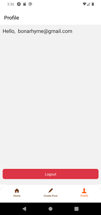
In the code above, handleLogout calls the signOut function from the firebase/auth package, which accepts the auth variable initialized in the firebase.ts file. We can access the currently signed-in user’s email from the auth variable with auth?.currentUser?.email.
At this time, we should have a complete authentication flow, and our profile screen should look similar to the image below:
The CreatePost page will allow us to write a new article and save it to Firebase. We will open the screens/CreatePost file and add the following code to it:
// screens/CreatePost.tsx

import { ActivityIndicator, StyleSheet, Text, View } from 'react-native';
import React, { useEffect, useState } from 'react';
import { addDoc, collection } from 'firebase/firestore';
import { auth, db } from '../firebase';
import Message from '../components/Message';
import Input from '../components/Input';
import Button from '../components/Button';
import { useNavigation } from '@react-navigation/native';
import { AppTabNavigationType } from '../navigators/appTabNavigator';

type Props = {};

const CreatePost = (props: Props) => {
    const navigation: AppTabNavigationType = useNavigation();

    const [title, setTitle] = useState<string>('');
    const [details, setDetails] = useState<string>('');

    const [loading, setLoading] = useState<boolean>(false);
    const [success, setSuccess] = useState<boolean>(false);
    const [error, setError] = useState<string>('');

    const [data, setData] = useState<any>();
    const postsCollection = collection(db, 'posts');
In the code above, we first import all needed dependencies. Next, we declare our navigation, making sure to pass the AppTabNavigationType we previously created in the navigators/appTabNavigator.tsx file.
After doing that, we create states for the title and details components, loading, success, and errror states for the API call, and the data state.
We also initialize the postsCollection variable by calling the collection function from the firebase package we installed earlier and passing in db along with the name of the collection we are trying to access from Firebase.
Now that we have initialized the postsCollection, we can create our handleSubmitPost function:
    const handleSubmitPost = async () => {
        if (!details || !title) {
            return;
        }
        setLoading(true);
        setError('');
        setSuccess(false);
        try {
        const postItem = {
                    title,
                    details,
                    author: {
                        email: auth?.currentUser?.email,
                        id: auth?.currentUser?.uid,
                    },
                };
            const response = await addDoc(postsCollection, postItem);
            setData(response?.id);
            setSuccess(true);
            setTitle('');
            setDetails('');
        } catch (error: any) {
            setSuccess(false);
            setError(error?.message || "An error occured while creating post");
        }
        setLoading(false);
    };
    useEffect(() => {
        let timeout: ReturnType<typeof setTimeout>;
        if (success) {
            timeout = setTimeout(() => {
                setSuccess(false);
                navigation.navigate('Home');
            }, 2000);
        }
        return () => clearTimeout(timeout);
    }, [success]);
    return (
        <View>
            <View style={styles.container}>
                {error ? <Message message={error} variant='red' /> : null}
                {success ? <Message message={"Post created successfully"} variant='green' /> : null}
                {loading ? <ActivityIndicator size='large' /> : null}
                <Input label='Title' value={title} onChangeText={(text) => setTitle(text)} />
                <Input label='Details' value={details} onChangeText={(text) => setDetails(text)} multiline numberOfLines={5} style={styles.textArea} />
                <Button title='Submit' onPress={handleSubmitPost} />
            </View>
        </View>
    );
};
export default CreatePost;

const styles = StyleSheet.create({
    container: {
        marginTop: 40,
        width: "100%",
        maxWidth: 350,
        marginLeft: "auto",
        marginRight: "auto"
    },
    promptContainer: {
        marginTop: 20
    },
    prompt: {
        color: "blue",
        textDecorationLine: "underline"
    },
    textArea: {
        textAlignVertical: 'top',
        height: 200
    }
});
First, we made sure to only allow users to submit their posts after they have entered a title and details. Then, we set the loading, error, and success states to the appropriate initial values before adding a try...catch statement.
In the try block, we first create the postItem object, which represents the data we want to store in the Firebase database. We then call the addDoc function, passing in our configured collection — postsCollection — and the postItem as arguments.
Once the function completes successfully and returns a response, we store the returned id in the data variable, update the success state to true, and reset the title and details states to their initial values.
Meanwhile, in the catch block, we set the success state to false and the incoming error to the error state.
Below the handleSubmitPost function, we have a useEffect that runs only after a successful response and waits for two seconds before redirecting the user to the home screen.
The returned markup contains error and success messages, Title and Details Input elements, and the Submit button. Once the provided styles have been applied, our screen should look similar to what we have in the image below:
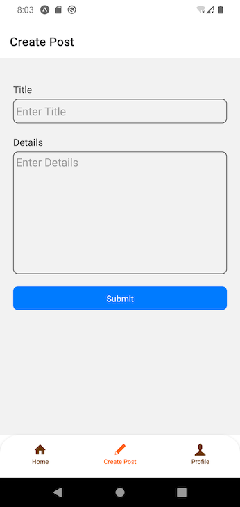
Note that to get the huge Details Input field you see above, we have to combine the multiline and numberOfLines props with the textAlignVertical: 'top', height: 200; style attached to the textArea object. To learn more, check out our guide to TextInput in React Native.
The home screen is where we will display the posts we have created. It will have a pull-to-refresh feature and an option for users to delete their own created posts.
As with the other files we previously created, the first step is to import the necessary dependencies. After that, we will define a PostType that represents the structure we expect each item in our post list to take.
Next, we will define the navigation variable, which — as we covered earlier in this tutorial — is responsible for routing. Then, we will declare various states:
postLists, loading, success, and error states for the data we will be fetching from firestoreloadingDeletePost, successDeletePost, and errorDeletePost states for the post deletion operation that we will set up shortlyrefreshing state we will use to handle the pull-to-refresh functionalityWe also need to make sure we pass the appropriate types to each state we have declared. So far, the code in our file should look like the below:
// screens/Home.tsx

import { ActivityIndicator, Alert, FlatList, RefreshControl, StyleSheet, Text, View } from 'react-native';
import React, { useEffect, useState } from 'react';
import { collection, deleteDoc, doc, getDocs } from 'firebase/firestore';
import { auth, db } from '../firebase';
import { useNavigation } from '@react-navigation/native';
import { HomeStackNavigationType } from '../navigators/homeNavigator';
import Message from '../components/Message';
import Button from '../components/Button';
type Props = {};
export type PostType = {
    id: string;
    title: string;
    details: string;
    author: {
        email: string;
        id: string;
    };
};
const Home = (props: any) => {
    const navigation: HomeStackNavigationType = useNavigation();
    const [postLists, setPostLists] = useState<PostType[]>([]);
    const [loading, setLoading] = useState<boolean>(false);
    const [success, setSuccess] = useState<boolean>(false);
    const [error, setError] = useState<string>('');
    const [loadingDeletePost, setLoadingDeletePost] = useState<boolean>(false);
    const [successDeletePost, setSuccessDeletePost] = useState<boolean>(false);
    const [errorDeletePost, setErrorDeletePost] = useState<string>('');
    const [refreshing, setRefreshing] = useState<boolean>(false);
The next step is to create the functions we will need in our components. We’ll start with goToPost function that will allow us to navigate to the SinglePost page, which we will implement in the next section:
    const goToPost = (id: string) => {
        navigation.navigate('Single Post', { id });
    };
The function accepts the id of a post as its parameter, which we can use to call the navigation.navigate method and pass the Single Post route name and id to it.
Next, let’s create the postsCollection and getPosts functions to retrieve created posts from the database and display them on the homepage:
    const postsCollection = collection(db, 'posts');
    const getPosts = async () => {
        setLoading(true);
        setError('');
        setSuccess(false);
        try {
            const data = await getDocs(postsCollection);
            const _data: PostType[] = data?.docs?.map((doc) => {
                const item = doc.data() as Omit<PostType, "id">;
                return {
                    id: doc?.id,
                    ...item
                };
            });
            setSuccess(true);
            setLoading(false);
            setPostLists(_data);
            setRefreshing(false);
        } catch (error: any) {
            setSuccess(false);
            setError(error?.message || "An error occured while fetching post");
        }
        setLoading(false);
    };
In these functions, we set loading, success, and error states respectively along with a try...catch statement. Then, we called the getDocs state and passed the postsCollection variable as a parameter.
We extracted the response using a map and stored the extracted result in the postLists state. Once we have done that, we can then handle the loading, success, refreshing states.
The next function we’ll implement is the deletePost function, which accepts a postId and title as parameters:
    const deletePost = async (postId: string, title: string) => {
        Alert.alert('Delete Post', title, [
            {
                text: 'Cancel',
                onPress: () => { },
                style: 'cancel',
            },
            {
                text: 'OK', onPress: async () => {
                    setLoadingDeletePost(true);
                    setErrorDeletePost('');
                    setSuccessDeletePost(false);
                    try {
                        const postDoc = doc(db, 'posts', postId);
                        await deleteDoc(postDoc);
                        setSuccessDeletePost(true);
                        getPosts();
                    } catch (error: any) {
                        setSuccessDeletePost(false);
                        setErrorDeletePost(error?.message || "An error occured while deleting comment");
                    }
                    setLoadingDeletePost(false);
                }
            },
        ]);


    };
This function calls the Alert component from React Native. We don’t need to change anything in the cancel part of the Alert component. However, in the OK section, we set the appropriate states for the post deletion functionality and create a try...catch statement.
In the try block, we initialize the postDoc variable by calling the doc function from Firebase. In this function, we pass our initialized db from firebase.ts, the collection name, and the postId. Then, we call the deleteDoc function from Firebase and pass in the initialized postDoc variable.
After receiving a successful response, we set the successDeletePost state to true and call the getPosts function in order to fetch an updated list of posts from Firestore.
Meanwhile, in the catch block, we set the successDeletePost and errorDeletePost states. Once outside of the try...catch statement, we also change the value of loadingDeletePost to false.
Since we need the posts to be fetched anytime we launch our application, we will run the getPosts function in a useEffect Hook and pass an empty dependency array to it:
    useEffect(() => {
        getPosts();
    }, []);

    return (
        <View style={styles.container}>
            {loading ? <ActivityIndicator size='large' /> : null}
            {error ? <Message message={error} variant='red' /> : null}
            {success ? <View>
                <FlatList
                    data={postLists}
                    renderItem={({ item }) => {
                        return <View style={styles.postContainer}>
                            <View>
                                <View style={{ flexDirection: 'row', justifyContent: 'space-between' }}>
                                    <Text style={styles.title} onPress={() => goToPost(item?.id)}>{item?.title}</Text>
                                    {auth && item?.author.id === auth.currentUser?.uid && <Button
                                        variant='red' title='Remove'
                                        onPress={() => { deletePost(item?.id, item?.title); }}
                                        width={70}
                                        height={25}
                                        paddingVertical={4} />}
                                </View>
                            </View>
                            <Text style={styles.description}>{item?.details?.slice(0, 100)}</Text>
                        </View>;
                    }}
                    keyExtractor={(item) => item.id}
                    ListEmptyComponent={() => <Text>There are no posts at the moment</Text>}
                    ItemSeparatorComponent={() => <View style={styles.line} />}
                    refreshControl={<RefreshControl
                        refreshing={refreshing}
                        onRefresh={() => {
                            setRefreshing(true);
                            getPosts();
                        }}
                    />}
                />
            </View> : null}
        </View>
    );
};
export default Home;
const styles = StyleSheet.create({
    container: {
        margin: 10
    },
    postContainer: {
    },
    title: {
        fontSize: 20,
        flex: 1
    },
    description: {
        color: "#222222"
    },
    line: {
        borderWidth: 0.5,
        borderColor: '#bbbbbb',
        width: '100%',
        marginVertical: 20,
    }
});
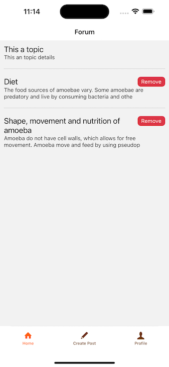
In the returned JSX, we have a View returning three items: the loader, an error message, and a View containing a FlatList.
In the FlatList, we pass the postLists to the data prop. We also add other props to the FlatList, including:
renderItem, which is simply a View returning a titleremovePost button labeled Delete that appears after the user creates a post. Tapping the Delete button will call the deletePost function to remove the post from Firestoreslice of the details property of item so we can display a preview of the post’s detailsWe will also pass an onPress event handler to the Text rendering the title component so that when the title text is pressed, we will call the goToPost and pass the id of the post as a parameter to render the appropriate SinglePost screen.
At this point, our Home screen should look like the image below:
Now that we’ve set up our post listing on the home screen of our app, let’s move on to setting up the single post screen.
In the SinglePost screen, we need to fetch a post from Firestore and display it. This screen will also contain a modal for adding comments.
As usual, we’ll begin by importing the necessary dependencies into the screens/SinglePost file:
// screens/SinglePost.tsx

import { ActivityIndicator, ScrollView, StyleSheet, Text, TouchableOpacity, View } from 'react-native';
import React, { useEffect, useState } from 'react';
import { doc, getDoc } from 'firebase/firestore';
import { db } from '../firebase';
import { RouteProp, useRoute } from '@react-navigation/native';
import { PostType } from './Home';
import Button from '../components/Button';
import Message from '../components/Message';

type Props = {};
Next, we define our states and declare a useEffect Hook to fetch the single post from Firestore:
// screens/SinglePost.tsx
const SinglePost = (props: Props) => {
   const route = useRoute<RouteProp<{ params: { id: string; }; }>>();
    const id = route.params.id;

    const [post, setPost] = useState<PostType>();
    const [loading, setLoading] = useState<boolean>(false);
    const [success, setSuccess] = useState<boolean>(false);
    const [error, setError] = useState<string>('');


    const getPosts = async () => {
        setLoading(true);
        setError('');
        setSuccess(false);
        try {
            const postDoc = doc(db, 'posts', id);
            const data = await getDoc(postDoc);
            const item = data?.data() as Omit<PostType, "id">;
            setPost({ ...item, id });
            setSuccess(true);
        } catch (error: any) {
            setSuccess(false);
            setError(error?.message || "An error occured while fetching comment");
        }
        setLoading(false);
    };
    useEffect(() => {
        getPosts();
    }, [id]);

 return <View></View>
}
In the code above, the route variable calls the useRoute Hook to access the id of the relevant post. The goToPost function we set up from the Home screen will provide this id. We then declare our states for the post and API operations, including loading, success, and error.
We initialize a postDoc in the getPosts function that we’ll pass to the getDoc function from Firebase. This fetches our post and assigns it to the data variable. We then set this data as our post state and change the success state to true.
The other operations are outlined in the code above. It’s worth noting that we call the getPosts function inside the useEffect Hook defined earlier.
For rendering, we return a simple JSX structure displaying the title and details of the post, separated by a horizontal line. To accommodate large content, we wrap everything in a ScrollView. Additionally, we render loading and error components for better UX during network requests.
At this point, the complete code in our screens/SinglePost.tsx file should look like the below:
// screens/SinglePost.tsx

import { ActivityIndicator, ScrollView, StyleSheet, Text, TouchableOpacity, View } from 'react-native';
import React, { useEffect, useState } from 'react';
import { doc, getDoc } from 'firebase/firestore';
import { db } from '../firebase';
import { RouteProp, useRoute } from '@react-navigation/native';
import { PostType } from './Home';
import Button from '../components/Button';
import Message from '../components/Message';

type Props = {};

const SinglePost = (props: Props) => {
    const route = useRoute<RouteProp<{ params: { id: string; }; }>>();
    const id = route.params.id;
    const [post, setPost] = useState<PostType>();
    const [loading, setLoading] = useState<boolean>(false);
    const [success, setSuccess] = useState<boolean>(false);
    const [error, setError] = useState<string>('');

    // Comment modal states below here

    // Comment modal states above here

    const getPosts = async () => {
        setLoading(true);
        setError('');
        setSuccess(false);
        try {
            const postDoc = doc(db, 'posts', id);
            const data = await getDoc(postDoc);
            const item = data?.data() as Omit<PostType, "id">;
            setPost({ ...item, id });
            setSuccess(true);
        } catch (error: any) {
            setSuccess(false);
            setError(error?.message || "An error occured while fetching comment");
        }
        setLoading(false);
    };
    useEffect(() => {
        getPosts();
    }, [id]);

    return (
        <View style={styles.container}>
            {loading ? <ActivityIndicator size='large' /> : null}
            {error ? <Message message={error} variant='red' /> : null}

            {Boolean(post) ? <ScrollView>
                <Text style={styles.title}>{post?.title}</Text>
                <Text>{post?.details}</Text>
                <View style={styles.line} />
                {/* Button to open comment modal below here */}

                {/* Button to open comment modal above here */}
            </ScrollView> : null}

                {/* Comment modal below here */}

                {/* Comment modal above here */}
        </View>
    );
};
export default SinglePost;
const styles = StyleSheet.create({
    container: {
        margin: 10
    },
    title: {
        fontSize: 24,
        textAlign: 'center',
        marginBottom: 10
    },
    line: {
        borderWidth: 0.5,
        borderColor: '#bbbbbb',
        width: '100%',
        marginVertical: 20,
    },
    commentButtonContainer: {
        flexDirection: 'row',
        justifyContent: 'space-between',
        alignItems: 'center'
    }

});
You’ll notice some commented placeholders for code related to the comment modal. We’ll set that up in the next section.
The comment functionality starts from the SinglePost screen. On this screen, we want to show a button that will display a comment modal when pressed. This modal will contain a text input for adding a comment and a list of existing comments.
We need to be able to fetch and delete comments from Firestore as well as display a comment input field. We also want to display the comments in the user interface and provide a button that allows the comment author to delete comments.
SinglePost screenLet’s start with the button that will display our comment modal. First, let’s add two states: modalVisible and commentsTotal. They will be defined like so:
// screens/SinglePost.tsx

// Other states
    const [modalVisible, setModalVisible] = useState<boolean>(false);
    const [commentsTotal, setCommentsTotal] = useState<number>(0);
Then we will add the following code into the ScrollView of our SinglePost:
// screens/SinglePost.tsx
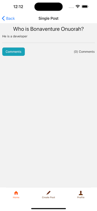
{/* Button to open comment modal below here */}
<View style={styles.commentButtonContainer}>
<Button variant='info'
title={`Comments`}
onPress={() => { setModalVisible(!modalVisible) }}
width={100} />
<Text> ({commentsTotal}) Comments</Text>
</View>
{/* Button to open comment modal above here */}
This added snippet renders a button that toggles the modalVisible state between true and false. It also includes a Text component that displays the total number of comments stored in the commentsTotal state.
At this point, our screen should look similar to the below:
To implement the CommentsModal component, we will open the components/CommentsModal file and import the packages and functions we need:
// components/CommentsModal.tsx

import { ActivityIndicator, Alert, FlatList, Platform, StyleSheet, Text, View } from 'react-native';
import React, { Dispatch, SetStateAction, useEffect, useState } from 'react';
import { Modal } from 'react-native';
import Button from './Button';
import { addDoc, collection, deleteDoc, doc, getDocs, query, where } from 'firebase/firestore';
import { auth, db } from '../firebase';
import Message from './Message';
import Input from './Input';
Then, we will define the CommentType and the Prop type:
// components/CommentsModal.tsx

export type CommentType = {
    id: string;
    details: string;
    post: {
        id: string;
    };
    author: {
        email: string;
        id: string;
    };
};

type Props = {
    modalVisible: boolean;
    setModalVisible: Dispatch<SetStateAction<boolean>>;
    postId: string;
    setCommentsTotal: Dispatch<SetStateAction<number>>;
};
Next, we create the CommentsModal component and pass the parameters we need:
// components/CommentsModal.tsx

const CommentsModal = ({ modalVisible, setModalVisible, setCommentsTotal, postId }: Props) => {
// Other code

return <View></View>
}

export default CommentsModal;

const styles = StyleSheet.create({
    centeredView: {
        flex: 1,
        backgroundColor: 'white',
        padding: 10,
        marginTop: Platform.OS === 'ios' ? 50 : 20
    },
    commentInputContainer: {
    },
    textArea: {
        textAlignVertical: 'top',
        height: 100
    },
    buttonContainer: {
        flexDirection: 'row',
        justifyContent: 'space-between'
    },
    line: {
        borderWidth: 0.5,
        borderColor: '#bbbbbb',
        width: '100%',
        marginVertical: 20,
    },
});
Next, we will create a details state that will hold the user’s added comment. We’ll also add a state to show or hide the comment text input:
// components/CommentsModal.tsx

    const [details, setDetails] = useState<string>('');
    const [toggleCommentInput, setToggleCommentInput] = useState<boolean>(false);
Now, let’s add the API states for adding, getting, and deleting comments, as well as for holding the comments when we eventually fetch them:
// components/CommentsModal.tsx

    const [loadingAddComment, setLoadingAddComment] = useState<boolean>(false);
    const [successAddComment, setSuccessAddComment] = useState<boolean>(false);
    const [errorAddComment, setErrorAddComment] = useState<string>('');

    const [comments, setComments] = useState<CommentType[]>([]);
    const [loadingGetComments, setLoadingGetComments] = useState<boolean>(false);
    const [successGetComments, setSuccessGetComments] = useState<boolean>(false);
    const [errorGetComments, setErrorGetComments] = useState<string>('');

    const [loadingDeleteComments, setLoadingDeleteComments] = useState<boolean>(false);
    const [successDeleteComments, setSuccessDeleteComments] = useState<boolean>(false);
    const [errorDeleteComments, setErrorDeleteComments] = useState<string>('');
Note that we need to pass the appropriate type to each state, as shown above.
Next, we’ll initialize our commentsCollection like so:
// components/CommentsModal.tsx

  const commentsCollection = collection(db, 'comments');
After that, we will define the addComment function, which is similar to the addPost function we defined earlier in the screens/CreatePost file:
// components/CommentsModal.tsx

    const addComment = async () => {
        setLoadingAddComment(true);
        setErrorAddComment('');
        setSuccessAddComment(false);
        try {
            const commentItem = {
                details,
                post: {
                    id: postId
                },
                author: {
                    email: auth?.currentUser?.email,
                    id: auth?.currentUser?.uid,
                },
            };
            await addDoc(commentsCollection, commentItem );
            setSuccessAddComment(true);            setDetails('');
        } catch (error: any) {
            setSuccessAddComment(false);
            setErrorAddComment(error?.message || "An error occured while adding comment");
        }
        setLoadingAddComment(false);
    };
Now we need to fetch our comments from Firestore. To do so, we will define the getComments function:
// components/CommentsModal.tsx

    const getComments = async () => {
        setLoadingGetComments(true);
        setErrorGetComments('');
        setSuccessGetComments(false);
        try {
            const postDoc = query(collection(db, "comments"), where("post.id", "==", postId));
            const data = await getDocs(postDoc);
            const itemsList: any = [];
            data.forEach((doc) => {
                itemsList.push({ ...doc.data(), id: doc.id });
            });
            setComments(itemsList);
            setSuccessGetComments(true);
            setCommentsTotal(itemsList?.length);
        } catch (error: any) {
            setSuccessGetComments(false);
            setErrorGetComments(error?.message || "An error occured while fetching comment");
        }
        setLoadingGetComments(false);
    };
In the code above, we handle the API states of loadingGetComments, successGetComments, and errorGetComments.
We initialize the postDoc variable by calling the query function. This accepts a collection and a where clause that matches any comment containing the post ID assigned in our previously defined addComment function. We then call the getDocs function and pass the defined postDoc as a parameter.
Since Firebase doesn’t return a plain array, we structure the data the way we want it using the forEach method. Finally, we assigned the fetched itemsList data to our comments state and adjust the other API states as needed.
The next function to handle is the deleteComment function, which accepts the commentId and comment details as parameters:
// components/CommentsModal.tsx


    const deleteComment = async (commentId: string, details: string) => {
        Alert.alert('Delete Comment', details, [
            {
                text: 'Cancel',
                onPress: () => { },
                style: 'cancel',
            },
            {
                text: 'OK', onPress: async () => {
                    setLoadingDeleteComments(true);
                    setErrorDeleteComments('');
                    setSuccessDeleteComments(false);
                    try {
                        const postDoc = doc(db, 'comments', commentId);
                        await deleteDoc(postDoc);
                        setSuccessDeleteComments(true);
                    } catch (error: any) {
                        setSuccessDeleteComments(false);
                        setErrorDeleteComments(error?.message || "An error occured while deleting comment");
                    }
                    setLoadingDeleteComments(false);
                }
            },
        ]);
    };
The function will behave similarly to the deletePost function we defined earlier in the screens/Home.tsx component.
The last function we need to define is the useEffect Hook, which will call the getComments function when the user first loads the SinglePost screen as well as when the user successfully adds or deletes a comment:
// components/CommentsModal.tsx

   useEffect(() => {
        getComments();
    }, [successAddComment, successDeleteComments]);
Now, let’s open screens/SinglePost.tsx, import the CommentsModal from components/CommentsModal, and render it below the ScrollView. At this point, the screens/SinglePost.tsx file will look like this:
// screens/SinglePost.tsx
import { ActivityIndicator, ScrollView, StyleSheet, Text, TouchableOpacity, View } from 'react-native';
import React, { useEffect, useState } from 'react';
import { doc, getDoc } from 'firebase/firestore';
import { db } from '../firebase';
import { RouteProp, useRoute } from '@react-navigation/native';
import { PostType } from './Home';
import Button from '../components/Button';
import Message from '../components/Message';
import CommentsModal from '../components/CommentsModal';
type Props = {};


const SinglePost = (props: Props) => {
    const route = useRoute<RouteProp<{ params: { id: string; }; }>>();
    const id = route.params.id;
    const [post, setPost] = useState<PostType>();
    const [loading, setLoading] = useState<boolean>(false);
    const [success, setSuccess] = useState<boolean>(false);
    const [error, setError] = useState<string>('');
    const [modalVisible, setModalVisible] = useState<boolean>(false);
    const [commentsTotal, setCommentsTotal] = useState<number>(0);
    const getPosts = async () => {
        setLoading(true);
        setError('');
        setSuccess(false);
        try {
            const postDoc = doc(db, 'posts', id);
            const data = await getDoc(postDoc);
            const item = data?.data() as Omit<PostType, "id">;
            setPost({ ...item, id });
            setSuccess(true);
        } catch (error: any) {
            setSuccess(false);
            setError(error?.message || "An error occured while fetching comment");
        }
        setLoading(false);
    };
    useEffect(() => {
        getPosts();
    }, [id]);

    return (
        <View style={styles.container}>
            {loading ? <ActivityIndicator size='large' /> : null}
            {error ? <Message message={error} variant='red' /> : null}

            {Boolean(post) ? <ScrollView>
                <Text style={styles.title}>{post?.title}</Text>
                <Text>{post?.details}</Text>
                <View style={styles.line} />
                <View style={styles.commentButtonContainer}>
                    <Button variant='info' title={`Comments`} onPress={() => {
                        setModalVisible(true);
                    }} width={100} />
                    <Text> ({commentsTotal}) Comments</Text>
                </View>
            </ScrollView> : null}
            <CommentsModal modalVisible={modalVisible} setModalVisible={setModalVisible} setCommentsTotal={setCommentsTotal} postId={id} />
        </View>
    );
};
export default SinglePost;
const styles = StyleSheet.create({
    container: {
        margin: 10
    },
    title: {
        fontSize: 24,
        textAlign: 'center',
        marginBottom: 10
    },
    line: {
        borderWidth: 0.5,
        borderColor: '#bbbbbb',
        width: '100%',
        marginVertical: 20,
    },
    commentButtonContainer: {
        flexDirection: 'row',
        justifyContent: 'space-between',
        alignItems: 'center'
    }

});
Now that we’ve built the comment modal component and implemented functionality for fetching and deleting comments, let’s go ahead and display comments and the comment input field in the UI. We’ll start with the input field in the next section.
Next, in the components/CommentsModal, we’ll return a modal in the JSX. Note that we’re handling the visibility of the modal using the modalVisible state passed from the SinglePost screen:
// components/CommentsModal.tsx


    <Modal
        animationType="slide"
        transparent={true}
        visible={modalVisible}
        onRequestClose={() => {
            setModalVisible(!modalVisible);
        }}
    >

  </Modal>
Inside this modal, we render a View that includes toggle functionality for our comment input and displays states for each API call:
<View style={styles.centeredView}>
<View style={styles.commentInputContainer}>
<View style={{ alignItems: 'flex-end' }}>
<Button
variant='gray' title='Close'
onPress={() => { setModalVisible(false); }}
width={50} paddingVertical={4} />
</View>
{!toggleCommentInput ? <Button variant='info'
title='Add a comment'
onPress={() => setToggleCommentInput(true)}
width={150} /> : null}
{loadingAddComment ? <ActivityIndicator size='large' />
: null}
{errorAddComment ? <Message message={errorAddComment}
variant='red' /> : null}
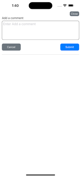
{toggleCommentInput ? <View>
<Input label='Add a comment' value={details}
onChangeText={(text) => setDetails(text)}
multiline numberOfLines={4}
style={styles.textArea} />
<View style={styles.buttonContainer}>
<Button variant='gray' title='Cancel'
onPress={() =>{ setToggleCommentInput(false); }}
width={100} />
<Button variant='blue' title='Submit'
onPress={() => {
setToggleCommentInput(false);
addComment();
}} width={100}
disabled={!details || loadingAddComment} />
</View>
</View> : null}
</View>
<View style={styles.line} />
{loadingGetComments ? <ActivityIndicator size='large' /> : null}
{errorGetComments ? <Message message={errorGetComments} variant='red' /> : null}
{/* Flatlist comes below here */}
{/* Flatlist comes above here*/}
</View>
In the code above, the Close button calls the setModalVisible function from SinglePost, effectively closing the whole comment modal when pressed. The Add a comment button sets the toggleCommentInput to true to display the comment TextInput field.
The other elements display the states of various API calls such as loading indicators and error or success messages.
When toggleCommentInput is set to true, we show a TextInput field and two buttons. One button hides the TextInput field while the other submits the comment.
Now, when you select Add a comment in the app, you should see an interface like the below:
Note that we also disabled the Submit button when the TextInput field is empty or after the user has already submitted their comment.
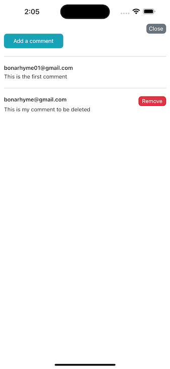
At this stage, we can submit comments, but we can’t view them yet. To set up this functionality, we will use a FlatList like so:
                  <FlatList
                    data={comments}
                    renderItem={({ item }) => <View>Item...</View>}
                    keyExtractor={(item) => item.id}
                    ItemSeparatorComponent={() => <View style={styles.line} />}
                    ListEmptyComponent={() => (
                    <Text>There are no comments available</Text>
                    )}
                />
Currently, the renderItem prop returns a placeholder View instead of the submitted comments. We can improve this by creating a new component in the components/Comment.tsx file:
// components/Comment.tsx

import { StyleSheet, Text, View } from 'react-native';
import React from 'react';
import { CommentType } from './CommentsModal';
import Button from './Button';
import { auth } from '../firebase';

type Props = {
    item: CommentType;
    deleteComment: (commentId: string, details: string) => void;
    loadingDeleteComments: boolean;
};
const Comment = ({ item, deleteComment, loadingDeleteComments }: Props) => {
    return (
        <View>
                <View style={{ flexDirection: 'row', justifyContent: 'space-between' }}>
                    <Text style={styles.email}>{item.author.email}</Text>
                    {auth && item?.author.id === auth.currentUser?.uid && <Button
                        variant='red' title='Remove'
                        onPress={() => { deleteComment(item?.id, item?.details?.slice(0, 40) + '...'); }}
                        width={70}
                        height={25}
                        paddingVertical={4} />}
                </View>
                <Text>{item.details}</Text>
        </View>
    );
};
export default Comment;
const styles = StyleSheet.create({
    email: {
        color: '#111111',
        fontWeight: '600',
        marginBottom: 5
    },
    details: {
    },
    centeredView: {
        flex: 1,
        justifyContent: 'center',
        alignItems: 'center',
        marginTop: 22,
    },
    modalView: {
        backgroundColor: 'white',
        borderRadius: 20,
        paddingVertical: 20,
        paddingHorizontal: 10,
        width: 200,
        shadowColor: '#000',
        shadowOffset: {
            width: 0,
            height: 2,
        },
        shadowOpacity: 0.25,
        shadowRadius: 4,
        elevation: 5,
    },
});
In the code above, we first define the prop types of the component, including a deleteComment callback that was defined earlier in the components/CommentsModal component.
After that, we return a View that renders the user’s email and a delete button. The delete button is shown only when the comment author matches the current user. Finally, our View displays the details of the comment.
At this point, we can use this new Comment component in our components/CommentsModal file by importing it and calling it inside the FlatList to replace the placeholder View.
Now, our components/CommentsModal file should look like this:
// components/CommentsModal.tsx

import { ActivityIndicator, Alert, FlatList, Platform, StyleSheet, Text, View } from 'react-native';
import React, { Dispatch, SetStateAction, useEffect, useState } from 'react';
import { Modal } from 'react-native';
import Button from './Button';
import { addDoc, collection, deleteDoc, doc, getDocs, query, where } from 'firebase/firestore';
import { auth, db } from '../firebase';
import Message from './Message';
import Input from './Input';
import Comment from './Comment';
export type CommentType = {
    id: string;
    details: string;
    post: {
        id: string;
    };
    author: {
        email: string;
        id: string;
    };
};
type Props = {
    modalVisible: boolean;
    setModalVisible: Dispatch<SetStateAction<boolean>>;
    postId: string;
    setCommentsTotal: Dispatch<SetStateAction<number>>;
};

const CommentsModal = ({ modalVisible, setModalVisible, setCommentsTotal, postId }: Props) => {
    const [details, setDetails] = useState<string>('');
    const [toggleCommentInput, setToggleCommentInput] = useState<boolean>(false);
    const [loadingAddComment, setLoadingAddComment] = useState<boolean>(false);
    const [successAddComment, setSuccessAddComment] = useState<boolean>(false);
    const [errorAddComment, setErrorAddComment] = useState<string>('');
    const [comments, setComments] = useState<CommentType[]>([]);
    const [loadingGetComments, setLoadingGetComments] = useState<boolean>(false);
    const [successGetComments, setSuccessGetComments] = useState<boolean>(false);
    const [errorGetComments, setErrorGetComments] = useState<string>('');
    const [loadingDeleteComments, setLoadingDeleteComments] = useState<boolean>(false);
    const [successDeleteComments, setSuccessDeleteComments] = useState<boolean>(false);
    const [errorDeleteComments, setErrorDeleteComments] = useState<string>('');

    const commentsCollection = collection(db, 'comments');
    const addComment = async () => {
        setLoadingAddComment(true);
        setErrorAddComment('');
        setSuccessAddComment(false);
        try {
            const commentItem = {
                details,
                post: {
                    id: postId
                },
                author: {
                    email: auth?.currentUser?.email,
                    id: auth?.currentUser?.uid,
                },
            };
            await addDoc(commentsCollection, commentItem);
            setSuccessAddComment(true);
            setDetails('');
        } catch (error: any) {
            setSuccessAddComment(false);
            setErrorAddComment(error?.message || "An error occured while adding comment");
        }
        setLoadingAddComment(false);
    };

    const getComments = async () => {
        setLoadingGetComments(true);
        setErrorGetComments('');
        setSuccessGetComments(false);
        try {
            const postDoc = query(commentsCollection, where("post.id", "==", postId));
            const data = await getDocs(postDoc);
            const itemsList: any = [];
            data.forEach((doc) => {
                itemsList.push({ ...doc.data(), id: doc.id });
            });
            setComments(itemsList);
            setSuccessGetComments(true);
            setCommentsTotal(itemsList?.length);
        } catch (error: any) {
            setSuccessGetComments(false);
            setErrorGetComments(error?.message || "An error occured while fetching comment");
        }
        setLoadingGetComments(false);
    };
    const deleteComment = async (commentId: string, details: string) => {
        Alert.alert('Delete Comment', details, [
            {
                text: 'Cancel',
                onPress: () => { },
                style: 'cancel',
            },
            {
                text: 'OK', onPress: async () => {
                    setLoadingDeleteComments(true);
                    setErrorDeleteComments('');
                    setSuccessDeleteComments(false);
                    try {
                        const postDoc = doc(db, 'comments', commentId);
                        await deleteDoc(postDoc);
                        setSuccessDeleteComments(true);
                    } catch (error: any) {
                        setSuccessDeleteComments(false);
                        setErrorDeleteComments(error?.message || "An error occured while deleting comment");
                    }
                    setLoadingDeleteComments(false);
                }
            },
        ]);


    };
    useEffect(() => {
        getComments();
    }, [successAddComment, successDeleteComments]);
    return (
        <Modal
            animationType="slide"
            transparent={true}
            visible={modalVisible}
            onRequestClose={() => {
                setModalVisible(!modalVisible);
            }}
        >
            <View style={styles.centeredView}>
                <View style={styles.commentInputContainer}>
                    <View style={{ alignItems: 'flex-end' }}>
                        <Button
                            variant='gray' title='Close'
                            onPress={() => { setModalVisible(!modalVisible); }} width={50} paddingVertical={4} />
                    </View>
                    {!toggleCommentInput ? <Button variant='info' title='Add a comment' onPress={() => setToggleCommentInput(true)} width={150} /> : null}
                    {loadingAddComment ? <ActivityIndicator size='large' /> : null}
                    {errorAddComment ? <Message message={errorAddComment} variant='red' /> : null}
                    {toggleCommentInput ? <View>
                        <Input label='Add a comment' value={details} onChangeText={(text) => setDetails(text)} multiline numberOfLines={4} style={styles.textArea} />
                        <View style={styles.buttonContainer}>
                            <Button variant='gray' title='Cancel' onPress={() => {
                                setToggleCommentInput(false);
                            }} width={100} />
                            <Button variant='blue' title='Submit' onPress={() => {
                                setToggleCommentInput(false);
                                addComment();
                            }} width={100} disabled={!details || loadingAddComment} />
                        </View>
                    </View> : null}
                </View>
                <View style={styles.line} />
                {loadingGetComments ? <ActivityIndicator size='large' /> : null}
                {errorGetComments ? <Message message={errorGetComments} variant='red' /> : null}
                <FlatList
                    data={comments}
                    renderItem={({ item }) => <Comment item={item} deleteComment={deleteComment} loadingDeleteComments={loadingDeleteComments} />}
                    keyExtractor={(item) => item.id}
                    ItemSeparatorComponent={() => <View style={styles.line} />}
                    ListEmptyComponent={() => <Text>There are no comments available</Text>}
                />
            </View>
        </Modal>
    );
};
export default CommentsModal;
const styles = StyleSheet.create({
    centeredView: {
        flex: 1,
        backgroundColor: 'white',
        padding: 10,
        marginTop: Platform.OS === 'ios' ? 50 : 20
    },
    commentInputContainer: {
    },
    textArea: {
        textAlignVertical: 'top',
        height: 100
    },
    buttonContainer: {
        flexDirection: 'row',
        justifyContent: 'space-between'
    },
    line: {
        borderWidth: 0.5,
        borderColor: '#bbbbbb',
        width: '100%',
        marginVertical: 20,
    },
});
With all of the above successfully implemented, our active comments modal should look like the below:
In this article, we learned a lot about React Native by exploring how to store posts on Firebase, store comments for those posts on Firebase, and then display everything in our React Native application. We also covered how to authenticate users with Firebase to enable users to add and delete comments and posts.
The complete source code for this project is available in this GitHub repository. I hope this article helped you better understand how to add comments functionality to a React Native app using Firebase and React Native to build a full-stack application on the fly.
Thanks for reading! Be sure to leave a comment if you have any questions. Happy coding!

LogRocket's Galileo AI watches sessions for you and and surfaces the technical and usability issues holding back your React Native apps.
LogRocket also helps you increase conversion rates and product usage by showing you exactly how users are interacting with your app. LogRocket's product analytics features surface the reasons why users don't complete a particular flow or don't adopt a new feature.
Start proactively monitoring your React Native apps — try LogRocket for free.
Would you be interested in joining LogRocket's developer community?
Join LogRocket’s Content Advisory Board. You’ll help inform the type of content we create and get access to exclusive meetups, social accreditation, and swag.
Sign up now
Discover how the Interface Segregation Principle (ISP) keeps your code lean, modular, and maintainable using real-world analogies and practical examples.

<selectedcontent> element improves dropdowns

Learn how to implement an advanced caching layer in a Node.js app using Valkey, a high-performance, Redis-compatible in-memory datastore.

Learn how to properly handle rejected promises in TypeScript using Angular, with tips for retry logic, typed results, and avoiding unhandled exceptions.

 Learn more →
