Modern smartphones typically come with touch screens instead of inbuilt physical keypads, and mobile operating systems offer various hand gesture features for using applications. For example, now, mobile apps support screen taps, long screen taps, drag and drop, and multi-touch-like hand gestures. Users can use almost all features in any generic app with simple finger touch events via buttons and other interactive UI elements.

React Native initially offered native platform-specific buttons and several touchable core components for handling basic user gestures. Later, the framework introduced the Pressable API for handling common user gestures.
In this article, we will discuss React Native’s touchable and pressable components, using examples to identify the advantages and limitations of each component type. Also, we will discuss when we need to use each component based on the UI/UX principles. Feel free to jump around this post, too, since we’ll be covering a lot:
TouchableOpacity componentTouchableHighlight componentTouchableWithoutFeedback componentTouchableNativeFeedback componentTouchableOpacity vs. TouchableHighlight vs. TouchableWithoutFeedback vs. TouchableNativeFeedbackIn React Native, we can use the Button component to handle basic touch events. The Button component renders a platform-specific, native button element on the screen, so it’s not customizable in a cross-platform way with various styles as View components. As a solution, React Native introduced touchable components to create custom-styled, cross-platform buttons.
Before discussing touchable components, let’s create a native button and identify its limitations.
First, create a new React Native project with the following command:
npx react-native init TouchableExample
cd TouchableExample
Next, add the following code to your App.js source file:
import React from 'react';
import {
  SafeAreaView,
  Button,
  StyleSheet,
  View,
} from 'react-native';

const App = () => {
  const onTap = () => {
    console.log('Button touched!');
  };
  return (
    <SafeAreaView style={styles.container}>
      <Button
        title="Default button"
        onPress={onTap}
      />
      <View style={styles.separator}/>
      <Button
        title="Default button (disabled)"
        disabled={true}
        onPress={onTap}
      />
      <View style={styles.separator}/>
      <Button
        title="Red button"
        color="red"
        onPress={onTap}
      />
    </SafeAreaView>
  );
};

const styles = StyleSheet.create({
  container: {
    flex: 1,
    justifyContent: 'center',
    marginHorizontal: 36,
  },
  separator: {
    height: 12
  }
});

export default App;
The above code snippet creates three native buttons:
Run the above code with the following commands:
npm start
# --- or ---
yarn start

npx react-native run-android
# --- or ---
npx react-native run-ios
You will see button elements with three different styles and a feedback animation based on your current mobile platform when you tap the active buttons. Look at the following preview shown on an Android device:
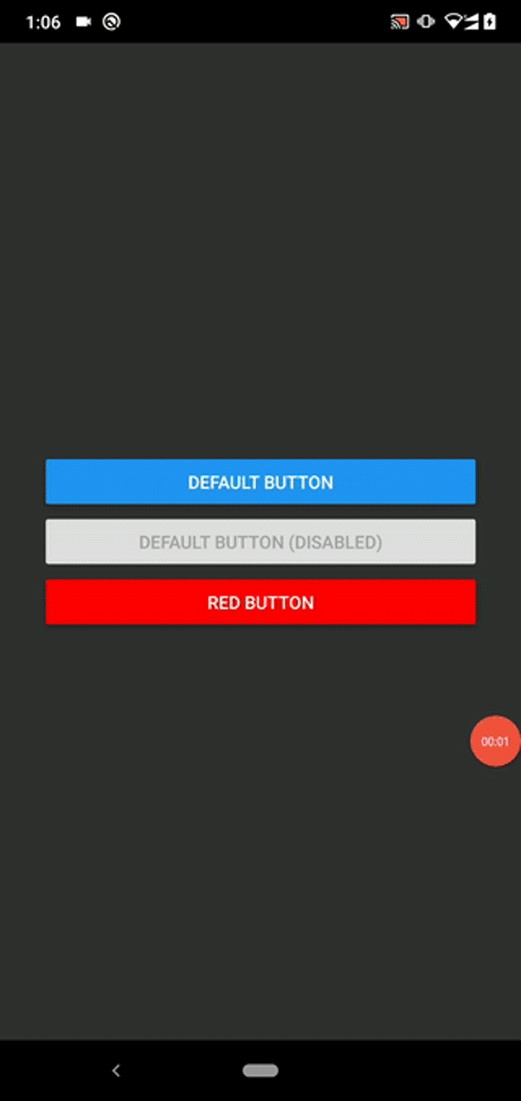
The color prop changes the background color of a particular button on Android and text color (a.k.a., the button foreground color) on iOS. The style prop is not available for Button, so we need to add a separator element or wrap it with a View to set the button margin accordingly.
As you can see, the Button component’s UI customization is limited to the color prop only, and buttons look different based on the mobile platform.
Therefore, React Native offers you touchable components to create customizable and cross-platform elements that users can touch.
TouchableOpacity componentTouchableOpacity is a core component that reduces the opacity level as the touch event feedback. It internally uses the Animated.View component to implement the opacity transition — then, you can use the style prop for styling, unlike the platform-specific Button component. It also supports child components , which allow you to build touchable images, custom buttons, and complex list items.
Add the following code to your App.js file to create some buttons with the TouchableOpacity component:
import React from 'react';
import {
  SafeAreaView,
  TouchableOpacity,
  StyleSheet,
  View,
  Text,
} from 'react-native';

const App = () => {
  const onTap = () => {
    console.log('Button touched!');
  };
  return (
    <SafeAreaView style={styles.container}>
      <TouchableOpacity
        style={[styles.button, { backgroundColor: '#ee2244' }]}
        onPress={onTap}>
        <Text>Red button</Text>
      </TouchableOpacity>
      <TouchableOpacity
        style={[styles.button, { backgroundColor: '#2277ee' }]}
        onPress={onTap}
        activeOpacity={0.6}>
        <Text>Blue button</Text>
      </TouchableOpacity>
      <TouchableOpacity
        style={[styles.button, { backgroundColor: '#22bb22' }]}
        onPress={onTap}
        activeOpacity={0.6}
        disabled={true}>
        <Text>Green button (disabled)</Text>
      </TouchableOpacity>
    </SafeAreaView>
  );
};

const styles = StyleSheet.create({
  container: {
    flex: 1,
    justifyContent: 'center',
    marginHorizontal: 36,
  },
  button: {
    padding: 12,
    marginBottom: 12
  }
});

export default App;
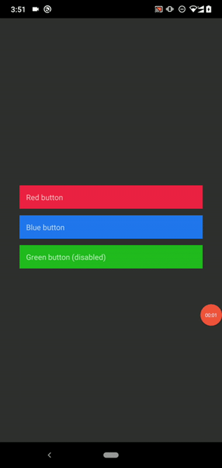
Here, we created three custom buttons by using the TouchableOpacity component as the base element. We can:
activeOpacity propdisabled propUnlike the platform-specific Button component, TouchableOpacity looks the same on all supported platforms.
Run the above source code and you will see the custom buttons, as shown below:
This component offers hitSlop and pressRetentionOffset to configure the touch action behavior and touch-sensitive region. These props have the following impacts:
hitSlop: Defines how far from the original button region the user’s touch action can startpressRetentionOffset: Defines how far the user needs to move their finger from the region to deactivate a pressed button. This offset value includes the hitSlop value, tooThe above props help you create smaller touchable elements in a user-friendly way, i.e., to add some interactive UI elements that render touchable regions smaller than a fingertip on the screen.
The following script implements a button that you can activate by touching 100px away from the top and bottom edges of the button, and 50px away from the left and right edges. Now, you don’t need to tap on top of the button region to activate it — but you will have to move your finger a bit further away to deactivate the pressed state compared to its default configuration:
<TouchableOpacity
    style={[styles.button, { backgroundColor: '#ee2244' }]}
    onPress={onTap}
    hitSlop={{top: 100, left: 50, right: 50, bottom: 100}}
    pressRetentionOffset={200}>
    <Text>Red button</Text>
</TouchableOpacity>
You can make any application UI section touchable with this component. For example, the following code snippet renders an image button:
import React from 'react';
import {
  SafeAreaView,
  TouchableOpacity,
  StyleSheet,
  Text,
  Image,
} from 'react-native';

const App = () => {
  const onTap = () => {
    console.log('Button touched!');
  };
  return (
    <SafeAreaView style={styles.container}>
      <TouchableOpacity
        style={[styles.button, { backgroundColor: '#2277ee' }]}
        onPress={onTap}>
        <Image
          style={styles.tinyLogo}
          source={{
            uri: 'https://reactnative.dev/img/tiny_logo.png',
          }}
        />
        <Text style={styles.buttonText}>Image button</Text>
      </TouchableOpacity>
    </SafeAreaView>
  );
};

const styles = StyleSheet.create({
  container: {
    flex: 1,
    justifyContent: 'center',
    marginHorizontal: 36,
  },
  button: {
    padding: 12,
    marginBottom: 12,
    flexDirection: 'row',
    borderRadius: 6
  },
  buttonText: {
    marginTop: 10,
    marginLeft: 20,
    fontSize: 20
  },
  tinyLogo: {
    width: 50,
    height: 50,
  },
});

export default App;
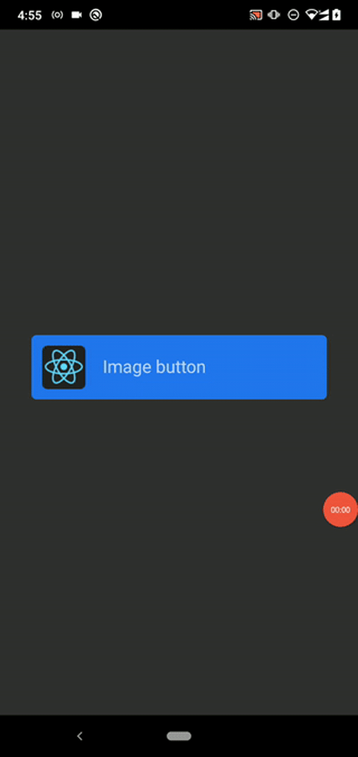
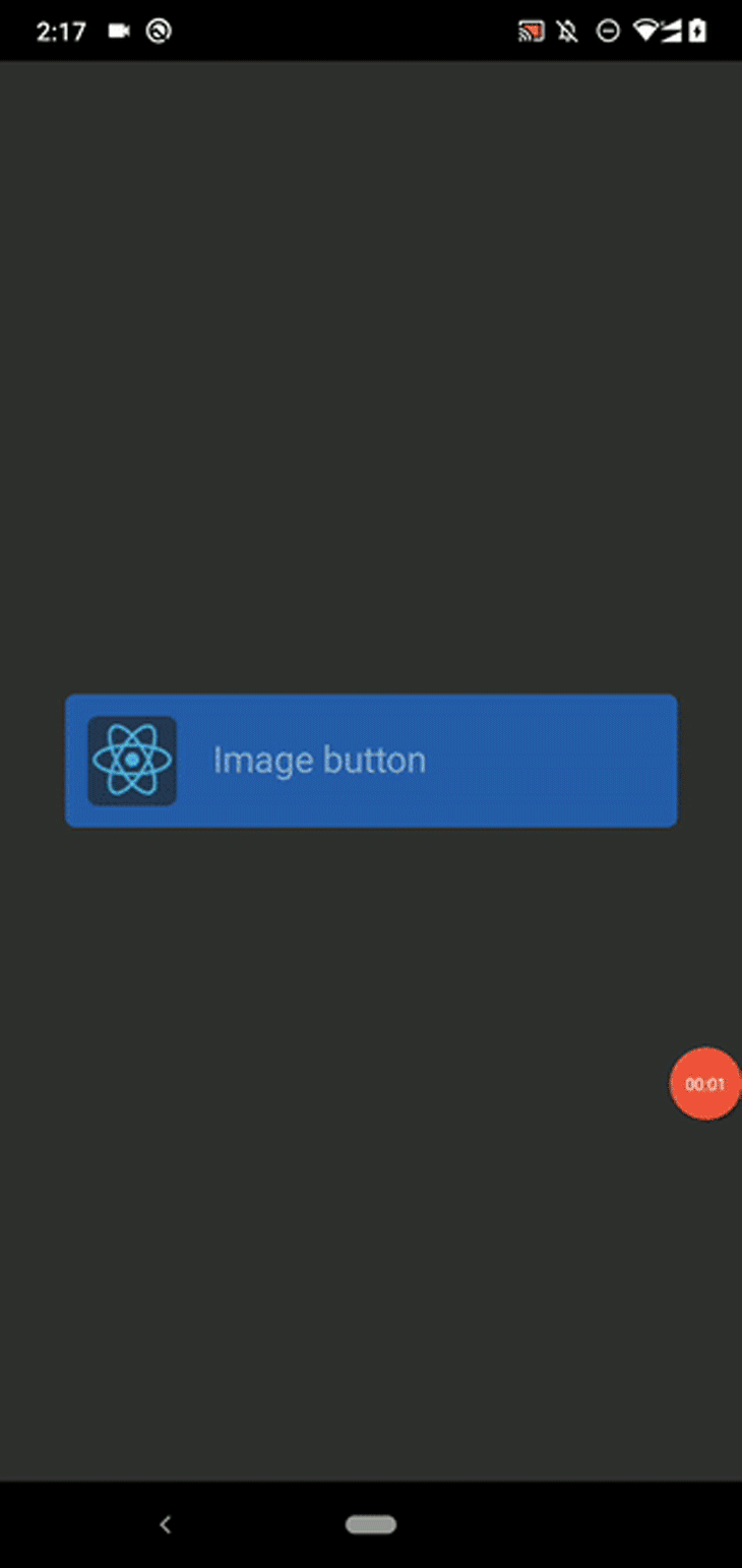
The above source code renders the following image button:
Most developers create modern list components with FlatList and TouchableOpacity. I described how to develop a touchable component-based ecommerce app in this article.
You can attach functions to various events in a particular touch event flow with the onPress, onPressIn, onPressOut, and onLongPress callbacks.
TouchableHighlight componentThe TouchableHighlight component lets you change the child View component’s background color during the button’s pressed state. You can’t put multiple child elements inside this component (because it seeks to change the underlying child component’s background color), but you can always add nested elements by wrapping them with a View. This component also accepts the style prop for applying View styles, similar to TouchableOpacity.
Let’s use the TouchableHighlight component in a code snippet to become more familiar with it. The following source code re-implements the image button we just built with the TouchableHighlight component:
import React from 'react';
import {
  SafeAreaView,
  TouchableHighlight,
  StyleSheet,
  Text,
  View,
  Image,
} from 'react-native';

const App = () => {
  const onTap = () => {
    console.log('Button touched!');
  };
  return (
    <SafeAreaView style={styles.container}>
      <TouchableHighlight
        style={[styles.button, { backgroundColor: '#2277ee' }]}
        activeOpacity={0.7}
        underlayColor="#30aaff"
        onPress={onTap}>
        <View style={styles.buttonContent}>
          <Image
            style={styles.tinyLogo}
            source={{
              uri: 'https://reactnative.dev/img/tiny_logo.png',
            }}
          />
          <Text style={styles.buttonText}>Image button</Text>
        </View>
      </TouchableHighlight>
    </SafeAreaView>
  );
};

const styles = StyleSheet.create({
  container: {
    flex: 1,
    justifyContent: 'center',
    marginHorizontal: 36,
  },
  button: {
    padding: 12,
    marginBottom: 12,
    borderRadius: 6
  },
  buttonContent: {
    flexDirection: 'row',
  },
  buttonText: {
    marginTop: 10,
    marginLeft: 20,
    fontSize: 20
  },
  tinyLogo: {
    width: 50,
    height: 50,
  },
});

export default App;
We change the default button’s pressed state color via the underlayColor prop , and then we can see the custom color as the touch event feedback. We can also change the underlying components’ opacity via the activeOpacity prop, like we did with the TouchableOpacity component.
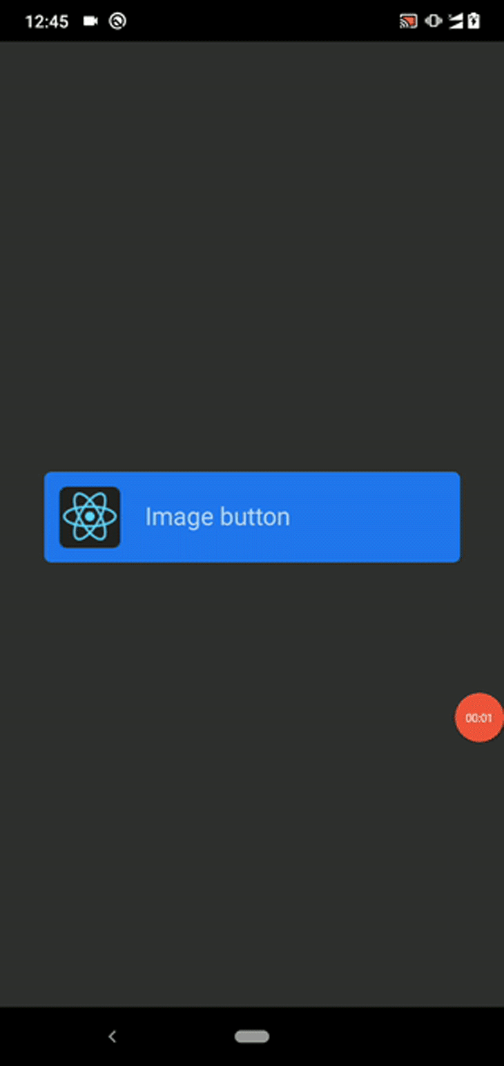
Look at the following preview of the image button:
You can subscribe to the background animation events via onShowUnderlay and onHideUnderlay callbacks.
TouchableWithoutFeedback componentThe TouchableOpacity and TouchableHighlight components can each inherit several shared props from the TouchableWithoutFeedback component definition. For example, disabled and onPress-like props came from the TouchableWithoutFeedback definition.
The TouchableWithoutFeedback component itself accepts user gestures but doesn’t display any feedback animation. Typically, user gestures show a feedback animation as a good UI/UX design practice, so TouchableWithoutFeedback is rarely helpful in practical use cases.
You can only attach one child element with this component, like the TouchableHighlight component, but you can always add nested elements by wrapping them with a View.
Look at the following example source code:
import React, { useState } from 'react';
import {
  SafeAreaView,
  TouchableWithoutFeedback,
  StyleSheet,
  Text,
  View,
} from 'react-native';

const App = () => {
  let [counter, setCounter] = useState(0);
  const onTap = () => {
    setCounter(counter + 1);
  };
  return (
    <SafeAreaView style={styles.container}>
      <TouchableWithoutFeedback
        onPress={onTap}>
        <View style={[styles.button, { backgroundColor: '#2277ee' }]}>
          <Text style={styles.buttonText}>Count ({ counter })</Text>
        </View>
      </TouchableWithoutFeedback>
    </SafeAreaView>
  );
};

const styles = StyleSheet.create({
  container: {
    flex: 1,
    justifyContent: 'center',
    marginHorizontal: 36,
  },
  button: {
    padding: 12,
    marginBottom: 12,
    borderRadius: 6
  },
  buttonText: {
    fontSize: 20,
    textAlign: 'center'
  },
});

export default App;
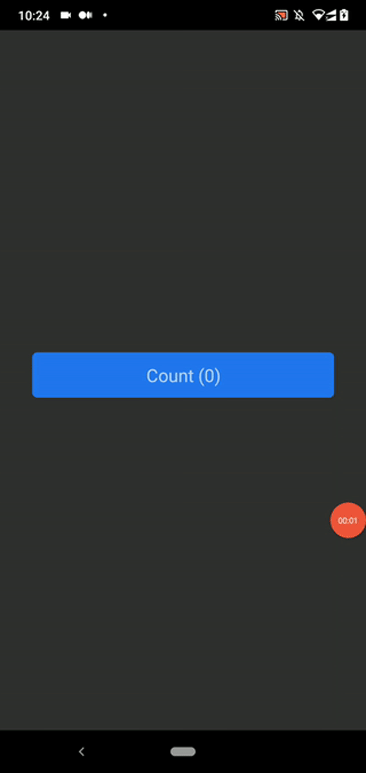
The above code snippet implements a simple counter app that increases its display value with every button tap event. Here, the counter value gets updated, but we can’t see a feedback animation.
Look at the following preview on Android:
TouchableNativeFeedback componentAs previously discussed, touchable components are cross-platform UI components, so you can implement a platform-independent UI section to capture user gestures. The TouchableNativeFeedback component is an Android-only component that helps us display the platform’s ripple effect.
Replace the previous code snippet’s imported TouchableWithoutFeedback core component with TouchableNativeFeedback, as shown below:
import {
  SafeAreaView,
  TouchableNativeFeedback, // Updated
  StyleSheet,
  Text,
  View,
} from 'react-native';
Next, add the following layout definition to the App component’s SafeAreaView:
<TouchableNativeFeedback
  onPress={onTap}>
  <View style={[styles.button, { backgroundColor: '#2277ee' }]}>
    <Text style={styles.buttonText}>Count ({ counter })</Text>
  </View>
</TouchableNativeFeedback>
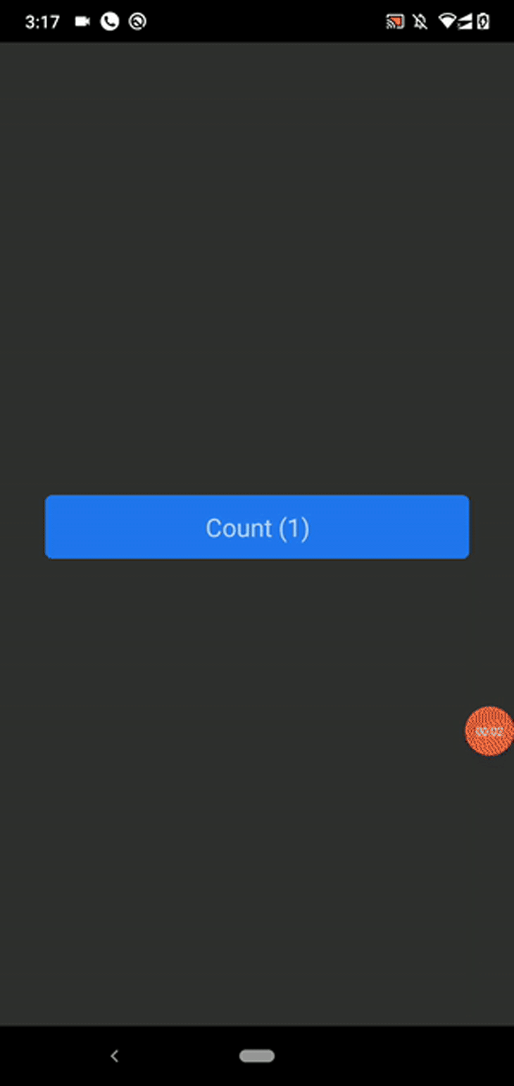
The above code produces the following button:
You can also customize the Android ripple effect with component props, as shown below:
<TouchableNativeFeedback
  onPress={onTap} background={TouchableNativeFeedback.Ripple('blue', false)}>
  <View style={[styles.button, { backgroundColor: '#2277ee' }]}>
    <Text style={styles.buttonText}>Count ({ counter })</Text>
  </View>
</TouchableNativeFeedback>
Now you will see a different ripple effect than the default one we saw earlier:

Check the Ripple static method documentation to learn more about all supported parameters.
TouchableOpacity vs. TouchableHighlight vs. TouchableWithoutFeedback vs. TouchableNativeFeedbackLook at the following table to see when to use each touchable component in your app:
| Touchable component name | TouchableOpacity | TouchableHighlight | TouchableWithoutFeedback | TouchableNativeFeedback |
|---|---|---|---|---|
| Function | Reduces the opacity when the user presses a specific touchable element | Changes the underlying View element’s background color when the user presses a specific touchable element | Doesn’t play UI animations when the user presses the element, but triggers event handlers | Plays the Android-specific ripple effect when the user presses the element |
| Platform compatibility | Works on both Android and iOS platforms | Works on both Android and iOS platforms | Works on both Android and iOS platforms | Works only on the Android platform |
| Support for child elements | Able to wrap multiple child elements without wrapping them in a View | Able to wrap only one child element, but adding nested elements is feasible by wrapping them in a View | Able to wrap only one child element , but adding nested elements is feasible by wrapping them in a View | Able to wrap only one child element , but adding nested elements is possible by wrapping them in a View |
| Appropriate use cases | Developers can use this component to create custom buttons, menu items, and list tiles | Use cases are the same as TouchableOpacity — the only difference is the feedback animation behavior. Many developers use this component for creating hyperlinks | Use cases are very rare — use only if you don’t need to show any button press feedback to the user | Suitable for any touchable component on the Android platform |
As discussed, React Native offers four different touchable components to handle basic user gestures. To introduce new effects, like a zoom effect, the React Native team needed to create another component. We were also unable to combine arbitrary animations for one touchable element when using pre-built touchable components, and had to stick to the particular, fixed feedback animation that came out of the box.
To address this, the React Native team introduced the Pressable component with the Pressability API in v0.63. If you use Expo, you’ll need to use Expo SDK 40 or a later version to access this API.
The React Native Pressability API doesn’t offer multiple inbuilt, animated components, as touchable components do — instead, it gives you one core component called Pressable. The Pressable component is flexible and lets app developers use any feedback animations they wish. We can recreate any pre-defined, touchable component behavior with Pressable.
Let’s create several buttons with different feedback animations to get started. I uploaded the example project source code to a GitHub repository, since it’s a bit large to add here directly.
Clone the repository with the following Git command and install dependencies:
git clone https://github.com/codezri/react-native-pressable-examples.git
cd react-native-pressable-examples

npm install
# --- or ---
yarn install
Now, run the sample application on your mobile phone or emulator:
npm start
# --- or ---
yarn start

npx react-native run-android
# --- or ---
npx react-native run-ios
You will see several buttons created with the Pressable component, as shown in the following preview:
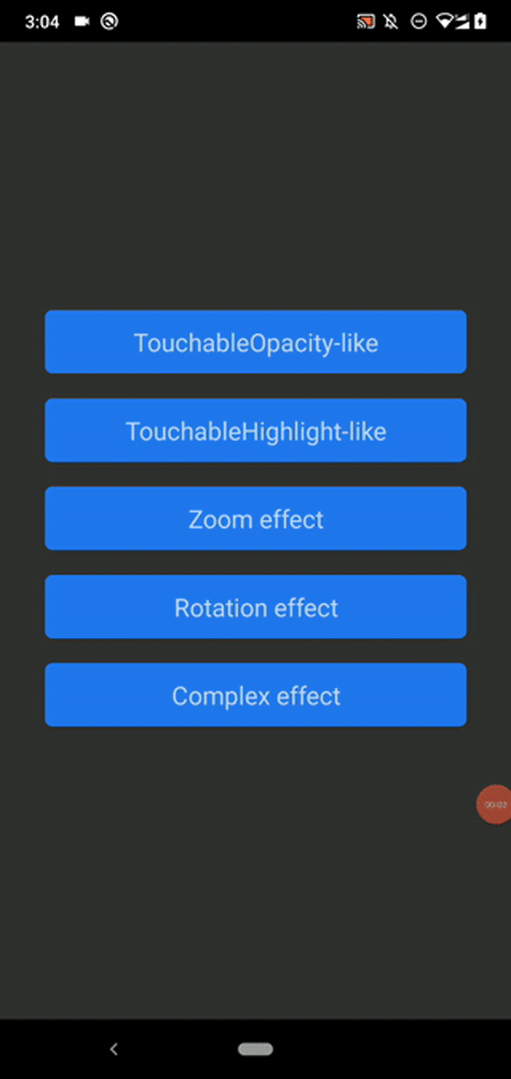
The first two buttons implement TouchableOpacity and TouchableHighlight-like components, respectively. The next three buttons implement various feedback effects with dynamic styles.
We can dynamically update any View style with the pressed state variable. For example, look how we change the element’s opacity value according to the pressable state:
const PressableOpacityButton = ({title, onTap}) => {
  return (
    <Pressable
      onPress={onTap}
      style={({ pressed }) => [
        {
          opacity: pressed
            ? 0.2
            : 1,
          backgroundColor: '#2277ee'
        },
        styles.button,
      ]}>
        <Text style={styles.buttonText}>{ title }</Text>
    </Pressable>
  );
}
We can also update child elements of the Pressable component based on the pressed state variable — check out the ComplexButton component source and see how we dynamically change the text color.
We created simple buttons for demonstration, but you can wrap any complex component with Pressable. Try to use Pressable in a complex app that is already developed with touchable components.
You can also enable the Android ripple effect by using the android_ripple prop as follows:
android_ripple={{color: 'white'}}
Try to create different pressable elements with unique feedback effects. You can use Pressable to create any interactive UI element as alternatives to inbuilt touchable components.
These feedback animations are not smooth, however, since we toggle styles based on the boolean pressable state, so we have to use the React Native Animations API to implement smooth feedback animations.
The good news is that a combination of the Pressability and Animation APIs can replace all existing touchable components in React Native!
For example, the following image button source changes its opacity smoothly when the user touches it:
import React from 'react';
import {
  SafeAreaView,
  Pressable,
  Animated,
  StyleSheet,
  Text,
  Image,
} from 'react-native';

const App = () => {
  const animated = new Animated.Value(1);
  const fadeIn = () => {
    Animated.timing(animated, {
      toValue: 0.4,
      duration: 150,
      useNativeDriver: true,
    }).start();
  };

  const fadeOut = () => {
    Animated.timing(animated, {
      toValue: 1,
      duration: 250,
      useNativeDriver: true,
    }).start();
  };
  return (
    <SafeAreaView style={styles.container}>
      <Pressable onPressIn={fadeIn} onPressOut={fadeOut}>
        <Animated.View
          style={[styles.button, { backgroundColor: '#2277ee', opacity: animated }]}>
          <Image
            style={styles.tinyLogo}
            source={{
              uri: 'https://reactnative.dev/img/tiny_logo.png',
            }}
          />
          <Text style={styles.buttonText}>Image button</Text>
        </Animated.View>
      </Pressable>
    </SafeAreaView>
  );
};

const styles = StyleSheet.create({
  container: {
    flex: 1,
    justifyContent: 'center',
    marginHorizontal: 36,
  },
  button: {
    padding: 12,
    marginBottom: 12,
    flexDirection: 'row',
    borderRadius: 6
  },
  buttonText: {
    marginTop: 10,
    marginLeft: 20,
    fontSize: 20
  },
  tinyLogo: {
    width: 50,
    height: 50,
  },
});

export default App;
Once you run the above code, you will see the following image button:
The above component behaves the same as the inbuilt TouchableOpacity component.
Pressable components also support hitSlop and pressRetentionOffset for customizing the accepted user gesture, and onPress, onPressIn, onPressOut, and onLongPress for subscribing to gesture lifecycle events.
Some React Native developers will mention that the Pressability API came as an improved replacement for the existing touchable components, while others believe that the Pressability API is a result of refactoring in the React Native codebase.
Check out the following comparison table to find the suitable component type for your app:
| Touchable | Pressable |
|---|---|
| Comes with inbuilt feedback animations: Opacity change Background color change The ripple effect (Android only) |
Doesn’t offer any inbuilt feedback animations; the developer has to implement feedback effects |
| Offers touchable features via four core components | Offers Pressability API features via one core component called Pressable |
| Effect customization is limited, but satisfies primary developer requirements | Very flexible and customizable because there are no inbuilt feedback animations |
| Some animations are smooth and attractive (i.e., TouchableOpacity opacity transition) | The developer needs to use the Animations API to implement smooth animations; if not, animations become instantaneous and traditional |
| Suitable for implementing interactive elements that require simple feedback effects, like opacity change and background change | Suitable for implementing interactive elements that require unique effects and animations. Developers can also use the Pressability API to implement UI kits and wrapper libraries thanks to extensive customization support. Libraries are available with inbuilt feedback animations, i.e., react-native-pressable-opacity |
Almost all React Native applications use touchable components to implement custom buttons, interactive lists, and tile-like generic UI elements. Also, popular UI toolkits like NativeBase use touchable components internally as building blocks for UI elements. Therefore, the React Native team may not deprecate touchable components any time soon.
However, they do recommend developers use the Pressability API when building new applications because it offers a better standard for handling user gestures, as they mentioned in their official blog:
We expect that most people will build and share components utilizing
Pressableunder the hood instead of relying on the default experience of something likeTouchableOpacity. — React Native v0.63 announcement
It’s undoubtedly a good idea to try the flexible Pressability API to build interactive UI elements in new apps. The core touchable components now use the Pressability API internally, so migration to the Pressability API is not compulsory — until, of course, we receive a React Native stable version that deprecates inbuilt touchable components.
We discussed and practically explored both touchable and pressable components in React Native. Both component types offer solutions for implementing interactive UI elements that respond to user gestures.
Showing feedback effects for a user gesture is known as a good UI/UX practice. For example, if we change a particular menu item’s color for the pressed state, users know that the app accepted the most recent user gesture. Therefore, every app typically shows feedback animations for interactive UI elements.
But overusing feedback animations reduces your app’s quality, so don’t use too many animations or colorful effects for user gestures . A minimal feedback animation that’s in line with your application’s theme will keep your app’s look professional.
Touchable components come with pre-built feedback animations with limited customization options — so you can use them more quickly, but you will face issues with customization. Meanwhile, the Pressability API lets you build feedback animations as you wish, so you have full freedom to implement feedback effects even though it takes some effort to implement. If you use a UI kit like NativeBase, you don’t need to use both component types directly — since UI kits typically come with a pre-defined gesture feedback system.

LogRocket's Galileo AI watches sessions for you and and surfaces the technical and usability issues holding back your React Native apps.
LogRocket also helps you increase conversion rates and product usage by showing you exactly how users are interacting with your app. LogRocket's product analytics features surface the reasons why users don't complete a particular flow or don't adopt a new feature.
Start proactively monitoring your React Native apps — try LogRocket for free.

A guide for using JWT authentication to prevent basic security issues while understanding the shortcomings of JWTs.

Discover how to build, render, and automate product demo videos with Remotion, replacing traditional screen recordings with reusable React code.

Chrome’s Modern Web Guidance embeds modern web platform skills into AI coding agents, helping them choose native HTML, CSS, and browser APIs over legacy patterns.

Learn how to use Fallow to analyze AI-generated code, detect dead code, duplicate logic, and complexity issues, and integrate automated code quality checks into your AI-assisted development workflow.
Hey there, want to help make our blog better?
Join LogRocket’s Content Advisory Board. You’ll help inform the type of content we create and get access to exclusive meetups, social accreditation, and swag.
Sign up now

 Learn more →
