Consider a situation where you want to retrieve a user’s login credentials. For this use case, it would be appropriate to have a component that allows the client to enter text data in your app.

This is where React Native’s TextInput component comes in. Apart from strings, we can even customize it to accept passwords and numbers.
In this article, you will learn the basics of React Native’s TextInput component. Later on, we will also tailor its properties according to our needs.
This will be the outcome of this guide:
To materialize an app with Expo, run the following terminal command:
expo init textinput-tutorial
Within your project directory, install the react-native-paper dependency like so:
npm install react-native-paper
The following code snippet renders a basic text box:
import { StyleSheet, Text, View, TextInput } from "react-native";
export default function App() {
  return (
    <View style={styles.container}>
      <TextInput style={styles.input} />
    </View>
  );
}
const styles = StyleSheet.create({
   input: {
    backgroundColor: "white"
  },
//...
});
You can make your element look even better like so:
const styles = StyleSheet.create({
  input: {
    borderColor: "gray",
    width: "100%",
    borderWidth: 1,
    borderRadius: 10,
    padding: 10,
  },
});
In the piece of code above, we styled the text box’s border and gave it some padding. Furthermore, we used the borderRadius property. This tells React to add rounded borders.
It definitely looks more attractive now!
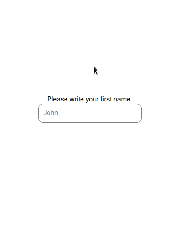
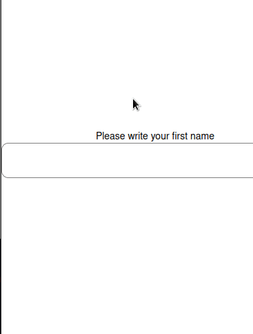
Adding a placeholder is useful when you want to provide hints and instructions to help the user fill in data.
To do so, use the placeholder prop:
<TextInput style={styles.input} placeholder="John" />
The TextInput component can also accept multi-line text. This can be useful for cases like acquiring user feedback:
<TextInput style={styles.input} multiline={true} />
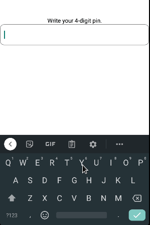
Want to restrict the user’s input length? This can be possible with the maxLength prop:
<TextInput style={styles.input} maxLength={4} />
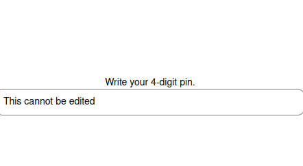
You can block input to your element using the editable prop:
<TextInput
  style={styles.input}
  editable={false}
  value="This cannot be edited"
/>
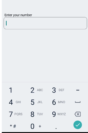
Consider a circumstance where you’re asking for the client’s phone number. Here, it would be sensible to show the numerical keyboard instead of the default one.
To change keyboard types, use keyboardType like so:
<TextInput style={styles.input} keyboardType="phone-pad"/>
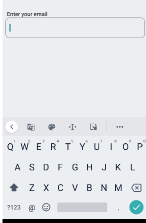
To get the user’s email address, the appropriate keyboardType woud be email-address :
<TextInput style={styles.input} keyboardType="email-address"/>
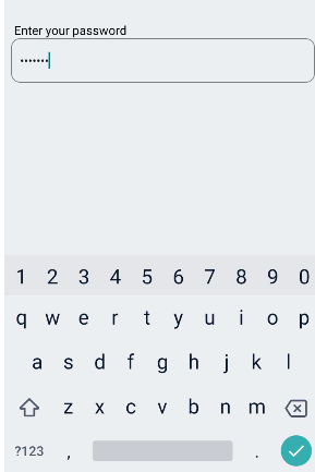
When it comes to passwords, we can customize our text field so that the entered data is obscured. To achieve this, we will use the secureTextEntry property like so:
<TextInput style={styles.input} secureTextEntry={true}/>
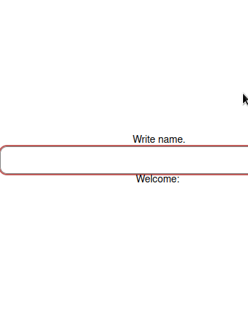
Let’s say you have a text box that functions as a search bar. In such a circumstance, you would want to capture the data every time the input’s value changes.
You can achieve this via the onChangeText prop. It is a callback that runs whenever the text field detects a change:
export default function App() {
  const [name, setName] = useState("");
  return (
    <View style={styles.container}>
      <Text>Write name.</Text>
      <TextInput
        style={styles.input}
        placeholder="John Doe"
        onChangeText={(value) => setName(value)}
      />
      <Text>Welcome: {name}</Text>
    </View>
  );
}
In this code, we told React Native to update the name Hook to the value of TextInput . In the end, we displayed the value of the name variable.
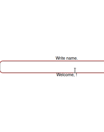
Consider a situation where you have a form and want to save data only if the user submits the form.
To make this possible, you can use the onSubmitEditing callback:
export default function App() {
  const [name, setName] = useState("");
  return (
    <View style={styles.container}>
      <Text>Write name.</Text>
      <TextInput
        style={styles.input}
        onSubmitEditing={(value) => setName(value.nativeEvent.text)}
      />
      <Text>Welcome, {name}!</Text>
    </View>
  );
}
In the above piece of code, React Native updates the name Hook variable to the input value if the user presses the return key.
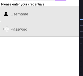
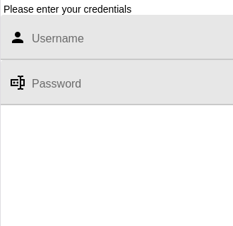
The React Native library allows us to display icons on any side of the text box. This will make your interface look more modern.
The following code snippet renders a graphic with the text field:
import { TextInput } from "react-native-paper";
//extra code removed...
return (
  <View>
    <Text> Please enter your credentials</Text>
    <TextInput label="Username" left={<TextInput.Icon name="account" />} />
    <TextInput
      label="Password"
      secureTextEntry
      left={<TextInput.Icon name="form-textbox-password" />}
    />
  </View>
);
The left property tells React Native to display the desired icon on the left.
This will be the output:
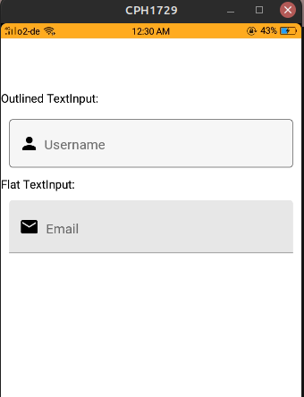
React Native Paper provides two design modes which help in theming:
flat: Creates a flat text input with an underline under the written text.outlined: Generates a TextInput component with an outline around it:<View>
<Text>Outlined TextInput:</Text>
<TextInput
label="Username"
left={<TextInput.Icon name="account" />}
mode="outlined"
style={{ margin: 10 }}
/>
<Text>Flat TextInput:</Text>
<TextInput
label="Email"
left={<TextInput.Icon name="email" />}
mode="flat"
style={{ margin: 10 }}
/>
</View>
Here, we created two TextInput instances. One of them has an outlined mode, and the latter uses a flat mode.
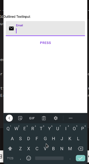
The library also provides an error prop that decorates our TextInput with error styling. This is great for situations where the app has to notify the user if their input is incorrect:
const [userError, setUserError] = useState(false);
return (
  <View>
    <TextInput
      label="Email"
      left={<TextInput.Icon name="email" />}
      style={{ margin: 10 }}
      error={userError} //the error prop will depend on our userError Hook
    />
    {/*If the user presses this button, the userError Hook's value will reset.*/}
    <Button onPress={() => setUserError((value) => !value)}>Press</Button>
    <StatusBar />
  </View>
);
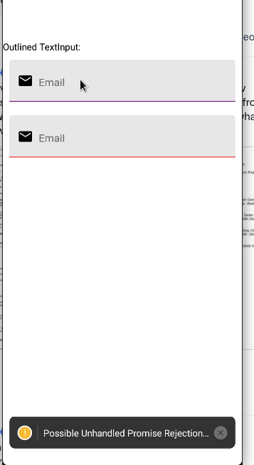
The activeUnderlineColor and inactiveUnderlineColor props modify the color of our input. This is great for enhancing the appearance and theming of your app:
<View>
  <Text style={{ paddingTop: 80 }}>Outlined TextInput:</Text>
  <TextInput
    label="Email"
    left={<TextInput.Icon name="email" />}
    style={{ margin: 10 }}
    activeUnderlineColor="green" //when this TextInput is active, change its accent color to green
    underlineColor="purple" //when inactive, set color to purple
  />
  <TextInput
    label="Email"
    left={<TextInput.Icon name="email" />}
    style={{ margin: 10 }}
    activeUnderlineColor="yellow"
    underlineColor="red"
  />
</View>
In this guide, you learned how to use and record TextInput in the React Native library. In my own apps, I use React Native Paper because it looks good on all platforms out of the box.
Thank you so much for reading!

LogRocket's Galileo AI watches sessions for you and and surfaces the technical and usability issues holding back your React Native apps.
LogRocket also helps you increase conversion rates and product usage by showing you exactly how users are interacting with your app. LogRocket's product analytics features surface the reasons why users don't complete a particular flow or don't adopt a new feature.
Start proactively monitoring your React Native apps — try LogRocket for free.
Would you be interested in joining LogRocket's developer community?
Join LogRocket’s Content Advisory Board. You’ll help inform the type of content we create and get access to exclusive meetups, social accreditation, and swag.
Sign up now
Not sure if low-code is right for your next project? This guide breaks down when to use it, when to avoid it, and how to make the right call.

Compare Firebase Studio, Lovable, and Replit for AI-powered app building. Find the best tool for your project needs.

Discover how to use Gemini CLI, Google’s new open-source AI agent that brings Gemini directly to your terminal.

This article explores several proven patterns for writing safer, cleaner, and more readable code in React and TypeScript.

 Learn more →

One Reply to "A complete guide to TextInput in React Native"
Unable to see icons inside paper textinput using right prop. Only space is created but nothing is shown. Any solution.