
Compare the top AI development tools and models of July 2026. View updated rankings, feature breakdowns, and find the best fit for you.

New from LogRocket: Galileo AI now spots your highest-impact bugs and dispatches them to AI agents in Cursor, Claude Code, or Codex to fix.

The LogRocket MCP connects your AI agents to Galileo AI. Detect issues, diagnose root causes, and ship fixes from Claude, Cursor, Codex, or your own agent.

A deep dive into May 2026’s AI model and tool rankings. We break down performance, usability, pricing, and real-world capabilities across 50+ features to help you pick the right tools for your development workflow.

Why the future of DX might come from the web platform itself, not more tools or frameworks.
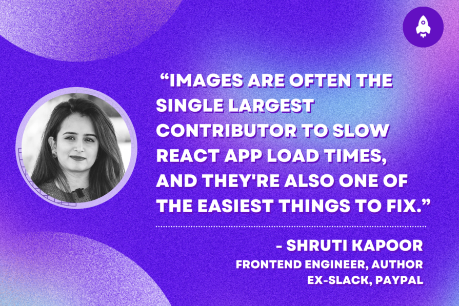
This post walks through a complete six-step image optimization strategy for React apps, demonstrating how the right combination of compression, CDN delivery, modern formats, and caching can slash LCP from 8.8 seconds to just 1.22 seconds.

Explore the core principles of GUI design and learn how consistency, simplicity, feedback, accessibility, and user testing contribute to better digital experiences.

Learn how to use Fallow to analyze AI-generated code, detect dead code, duplicate logic, and complexity issues, and integrate automated code quality checks into your AI-assisted development workflow.

After five years in UX, I revisited the Daily UI challenge to reconnect with hands-on design. Along the way, I learned that great interfaces come from thoughtful briefs, sound judgment, and user feedback, not just better AI tools.

Learn what makes a great login screen through real-world examples and UX best practices for creating secure, accessible, and low-friction authentication flows.
Learn how to protect full-stack projects from NPM supply chain attacks with a practical security checklist.

Explore 15 essential MCP servers for web developers to enhance AI workflows with tools, data, and automation.

Learn when streaks improve retention, when they create fragile engagement, and how PMs can design healthier systems around user progress.

Skeuomorphism helped define early digital interfaces by mimicking real-world objects to make technology more intuitive. Learn how it compares with flat design and neumorphism, why it declined, and where it still has a place in modern UX.

Learn how contrast-color() automatically picks accessible text colors using native CSS, without JavaScript.

Learn how to build a harness-style AI workflow using Claude Code with specialized Dev, QE, and Ops subagents, gated handoffs, MCP telemetry, and LEARNING.md.

A technical debt register brings transparency and clarity as to what type and how much debt you have and can be used to monitor and review your debt ratio.

AI has made polished, confident content easy to generate, but that does not make it trustworthy. This article explains how UX teams can design stronger quality signals using source transparency, validation, confidence communication, and reputation.