Web accessibility (a11y) isn’t an easy topic. For years, I’ve listened to conference talks about this important subject, identified with its importance, but somehow never managed to get started. In contrast to let’s say, Australian developers (due to the Disability Discrimination Act), I haven’t been forced to incorporate a11y into my projects since I work for a German employer with European customers.
That changed last year when I became aware that the German a11y act would be enforced for B2C websites and mobile apps at the end of June 2025. Suddenly, we couldn’t ignore a11y anymore; legal compliance became a business imperative. I’m not proud to admit it, but this legal pressure was the catalyst I needed to finally dive deep into a11y.
What followed was an eye-opening journey. In an ongoing project, trying to improve a11y as an afterthought proved hard and inefficient — much like when responsive design emerged and we had to completely rethink our approach to layout and development.
The real breakthrough came when I started using a screen reader (SR) myself. A SR is a tool that reads out loud the text and descriptions displayed on a computer or phone screen so users with visual impairments are able to utilize the software. I also began learning about practical a11y topics like focus management and keyboard navigation. Adding SR usage and a11y tools to my development workflow helped me gradually incorporate working a11y patterns into my daily development and improve the overall project a11y over time.
This article is aimed at anyone who doesn’t yet have extensive practical experience of designing for accessibility.
The Replay is a weekly newsletter for dev and engineering leaders.
Delivered once a week, it's your curated guide to the most important conversations around frontend dev, emerging AI tools, and the state of modern software.
What does a11y mean, by the way?
The abbreviation comes from the word “accessibility” — there are 11 letters between the “a” and “y”. (Now you can impress your friends at parties with this thrilling piece of web development trivia, can’t you?)
All users benefit from a good a11y design, as the curb cut effect says. Good a11y means designing and developing websites that can be used by everyone, including people with disabilities. At its core, a11y ensures that people with visual, auditory, motor, or cognitive disabilities can perceive, understand, navigate, and interact with web content. This includes users who rely on SR, keyboard navigation, voice control, or other AT.
The Web Content Accessibility Guidelines (WCAG) provide the international standard for web accessibility. Developed by the W3C Web Accessibility Initiative (WAI) as part of of the World Wide Web Consortium (W3C), WCAG offers concrete guidelines organized around four principles:
The current standard is WCAG 2.2, with WCAG 3.0 in development. These guidelines form the basis for accessibility laws worldwide, including the European Accessibility Act that’s driving the German law mentioned earlier.
The biggest lesson learned for me? a11y is like responsive design; it works best when built in from the start, not retrofitted later. When you design components with multiple interaction modes in mind right from the beginning, a11y feels natural. When you try to add it afterward, it feels like fighting the system.
In my personal experience, it can be very tedious to make a component usable for assistive technology (AT) users after it has been initially implemented. In the worst case, it means throwing away a lot of code and re-implementing parts again.
This article shares what I’ve learned about building accessible websites:
Initially, I didn’t have a complete picture of what real a11y means. In my vague imagination, I thought that the main task was to use mainly ARIA attributes. But I was wrong.
The biggest challenge isn’t technical; it’s recognizing that there are multiple, equally valid ways to use web interfaces. Moving from mouse-first thinking to inclusive design fundamentally changes how you approach every development decision.
WCAG compliance is a baseline, not a goal. Technical a11y and real usability are different things. Focus on creating efficient, understandable experiences for people using AT.
In the past, I designed websites in the belief that every user uses a mouse. Far from it, because people with impairments are dependent on the keyboard.
Every UI component must work across multiple interaction modes. When I design the main navigation now, I consider:
This multi-dimensional thinking changes fundamental design decisions, from the DOM structure, to understandable content to the visual hierarchy. It does add another layer of complexity to the development process, but it’s a win for all types of users.
Every interactive component needs keyboard navigation and focus management built in from the start. This includes:
Focus tells a user what the active element is. Focus indication is also picked up by SR, as it’s not only a visual cue.
The WCAG principle is clear: focus order must preserve meaning and operability. When the sequence of focusable elements doesn’t match the logical order for completing tasks, users become disoriented. This is especially critical for complex interfaces where visual layout might not reflect the intended interaction flow.
It’s important to understand that focus management targets interactive elements only. We will see focusing techniques like tabindex later, but you shouldn’t overdo it. Focusing none-interactive elements might lead to a productivity killer for keyboard users due to many tab stops.
From an SR point of view, this is not even required, since they have implicit functionality to navigate text content.
Make sure that focus is not lost in SPAs in the absence of page reloads. This would be a huge barrier for users relying on keyboard navigation. Even when the page is perfectly usable with mouse input, you need to ensure correct focus management with concepts like ARIA live regions.
In a past project of mine, we used JavaScript to dynamically position the main navigation. This had the side effect that the component was last in the focus order. This is confusing to keyboard users since the component was not presented in a logical manner within the content flow.
It’s important to understand that you have two kinds of keyboard users : sighted keyboard users and SR users. The former interact with the visual presentation, while the latter follow the programmatically determined reading order.
Keyboard navigation for sighted users means using mainly the Tab and Shift+Tab keys to move between interactive elements like links, buttons, and form controls, with visual focus indicators highlighting the currently selected element.
SR navigation provides many more controls and capabilities. Users can navigate to all content (headings, paragraphs, images, etc.), jump between different content types using specialized commands, and access detailed information about page structure and element properties. Importantly, SR don’t always move visual focus when navigating content, allowing users to explore the page without triggering focus events or visual highlighting.
A well-designed focus order serves both groups by ensuring that:
If the sequence feels confusing or illogical, it likely violates WCAG success criterion “focus order”.
It sometimes makes sense to add a different affordance for users relying to SR:
Users with disabilities reveal gaps that no automated a11y tool catches. Observing test sessions shows you the difference between technical compliance and actual usability.
Each type of user navigates web pages differently, often using specialized AT that developers rarely experience firsthand. Users who are blind might navigate primarily by headings and landmarks using SR, while users with motor disabilities may rely on keyboard navigation. Users with low vision or color vision deficiencies might use screen magnification software or high contrast modes that change how they perceive and interact with interfaces.
As developers, we typically don’t have personal experience with all these diverse navigation strategies and the unique barriers each group encounters. Thus, observing real users reveals universal knowledge about navigation patterns and workarounds.
However, the most important thing is that you learn about pain points or blockers that a user faces while navigating your web application.
The most accessible products come from teams where members understand that accessibility is a team effort.
It’s crucial that everyone understands their role since accessible solutions are not possible if everyone doesn’t pull their weight.
Using an SR should become part of your daily development workflow, not just an afterthought during testing. A SR reveals accessibility issues that visual inspection and automated tools miss entirely.
If possible, your development team should test with SR available for Windows, macOS/iOS, and Android. They handle web content differently: what works perfectly in VoiceOver (VO) on iOS might have issues in NVDA, similar to browser compatibility differences.
Of course, it is not an easy task to cover all SR by a developer, especially if there is no access to different devices. One option could be to distribute responsibilities for different devices to different team members, especially if the project context allows developers to use their private devices for testing. But using at least one SR greatly improves overall a11y.
Here are free SR options for different platforms. For Windows and Android, many more options are available:
As an example, if you want to get started with VO, Apple provides an excellent built-in tutorial. Go to System Preferences > Accessibility > VoiceOver > Open VoiceOver Training. This interactive tutorial teaches essential navigation patterns and introduces you to concepts unique to SR usage.
Understanding how SR works is crucial for building accessible interfaces. This section focuses on VO on macOS since it’s since I work with it on a daily basis. While other SR like NVDA and TalkBack have different naming conventions and additional features, the core navigation concepts remain remarkably similar across platforms.
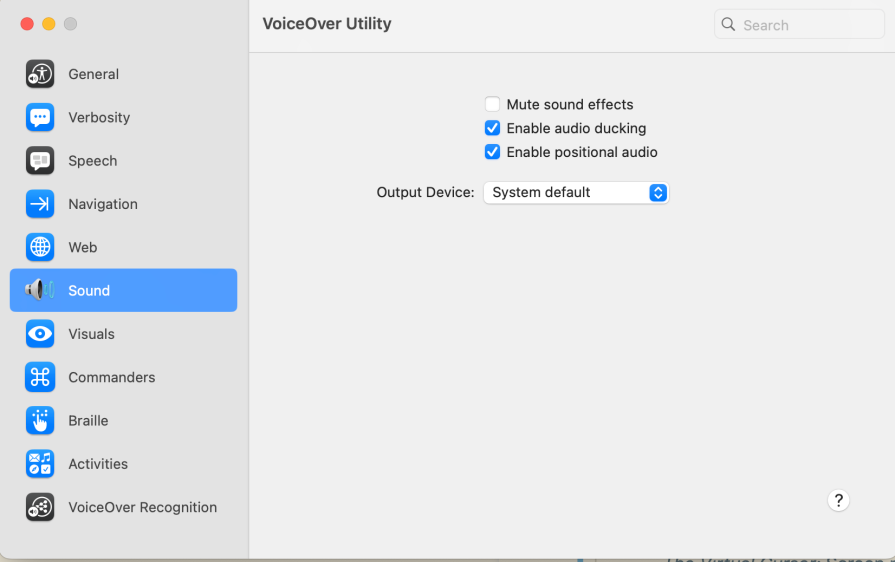
You can activate VO with Cmd+F5. If you have no corresponding impairments, while debugging your project you can mute VO’s voice output in VoiceOver utility and just use the textual announcements:
As you learn from Apple’s tutorial, there is a VO modifier key that is part of keyboard commands. In my case, it’s Caps Lock. In the following, I will use the abbreviation VO instead.
Unlike sighted users who scan visually, SR users have two distinct modes of interaction. They can either listen to content being read sequentially or actively navigate by jumping between specific elements like headings, links, or form controls.
Screen readers create a virtual representation of your page content that users can explore without moving the browser’s visual focus. This means users can “look around” your interface without triggering focus events or hover states. They’re essentially browsing a linearized version of your content.
The most powerful feature for developers to understand is how users jump between similar elements. VO users can quickly navigate between elements like all headings (VO+Cmd+H) or all links (VO+Cmd+L). This is why proper semantic markup matters: it creates these navigation shortcuts automatically.
The rotor menu (VO+U) acts like a content filter, showing all elements of a specific type on your page. It’s invaluable for developers because it reveals exactly what screen reader users see when they navigate your interface:
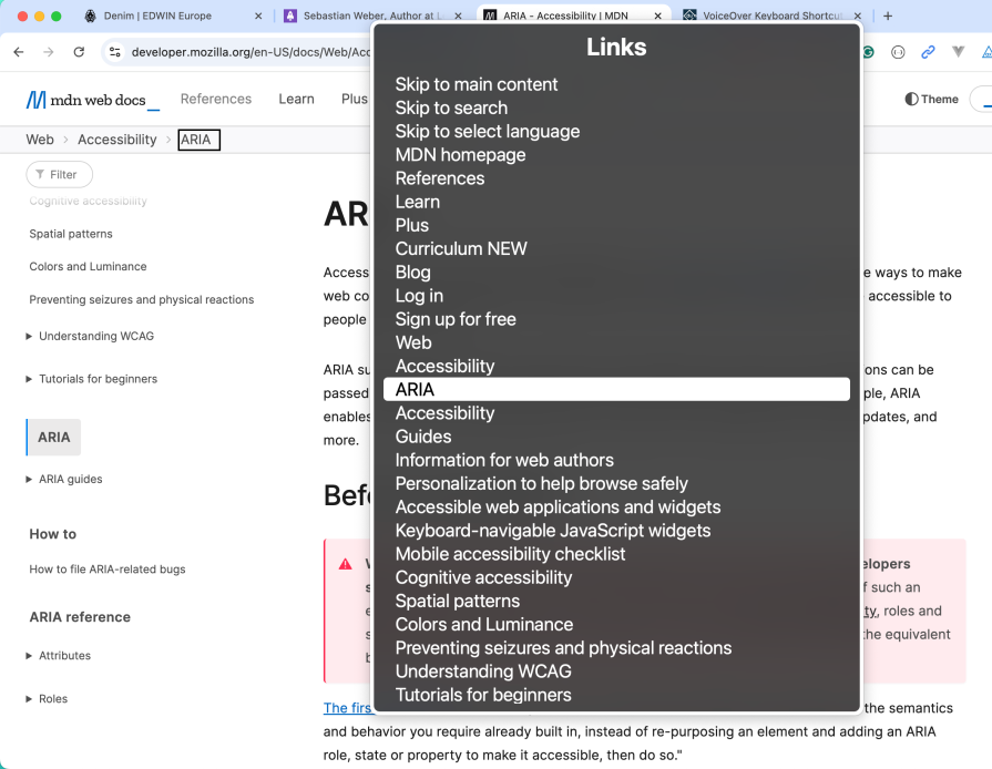
The rotor shows separate lists for headings, links, landmarks, form controls, and more. You can switch between them with the left key and the right key.
If your links don’t make sense when listed together in the rotor, they won’t make sense to SR users either. The SR also announces when it’s at the beginning or the end of a group, e.g., a <header>section.
SR automatically recognizes semantic HTML landmarks, allowing users to jump directly between major page sections. You’ll also find a list called “Landmarks” in rotor for that. This is why using <main>, <nav>, <aside>, and proper <header>/<footer> elements matters: they create a navigable page structure.
This distinction trips up many developers: the SR cursor and browser focus are independent. Users can explore content with the SR cursor (VO+left key and VO + right key) without moving visual focus, then use VO+Space to activate elements when needed.
This means users might “read” a button without focusing it visually. Of course, some SR users also use Tab like sighted keyboard users.
Understanding these concepts transforms how you approach interface design. An SR should be part of your daily tool belt as natural as your browser’s dev tools. When you know how actual users interact with your components and navigate through your page, you naturally create better semantic markup, more descriptive content, and overall a better experience for every user.
This YouTube video gives an overview of the concepts I described above.
This section deals with my preferred a11y tools complementing the SR usage.
Axe Core is an open-source accessibility testing engine that automatically detects accessibility violations in web applications. Axe catches common accessibility issues like missing alt text, or improper ARIA usage.
It’s the foundation for many accessibility testing tools. As an example, browser extensions (e.g., Chrome) can be utilized for manual accessibility testing. Axe really comes into its own when it is used for automatic testing by IDE integration (e.g., VSCode Axe Linter), or through CI/CD workflows (e.g., Cypress Axe).
Linting performs a static code analysis for potential issues and enforces coding standards directly in your development environment as you write code. While there isn’t a single library-agnostic ESLint plugin for accessibility, each major framework has dedicated accessibility linting options that integrate with the Axe Core engine mentioned above, e.g.:
@axe-core/react provides comprehensive accessibility rules for React componentseslint-plugin-vuejs-accessibility offers Vue-specific accessibility linting rulesThese plugins catch the above-mentioned issues as you write code, providing immediate feedback in your IDE. Use @axe-core/cli directly in your build process or testing pipeline when no specific ESLint plugin exists for your tech stack.
The Silktide browser extension offers comprehensive a11y testing directly in your browser. Unlike basic compliance checkers, Silktide provides detailed insights into how real users with disabilities experience your website. It highlights issues with clear explanations and prioritizes fixes based on their impact on user experience.
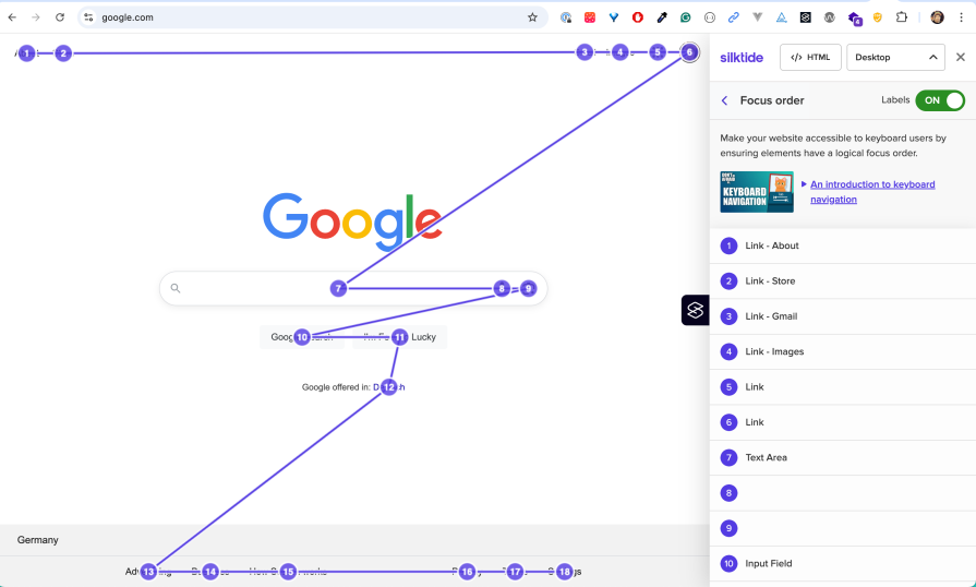
I find a visualization of the focus order very handy:
Another helpful feature is showing the headlines on a page:
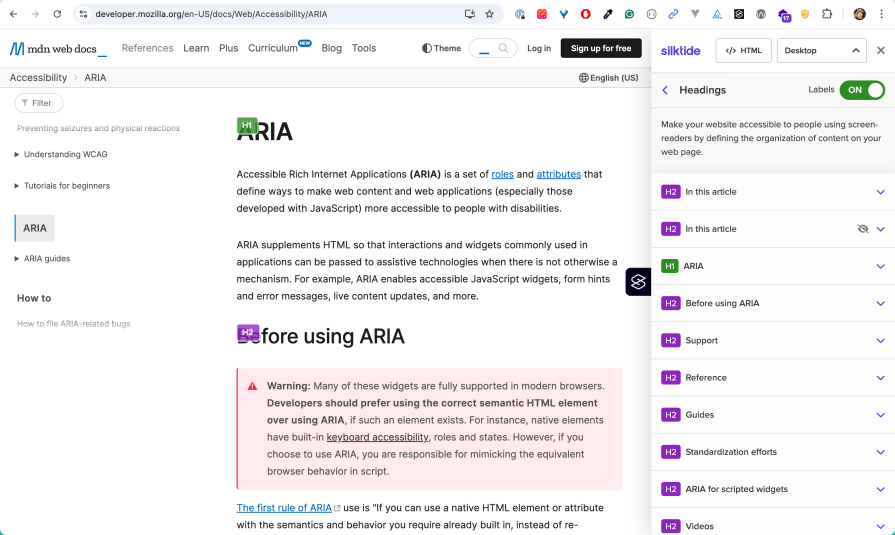
Wrongly nested headlines can occur, especially when components can be placed dynamically on a page through a content management system (CMS).
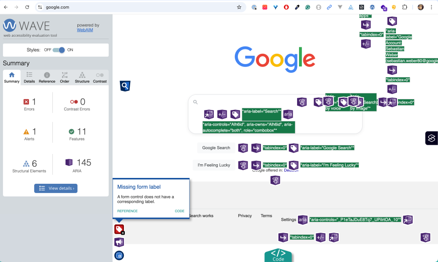
The WAVE (Web Accessibility Evaluation Tool) browser extension serves as an alternative to Silktide with a different approach to accessibility testing. While Silktide focuses on user experience insights and impact prioritization, WAVE excels at providing immediate visual feedback by injecting accessibility information directly into the page structure:
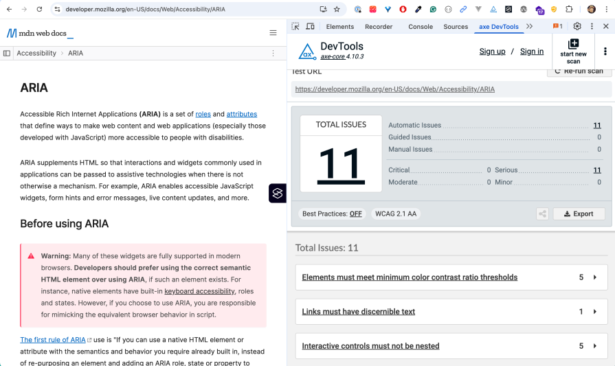
In addition, WAVE integrates into Chrome’s DevTools:
WAVE is particularly useful for quickly identifying structural issues like improper heading hierarchy, missing form labels, and color contrast problems at a glance, making it ideal for developers who prefer in-context visual debugging over separate reporting interfaces.
Chrome’s built-in Accessibility devTools provide powerful debugging capabilities for a11y issues. One main feature is the accessibility tree, which is a representation of the visual DOM tree in a way useful to AT:
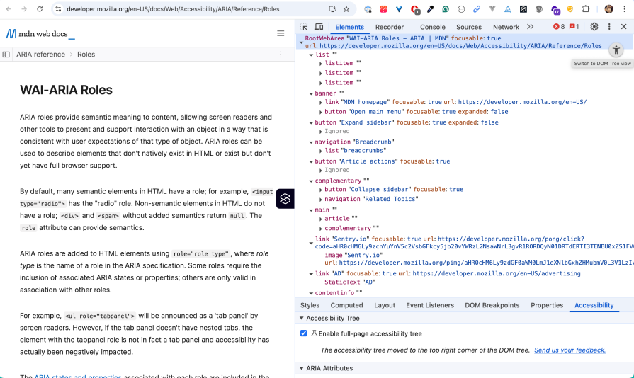
This tutorial nicely introduces how to identify bugs with Lighthouse automatically and with a SR manually. You’ll also learn how to fix them with the help of the devTools, including the Accessibility Tree.
Automate as much as possible a11y testing to get feedback as early as possible in development. Sooner or later, working features will break due to side effects. The important thing is to find out early, not by actual users on the live site.
There are many tools out there. A typical approach is to perform static code analysis at development time with linters and runtime checks:
Two popular choices are Lighthouse and WebPageTest, which also perform a11y audits. Lighthouse is directly embedded into Chrome’s devTools. WebPageTest has the advantage that it runs audits on real devices:
Remember, automated tools catch only a fraction of a11y issues. The rest requires regular human testing. That’s why it’s important to use SR and a11y tools on a daily basis while developing features.
This section introduces the fundamental a11y concepts and best practices that help create inclusive, robust, and user-friendly web experiences.
HTML and ARIA (Accessible Rich Internet Applications) constitute the technical foundation to convert content into accessible formats that AT understands, like SR or Braille.
ARIA provides a set of attributes that communicate semantic information like role and state to AT. It does this by utilizing the browser’s accessibility APIs. The context is exposed in the form of the aforementioned Accessibility Tree. These concepts give meaning to the content, not just structure or styling.
However, you might need less ARIA than you think. Proper HTML elements come with a11y features out of the box. ARIA is supplemental, i.e., it’s designed to fill gaps when no suitable native HTML element exists.
Most a11y issues can be solved with the right HTML element, since custom ARIA implementations are error-prone in terms of incorrect or missing features.
Let’s look at an extreme case. Ben Myers offers a hands-on walkthrough of what it takes to turn a generic <div> into an accessible button. His article clearly shows how much work it is to reengineer the “button contract” of the native <button> element and how much you gain for free by just using it:
tabindex="0")role="button")You clearly see why this is an anti-pattern and why you should use existing HTML elements. You should also use the right element for the job. In fact, learning a11y makes you a better web developer. Understanding the difference between buttons and links is crucial to designing accessible websites; this knowledge has always been important, not only because of a11y.
Semantic HTML elements like <header> or <nav> come with built-in a11y features: keyboard support, focus management, and meaningful ARIA roles that AT understands automatically.
When HTML5 introduced semantic elements, it made much of the ARIA code that developers previously needed obsolete. Each semantic element automatically provides the same a11y information that used to require explicit ARIA attributes:
<!-- Old approach: divs with ARIA roles (pre-HTML5) -->
<div role="banner">
  <h1>My Website</h1>
  <div role="navigation">
    <a href="/home">Home</a>
    <a href="/about">About</a>
  </div>
</div>

<!-- HTML5 semantic elements -->
<header>
  <h1>My Website</h1>
  <nav>
    <a href="/home">Home</a>
    <a href="/about">About</a>
  </nav>
</header>
The following non-exhaustive list gives an overview of semantic elements:
<button> elements are automatically focusable, keyboard accessible (Enter/Space activation), and announced as “button” to SR<a href="..."> provides keyboard navigation (Enter activation) and announced as “link” with destination<h1> through <h6> create a navigable document outline that SR users can jump through quickly<p>, <ul>, <ol> provide meaningful content structure with context announcements<nav> landmarks help users skip directly to navigation sections (role=”navigation”)<main> identifies the primary content area, allowing users to bypass headers and sidebars (role=”main”)<aside> creates sidebar regions (role=”complementary”)<label> elements create programmatic relationships with form controls, enabling SR to announce field purposes<fieldset> and <legend> group related form controls with clear descriptionsFor a complete reference of semantic HTML elements and their accessibility features, see the MDN HTML element reference.
As a rule of thumb, use semantic HTML first, ARIA second. This is backed by the first rule of ARIA:
If you can use a native HTML element or attribute with the semantics and behavior you require already built in, instead of re-purposing an element and adding an ARIA role, state or property to make it accessible, then do so.
While ARIA is powerful, it should be used strategically, not as a replacement for semantic HTML. The key concept to understand is that ARIA attributes only change how AT interprets elements: they don’t add keyboard behavior, focus management, or visual styling.
If you want to “reinvent the wheel” by using a <div> with ARIA to replicate a native UI element, the challenge is to mimic the equivalent browser behavior. There are situations where you need to do this, as the next section shows.
While semantic HTML should be your first choice, there are legitimate cases where ARIA is necessary to create accessible interfaces. These situations typically arise when you need UI components that don’t have semantic HTML equivalents.
Take a tab list component as a perfect example. There’s no native HTML element for it. Such an UI element requires:
This is where ARIA becomes essential. A properly implemented tabs component uses roles like tablist, tab, and tabpanel, along with properties like aria-selected and aria-controls to create the semantic relationships that assistive technology needs.
The W3C ARIA Authoring Practices Guide provides a comprehensive tabs example that demonstrates the complete implementation with all necessary ARIA attributes, keyboard handling, and focus management:
See the Pen
W3C APG tab demo by Sebastian Weber (@doppelmutzi)
on CodePen.
Similar situations arise with other complex widgets that lack HTML equivalents:
role="button", aria-expanded, aria-controls)role="menu", role="menuitem")aria-sort, aria-describedby)aria-live, aria-atomic)Use ARIA when semantic HTML can’t express the interface semantics you need. But remember: ARIA only changes the accessibility tree — you still need to implement all the expected behaviors (keyboard navigation, focus management, visual styling) with JS and CSS.
When you do use ARIA, follow established patterns from the W3C ARIA Authoring Practices Guide rather than inventing your own approaches. These patterns have been tested with real AT users and represent best practices for accessible implementation.
Live region attributes constitute an important concept for interactive pages. As an example, aria-live marks a region whose content changes should be announced to SR. Users will hear important dynamic updates — cart totals, validation errors, or status messages — without the browser stealing keyboard focus and getting the user lost.
HTML alone has no standardized way to signal or announce such runtime changes to AT, so aria-live fills that gap, as you will see later in the demo section.
Use <span> and <div> sparingly since they are generic containers that provide no meaning to SR. Instead, choose semantic elements that describe the content’s purpose and structure.
The browser support for HTML accessibility is pretty good nowadays. a11y-related HTML features are grouping elements (like <article>), text-level semantics (like <time>), media elements (like <video>), form controls (like input types), and properties (like hidden). These elements and properties provide contextual context to AT.
Using semantic elements, markup order, and correct nesting are crucial for creating a logical content flow that mirrors how users consume content naturally. SR follows the document order, so the sequence of elements in your HTML directly impacts the user experience.
Using correct hierarchical structures by nesting HTML elements improves the content structure and, thereby, adds to a better a11y.
As a straightforward example, use the correct headline levels. This is important, since SR users navigate by headings using keyboard shortcuts. Proper hierarchy creates a logical document outline that helps users understand content structure and jump to relevant sections quickly:
<!-- Bad Example - Incorrect heading hierarchy -->
 <article>
  <h1>Main Article Title</h1>
  <!-- BAD: Skips h2 and h3 -->
  <h4>First Section</h4>
  <!-- BAD: Multiple h1s -->
  <h1>Another Title</h1>
</article>

<!-- Good Example - Correct heading hierarchy -->
 <article>
  <h1>Main Article Title</h1>
  <h2>First Section</h2>
  <h3>Subsection</h3>
</article>
Of course, it’s hard to know how to use and nest every available HTML element. You can consult the HTML element reference and navigate to a specific element. All element reference pages are structured the same way. They provide the subsections’ usage notes and accessibility.
The example of main reveals:
main ARIA roleLandmarks provide crucial structural context that helps SR users understand and navigate page content efficiently. They act as a roadmap, allowing users to jump directly to specific content sections without having to navigate through every element sequentially. Landmarks mirror how sighted users visually scan pages. AT translates landmarks into navigable regions that users can access through keyboard shortcuts or rotor menus.
Modern HTML provides several semantic elements that automatically create landmark regions:
<header>– Page or section header content<nav>– Navigation links<main>– Primary page content<aside>– Sidebar or supplementary content<footer> – Page or section footer<section> – Distinct content section<form> – Form regionThere exists another option to create landmarks that was more important in the past (in the days of Internet Explorer),namely with ARIA landmark roles:
Don’t add ARIA landmark roles to HTML landmark elements that already provide the same meaning to avoid redundancy. Instead, prefer HTML landmarks since browser support is very good.
Let’s look at a practical example: Header vs. Banner.
The <header> element and role="banner" serve similar purposes but have different usage rules. Use the header element as a direct child of the body element for page headers (only once per page). Use the banner role when you need header functionality but can’t use the header element due to nesting constraints (e.g., when nested inside a main element or other sectioning elements):
<!-- Preferred: HTML header as direct child of body -->
<body>
  <header>
    <h1>Site Title</h1>
    <nav>...</nav>
  </header>
  <main>...</main>
</body>

<!-- Use banner role when HTML constraints require it -->
<main>
  <div role="banner">
    <h1>Article Title</h1>
  </div>
  <article>...</article>
</main>
Consult MDN documentation (e.g., header vs banner) for proper nesting rules and best practices when in doubt.
Not everything visual should be accessible to SR, but you need to understand the difference between decorative and informative content. Hide decorative images and visual elements that don’t add meaning, but preserve structural information that helps users understand the interface.
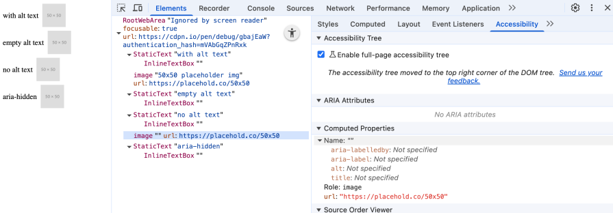
Decorative images can easily hidden with alt="", so SR don’t announce it. That’s crucial if the image does not add any context to the user.
This simple Codepen shows different variants of using alt attributes and how the accessibility tree displays it:
See the Pen
Ignored by screen reader by Sebastian Weber (@doppelmutzi)
on CodePen.
As the screenshot reveals, omitting an alt attribute still shows the image. Instead, use alt="" if you really want to ignore the image:
Other visual elements can also be hidden if they are not designed to be used by SR users. One example is an image carousel that can be hidden from SR by aria-hidden="true". In such a case, a more appropriate keyboard-focused component could be used.
Of course, this approach also has disadvantages. The use of multiple components has a negative impact on performance. It’s preferable to use a single component that is suitable for SR users and sighted users.
Adding meaningful context with alt texts of images is no easy task. A rule of thumb is to write alt texts like you’re reading the page to someone over the phone.
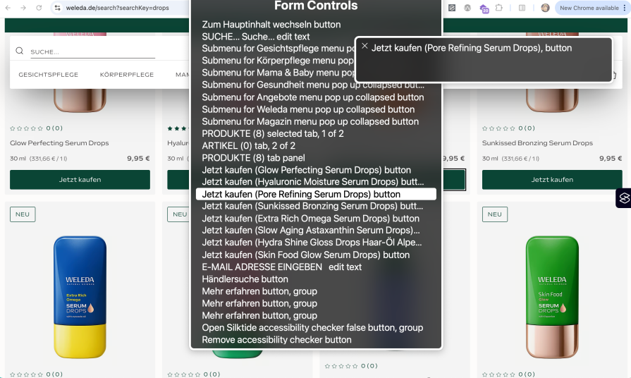
As we already know, an SR provides the possibility to jump to structural elements, such as headlines, links, or landmarks. If you are on a search result page of an online shop with many product cards, it could be useful to add even more context to the redundant “add to cart” button labels.
The following screenshot shows the macOS rotor menu of a German online shop (weleda.de) that enriches the call-to-action buttons (“Jetzt kaufen” / “buy now“) with the actual product name to give more context:
You can also enrich generic regions when you use <section> elements with contextual information with aria-label or aria-labelledby to improve the landmark menu. As always, you have to weigh up whether this information is useful or even disadvantageous due to redundant information.
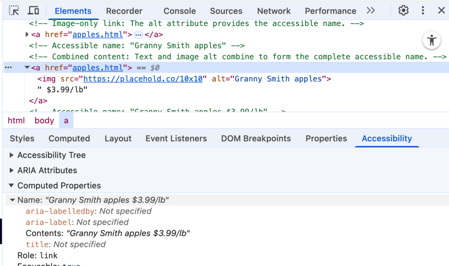
Every interactive element on your page has an accessible name — the text that SR announces to identify that element. Understanding how accessible names are computed is crucial for creating interfaces that make sense to AT users.
The accessible name for an element can come from several sources, applied in a specific order of precedence:
alt attribute for images, title attributesfor/id relationshipsaria-label or aria-labelledby (highest precedence)The next CodePen showcases a couple of examples to understand how accessible names are derived:
See the Pen
How accessible names are derived by Sebastian Weber (@doppelmutzi)
on CodePen.
When you want to debug an accessible name, Chrome devTool’s Accessibility tab exposes it with computed properties:
In the following, I present solutions to common accessibility-related problems.
In this section you learn about:
Using the example of a modal dialog, we will look at different ways of managing focus order adequately. The goal is to restrict focus only to the interactive elements inside of the dialog content, when the dialog is active.
We need to make sure to establish a focus trap, i.e., we need to focus the first interactive element again after the user presses Tab on the last interactive element:
See the Pen
Focus management by Sebastian Weber (@doppelmutzi)
on CodePen.
The CodePen provides a broken implementation and three different working versions: with a native dialog element, with a rather JS-heavy approach using the focus() method, and with the new inert attribute.
Inside every dialog, I display which interactive element is currently focused. A simple document.activeElement is all it takes to get the focused element.
The broken dialog shows that the user can “navigate in the background”, so the focus management is not restricted to the dialog. The implementation with <dialog> requires no extra work to get correct focus management working. In addition, pressing Esc closes the dialog automatically without providing any event handlers. This approach is preferable if you do not need to support Internet Explorer.
If it’s not possible to utilize <dialog>, you can use the focus() method, which is less performant. The first challenge is to define different CSS selectors to target interactive elements inside the dialog. You’ll find different implementations when you search for them.
One issue with the solution presented in the example is that it also picks up disabled buttons, which shouldn’t be the case:
// ===== Custom dialog (focus method) =====

/* ... */

let focusableSelectors = 'a, button, input, textarea, select, [tabindex]:not([tabindex="-1"])';
let focusableElements = [];
let firstFocusable, lastFocusable;

openCustomFocusBtn.addEventListener("click", () => {
  customDialogFocus.hidden = false;
  focusableElements = Array.from(customDialogFocus.querySelectorAll(focusableSelectors));
  firstFocusable = focusableElements[0];
  lastFocusable = focusableElements[focusableElements.length - 1];
  firstFocusable.focus();
});
The code finds and stores the first and last interactive elements of the dialog content when the dialog is opened. It focuses on the first interactive element.
In contrast to the <dialog> approach, we need to implement the keyboard handling on our own. The code makes sure that pressing Tab on the last interactive element focuses the first one and pressing Shift+Tab on the first interactive element focuses the last one:
customDialogFocus.addEventListener("keydown", e => {
  if (e.key !== "Tab" || focusableElements.length === 0) return;

  if (e.shiftKey) {
    if (document.activeElement === firstFocusable) {
      e.preventDefault();
      lastFocusable.focus();
    }
  } else {
    if (document.activeElement === lastFocusable) {
      e.preventDefault();
      firstFocusable.focus();
    }
  }
});
This has less to do with focus management, but more with the effort required to implement a dialog. In contrast to using the <dialog> element, in all other custom approaches we need to use ARIA to make SR aware that this component constitutes a modal dialog (role="dialog", aria-modal="true"):
<!-- Custom dialog (focus method) -->
<div id="custom-dialog-focus"
      role="dialog"
      aria-modal="true"
      aria-labelledby="custom-dialog-title-focus"
      hidden>
  <!-- ... -->
</div>
The variant using inert requires a different DOM structure. The custom dialog needs to be outside of the page content, which is part of the <main> element:
<main id="content-container">
  <!-- ... -->
</main>
<div id="custom-dialog-inert"
     role="dialog"
     aria-modal="true"
     aria-labelledby="custom-dialog-title-inert"
     hidden>
  <!-- ... -->
</div>
This makes it possible to mark the whole DOM tree with <main id="content-container"> as root as inactive, i.e., not clickable and not focusable by adding the inert attribute, when the dialog is opened:
// ===== Custom dialog (inert) =====
/* ... */
  const contentContainer = document.getElementById("content-container");

openCustomInertBtn.addEventListener("click", (event) => {
  const triggerElement = event.currentTarget;
  customDialogInert.hidden = false;
  contentContainer.setAttribute("inert", "");
  // store ID of element (button) that opens this dialog
  customDialogInert.dataset.triggerId = triggerElement.id;
});
The next snippet shows that the inert attribute gets removed when the dialog is closed (contentContainer.removeAttribute("inert")).
The rest of the code implements two additional accessibility features that are without extra effort available with the dialog component: closing the dialog by pressing the Esc key and focusing the interactive element on dialog close that originally opened it (i.e., the button with the label “Open custom modal dialog (fixed with inert)”):
function closeCustomInert() {
  customDialogInert.hidden = true;
  // make the page content active again
  contentContainer.removeAttribute("inert");

  // determine the HTML element that originally opened the dialog (ID was stored above) and focus it
  const triggerId = customDialogInert.dataset.triggerId;
  if (triggerId) {
    const triggerEl = document.getElementById(triggerId);
    if (triggerEl) triggerEl.focus();
    delete customDialogInert.dataset.triggerId;
  }
}

// handle close button click / activation
closeCustomInertBtn.addEventListener("click", closeCustomInert);

// ESC key listener
document.addEventListener("keydown", (event) => {
  if (!customDialogInert.hidden && event.key === "Escape") {
    event.preventDefault(); // prevent scrolling etc.
    closeCustomInert();
  }
});
Using tabindex is also a possible solution. It requires event listening and a lot of DOM tree traversing, which makes it cumbersome and error-prone.
Basically, you have to dynamically add and remove tabindex="0" (add an element to the focus order) and tabindex="-1" (remove an element from the focus order) to HTML elements on your page.
To me, the approaches shown above are preferable. However, if you want to find out more about this approach, consult this tabindex guide.
In this section, you’ll learn how to:
A product teaser leading to a product detail page is used in every online shop. The underlying card component pattern is the subject of this section:
See the Pen
accessible card component by Sebastian Weber (@doppelmutzi)
on CodePen.
The left card in the example has a couple of issues from an accessibility perspective. The image has an empty alt attribute that’s ignored by SR. Alternatively, an aria-hidden="true" can be used. This might be ok if the shop owner cannot provide meaningful image descriptions on a product card. Usually, the details visible on the pack shot are listed as structural data in extracts on the card and completed in the detail page.
As you can see, the accessibility tree confirms that the image is skipped for AT:
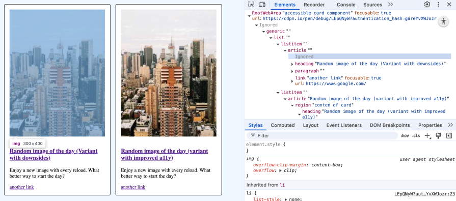
A major design issue with the first card is that we want to click the whole card and not only the link inside. Wrapping everything in an <a> would lead to a couple of problems:
That’s why I dispensed this approach. The problem is now that sighted users cannot click on the whole card but need to click on the links directly.
To solve this issue, let’s explore the second card. The whole card can be clicked over its entire surface to navigate to the link inside of the <h3> tag. When you select the link with the label “another link,” you navigate to the correct target.
When you navigate with the Tab key to the second card, you recognize a green focus ring around the whole card instead of the link inside the headline. When you press Tab again, this focus ring disappears and the link “another link” gets focused.
Extending the click area to the parent container’s size and focus management is achieved by these styles:
/* start - trick to extend the whole click area to the width/height of the parent container */
.accessible-card {
  position: relative;
}

.accessible-card h3 a::before {
   content: '';
   position: absolute;
   inset: 0;
   z-index: 1;
}
/* end */

/* start - Focus ring for card, apply styles to card content except for secondary link */
.accessible-card:focus-within {
  box-shadow: 0 0 0 .15rem green;
}

.accessible-card:has(.secondary-link:focus-within) {
  box-shadow: none;
}

.accessible-card :where(a:not(.secondary-link)):focus {
  outline: none;
  box-shadow: none;
  border: none;
}
/* end */

/* make secondar link clickable/focusable */
.accessible-card .secondary-link {
  z-index: 2;
  position: relative;
}
The second card addresses another important a11y-related aspect. For sighted users, it makes sense to show the image first, but for SR users, the text content has a higher priority. That’s why the text content is earlier in the document flow. The visual order is changed via Flexbox, which is irrelevant for SR:
.accessible-card img {
  order: -1;
}
Now the text content is announced first and the image second.
In this section, you learn about improving usability for sighted mouse users and SR by providing different content:
See the Pen
SR-only content vs content for sighted users by Sebastian Weber (@doppelmutzi)
on CodePen.
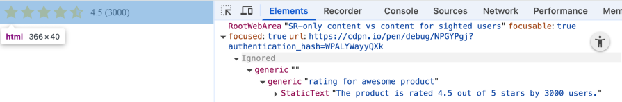
This simple demo shows how you can provide different content for sighted users and for SR users. The visual stars are not that useful for blind people. It could be unclear what (“4.5 (3000)”) means.
Therefore, let’s hide it from SR with aria-hidden="true" and provide a screen-reader-only component:
<div class="sr-only">The product is rated 4.5 out of 5 stars by 3000 users.</div>
These are the styles for sr-only that represents a common pattern used by libraries like Tailwind to visually hide content that’s only visible for SR. It’s still visible to SR:
.sr-only {
  position: absolute;
  width: 1px;
  height: 1px;
  padding: 0;
  margin: -1px;
  overflow: hidden;
  clip: rect(0, 0, 0, 0);
  white-space: nowrap;
  border: 0;
}
As you can see from the accessibility tree, the visual component is ignored, and SR-optimized content is provided:
In this section, you learn how to improve the orientation of SR users with ARIA region name and improve usability for keyboard users with skip links to reduce the number of manual keystrokes:
See the Pen
Skip links and named ARIA regions by Sebastian Weber (@doppelmutzi)
on CodePen.
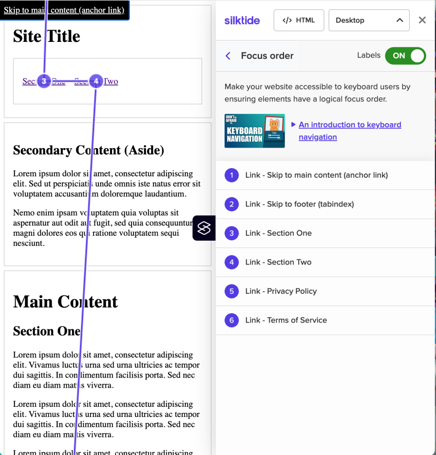
This demo showcases two essential accessibility patterns that significantly improve navigation for sighted keyboard users. Skip links provide keyboard users with navigation shortcuts to jump directly to important page sections without having to tab through every interactive element in sequence. In the demo, when you focus on the first two interactive elements, the skip links are shown. It is a common practice to visually hide these skip links and only show them on focus:
In theory, SR users can also use this, but most likely they ignore it in favor of using VO’s rotor menu or NVDA’s element list to jump straight to landmarks, headlines, links, etc.
ARIA region names enhance the structural understanding of the page by providing clear, descriptive labels for landmark elements that SR can announce and navigate between. With VO these region names are shown in the landmark section that improves orientation:
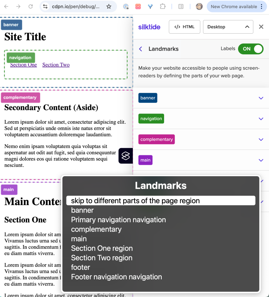
The demo shows different variants to provide region names (aria-label, aria-labelledby). For semantic landmark elements (e.g., header), implicit region names are provided (banner), so in most cases, no additional work is required.
The demo provides two variants of skip links. Skipping to the header is implemented with anchor links. Jumping to the footer is realized with tabindex="-1" and the focus() function. These skip links are only shown temporarily when the user focuses them via Tab.
The approach with tabindex="-1" has the advantage that the target element shows a focus ring. This is useful for both sighted keyboard users and SR users. It triggers an SR announcement, so users know they jumped successfully.
Why should you prefer tabindex="-1" instead of tabindex="0"? The target element only receives focus when the skip link specifically sends you there. It won’t become an extra tab stop in normal navigation. We learned that only interactive elements should usually be focusable in the tab order. However, skip links are meant to move both visual location and focus context. Thus, it’s ok to temporarily focus on none-interactive elements.
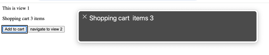
A rather complex task of accessibility design is to deal with updating content after initial load.
Typically, sighted users are made aware of these changes by UI elements such as toast messages. But what is required to make an SR announce such content updates?
That’s where ARIA live regions come into play. They expose dynamic content changes in a way that can be announced by AT. There are two variants to create a live region, either with the aria-live attribute or with ARIA roles with implicit live region attributes, such as role="alert".
Consider the following example. Whenever the add to cart button is clicked, the text content of the element with the id="add-count" gets updated:
See the Pen
deal with content updates by Sebastian Weber (@doppelmutzi)
on CodePen.
We transform a regular <p> tag into a live region by role="status" to communicate count updates to AT:
<p role="status" id="cart">
   <span>Shopping cart</span>
   <span id="add-count">0</span>
   items
</p>
<button onclick="buy()" aria-controls="cart">Add to cart</button>
When you activate the SR and click on the button, the focus will not shift from the button, but the SR announces the new content:
Another common use case with interactive pages, especially with single page applications, is changing views on the fly instead of loading entire pages. Typically, some routing mechanism is used.
When you click on the button “navigate to view 2″ in the demo you see a simple example, where the view changes and the headline gets focused. This way, the attention of the SR user gets shifted to a logical starting point:
function navigate() {
  // ...
  heading.setAttribute("tabindex", "-1");
  heading.focus();
}
Learning accessibility made me a better web developer in unexpected ways. Diving deep into a11y concepts exposed me to Web standards and interaction patterns I’d never considered before — from focus management and semantic markup to the intricacies of AT. These aren’t just accessibility concepts; they’re fundamental Web development skills that improve code quality across the board. A sincere approach to accessible design also means better collaboration between all disciplines in your team – from UX design to content editors to developers.
There’s an added bonus: your SEO team will thank you. Good accessibility practices directly improve Lighthouse scores, since many a11y principles overlap with search engine optimization. Semantic HTML, proper heading structure, and meaningful link text benefit both SR and search crawlers.
Good a11y isn’t just about checking a box; it’s also a tool to help us all build better software.
Learn what vinext is, how Cloudflare rebuilt Next.js on Vite, and whether this experimental framework is worth watching.

Memory leaks in React don’t crash your app instantly, they quietly slow it down. Learn how to spot them, what causes them, and how to fix them before they impact performance.
Build agent-ready websites with Google Web MCP. Learn how to expose reliable site actions for AI agents with HTML and JavaScript.
Build a CRUD REST API with Node.js, Express, and PostgreSQL, then modernize it with ES modules, async/await, built-in Express middleware, and safer config handling.
Would you be interested in joining LogRocket's developer community?
Join LogRocket’s Content Advisory Board. You’ll help inform the type of content we create and get access to exclusive meetups, social accreditation, and swag.
Sign up now

 Learn more →
