According to Statcounter, mobile devices account for 56 percent of internet usage, while desktops account for around 48 percent of the users, tablet users being only 2 percent of the remaining market share.

Knowing that screen size matters when starting a UI project, you should consider building a responsive layout grid using a tool like Figma, which will help by saving and reusing a layout over multiple projects. A responsive grid ensures that your website adapts well to different screen sizes and provides a great and consistent user experience to all users.
With a responsive layout, we’ll also need to consider the language we will design for. According to Statista, Node.js and React.js are the most used ones.
Ready to design a responsive layout?
Now that we know there are different screen sizes and layout options, let’s find which screens are most used so we can then narrow it down to some specific breakpoints. According to Statcounter GlobalStatus, these are the most used screen sizes; it’s important to mention that if we filter by region or country, the data may differ:
Mobile:
Tablet:
Desktop:
You can see that users have a lot of options! Responsive grids and layouts will help us design for all these different screens.
But in order to design responsively, we need to use a language or framework capable of that.
Websites are usually built with frontend technologies. Commonly, the basic languages involved in the creation are the ones below:
HTML:
CSS:
JavaScript:
Basics are always important, but as the years went by, some genius put together frameworks to reduce the amount of work and code developers had to do to create a website; frameworks allow devs to reuse UI components, create grid systems, and streamline the web development cycle. Good examples of this would be Bootstrap, Foundation, or Bulma.
On top of that, it is important to note that some frameworks are responsive, meaning that the layout adapts and displays well on different screen sizes, creating a fluid and smooth user experience.
Native app development involves building separate apps for each platform (iOS and Android) using the given language of each platform (Swift/Objective-C for iOS, Java/Kotlin for Android). This approach meant that when only designing for mobile, you didn’t care much about screen resolutions because your options were quite limited.
Hybrid app development is increasingly more common due to its code reusability, cost efficiency, faster development cycle, cross-platform compatibility, and improved performance. To make it clear and understandable, by using web technologies and hybrid frameworks, developers can write code once and use it for web, iOS and android; This reduces costs and time knowing that the outcome offers near-native performance.
Let’s go over the anatomy of a layout.
This section will continue with a sneak peak of the concept of spacing, because the pixels between components and other elements are key to break the layout in smaller pieces.
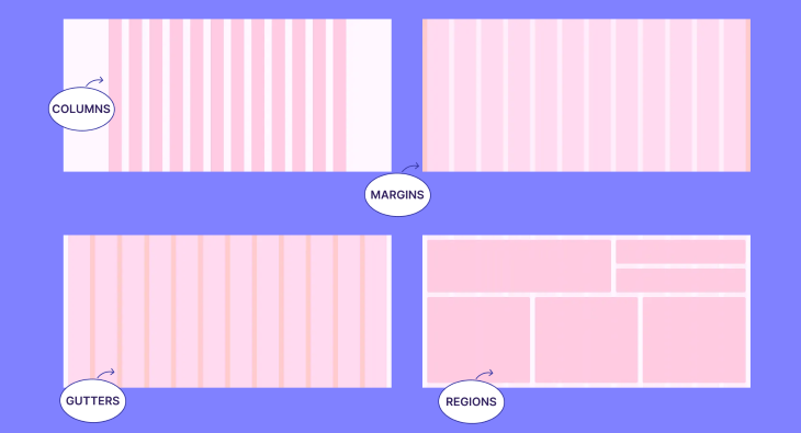
The last topic we will cover is the layout breakpoints, the most fundamental concept to understand and build a responsive grid. The breakpoints will provide a structured layout for elements, consisting of columns, gutters, and margins within the body region.
A layout is the architectural blueprint that orchestrates the symphony of visual elements on a screen. Like an artist’s canvas, it becomes the playground where images, text, and interactive components come together in a choreographed dance. A meticulously designed layout includes balance, rhythm, and harmony, fostering a delightful user experience that engages and captivates. It is the backbone of digital design.
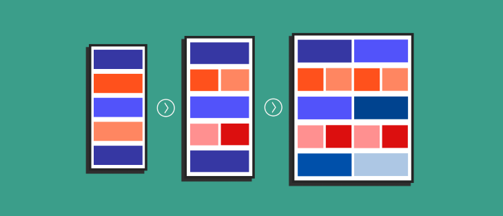
The layout usually has multiple regions where the content is distributed; the minimum expression of the content is distributed in the following:
The primary objective of a responsive grid is to facilitate adaptive layout transformations according to varying screen sizes, thereby guaranteeing consistent designs throughout different pages of your website.
By employing a responsive grid system, usually a 8px grid, the arrangement and positioning of elements intelligently adjust, allowing for optimal presentation and a seamless user experience across various devices and platforms.
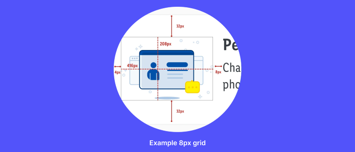
The 8px grid system stands as the most renowned choice, known for its benefits in scaling and consistency. By adhering to an even number, designing becomes more effortless and reliable. This system ensures that all components harmoniously align to an 8px square baseline grid, catering to mobile, tablet, and desktop interfaces.
The essence of the 8px grid lies in utilizing increments of 8px to size and space out web page elements. This means that any defined height, width, margin, or padding adheres to this increment. Fluid grids are created through division, while fixed grids rely on multiplication. Typography also aligns with the 8px baseline grid, calculating line height using multiples of 8.
Occasionally, a 4px grid can come into play. When designing for small screens, a smaller number may be necessary to create icons or provide space between components or typography. The flexibility of the grid system allows for adaptable and precise design decisions based on specific requirements.
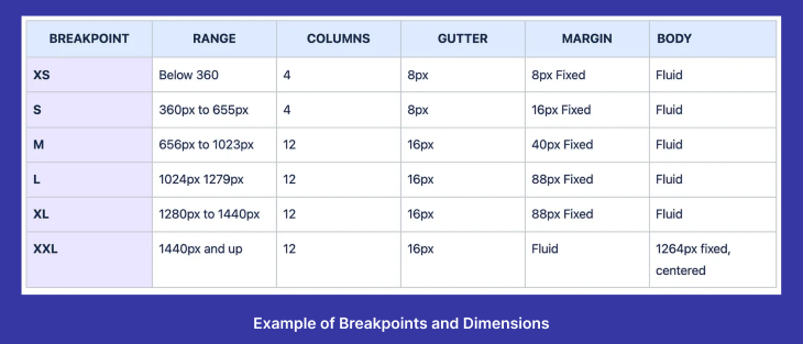
To facilitate efficient design and development, I propose a table as a reference tool for working on websites. The table outlines the corresponding column widths, with 12 columns equating to a fluid 8.33 percent width of the grid, and 4 columns equating to a fluid 25 percent width. By utilizing this grid system, designers and frontend engineers can achieve a cohesive and responsive design that adapts to different devices and screen sizes.
Find below different examples of breakpoints from popular software developers that can inspire you to create the best option for your design.
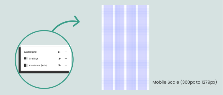
Start creating a new file and adding one or more artboards to it. Before start designing you can create a grid by following the next steps:
By following these steps, you can quickly set up a layout grid in Figma, customize its properties, and align elements effortlessly for a well-structured design.
When it comes to responsive grid systems, several major software developers have introduced widely used frameworks that empower efficient and adaptable web design.
Bootstrap, developed by Twitter, is renowned for its comprehensive set of CSS and JavaScript components, including a 12-column grid system.
Spectrum, a versatile design system created by Adobe, offers a responsive grid system that supports various screen sizes and devices. Discover Spectrum at Material Design, by Google, is a popular React component library with a responsive grid system.
You can also explore the IBM grid system, with breakpoints and other relevant information. These frameworks provide robust tools and resources for creating responsive layouts and are widely used by developers across the globe.
In conclusion, when designing for different devices, it is crucial to have a clear understanding of the target platforms beforehand. Tailoring the design to suit smartwatches versus computers requires careful consideration.
Additionally, effective collaboration with the development team is essential. Understanding the coding language, whether a framework will be utilized, or if custom code will be written from scratch, fosters smoother implementation and integration.
Lastly, early establishment of grids and layouts is vital. By incorporating a responsive layout grid, designers can ensure consistent structure and visual appeal across various screen sizes and resolutions.
By following these key principles, designers can create seamless and user-friendly experiences that adapt effortlessly to the diverse technological landscape.

LogRocket's Galileo AI watches sessions and understands user feedback for you, automating the most time-intensive parts of your job and giving you more time to focus on great design.
See how design choices, interactions, and issues affect your users — get a demo of LogRocket today.
Design engineering has always lived between design and code. But with AI tools turning prompts into interfaces and code into editable canvases, that bridge is becoming a new way of building.
A three-week mobile banking project taught me that the “proper” UX process is not always realistic. Sometimes, the better approach is to work with what you know, identify what you still need to learn, and make the strongest decision possible under real constraints.
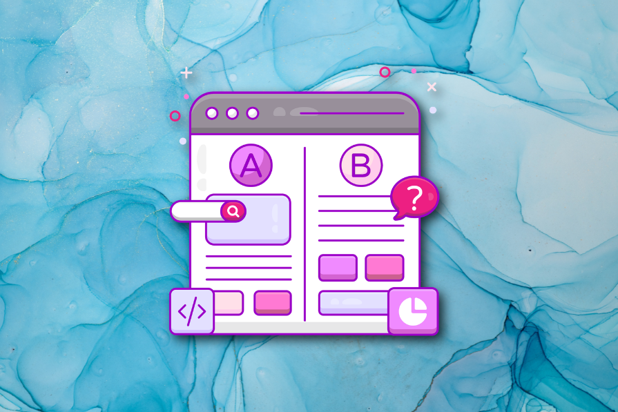
A/B testing compares two versions of a design to see which performs better with real users. Here’s how UX teams can use it to test hypotheses, measure outcomes, and make smarter product decisions.
This case study shows how one ad experience redesign increased total ad exposure while lowering perceived friction, proving that timing and context can matter more than raw interruption.

 Learn more →
