Vercel’s AI SDK solved the complex challenge of integrating AI into applications. AI SDK provides a unified TypeScript toolkit that abstracts away the complexity of working with various large language models (LLMs). However, as developers adopted AI SDK for backend integration, they faced a new challenge: crafting great frontend user interfaces for AI applications. Building conversational UIs, message displays, and interactive elements required significant time and expertise.
Vercel addressed this gap with AI Elements: a comprehensive component library built on Shadcn UI that seamlessly integrates with AI SDK.
In this article, we’ll build an AI assistant that demonstrates how AI SDK and AI Elements work together. Through hands-on implementation, we’ll explore how you can use these tools to create AI applications with minimal setup and helpful user interfaces. You’ll learn to leverage components like Conversation, Message, and Reasoning to build AI experiences that feel native and intuitive to your users.
For this article, you’ll need the following:
Before we begin, let’s understand what Vercel AI Elements are and what powers them. AI Elements provides pre-built React components specifically designed for AI applications, including conversations, message displays, code artifacts, and reasoning chains, with built-in support for streaming responses, error handling, and accessibility. They are built on top of Shadcn UI.
Before the introduction of Vercel AI Elements, frontend developers had to build AI elements from scratch (building the user interface for AI Elements and making them dynamic, interactive and data-driven), which required significant time and expertise. Building an AI chat UI meant juggling Tailwind, React Query, WebSockets, etc., and custom streaming logic. Now, Vercel’s component library handles it all (streaming, state, and styling) in one place.
Vercel AI Elements are designed to be used with the recently released Vercel AI SDK. For this reason, we will set up both the Vercel AI SDK and AI elements in the next section.
Now that you have an understanding of AI Elements, let’s set up our project.
We’ll start by creating a new Next.js application and then installing the necessary dependencies.
First, set up a new Next.js project:
npx create-next-app@latest
When prompted, be sure to select TypeScript and Tailwind CSS for the project. Once the installation is complete, navigate to your new project directory.
Next, install Vercel AI SDK by running the following npm command:
npm install ai @ai-sdk/react
Now, install the AI element:
npx ai-elements@latest
We also need to install zod for data validation. Run the command below to install Zod:
npm install zod
The AI SDK supports various AI providers. In this project, we will be using Google AI. Let’s quickly get it installed:
npm install @ai-sdk/google
The final step is to configure your AI provider. You’ll need to get an API key from Google AI and make it available to your application as an environment variable.
In the root folder of your project, create a .env file and give it the following content:
apiKey=your_gemini_api_key_here
We will need the following AI element components for this project:
conversationmessageprompt-inputresponseactionsreasoningFirst install conversation with:
npx ai-elements@latest add conversation
We also need the message component, and we will install it with:
npx shadcn@latest add @ai-elements/message
Next, install the prompt-input that we will use for getting input with:
npx shadcn@latest add @ai-elements/prompt-input
Run the code below to install the reasoning component:
npx shadcn@latest add @ai-elements/reasoning
Run the code below to install the response component:
npx shadcn@latest add @ai-elements/response
Finally, install the action buttons:
npx shadcn@latest add @ai-elements/actions
That’s all for component installation. Let’s get into setting up the folder structure.
Inside the src folder and inside the app folder create api folder, then inside the api folder create a chat folder.
We will also create a aichat.tsx file.
If you find the structure confusing, the diagram below explains it: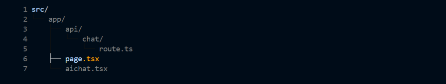
We will be working with three files:
route.tsx for our backendpage.tsx for displaying the AI chat componentaichat.tsx for our AI chat componentIn your page.tsx file, add the following boilerplate code:
import React from 'react';

const DayPlanner = () => {
  return (
    <div
      className="relative flex h-auto min-h-screen w-full flex-col bg-slate-50 group/design-root overflow-x-hidden"
      style={{
        '--checkbox-tick-svg': 'url("data:image/svg+xml,%3csvg viewBox=%270 0 16 16%27 fill=%27rgb(248,250,252)%27 xmlns=%27http://www.w3.org/2000/svg%27%3e%3cpath d=%27M12.207 4.793a1 1 0 010 1.414l-5 5a1 1 0 01-1.414 0l-2-2a1 1 0 011.414-1.414L6.5 9.086l4.293-4.293a1 1 0 011.414 0z%27/%3e%3c/svg%3e")',
        fontFamily: 'Inter, "Noto Sans", sans-serif',
      }}
    >
      <div className="layout-container flex h-full grow flex-col">
        <div className="gap-1 px-6 flex flex-1 justify-center py-5">
          <div className="layout-content-container flex flex-col max-w-[920px] flex-1">
            <div className="flex flex-wrap justify-between gap-3 p-4">
              <p className="text-[#0d141b] tracking-light text-[32px] font-bold leading-tight min-w-72">Your Day Planner</p>
            </div>
            <h2 className="text-[#0d141b] text-[22px] font-bold leading-tight tracking-[-0.015em] px-4 pb-3 pt-5">Today's Schedule</h2>
            <div className="px-4 py-3 @container">
              <div className="flex overflow-hidden rounded-lg border border-[#cfdbe7] bg-slate-50">
                <table className="flex-1">
                  <thead>
                    <tr className="bg-slate-50">
                      <th className="table-870b4b9a-0283-4d4d-8c1e-005143691cdc-column-120 px-4 py-3 text-left text-[#0d141b] w-[400px] text-sm font-medium leading-normal">Time</th>
                      <th className="table-870b4b9a-0283-4d4d-8c1e-005143691cdc-column-240 px-4 py-3 text-left text-[#0d141b] w-[400px] text-sm font-medium leading-normal">Activity</th>
                    </tr>
                  </thead>
                  <tbody>
                    <tr className="border-t border-t-[#cfdbe7]">
                      <td className="table-870b4b9a-0283-4d4d-8c1e-005143691cdc-column-120 h-[72px] px-4 py-2 w-[400px] text-[#4c739a] text-sm font-normal leading-normal">9:00 AM</td>
                      <td className="table-870b4b9a-0283-4d4d-8c1e-005143691cdc-column-240 h-[72px] px-4 py-2 w-[400px] text-[#4c739a] text-sm font-normal leading-normal">Morning Meeting</td>
                    </tr>
                    <tr className="border-t border-t-[#cfdbe7]">
                      <td className="table-870b4b9a-0283-4d4d-8c1e-005143691cdc-column-120 h-[72px] px-4 py-2 w-[400px] text-[#4c739a] text-sm font-normal leading-normal">10:30 AM</td>
                      <td className="table-870b4b9a-0283-4d4d-8c1e-005143691cdc-column-240 h-[72px] px-4 py-2 w-[400px] text-[#4c739a] text-sm font-normal leading-normal">Project Work</td>
                    </tr>
                    <tr className="border-t border-t-[#cfdbe7]">
                      <td className="table-870b4b9a-0283-4d4d-8c1e-005143691cdc-column-120 h-[72px] px-4 py-2 w-[400px] text-[#4c739a] text-sm font-normal leading-normal">12:00 PM</td>
                      <td className="table-870b4b9a-0283-4d4d-8c1e-005143691cdc-column-240 h-[72px] px-4 py-2 w-[400px] text-[#4c739a] text-sm font-normal leading-normal">Lunch Break</td>
                    </tr>
                    <tr className="border-t border-t-[#cfdbe7]">
                      <td className="table-870b4b9a-0283-4d4d-8c1e-005143691cdc-column-120 h-[72px] px-4 py-2 w-[400px] text-[#4c739a] text-sm font-normal leading-normal">1:00 PM</td>
                      <td className="table-870b4b9a-0283-4d4d-8c1e-005143691cdc-column-240 h-[72px] px-4 py-2 w-[400px] text-[#4c739a] text-sm font-normal leading-normal">Client Call</td>
                    </tr>
                    <tr className="border-t border-t-[#cfdbe7]">
                      <td className="table-870b4b9a-0283-4d4d-8c1e-005143691cdc-column-120 h-[72px] px-4 py-2 w-[400px] text-[#4c739a] text-sm font-normal leading-normal">3:00 PM</td>
                      <td className="table-870b4b9a-0283-4d4d-8c1e-005143691cdc-column-240 h-[72px] px-4 py-2 w-[400px] text-[#4c739a] text-sm font-normal leading-normal">Wrap Up</td>
                    </tr>
                  </tbody>
                </table>
              </div>
              {/* Note: The <style> block needs to be handled separately. You can't put it directly in JSX. */}
            </div>
            <h2 className="text-[#0d141b] text-[22px] font-bold leading-tight tracking-[-0.015em] px-4 pb-3 pt-5">To-Do List</h2>
            <div className="px-4">
              <label className="flex gap-x-3 py-3 flex-row">
                <input
                  type="checkbox"
                  className="h-5 w-5 rounded border-[#cfdbe7] border-2 bg-transparent text-[#1172d4] checked:bg-[#1172d4] checked:border-[#1172d4] checked:bg-[image:--checkbox-tick-svg] focus:ring-0 focus:ring-offset-0 focus:border-[#cfdbe7] focus:outline-none"
                />
                <p className="text-[#0d141b] text-base font-normal leading-normal">Prepare presentation slides</p>
              </label>
              <label className="flex gap-x-3 py-3 flex-row">
                <input
                  type="checkbox"
                  className="h-5 w-5 rounded border-[#cfdbe7] border-2 bg-transparent text-[#1172d4] checked:bg-[#1172d4] checked:border-[#1172d4] checked:bg-[image:--checkbox-tick-svg] focus:ring-0 focus:ring-offset-0 focus:border-[#cfdbe7] focus:outline-none"
                />
                <p className="text-[#0d141b] text-base font-normal leading-normal">Respond to emails</p>
              </label>
              <label className="flex gap-x-3 py-3 flex-row">
                <input
                  type="checkbox"
                  className="h-5 w-5 rounded border-[#cfdbe7] border-2 bg-transparent text-[#1172d4] checked:bg-[#1172d4] checked:border-[#1172d4] checked:bg-[image:--checkbox-tick-svg] focus:ring-0 focus:ring-offset-0 focus:border-[#cfdbe7] focus:outline-none"
                />
                <p className="text-[#0d141b] text-base font-normal leading-normal">Review project proposal</p>
              </label>
            </div>
          </div>
          <div className="layout-content-container flex flex-col w-[360px]">
            <div className="flex justify-end overflow-hidden px-5 pb-5">
              <button className="flex max-w-[480px] cursor-pointer items-center justify-center overflow-hidden rounded-lg h-14 px-5 bg-[#1172d4] text-slate-50 text-base font-bold leading-normal tracking-[0.015em] min-w-0 gap-4 pl-4 pr-6">
                <div className="text-slate-50" data-icon="ChatCircleDots" data-size="24px" data-weight="regular">
                  <svg xmlns="<http://www.w3.org/2000/svg>" width="24px" height="24px" fill="currentColor" viewBox="0 0 256 256">
                    <path
                      d="M140,128a12,12,0,1,1-12-12A12,12,0,0,1,140,128ZM84,116a12,12,0,1,0,12,12A12,12,0,0,0,84,116Zm88,0a12,12,0,1,0,12,12A12,12,0,0,0,172,116Zm60,12A104,104,0,0,1,79.12,219.82L45.07,231.17a16,16,0,0,1-20.24-20.24l11.35-34.05A104,104,0,1,1,232,128Zm-16,0A88,88,0,1,0,51.81,172.06a8,8,0,0,1,.66,6.54L40,216,77.4,203.53a7.85,7.85,0,0,1,2.53-.42,8,8,0,0,1,4,1.08A88,88,0,0,0,216,128Z"
                    ></path>
                  </svg>
                </div>
                <span className="truncate">AI Assistant</span>
              </button>
            </div>
<div>
  <p>We will add our Ai Assistant here</p>
  <ConversationAi/>
</div>

          </div>
        </div>
      </div>
    </div>
  );
};

export default DayPlanner;
In the above, we have a table with hardcoded data and a to-do list with no functionality.
This is how it looks in the browser: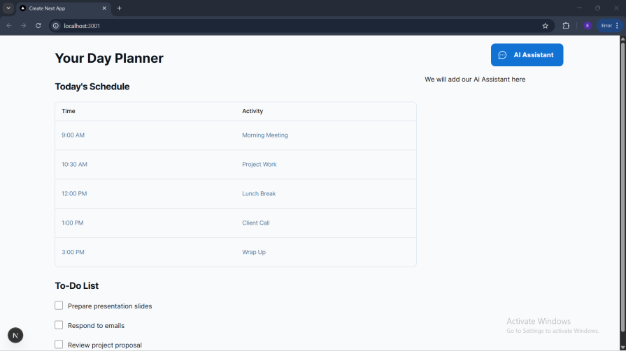
Now that we have our basic UI, let’s set up the AI feature.
Let’s first set up our backend. In the chat folder, create a route.ts file and give it the following content:
import { streamText, UIMessage, convertToModelMessages } from 'ai';
import { google } from '@ai-sdk/google';
Here, we imported three components from the AI SDK. Since we are using Gemini, we also imported the provider SDK that we installed earlier.
Below is the remaining content of the route.ts file:
export const maxDuration = 30;
export async function POST(req: Request) {
  const { messages }: { messages: UIMessage[] } = await req.json();
  const result = streamText({
    model: google('gemini-2.5-flash'),
    messages: convertToModelMessages(messages),
    system: `You are a productivity-focused AI assistant. Your expertise includes:
    - Task and project management
    - Time blocking and scheduling
    - Goal setting and achievement
    - Workflow automation
    - Focus and concentration techniques
    - Team collaboration tools

    Always provide practical, actionable advice to help users maximize their productivity.`,
  });
  return result.toUIMessageStreamResponse({sendReasoning: true});
}
The await req.json() parses the incoming request to get the array of messages that represent the conversation so far. The streamText function is where the magic happens. It receives two important parameters:
model: Sets the AI model the app will interact with.messages: Sends the conversations to the AI.We then return the result to our frontend with result.toUIMessageStreamResponse() enabling reasoning. The system parameter in streamText is specifically designed to ensure every conversation starts with productivity-focused context.
To set up the AI chat component, create an aichat.tsx file and provide it with the elements below.
We first have our imports:
'use client';
import {
  Reasoning,
  ReasoningContent,
  ReasoningTrigger,
} from '@/components/ai-elements/reasoning';
import {
  Conversation,
  ConversationContent,
  ConversationEmptyState,
  ConversationScrollButton,
} from '@/components/ai-elements/conversation';
import { Message, MessageContent } from '@/components/ai-elements/message';
import {
  Input,
  PromptInputTextarea,
  PromptInputSubmit,
} from '@/components/ai-elements/prompt-input';
import { MessageSquare } from 'lucide-react';
import { useState } from 'react';
import { useChat } from '@ai-sdk/react';
import { Response } from '@/components/ai-elements/response';
In the above, we imported the AI elements that we installed earlier. We also imported icons from the lucide-react package.
Now the basic structure and state management:
const ConversationDemo = () => {
  const [input, setInput] = useState('');
  const { messages, sendMessage, status } = useChat();
  const handleSubmit = (e: React.FormEvent) => {
    e.preventDefault();
    if (input.trim()) {
      sendMessage({ text: input });
      setInput('');
    }
  };
  return (
    <div className="max-w-4xl mx-auto p-6 relative size-full rounded-lg border h-[600px]">
      {/* We'll build the content here step by step */}
    </div>
  );
};
The useChat() Hook from AI SDK provides messages, sendMessage, and status. The handleSubmit function contains basic form handling with useState for input management.
Now let’s add the core conversation components:
The Conversation component is the main container for our chat. ConversationContent is where messages are displayed and ConversationScrollButton handles auto-scrolling.
Let’s add the empty state when there are no messages:
<ConversationContent>
  {messages.length === 0 ? (
    <ConversationEmptyState
      icon={<MessageSquare className="size-12" />}
      title="Start a conversation"
      description="Type a message below to begin chatting"
    />
  ) : (
    // We'll add message rendering here
  )}
</ConversationContent>
This shows a friendly empty state when conversation starts, providing clear guidance to users.
Now let’s add message rendering with reasoning support:
{messages.map((message) => (
  <Fragment from={message.role} key={message.id}>
    <Message>
      <MessageContent>
        {message.parts.map((part, i) => {
          switch (part.type) {
            case 'text':
              return (
                <Response key={`${message.id}-${i}`}>
                  {part.text}
                </Response>
              );
            case 'reasoning':
              return (
                <Reasoning
                  key={`${message.id}-${i}`}
                  className="w-full"
                  isStreaming={status === 'streaming' && i === message.parts.length - 1 && message.id === messages.at(-1)?.id}
                >
                  <ReasoningTrigger />
                  <ReasoningContent>{part.text}</ReasoningContent>
                </Reasoning>
              );
          }
        })}
      </MessageContent>
    </Message>
  </Fragment>
))}
The Fragment from={message.role} distinguishes between user and AI messages, Response renders text content, and Reasoning shows AI’s thinking process with streaming support.
Finally, let’s add the input form just below the Conversation component:
<Input
  onSubmit={handleSubmit}
  className="mt-4 w-full max-w-2xl mx-auto relative"
>
  <PromptInputTextarea
    value={input}
    placeholder="Say something..."
    onChange={(e) => setInput(e.currentTarget.value)}
    className="pr-12"
  />
  <PromptInputSubmit
    status={status === 'streaming' ? 'streaming' : 'ready'}
    disabled={!input.trim()}
    className="absolute bottom-1 right-1"
  />
</Input>
The Input is a form container with submit handling, PromptInputTextarea is a text input with proper styling, and PromptInputSubmit is a submit button with status awareness.
Let’s go ahead and add action buttons to retry, like, dislike, copy, and share.
We will need to make the following imports:
import { Actions, Action } from '@/components/ai-elements/actions';
import { ThumbsUpIcon } from 'lucide-react';
import { RefreshCcwIcon, CopyIcon } from 'lucide-react';
Next, inside the useChat object, we will import regenerate for the retry action:
const { messages, sendMessage, status, regenerate } = useChat();
Add the following just below Message component inside the Fragment used in the ConversationDemo component:
{message.role === 'assistant' && isLastMessage && (
  <Actions>
    <Action
      onClick={() => regenerate()}
      label="Retry"
    >
      <RefreshCcwIcon className="size-3" />
    </Action>
    <Action
      onClick={() =>
        navigator.clipboard.writeText(part.text)
      }
      label="Copy"
    >
      <CopyIcon className="size-3" />
    </Action>
  </Actions>
)}
This will add action buttons with the retry and copy functionality to the last response message in the chat.
We now have our AI assistant looking nice: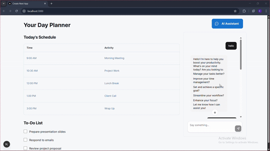
In this article, you’ve built a complete productivity AI chat assistant using Vercel AI Elements and the AI SDK. We covered the essentials from project setup and creating a streaming backend to assembling a frontend with Vercel AI Element’s pre-built components.
A year ago, what we just built would have taken weeks. Building an AI chat interface from scratch meant creating streaming response handlers, implementing loading states and error boundaries, building accessible/keyboard-navigable components, crafting smooth animations for message appearance, managing conversation state across re-renders, and handling edge cases like network failures and reconnection logic. Vercel AI Elements eliminates most of this.
Previously, every AI feature required custom UI engineering. Now, AI Elements gives you production-ready components that handle the complexity, letting you focus on what makes your app unique.
Debugging Next applications can be difficult, especially when users experience issues that are difficult to reproduce. If you’re interested in monitoring and tracking state, automatically surfacing JavaScript errors, and tracking slow network requests and component load time, try LogRocket.
LogRocket captures console logs, errors, network requests, and pixel-perfect DOM recordings from user sessions and lets you replay them as users saw it, eliminating guesswork around why bugs happen — compatible with all frameworks.
LogRocket's Galileo AI watches sessions for you, instantly identifying and explaining user struggles with automated monitoring of your entire product experience.
The LogRocket Redux middleware package adds an extra layer of visibility into your user sessions. LogRocket logs all actions and state from your Redux stores.
Modernize how you debug your Next.js apps — start monitoring for free.
Install LogRocket via npm or script tag. LogRocket.init() must be called client-side, not
server-side
$ npm i --save logrocket

// Code:

import LogRocket from 'logrocket';
LogRocket.init('app/id');
// Add to your HTML:

<script src="https://cdn.lr-ingest.com/LogRocket.min.js"></script>
<script>window.LogRocket && window.LogRocket.init('app/id');</script>

Learn how to build smooth staggered animations in CSS using modern features like sibling-index(), complete with practical examples, fallbacks, and accessibility tips.

Compare the top AI development tools and models of July 2026. View updated rankings, feature breakdowns, and find the best fit for you.

Learn how to detect unused and ghost dependencies in JavaScript projects using Knip, a project-level linter that keeps your dependency graph accurate.

Learn how Storybook MCP enables AI agents to understand your component library, generate accurate UI, and validate code using documentation, stories, and automated tests.
Would you be interested in joining LogRocket's developer community?
Join LogRocket’s Content Advisory Board. You’ll help inform the type of content we create and get access to exclusive meetups, social accreditation, and swag.
Sign up now

 Learn more →
