UX design can get confusing. There’s so much to do in so little time that it can be hard to know what to tackle first and in what order.
That’s why it’s important to get your design techniques right.
Simply put, a design technique is a structured approach to achieving one’s goals. It’s like a tool you use to get the work done.
They range from broad, strategic research techniques to very specific validation exercises.
UX design is the art and science of choosing the right UX techniques and applying them correctly and in the right order. Simple as that.
To help you hone your skills, this article unpacks some of the most widely used design techniques.
Editor’s note: This blog was rewritten 11 June 2025 by Bart Krawczyk to explain UX techniques across the entire design lifecycle, as well as to add coverage of user research, ideation, prototyping, testing, and validation.
The first step of every UX initiative is to deeply understand your users and their needs. Let’s take a look at a few techniques that can help you with that.
If there were one single technique every UX designer should master, it’s user interviews. The ability to get relevant insights from actual users is incredibly valuable.
There are two main types of user interviews:
The quality of your user interviews often translates directly to the quality of your end designs.
Surveys are the main way for you to get quantitative insights — that is, statistically significant information about your users.
They allow you to cheaply validate your beliefs and gather unique insights that would be hard to spot during interviews with a limited number of users.
A great survey consists of:
Field studies, often known as ethnographic studies, consist of observing users in their natural environment.
For example, once I was working on improving the cashier experience in a retail store, so I just stood behind the counter for a whole day and observed how they worked and what they clicked in the POS software.
It helps us build stronger empathy with users and notice patterns and interactions that they wouldn’t even consider mentioning during other types of studies.
Diary studies are one of the more sophisticated methods of user research.
You start by defining what questions a user group should answer every day, and then ask them to do so. It can range from filling out a Google form, having a scheduled call, or writing in a literal diary.
This type of research helps you uncover users’ attitudes over time. For example, how fitness motivations change over time from January 1st to February 1st.
Research itself is a waste of time if it doesn’t lead to any tangible outcomes. Let’s take a look at techniques that help you turn research into actionable artifacts.
User personas are a great way to synthesize your findings from user research. It’s a single document that contains the most important information about a particular user segment, such as:
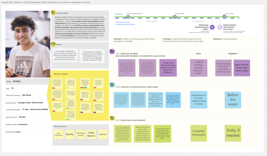
Later, you can test your ideas and solutions by checking the relevance with the user persona, greatly improving the chance that the final solution will be what users actually need.
An empathy map has a similar purpose to user persona — that is, to aggregate insights into a cohesive artifacts:
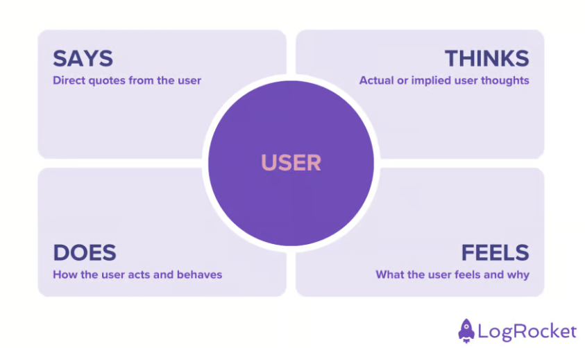
You make one by aggregating what the user says, thinks, does, and feels into a small canvas.
Personally, I use them as an extension for the user persona, but almost never as a standalone tool — persona just seems to do the job better, with less artificial divisions.
A user journey map is a visualization of the path a user takes when solving a particular problem. It can work both as a synthesis tool (summarizing the current user journey of a user) and as an ideation tool (ideating the ideal user journey your product should create):
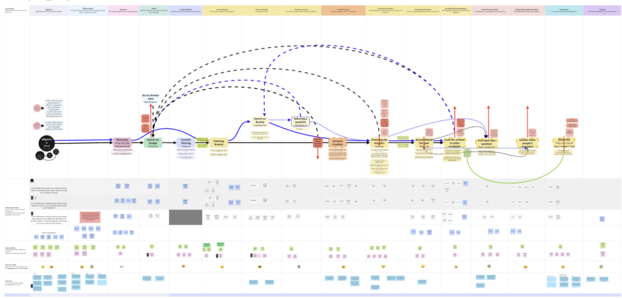
By mapping what people experience at each step, you can “feel” the journey, making it easier to empathise with the user and design a product that makes sense from the beginning to the end.
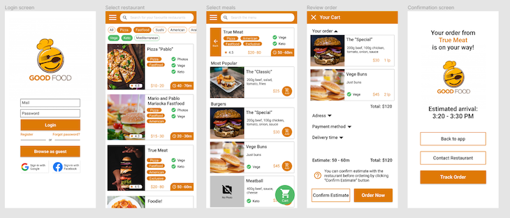
Storyboarding is a more detailed way of describing and visualizing a specific part of a user journey.
You can use screenshots if you’re working on an existing user journey, or a simple mockup if you are ideating a new user journey:
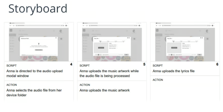
By seeing how the journey looks visually, it’s easier to spot UX challenges and ideate alternate solutions than when just working on a high-level description of the journey.
Jobs to be done synthesize and summarize what specific objectives users are trying to achieve:

By understanding the end goal users are trying to achieve, you can design innovative solutions in a non-biased way.
Affinity mapping is a way of organizing large amounts of insights into more manageable, related groups.
For example, if you mapped 100 sticky notes of insights and interesting observations from your research, instead of processing all of them separately, you should first group them into related categories.
Prioritizing, discussing, and acting on ~10 groups of observations is much more manageable than working on ~100 individual observations.
Information architecture is an often-neglected topic, as people tend to often associate it exclusively with navigation design. But with products getting increasingly complex, a proper IA is needed from the very beginning, even on a feature level.
Card sorting is a great way to figure out how to structure information on your website and product.
Say you have 40 subpages and you’re unsure how to organize them. Ask a couple of users to group these under specific categories and that’s it:
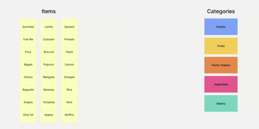
Card sorting usually happens in two stages:
After the card sorting, you can map a newly established page structure in the form of a sitemap — a hierarchical order of categories and subcategories:
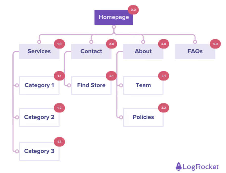
Sitemaps help you conduct a sanity check if:
Then they serve as documentation, making any new hierarchy-related initiative, as well as onboarding new designers, significantly easier.
Card testing can help you discover (open) and refine (closed) categories and your information hierarchy. Then, the sitemap allows you to concisely map the outcomes.
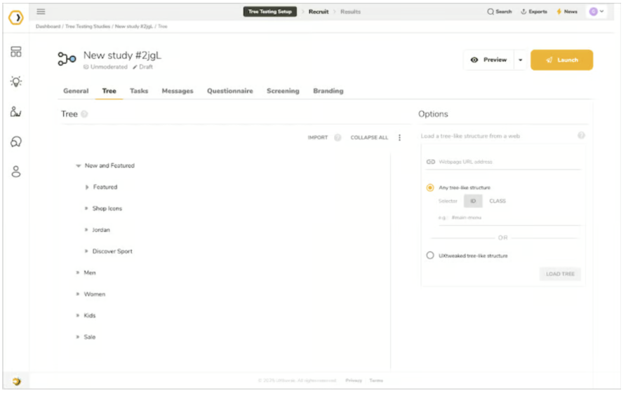
Once, you’ve done that you can test it with tree testing:
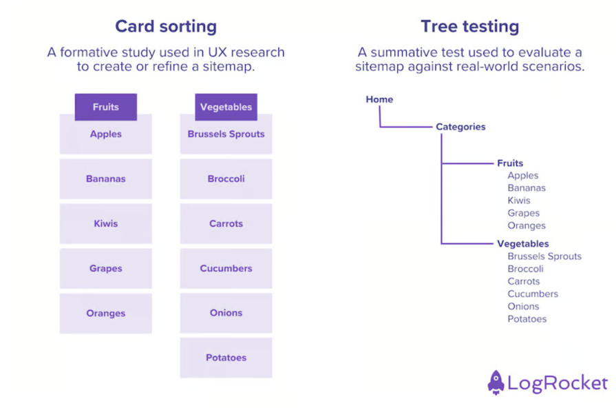
Based on card sorting results, you create an actual navigation hierarchy and then test it with users. You usually give users a task, such as “find a page X”, and observe how they navigate towards it and if they click through the right categories, and if not, where the confusion is.
Many remote user testing tools, such as UXTweak, even have a dedicated mode for tree testing:
Creating a content inventory is a good exercise to understand what content is available to the user and how to access it.
You usually do that by manually going through the site and mapping every subpage, including:
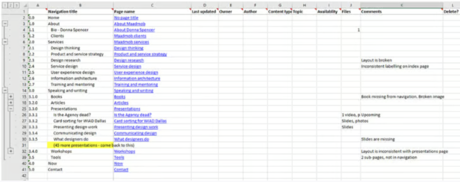
This exercise helps you:
Now that you have an understanding of user behavior and potential solutions, let’s take a look at how to move forward and test if you were right.
Wireframes are a way to mock up a visual direction before investing in full UI design. Low-fidelity wireframes can be done by practically anyone:
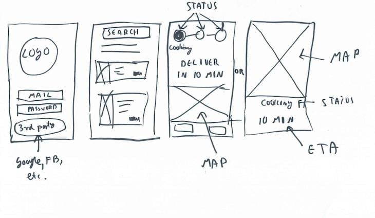
Low-fidelity wireframes help convey the idea:
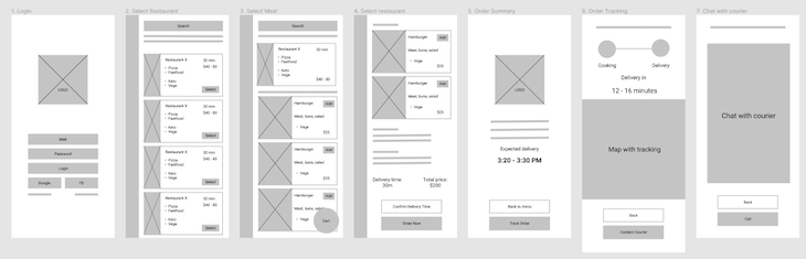
Medium-fidelity wireframes allow you to evaluate structure and user journey:
High-fidelity wireframes help you to evaluate the high-level look and feel even without a perfect UI.
Clickable prototypes allow you to test designs and solutions without any development effort.
Sometimes, a Figma mockup and a few interactions are all you need to gather relevant feedback from the users.
Given how easy it is to turn a wireframe into a prototype, it should be a mandatory step in every design initiative.
A/B testing, which involves showing different versions of the page to part of the users, is the most scientific testing method you can choose.
It gives a clear picture of which design and UX work better from a data perspective and can give you a somewhat precise understanding of the lift (e.g., is it a one percent improvement or a ten percent improvement).
However, it’s also the most expensive method, as it requires developing variants and setting up an experiment, so only use it for confirming pre-validated solutions.
Testing directly with users is a great way to get additional insights if they understand the current implementation and how it could be improved.
In most cases, you simply give the user access to a prototype or working product, ask them to perform a few tasks, and observe how easy the process is.
It can be done in two ways:
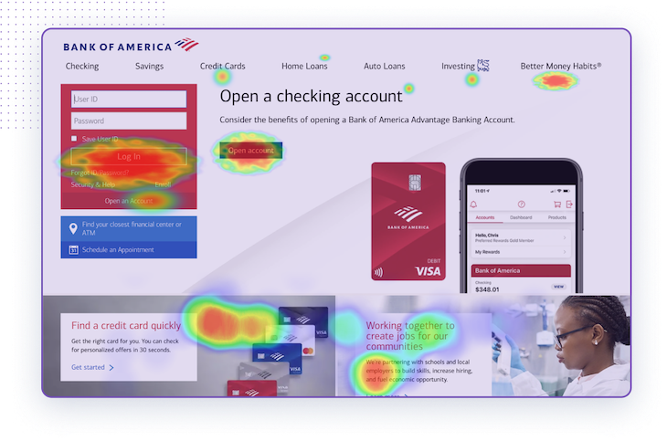
Qualitative data helps you notice patterns at a scale, even without talking to users themselves.
For example, heatmaps show you where users spend most of the time and what they click, making it clear how they navigate through the site:
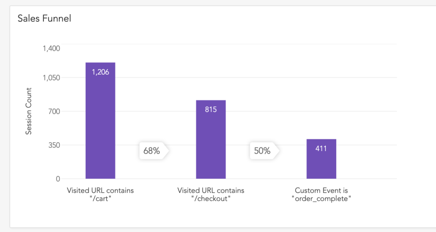
Funnels, on the other hand, can show you at which step most users tend to drop off, making it easier to prioritize next improvements:
There are many more use cases for data analytics, although from experience, UX designers tend to work mainly on heatmaps and funnels.
UX design is such a broad term that it’s easy to get overwhelmed and confused.
An easy way to manage it is to break down the practice into specific steps and techniques. You can then focus on improving particular techniques to improve your craft, as well as experiment with different techniques to iterate on your design process.
Start with user research, by:
Then move to analyzing the results and ideating solutions with:
Ensure the architecture of the design is clear with:
Lastly, prototype and test solutions with:
Voila, we basically went through the whole user experience design process. You don’t need to employ all techniques every single time. It’s more of a library of tools you can learn and use. Experiment with different toolsets for different needs and explore a new approach every now and then.

LogRocket's Galileo AI watches sessions and understands user feedback for you, automating the most time-intensive parts of your job and giving you more time to focus on great design.
See how design choices, interactions, and issues affect your users — get a demo of LogRocket today.

AI tools can generate beautiful UI concepts in minutes, but most teams struggle to integrate those outputs into real design systems. This guide explores why AI drifts toward generic patterns and how to build governed workflows that keep speed without sacrificing brand consistency.

Adaptive interfaces personalize experiences using behavioral signals and machine learning. But when personalization becomes autonomous, systems can reinforce patterns, limit discovery, and shape user behavior in ways designers didn’t intend.

Security requirements shouldn’t come at the cost of usability. This guide outlines 10 practical heuristics to design 2FA flows that protect users while minimizing friction, confusion, and recovery failures.
2FA failures shouldn’t mean permanent lockout. This guide breaks down recovery methods, failure handling, progressive disclosure, and UX strategies to balance security with accessibility.


