Editor’s note: This article was updated by Iwalola Sobowale on 5 December 2024 to dive deeper into the importance of UX sitemaps, provide clear steps and actionable best practices for creating them, discuss advanced tips for complex sitemap projects, compare popular tools for creating sitemaps, and more.

A UX sitemap is a detailed visual outline of your digital product that aids efficient project planning. Though traditionally associated with web design, you can use a UX sitemap to help organize the content of your product, showing how all the content and pages are connected.
A UX sitemap serves as a blueprint for digital products, ensuring a clear, logical, and user-friendly experience. Depending on the complexity of the product you offer, the UX sitemap can be an important artifact that acts as a single source of truth, helping your team determine how your product is structured even before a single line of code is written.
Some of the many benefits of UX sitemaps through all stages of web and app design include:
Designing a UX sitemap at the start of any design project is important because it provides a systematic overview of your website or app and shows how your users might interact with the content of your website, creating a smooth user experience and enhancing the performance of your product.
Below is an example of what a sitemap of an ecommerce product might look like:
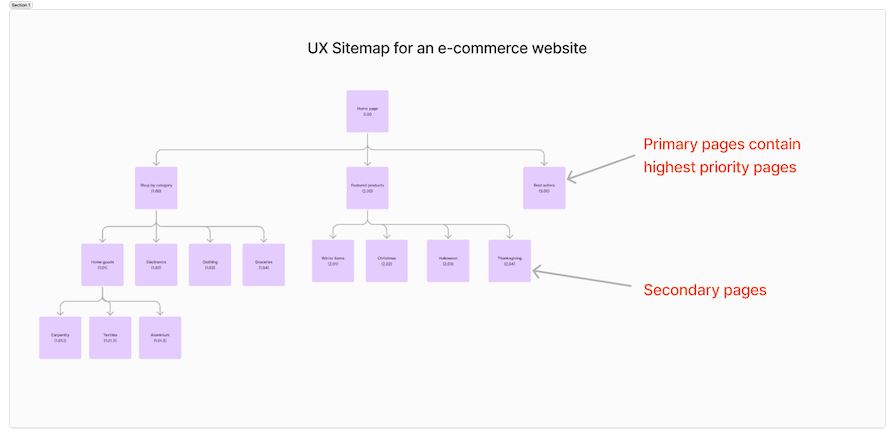
Every page has a unique reference number and is labelled with a name or page title, just like you would name your pages and screens in a design file. The highest priority pages are arranged in the first row and each of the following rows are organized in order of priority. There must be a clear indication of where each page is linked to the one before it.
Technically, you can design without a UX sitemap. You’ve likely already designed entire websites or apps without first creating a UX sitemap.
But in hindsight, you’ll realize that you and your team likely experienced one or more of the following issues:
A product developed without the clarity of thought and planning that a sitemap offers will very likely be confusing and difficult to navigate for users. UX sitemaps are a worthwhile investment that can prevent many frustrating issues throughout the design process and ultimately enhance your product’s UX.
At the very least, a UX sitemap is important because it helps the product team make certain design considerations way before the product is launched, saving time and money.
But a sitemap is a valuable tool for even more important reasons. Here are three key benefits of creating a well-organized sitemap early on in the design process:
For a UX designer, a UX sitemap can be the difference between a well-planned design project with a smooth handover to developers, and a choppy design job with last minute changes, disjointed user flows, and misaligned expectations with stakeholders.
Earlier in the article, we discussed how the UX sitemap depicts a user journey from a bird’s-eye view. This UX sitemap is often misinterpreted to be an element of information architecture or a user journey flow.
For clarity, this is how a user journey map or flow differs from a sitemap:
| Feature | User flow/journey map | UX sitemap |
|---|---|---|
| Focus | Shows the specific steps a user takes to complete an action or task. | Shows the entire structure and hierarchy of a website or application – providing a high-level view of the entire design. |
| Purpose | In a user flow, the user’s action determines their next step. This helps designers understand the user’s behavior and resulting experience from start to finish, identifying pain points and opportunities for improvement | The UX sitemap influences the user’s steps but is not influenced by their actions. It’s used to visualize the navigation relationship between different pages and sections of the product. |
| Details | User flows are paths in the entire map; they show a user’s steps from point one (or screen one) to the next. They provide a detailed view, showing each interaction and decision point. | The UX sitemaps give you a clear picture of the navigation summary. It typically offers a high-level overview, showing the main categories and subcategories. |
| User access | They cannot be seen by users but can be experienced. | Sitemaps, depending on the type, can be seen by users for easy navigation through a product. |
| User perspective | Strongly focused on the user’s perspective, considering their emotions, motivations, and potential frustrations. | Less focused on the user’s perspective, but more on the information architecture and navigation. |
An important note here is that a UX sitemap is not information architecture. The UX sitemap focuses on the content structures and page categories of the website, while information architecture highlights the structure of the website.
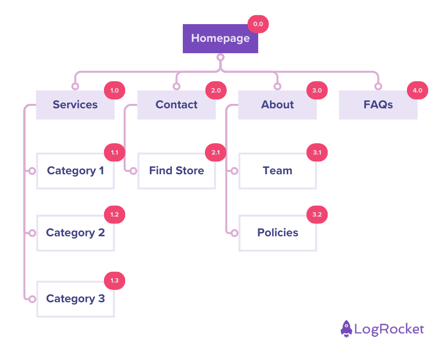
This is what a UX sitemap could look like:
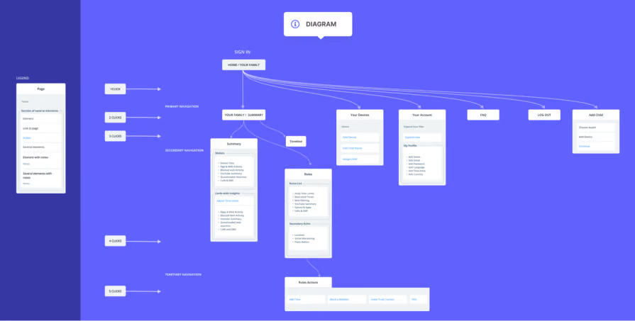
Meanwhile, this is what information architecture could look like:
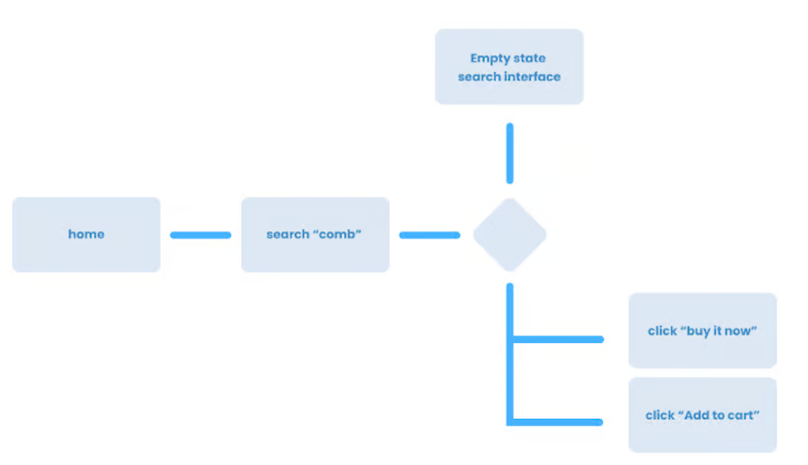
And finally, this is what a simple user flow diagram could look like:
There are a few key steps involved in creating a sitemap, and you might use different steps depending on your workflow. As we’ve discussed, you will have already done quite a bit of research, product discovery and ideation before you begin to work on designing a UX sitemap. As such, you should already be clear on:
Once you are clear on the above, you can follow these steps to create an effective sitemap:
The first step in creating a fully functional sitemap is to consider the outline of your product’s content. The best way to go about this is to write down all the information you will want to have on the site and organize it.
First list all your primary pages, then secondary pages, and so on and so forth. Here’s an example of the content list for an ecommerce site:
Be sure to note down the major sections of the website. You can also write them on sticky notes in a design tool like FigJam or Miro; this would help you group similar content. Choose the primary content hierarchy, then add the secondary pages under each primary content:
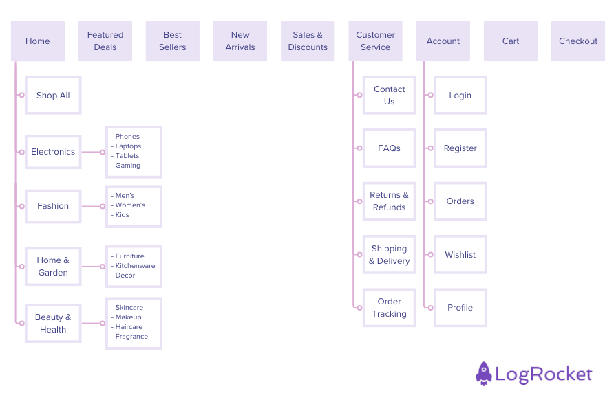
Depending on the complexity of your project, you’ll need to decide whether to adopt a flat or deep site architecture.
With flat architecture, any page on your website can be reached (by both users and site crawlers) in four clicks or less. As a result, websites with flat architecture are generally able to rank better in terms of SEO. Flat sitemaps are suitable for products with only a few pages (around 10), like personal portfolios, small business websites, or informational content.
For more complex products that have more pages, you’ll likely need a deep site architecture. This means it’ll take more than four clicks to reach certain pages or screens in your website or app. Examples include large ecommerce websites or apps, blogs and news content, social media platforms, corporate websites, government platforms.
Below is the sitemap for a hypothetical news website in which it’ll take at least four clicks to get from the homepage to “news story 1”:
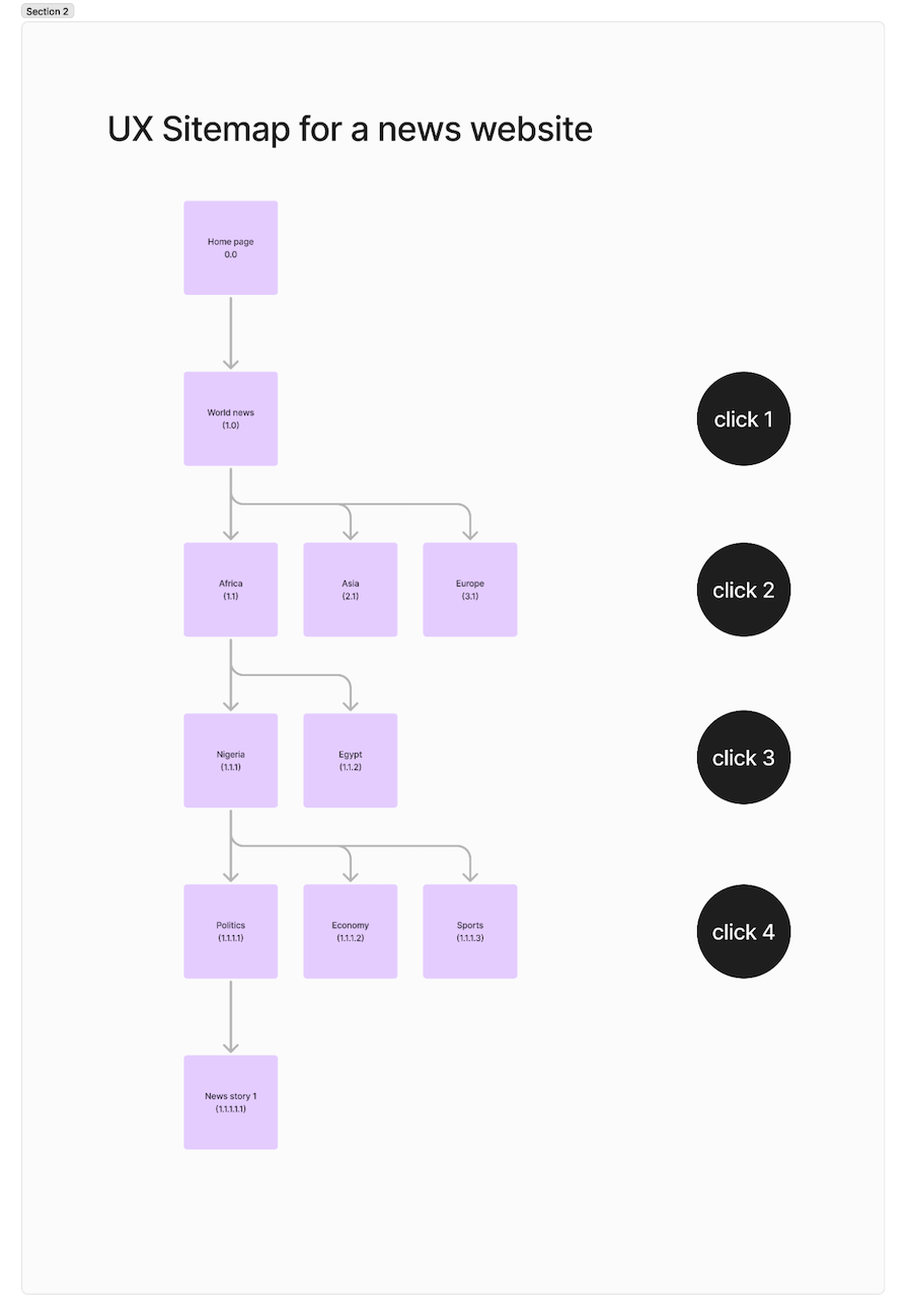
For this kind of website, you will need to adopt a deep UX sitemap. However, to improve your SEO and website usability, it is important to also think about alternative ways or shortcuts that’ll enable your users to reach deeper pages with fewer clicks.
The better organized your content is, the easier it is to use or navigate your website or app. In this step, group and organize content and categories according to importance and usefulness. Depending on the website or product, the content that is most important and useful are usually at the top of the page for easy findability.
For instance, an ecommerce site would most likely have items for sale in categories on the first page rather than chat features. It would also have search and filter features, making it easy for customers to use for shopping:
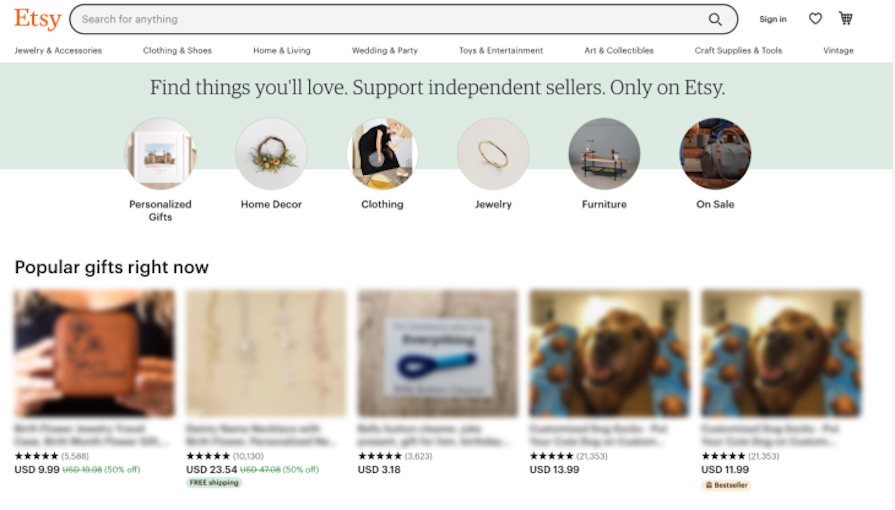
The image above is from Etsy. The content is organized in a way that makes it easy for customers to use; they can use the search bar to find an item or use the categories listed. Since it is a shopping site, the first page contains items for sale.
This step involves linking and grouping content pages that fit into the same category or page.
For instance, the About section of a site might tell a user about the product, so it should most likely be on the homepage, which the user will likely visit first. As such, the reference numbers will need to reflect this: your About page could be labelled as 1.0, which is the first page, followed by 1.1, which is linked to the mother page:
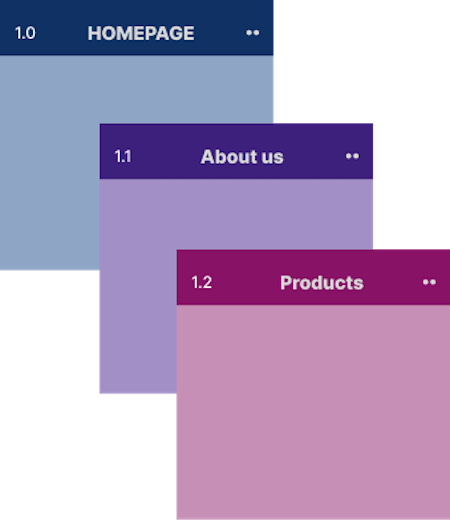
Pro tip: Use consistent terminology, reference numbering and formatting throughout your sitemap.
There are various design tools you can adapt to create sitemaps. Many of these tools even offer useful templates for creating your UX sitemap. The three I use most are:
I’ll discuss Miro and some other tools in more detail below.
For most projects, this is the final stage. After the designer has put the sitemap together, it can now be tested and shared among the teams for collaborative feedback to aid improvement.
Here, you can consult stakeholders and the product manager to understand what the top priorities are and complete iterations before the final development to save money and time. You can also run various scenarios to see how your users might interact with your product, identify edge cases, and any gaps in the products sitemap. Once you get feedback from the team, you can now trim unnecessary content or add relevant pages.
Pro tip: Conduct usability tests with potential users to identify potential navigation issues and areas of confusion. For this, you can create low-fidelity wireframes to visualize the layout and information hierarchy. You can also use card sorting exercises to test your information architecture with real users.
As we’ve already discussed, one of the key use cases for UX sitemaps is to get the most important content or pages to your users quickly. To do this, below are some considerations you should take into account.
Understanding your target audience is essential to creating a sitemap. Your site must be organized in a way that persuades your target users to make certain decisions without forcing them to do so.
This is why we research users—to find out their needs and patterns of interacting with products.
For instance, websites that have free trials are most likely to have people sign up after the expiration of the trial. In comparison, websites that ask users to subscribe first are more likely to have the user exit the website and look for one with a free trial, especially if they do not frequently use the product type.
In design, minimalism is influenced by both structure and elements, as well as the content. Consider what types of content and elements would be needed to optimize your product; try not to overload the pages with too much content.
Remember, for most content, less is more. For instance, do not overload your website with too much text content, and when using images or illustrations, try not to go overboard. Some negative space improves the user experience.
Consider the functionality of the site. Does organizing content in a specific pattern affect functionality? If yes, you need to go over your sitemap again.
Also, though new design trends and emerging patterns can be appealing, in certain instances, it’s important to prioritize functionality and familiarity over aesthetics.
An example of this is making the homepage the first thing you see when landing on a website or app. If a user is conditioned to see the homepage first but your website has the payment page first, it can be quite confusing and affect the function of your website because they need to make a decision before paying.
For complex digital products, designing a UX sitemap will come with some unique challenges. As with some of our most popular and well-loved products, a lot of careful planning goes into designing and updating every little feature and aspect.
Here are some challenges you’ll likely encounter and strategies to overcome them.
The main challenge in designing sitemaps for multi-product platforms is in maintaining consistency across multiple products while also highlighting unique features and benefits.
An example is Microsoft, which offers a wide range of products, including Windows, Office, Azure, and Xbox. Their sitemap likely includes a core structure with common elements like account management, support, and pricing. However, each product would likely have its own specific sitemap with detailed information about features, pricing, and support.
Some strategies you can consider are:
Adapting the sitemap to different languages, cultures, teams, and regional preferences can be complicated. To do this, you can consider:
An example of a product team that likely faces this challenge is Netflix, which offers content in multiple languages and regions. Their sitemap must account for different language preferences, currency formats, and content availability. For example, a user in the US might see different content recommendations than a user in Japan.
Continually evolving products can make it extremely challenging to keep the sitemap up-to-date over time. You can address this by:
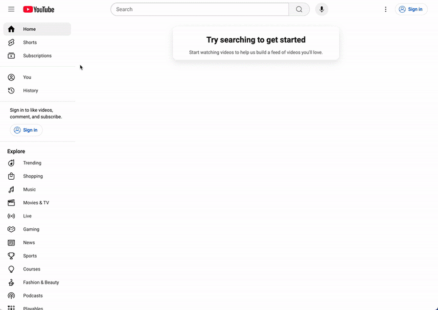
Consider how YouTube has evolved their product over time. The original site was fairly simple:
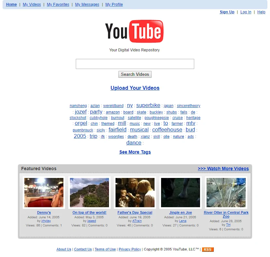
If we were to create a sitemap for the oldest and newest versions of YouTube, you’d see that it has since become much more complicated and personalized:
How do you organize large amounts of information in a clear and intuitive way? You can:
An example of a site with a highly complex IA is Wikipedia. This vast and interconnected site requires a well-structured sitemap. They use a hierarchical structure, with categories and subcategories, and a search function to help users navigate the massive amount of content.
You can use several types of tools for creating sitemaps. Before creating one, find a tool that is accessible by the rest of the team and not too complicated to use.
These would be some of my recommendations:
| Tool | Features | Use cases | Pros | Cons |
|---|---|---|---|---|
| Miro | Whiteboarding, mind mapping, diagramming, and prototyping | Collaborative brainstorming, sitemapping, user journey mapping | Highly collaborative, versatile, and user-friendly interface suitable even for non-designers. Has AI features. | Can be overwhelming for simple projects. |
| Figma (and FigJam) | Design, prototyping, and collaboration | UI/UX design, wireframing, prototyping, and sitemapping | Primarily a design tool, allows for real-time collaboration, and version control. Has AI features. | Steep learning curve for beginners |
| Whimsical | Diagramming, mind mapping, and flowcharting | Creating simple diagrams, sitemaps, and user flows | Very easy to use, intuitive interface | Limited advanced features compared to professional design tools like figma |
| Sketch | Vector graphics editor and prototyping tool | UI/UX design, wireframing, and prototyping | Primarily a design tool | Mac-only, steep learning curve for beginners |
| Lucidchart | Diagramming and flowcharting | Creating flowcharts, organizational charts, and sitemaps | Versatile tool for various diagram types, easy to use | Can be overwhelming for complex diagrams |
| Draw.io | Free online diagramming tool | Creating flowcharts, organizational charts, and sitemaps | Free, easy to use, and web-based | Limited advanced features and customization options |
| Flowmapp | Website planning and mapping tool | Creating sitemaps, user flows, and wireframes | AI-powered, focuses on website structure and user flows, easy to use | Less suitable for complex design tasks |
What is a UX sitemap?
A UX sitemap is a detailed visual outline of your digital product that aids efficient project planning. It helps you organize the content of your product (whether a website or app), showing how all the content and pages are connected. The final product improves usability, findability and efficiency.
How do you create a UX sitemap?
What is a sitemap vs. information architecture (IA)?
A sitemap focuses on the structure of content and pages, helping teams prioritize and plan design projects, while IA highlights the overall organization of information, influencing how users find and navigate the website or app. The two concepts are interlinked, and in fact, a sitemap will influence the information architecture.
What is a sitemap vs. wireframe?
A sitemap shows the big picture “blueprint” for the product, while wireframes focus on the layout and content of individual pages.
What are the best tools for making UX sitemaps?
There are various tools for creating detailed and adaptive sitemaps, and some even have AI capabilities. It’s most important to select a tool that is ideal for your project’s complexity and your team’s needs. Some of the best tools include:
As a designer, embracing structure and consistency reflects in the output of your digital products. Creating a UX sitemap at the start of your design project helps you organize your ideas, align better with your stakeholders, and plan more efficiently.
If you follow the steps outlined in this guide, you’ll be able to create a UX sitemap that serves as a solid foundation for your design process. You can use the sitemap to improve your workflows and collaborate more efficiently with stakeholders.
One thing to remember is that a UX sitemap is a living document. It’s important to regularly review and update it as your project evolves and as you gather more feedback from your users.
The ultimate goal is to create a seamless user experience for your users, prioritizing usability, consistency, and findability. At the end of the day, a detailed UX sitemap acts as a plan or blueprint that will help you navigate potential landmines, address gaps, and deliver optimized products for your customers.
Featured image source: IconScout
LogRocket's Galileo AI watches sessions and understands user feedback for you, automating the most time-intensive parts of your job and giving you more time to focus on great design.
See how design choices, interactions, and issues affect your users — get a demo of LogRocket today.

I’ve reviewed “final” designs more times than I can count — and the copy almost always gives users a reason to hesitate.

The checkbox is one of the most common elements in UX design. Learn all about the feature, its states, and the types of selection.

Optimization fatigue is real. Here’s why designing only for metrics drains creativity, and how to bring the human back into UX.

Let’s explore why and when to use drag and drop, discussing real-world examples, platform-specific considerations, and accessibility tips.