UI elements are visual and interactive components that provide navigational support to users; they help them better control the system they are using. They do this by providing an interface with a clear visual language, enabling messaging and navigation to be consistent and logical. The most commonly recognized UI elements include buttons, menus, and tabs. But there’s a whole world of UI elements beyond those. And broadly, we can group them into four categories:
In this article, we’re going to run through forty essential UI design elements that, as a UX designer, you’ll need to be familiar with to provide the best user experiences to visitors of your website or app.
Let’s dive in!
Editor’s note — This post was updated on 14 April, 2025, to include LogRocket’s YouTube video on UI elements for added context and clarity. We’ve also reorganized the examples around four key categories from the video — Navigation, Input, Feedback, and Display — to improve structure and readability. A new FAQ section addresses common questions about UI elements, and we’ve added reference tables to help you quickly scan each category. All examples and images have also been refreshed in this update.
Navigational UI elements help users find their way around an interface. They provide structure, orientation, and pathways so users always know where they are and how to get where they want to go.
Whether it’s moving between pages or switching views within an app, these elements are key to creating a smooth, intuitive journey. Navigational UI elements include:
| UI element | Description | Use case |
| Accordion | A collapsible content panel that expands or hides sections of information to save space and reduce cognitive load | Used on FAQ pages where each question expands to reveal the answer while collapsing the rest |
| Bento menu | A compact menu layout that displays a grid of options, inspired by Japanese bento box compartments | Found in apps like photo editors where users need quick access to multiple tools like crop and filters in a small space |
| Breadcrumb | A trail of clickable links showing the user’s path through a site’s hierarchy | Seen in ecommerce sites showing navigation like Home > Men’s clothing > Jackets > Leather jackets |
| Hamburger menu | A three-line icon that expands into a full menu when clicked, keeping interfaces clean and minimal | Common in mobile apps or websites to tuck away the primary navigation until needed |
| Kebab menu | A vertical three-dot icon that reveals additional options or actions in a dropdown when clicked | Used for overflow options like Edit, Report, or Remove on a post or list item |
| Meatballs menu | A horizontal three-dot icon, similar to kebab, offering hidden or less-used settings or actions | Used in toolbars or cards to display extra settings like Open in new tab or Download |
| Tab or nav bar | A horizontal or vertical set of tabs that allows users to switch between key sections or views of an application | In mobile banking apps, tabs let users switch between Home, Transactions, Cards, and Settings |
| Sidebar | A panel on the left or right side of the screen containing navigation links, filters, or tools | Gmail’s sidebar provides persistent access to Inbox, Sent, Drafts, and other folders |
| Pagination | Divides large sets of content into multiple pages with navigation to move between them | Search results pages often use numbered pagination like 1 2 3 Next |
| List of links | A straightforward list of hyperlinks directing users to different internal or external pages | Footer menus with links to About, Careers, Privacy policy, Contact, or on a sitemap page |
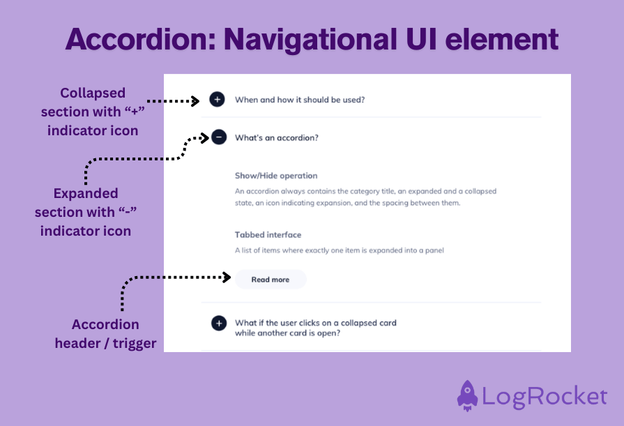
An accordion is a design element that enables users to collapse and expand content panels. Accordion UIs help conserve space on the screen and reduce the user’s cognitive load by revealing only that information a user needs at any one time.
An accordion might be used on a website’s FAQ page, for example, revealing each answer only when the user clicks on the question, and collapsing other answers:
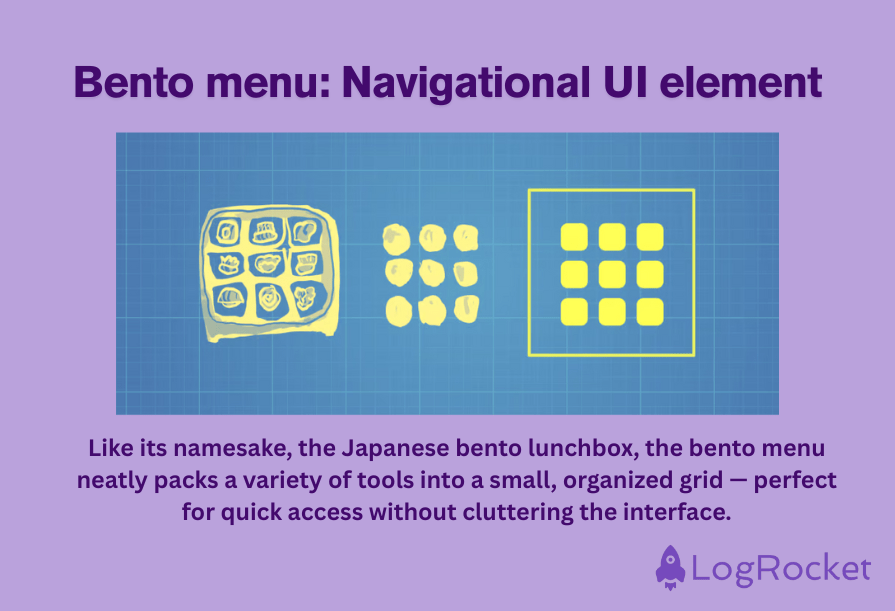
A menu element that seeks to be as compact as it is organized, the bento menu typically displays a set of actions or options within a structure similar to that of a Japanese bento box.
For UI designers, the benefit of using this element is that it presents the user with an array of options — both on mobile or desktop — while saving on screen space.
A popular use case for bento menus is within a photo editing app, whereby users are given easy and fast access to a range of cropping, filter, or text tools arranged in a small grid in one corner of the screen:
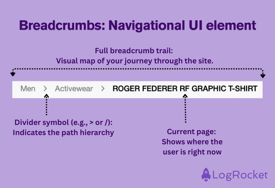
A useful navigation aid, a breadcrumb shows the user the route they’ve taken through the website’s hierarchy to reach their current location. It does this by displaying a trail of clickable links to the previously visited pages at the top of the page.
The benefit for users of this so-called “helper element” is that they can easily retrace their steps to the site’s main pages.
On an ecommerce website, for example, a trail of breadcrumbs might look like this: Home > Category > Subcategory > Product, with each word linked to its respective page:
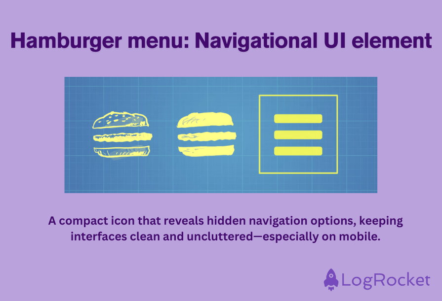
A hamburger menu is another element that helps UI designers conserve space on the page and present a less cluttered interface to users. The hamburger menu is represented by three horizontal lines, which resemble a hamburger.
When clicked or tapped, the element reveals a list of navigation options that were previously not visible:
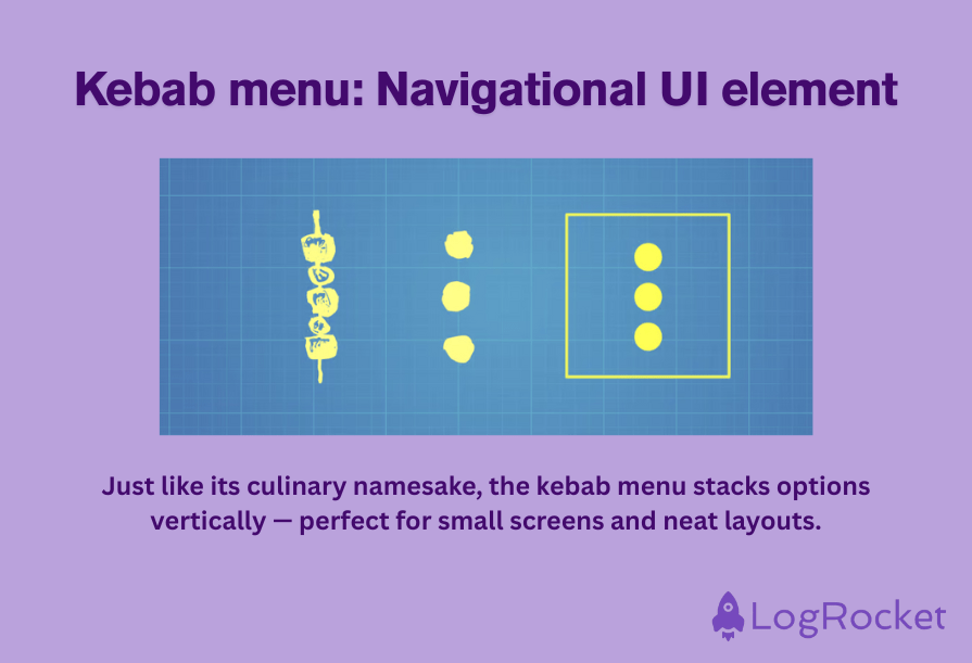
Sometimes known as an overflow menu, the kebab menu is a set of three dots, usually arranged vertically that, when clicked, reveal more options or actions for the user to choose from in a dropdown list.
Similar to the hamburger menu, kebab menus are used to keep an interface uncluttered and are typically employed to house less frequently used functions:
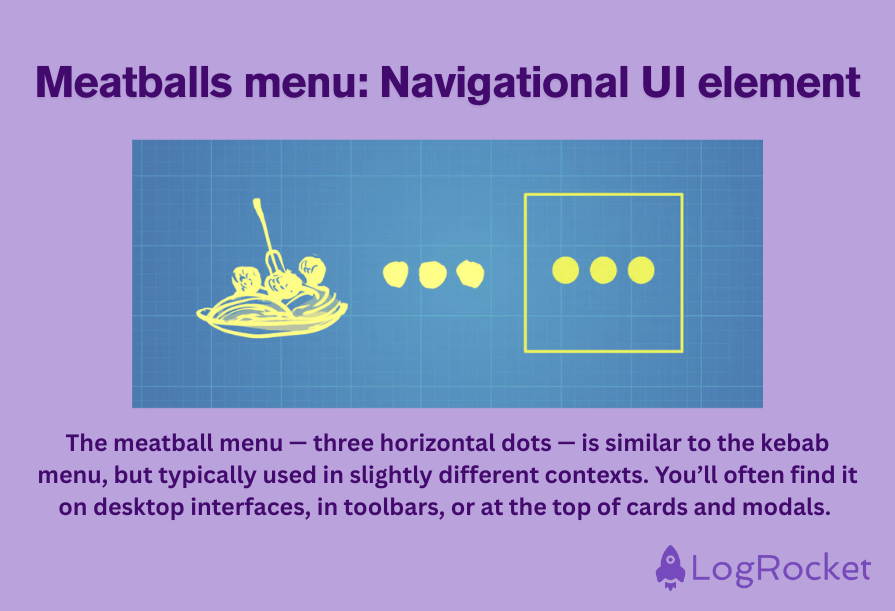
Similar to the kebab menu, the meatballs menu is another tool UI designers use to keep an interface uncluttered while still offering users a range of options, settings, or actions.
The meatballs menu appears as three dots, but unlike the kebab menu, which appears vertically, the meatballs menu appears horizontally:
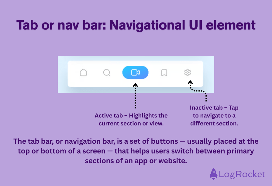
Typically consisting of a row or column of tabs, the tab bar is a horizontal navigational UI element found on mobile apps that we use to organize content and enable users to quickly switch between different key functions or parts of an application:
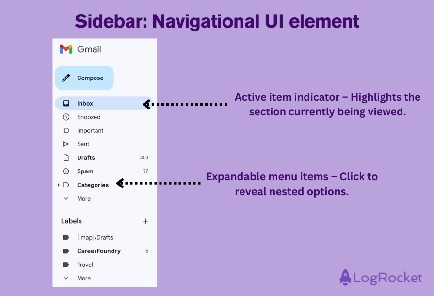
A sidebar in UI design is a panel that contains navigational tools, links, and information for users that helps them navigate to different areas of a website or use different functionalities. The sidebar is found at the side of the page, but it can be vertical or horizontal.
Gmail provides a good example of a sidebar, with users able to access different mail folders at all times along the left-hand side of the page:
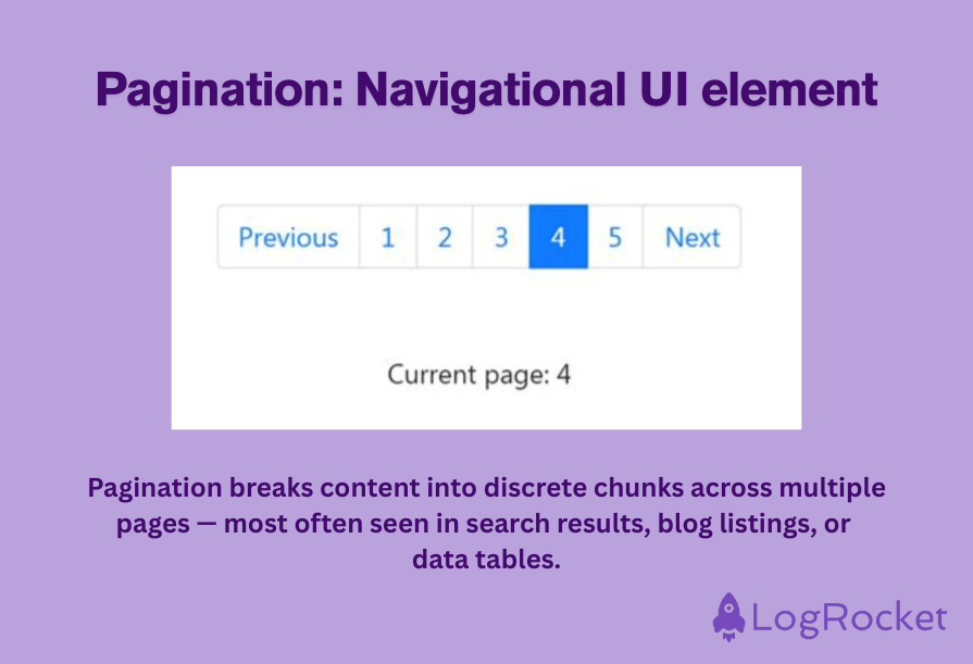
A key navigation tool, pagination is when content is divided into separate pages, supporting the navigation of large amounts of information and helping users find where they are within that data.
An example of pagination is the numbered links found at the bottom of search engine results pages:
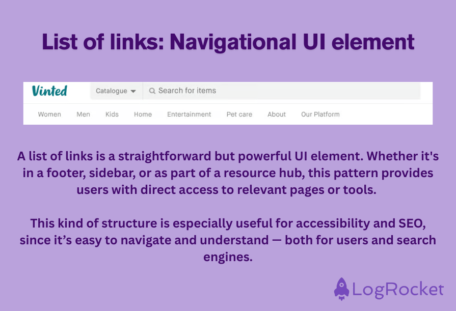
A list of links is a navigational element that hosts exactly what it describes: a list of links. These can be internal links to content within the site or external links to other resources.
A list of links might be displayed in a sidebar, the header, or the footer, or simply integrated into the main content area:
Input UI elements allow users to interact directly with a system — whether that means typing, selecting, uploading, or toggling. They’re how users provide information, make choices, and control what happens on the screen.
These components need to be clear, intuitive, and responsive — because even a small usability issue can cause frustration or errors. The more seamless the input experience, the more likely users are to complete tasks without hesitation.
| UI element | Description | Use case |
| Button | A clickable element that initiates an action when tapped or clicked | A “Submit” button at the end of a form triggers data processing |
| Checkbox | A square box that toggles between checked and unchecked states | Used to turn settings like “Dark mode” on or off |
| Dropdown | A menu that expands to show a list of selectable items | Used to select a country during signup |
| Input field | An area where users can enter or edit text, numbers, or other data | A login screen with fields for email and password |
| Combobox | A hybrid of dropdown and input field that allows text entry or item selection | A location field where users can choose or type a city |
| Multiselect | A dropdown-style input that lets users select multiple options | Selecting preferred transport modes like train and bus |
| Date picker | A visual or manual tool for selecting a date from a calendar | Choosing travel dates on booking websites |
| Form | A container with multiple input fields to gather user information | A registration form collecting name, email, and password |
| Password field | A secure input field that hides characters as the user types | Entering a password on a login page |
| Radio button | A small circle used for selecting one item from a list of exclusive options | Selecting gender identity during profile setup |
| Slider control | A draggable bar used to adjust values along a continuum | Adjusting screen brightness or volume levels |
| Stepper | An input with plus and minus buttons to increment or decrement values | Selecting a product quantity before checkout |
| Toggle | A switch that enables users to turn a setting on or off | Turning notifications on or off in app settings |
| Picker | A scrolling selector that lets users choose from predefined options | Choosing time or date in mobile app settings |
| Search field | A text input designed for searching within a system or database | Typing a query into Google’s homepage search bar |
| Comment | A field for posting written feedback or thoughts tied to content | Leaving feedback in Google Docs or a reply on Instagram |
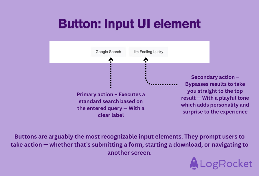
Buttons fall under the “input” category of elements used by UI designers and are interactive, visually recognizable design elements that can be clicked on or tapped by a user to initiate a specific action.
A common example of a type of button is the Submit button at the end of a form, which, once clicked on, triggers the processing of the form. Here’s another example:
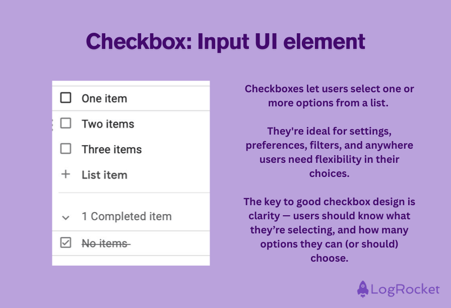
A checkbox is an element that most of us are very familiar with: a simple square box that a user can check or uncheck when clicked or tapped. You can signal this on the interface by the display of a small tick.
This design element can be used to allow users to toggle back and forth between two different states. For example, the checkbox next to the “Dark Mode” option on a device enables users to toggle between dark and light mode by checking or unchecking the box.
Here’s another example:
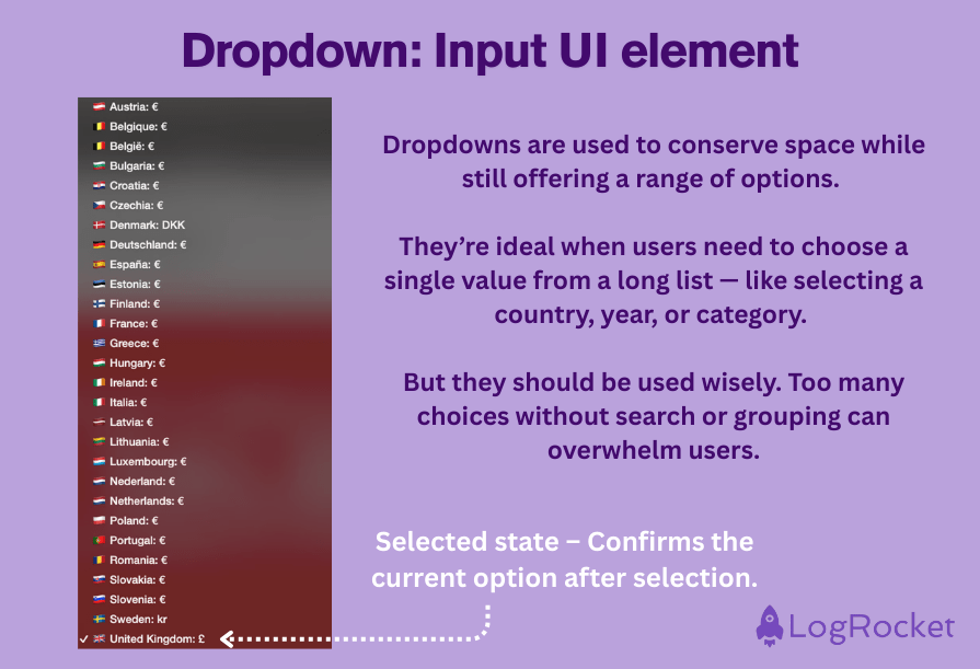
The dropdown allows users to select an item from a list of options that appear when the dropdown is clicked on. When selecting your country of residence, for example, it is common to see this UI element.
When clicked or tapped, the dropdown list displays a long list of countries, and the user selects the one that is relevant to them:
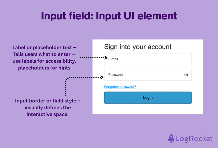
Search bars, text boxes, and dropdowns are all input fields; interactive areas of an interface where users can enter or edit data.
This design element is usually used to gather information such as login details, numbers, or dates, but can also be used for color selection, ratings, URLs, and much more.
Here’s an example:
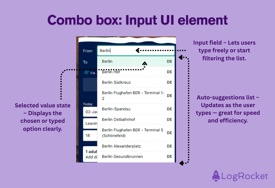
Combining the features of both a dropdown list and a text box, a combobox (short for combination box) enables users to either select an option from a list or enter a specific value if the option they are looking for is not immediately visible or available:
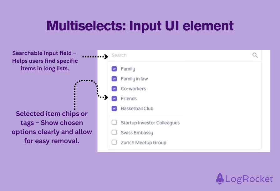
A multiselect is a design element that allows users to select multiple items from a list of options at the same time, in doing so, providing a streamlined process for communicating preferences and boosting user flexibility.
An example of a multiselect would be when users are asked to express their preferred method of transportation; the multiselect dropdown allows the selection of both “train” and “bus,” not just one or the other. You can also multiselect categories:
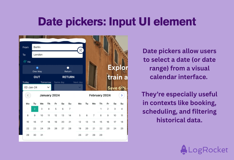
If you’ve ever booked a train, flight, or hotel, you’ll be familiar with the date picker design element.
This graphical input element allows users to select a date from a calendar image or input a date manually that is then submitted to the system:
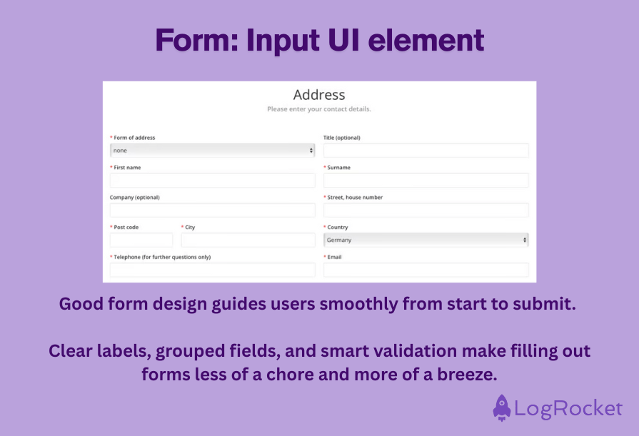
To collect user data in one place, a form consists of an arrangement of input fields, checkboxes, buttons, and other interactive elements. Commonly, we use forms for tasks such as user registration or data submission, with fields including name, email address, password, and so on.
At the end of a form, the user is usually required to click or tap a “Submit” button to confirm that they are happy for their data to be processed:
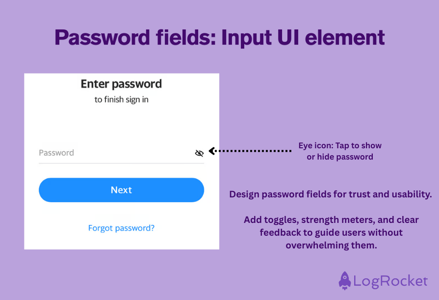
Another input design element, a password field, is the place where users are asked to type in their chosen password. This element is designed to securely capture the password information and conceal the characters entered by a user.
Password fields are most commonly found on login screens, where users are required to select secure passwords, with the characters hidden (usually with stars or dots) to prevent onlookers from seeing the password that has been entered:
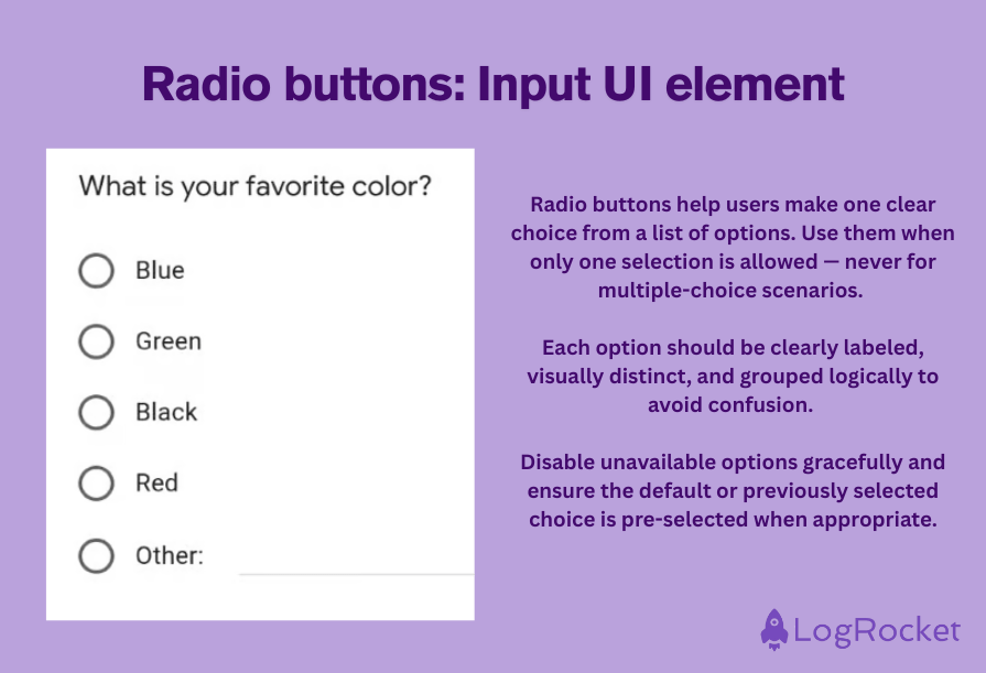
Similar to, but not to be confused with checkboxes, radio buttons are a type of input element that enables users to select a single option from a list of many mutually exclusive items. The key difference between radio buttons and checkboxes is that while checkboxes allow a user to select as many items as they wish, radio buttons only allow the user to select one item.
A good example of radio buttons is when a user is asked to select their gender on a form. In this instance, users can only select one of the available options, indicated by a filled-in circle that sits next to the selected gender identity. You’ll find radio buttons frequently in surveys:
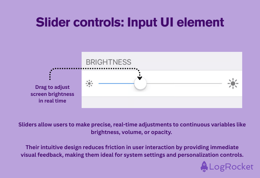
Commonly used for adjusting brightness or volume, slider controls are a popular UI element that support users in adjusting a value.
Visually, slider controls usually have a knob or handle that the user drags using a finger or mouse to adjust settings, choose preferences, or select values:
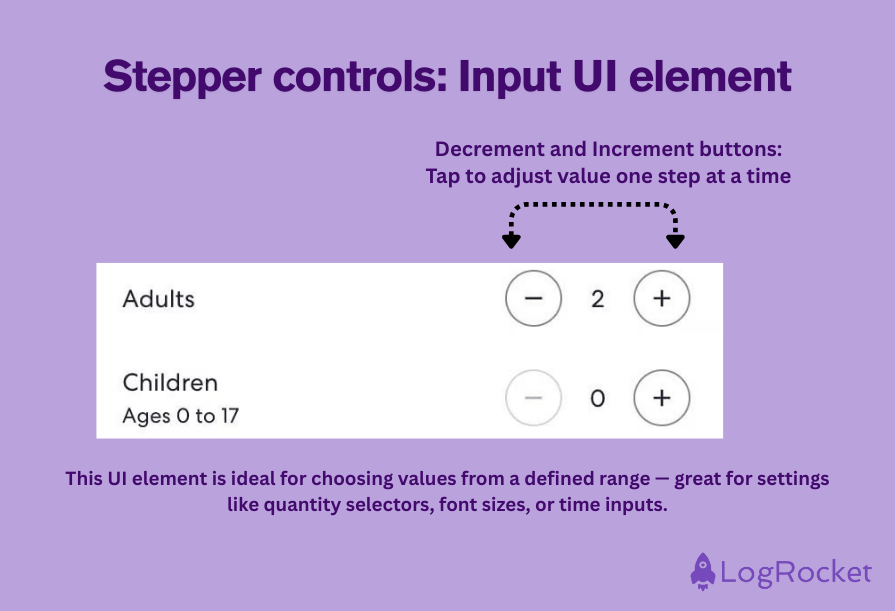
A stepper is not dissimilar to a slider, but this UI element differs from the latter in that, rather than offering a continuous range of values for a user to choose from, users can increment or decrement a value within a specific range.
The benefit of using a stepper is that it can make very precise adjustments, while for interfaces, the tool enables them to offer limited sets of values:
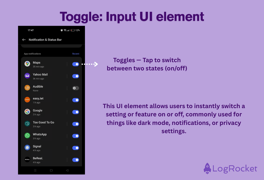
A toggle enables users to switch between two distinct states, usually by representing an on/off switch or an active/inactive option.
This control setting allows users to quickly enable or disable certain features within the settings of an application, website, or interface to customize their experience to their preferences:
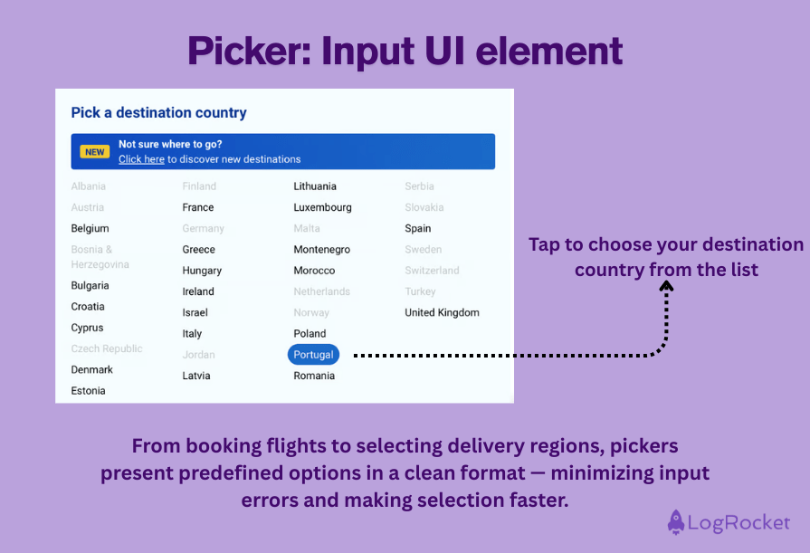
Most commonly seen in the context of choosing dates and times, a picker is a UI design element that allows users to choose a specific value from a set of predefined options.
The picker ensures that the format of all data entered is consistent across a platform, which makes it easier to categorize or analyze:
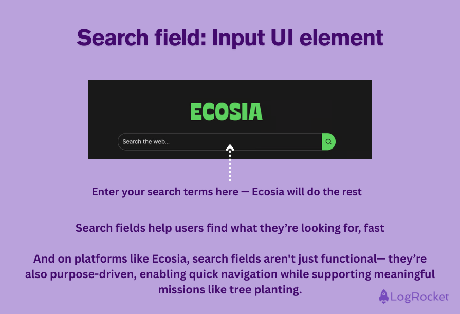
The search field element is a tool for assisting users in searching for specific data within an interface or system.
One example of a search field is the one found on search engine homepages that enables users to search the internet, but you’ll also find them in pretty much every type of program to help users search for specific information within that system:
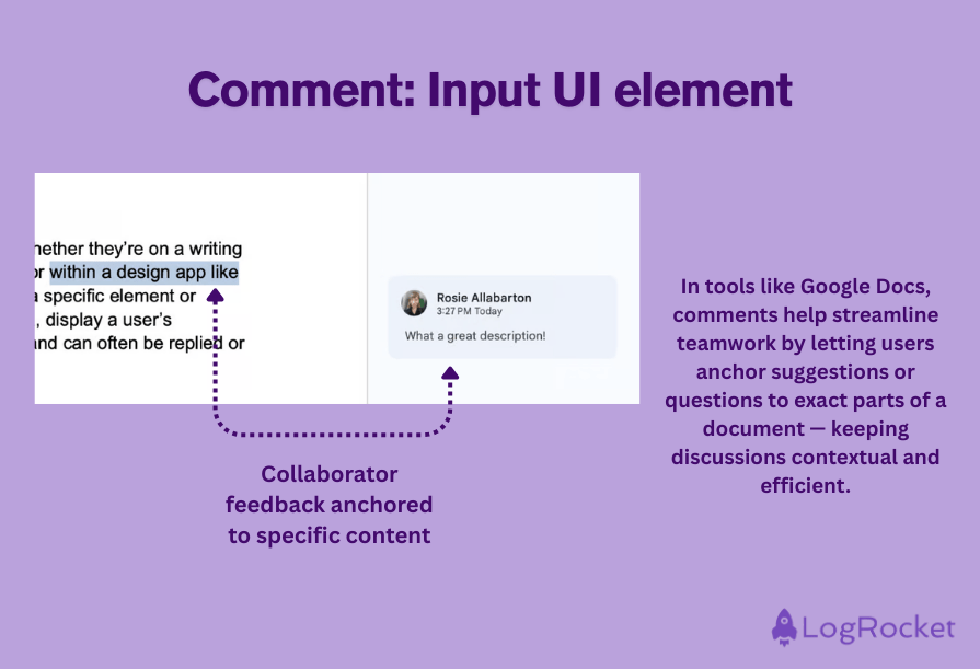
These days, we’re all pretty familiar with comments on interfaces. Whether they’re on a writing software like Google Docs, a social media platform like Instagram, or within a design app like Figma, comments display user-generated content that can refer to a specific element or section of the interface being viewed. In the case of social media, they can display a user’s response to an entire post.
Comments are posted in chronological order and can usually be replied to or responded to by other users viewing the page:
Feedback UI elements are the interface’s way of speaking back to the user. They confirm actions, display statuses, highlight errors, and provide guidance — all of which are essential to a smooth, responsive experience.
When designed well, these components keep users informed, reassured, and engaged throughout their journey.
| UI element | Description | Common use case example |
| Badge | A small visual indicator that shows status or counts | Unread message count shown as a red badge on a messaging app |
| Confirmation dialog | A popup that asks users to confirm before completing an important action | Appears before deleting a file or confirming a purchase |
| Modal | An overlay box that interrupts the main content until the user takes action | Displayed when users need to accept terms or respond to a prompt |
| Progress bar | A horizontal bar that visually tracks task completion or system activity | Uploading files or submitting a multi-step form |
| Toast notification | A short-lived, unobtrusive message that provides feedback without interrupting workflow | Confirmation that a message was sent or a setting was saved |
| Loader | A visual cue (often animated) that indicates content or data is being processed | Spinning icon while a webpage loads |
| Notification | A visual alert that draws attention to a new message, update, or issue | A red dot showing a new message or a warning for a failed process |
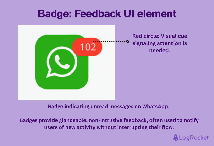
UI designers use badges as visual indicators within an interface to convey to the user the status of an item or specific information about it. Usually used in conjunction with an app icon, a badge on a messaging app icon, for example, is there to tell the user how many unread messages they have.
This badge typically appears as a number within a red circle in one corner of the icon:
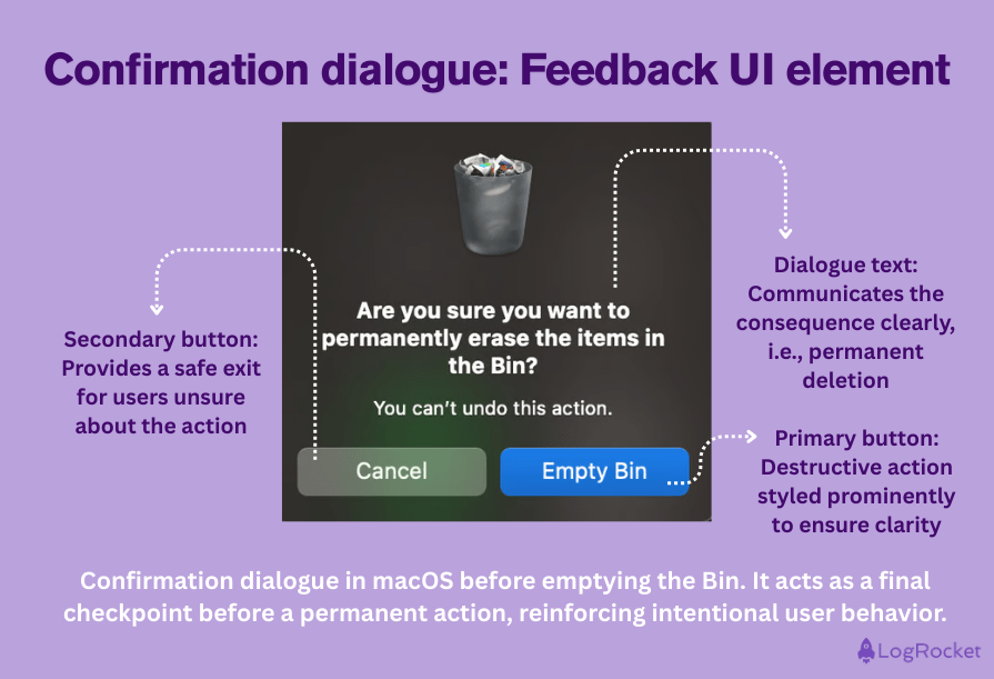
Confirmation dialogues are another input element consisting of pop-up messages or modal boxes that require user verification or consent before proceeding with an action.
These UI elements usually appear before potentially irreversible actions, such as deleting a file on your desktop or confirming a purchase on an ecommerce site:
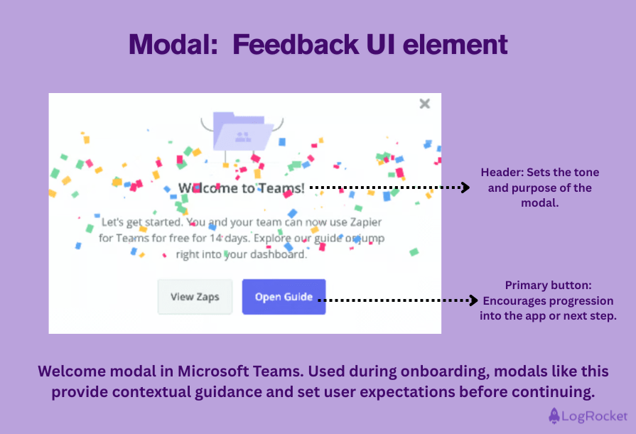
The modal is a small window or unit that overlays the main content on a webpage, with a message prompting users to take an action before they can get back to the main workflow.
While it is sometimes used as a marketing technique, with the box appearing just before a user tries to leave a site, it is also used as a preventative measure — when a user wants to delete a file, a modal box will appear to check they are sure about the action they are taking:
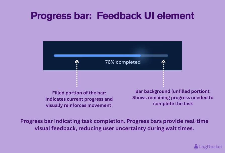
We’ve probably all encountered a progress bar at some time or another: it’s the horizontal line that gives users a visual clue as to the status of a task or process.
It’s commonly seen when downloading files, installing software, or submitting forms:
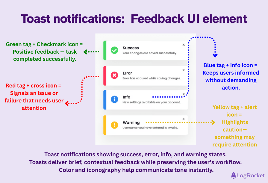
Providing a succinct communication function between an interface and a user, the toast UI element gives users feedback or information unobtrusively.
Without interrupting the user’s workflow, we normally see the toast element as notifications, alerts, or confirmations that appear at the top or bottom of the screen and disappear after a short period:
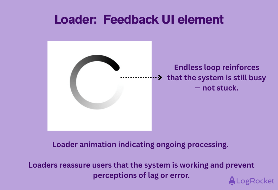
We’ve all experienced the loader UI element at some time or another. This (often fun) visual element indicates that the backend is completing an action or processing data.
UI designers sometimes use animations or progress bars when a webpage is loading to communicate to users that the content they are asking for is being collected.
The loader prevents the user from giving up or perceiving the short delay as a lack of responsiveness on the side of the system:
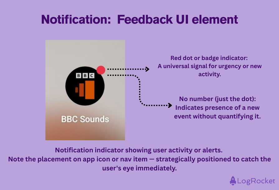
A notification is an alert that appears on an interface to communicate that something is new, has changed, or has gone wrong. Common uses for notifications include alerting users when a new message has arrived or letting a user know that a process they were trying to complete has failed.
Typically, notifications are displayed as red dots on an interface to immediately draw the user’s eye to them:
Display UI elements focus on presenting information clearly and effectively without requiring direct interaction from users.
These elements support usability by offering visual context, organizing content, and guiding attention — helping users understand what’s on the screen at a glance.
| UI Element | Description | Use case |
| Card | A modular container that displays related content such as text, images, and buttons in a cohesive layout | Used across social media platforms, dashboards, and content-heavy layouts |
| Charts | Visual representations of dat, like line graphs or pie charts, to simplify complex information | Common in analytics dashboards, finance apps, and admin panels |
| Icon | A visual representation of an object, idea, or action that enhances usability and recognition | Found throughout all digital interfaces including navigation bars, buttons, and tooltips |
| Feed | A continuously updating stream of content shown in chronological order | Core to social media platforms, news apps, and community forums |
| Tag | A label used to categorize and organize content for easier discovery | Frequently used in blogs, content management systems, and file managers |
| Widget | A compact UI element that shows key app features or data at a glance | Seen in mobile home screens, dashboards, and app sidebars |
| Carousel | A horizontal slider that lets users browse multiple images or cards in a limited space | Common in ecommerce homepages, product showcases, and portfolio websites |
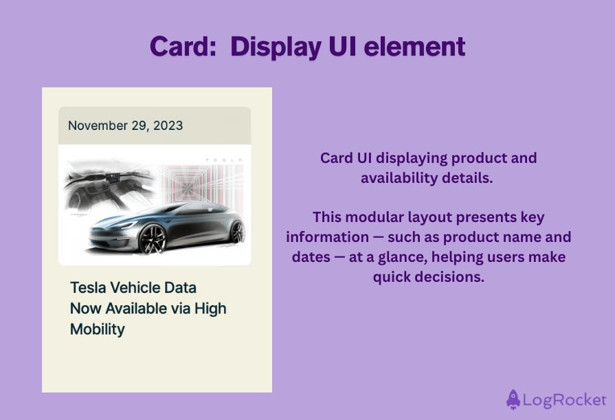
Used to display all sorts of related content, such as text, images, and buttons, a card is a modular container that presents a visually coherent yet distinct item on a digital interface. On a social media platform, for example, you might use a card to display a user’s profile picture and messaging buttons, presenting others with a cohesive picture of all of a user’s information in one place.
Cards are often laid out side by side on an interface, with each one presenting the user with a snapshot of what they’ll encounter should they pick one card or another:
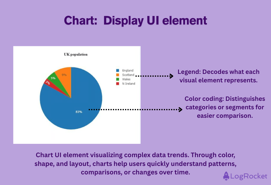
Charts represent data visually. For users looking to understand, analyze, or visualize data of a complex set of numbers, trends, statistics, or facts, charts can communicate this information in an easy-to-digest way through the use of compelling visual cues such as colored lines, pie slices, or bars, which represent different groups.
A finance app might publish a line chart that illustrates a company’s performance on the stock market over time, for example, communicating the status of that organization’s performance quickly and effectively to users. Or you might visualize the population this way:
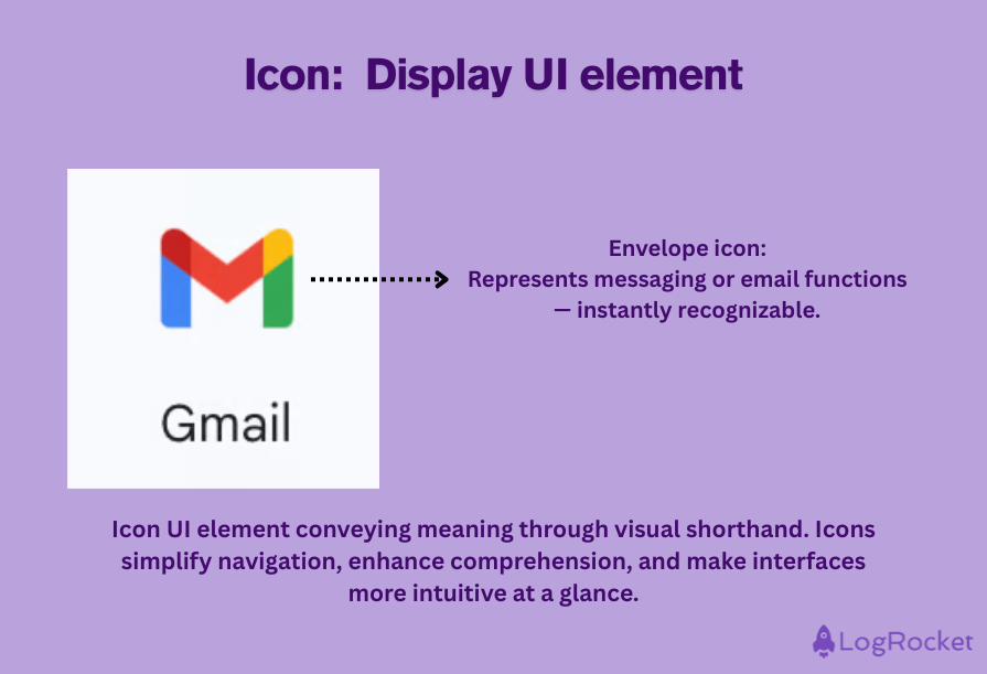
We use the word “icon” a lot in design, and this term generally refers to the visual representation of an object, idea, or action that is used to communicate a message to users quickly. Icons — when designed right — assist in making interfaces more intuitive and familiar, which speeds up interactions, reduces cognitive load, and makes for a more pleasant user experience.
An example of an icon would be an envelope, which is the universally recognized image for a message or email:
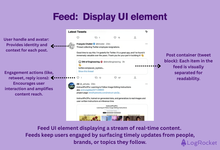
A feed is a continuously updated stream of user-generated content, typically presented in chronological order, that appears on a platform’s interface in the form of text, images, videos, memes, and more.
A social media timeline is a good example of a feed, whereby posts, updates, and activity from individuals or companies that the user follows are published dynamically and in an ongoing flow:
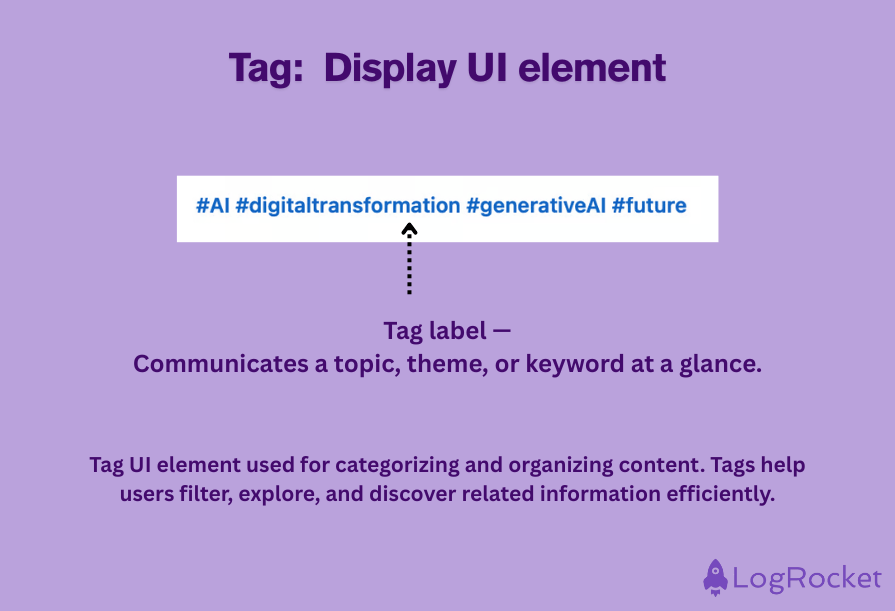
A tag is a UI design element that is used to mark, label, and categorize content that helps users find the information they need swiftly. Tags are invaluable for managing large amounts of data as they offer a fast way of creating topics and adding data to particular topics.
On social media and blogs, tags are particularly common as brands can make their posts more findable to users searching for specific keywords related to their industry:
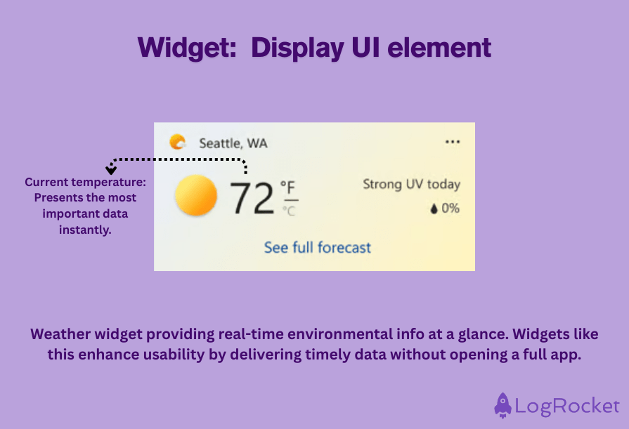
A widget is a UI element that provides a quick glimpse of an app’s most valuable information and functions.
Usually embedded in an application or interface, they’re a useful tool for developers and designers who wish to add specific types of content or features to an interface, while for the user, they serve to support more compact and modular interactions:
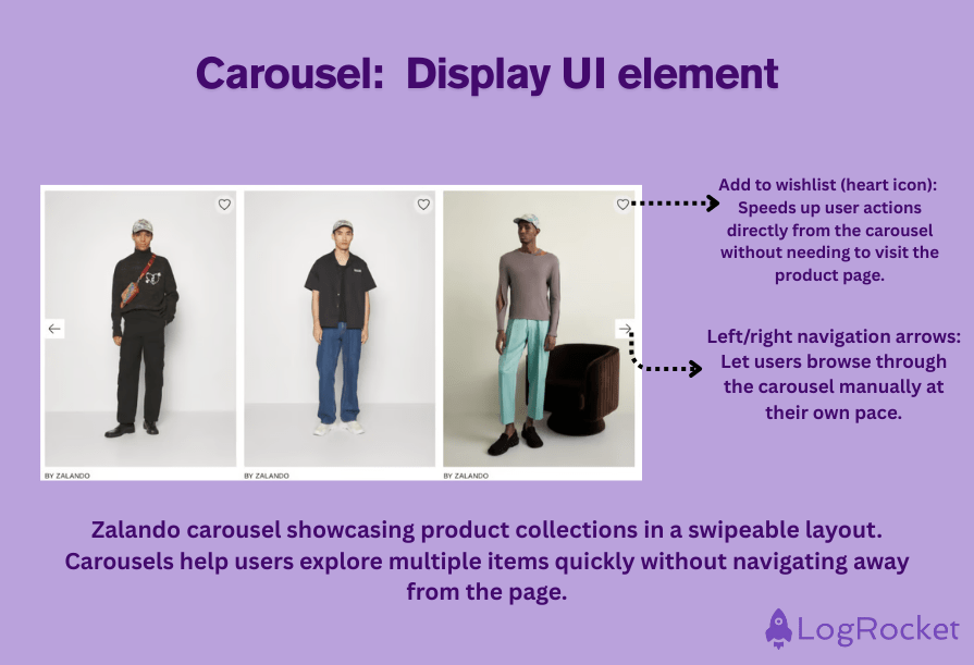
A carousel is a popular dynamic element because it enables users to browse a range of images or cards quickly and easily. On a mobile or tablet device, this is done by swiping horizontally, while on a desktop, the same result is achieved by clicking on an arrow.
These cards might tell a story or link to more resources, always moving in a cyclical motion. Carousels are a great way for UI designers to optimize the space they have available to them and showcase multiple ideas in one area:
UI elements are the building blocks of user interfaces. They include everything from buttons and input fields to charts and cards — anything that users interact with or use to absorb information.
They create the structure and experience of a product. Well-designed UI elements help users navigate, complete tasks, and understand content efficiently and intuitively.
Start with the user’s goal. Choose elements that reduce friction and guide users toward their objectives — whether that means using a button for clear calls to action or a card to organize content visually.
Interactive elements respond to user actions (like buttons, sliders, and forms), while display elements organize and present information (like cards, icons, and charts).
Good UI elements improve usability by being intuitive, accessible, and consistent. They help reduce cognitive load and make digital experiences feel seamless.
Yes — maintain visual consistency, prioritize accessibility, use standard patterns users recognize, and always test your UI with real users to see what works best.
We’ve just explored forty of the most common UI elements you’ll run into when designing digital products — from buttons and sliders to cards and carousels.
As a UX designer, these elements are your everyday toolkit. Use them to craft smoother, smarter, and more intuitive experiences that guide users, support their goals, and keep them coming back for more.
Want to see some of these elements in action? Check out this quick breakdown on YouTube to get inspired and start putting these components to work in your own projects:

LogRocket's Galileo AI watches sessions and understands user feedback for you, automating the most time-intensive parts of your job and giving you more time to focus on great design.
See how design choices, interactions, and issues affect your users — get a demo of LogRocket today.

I was working with an intern on a UX research project, and before we even started, we both had private […]

AI has accelerated design execution, but speed can come at the expense of intentionality. Learn how UX teams can preserve product thinking and judgment.

UX testing is not limited to layouts, copy, and visual design. Full-stack and server-side experiments help teams evaluate how backend logic, APIs, algorithms, and product flows affect the overall user experience.
In A/B, A/B/n, or multivariate testing scenarios, using p-value with traditional null-hypothesis-based statistical analysis is so common, and most designers […]

 Learn more →
