Content is in excess across the internet, and finding a proper way to present this content (with user experience in mind) is a good foundation for creating products that hook your audience. Pagination and infinite scroll are two common approaches used in web design to display large collections of similar content to a user.
Both methods have use cases where they thrive and, conversely, other scenarios where they’re not as effective. In this post, we’ll analyze the two approaches and learn how to make the right decision for the best user experience in our apps.
Editor’s note: This article was updated by the author on 20 February 2025 to provide easily skimmable bulleted lists of best practices and recommendations for both paginated and infinitely scrollable content formats, pros and cons of each approach, clear recommendations around when to use each (or a hybrid approach), and updated examples of each content format in action.
Pagination is the process of dividing content to be displayed across a site (or application) into discrete pages. By separating content this way, users can easily sift through your material while having the option to go back and forth between pages, searching for their desired result.
LogRocket’s blog landing page is an example of a well-paginated interface:
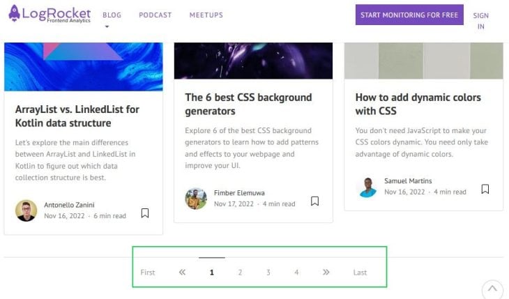
The pagination system at the bottom allows users to traverse content easily, from the front page of the blog up to the last page. I think we can agree that this approach can make the browsing experience somewhat like reading a book — hence the term “pagination,” like turning physical pages.
Generally, pagination is known to be a fitting approach when designing interfaces for goal-oriented tasks, like displaying the search results of a query.
Pagination also has other benefits, including improved page load times, but we’ll cover all its ups and downs in a subsequent section.
Here are some best practices you can implement to improve the UX of your pagination system:
Let’s now take a look at infinite scroll.
Infinite scroll is a design pattern that continuously loads new content when a user reaches the bottom of the page. The standout benefit of this approach is that it reduces interaction costs, allowing your user to arrive at new content without clicking Next or Previous buttons, like you would on a paginated interface.
The Pinterest app is a fine example of infinite scroll in action:

By continuously serving fresh content, Pinterest encourages its users to continue scrolling to see if the unfolding content satiates their search — or is better than a previous result already seen on the page.
Subsequently, this scrolling action increases the user’s engagement. The psychology behind this model’s success is better explained by the third step in Nir Eyal’s Hooked Model: variable reward.
Here are some best practices you can implement to improve the infinite scroll UX:
Just like pagination, infinite scroll comes with its drawbacks, and in the following section, we’ll dive deep into the highlights and challenges of both approaches.
Now that we’re familiar with these two approaches to rendering content, we can dive into the pros and cons of both from the perspective of delivering a satisfying user experience. Here are some major factors to consider when choosing between these content presentation options:
| Factor | Pagination | Infinite scroll |
|---|---|---|
| User engagement | ✅ Offers a convenient layout for viewing content and completing tasks, which can boost conversions | ✅ A continuous supply of content encourages users to spend more time on the site, thereby keeping them engaged |
| Cognitive load and interaction cost | ❌ Requires extra manual and repetitive actions to arrive at new content; clicking Next, Previous, or numbered page buttons may cost user attention | ✅ Since scrolling is more intuitive to web visitors, it‘s easier for a user to browse through the site without making extra interactions to arrive at new content |
| Navigation | ✅ Allows users to open or bookmark individual pages, and keeps footer content in view to assist with navigation | ❌ Keeps footer content out of view and makes it difficult to find specific content, return to previous sections, and understand the overall structure of the page |
| Performance | ✅ Paginated pages usually contain less content, resulting in faster page loads | ❌ Displaying and continuously fetching a lot of content can increase load times, especially for users with poor internet connections
Tip: Providing visual feedback with skeleton screens can help mitigate user frustration when content loads slowly |
| Usability and content discovery | ❌ Content is not presented seamlessly to the user, with less content per page, potentially frustrating or distracting users Increasing the number of results per page is a good fix for this problem — LogRocket’s blog page serves 24 posts before revealing the pagination system. |
❌ Doesn’t save the user’s scroll position while interacting with content, potentially making it harder to complete tasks
Tip: Adding a Load More button instead of loading new content automatically allows users to keep the footer in view |
| Mobile experience | ❌ Opening new tabs or navigating between pages to view content is not a smooth experience for mobile users | ✅ Scrolling down for new content is often more convenient than opening results in new tabs or pages for mobile users |
| Accessibility | ✅ Better experience for screen reader users as pagination provides clear landmarks (e.g Page 2 of 12) to guide the user | ❌ Infinite scroll dynamically updates content and can cause content shifts which can be difficult for assistive technologies to track |
| SEO | ✅ Pagination creates distinct URLs for content, allowing search engines to crawl and index. This also helps with internal linking | ❌ Infinite scroll relies on user interaction (scrolling) to load new content. If proper workarounds (like dynamic URL updates or preloaded paginated versions) aren’t implemented, search engines cannot crawl and index all content, leading to poor SEO performance |
Both content layout approaches are promising, but it ultimately depends on the user experience design of your product. Are you aiming to increase user engagement? Does your product rely on user-generated content? Infinite scroll is known to be a better approach for these scenarios. Or are you looking to help users complete goal-oriented tasks whilst delivering a satisfying navigation experience? Then pagination will solve this for you.
I prefer infinite scroll for its intuitive design, but both approaches have their strengths and can be optimized for better performance. Let’s explore examples where each method works best.
Who benefits most?
Who benefits most?
Let’s look at two websites that successfully use pagination to enhance user experience and SEO: Hacker News and the New York Times.
Hacker News keeps things simple, making it easy for readers to browse through content:
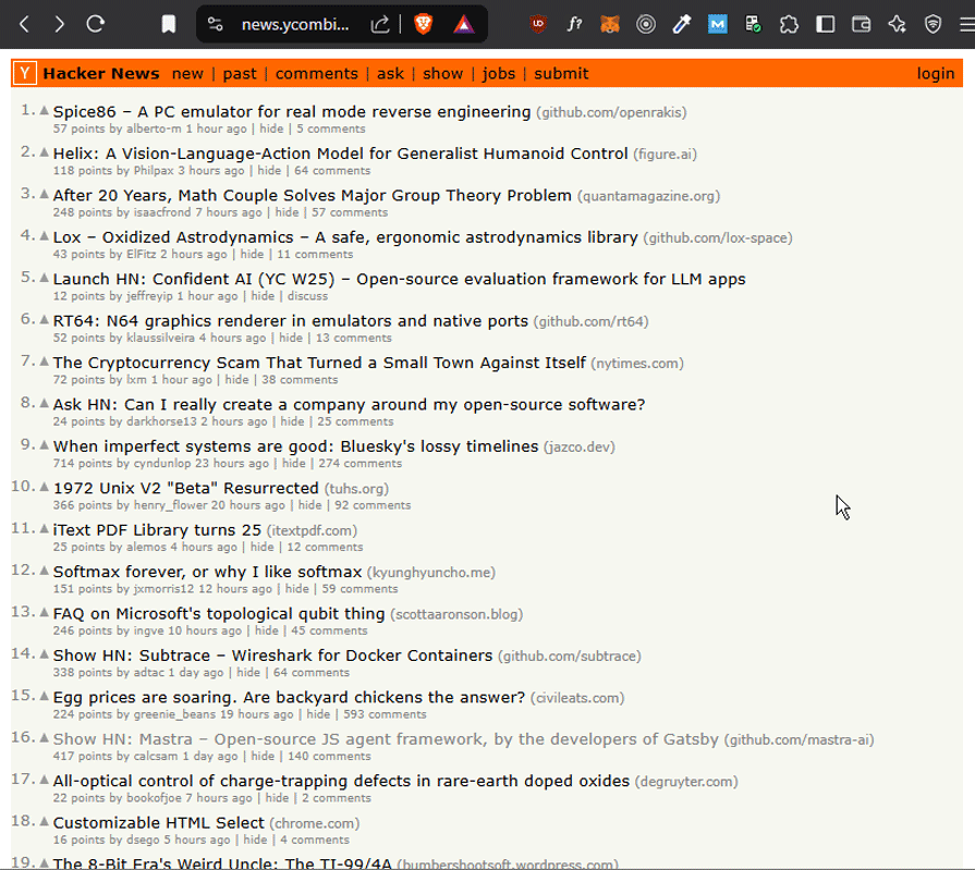
However, one notable drawback is the lack of a Previous button. If a user wants to return to an earlier page, they have to rely on their browser’s back button rather than a dedicated navigation option. This can disrupt the browsing experience, especially for deep dives into older content.
As expected of such a major publication, this one’s impressive! Take a look:
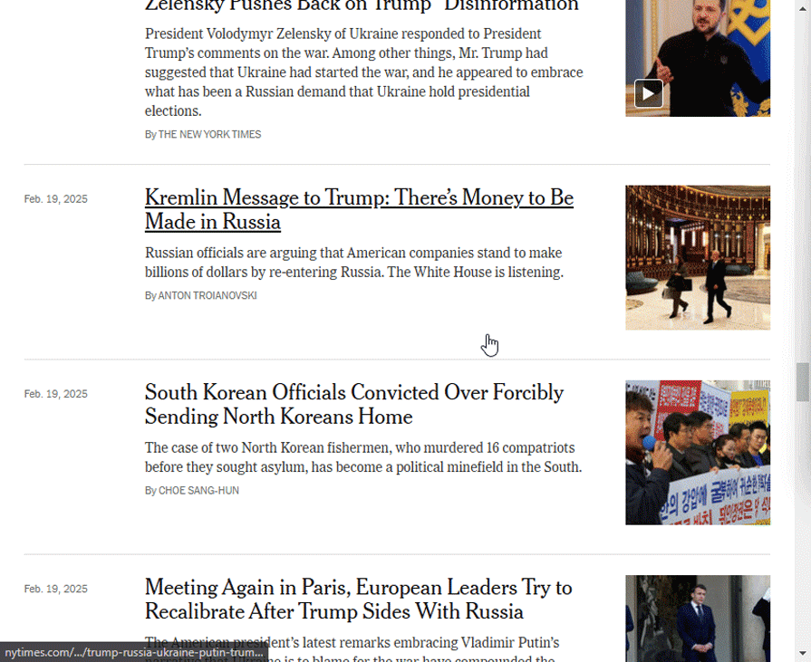
You’ll notice that the site combines both pagination and infinite scroll for an optimal reading experience:
This hybrid approach provides the best of both worlds — seamless discovery while maintaining structured navigation and SEO-friendly page indexing.
Let’s explore how Pexels and ASOS use infinite scrolling to create a smooth and engaging user experience.
Pexels, a stock photo platform, uses infinite scroll to help users discover images effortlessly:
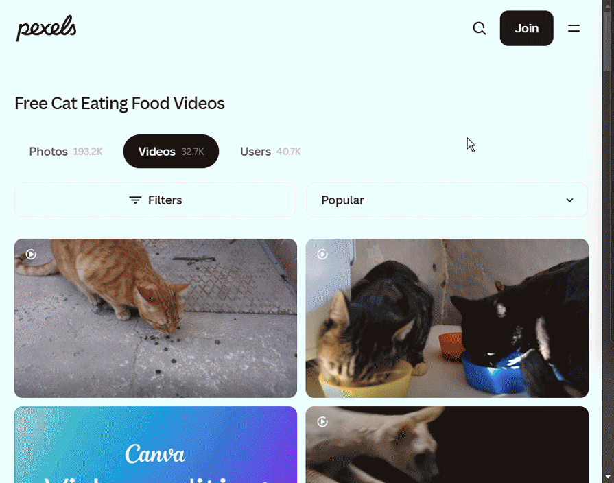
This approach works well for visual discovery platforms because users often browse passively until they find something they like. The dynamic loading keeps engagement high without unnecessary interruptions.
ASOS, an ecommerce fashion store, also uses infinite scroll, but with a more structured approach:
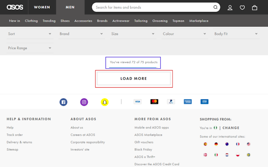
Why it works:
There are a variety of tools for implementing pagination and infinite scroll in your interfaces. No code tools like Webflow and WordPress have plugins you can use in their website builders. Here are some resources to get you started:
The JavaScript ecosystem also has popular packages for infinite scroll and pagination.
Both pagination and infinite scroll offer unique advantages, and the right choice depends on the nature of the content and the user experience goals.
Pagination provides structured navigation, making it ideal for goal-oriented tasks like searching or comparing products. On the other hand, infinite scroll enhances engagement by allowing seamless exploration, especially for content-heavy platforms like social media and visual discovery sites.
Hybrid approaches, such as the New York Times’s implementation, demonstrate that infinite scroll can be designed thoughtfully to balance engagement and usability. Ultimately, understanding user behavior and optimizing for performance, accessibility, and SEO will help in making the best decision for your application.

LogRocket's Galileo AI watches sessions and understands user feedback for you, automating the most time-intensive parts of your job and giving you more time to focus on great design.
See how design choices, interactions, and issues affect your users — get a demo of LogRocket today.
Traditional A/B testing splits traffic evenly, but multi-armed bandits dynamically send more users to the better-performing version. Here’s how the method works, where it helps, and when UX teams should use it over classic A/B testing.

AI agent simulations promise faster, lower-risk UX testing by replacing real users with AI-simulated personas. Here’s how the method works, where it falls short, and when designers should rely on simulated users versus real user testing.
A/B testing is great for comparing two versions of a design, but multivariate testing helps teams evaluate multiple design element combinations at once. Here’s how both methods work, how they differ, and when UX teams should use each one.
Design engineering has always lived between design and code. But with AI tools turning prompts into interfaces and code into editable canvases, that bridge is becoming a new way of building.


