Editor’s note: This guide to using styled-components with React Native was last updated on 17 April 2023 to reflect changes to React Native and include new sections on the benefits of using the styled-components library.

Styling an application is an important aspect of development, and managing styles can lead to better code readability. In React Native apps, styling components is done with the default method of the StyleSheet API.
However, the CSS-in-JS approach using styled-components is another way to create and style UI components in React Native apps. In this tutorial, we’ll discuss the advantages the styled-components library has over the general StyleSheet manager in React Native.
Jump ahead:
The Replay is a weekly newsletter for dev and engineering leaders.
Delivered once a week, it's your curated guide to the most important conversations around frontend dev, emerging AI tools, and the state of modern software.
The styled-components library is an open source CSS-in-JS library that allows you, as a React Native developer, to define UI components and styles in a single file location. It becomes easy to couple styling with its suitable component, which may result in an optimized developer experience when working with large applications.
StyleSheet and styled-components?When using StyleSheet, you’re basically using a React Native module to instantiate style classes. Once these classes are defined and instantiated using StyleSheet.create({...}), these classes can then be applied to your components using the style property. See the example below:
import React from 'react';
import {StyleSheet, Text, View} from 'react-native';

const App = () => (
  <View style={styles.container}>
    <Text >React Native</Text>
  </View>
);

const styles = StyleSheet.create({
  container: {
    flex: 1,
    padding: 24,
    backgroundColor: '#eaeaea',
  }
})
When using styled-components, you aren’t declaring styled classes — you are actually creating components that are inherently styled. This means that rather than creating a component, then creating a class using StyleSheet, and then applying that class to the component; you can create the component with the predefined styles without separately declaring style classes. See the code below:
import React from 'react';
import {Text, View} from 'react-native';
import styled from 'styled-components/native';

const App = () => (
  <Container>
    <Text >React Native</Text>
  </Container>
);

const Container = styled.View`
  flex: 1;
  background-color: white;
  align-items: center;
  justify-content: center;
`;
One advantage that the styled-components library has over React Native’s default way of defining styles is that it allows us to use plain CSS over styles that are defined using JavaScript objects. It is better for developers with experience in a web-based background.
For example, React Native follows a styling convention when defining CSS property names. It uses camelCase based property names. A background-color property in a React Native app using the StyleSheet API is written as: backgroundColor: 'tomato';.
When using the styled-components library, you can use the CSS naming conventions. Therefore, backgroundColor is written as background-color just like in plain CSS. React Native allows us to define values for properties like margin, padding, shadows, font size, and more by defining without a unit such as px (pixels). For example, the font size when using StyleSheet API is defined as fontSize: 20;. These unitless values render differently on various screen sizes due to the pixel density of a particular screen.
When using styled-components, however, you have to use the suffix px when defining the value of a property like font-size because styled-components uses css-to-react-native. The css-to-react-native library requires units to be specified. This package enables styled-components to convert plain CSS properties into React Native style sheet objects in the background. This isn’t a drawback to styled-components; instead, it is something to be mindful of.
To install the styled-components library, start by creating a new React Native project. For a quick development process, I am going to use expo-cli. After the project directory is created, make sure to install the styled-components library. Then, open up a terminal window and execute the following command:
npx expo-cli init [Your Project Name]
# after the project is created
cd [Your Project Name]
# then install the library
yarn add [email protected]
# also install the icons library
expo install @expo/vector-icons
In this section, let’s write our first styled component to display the title of the app in the App.js file. To get started, import the styled-components library with the command below:
import styled from 'styled-components/native';
To use the styled-components library in a React Native app, you must import the /native to access primitive components instead of importing them directly from React Native. Then, let’s replace the View and Text components from the react-native library.
These new components are going to follow the custom semantics from styled-components. Here is an example of View and Text components being styled using styled objects from the styled-components library:
const Container = styled.View`
  flex: 1;
  background-color: white;
  align-items: center;
  justify-content: center;
`;
const Text = styled.Text`
  font-size: 18px;
  color: blue;
  font-weight: 500;
`;
These custom styled-components use the same CSS logic to style the components as any React Native app. The difference here is that writing property names and their values closely follow plain CSS conventions rather than React Native. The modified App component looks like the below code:
export default function App() {
  return (
    <Container>
      <Text>Open up App.js to start working on your app!</Text>
    </Container>
  );
}
Now, go back to the terminal window. To see the code in action, execute the command yarn start. You can now view the following result in any iOS or Android emulator or a real device that has Expo Client app. Here’s what that looks like:
Creating custom components in any React or React Native app requires the use of props. The advantage here is that the application’s code remains as DRY as possible. The styled-components library allows you to consume props in custom components, something not available in React Native when using StyleSheet objects.
Let’s take a trivial example. In the components/ directory, create a new component file called PressableButton.js. This component will later be used in the App component to display a custom button component.
Inside this file, let’s create a custom component using TouchableOpacity and Text. This custom button component is going to have props such as a custom button title, and bgColor to set the background color of the button component to any valid value from the parent component, as shown below:
import React from 'react';
import styled from 'styled-components/native';
const ButtonContainer = styled.TouchableOpacity`
  margin-vertical: 40px;
  width: 120px;
  height: 40px;
  padding: 12px;
  border-radius: 10px;
  background-color: ${props => props.bgColor};
`;
const ButtonText = styled.Text`
  font-size: 16px;
  text-align: center;
`;
const PressableButton = ({ onPress, bgColor, title }) => (
  <ButtonContainer onPress={onPress} bgColor={bgColor}>
    <ButtonText>{title}</ButtonText>
  </ButtonContainer>
);
export default PressableButton;
To set the background color of this custom component dynamically, you can pass an interpolated function such as ${props => props ...}. This interpolated function is equivalent to the following code snippet:
background-color: ${(props) => {
  return (props.bgColor)
}}
To test this out, go to the App.js component file, and import the PressableButton component after other statements, like so:
import PressableButton from './components/PressableButton';
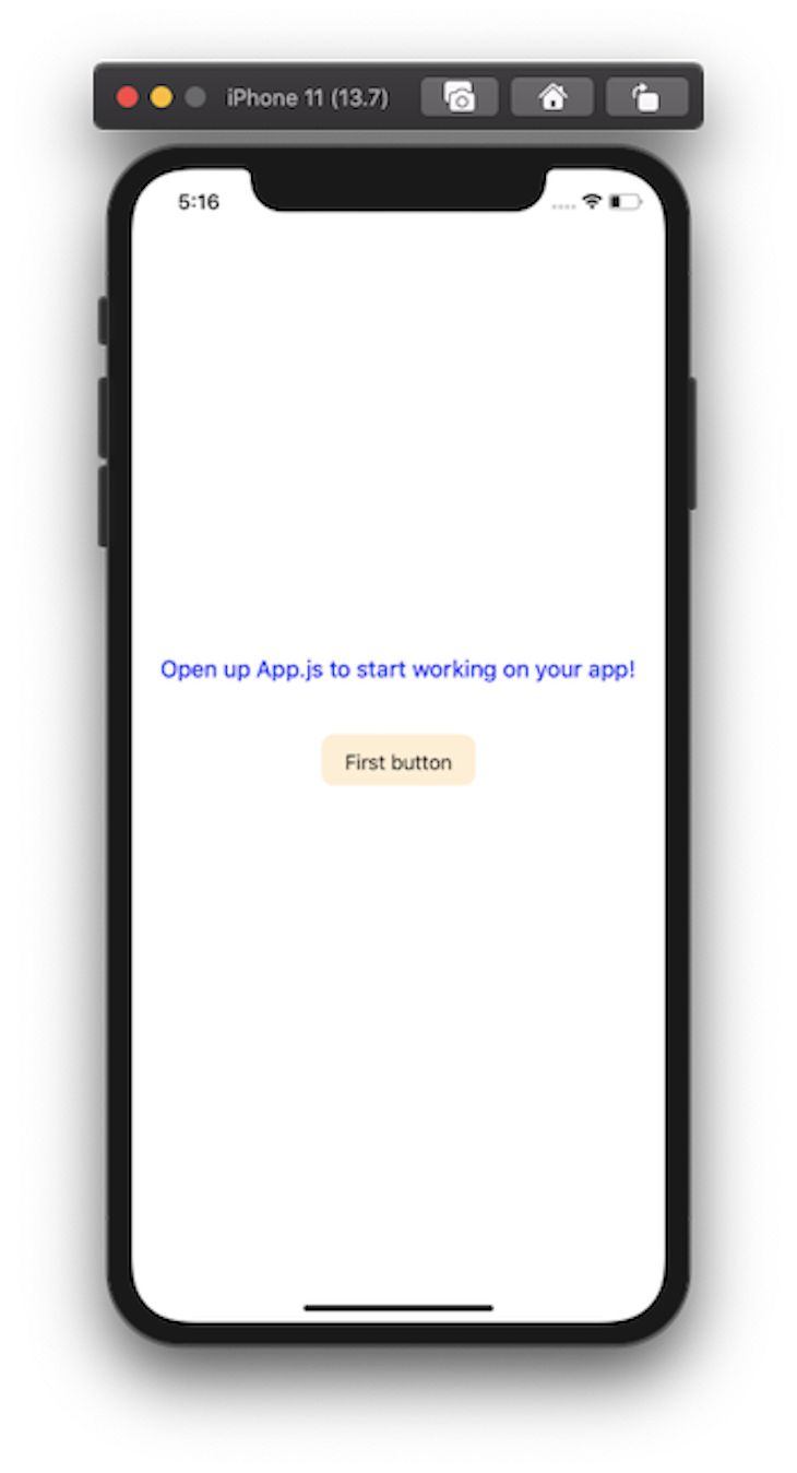
Now, we can use PressableButton in our App component, as shown below:
export default function App() {
  return (
    <Container>
      <Text>Open up App.js to start working on your app!</Text>
      <PressableButton
        onPress={() => true}
        title='First button'
        bgColor='papayawhip'
      />
    </Container>
  );
}
Here is the output you are going to get after this step:
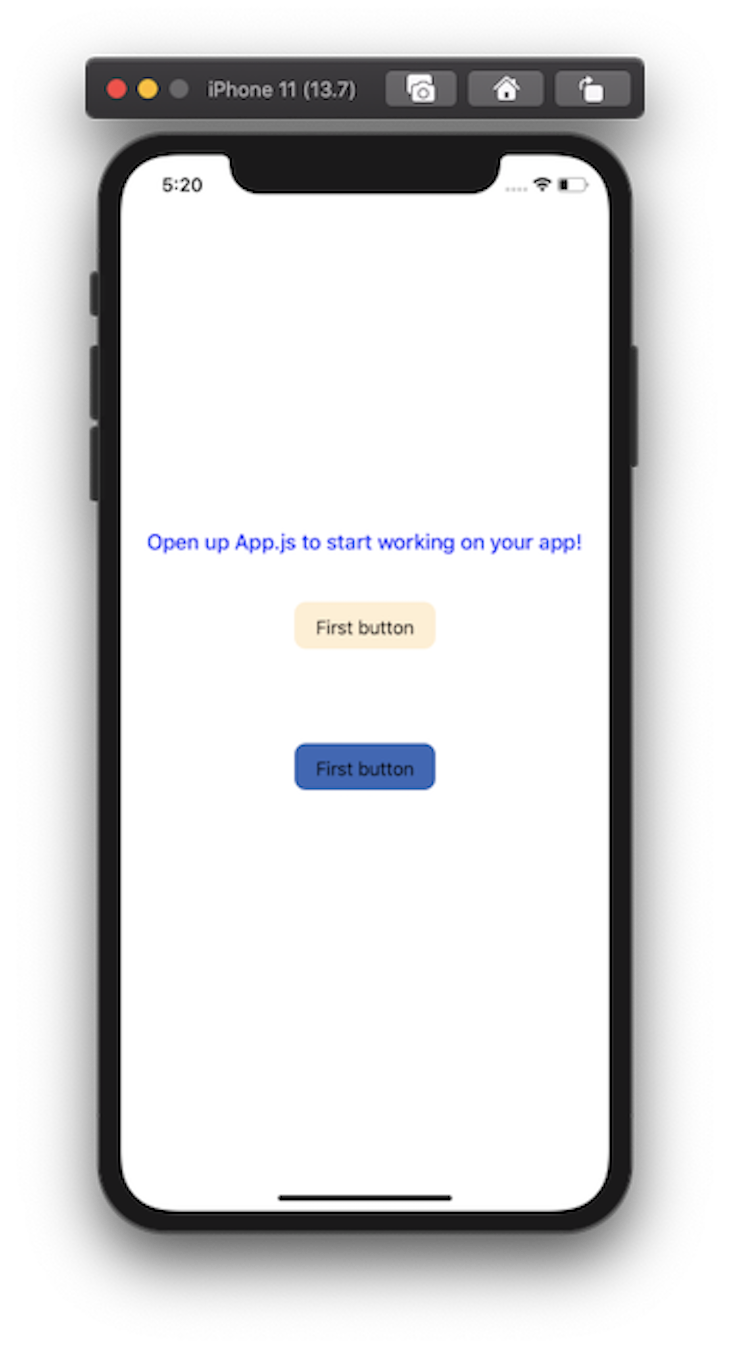
Let’s add another button with a different background color with the following code:
<PressableButton onPress={() => true} title='First button' bgColor='#4267B2' />
It is displayed after the first button, like this:
Interpolated functions in the styled-components library can also be used to extend the style of a particular property. For example, the text color on the second button is not looking good. To change that, we want to have two variants of the PressableButton component.
The first one is going to be primary, where the color of the text is going to be white. The second variant is going to have a text color of black but is going to act like the default variant. This means that the second variant does not have to be explicitly defined.
Modify the PressableButton.js file by adding a color attribute to the ButtonText styled object, as shown below:
const ButtonText = styled.Text`
  font-size: 16px;
  text-align: center;
  color: ${props => (props.primary ? 'white' : '#010101')};
`;
Then, add the prop primary to the PressableButton component:
const PressableButton = ({ onPress, primary, bgColor, title }) => (
  <ButtonContainer onPress={onPress} bgColor={bgColor}>
    <ButtonText primary={primary}>{title}</ButtonText>
  </ButtonContainer>
);
Now, go back to the App.js file and add the prop variant primary to the second button, like so:
<PressableButton
  onPress={() => true}
  title='First button'
  bgColor='#4267B2'
  primary
/>
The changes are reflected instantly in the Expo Client app:

Let’s build an app screen to see how we can define different primitive React Native components using styled objects from the styled-components library. To give you an overview of what we are going to build, here is the end result:
If you want to follow along, please download the following assets from GitHub.
SafeAreaView componentLet’s start by building the header section of the app. Create a new component file called components/Header.js. This component is going to display the app Title as well as two icons in a row. These two icons can be used to create further actions.
To display icons, let’s use MaterialCommunityIcons from @expo/vector-icons. This Header component is going to receive the prop headerTitle from the parent component App. The Title is defined from the Text, and each icon is wrapped by a TouchableOpacity button called IconButton. Add the following code snippet:
import React from 'react';
import styled from 'styled-components/native';
import { MaterialCommunityIcons } from '@expo/vector-icons';
const Container = styled.View`
  width: 100%;
  height: 50px;
  padding-horizontal: 10px;
  flex-direction: row;
  align-items: center;
  justify-content: space-between;
`;
const Title = styled.Text`
  font-size: 28px;
  font-weight: 700;
  letter-spacing: 0.25px;
  color: #4267b2;
`;
const IconButtonsRow = styled.View`
  flex-direction: row;
`;
const IconButton = styled.TouchableOpacity`
  width: 40px;
  height: 40px;
  border-radius: 20px;
  background: #e6e6e6;
  align-items: center;
  justify-content: center;
  margin-left: 12px;
`;
const Header = ({ headerTitle }) => {
  return (
    <Container>
      <Title>{headerTitle}</Title>
      <IconButtonsRow>
        <IconButton activeOpacity={0.7} onPress={() => true}>
          <MaterialCommunityIcons name='magnify' size={28} color='#010101' />
        </IconButton>
        <IconButton activeOpacity={0.7} onPress={() => true}>
          <MaterialCommunityIcons
            name='facebook-messenger'
            size={28}
            color='#010101'
          />
        </IconButton>
      </IconButtonsRow>
    </Container>
  );
};
export default Header;
Notice in the above code snippet on IconButton that you can use the available prop, such as activeOpacity, in the same way you would use it on a TouchableOpacity component. The styled-components library still uses the props that are available on a React Native component. Next, import this component inside App.js and modify it:
import React from 'react';
import styled from 'styled-components/native';
import Header from './components/Header';
const Container = styled.View`
  flex: 1;
  background-color: white;
`;
export default function App() {
  return (
    <Container>
      <Header headerTitle='social' />
    </Container>
  );
}
Here is the output you are going to get on an iOS simulator:
The Header component is taking the space behind the safe area boundaries of an iOS device. To fix this, the styled-components library provides a component called SafeAreaView which works in the same manner as React Native’s SafeAreaView. Modify the following snippet:
const Container = styled.SafeAreaView;
Now, the output is the desired result, as shown below:
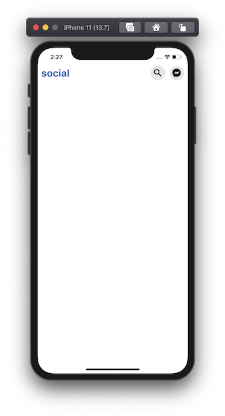
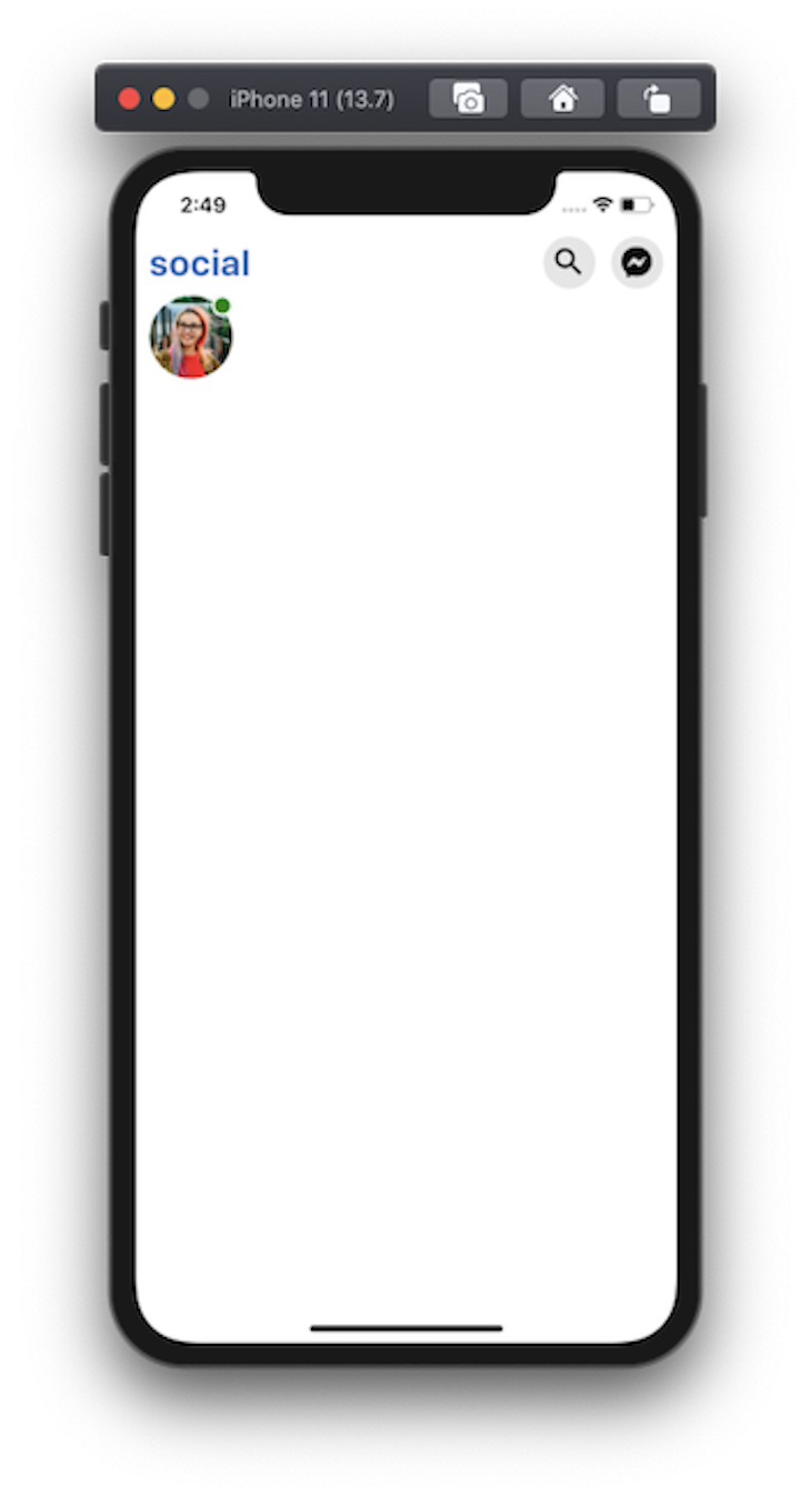
Image componentTo display an avatar image, the Image component can be used. Create a new component file called components/Avatar.js. It is going to receive one prop that is the source of the image to display. You can use the source prop to reference the image.
The styling for Avatar image begins with a width and a height of 64 pixels. Having a border-radius property that equals exactly half the value of width and height makes the image a circle. The border-radius property is used to create rounded corners. Add the following code snippet:
import React from 'react';
import styled from 'styled-components/native';
const Container = styled.View`
  width: 64px;
  height: 64px;
`;
const Image = styled.Image`
  width: 64px;
  height: 64px;
  border-radius: 32px;
`;
const Avatar = ({ imageSource }) => {
  return (
    <Container>
      <Image source={imageSource} />
    </Container>
  );
};
export default Avatar;
Now, open App.js and import the Avatar component. Wrap it with another component called RowContainer that has the following styles:
// after other import statements
import Avatar from './components/Avatar';
const RowContainer = styled.View`
  width: 100%;
  padding-horizontal: 10px;
  flex-direction: row;
`;
Then, modify the JSX rendered by App component:
<Container>
  <Header headerTitle='social' />
  <RowContainer>
    <Avatar imageSource={require('./assets/images/avatar1.png')} />
  </RowContainer>
</Container>
The avatar image looks like this:
position: absolute property to create an online indicatorCSS properties such as margin and padding are available to add spacing between different UI elements. The spacing is in relation to one another. There are some scenarios when this relation is not aligned exactly like the design of the app states. For these scenarios, we often use the position: absolute property.
React Native relies on the position: relative property by default. This is why we do not have to explicitly define it every time we style the UI components. The absolute value is used only for scenarios to fit the exact design pattern. It comes with the following properties that are often used in combination:
topleftrightbottomLet’s enhance the Avatar component by displaying an online status indicator on the top right corner of the avatar image. First, define a new custom component called OnlineIndicator. It is going to have fixed width and height values, as well as a border. The good thing about using styled-components is that you can define the value of the border property in the same way as in plain CSS.
The position is set to absolute, which means that the OnlineIndicator component is going to be relative to its parent component. Since it has to be displayed on the top and right corner, let’s set the values of those two properties to 0.
You can modify these values to satisfy the design pattern you are following by increasing or decreasing each value in px, as shown below:
const OnlineIndicator = styled.View`
  background-color: green;
  position: absolute;
  width: 16px;
  height: 16px;
  border-radius: 8px;
  top: 0;
  right: 0;
  border: 2px solid white;
`;
const Avatar = ({ imageSource }) => {
  return (
    <Container>
      <Image source={imageSource} />
      <OnlineIndicator />
    </Container>
  );
};
Here is the output after this step:
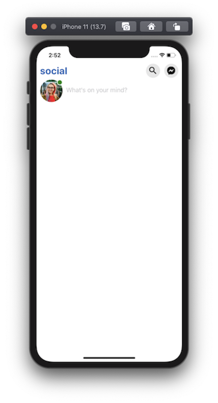
TextInputTo add a text input component, the styled object uses TextInput. Create a new file called components/InputContainer.js and add the following code snippet:
import React from 'react';
import styled from 'styled-components/native';
const Container = styled.View`
  width: 100%;
`;
const TextInput = styled.TextInput`
  width: 100%;
  height: 60px;
  font-size: 18px;
  flex: 1;
  color: #010101;
  margin-left: 10px;
`;
const InputContainer = () => {
  return (
    <Container>
      <TextInput placeholder="What's on your mind?" />
    </Container>
  );
};
export default InputContainer;
Because we want to display this component next to the avatar image, let’s import it in the App.js file, like so:
<RowContainer>
  <Avatar imageSource={require('./assets/images/avatar1.png')} />
  <InputContainer />
</RowContainer>
Here is the output:
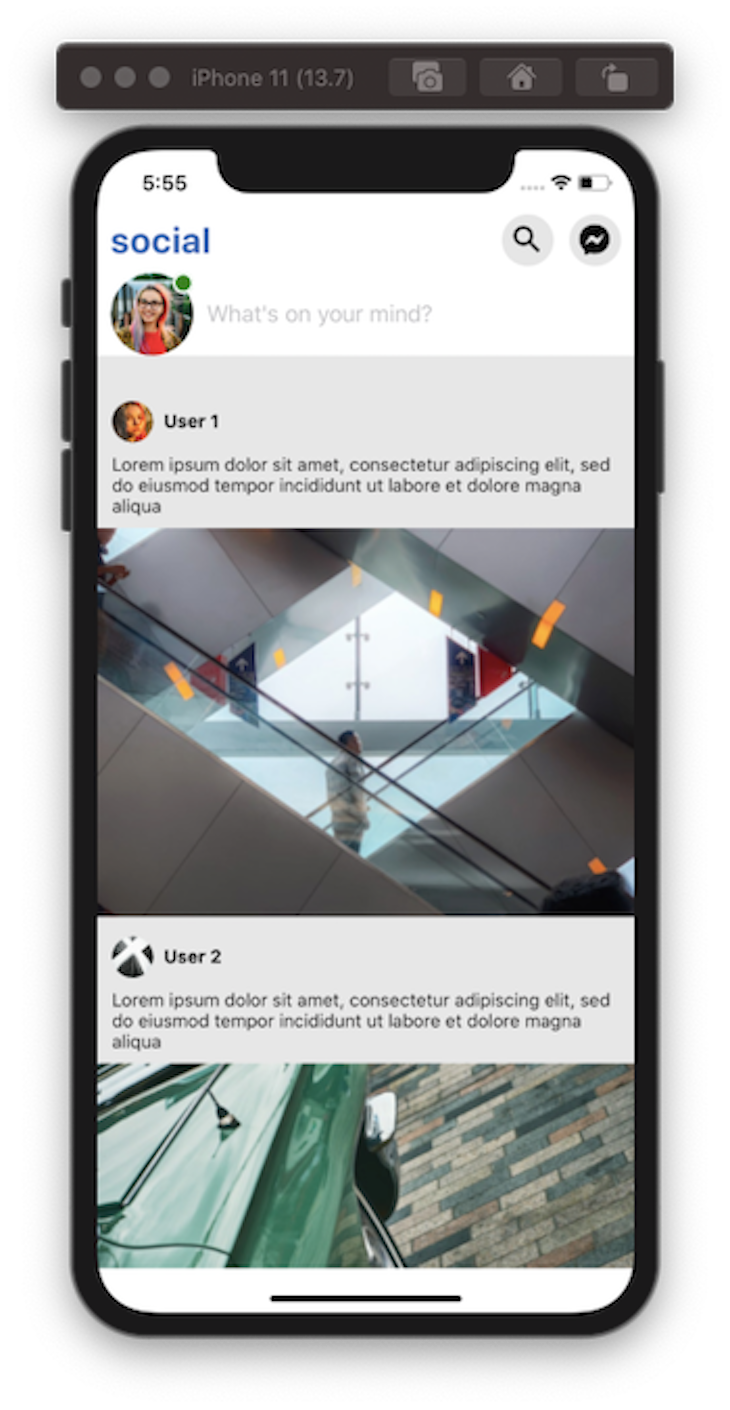
ScrollViewNow, using a ScrollView component, let’s display a list of posts. Each post is going to have a user’s avatar image, username, post description, and post image. To display the data, I am going to use a mock array that contains four different objects. Add this array in the App.js file:
const DATA = [
  {
    id: '1',
    userAvatar: require('./assets/images/avatar2.png'),
    userName: 'User 1',
    postText:
      'Lorem ipsum dolor sit amet, consectetur adipiscing elit, sed do eiusmod tempor incididunt ut labore et dolore magna aliqua',
    postImage: require('./assets/images/post1.png')
  },
  {
    id: '2',
    userAvatar: require('./assets/images/avatar4.png'),
    userName: 'User 2',
    postText:
      'Lorem ipsum dolor sit amet, consectetur adipiscing elit, sed do eiusmod tempor incididunt ut labore et dolore magna aliqua',
    postImage: require('./assets/images/post2.png')
  },
  {
    id: '3',
    userAvatar: require('./assets/images/avatar3.png'),
    userName: 'User 3',
    postText:
      'Lorem ipsum dolor sit amet, consectetur adipiscing elit, sed do eiusmod tempor incididunt ut labore et dolore magna aliqua',
    postImage: require('./assets/images/post3.png')
  },
  {
    id: '4',
    userAvatar: require('./assets/images/avatar4.png'),
    userName: 'User 4',
    postText:
      'Lorem ipsum dolor sit amet, consectetur adipiscing elit, sed do eiusmod tempor incididunt ut labore et dolore magna aliqua',
    postImage: require('./assets/images/post4.png')
  }
];
Next, create a new component file called components/Card.js. It is going to accept the array of data as the only prop. To iterate through the data array, JavaScript’s map function is used. We already know the structure of data represented.
Start by creating VerticalList, which is defined from ScrollView. Then, create an empty ListContainer component that is the representation of a View component. To display the username and avatar image, create a Row container component that has a flex-direction property set to the value of row.
The SmallAvatar is going to display the user’s avatar image and UserName is used to display the username. Similarly, the PostDescription and PostImage are used to display the contents of a post. Add the following snippet:
import React from 'react';
import styled from 'styled-components/native';
const VerticalList = styled.ScrollView`
  flex: 1;
`;
const ListContainer = styled.View``;
const Header = styled.View`
  height: 50px;
  flex-direction: row;
  align-items: center;
  justify-content: space-between;
  margin-top: 6px;
  padding: 0 11px;
`;
const Row = styled.View`
  align-items: center;
  flex-direction: row;
`;
const SmallAvatar = styled.Image`
  width: 32px;
  height: 32px;
  border-radius: 16px;
`;
const UserName = styled.Text`
  padding-left: 8px;
  font-size: 14px;
  font-weight: bold;
  color: #010101;
`;
const PostDescription = styled.Text`
  font-size: 14px;
  color: #222121;
  line-height: 16px;
  padding: 0 11px;
`;
const PostImage = styled.Image`
  margin-top: 9px;
  width: 100%;
  height: 300px;
`;
const Card = ({ data }) => {
  return (
    <VerticalList showsVerticalScrollIndicator={false}>
      {data.map(item => (
        <ListContainer key={item.id}>
          <Header>
            <Row>
              <SmallAvatar source={item.userAvatar} />
              <UserName>{item.userName}</UserName>
            </Row>
          </Header>
          <PostDescription>{item.postText}</PostDescription>
          <PostImage source={item.postImage} />
        </ListContainer>
      ))}
    </VerticalList>
  );
};
export default Card;
Any available attribute on a React Native component is valid on a component created using styled object. For example, to hide the vertical scroll indicator, set the value of showsVerticalScrollIndicator to false, just as in the above snippet.
To see the ScrollView working, add the Card component in App.js, as shown below:
// import the Card component
import Card from './components/Card';
return (
  <Container>
    {/* rest remains same */}
    <Card data={DATA} />
  </Container>
);
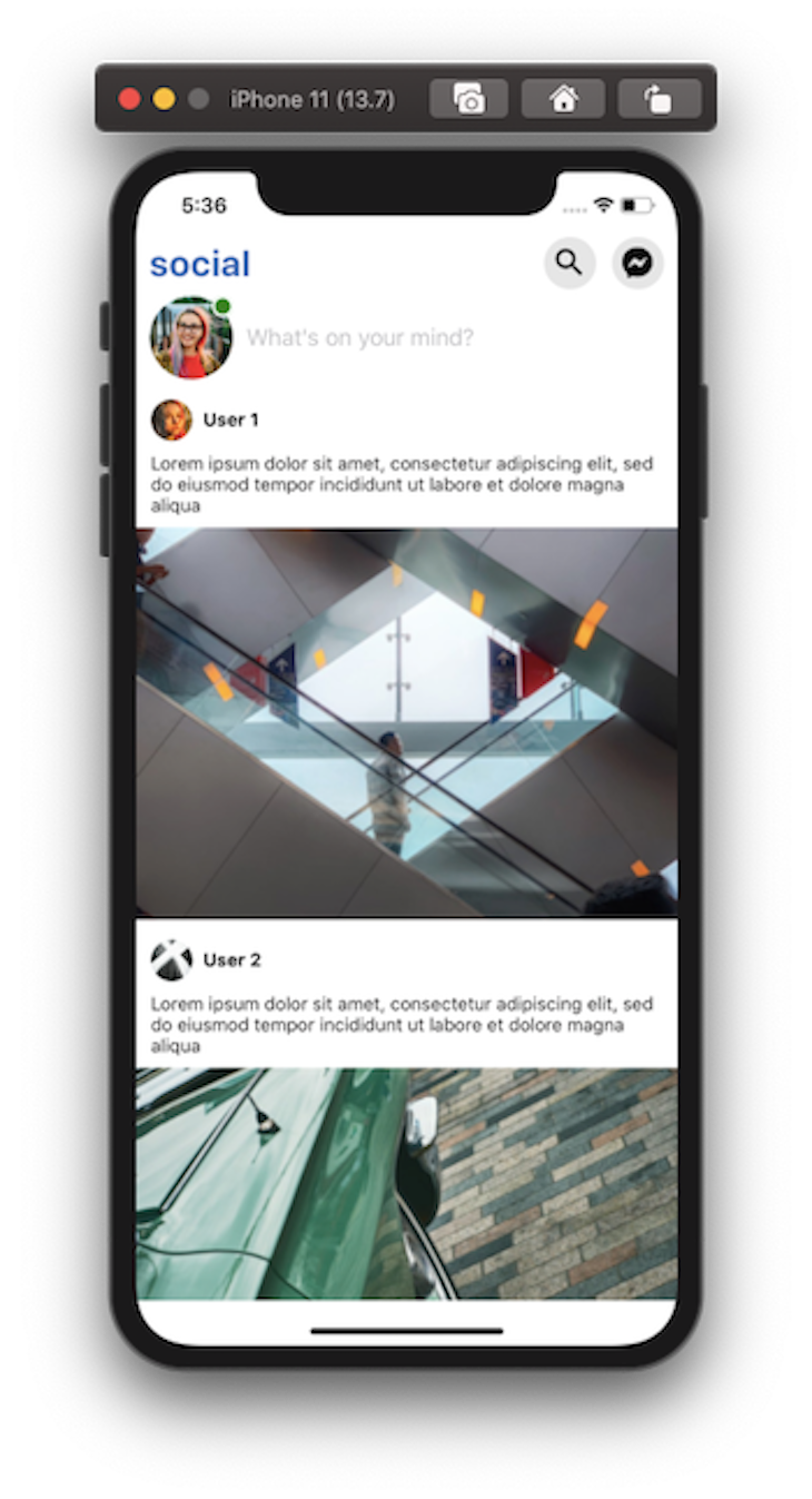
Here is the output:
You can also extend the styled object with ScrollView by using a chainable method called attrs. It attaches the props to a styled component.
The VerticalList component we created does not require custom props, but by using the chainable method, it can ScrollView‘s contentContainerStyle object to apply the style to the scroll view content container. Let’s add some padding vertical of 20 and some background color:
const VerticalList = styled.ScrollView.attrs(props => ({
  contentContainerStyle: {
    backgroundColor: '#e7e7e7',
    paddingVertical: 20
  }
}))`
  flex: 1;
`;
One thing to consider when using styled-components is whether or not you might consider eventually adding a new or changing your existing framework. The styled-components library is not framework agnostic and cannot be used with other mobile JavaScript frameworks, such as Mobile Angular UI, Ember.js, or Ionic.
Another consideration is app speed/loading. Inline styles are a faster alternative to a CSS-in-JS approach like styled-components. Realistically, the lag won’t be too significant initially. However, if your app grows, so will its need to process style components at runtime.
Finally, you should consider present or future style guides and readability. Being able to give any name to a style component means that it can be harder to differentiate between styled-components, React Native components, or custom components in the app itself. This could add confusion during debugging (when you want as little confusion as possible).
I hope you had fun reading this tutorial. Using the styled-components library with React Native has its share of advantages, as discussed in this post.
Have you tried styled-components with React Native before? If not, are you going to try it now in your next project? Let me know in the comments below! The full source code is available at this GitHub repo.

LogRocket's Galileo AI watches sessions for you and and surfaces the technical and usability issues holding back your React Native apps.
LogRocket also helps you increase conversion rates and product usage by showing you exactly how users are interacting with your app. LogRocket's product analytics features surface the reasons why users don't complete a particular flow or don't adopt a new feature.
Start proactively monitoring your React Native apps — try LogRocket for free.

Learn how to build advanced Next.js forms with rule engines, client-side previews, Server Actions, and server-validated form logic.

AI is reshaping engineering teams emotionally as well as technically. A CTO shares insights on fear, trust, burnout, identity, and leading through AI change.

Learn what context rot is, why AI agent sessions degrade over time, and how to fix it with compaction, prompt anchoring, context files, plan files, and RAG.

Learn about TypeScript v6’s breaking changes, new ES2025 features, and deprecated options. A complete migration guide from v5 to prepare for v7.
Would you be interested in joining LogRocket's developer community?
Join LogRocket’s Content Advisory Board. You’ll help inform the type of content we create and get access to exclusive meetups, social accreditation, and swag.
Sign up now

 Learn more →
