Editor’s note: David Omotayo last updated this article on 21 August 2024 to provide information about HTML checked attributes and answer some popular questions about them, as well as to offer information about conditionally styling checkboxes using pseudo selectors like :has and :not to style elements based on specific conditions.
Checkboxes are a commonly used element in forms and surveys. Whether you’re using a checkbox as part of a form for booking flight reservations, accepting user inputs, or receiving feedback from an online product survey, checkboxes are an easy way to record a user’s choices.
On webpages, we can use the HTML input checkbox element to render a checkbox. Like other HTML elements, you can also style checkboxes with CSS to make them look more appealing. However, CSS properties like color, font, border, width, and height do not apply to checkboxes.
In this article, we’ll discuss the CSS properties you can apply to checkboxes and the scenarios where they make useful additions to your UI/UX. Let’s get started!
Before diving into the details, let us take a quick primer on one of the attributes that gives the HTML checkbox element its magic, the checked attribute, and address some misconceptions about it.
The checked attribute is used with <input> elements of type checkbox or radio to specify that the element should be preselected (ticked) when the page loads. The attribute is a Boolean attribute, meaning it doesn’t need a value — just adding it to a checkbox element is enough to mark the element as checked.
Despite this, the checked attribute also accepts string values, which has caused a decade-old confusion among developers about the correct way to use the checked attribute — although, according to the specs, the correct to assign the checked attribute is as follows:
<input type=checkbox checked="checked">
However, the browser would accept just about any value between the quotes and still exhibit the same behavior as the former. The following would also be considered valid HTML checked attributes:
<input type=checkbox checked>
<input type=checkbox checked="">
<input type=checkbox checked="bool">
<input type=checkbox checked="true">
<input type=checkbox checked="false">
See the Pen
Checkbox values by david omotayo (@david4473)
on CodePen.
How you use the checked attribute is up to you, but it is advised to provide a descriptive value like checked='checked' or simply set the attribute without a value or with empty quotes: checked or checked=''.
Another popular question often asked among developers is the difference between checked and defaultChecked. While both properties can be used to preselect a checkbox on page load, defaultChecked is a property that can only be set using JavaScript, while checked is an HTML attribute. Here’s an example:
const el = document.getElementById("checkbox").defaultChecked;
One of the simplest and most common ways to style a checkbox is to use input[type=checkbox] or pseudo selectors to set the style with CSS properties based on a specific state.
In the example below, we styled the outline of every checkbox, regardless of its state, to a black color with a width of 3px.
Here is the HTML markup:
<fieldset>
<legend>What is/are your favorite programming language(s)?</legend>
<div>
<input type="checkbox" id="lang1" name="lang1" value="Java">
<label for="lang1">Java</label>
</div>
<div>
<input type="checkbox" id="lang2" name="lang2" value="Python">
<label for="lang2"> Python</label>
</div>
<div>
<input type="checkbox" id="lang3" name="lang3" value="Go">
<label for="lang3">Go</label>
</div>
<div>
<input type="checkbox" id="lang4" name="lang4" value="Rust" checked>
<label for="lang4">Rust</label>
</div>
</legend>
</fieldset>
<div>
<input type="submit" value="Submit" id="btnSubmit">
</div>
And here is the CSS code:
div {
  margin-bottom: 10px;
}

fieldset {
  border: 1px solid blue;
}

legend {
  padding: 10px;
  background:  #5c0b02;
  color: white;
}

input[type="submit"]{
  background: #0de281;
}

input[type="checkbox"] {
    outline: 3px solid black;
}
The output will look like the following CodePen:
See the Pen CSS Checkbox Styling Demo1A by Mamta Dalal (@mamta_d) on CodePen.
By using the input:checked pseudo selector, we can also set a specific style for the checkbox when it is checked. In the code below, we’ve retained the same HTML markup from the previous example, but we tweaked the CSS style to add the following code in place of input[type="checkbox"]:
input:checked {
    outline: 2px solid yellow;
}
In the CodePen below, you can observe the yellow tints around the selected checkboxes:
See the Pen
CSS Checkbox Styling Demo1B by Mamta Dalal (@mamta_d)
on CodePen.
We can also use the :hover pseudo-class, although not specific to the checkbox element, to set custom styles for the checkbox when it is hovered upon:
input[type="checkbox"]:hover {
    outline: 2px solid yellow;
}
See the Pen
Checkbox:hover pseudo class by david omotayo (@david4473)
on CodePen.
Similar to :checked and :hover, :has and :not allow you to style elements based on specific conditions. These pseudo-classes can be creatively used to style checkboxes and their related elements based on their checked state or the state of sibling elements.
:has(selector) : This targets elements based on the presence of specific child elements that match the provided selector in the :has pseudo-class. For example, to style a label when its associated checkbox is checked, the process would be as follows:
// HTML
<label>
  <input type="checkbox" checked>
  Accept Terms and Conditions
</label>
// CSS
label:has(input[type="checkbox"]:checked) {
  color: green;
  font-weight: bold;
}
This rule translates: If the <label> element contains a checked checkbox, change its text color to green and make the font bold.
:not(selector) : This targets elements that do not match the provided selector. For example, we can style the label from the previous example to exhibit different behavior when the checkbox is checked:
label:not(:has(input[type="checkbox"]:checked)) {
  color: gray;
  font-weight: normal;
}
This rule translates: If the <label> element doesn’t contain a checked checkbox, change its text color to gray and use the default font-weight.
Additionally, we can chain both pseudo-classes to apply even complex styling rules. For example, if we want to highlight a container when all checkboxes inside it are checked, we can chain the :has and :notpseudo-classes as follows:
.container:has(input[type="checkbox"]:not(:checked)) {
  background-color: lightcoral;
}
.container:has(input[type="checkbox"]:checked:not(:has(~ input[type="checkbox"]:not(:checked)))) {
  background-color: lightgreen;
}
Here, the first rule applies a red background to .container if any of the checkboxes inside it are not checked, while the second rule applies a green background to .container only if all checkboxes inside are checked:
See the Pen
conditional checkboxes by david omotayo (@david4473)
on CodePen.
Besides the checked and unchecked states for checkboxes, a third state is also possible — the indeterminate state. In this state, it’s impossible to determine whether the item is checked or not.
You can only set this state via JavaScript; it cannot be set using an HTML attribute. To enable the indeterminate state in JavaScript, you can set the indeterminate property of an HTML input element to true. Instead of the checkmark or tick seen in most browsers, in the indeterminate state, a checkbox has a horizontal line in the box.
Let’s say you’re asking the user to select the number of levels they’ve cleared in a game. When you check or uncheck a level’s checkbox, a JavaScript function reviews the total number of checked levels:
uncheckedindeterminatecheckedIn this case, the indeterminate state is used to indicate that the user has started collecting levels but hasn’t completed all of them yet.
Suppose you want to style the odd-numbered indeterminate levels. You can do so with the following code:
<fieldset>
<legend>Select the levels cleared in the game</legend>
<div>
<input type="checkbox" id="level1" name="level1" value="Level1">
<label for="level1">Level1</label>
</div>
<div>
<input type="checkbox" id="level2" name="level2" value="Level2">
<label for="level2"> Level2</label>
</div>
<div>
<input type="checkbox" id="level3" name="level3" value="Level3">
<label for="level3">Level3</label>
</div>
</legend>
</fieldset>
<div>
<input type="submit" value="Submit" id="btnSubmit">
</div>
div {
  margin-bottom: 10px;
}

input[type="submit"]{
  background: #0de281;
}

input:indeterminate {
  background: yellow;
  outline: 2px solid red;
}
label {
  background: yellow;
}

const inputs = document.getElementsByTagName("input");
for (let i = 0; i < inputs.length; i++) {
  if(i%2==0)
  inputs[i].indeterminate = true;
}
The output will look like the following:
See the Pen
CSS Checkbox Styling Demo 2 by Mamta Dalal (@mamta_d)
on CodePen.
accent-color property on checkboxesSince 2021, the accent-color property has been available for HTML input elements, including checkboxes. At the time of writing, most recent versions of popular browsers support accent-color.
When applied to checkboxes, accent-color enables developers to override and customize the default checkmark color. When done right, this can greatly improve accessibility. By using their internal algorithms, browsers can automatically arrive at the best-suited color for the checkmark at render time, ensuring sufficient color contrast:
<fieldset>
  <legend>What is/are your favorite programming language(s)?</legend>
  <div>
    <input type="checkbox" id="lang1" name="lang1" value="Java">
    <label for="lang1">Java</label>
  </div>
  <div>
  <input type="checkbox" id="lang2" name="lang2" value="Python">
  <label for="lang2"> Python</label>
  </div>
  <div>
  <input type="checkbox" id="lang3" name="lang3" value="Go">
  <label for="lang3">Go</label>
  </div>
  <div>
  <input type="checkbox" id="lang4" name="lang4" value="Rust" checked>
  <label for="lang4">Rust</label>
  </div>
     </legend>
</fieldset>
<div>
<input type="submit" value="Submit" id="btnSubmit">
</div>

<p class="info">Your browser does not support the accent-color property.</p> div { margin-bottom: 10px; } fieldset { border: 1px solid blue; } legend { padding: 10px; background: #5c0b02; color: white; } input[type="submit"]{ background: #0de281; } input[type=checkbox]{ accent-color: #C70039; } .info { background: #fff9c4; border-radius: 6px; padding: 0.5rem; text-align: center; width: clamp(300px, 60%, 850px); } @supports (accent-color: #fff) { .info { display: none; } }
The code above will generate the following output:
See the Pen
CSS Checkbox Styling Demo 3 by Mamta Dalal (@mamta_d)
on CodePen.
The accent-color property can be useful if you have two or more forms or fieldsets on a page and you want to style their respective checkboxes in different colors.
Developers and web designers sometimes customize checkboxes to override the default behavior. For example, let’s say you want to completely override the default checkbox’s UI and not just the checkmark associated with the element. You could either render it by writing some lengthy CSS code, or you could use an HTML checkbox to implement a cool feature like a toggle button.
The code below shows a simple example with custom dimensions, color, and font size for the checkbox and its checkmark:
What would you prefer to have?
 <br>
<div class="checkbox">
  <input id="check1" type="checkbox" name="check" value="check1">
  <label for="check1">Breakfast</label>
  <br>
  <input id="check2" type="checkbox" name="check" value="check2">
  <label for="check2">Lunch</label>
  <br>
  <input id="check3" type="checkbox" name="check" value="check3">
  <label for="check3">Dinner</label>
</div>
label {
  display: inline-block;
  cursor: pointer;
  position: relative;
  padding-left: 25px;
  margin-right: 15px;
  font-size: 11px;
}

label:before {
  content: "";
  display: inline-block;


  width: 16px;
  height: 16px;


  margin-right: 10px;
  position: absolute;
  left: 0;
  bottom: 1px;
  background-color: pink;
  box-shadow: inset 0px 2px 3px 0px rgba(0, 0, 0, .3), 0px 1px 0px 0px rgba(255, 255, 255, .8);
}

input[type=checkbox] {
  display: none;
}
.checkbox label:before {
  border-radius: 3px;
}

input[type=checkbox]:checked + label:before {
  content: "\2713";
  text-shadow: 1px 1px 1px rgba(0, 0, 0, .2);
  font-size: 12px;
  color: #fff;
  text-align: center;
    line-height: 12px;
}
Here is the result:
See the Pen
CustomCheckboxStyling by Mamta Dalal (@mamta_d)
on CodePen.
In modern CSS, layouts are important for web designers when creating complicated designs. Flexbox and Grid are two popular layouts used in modern CSS.
While Flexbox provides a one-dimensional layout and defines the layout for either a row or a column, Grid provides a two-dimensional layout, defining the layout for both the row and column simultaneously. Let’s understand the basics of the grid layout so that we can use it to style checkboxes.
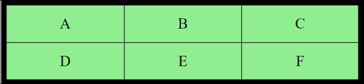
A grid layout has one parent element with one or more child elements. Items in a grid container are called grid items. All grid items are placed inside columns and rows. The image below shows an example of a grid layout container with six grid items:
Let’s review the various terminologies that are associated with the CSS grid layout:
To convert an HTML element into a grid container, you can set the display property to grid with the following code:
.grid-container { display: grid;
}
To generate an inline-level grid, you can also set the display property to inline-grid:
grid-container {
display: inline-grid;
}
You can control the layout of the grid using the grid container properties. For example, you can specify the number of columns or rows as well as the height of rows. You can also align the grid inside of the container. Let’s review a few properties of the grid container:
grid-template-columns defines the number and size of columns. auto indicates that all columns should have the same width:grid-template-columns: <column_width> <column_width> <auto>;
grid-template-rows defines the height of the rows:grid-template-rows: <row_height> <row_height> ;
grid-gapallows us to use both the grid-row-gap and the grid-column-gap properties together:grid-gap: <grid-row-gap> <grid-column-gap>;
justify-content helps to align grid items along the inline row axisspace-evenly provides the columns with an equal amount of space between and around themspace-around provides the columns with an equal amount of space around themspace-between provides the columns with an equal amount of space between themcenter aligns the grid in the middle of the containerstart and end align the grid at the beginning and end of the container, respectively:
justify-content: space-evenly| space-around| space-between| center|start| end;
align-content helps to vertically align the whole grid along the block column axis:
align-content: space-evenly| space-around| space-between| center| start| end;
In the example above, space-evenly provides rows with an equal amount of space between and around them, while space-around provides rows with an equal amount of space around them. Similarly, space-between provides rows with an equal amount of space between them. center, start, and end align rows in the middle, beginning, and end of the container, respectively.
Now, we’ll learn how to use the justify-content, grid-template-rows, and grid-gap properties together with checkbox controls:
<body> <div class="grid-container"> <div> <fieldset> <legend>What is/are your favorite programming language(s)?</legend> <p> <input type="checkbox" id="lang1" name="lang1" value="Java"> <label for="lang1">Java</label> </p> <p> <input type="checkbox" id="lang2" name="lang2" value="Python"> <label for="lang2"> Python</label> </p> <p> <input type="checkbox" id="lang3" name="lang3" value="Go"> <label for="lang3">Go</label> </p> <p> <input type="checkbox" id="lang4" name="lang4" value="Rust" checked> <label for="lang4">Rust</label> </p> </legend> </fieldset> </div> <div><input type="submit" value="Submit" id="btnSubmit"></div> </div> </body>
The CSS code should look like the following:
.grid-container {
  display: grid;
justify-content: start;
grid-template-rows: 190px 40px auto;
 grid-gap: 5px;
  background-color: lightgreen;
  padding: 10px;
}
 .grid-container > div {
background-color: lightblue;
padding: 10px 0;
font-size: 12px;
}
fieldset {
 border: 1px solid blue;
}

legend {
  padding: 10px;
 background:  #5c0b02;
 color: white;
}

input[type="submit"]{
  background: #0de281;
}

input[type="checkbox"] {
  outline: 3px solid black;
}
The output will look like the following:
See the Pen
Checkbox Grid 1 by Mamta Dalal (@mamta_d)
on CodePen.
We can use the align-content property as follows:
.grid-container {
  display: grid;
 justify-content: start;
grid-template-rows: 190px 40px auto;
background-color: lightgreen;
 align-content: space-evenly;
grid-gap: 10px;
 padding: 10px;
}

.grid-container > div {
background-color: lightblue;
font-size: 12px;
padding: 10px 0;
}
fieldset {
  border: 1px solid blue;
}

legend {
padding: 10px;
 background:  #5c0b02;
  color: white;
}

input[type="submit"]{
 background: #0de281;
}

input[type="checkbox"] {
    outline: 3px solid black;
}
Our HTML code will remain the same as earlier; the output is as follows:
See the Pen
Checkbox Grid 2 by Mamta Dalal (@mamta_d)
on CodePen.
Let’s learn how to organize the checkboxes properly in rows and columns like a matrix using the various grid properties:
<body>
  <fieldset>
    <legend>What is/are your favorite programming language(s)?</legend>
    <div class="grid-container">
      <div>
        <input type="checkbox" id="lang1" name="lang1" value="Java">
        <label for="lang1">Java</label>
      </div>
      <div>
        <input type="checkbox" id="lang2" name="lang2" value="Python">
        <label for="lang2"> Python</label>
      </div>
      <div>
        <input type="checkbox" id="lang3" name="lang3" value="Go">
        <label for="lang3">Go</label>
      </div>
      <div>
        <input type="checkbox" id="lang4" name="lang4" value="Rust" checked>
        <label for="lang4">Rust</label>
      </div>
    </div>
    </legend>
  </fieldset>
<div><input type="submit" value="Submit" id="btnSubmit"></div>
</body>
The corresponding CSS code looks like the following:
.grid-container {
  display: grid;
  grid-template-columns: 60px 60px;
  grid-auto-rows: 40px;
  background-color: lightgreen;
  grid-gap: 15px;
  padding: 10px;
}

.grid-container > div {
background-color: lightyellow;
font-size: 12px;
padding: 10px 0;
}

fieldset {
  border: 1px solid blue;
}

legend {
  padding: 10px;
  background:  #5c0b02;
  color: white;
}

input[type="submit"]{
  background: #0de281;
}

input[type="checkbox"] {
    outline: 3px solid black;
}
The outcome depicts the checkboxes neatly arranged in a matrix-like grid:
See the Pen
Checkbox Grid 3 by Mamta Dalal (@mamta_d)
on CodePen.
We can style grid items with grid-style properties, as seen in the following example using the grid-column and grid-row properties:
<div class="grid-container">
<div class="box1">
<input type="checkbox" id="itemA" name="itemA" value="A">
<label for="itemA">A</label>
</div><div>
<input type="checkbox" id="itemB" name="itemB" value="B">
<label for="itemB">B</label>
</div><div class="box2">
<input type="checkbox" id="itemC" name="itemC" value="itemC">
<label for="itemC">C</label>
</div><div>
<input type="checkbox" id="itemD" name="itemD" value="D">
<label for="itemD">D</label>
</div><div>
<input type="checkbox" id="itemE" name="itemE" value="E">
<label for="itemE"> E</label>
</div><div>
<input type="checkbox" id="itemF" name="itemF" value="F">
<label for="itemF"> F</label>
</div>
</div>
The CSS code will look like the following:
.grid-container {
display: grid;
grid-template-columns: 40px 40px 40px;
grid-gap: 10px;
background-color: gray;
padding: 10px;
}
.grid-container > div {
  background-color: green;
  text-align: center;
  padding: 10px 0;
  font-size: 15px;
}
.itemC {
grid-column: 2 / span 5;
}

.box1 {
  grid-column: 1 / 4;
  grid-row: 1 / 3;
}

.box2 {
  grid-column: 1;
  grid-row: 3 / 5;
}
See the Pen
Checkbox Grid 4 by Mamta Dalal (@mamta_d)
on CodePen.
Introduced in CSS Grid Layout Module Level 2, CSS subgrid is a powerful UI tool that has the ability to produce outstanding layouts.
Without the use of the subgrid, when the grid is stretched or resized, nested grids can lead to the erratic placement of items. All of the grids have different-sized content, which influences the layout and makes each element act independently.
Additionally, nested grids lack support for responsive web design. With a variety of common screen sizes in today’s digital world, support for a responsive webpage is imperative. The CSS subgrid feature causes child grid containers to align with the parent grid. The CSS subgrid allows the child grid to inherit the grid structure of the parent container, simplifying the creation of intricate layouts.
Nowadays, developers are no longer required to design the grid template or grid lines for the child grid container. Instead, they are automatically inherited from the parent grid container.
To apply the CSS subgrid to a project, it must be activated in the nested grid container by specifying the subgrid value for the grid-template-columns or grid-template-rows property. To establish its own grid, the child grid container applies the grid tracks of the parent grid container.
This enables the creation of nested grids with consistent track alignment, making it easier to design flexible and complex layouts. Let’s see this in action:
<form class="grid">
  <label>Enter Your Name:</label>
  <input type="text" id="Name" />
  <div class="parent">
  <label>Do you like</label><br/>
<div class="child">
<input type="checkbox" value="Music" id="Music" />
<label for="Music">Music</label><br>
<input type="checkbox" value="Books" id="Books" />
<label for="Books">Books</label><br>
<input type="checkbox" value="Movies" id="Movies" />
<label for="Movies">Movies</label><br>
<br/>
  <input type="submit" value="Submit"/>
  </div>
 </div>
</form>
Now, the CSS code will look like the following:
.grid {
  display: grid;
  grid-template-columns: repeat(9, 1fr);
  grid-template-rows: repeat(4, minmax(100px, auto));
  grid-template-rows: auto;
  background-color: gray;
}
.parent {
  background-color: yellow;
  display: grid;
  grid-column: 2 / 7;
  grid-row: 2 / 4;
  grid-template-columns: repeat(3, 1fr);
  grid-template-rows: subgrid;
}
.child {
  background-color: lightblue;
  grid-column: 2 / 4;
  grid-row: 1 / 3;
}
See the Pen
Checkbox Grid 6 by Mamta Dalal (@mamta_d)
on CodePen.
Although this styling isn’t very pretty or optimal, it should give you a fair idea of how subgrids work.
currentcolor property on your checkboxSometimes, you might want to style a checkbox so that it takes on the existing color of the element or the parent element. Let’s say that we have a form with checkboxes defined on it, and you want the checkbox outline to be the same as the font color of the form elements.
In this case, you would use the currentcolor property of the child element, which is the checkbox. Consider the following HTML markup and its corresponding CSS code, respectively:
<form class="container">
<label>Do you like</label><br/>
<input type="checkbox" value="Music" id="Music" />
<label for="Music">Music</label><br>
<input type="checkbox" value="Books" id="Books" />
<label for="Books">Books</label><br>
<input type="checkbox" value="Movies" id="Movies" />
<label for="Movies">Movies</label><br>
<br/>
<input type="submit" value="Submit"/>
</form>
.container{
  background-color: black;
   color: magenta; /* Magenta color */
  }
input[type="checkbox"] {
  accent-color:  yellow;
  outline: 3px solid currentcolor; /* Magenta border color */
}
input[type="submit"]{
  background: lightgray;
}
As a result of the CSS styling, the outline of the checkboxes will be magenta, which is the current color in the form:
See the Pen
Checkbox Grid 5 by Mamta Dalal (@mamta_d)
on CodePen.
Instead of using the bare-bones HTML checkbox input element, you can render it in a more visually appealing manner by applying a variety of CSS styles.
In this article, we discussed how you can apply different CSS styles to customize and override a checkbox’s default look and feel. Using the different styling features covered in this article, developers and web designers can provide users with a rich visual experience using checkboxes.
I hope you enjoyed this article, and be sure to leave a comment if you have any questions. Happy coding!
As web frontends get increasingly complex, resource-greedy features demand more and more from the browser. If you’re interested in monitoring and tracking client-side CPU usage, memory usage, and more for all of your users in production, try LogRocket.

LogRocket lets you replay user sessions, eliminating guesswork around why bugs happen by showing exactly what users experienced. It captures console logs, errors, network requests, and pixel-perfect DOM recordings — compatible with all frameworks.
LogRocket's Galileo AI watches sessions for you, instantly identifying and explaining user struggles with automated monitoring of your entire product experience.
Modernize how you debug web and mobile apps — start monitoring for free.

Learn how Storybook MCP enables AI agents to understand your component library, generate accurate UI, and validate code using documentation, stories, and automated tests.

Debug RSC hydration mismatches in production with Next.js instrumentation, Suspense isolation, HTML diffing, and CI smoke tests.

Explore why npm dependencies are a major supply chain security risk and how to protect JavaScript apps from compromised packages and transitive threats.

Enabled React Compiler v1.0 on a production Next.js app. Here’s every warning, breakage, and silent opt-out I documented — and what actually worked.
Would you be interested in joining LogRocket's developer community?
Join LogRocket’s Content Advisory Board. You’ll help inform the type of content we create and get access to exclusive meetups, social accreditation, and swag.
Sign up now

 Learn more →
