Editor’s note: This article was last updated by Njong Emy on 9 February 2024 to differentiate between optional and default React props as well as to explain how to set default props and optional props in React.

React is a powerful component-based JavaScript library for building scalable applications that can run on different platforms, like the server, web, mobile, and desktop environments. Thousands of applications that run on these platforms today are built on top of React.
In this article, we’ll cover setting default props for React components. The images in this guide represent views that are rendered with some basic Bootstrap 4 CSS styling. To get similar results, you’ll have to run the code snippets with some additional Bootstrap styles. Let’s get started!
The Replay is a weekly newsletter for dev and engineering leaders.
Delivered once a week, it's your curated guide to the most important conversations around frontend dev, emerging AI tools, and the state of modern software.
React apps are usually a composition of several independent components that make up the UI of the application. A React component is simply a JavaScript function that takes an object of arbitrary inputs, known as props, and returns React elements that describe what should be rendered on the UI:
// Simple React Component
function ReactHeader({version}) {
  return <h1>React {version} Documentation</h1>
}
The example above defines a very simple ReactHeader component that renders a <h1> element containing a heading for the documentation of a specified React version. It uses the JSX syntax to create the DOM elements hierarchy of the component in a declarative way. You can learn more about using JSX with React in the official docs.
Without JSX, the previous code snippet would be written as follows:
// Simple React Component (without JSX)
function ReactHeader({version}) {
  return React.createElement('h1', null, `React ${version} Documentation`);
}
JSX is not required for you to use React. For example, if you intend to use React without any form of compilation, then JSX wouldn’t be the way to go.
In fact, every JSX in your React component gets compiled to its createElement equivalent before the component is rendered. However, in this guide, we’ll use JSX in all components wherever possible.
From the previous code snippets, it is clear that the ReactHeader component requires that a version prop is passed to it. It is worth noting that props are passed from parent components to child components, and can only move downward in the component tree. This means that for the ReactHeader component to receive the version prop, it must have been passed down from a parent component. Let’s call that parent component HeaderParent.
The HeaderParent component would therefore look like this:
// Parent component that passes version prop to child

function HeaderParent(){
   <div>
        <ReactHeader version={16} />
    </div>
}
If we render this HeaderParent component, it then calls the ReactHeader component, thereby also rendering it.
Notice that the ReactHeader component has been rendered with the version prop set to 16. At the moment, everything seems to be working properly in the ReactHeader component, as seen in the following image:

When the ReactHeader component is rendered without the version prop, the version prop is not passed. So if we use the version prop in the child component without passing it from the parent, we would essentially be passing nothing.
Therefore, the reference to version in the component is undefined, as seen in the image below:

One way you could handle this is by applying conditional rendering. Whenever a required prop is not passed, or it is invalid, you can prevent the component from rendering and render nothing instead:
// ReactHeader component with conditional rendering
function ReactHeader(version) {
  return (
    Number.isFinite(version)
      ? <h1>React {version} Documentation</h1>
      : null
  );
}
Alternatively, you could set default props for the component. Default props are a way of providing default values for props that are not required by the component.
Default props can be used to define any props that you want to be set for a component, whether or not a value is passed in from the parent component. When using default props, you can still override the values specified in the default props object when you pass in values from the parent component.
According to the React documentation, defaultProps can be defined as a property on the component class itself to set the default props for the class. In our previous example, you can essentially tweak the component to use a default value for the version prop whenever it is not passed:
// passing the version as a default prop
const ReactHeader = ({version = 16 }) => {
  return (
    <h1>React {version} Documentation</h1>
  )
}
Based on the change we have made above, if we didn’t pass a version prop from the parent component, HeaderParent, this component will still render because we have directly set a default.
Now if we do pass a version prop from the parent, this default would be overridden by the value passed from the parent. Note also that the default value is used only if the version prop is missing, or if it is passed as version ={undefined} from the parent. If you use version={null} or version={0}, the default value will not be used.
We already know now that default pops are predefined values set for props, ensuring that if certain props are not provided, the component still gets to work. They serve as fallback values when props are omitted. Default props are useful for defining default behavior or appearance for a component when certain values are not provided, thereby enhancing the component’s predictability.
With optional props, however, we see that if they are not passed, the component still renders, but with the prop being undefined. Optional props are not mandatory and are useful when certain props are not essential for the component to function.
Our HeaderParent component, as defined here, passes an optional prop, version to its child component ReactHeader:
function HeaderParent(){
   <div>
        <ReactHeader version={16} />
    </div>
}
If the prop is not specified when a component is rendered, then the default prop will be used. One way to set a default prop is by destructuring the props object as follows:
const Text = ({fontSize = "20px"}) => {
  return <p style={{fontSize}}>Some text I guess</p>
}
Default props are useful when you want to have a fallback prop in case the user doesn’t specify one. For example, you might want to have a default font size for a paragraph component. If the user doesn’t specify a font size, then the font size of the text will fall back to the default value.
In this guide, we’ll cover three ways of setting default props for different types of React components.
In React, classes are best suited for building stateful components, in which you need to maintain state internally within the component, or in cases where you want to leverage the lifecycle methods of the component.
When React was initially released, classes had not yet become a thing in JavaScript. However, React provided the React.createClass() API for creating class-like components. Over time, this API was deprecated and finally removed from React in favor of ES6 classes.
If you’re using a React version earlier than 15.5.0 or are working with legacy code, you can use the React.createClass() API to create a simple React component as follows:
import React from 'react';

/**
 * ThemedButton Component
 * Using React.createClass()
 *
 * Renders a Bootstrap themed button element.
 */

const ThemedButton = React.createClass({

  // Component display name
  displayName: 'ThemedButton',

  // render() method
  render() {
    const { theme, label, ...props } = this.props;
    return { label }
  }

});
The code snippet above creates a very simplistic ThemedButton component using the React.createClass() API. The ThemedButton component basically renders a Bootstrap-themed button based on the props passed to it.
For the ThemedButton component to properly render the button, it requires a theme prop and a label prop to be passed. Now, you can render a set of themed buttons in the React app as follows:
import React from 'react';
import ReactDOM from 'react-dom';

// [...ThemedButton component here]

function App(props) {
  return (
    <div>
      <ThemedButton theme="danger" label="Delete Item" />
      <ThemedButton theme="primary" label="Create Item" />
      <ThemedButton theme="success" label="Update Item" />
      <ThemedButton theme="warning" label="Add to Cart" />
      <ThemedButton />
    </div>
  );
}

const rootElement = document.getElementById('root');
ReactDOM.render(<App />, rootElement);
Notice that the ThemedButton component has been rendered five times in the app. The fifth time, the ThemedButton isn’t passed any props. The app looks like the image below:
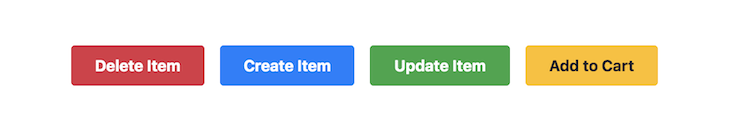
From this image, you’ll notice that the fifth button isn’t visually represented on the view because it is rendered without theme and label props. Therefore, we need to set default props for the ThemedButton component.
For components created using the React.createClass() API, you can set default props by adding a componentName.defaultProps outside the render method of your component. This should return an object representing the default props set for the component:
const ThemedButton = React.createClass({

  // Component display name
  displayName: 'ThemedButton',

  // render() method
  render() {
    const { theme, label, ...props } = this.props;
    return <button className={`btn btn-${theme}`} {...props}>{ label }</button>
  },

  // Set default props
  ThemedButton.defaultProps = {
    theme: "secondary",
    label: "Button Text"
  };

})
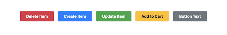
In the code snippet above, default props have been set for the ThemedButton component. The theme prop defaults to "secondary" if not passed, while the label prop defaults to "Button Text". With the default props set, the app should now look like the following screenshot:
With the addition of static class properties and methods to the ECMAScript specification, you can alternatively specify the defaultProps, as shown in the following code:
class ThemedButton extends React.Component {
  render() {
    // ...implement render method
  }

  // Set default props
  static defaultProps = {
    theme: "secondary",
    label: "Button Text"
  }
}
In React, the function syntax is appropriate for components that simply render elements without keeping track of their state or lifecycle. These components are usually called functional components or stateless functional components.
When re-written as a stateless functional component, the ThemedButton component will look like the following code:
import React from 'react';

function ThemedButton(props) {
  const { theme, label, ...restProps } = props;
  return <button className={`btn btn-${theme}`} {...restProps}>{ label }</button>
}
As with class components, you can set default props on a functional component by adding a static property named defaultProps to the component function itself:
function ThemedButton(props) {
  // ...render component
}

// Set default props
ThemedButton.defaultProps = {
  theme: "secondary",
  label: "Button Text"
};
It is important to note, however, that the above method of setting default props for functional components is deprecated for versions of React smaller than 18.3, so it’s not advisable to use it as a way of defining default props anymore.
Instead, you should use the ES6 object destructuring syntax, where you can destructure the props of a functional component with default values. With destructured props, the ThemedButton component will look like the following code:
import React from 'react';

// METHOD 1:
// Default Props with destructuring
function ThemedButton(props) {
  const { theme = 'secondary', label = 'Button Text', ...restProps } = props;
  return <button className={`btn btn-${theme}`} {...restProps}>{ label }</button>
}

// METHOD 2:
// More compact destructured props
function ThemedButton({ theme = 'secondary', label = 'Button Text', ...restProps }) {
  return <button className={`btn btn-${theme}`} {...restProps}>{ label }</button>
}
React Select is an open source select control with multi-select and autocomplete, all working out of the box to create customizable dropdown selects in React.
These components heavily rely on optional props to set default values, options, and labels, for these dropdown input controls. You can install react-select with yarn add react-select or npm i --save react-select depending on your package manager.
Say we had a react-select component like so, with optional props:
import React from 'react';
import Select from 'react-select';
const MySelectComponent = () => {
 const  options = [
    { value: 'chocolate', label: 'Chocolate' },
    { value: 'strawberry', label: 'Strawberry' },
    { value: 'vanilla', label: 'Vanilla' }
  ]
  const defaultValue = { value: 'vanilla', label: 'Vanilla' };
  const placeholder = 'Select a flavor...';
  return (
    <Select
      options={options}
      defaultValue={defaultValue}
      placeholder={placeholder}

    />
  );
};
export default MySelectComponent;
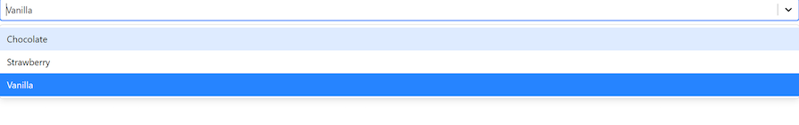
The above code creates a simple dropdown menu for us with a list of flavors, the default flavor being vanilla:
If we now wanted to incorporate default props in this component, it would be the same thing as we’ve seen before with functional and class components:
import React from 'react';
import Select from 'react-select';


const MySelectComponent = ({ options, defaultValue, placeholder) => {
//default props
  const defaultOptions = [
    { value: 'apple', label: 'Apple' },
    { value: 'banana', label: 'Banana' },
    { value: 'orange', label: 'Orange' }
  ];
  const defaultDefaultValue = { value: 'mango', label: 'Mango' };
  const defaultPlaceholder = 'Select a flavor...';

  //optional props
  options = [
      { value: 'chocolate', label: 'Chocolate' },
      { value: 'strawberry', label: 'Strawberry' },
      { value: 'vanilla', label: 'Vanilla' }
    ]

    return (
      <Select
        options={options || defaultOptions}
        defaultValue={defaultValue || defaultDefaultValue}
        placeholder={placeholder || defaultPlaceholder}
      />
    );
};
export default MySelectComponent;
Just like we’ve seen before, in this block of code, we destructured options, placeholder, and defaultValue as we pass them to our component.
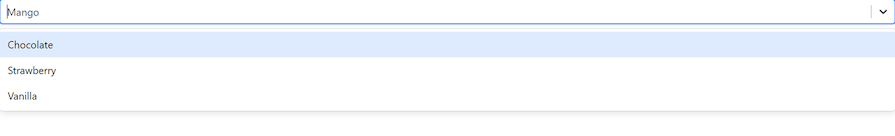
Within our component now, we’ve defined default values that our select input should fall back to in case the optional props are not in use. As you can see in this new implementation, when the component is rendered, defaultValue is no longer vanilla, but mango.
This is because the select menu needs defaultValue, but because there is no optional prop to provide it (I removed the defaultValue variable, if you didn’t notice), it uses defaultDefaultValue, which is a default prop instead.
Our output now looks like this:
Default props are a great way to make your React components reusable and easier to maintain. In this guide, we’ve covered what default props are, exploring three ways to set default props for different types of React components.
We’ve also learned how default props can be used to provide fallback values for optional props. With these tips in mind, you should be able to take full advantage of default props in your own React projects.
Install LogRocket via npm or script tag. LogRocket.init() must be called client-side, not
server-side
$ npm i --save logrocket

// Code:

import LogRocket from 'logrocket';
LogRocket.init('app/id');
// Add to your HTML:

<script src="https://cdn.lr-ingest.com/LogRocket.min.js"></script>
<script>window.LogRocket && window.LogRocket.init('app/id');</script>

Learn how to build advanced Next.js forms with rule engines, client-side previews, Server Actions, and server-validated form logic.

AI is reshaping engineering teams emotionally as well as technically. A CTO shares insights on fear, trust, burnout, identity, and leading through AI change.

Learn what context rot is, why AI agent sessions degrade over time, and how to fix it with compaction, prompt anchoring, context files, plan files, and RAG.

Learn about TypeScript v6’s breaking changes, new ES2025 features, and deprecated options. A complete migration guide from v5 to prepare for v7.
Would you be interested in joining LogRocket's developer community?
Join LogRocket’s Content Advisory Board. You’ll help inform the type of content we create and get access to exclusive meetups, social accreditation, and swag.
Sign up now

 Learn more →
