The collapsible sticky header technique has become quite common in modern mobile apps. In this technique, the header stays fixed at the top, narrows as the user scrolls down, and expands as the user scrolls back to the top.

In this tutorial, we’ll go over the underlying principles for building a collapsible sticky header using React Native’s ScrollView component. You can then use these principles as the foundation for making more advanced ones in your future projects. See the full demo on Expo Snack.
ScrollView in React Native?
animHeaderValue and scrollOffsetY<ScrollView> to our sticky headerFeeling excited? Let’s go!
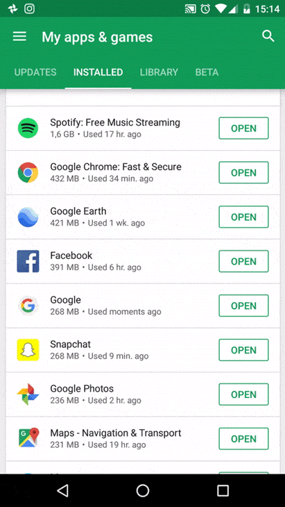
Typically, the collapsible header technique is used to hide the least-needed parts of the header to free up more space for the scroll view, as seen in the Google Play mobile app example below.
The use of animation also adds a smooth and friendly experience to the app.
ScrollView in React Native?A ScrollView is a built-in React Native component that not only serves as a container for other elements, but also lets you scroll the child elements and views inside it. Basically, it is a scrollable container.
The syntax for ScrollView is very simple:
<ScrollView/>
Take a look at the example below to see ScrollView in action:
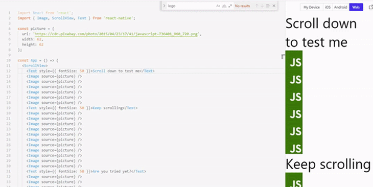
ScrollViewThe ScrollView component can be used in various ways. Let’s go over some examples.
First, you can use ScrollView when you want to render a list of child elements — text, images, views, etc. — on the screen. All elements in the list will be rendered at once, including those that are not currently visible.
You can also use ScrollView to scroll children elements. When you render elements in a ScrollView, you can scroll those elements if they extend beyond the visible part of the screen.
ScrollView is also great for rendering a few items of limited size, such as text.
Finally, when a ScrollView is rendered, it loads all the data needed by its children element at once. This greatly improves the speed by which data is accessed by the child components.
ScrollView componentsYou configure ScrollView components using props. ScrollView supports various props for configuring different aspects.
For example, by setting the pagingEnabled props to true on a ScrollView component, you’re configuring it to allow paging through views using swiping gesture. On iOS, you can set up the maximumZoomScale and minimumZoomScale props on a ScrollView to allow the user to zoom in and out of its content.
The onScroll prop is particularly relevant to this sticky header tutorial. onScroll allows you to define an action that is to be executed when the user scrolls the ScrollView. For sticky headers, you can use onScroll to expand the header as the user scrolls up, and shrink it as the user scrolls down.
Now let’s get started on implementing a collapsible header using the React Native ScrollView component.
This tutorial assumes that you are familiar with JavaScript ES6 and React, the language and library upon which React Native is based. We’ll use Expo Snack as our online code editor, which will enable us to develop our React Native app inside the browser.
Using Expo Snack is faster than setting up the dev environment locally, as you won’t need to install anything. Just download the Expo client app on your device and hook it to your Expo Snack project via a simple QR scan to get started.
If you’d still prefer to set up the dev environment locally, follow the environment setup instructions in the React Native docs to guide you on how to do so before proceeding with this tutorial.
The first step is to create a new file called DynamicHeader.js inside your components directory. This file is for your collapsible header component.
Next, inside the DynamicHeader.js file, we’ll begin by importing React and some React Native UI components. Then, we’ll create a very basic component that returns nothing for now.
import * as React from 'react';
import { Text, View, StyleSheet, Animated } from 'react-native';

const DynamicHeader = ({animHeaderValue}) => {
  return null;
};

export default DynamicHeader;
You can see that the function above takes in animHeaderValue as an argument, but what does animHeaderValue mean? In order to answer this, let’s briefly switch from our DynamicHeader.js file to our App.js file.
animHeaderValue and scrollOffsetYAt the start of our App.js file, we’ll import the React library, the useRef hook, the DynamicHeader which we just created, and certain components needed to build the UI.
import React, { useState, useRef } from 'react';
import AnimatedHeader from './components/AnimatedHeader';
import { SafeAreaView, ScrollView, Text, View, Animated, StyleSheet } from 'react-native';
Below the imports, we have the App() function. Inside it, the first thing we’ll do is use the useRef() hook from React to set up a reference that will track scrollOffsetY, which represents the amount of distance by which the scroll view offsets its initial position along the horizontal axis.
export default function App() {
  const scrollOffsetY = useRef(new Animated.Value(0)).current;

}
In order to animate elements in React Native, we need Animated.Value from the Animated library.
Using Animated.Value, we set the initial value of the scroll position to 0. scrollOffsetY will be updated with the current position of the scroll view every time the user scrolls. It is this value that we then pass down to <DynamicHeader> as a prop.
return (
      <SafeAreaView style={{ flex: 1 }} forceInset={{ top: 'always' }}>
        <DynamicHeader animHeaderValue={scrollOffsetY} />
        <View style={{ flex: 1, alignItems: 'center' }}>
          <Text>Open up App.js to start working on your app!</Text>
        </View>
      </SafeAreaView>
);
Now that we understand where the argument animHeaderValue of DynamicHeader() comes from, it’s time to finish the header.
Back in component/DynamicHeader.js, we’ll continue by defining three constants above the component function:
// Imports

const Max_Header_Height = 200;
const Min_Header_Height = 70;
const Scroll_Distance = Max_Header_Height - Min_Header_Height

const Header = ({scrollOffsetY}) => {
  return null;
};
Max_Header_Height: The maximum height of the headerMin_Header_Height: The minimum height of the headerScroll_Distance: The difference between the maximum and minimum header heightNow that we have these values stored in variables, we’ll use the interpolate() function from Animated.Value to animate the header’s height against the current value of scrollOffsetY.
const animatedHeaderHeight =  animatedValue.interpolate({
    inputRange: [0, Scroll_Distance],
    outputRange: [Header_Max_Height , Header_Min_Height],
    extrapolate: 'clamp'
})
What this will do is animate the header between a maximum and minimum height at the same rate at which the inputRange value goes from 0 to Scroll_Distance. We also set the extrapolate property to define how the interpolation should operate.
We can further enhance the user experience by animating other properties besides the header height, such as the background color, padding, and every other animatable CSS property.
To demonstrate this, let’s also animate the background color from blue to red, interpolating the in-between color values:
const animateHeaderBackgroundColor = animHeaderValue.interpolate({
    inputRange: [0, Header_Max_Height - Header_Min_Height],
    outputRange: ['blue', 'red'],
    extrapolate: 'clamp'
})
Now, let’s apply these animations to Animated.View in order to animate our DynamicHeader component:
const AnimatedHeader = ({ animatedValue }) => {
  // ...
  return (
    <Animated.View
        style={[
          styles.header,
          {
            height: animateHeaderHeight,
            backgroundColor: animateHeaderBackgroundColor
          }

        ]}
      >
        <Text style={styles.headerText}>
          A List of Books
        </Text>
    </Animated.View>
  );
};
Here we are applying some styles to the header and its text — you can see the full stylesheet below. Then, for both the height and backgroundColor properties, we pass the two interpolation functions (animatedHeaderHeight and animateHeaderBackgroundColor) to apply the animations.
To complete this section, here’s the remainder of the stylesheet for this component:
const styles = StyleSheet.create({
  header: {
    justifyContent: 'center',
    alignItems: 'center',
    left: 0,
    right: 0,
    paddingTop: 10
  },
  headerText: {
    color: '#fff',
    fontSize: 25,
    fontWeight: 'bold',
    textAlign: 'center'
  },
});
<ScrollView> to our sticky headerIn order for the animation to work, we’ll need to create a <ScrollView> for the header to animate against. <ScrollView> will render the following list of programming books, which goes inside a data.js file in your root folder:
export const DATA = [
  {
    id: 1,
    title: 'Modern JS: A curated collection'
  },
  {
    id: 2,
    title: 'JavaScript notes for professionals'
  },
  {
    id: 3,
    title: 'JavaScript: The Good Parts'
  },
  {
    id: 4,
    title: 'JavaScript: The right way'
  },
  {
    id: 5,
    title: 'Exploring ES6'
  },
  {
    id: 6,
    title: 'JavaScript Enlightenment'
  },
  {
    id: 7,
    title: 'You dont know JS'
  },
  {
    id: 8,
    title: 'Learn JavaScript'
  },
  {
    id: 9,
    title: 'JavaScript succintly'
  },
  {
    id: 10,
    title: 'Human JavaScript'
  },
  {
    id: 11,
    title: 'JavaScript design patterns'
  },
  {
    id: 12,
    title: "JS50: 50 illustrations in JS"
  },
  {
    id: 13,
    title: 'Eloqent JavaScript'
  },
  {
    id: 14,
    title: 'Practical ES6'
  },
  {
    id: 15,
    title: 'Speaking JavaScript'
  }
];
Then back in App.js, we’ll continue from where we left off. First, we’ll import the books data at the top of the file, among the other imports :
// Other imports
import { DATA } from './data';
After importing the data, we’ll modify the App() function by adding a <ScrollView> to our view, just below <DynamicHeader>.
As seen below, the <ScrollView> takes in a couple of very important props to configure the scroll view. The first and most important prop is the onScroll prop, which runs every time the user scrolls the <ScrollView>.
In response to the user scroll, we use the Animated.event function to map the horizontal scroll offset value together with scrollOffsetY.
export default function App() {
  let scrollOffsetY = useRef(new Animated.Value(0)).current;

  return (
    <SafeAreaView style={styles.container}>
      <DynamicHeader animHeaderValue={scrollOffsetY} />
      <ScrollView
        scrollEventThrottle={16}
        onScroll={Animated.event(
          [{ nativeEvent: { contentOffset: { y: scrollOffsetY}}}],
          {useNativeDriver: false}
        )}
      >
            {DATA.map((book, index) => {
              return (
                  <Text style={styles.scrollText} key={book.id}>{book.title}</Text>
              )
            })}
      </ScrollView>
    </SafeAreaView>
  );
}
The other prop, scrollEventThrottle — which is a React Native prop specific to iOS apps — controls how often the scroll event will be fired while scrolling (as a time interval in milliseconds). Any value ranging from 10 to 16 is optimal for performance.
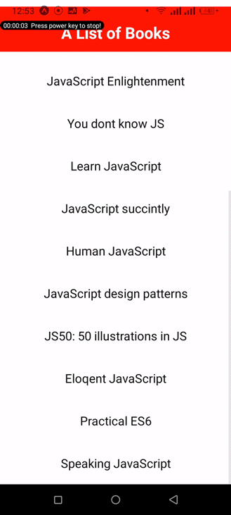
Here’s the result on an Android device:
See the full demo on Expo Snack.
Using a collapsible header on scroll greatly improves the user experience for React Native apps, especially for applications with a complex header structure. Mobile apps should always be structured in such a way that they can smartly adjust to the users’ needs.
Have a great week.

LogRocket's Galileo AI watches sessions for you and and surfaces the technical and usability issues holding back your React Native apps.
LogRocket also helps you increase conversion rates and product usage by showing you exactly how users are interacting with your app. LogRocket's product analytics features surface the reasons why users don't complete a particular flow or don't adopt a new feature.
Start proactively monitoring your React Native apps — try LogRocket for free.
Would you be interested in joining LogRocket's developer community?
Join LogRocket’s Content Advisory Board. You’ll help inform the type of content we create and get access to exclusive meetups, social accreditation, and swag.
Sign up now
Not sure if low-code is right for your next project? This guide breaks down when to use it, when to avoid it, and how to make the right call.

Compare Firebase Studio, Lovable, and Replit for AI-powered app building. Find the best tool for your project needs.

Discover how to use Gemini CLI, Google’s new open-source AI agent that brings Gemini directly to your terminal.

This article explores several proven patterns for writing safer, cleaner, and more readable code in React and TypeScript.

 Learn more →

2 Replies to "Using React Native ScrollView to create a sticky header"
Thanks Brother!!!
I am a newbie in react native!
Great Thanks To YOU!!!!
This was well written and great way to kickstart an interest in RN animation