Tooltips and other popovers have continually proven essential in improving the UX of any application. They make it easy to further explain an item that a user is viewing — like by hovering over tooltips — or to navigate into subsections, like in dropdowns.

Creating a tooltip or dropdown with CSS is easy. However, positioning them to flow with your UI at all times can be a hassle. Typically, you’d have to introduce JavaScript to do so, which can be tedious.
This is where libraries like Popper.js come in handy. Popper is a JavaScript library that helps you manage your popovers easily. In this article, we will look at how Popper can be used in a React application. We will cover:
react-popper
react-popper with modifiers
react-popperNote that the version of Popper used throughout this article is v2, which features many improvements from v1.
The Replay is a weekly newsletter for dev and engineering leaders.
Delivered once a week, it's your curated guide to the most important conversations around frontend dev, emerging AI tools, and the state of modern software.
Before we really dive into Popper, let’s take a look at the library we would be using to style our popovers in this article.
Popper doesn’t come pre-styled. This is because it doesn’t create your tooltips or popovers; it only helps make them better positioned and perform better with less code.
You will have to style your tooltips yourself. This is where the styled-components library can come in.
The styled-components React library is a great way to style React components easily. It uses the basic CSS-in-JS styling syntax.
This library allows you to create a component and attach styles to it using ES6 tagged template literals. The code below shows a styled Button component:
import styled from 'styled-components';

const Button = styled.button`
  padding: 10px;
  border: 2px solid blue;
  border-radius: 4px;

  &:hover {
    border-color: red;
  }
`;

const Example1 = () => {
  return (
    <main>
      <Button>Click me</Button>
    </main>
  );
};

export default Example1;
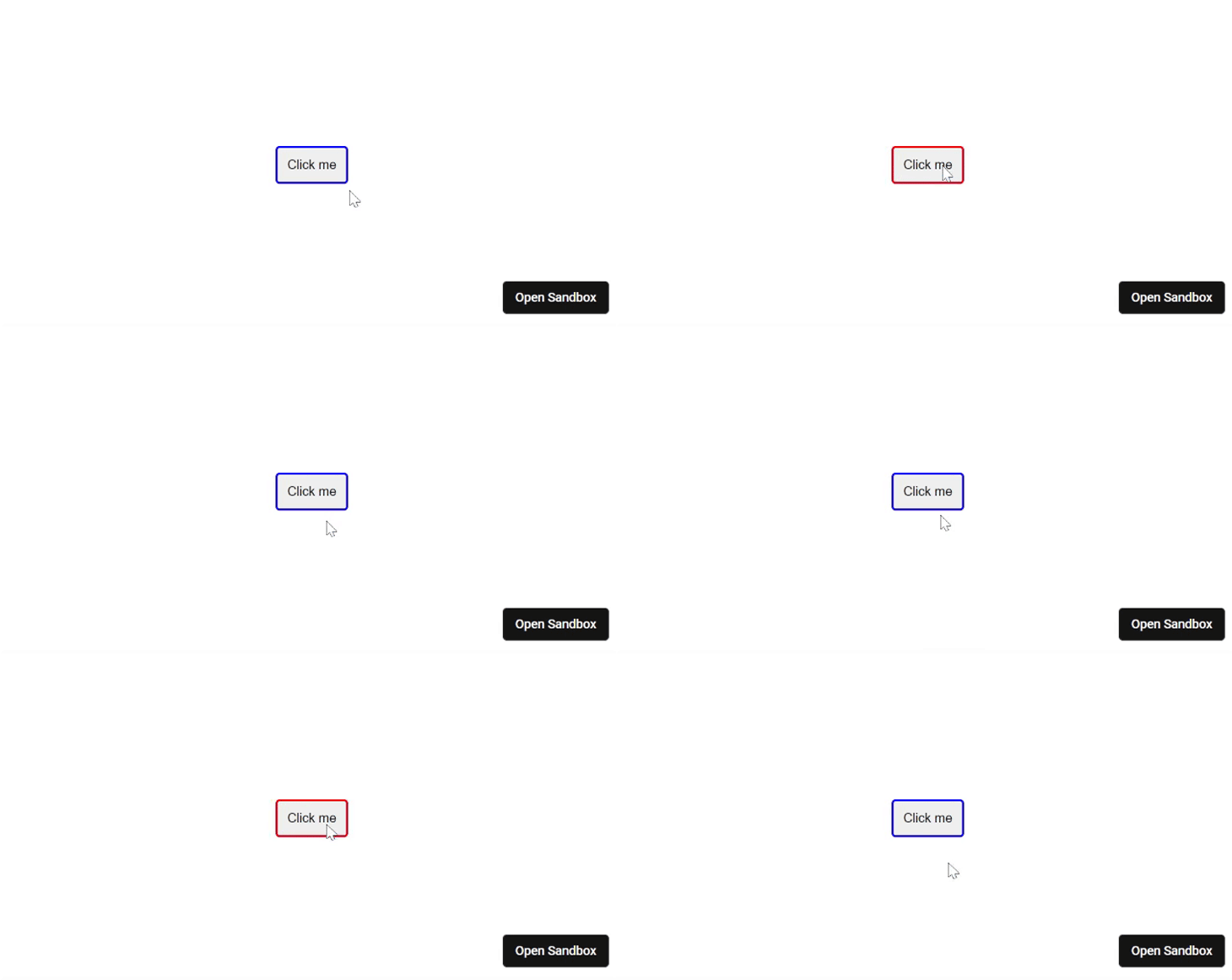
The result should look like so:

The & operator is how styled-components references the component being styled. Think of it as JavaScript’s this in classes.
Also, in the example above, we find CSS being used in ES6 template literals to style a button. The Button component — which is an actual React component — is a button and all the properties/attributes of a button element can be passed into the Button component:
const Example1 = () => {
  return (
    <main>
      <Button type="submit">Click me</Button>
    </main>
  );
};
We will not be able to go over every detail of using styled-components here, but what I have explained about styled-components so far is sufficient for this tutorial.
Popper is not a tooltip or dropdown library. Rather, it’s a library that makes building a tooltip or dropdown easier. In other words, Popper doesn’t create your tooltip for you, but it helps position your tooltip so that it fits into your UI at all times.
Positioning popovers with Popper is fully customizable. You can turn features on and off, customize existing features to meet your needs, and create some custom features.
Popper v2 saw a decrease in size from over 7kb minzipped to what now is 3kb minzipped. It is also possible to eliminate unused code from your bundles through tree shaking.
Popper can be used for any popovers, but it is mostly used for tooltips. While I will refer to tooltips in this article, you can use this knowledge to put in any popovers you want to create.
Popper is for vanilla JS by default, but also has support for React. The creators created another library called react-popper to extend the core Popper library for use in React applications.
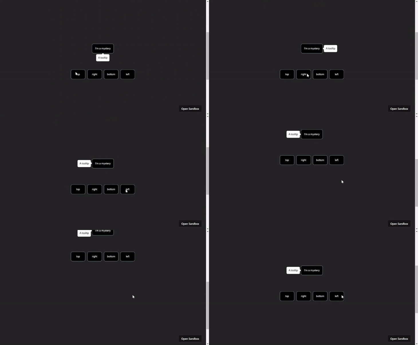
Below is a basic interactive example of positioning a tooltip with react-popper:

You can interact with the example in your browser to see how it works for yourself.
In this example, we provided four means of positioning the tooltip item around the button:
toprightbottomleftPopper also provides other positions like top-start and top-end, which we will talk about later in more detail.
react-popperThis is a code-along section, so try and follow along. In this section, we will talk about everything you need to get started with using Popper in React.
To begin, let’s create a new React project with Vite using the command below:
npm create vite@latest popper-js -- --template react
Our project will be called popper-js. You can choose to give yours any suitable name.
Next up, we will install the dependencies:
npm install styled-components @popperjs/core react-popper
Now that we have the project set up, you can run npm run dev to get the project started on a localhost.
Next, let’s create a simple tooltip to display some information on the website. Clear out the code in the App.js file and paste the following into it instead:
import {
 StyledAppContainer,
 LongEl,
 Tooltip,
 Button
} from "./App.styled";
import { useState } from "react";

export default function App() {
 const [referenceEl, setReferenceEl] = useState(null);
 const [popperEl, setPopperEl] = useState(null);

 return (
   <StyledAppContainer>
     <div>
       <LongEl />
       <Button ref={setReferenceEl}>I'm a mystery</Button>
       <Tooltip
         ref={setPopperEl}
       >
         <p>A tooltip</p>
       </Tooltip>
       <LongEl />
     </div>
   </StyledAppContainer>
 );
}
All we’re doing in the code above is creating the components we will need for our tooltip.
The Button component is the reference element. Popper uses the reference element as the element around which to position the tooltip. The tooltip component is the popover container or element, which represents what will be popped over.
We also have a couple of LongEl components, the sole purpose of which is to make it possible to scroll the viewport up and down. This will help us see Popper at work.
Both the reference element and popper or popover element have been assigned callback refs, which we will use to give Popper access to these elements.
If you save the file you created earlier, you’re going to have a couple of errors because we haven’t created the styled components we used. To fix this, go ahead and create a new file called App.styled.jsx and paste the following code into it:
import styled from "styled-components";

export const LongEl = styled.div`
 min-height: 100vh;
 width: 100%;
`;

export const StyledAppContainer = styled.div`
 min-height: 100vh;
 margin: 0;
 font-family: sans-serif;
 text-align: center;
 background: #242424;
 display: flex;
 justify-content: center;
 align-items: center;
`;

export const Button = styled.button`
 background: #000;
 padding: 15px;
 border: 1px solid lightblue;
 border-radius: 8px;
 color: #fff;
 font-family: sans-serif;
 font-size: 0.8rem;
 font-weight: 500;
`;

export const Tooltip = styled.div`
 background: #fff;
 border-radius: 5px;
 padding: 10px;
 text-align: left;
 position: relative;
 font-size: 0.8rem;
 max-width: 140px;
`;
This will ensure all the components we need are styled and ready to use.
usePopper hookNow we have the tooltip ready to be made functional with Popper. In the App.js file, we will import the usePopper hook from react-popper and make use of it in the App component:
import { usePopper } from "react-popper";

export default function App() {
 const [referenceEl, setReferenceEl] = useState(null);
 const [popperEl, setPopperEl] = useState(null);
  const { styles, attributes } = usePopper(referenceEl, popperEl, {
    placement: "bottom"
  });

 return (
   <StyledAppContainer>
     <div>
       <LongEl />
       <Button ref={setReferenceEl}>I'm a mystery</Button>
       <Tooltip
         ref={setPopperEl}
         style={styles.popper}
         {...attributes.popper}
       >
         <p>A tooltip</p>
       </Tooltip>
       <LongEl />
     </div>
   </StyledAppContainer>
 );
}
The usePopper hook takes three arguments:
referenceEl — the reference element along which popperEl will be placedpopperEl — the popover element; in this case, the tooltipoptions — an object to help customize the tooltip to fit your needs.The options object includes properties like the following:
modifiers — an array of middlewares
placement — the initial placement of the tooltipstrategy — describes the positioning strategy to use
absolute is used by defaultonFirstUpdate — a function called when the first update is madeThe modifiers property will be discussed in detail later. For the strategy property, in cases where the reference element is in a fixed container, you can easily change it from absolute to fixed to help properly position the tooltip.
The placement property takes in a string of initial positions for the tooltip including top, bottom, left, right, and others. The default value is auto, which tells Popper to place the tooltip where there is the most space. The other possible values are:
top-starttop-endright-startright-endbottom-startbottom-endleft-startleft-endSetting an initial placement will not stop Popper from flipping the tooltip when the need arises. We will also look more at flipping when we discuss modifiers.
The usePopper hook returns an object of styles and attributes. Both are objects that are used to assign styles and attributes to the tooltip element. Both also have a popper property that specifies that popperEl should use a set of styles as well as have a set of attributes.
If you log styles.popper to the console, you’d literally have an object of styles that Popper knows your tooltip would need to help it work. These styles are completely different from the ones we used with styled-components.
The attributes are also needed when we want to have more functions in the tooltip. An example of this could be making the tooltip only appear when triggered. Another example is having an arrow on the tooltip that goes everywhere the tooltip goes while maintaining its position on the tooltip.
Go ahead and save your file and run the project. If you haven’t been following, you can open this example in CodeSandbox.
So far we’ve only created an always-seen tooltip, which isn’t what tooltips really are, right? The tooltip should be able to disappear and appear whenever we want. Doing this with Popper is very easy.
Let’s improve our example above and make the tooltip hidden by default. Then, when the reference element is hovered on, it can be displayed. This implies we would add an onMouseEnter and an onMouseLeave event to the reference element, like so:
export default function App() {
 const [referenceEl, setReferenceEl] = useState(null);
 const [popperEl, setPopperEl] = useState(null);
 const { styles, attributes } = usePopper(referenceEl, popperEl, {
   placement: "bottom"
 });

 const showTooltip = () => {
   popperEl.setAttribute('data-show', true);
 }

 const hideTooltip = () => {
   popperEl.removeAttribute('data-show')
 }

 return (
   <StyledExampleContainer>
     <div>
       <LongEl />
       <Button
         onMouseEnter={showTooltip}
         onMouseLeave={hideTooltip}
         ref={setReferenceEl}
       >
         I'm a mystery
       </Button>
       <Tooltip
         ref={setPopperEl}
         style={styles.popper}
         {...attributes.popper}>
         <p>A tooltip</p>
       </Tooltip>
       <LongEl />
     </div>
   </StyledExampleContainer>
 );
}
The next step is to change the style of the tooltip to only display whenever the data-show attribute is set. Head over to the App.styled.jsx file and update the Tooltip component like so:
export const Tooltip = styled.div`
 background: #fff;
 border-radius: 5px;
 padding: 10px;
 text-align: left;
 position: relative;
 font-size: 0.8rem;
 max-width: 140px;
 visibility: hidden;

 &[data-show="true"] {
   visibility: visible;
 }
`
Now save and run the project to see the tooltip at work, or you can view the updated example in CodeSandbox.
For accessibility, you may want to add more than just the onMouseEnter and onMouseLeave events. You can also add the onFocus and onBlur events so folks navigating with a keyboard will also be able to view the tooltip.
react-popper with modifiersSo far, we’ve seen a basic example of using react-popper, which could be all your app requires. But if your app requires more functionalities than what we’ve covered so far, you can also get much more out of this library. So let’s take a look!
When it comes to adding or changing functionalities in Popper, all we need is the modifiers property of the usePopper hook. There are default modifiers that come with Popper by default, some of which are:
popperOffset — Used to position the popper element around the reference elementoffset — Used to move the popper element along its reference element
popperOverflow — Helps keep the popper visible within its boundary area by preventing it from being cut offarrow — Used to specify an arrow for the tooltip as well as position it along the tooltipflip — Used to flip the tooltip when needed
hide — Used to hide the popper element when it’s detached from its reference elementAll these default modifiers — as well as any others not mentioned here — are all used by Popper to make your tooltip do what it does. We can either create more modifiers or update the current ones to fit our needs.
First, let’s take a look at creating a modifier.
A modifier requires four properties for it to function:
namephaseenabledfnThe name property represents the name of the modifier. Just like each default modifier has a name, so should yours. The name makes it possible to refer to the modifier from other parts of the library.
Each modifier should have a unique name so you don’t end up overriding a default or custom modifier. Since the relevance of a modifier increases in descending order, modifiers at the bottom of the array will always override those before it when necessary.
A simple example would be to change the distance between the popper element and the reference element:
const { styles, attributes } = usePopper(referenceEl, popperEl, {
   modifiers: [
     {
       name: "offset",
       options: {
         offset: [0, 10] // [skidding, distance]
       }
     }
   ]
 });
The phase property relates to the three different core phases of Popper modifiers lifecycle:
main — for modifiers that only want to perform logicread — for modifiers that only want to read from the DOMwrite – for modifiers that only need to write to the DOMThis helps group Popper’s access to the DOM. Popper also provides two subphases for each main phase — beforeMain and afterMain.
The enabled property is a boolean that specifies if the modifier is enabled or not. The default modifiers listed above are enabled by default, but you can easily disable any of them with the enabled property, like so:
const { styles, attributes } = usePopper(referenceEl, popperEl, {
  modifiers: [
    {
      name: 'flip',
      enabled: false
    }
  ]
});
The example above will stop the tooltip from flipping. Just a side note, turning off the flip mode will also turn off the function of setting placement as auto. In other words, the flip modifier has to be enabled for autoplacement to work.
The fn property is a function that returns a state object, which is literally the state of the popper created. The function is also used to provide logic to the modifier.
Traditionally, functions on modifiers create an infinite loop because react-popper does shallow comparisons on the configuration provided. With inline functions, the shallow comparison fails and makes the code think the configuration changed.
The solution to this would be to either use React’s useMemo hook or declare the function outside the component.
There are other properties used for creating modifiers with Popper. For example, there is a requires property that you use to specify the modifiers the modifier you’re creating depends on.
Additionally, there is an options property that is used to specify all the properties used to configure the modifier. You should head up to the Popper docs to check these out if you want more than the required props.
Now, let’s create our first custom modifier. This modifier will simply change the background color of the tooltip when it’s at the top of the reference element:
 const changeTooltipBg = useMemo(
   () => ({
     name: "tooltipBgChanger",
     enabled: true,
     phase: "write",
     fn: ({ state }) => {
       if (state.placement === "top") {
         popperEl.setAttribute('to-red', true);
       } else {
         popperEl.removeAttribute('to-red');
       }
     }
   }),
   [popperEl]
 );
  const { styles, attributes } = usePopper(referenceEl, popperEl, {
   placement: "bottom",
   modifiers: [
     changeTooltipBg
   ]
 });
This means you’d also have to adjust your styles. See the example in CodeSandbox.
Notice I used the write phase because we are writing to the DOM here.
Before we round off this article, I’d like us to look at a couple of modifiers. We will take a look at some of the useful things about some default modifiers that will be very useful to your project.
The offset modifier is for specifying the distance between the popper and the reference element as well as the displacement — or skidding — of the popper element along the reference element.
The values for skidding and distance are both passed as an array with skidding as the first value. They are passed into an offset property of the options object of the modifier:
const { styles, attributes } = usePopper(referenceEl, popperEl, {
   modifiers: [
     {
       name: "offset",
       options: {
         offset: [0, 0] // [skidding, distance]
       }
     }
   ]
 });
Both skidding and distance accept positive and negative values. For skidding, a positive value displaces or slides the tooltip to the right if it is currently at the top or bottom. Likewise, it moves the tooltip to the top if it is currently at the left or right. Meanwhile, a negative value does the opposite.
For distance, a positive value pushes the tooltip away from the reference element. Meanwhile, a negative value pushes the tooltip towards the reference element, so that it can overlay on the reference element.
Rather than specifying an array of values directly, you could also do it with a function, this way you can specify a value dynamically. This is because the function returns an object of popper, reference, and placement properties:
const changeDistance = useMemo(
   () => ({
     name: "offset",
     options: {
       offset: ({ popper, reference, placement }) => {
         if (placement === "top" || placement === 'bottom') {
           return [0, popper.height / 2];
         }

         return [0, 0];
       }
     }
   }),
   []
 );

 const { styles, attributes } = usePopper(referenceEl, popperEl, {
   placement: "bottom",
   modifiers: [changeDistance]
 });
The popper and reference properties return the height and width of both the popper element and the reference element respectively.
Arrows are quite useful for indicating the reference element the popover points to. Just like using popper elements, Popper also provides styles and attributes for arrow elements.
The steps we will take to add an arrow to the tooltip project we’ve been building earlier are:
Let’s implement these steps now.
For step one, let’s head over to the App.jsx file to add an element for the arrow:
 return (
   <StyledAppContainer>
     <div>
       <LongEl />
       <Button ref={setReferenceEl}>I'm a mystery</Button>
       <Tooltip
         style={styles.popper}
         data-show="true"
         {...attributes.popper}
         ref={setPopperEl}
       >
         <p>A tooltip with</p>
         <span
           ref={setArrowEl} // doesn't exist yet
           style={styles.arrow}
           {...attributes.arrow}
           className="arrow"
         />
       </Tooltip>
       <LongEl />
     </div>
   </StyledAppContainer>
 );
Notice the attributes and styles of the arrow attached to the element that will represent our arrow. This won’t have any effect because we haven’t referenced the arrow element in the arrow modifier.
For step two, we are still working in the App.js file. Create a new state for referencing the arrow element like so:
const [arrowEl, setArrowEl] = useState(null);
Next, we reference the arrow element in the arrow modifier like so:
const { styles, attributes } = usePopper(referenceEl, popperEl, {
  placement: "left",
  modifiers: [
    { name: "arrow", options: { element: arrowEl } }
  ]
});
Finally, for step three, adding the styles from Popper to the arrow doesn’t create the arrow. Rather, it helps displace the arrow along the tooltip at all times:

We are the ones to create the tooltip and position it based on the placement of the arrow. Find the Tooltip styled component in the App.styled.jsx file and add these styles:
`
 .arrow,
 .arrow::before {
   position: absolute;
   width: 8px;
   height: 8px;
   background: inherit;
   transition: top 0.3s ease-in, bottom 0.3s ease-in, left 0.3s ease-in,
     right 0.3s ease-in;
 }

 .arrow {
   visibility: hidden;
 }

 .arrow::before {
   visibility: hidden;
   content: "";
   transform: rotate(45deg);
 }

 &[data-popper-placement^="top"] > .arrow {
   bottom: -4px;
 }

 &[data-popper-placement^="bottom"] > .arrow {
   top: -4px;
 }

 &[data-popper-placement^="left"] > .arrow {
   right: -4px;
 }

 &[data-popper-placement^="right"] > .arrow {
   left: -4px;
 }
`
One more thing we could do is hide the arrow when it gets to the edge of the popper, since it being at the edge right now doesn’t look so good. Doing so is easy! All we have to do is create a custom modifier and check when the arrow hits the edges:
const hideArrowAtEdges = useMemo(
   () => ({
     name: "arrowHide",
     enabled: true,
     phase: "write",
     fn: ({ state }) => {
       const { arrow } = state.elements;

       if (arrow) {
         if (state.modifiersData.arrow.centerOffset !== 0) {
           arrowEl.setAttribute("data-hide", true);
         } else {
           arrowEl.removeAttribute("data-hide");
         }
       }
     }
   }),
   [arrowEl]
 );

 const { styles, attributes } = usePopper(referenceEl, popperEl, {
   placement: "left",
   modifiers: [
     { name: "arrow", options: { element: arrowEl } },
     hideArrowAtEdges
   ]
 });
Feel free to interact with this example in CodeSandbox.
You can hide popper elements when the reference element is no longer visible on the viewport.
The hide modifier makes this possible by attaching an attribute — data-popper-reference-hidden — to the popper element when the reference element is no longer visible.
All we have to do is to select the attribute and attach a style to it like so:
&[data-popper-reference-hidden="true"] {
   visibility: hidden;
 }
react-popperPortals are essential for managing popovers in large-scale applications. They help manage the DOM hierarchy of your popovers.
Usually, you’d want to use zIndex for small-scale applications. However, zIndex is not so effective for larger applications because it’s hard to keep track of all zIndex values at scale.
Portals allow you to render your popovers outside of React’s default DOM hierarchy. Using Portals in React is pretty straightforward.
Using Portals with react-popper does not require anything special from the library. You don’t need to turn anything on; you only need to wrap the popover with the portal and point to the destination:
{createPortal(
    <Tooltip
      style={styles.popper}
      data-show="true"
      {...attributes.popper}
      ref={setPopperEl}
    >
     <p>A tooltip</p>
     <span
        ref={setArrowEl}
        style={styles.arrow}
        {...attributes.arrow}
        className="arrow"
      />
    </Tooltip>,
    document.getElementById("popper")
)}
See the example in CodeSandbox.
In 2021, the creator of Popper announced that Popper is now Floating UI. Floating UI is simply the next level of Popper.
In terms of features, size, cross-platform support, scalability, and others, Floating UI is objectively the better option.
Popper v2 is greatly improved in comparison to v1, but Floating UI is the future. Unlike Popper, which can only be used in vanilla JavaScript and React, Floating UI can also be used in React Native and Vue.
In terms of the way they work, there are not many differences. You can easily transition to Floating UI from Popper at any time.
So what could possibly want to make you use Popper over Floating UI?
Well, a downside of Floating UI is that it hasn’t seen as much adoption as Popper has, so there are fewer tutorials and project samples on it compared to Popper.
However, a downside of Popper right now is that the creator also announced that the library will be kept in a state of low maintenance, and he has held true to his word. If you can, I’d recommend you move to Floating UI.
In this tutorial, we looked at how to use Popper v2 in React to better position popovers. We looked at how we can create custom modifiers to extend react-popper and how we can use React Portals with react-popper, which turned out to be super easy and useful.
We also looked at styling our popovers with styled-components. As a side note, styled-components isn’t just for styling popovers. You can also use it to style anything in React, be it a simple element like we saw in this article or a component from a library.
That’s it. Thanks for reading, and happy hacking.
Install LogRocket via npm or script tag. LogRocket.init() must be called client-side, not
server-side
$ npm i --save logrocket

// Code:

import LogRocket from 'logrocket';
LogRocket.init('app/id');
// Add to your HTML:

<script src="https://cdn.lr-ingest.com/LogRocket.min.js"></script>
<script>window.LogRocket && window.LogRocket.init('app/id');</script>

Why the future of DX might come from the web platform itself, not more tools or frameworks.

A hands-on test of Claude Code Review across real PRs, breaking down what it flagged, what slipped through, and how the pipeline actually performs in practice.

CSS art once made frontend feel playful and accessible. Here’s why it faded as the web became more practical and prestige-driven.

Learn how inline props break React.memo, trigger unnecessary re-renders, and hurt React performance — plus how to fix them.
Would you be interested in joining LogRocket's developer community?
Join LogRocket’s Content Advisory Board. You’ll help inform the type of content we create and get access to exclusive meetups, social accreditation, and swag.
Sign up now