The CSS float property specifies whether an element should float to the left, right, or not at all, and allows us to take an element, remove it from the normal flow of a page, and position it to the left or right of its parent element.
When this happens, all the other elements on the page flow around the floated element. Today, however, we have tools that make positioning these floating elements (in this case, called poppers) easier while intelligently keeping them in view.
While there are many positioning tools and libraries, Floating UI and Popper remain the most popular and most used. Hence, the need to answer these questions:
In this article, we will look at these two libraries, what makes them different, and which one is best to use.
Before Popper was created in 2006, Tether was the open source solution to position floating elements but was superseded by Popper.
Popper is a lightweight library that aims to provide a reliable and extensible positioning engine to ensure all popper elements are positioned in the right place These popper elements include tooltips, popovers, dropdowns, menus, and more.
Popper also focuses on compatibility, bundle size, and a more modern API.
Floating UI is an upgrade of Popper; it is an evolution of libraries like Popper v2 and Tether with a more modern API.
Federico Zivolo, the creator of Popper and co-maintainer of Floating UI, notes that even though Popper v2 might still be available and working, Floating UI was created to replace it.
One distinct factor that makes Floating UI better than Popper is that while Popper only runs on the web using the DOM, Floating UI supports both the web, React Native, Canvas, and more.
Since Floating UI is an upgrade to Popper, let us see what makes them different.
Before we go into the differences between Floating UI and Popper, you might wonder why you should learn how to use a new tool for what you can do with your pure CSS.
While you’re correct—you can use pure CSS to do the same things Popper and Floating UI can—there are some downsides to using pure CSS instead of using Floating UI or Popper.
Vanilla CSS poppers do not flip to a different placement or position to fit better in view when necessary. You can achieve this using JavaScript to transform the poppers, but you cannot achieve this with CSS only.
Popper and Floating UI automatically flip poppers to fit in view as best as possible. Using Floating UI, let’s see how we can automatically flip our poppers.
In React, add this code to an App.js file; the paragraph will be our reference element while the tooltip will be our popper:
// App.js

import React from 'react';
import { computePosition, flip } from '@floating-ui/dom';
import './style.css';

const App = () => {
const paragraph = document.querySelector('.paragraph');
const tooltip = document.querySelector('.tooltip');
computePosition(paragraph, tooltip, {
    placement: 'top',
    middleware: [ flip() ]
}).then(({ x, y }) => {
    Object.assign(tooltip.style, {
       left: `${x}px`,
       top: `${y}px`
    });
});
    return (
        <div>
            <p className="paragraph"> Hover over me! </p>
            <div className="tooltip">
                This is a tooltip that shows extra info
            </div>
        </div>
    );
};
export default App;
In a style.css file, add the code below:
// style.css

body {
    margin: 0;
    padding: 0;
    box-sizing: border-box;
}
.paragraph {
    margin: 60px 0 0 60px;
    font-size: 14px;
    position: absolute;
}
.tooltip {
    background: black;
    color: white;
    font-size: 16px;
    padding: 6px;
    border-radius: 5px;
    pointer-events: none;
    position: absolute;
}
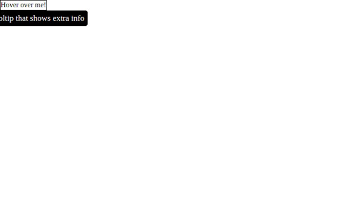
Floating UI has a middleware called flip, and it automatically translates or changes the popper placement to the opposite axis or direction when it is out of our viewport, so we don’t need to manually change it ourselves.
Flip() is used when a popper is placed at the top or bottom of the reference element.
That means if we placed our popper on top of the reference element, when there is no space above the reference element to display the popper, Floating UI automatically changes the placement to the bottom and vice versa.
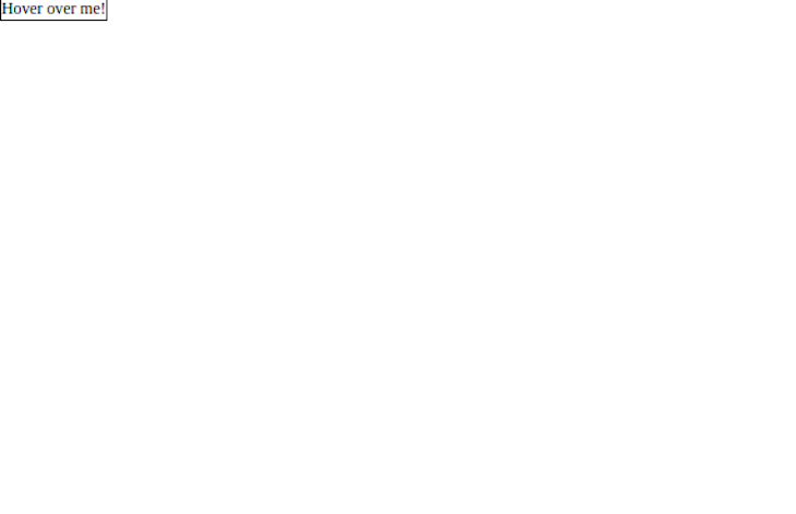
So, here’s what our app looks like before we added Flip():
And then, here’s our after we add Flip():
Pure CSS poppers are not prevented from overflowing clipping boundaries, such as the viewport. They will get partially cut off or overflow if they’re near the edge since there is no dynamic positioning logic.
But, when using Popper and Floating UI, your popper will always be positioned in the right place without manually adjusting, therefore ensuring the popper is always kept inside the viewport.
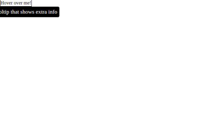
Unlike Flip() that works vertically, Shift() works horizontally along the x-axis. This will always ensure the popper doesn’t overflow outside our viewport.
To import Shift() from the Floating UI package, add the following:
// App.js

import { computePosition, shift } from '@floating-ui/dom';

computePosition(paragraph, tooltip, {
    middleware: [ shift() ]
})
Here’s what our app looks like before we added Shift():
And then with Shift() added:
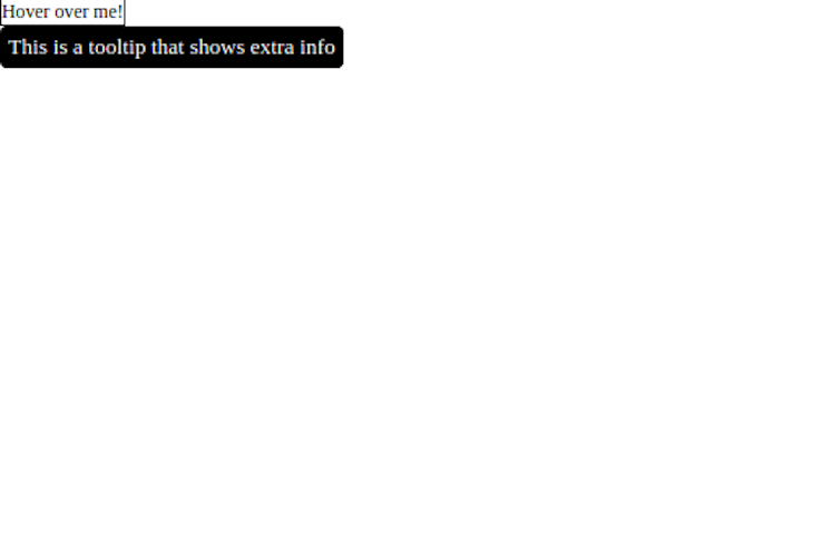
When using pure CSS to position popper elements, they must be carefully placed to consider overflow on all screen sizes and positioned over the reference element correctly, which can be time-consuming.
With Popper and Floating UI, you can place your elements anywhere and they will position correctly without needing to consider different screen sizes, layouts, and so on.
This massively speeds up development time because the work is automatically offloaded to Popper and Floating UI.
As previously mentioned, Floating UI is cross-platform. While Popper only supports the web, Floating UI supports mobile, Canvas, and WebGL with the right interface logic. In fact, Floating UI runs on any JavaScript environment.
Popper is a lightweight library meaning that it is small in size at about 3kb. Floating UI, on the other hand, is only 600 bytes, which makes it even smaller in size.
Tree-shaking is the removal of unused codes from a bundle during bundling for production.
Popper is not tree-shakeable by default. To leverage the tree-shaking feature, you must use Popper Lite:
import { createPopper } from "@popperjs/core/lib/popper-lite"
Floating UI is modular by default hence it is tree-shakeable. Also, new features are tree-shaken away if you don’t want to use them.
Placement is an option that shows where the poppers are placed, meaning the popper can be placed either at the top, bottom, left, or right of the reference element.
The auto-placement automatically places the popper at the side with more space, and Popper offers auto-placement as one of the placement options while Floating UI offers it as a modifier:
// Popper
import { createPopper } from "@popperjs/core"

createPopper(referenceElement, floatingElement, {
    placement: 'auto'
})

// Floating UI
import { computePosition, autoPlacemnt } from "@floating-ui/dom"

computePosition(referenceElement, floatingElement, {
    middleware: [ autoPlacement()]
})
Floating UI supports more features than Popper like the size and inline middlewares. The size middleware changes the size of the floating element, ensuring it doesn’t overflow the available space. This means that the floating element will always fit into the available space:
import { computePosition, size } from '@floating-ui/dom';

computePosition(referenceElement, floatingElement, {
    middleware: [ size({ padding: 5 })]
})
The inline middleware allows the positioning of the floating element on an inline reference element. When the reference element spans over another line, the inline middleware allows the floating element to properly position on the inline reference element.
Popper is built with extensibility in mind, yet, writing modifiers is still difficult because you need to check the data of other modifiers to write the correct logic.
To write an offset modifier in Popper, we do so with the following:
// Popper
import { createPopper } from "@popperjs/core"

createPopper(referenceElement, floatingElement, {
    placement: "top",
    modifiers: [{
        name: "offset",
        options: {
            offset: [0, 7]
        }
    }]
})
To write another modifier like flip, we must first check the data of offset before writing the flip modifier:
// Popper
import { createPopper } from "@popperjs/core"

createPopper(referenceElement, floatingElement, {
    placement: "top",
    modifiers: [{
        name: "offset",
        options: {
            offset: [0, 7]
        }
    }, name: "flip",
       options: {
            fallbackPlacements: ["top", "bottom"]
        }
    ]
})
With Floating UI, it is easier to write modifiers because you only need to arrange the middlewares properly since you control the order of the middleware array, making it more extensible:
// Floating UI
import { computePosition, shift, flip, offset } from "@floating-ui/dom"

computePosition(refrenceElement, floatingElement, {
    middleware: [ offset(), flip(), shift() ]
})

//Note: Offset must always be at the beginning of the array while hide and arrow must always be at the end
Floating UI is built with TypeScript, hence it leverages the benefits of TypeScript like readability, type-check, predictability of the modifiers, and so on.
Popper, however, is built with Flow and is loosely typed by default, which means modifiers are not strictly type-checked. This means that modifiers’ data type errors are not spotted early except during runtime, making it error-prone.
TypeScript checks for data types and spots errors in the data types that change. Popper is not built that way, so the modifiers types are not checked early. The problem with this is that you will only spot the error at runtime/execution.
Since Floating UI is written in TypeScript, it makes it more predictable than Popper.
That means everything stays the way it was initially defined; the middlewares are not enabled by default and you don’t need to preconfigure any middleware but can instead add them when you need them, unlike in Popper, where the middlewares are enabled by default.
Floating UI and Popper offers middlewares like the offset, arrow, shift, flip, and so on. To use these middlewares in Floating UI, you must import and use them because they are not enabled by default:
// Floating UI
import { computePosition, shift, flip, offset } from "@floating-ui/dom"

computePosition(refrenceElement, floatingElement, {
    middleware: [ offset(), flip(), shift() ]
})
In Popper, however, these middlewares are already enabled by default:
// Popper
import { createPopper } from "@popperjs/core"

createPopper(referenceElement, floatingElement, {
    modifiers: [{
        name: "offset",
        options: {
            offset: [0, 7]
        }
    }]
})
Popper is being kept in a low maintenance mode, meaning maintenance will be low in frequency, so it’s currently unclear if new features will be added in the near future.
Much work, however, has gone into Floating UI to make it the best and easiest-to-use solution in the positioning space.
We have seen why using libraries like Floating UI and Popper to position our floating elements is better than using just vanilla CSS.
Floating UI is the evolution of Popper v2 to replace Popper and make it more cross-platform compatible. Sadly, there are few tutorials and fewer to no videos on Floating UI, so only the documentation is available to learn how to use it.
However, Popper has been used for quite a long time, and thus more tutorials and community support should you run into a problem.
Yet, for your use case, you should go for Floating UI because it offers more advantages. Not only is it easier to use, but you can use it with React, Vue, or even vanilla JavaScript to position your floating elements on the web. You can also use it with React Native to position floating elements on mobile.
Gracias!
As web frontends get increasingly complex, resource-greedy features demand more and more from the browser. If you’re interested in monitoring and tracking client-side CPU usage, memory usage, and more for all of your users in production, try LogRocket.

LogRocket lets you replay user sessions, eliminating guesswork around why bugs happen by showing exactly what users experienced. It captures console logs, errors, network requests, and pixel-perfect DOM recordings — compatible with all frameworks.
LogRocket's Galileo AI watches sessions for you, instantly identifying and explaining user struggles with automated monitoring of your entire product experience.
Modernize how you debug web and mobile apps — start monitoring for free.
Would you be interested in joining LogRocket's developer community?
Join LogRocket’s Content Advisory Board. You’ll help inform the type of content we create and get access to exclusive meetups, social accreditation, and swag.
Sign up now
This guide walks you through creating a web UI for an AI agent that browses, clicks, and extracts info from websites powered by Stagehand and Gemini.

This guide explores how to use Anthropic’s Claude 4 models, including Opus 4 and Sonnet 4, to build AI-powered applications.

Which AI frontend dev tool reigns supreme in July 2025? Check out our power rankings and use our interactive comparison tool to find out.
Learn how OpenAPI can automate API client generation to save time, reduce bugs, and streamline how your frontend app talks to backend APIs.
2 Replies to "Popper vs. Floating UI"
Popper actually has stricter types compared to Floating UI, simply because Flow is a stricter type checker than TS.
Okay, thank you very much for the correction Federico. Will update the article asap.